
Abstract
Financial institutions use credit Scoring models to predict the default of their customers and assist in decision-making about the granting of credit. As a large volume of credit transactions is generated daily alongside a potential increase in this information with the advent of Open Finance, it is challenging to monitor this information quickly so we can act in case these models lose performance. Considering this context, our research aims to provide a Visual Analytics approach to assist in monitoring credit models. For this, initially, we carried out a systematic review of the literature on the subject and conducted semi-structured interviews with 13 domain experts. Considering the needs raised with this study, we created a prototype called Visual Analytics for monitoring Credit Scoring models (VACS). The main contributions of this work are twofold: The requirements gathered through interviews with specialists, which allowed the analysis of how the models are monitored within financial institutions, something that is not disclosed and that can help in the standardization of the monitoring process; and VACS, which was evaluated by four domain experts who considered it a very complete and easy-to-use tool.
Introduction
In financial systems, credit is the contract between consumers and creditors that occurs due to the trust between both parties. Commercial companies may stop doing business if credit cards are rejected, for example. For Financial Institutions (FIs), each transaction represents income and expenses that impact their results. 1 The FIs are responsible for granting credit to individuals and companies, 2 where the competition between them has grown in recent years, turning credit offers more abundant and accessible. At the same time, when intermediating these financial transactions, the FIs must also manage the inherent risk of these operations, as this affects the sustainability of their business.
Credit Scoring (CS) models are tools used by FIs to measure how likely an applicant is to default. These models are based on information about the credit applicant’s profile which is collected during the request. The output of these models is a score that measures the probability of each client defaulting in the future. These models streamline the granting of credit, 3 and the FIs use them to assist during decision-making. 4 With the advancement in the study of techniques and strategies for building CS models, companies have become more aware that data-based decisions might be more accurate than subjective decisions. There is still great anticipation for introducing open-finance data in these models, allowing financial data sharing between institutions and thus increasing the amount of information about each client that can be tested and applied in CS models and the competition between FIs. 5
Nonetheless, there is also a need to monitor the performance of these models, guaranteeing that there were no mistakes during deployment and that they remain calibrated. 6 The models’ performance can be affected by changes in the data that compose them or even external economic factors, such as higher unemployment rates, which would affect the default rates. 7 Monitoring these models would allow companies to act more promptly in case of performance loss. However, there is still the challenge of mining the data used by the models to build adequate performance control indicators. The area of Visual Analytics (VA) 8 constitutes an important role in this matter since an analysis based on data mining and interactive visualizations allows for an easier and faster understanding of complex data, providing insights that assist in decision-making. 9
However, monitoring models require the usage of some statistical indicators that are not directly found in commercial tools, such as Tableau (https://www.tableau.com/). Meanwhile, some tools that use VA to interpret and investigate Machine Learning (ML) models were created in recent years 10 to assist in understanding what is happening in these models, frequently considered “black boxes.”
This work aims to present a VA approach for monitoring CS models. We started by conducting a systematic review of the literature followed by semi-structured interviews with domain specialists to gather the requirements we would need to fulfill with our work. We then built a prototype called Visual Analytics for monitoring Credit Scoring models (VACS) based on these results. It allows for simulating the monitoring process in two previously created CS models and presents visualizations that would enable, for example, verifying the stability of the variables and conducting a fairness analysis of the score. Since the data about the monitored models are restricted to each FI, and are not publicly available, we believe that the results may help in the standardization of monitoring methodologies, assisting mainly FIs that have been adhering recently to the use of predictive models for credit risk management and decision making. Furthermore, our other contributions are:
The requirements gathered by our literature study and interviews with domain specialists allowed us to detail how FIs monitor CS models and their requirements;
A VACS prototype that encompasses the requirements identified by providing a vast amount of functionalities and interactive visualizations;
The introduction of the fairness analysis concept in the context of monitoring credit scoring models;
A qualitative evaluation with domain specialists that allowed us to assert whether we fulfilled the requirements identified, evaluate the functionalities available on VACS, and gather new suggestions for improvements for future work.
The remainder of this work is organized as follows: First, we describe our research methodology. Then, we present both our study of the literature and the results from our interviews with domain specialists that were used for requirements gathering. Following that, we describe VACS and its evaluation in detail. Based on our evaluation, we then discuss our major contributions, limitations, and plans for future work. We end this work with our conclusions and final remarks.
Research methodology
Figure 1 summarizes this research’s development steps, which are detailed below. Initially, we sought public datasets and performed a systematic literature review. During this study of the literature, we identified that we would need to build at least two predictive models to be used as the basis for our prototype. Furthermore, to increase the credibility of the evidence, we conducted semi-structured interviews with domain specialists who worked or currently work with CS models. When creating the questionnaire, we considered the confidentiality of the FIs’ processes. Thus we did not ask any questions that could identify which institution the participant worked in. Moreover, we tailored each question to focus on the participant’s general experience, that is, they could answer based on broad experiences without needing to specify which institution they are referring to. In cases where the participants made more specific comments, we avoided taking them into our analysis to preserve their anonymity. It is important to mention that the interviews followed the protocol of the Ethics and Research Committee (https://plataformabrasil.saude.gov.br/login.jsf, CAAE 37086420.2.0000.5336.
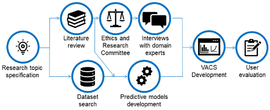
Research methodology used for VACS development.
The results obtained from the interviews allowed us to clarify which visualizations and functionalities the specialists believe to be necessary for a VA approach for monitoring CS models. Additionally, we synthesized the interviews’ results in five user requirements contemplated in the prototype developed. We also realized that we would need at least two models to properly illustrate how our approach would perform in real scenarios because institutions always use multiple models. We included a few simulated scenarios using our models’ output data to further approximate our experiments to real situations.
We then created the VACS prototype using the visualization techniques and indicators obtained from the literature review, requirements identified from the interviews, and two CS models built using real data. The datasets used were then adapted to allow the simulation of the monitoring process in real scenarios. The feedback from domain specialists, gathered during the early stages of development, allowed us to enhance our prototype significantly to better fit real-world needs.
Lastly, we evaluated our prototype by conducting another interview with domain specialists. The questionnaire used focused on evidencing whether the functionalities created were capable of fulfilling the requirements identified from the first interview. To avoid bias during the evaluation, we organized our final interview group to have an equal number of recurring specialists from our first round of interviews and specialists who had never interacted with VACS.
Background
In our highly competitive market, FIs must attract new clients, retain old ones, and meet their expectations by offering better financial products and services while managing credit risks. Credit management systems are crucial for estimating the risk of each client defaulting. 11
The decision-making process for credit concessions used to rely solely on the FIanalysts’ opinion, but the growth in the credit card market in the 1960s prompted the idea of optimizing this process. The introduction of techniques such as logistic regression as decision models in the 1980s allowed CS models to grow significantly in recent years, 12 with logistic regression and artificial neural networks being the most commonly used methods. 13
CS models use historical data to estimate the probability of each client defaulting in the future, and this probability is generally called “Credit Score” or “Probability of Default.” 14 The predictive variables used for calculating this probability, the model’s score, are diverse and cover various aspects, including demographic data, the client’s credit history, and many others. 15 This score aids analysts in decision-making for credit concession and the adequate interest rates for the risk taken when credit is given. Thus, clients with a higher probability of defaulting will receive higher rates to compensate for the higher risk the FIis taking. Initiatives such as Open Finance assist in lowering the rates offered since it provides FIs with comprehensive data about the client, allowing the models to identify groups with risk of defaulting more accurately. 16
After the development stage of CS models, there is an implantation stage where analysts employ these models to aid them in the decision-making for credit concessions. Once it reaches this stage, the model becomes integral to the FI’s decision-making pipeline. It is essential to monitor these models to ensure that their performance remains coherent with what was observed during their development and that their predictor variables remain stable. 17 Thus it is necessary to constantly compare the data used during development and the data acquired after the models were implanted. Another critical stage of evaluating the models is called “Fairness Analysis,” which comprises studies to identify whether the models are unfair toward a specific group of people since the models may have some undesired social biases. For example, the model may attribute lower scores to women, causing women to receive higher interest rates than men.
One method of identifying significant changes in the model’s score, compared to its development phase, is analyzing whether there were changes in its distribution after it was employed. The Probability Density Function (PDF) is an equation that reflects the probability distribution of a continuous random variable. 18 Therefore, by studying the PDF curve of the model’s score, we can identify the highest and lowest probability regions and whether these regions have changed over time.
Related work
We conducted a systematic literature review (SLR) on visualization techniques used for data modeling and metrics for monitoring the performance of CS models. Additionally, we also sought tools that were used to monitor these models. However, we could not find any work focusing on the challenge of visual monitoring CS models. Some of them addressing visualization when creating models, especially ML models, and metrics to monitor either CS models or predictive models, in general, gave us important insights.
Since ML models are hard to explain, many visualizations and new visual tools have been recently created, making them more explainable. 19 Most of these tools can also monitor models in general since they do not focus on a specific modeling technique. The visualizations are based on the model’s output, thus being able to adapt to many modeling contexts. 10 The main results of this research are summarized in the following sections, highlighting the main contributions we identified that could be used to monitor CS models. We also present the main challenges and considerations identified during the study.
New tools
Some related work uses paid tools like Tableau or free tools like R to create the visualizations used to monitor or explain models. However, others have developed new tools and even made them available for free. This section addresses the new tools created and their advantages. Zhang et al. 20 proposed an interactive manifold visualization tool, which provided the diagnostic and comparison between models and was not restricted to specific modeling techniques. The work by Wexler et al. 10 presents the “What-If Tool,” which contains all the functionalities and advantages of the previous work, but encompasses a larger spectrum of visualizations and comparisons. Cashman et al. 21 introduced the term “Exploratory Model Analysis” (EMA) as the process of exploring a set of potential models that can be trained in a dataset and creating a Visual Analytics workflow for EMA. Wang et al. 22 aimed to use Visual Analytics to help the understanding of decision tree algorithms, such as Extreme Gradient Boosting 23 and Light Gradient Boosting Machine, 24 by creating the tool “Visual Interpretation System for Tree Boosting Models.”
Monitoring models
We analyzed two works with applications in other areas that sought to monitor the model’s prediction errors. These works created metrics and visualizations that identified error patterns to monitor prediction mistakes, whereas, in both, mapping those expected patterns proved to be an effective method to find mistakes.
In their work, Garcia Caballero et al. 25 aimed to identify and correct wrong predictions to aid physicians with diagnostics after the development stage. They created a visual tool that allowed the user to explore the model’s output and understand what caused that result by using strategies such as identifying unlikely patterns and errors. The methods employed in their work proved effective for identifying common mistakes in real scenarios such as data input errors.
Schlechtingen and Santos 26 created a model for predicting failures in wind turbines. They employed line charts with control limits according to their standard deviation to identify when a prediction error occurred. The prediction error is measured as real data is being gathered, making it possible to assert the model’s performance, retrain it when needed, and check the adherence of predictions. Their work showed that the model’s errors were not always related to the input variables but could be caused by unexpected environmental changes.
Visual managing of models
This section addresses the use of visualizations to manage models. Two works show that when visualizations were introduced in the decision process when modeling data, the decisions made were more accurate. Since the process of managing models aims to ease managers’ decision-making regarding changes, introducing visualizations could also aid in this process.
The work by Gingerich and Conati 27 demonstrates how decisions made during the development of models by using personalized visualizations to highlight opportunities were essential in the decision-making of the best modeling strategy. De Baets and Harvey 28 conducted a controlled experiment to compare the models developed by two groups. The experiment results show that the group with the option of using visualizations before deciding on the final model achieved better results than the group that did not have this opportunity. Thus, it was possible to infer that when visualizations are introduced in the decision-making process, the users tend to adjust their choices according to what the visualizations show.
Visualizations for fairness analysis
We have identified that in recent years some works show that visualization techniques have been used to explain ML models. Since this type of model has the disadvantage of being hard to explain, many visualizations and new visual tools have been created that make them more explainable. 19
The work by Wexler et al. 10 built visualizations that helped the user understand whether the model was fair with classified individuals, that is, if the models did not use discriminatory variables. To achieve this, they used performance visualizations, such as the ROC curve and confusion matrix, simulating the threshold based on variables chosen by the user. With the growing usage of ML models, the fairness analysis of the model’s results has been frequently researched, 29 and these visualizations contribute to lowering the discrimination these models can generate. Szepannek and Lübke 30 proposed partial dependency charts to visualize the model’s fairness according to a given attribute.
Discussion
Our literature review showed how the difficulty of explaining ML models instigated a variety of research that demonstrated the value of using visualization techniques in the data modeling stage. Many charts have been created explaining how the model’s results are related to the predictive variables and where and why the model’s errors occur. Bar charts, histograms, and scatterplots are used for variable analysis. The confusion matrix and ROC curve are commonly utilized for fairness analysis.
For a long time, CS models majorly have been using statistical techniques, such as logistic regression, where the relationship between the model’s variables and the score is easy to interpret. 31 This may have been why there is a lack of work directly addressing the visual exploration of these models. Because of the lack of research on this specific application for VA, the closest comparison for our work that we found in the literature was the “What-if Tool.” However, whereas they made their tool more generic to encompass a plethora of different models and applications, we have specialized our tool with charts and metrics that provide the most substantial information that would help a professional in CS analysis to perform his job more efficiently. Therefore, there is a gap to be filled by employing the different visualization techniques used to explain ML models and adopting metrics used to monitor other models to aid in the visual monitoring of CS models.
Interviews with domain experts
Aiming to assist in gathering requirements, we conducted a qualitative study based on a survey. For this, we interviewed 13 specialists in the area of credit modeling 32 following a semi-structured questionnaire with 28 open-ended questions. The questions encompassed information about the participants’ profiles, tools and data they used, as well as activities, visualization techniques, and indicators they used to monitor models.
We interviewed nine women and four men who work or have worked with credit modeling for at least 2 years. These professionals occupied different positions in their respective companies, with seven working in management positions. All of them have a STEM degree: nine graduated in Statistics, two in Mathematics, one in Civil Engineering, and one in Physics. Furthermore, they all have a postgraduate degree, three a master’s degree, and one a doctorate.
None of the participants had worked with a tool created specifically for model monitoring. Six claimed to know tools for this purpose, but they were not acquired in the FIs because they were expensive or required much time to adapt the pipeline the participants used. Eight stated that they employed general-purpose tools for monitoring models. However, these tools only partially fulfilled the expected requirements since they just allowed the user to monitor fundamental indicators through a manual process. One indicated that non-specific tools were inadequate because they require too much interpretation and have no alerts for problems arising within the models.
All participants mentioned that they used visualizations to interpret the data, and the most frequently mentioned included bars, lines, histograms, and tables. These visualizations sought to verify the score distribution, monitor the indicators, compare the model’s current results with the development results regarding both the variables and the score, and analyze tendencies. The participants also listed a few analyses and visualizations they consider essential, for example, using colors to illustrate if the indicators are within the acceptable or close to their thresholds, visualizations representing the calculated score in credit engines, and the summary of the status of models used by the FIs. When questioned if an VA approach would contribute to monitoring models in the FIs,12 participants stated that it would be helpful, and one argued that it would depend on the approach. The reasons included the theme’s relevance, the agility of visual monitoring, and the lack of reference material about monitoring models.
When questioned if the models are monitored in the FIs, 11 participants answered yes, one answered mostly yes, and one participant answered that they worked at two FIs, and this was practiced in only one of them. However, all of them believe that it is important that the developed models are monitored, stating the following reasons: decision making, since the models help FIs in the credit decision and this can compromise their financial health; deterioration, because the model will lose performance over time; changes in the bank’s customer profile; action taking, because the monitoring process assists in the decision of whether the model needs to be changed, recalibrated, or adjusted; and model calculation errors.
Although despite is important, the participants mentioned that it is hard to prioritize this activity due to the time spent creating the model, which is a lot of manual labor, and because the indicators need to be built from the very beginning. Other complications are the vast number of models and the consolidation of information in a single place, and the team that builds the model not being the same that monitors it. However, they all consider it important to monitor the data distribution before analyzing the model’s output. They also mentioned that they analyze the credit indicators and the distribution of the variables and scores calculated to compare with their development counterparts. All participants used more than one statistical indicator in the monitoring process, the one most frequently mentioned being the Kolmogorov-Smirnov (KS) test, which checks the discrimination of the models.
Amongst the functionalities that a VA approach for monitoring CS models should contain, we highlight five requirements cited by at least four participants: (
With the interviews, we learned that the FIs usually monitor CS models without using tools specialized for it due to the required cost, time to adapt the monitoring processes already being done, and other activities with higher priority. On the subject of visualizations and indicators used, we identified that the visualizations mentioned in the interviews were the same found in our literature study. Nevertheless, with the interviews, we gathered more statistical indicators that tend to be used to monitor CS models. Therefore, doing this study with specialists in the area gave us a better understanding of how the process of monitoring models is conducted within FIs, complementing the results of our literature study. Additionally, we could gather the main challenges when creating CS models, the profile of professionals that work in this area, and the main requirements expected from a VA approach aiming to assist in the process of monitoring CS models.
VACS description
We developed VACS considering both the analysis of the related work and the requirements gathered from the domain specialists. Its main objective is to detect the model’s performance loss or signals indicating that it is not adherent to its development stage. The prototype was implemented using Shiny (https://shiny.rstudio.com/), a package developed for R, which allows for creating interactive HTML applications. On most of the visualizations made, we used R’s highcharter package (https://cran.r-project.org/web/packages/highcharter/highcharter.pdf) for the charts to be visually pleasing, easy to use, and interactive.
We present in Figure 2 a summary of the indicators and visualization techniques identified from our studies and interviews with specialists while also signaling those included in VACS with a green check. It is important to highlight that we have included all visualization techniques mentioned during the interviews in VACS, but we included only a subset of the ones identified in the literature study. We made this decision considering the type of data, the tasks involved in monitoring CS models, and based on how each visualization would interact with the analytical data of the model’s score alongside the predictive variables in the dataset.
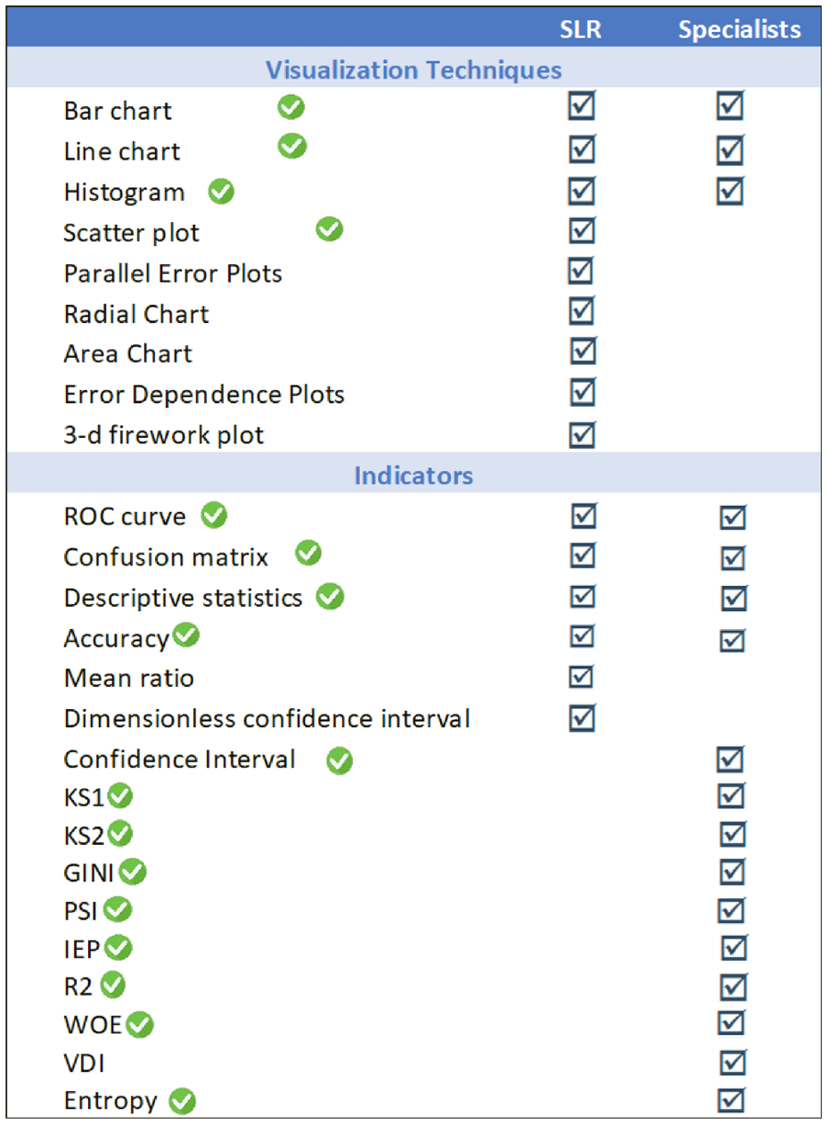
Visualization techniques and indicators raised in the SLR and the interviews.
As for the indicators, we did not include the VDI (Variable Deviation Index) mentioned in the interviews because we did not find a reasonable basis in the literature for this indicator. We also did not include the mean ratio and dimensionless confidence interval indicators identified in the literature review because it would require further information to be included in the dataset – such as the standard deviation of the predictor variables.
We chose to use traditional charts, such as scatter plots and bar and line charts, as they were mentioned in the interviews and because they are more appropriate considering the different experiences, expectations, and visualization literacy 33 of the target audience. Moreover, they are suitable for the time series data we worked with, primarily numeric types. Since the number of indicators and charts to be included is very large (see Figure 2), it would not be possible to put them in a single dashboard without getting messy. Thus, we opted to develop a multipage dashboard 34 following the human-computer interaction (HCI) pattern called Module Tabs (https://ui-patterns.com/patterns/ModuleTabs). This HCI pattern is used when there is no room for all content that, then, is divided into coherent groups. 35 Since we design fewer than 10 modules with content related to each other, and, according to Tidwell 35 (p. 156), “tabs are now ubiquitous in desktop interfaces and websites” and “no one is going to be confused by how they work,” we consider an appropriate solution.
To meet the requirements gathered from the interviews, we chose to work with two datasets on our prototype. The first one, published by the US. Small Business Administration (SBA), was chosen because it contains summarized information and a large amount of data. This dataset comprises data from companies that received credit using SBA as a guarantor between 1969 and 2014. This kind of data is hard to acquire from FIs due to it being extremely confidential, 13 and because of this, the dataset has been used in real credit decisions. The second dataset contains analytical information without any aggregation, which allows for some indicators and visualizations that were not possible with only summarized data. This German dataset, available on the UCI Machine Learning Repository, is widely used in research about credit models 13 and is based on real concessions.
VACS’s homepage (Figure 3) comprises a summary of all models’ information and a menu that gives access to more detailed information for each model. VACS has four main menu options: “Models’ Summary” (Figure 4(a)),which, when selected, shows a summary of the leading indicators and visualizations, as well as alerts concerning the models’ performance; “Model A” and “Model B” (Figure 4(b)),which are composed by a submenu (Figure 4(d)) with options that allow access to a detailed analysis of each selected model, such as an analysis of the score, variables stability, and indicators; and “Catalog” (Figure 4(c)),which gives access to additional information about the models, such as a description of the indicators used, the variables that constitute the models, and a description of the categories of each variable. In the following sections, we detail each main menu option functionalities and the visualizations they contain (A video demonstrating VACS’s visualizations and interactions is available on https://youtu.be/eX13zSlvZJAYouTube).

In the “Models’ summary” section, the user can select a month (a) of interest to analyze the main indicators of both models (b and c) and quickly identify inverted variables (d).

VACS’s menu options Sub-menu: (a) contains summarized statistics from both models. Sub-menu (b) allows for a more in-depth analysis of each model divided into three main points (d). Lastly, sub-menu (c) provides more specialized statistical metrics about both models.
Models’ summary
The menu “Models’ Summary” gives access to the main indicators concerning the analyzed models’ performance and stability (Figure 3(b) and (c)). The colors change according to the indicator’s current state: green if it is within expected, yellow if it is slightly off what is expected, and red in cases where the indicators are gravely outside the thresholds indicated in the literature. Thus, this menu provides the user with an overview of the models’ performance. Furthermore, we included a section for alerts of inverted variables on each model, marking them in red (Figure 3(d)). A variable is considered inverted when its categories’ semantics invert, for example, when an excellent category behaves like a bad category and vice-versa. The user can also select which month will be used as a reference (Figure 3(a)).
Models
The selection of the menus referring to the models (Figure 4(b)) opens a sub-menu with three options for the selected model (Figure 4(d)): “Score Analysis”, which gives access to multiple visualizations that aid with analyzing the model’s output; “Predictor Variables”, which provides visualizations made to help with the stability analysis of model’s predictor variables; and “Indicators”, which contains tables with the indicators referring to the model’s predictor variables and the output score. The functionalities and visualizations for each sub-menu are detailed in the following sections.
Score analysis
The “Score Analysis” sub-menu contains six tabs (Figure 5(a)) dedicated to visualizations to aid in the process of analyzing the model’s performance and compare to its development stage.
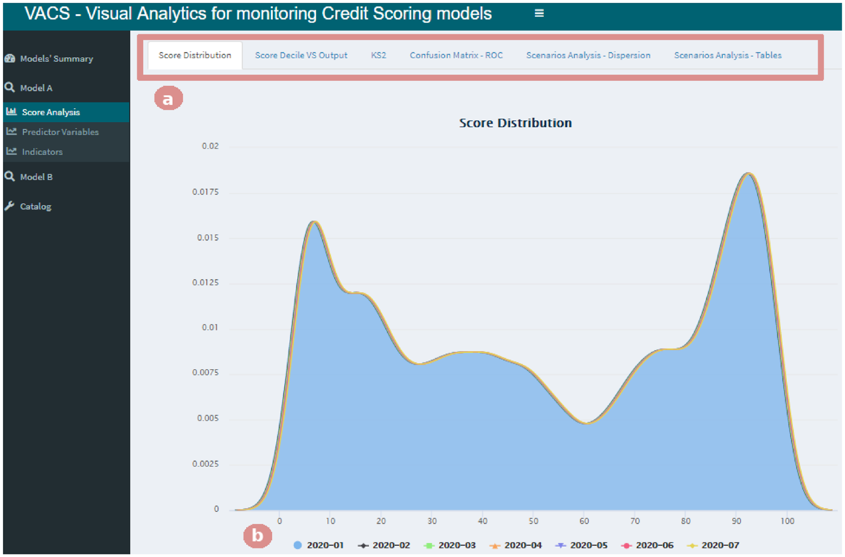
Selecting the “Score Analysis” menu gives access to six tabs (b). Here, the “Score Distribution” tab is selected, allowing the analysis of the score probability density function for the period chosen by the user (a).
The “Score Distribution” tab in Figure 5 presents a chart of the score probability density function for the period selected by the user (Figure 5(b)), allowing the comparison of each month against the period the model was developed. Then, by selecting the “Score Decile VS Output” tab, the user has access to a bar chart and a line chart that allows the analysis of the score stability (an example of this interaction is shown later in Section “Case study”). We calculated the decile cuts for scores from the development stage and applied them to the other months in the database to allow the analysis of changes over time.
The tab named “KS2” shows the model’s KS2 chart (displaying the model’s results for the Kolmogorov-Smirnov test 36 ) for the selected period, illustrating the split between the cumulative distribution of the instances marked as “1” and the ones marked as “0” in the database. It is important to note that VACS can be used to monitor any model with a binary output because it does not distinguish what clients are considered “good” or “bad.” During the interviews, it was clear that this varies for each individual FI.
The model’s confusion matrix is presented in the “Confusion Matrix – ROC” tab, where the user can select what score threshold they would like for the result to be considered positive. We then generate the matrix that compares the predictions, based on the chosen threshold, with their true value in the database. Furthermore, we also included a ROC curve that allowed the comparison of results achieved in other months.
Selecting the “Scenarios Analysis – Dispersion” tab (Figure 6) gives access to a scatter plot of the scores according to the selected variable. Because we were concerned with performance and to avoid “polluting” the chart, we opted to include a more straightforward method of sampling in which the user chooses a sample size of up to 5000 cases to maximize the visualization of patterns and possible outliers. It is important to note that the chart’s horizontal axis will adapt to the type of variable selected, categorical or continuous. The main objective of this chart was to provide a fairness analysis of the score, evaluating whether the models are unfair to a specific public. With this analysis, we seek to provide means to identify if the scores predicted by the models have undesired biases. For example, if we suspect the model might have a gender bias, we can choose to plot the relationship between the variable “Gender” and the score and quickly check whether there is a trend of women getting higher scores than men.
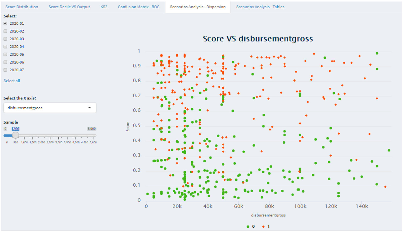
The “Scenarios Analysis – Dispersion” tab in the “Score Analysis” menu provides a scatter plot of the scores according to the selected variable. The user can choose on a slider what is the adequate sample size for their analysis.
Finally, in the “Scenarios Analysis – Tables” tab, there are two visualizations in the form of tables. The first contains the model’s response percentage according to a pair of variables of interest. This table is presented as a heat map with the following scheme: the higher the column values are colored with intense green color, and the lower the values are colored with an intense red color – each of those having different levels depending on how big or small the value was. Our objective in introducing this color scheme was to facilitate interpreting the table values. 21 The second table contains the total amount of the variables of interest, allowing the user to analyze how the data was distributed between the categories of the chosen variables. To make it easier to analyze higher concentrations of data, we included color bars such that the higher column values would have bigger bars.
Predictive variables
This sub-menu contains two tabs (Figure 7(d)) that provide visualizations that aid in the analysis stability of the model’s predictor variables. The first tab, “General Variables,” provides line and bar charts for visualizing all the model’s variables. We use the stacked bars chart to analyze the stability of the proportion of the total in the categories over the reference months. The user can select which categories they want to investigate and which to remove by clicking on the legend options (Figure 7(a)).
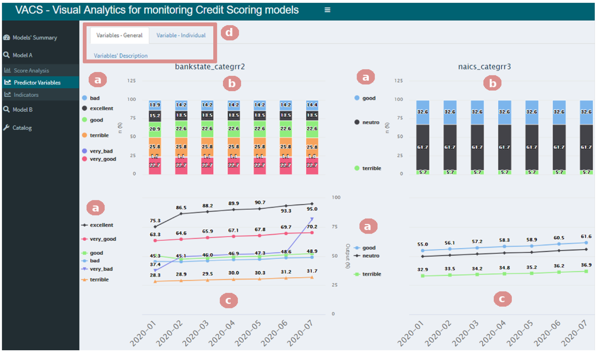
Selecting the “Predictor Variables” menu gives access to two tabs (e). Here, the “Variables – General” tab is selected, allowing the analysis over the reference months of the stability (a and b) and the response percentage (c and d) of the chosen categories.
The response percentage for each category presented in the stacked bar chart (Figure 7(b)) is shown in the line chart (Figure 7(c)), which helps in comparing how the performance of the model variables compared to the development stage (2020-01 in our example). It is possible to identify, for example, that the category very bad not only increased over the months but also crossed the category bad. In other words, the response percentage in the bad category was bigger than the one in the very bad category, which influences the final score.
Through the tab “Individual Variable,” the user can execute the same analysis of stability and performance found on the “General Variables” tab (Figure 7(b) and (c)), except they can focus on a single variable of interest. This tab also includes all the previously discussed functionalities, such as zoom, tooltips, and the possibility of selecting which categories are shown.
Figure 8 presents an example of an interaction where the user filters these charts by a subset of categories (Figure 8(a)). In this example, we removed the categories very bad, very good, and good from the chart to focus the analysis on the other ones. We also included tooltips in both charts to make the analysis easier and more interactive. This way, by hovering the mouse over the category, it gets highlighted, and the values contained in the selected point are shown (Figure 8(b)). We also included a zoom feature (Figure 8(c)) where, for example, the user can make the chart focus exclusively on the categories good and neutral by dragging the mouse over them. The user can also easily undo the zoom by clicking the “Reset Zoom” button that appears while the feature is activated (Figure 8(d)).
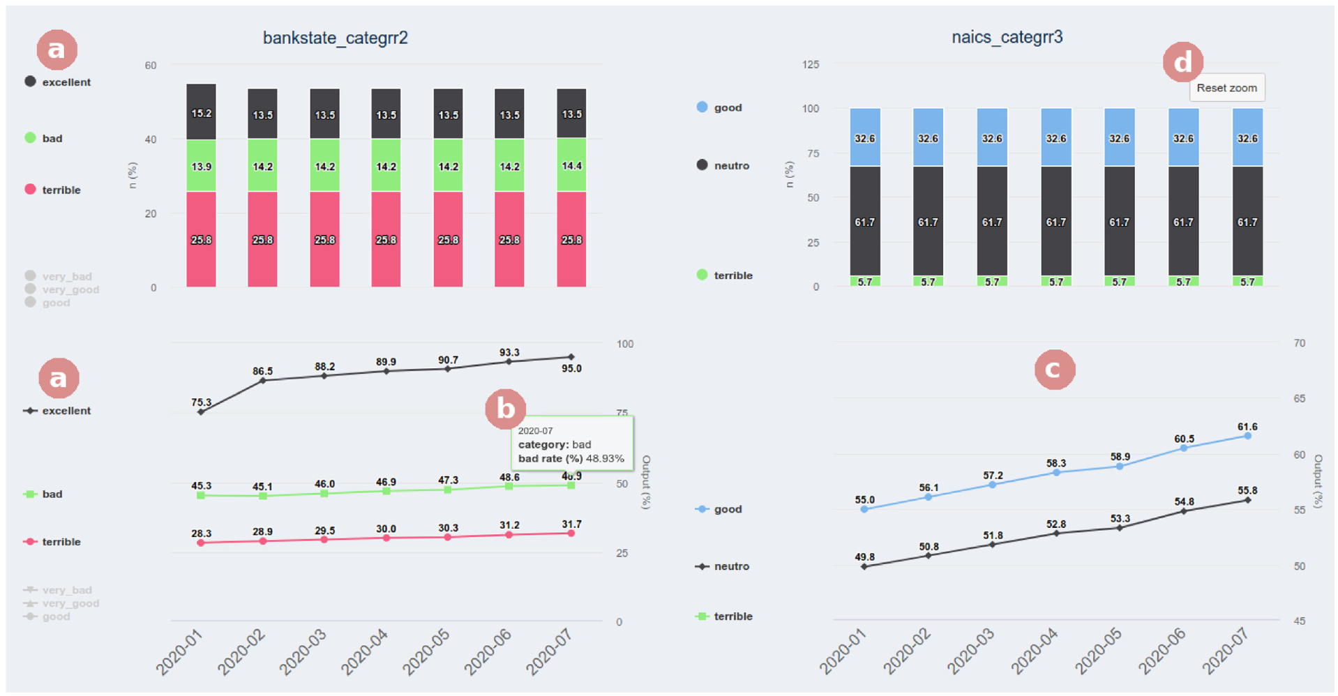
Example of an interaction with a mouse hover (b), selection of categories (a), and zoom (c and d) within the “Variables – General” tab.
Indicators
The sub-menu “Indicators” gives access to two tabs (Figure 9(c)) that contain tables covering the indicators, predictor variables, and the score. The first tab contains a table with the entropy indicators and the information value for each variable. We employed a color scheme to facilitate the analysis of entropy values outside expected thresholds. Our prototype shows higher values with a stronger blue color and lower ones with a weaker blue color. The user can easily modify these boundaries. In the second tab, we provide an analysis of the indicators (Figure 9(a)) referring to the score in terms of performance and stability of the model. Additionally, in both tabs, we employed another color scheme to facilitate the analysis of indicators (Figure 9(b)). We present adequate values in green, worsening values in yellow, and inadequate ones in red.
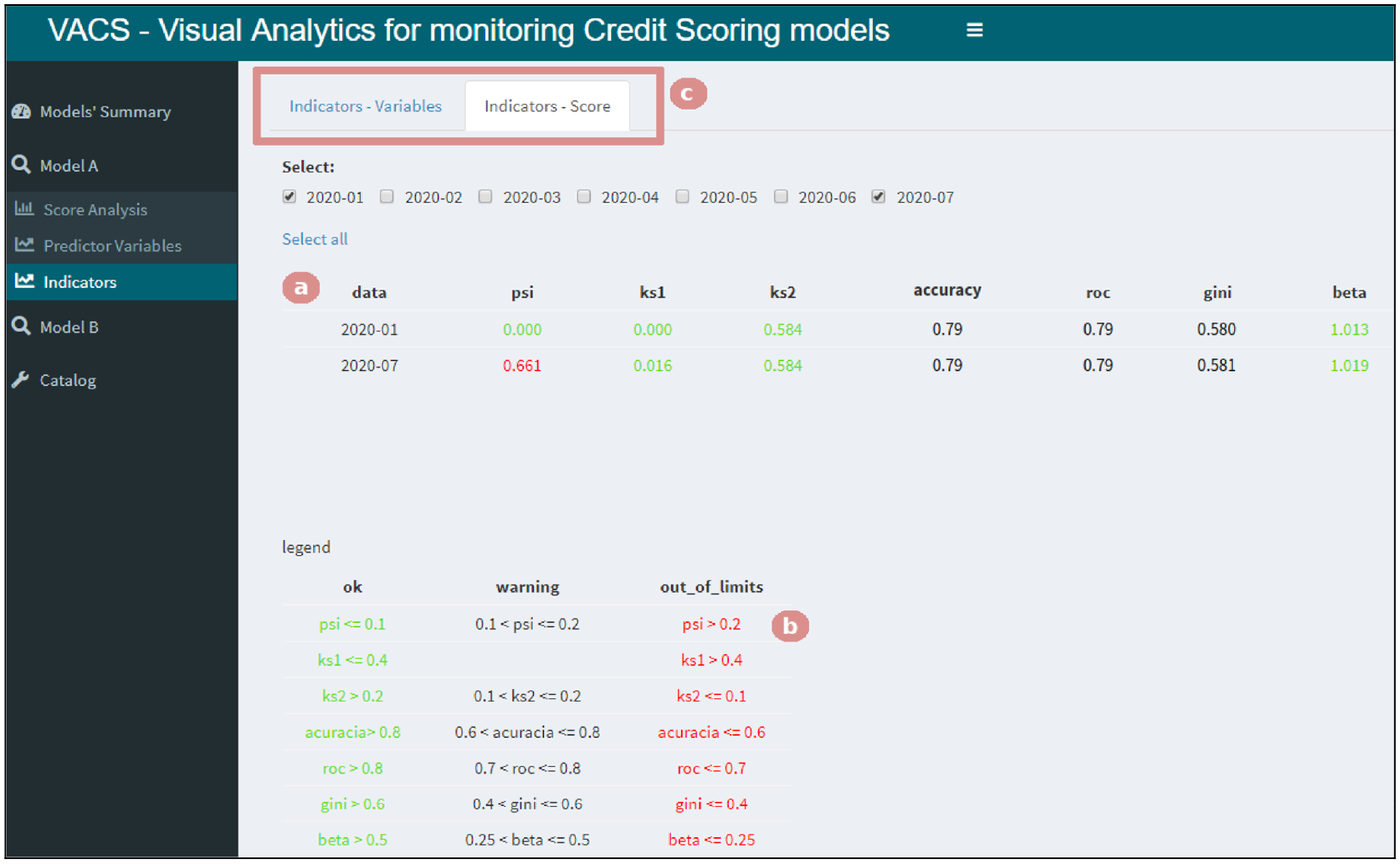
Selecting the “Indicators” menu gives access to two tabs (c). Here, the “Indicators – Score” tab is selected, allowing the user to see if there is an indicator with different behavior than during development (a) and the legend with the limits used for changing colors (b).
Catalog
The “Catalog” menu gives access to two tabs containing information that helps interpret charts. The first one includes a table with each variable’s description and the categories that constitute them. Since the name of the categories created during development may not be intuitive, this tab provides information that illustrates what each category represents. The second tab presents a table describing all the indicators used, aiming to aid people from other areas without technical knowledge in interpreting the indicators’ values.
Case study
To better understand VACS, including its interface and functionalities, we present a step-by-step analysis of a case study of a Score change assigned by model A (Figure 10(b)) in July 2020 (“2020 − 07”). This can happen, for example, when there is a change of clients attended by the FI which are being scored by the same model or because of an error during the creation of the model’s variables. Let us assume that, during its creation, the model classified as “bad” the clients that had started a new business. Furthermore, the data showed that, on average, 66% of the public classified by the model consisted of such clients. Then, the question is: How can we verify whether this has changed over time using VACS? In this section, we provide a step-by-step on how an analyst could navigate the available tabs to test this hypothesis.
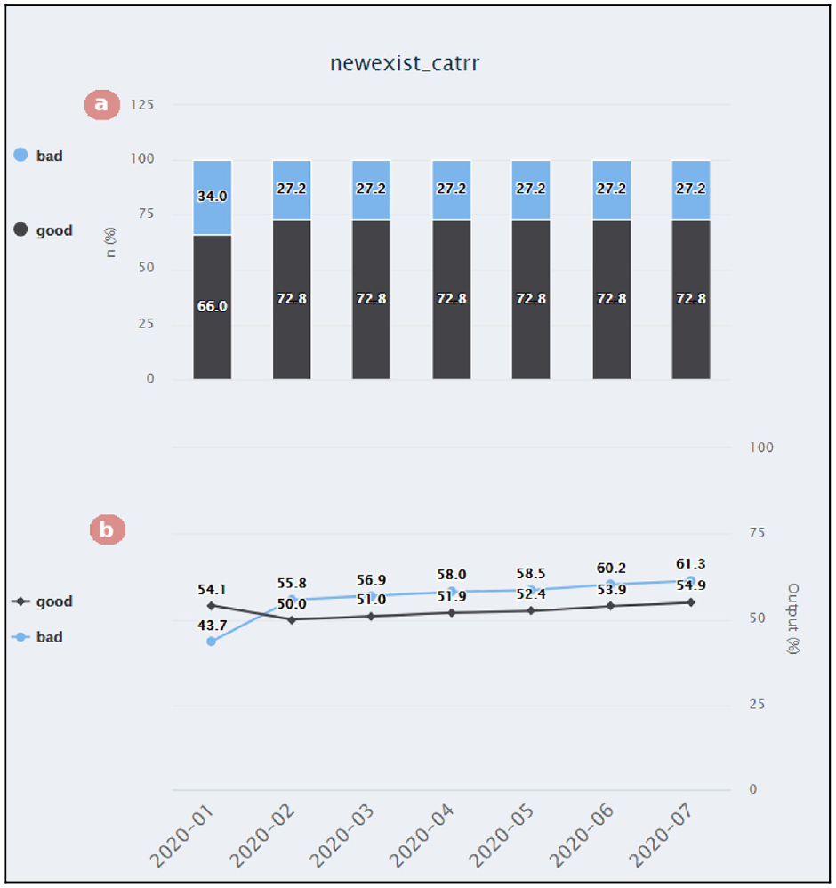
The “Variables – Individual” tab from the “Predictor variables” menu allows the analysis of variable inversions. In the first chart (a), we can see that the proportion between businesses being labeled “good” and “bad” remains the same throughout the months. However, in the second chart (b), the model started scoring these labels differently after the first month.
The first visualization presented by VACS is a summary of the indicators, which contains, for example, an alert for variables that do not have the same performance compared to when the model was created, as illustrated in Figure 3. This way, we can check that the PSI (Population Stability Index) indicator, which compares the model’s distribution during development versus a period of interest (in this case, “2020 − 07”), is out of the recommended limits – which is shown highlighted in red in the “Models’ Summary” page (Figure 3(d)). In other words, there has been a change in the score distribution.
Since the “Models’ Summary” tab of our prototype contains only summarized information, the first analysis, in this case, could be checking whether there is another performance indicator with different behavior than it had during development (Figure 9(a)) and checking the expected value for that indicator (Figure 9(b)). To be within the desired bounds, the value of the PSI indicator should be lower than “0.2”. Thus, having “0.661” means it is way beyond what is desired. However, the model’s overall performance stays the same as expected during development, which can be deduced as there are no other alerts.
From this initial analysis, we can conclude that the alert does not reflect a drop in the model’s performance but a change in the target audience being analyzed by the model. Therefore, the next step is checking whether this change is happening because the model is attributing this new audience a score higher or lower than it did during its development. By analyzing Figure 11, we can see that the model has given higher scores to this new audience. By comparing the current decile splits with the ones from when the model was created (Figure 11(a)), using the same thresholds, we can see a higher percentage on the tenth decile, meaning that more clients have been receiving a higher score. However, we can also observe that the scores are still properly sorted even with this change (Figure 11(b)), that is, the model has maintained a high performance. This conclusion is supported by what we observed with the indicators.

The “Score Decile VS Output” tab from the “Score Analysis” menu demonstrates that the model has given higher scores to a new audience. The first chart (a) compares the deciles between the month of interest and when the model was created. The second chart (b) compares the score attributed to each decile.
By checking the model’s variables (as shown in Figure 10), it is possible to verify which variables explain this change and what was the feature that suffered the change in its expected percentage. We can observe that the feature “newexist_catrr” (which corresponds to how long the client has owned a business) labels clients with more recent businesses as “bad” and clients with long-lasting businesses as “good” (Figure 10(a)). The change in behavior for this feature can be explained by the FI having more clients that own long-lasting businesses than in the past. Furthermore, by looking at the “Models’ Summary,” we can see that these clients became worse (fewer of them have been graded as “good”) than clients that own newer businesses. A possible cause for this reversal is a mistake when calculating the variable containing how long the client owns the business. Therefore, this will impact individual scores but not the model’s overall performance.
In summary, VACS can provide alerts concerning when the model is not performing the same as when it was created. It also allows for an in-depth analysis of what caused these changes.
First impressions
In this section, we present the results obtained in the evaluation of VACS to assert whether it fulfilled the gathered requirements and to compile suggestions for enhancing it. For this evaluation, we conducted semi-structured interviews with open-ended questions about the prototype, monitoring models, and how VACS would be applied within FIs.
The participants were chosen based on their experience with CS models, where they needed to have worked with them for at least 2 years. We interviewed four specialists, two that had been part of our first interview and two that had no prior knowledge of VACS. Thus, we could evaluate how the answers converged while avoiding biases from participating in the requirements gathering. We decided it was adequate to conduct these interviews with fewer people than the first because, in qualitative research, the objective was to explore the opinion of the interviewees in greater depth. 32 Moreover, Lazar et al. 37 (p. 187) claim that “direct conversations with fewer participants can provide perspectives and useful data.”
First, we explained the project’s objectives and how the interview would work, and then we presented VACS and its functionalities. In sequence, we shared the prototype’s link (https://daianebaldo.shinyapps.io/demo_vacs/) so that they could interact and explore VACS using the two datasets available, instigating them to simulate how they monitor credit models in FIs. Once they were done, we proceeded to apply the questionnaire. We interviewed four people that graduated either in Statistics or Engineering, three men and a woman. Three of them had postgraduate degrees, all of them had worked in FIs for more than 5 years, and three were working with credit modeling at the time of the interview.
When questioned about the usage of VACS in the monitoring process, the interviewees stated that the prototype was comprehensive and allowed for adequate monitoring through the analysis of the models’ performance and the possible actions needed. Concerning contributions, they highlighted the practicality of having the models ready for analysis and mentioned its standardization since the same visualizations and indicators were used for all the models loaded. The functionalities available in the “Models’ Summary” menu were cited as positive by all participants, as it makes the monitoring process more agile and generates alerts about the models used by the FI and the variables with inverted categories. They also considered VACS easy to use and the provided analysis intuitive with no learning difficulties. Nonetheless, they did mention some points that still needed improvements, for example, zooming with the notebook’s touchpad and the order that some menus were placed.
The participants mentioned that the charts are visually pleasing and easy to interpret when considering how the visualizations and interactions presented on VACS could assist in the monitoring process. They also mentioned they found it easy to explore hypothetical scenarios, allowing them to evaluate hypotheses of why the model could not perform adequately or the effects of credit policies. An advantage cited was the possibility of comparing the development stage with the application over time and the summary screen, which provided an overview of variables with inverted categories and the main indicators. The participants were unanimous when affirming that the variety of indicators, the stability analysis, and the color-based visualizations helped them to identify any deviation quickly. One participant mentioned the monitoring could be extended to any model with binary output. When explaining the concept of fairness analysis, the participants agreed that this idea made sense, mainly because those biases can be present even if the variables that cause them the most (e.g. age and gender) were not included in the model. Furthermore, it was also discussed how it could be used to analyze how the models are distributed for different publics of the FIs and evaluate cut-off points in credit policies.
Different ways of using VACS to identify model performance drops or faults after implantation were also discussed, such as: checking the alerts on “Models’ Summary”; comparing the current and development scores and checking if there was any change in its behavior; and analyzing the variables. When asked what they liked the most about VACS, the participants mentioned the “Models’ Summary” menu, the charts interactivity and comparisons, the clear visualizations, the menus navigation system, being able to monitor different models in a single interface, and the possibility to analyze scenarios – the models’ fairness being cited as a new and important analysis. One participant called our prototype “democratic” because it has no relation to the technique used, stating that “Democratic, because it does not care about the technique, as long as the answer is binary, it will work, which is an important point.” A suggestion was to create a “Key Performance Indicator” (KPI) for the stability and discrimination to summarize further the performance, which would be helpful in cases where the FI used many models.
When asked about how the use of VA presented in VACS could contribute to monitoring models in FIs, the participants were unanimous in stating that it would help and expedite their work. The color-based alerts would be helpful to direct the actions to be taken and also to help non-technical people interpret what is happening as well as the visualizations. In their response, all participants also mentioned that they would certainly use VACS to assist them in monitoring models. Their reasoning is mainly based on the very comprehensive prototype for the analysis needed, the ease of navigating it, its performance, interactivity, and dynamism. On the subject of difficulties VACS would face to be usable in FIs, three participants stated that, due to data security, VACS would first need to be approved by each FI, which could be an obstacle. Furthermore, not all areas should have access to all the menus because some data is confidential – such as the model’s variables. Another concern discussed was related to the analytical base, as depending on its size, it could majorly affect VACS’s performance.
Concerning monitoring models within the FIs and how the results of our research could help in this matter, all interviewees answered that the knowledge of how the monitoring is done is confidential to each FI and that they could not elaborate further. One participant mentioned that the material about indicators and their description could help professionals from other areas better understand what the FI’s technical team presented, thus helping to propagate the knowledge. Another one mentioned that it could also help in standardization because each FI focuses on specific parts of the monitoring process, and it would provide insights on new approaches for monitoring models. The participants praised VACS and mentioned that this research could help as a guide to monitor models and suggested it could be used in subjects teaching about CS models.
Finally, we asked the participants specifically about suggestions to improve VACS, in addition to considering the suggestions made during the questionnaire or even during the initial stage when they were first interacting with VACS. These suggestions were mostly directed toward changing and including some buttons, indicators, and alerts, changing some colors, changing and removing some menus, and being able to use VACS with any model with binary output. However, it is important to note that many suggestions were based on personal preference. Thus frequent suggestions did not achieve a consensus among the participants, as, for instance, the menus’ organization.
Discussion, limitations, and future work
The first contribution of this work was the research with domain specialists. Because of the lack of related work that monitored CS models, we believe that divulging it may be especially useful to FIs that are starting to work with credit modeling or even to help standardize the minimal requirements for monitoring CS models in institutions that already use these models. The second contribution was the five requirements identified during the interviews with specialists, which supported the creation of VACS: practicality (
To fulfill the
Concerning the
We dedicated three tabs in the sub-menu “Score Analysis,” shown in Figure 6, for the requirement
For the
We identified two limitations in VACS: the connection with the database and the approval of the tool by FIs. The users that use a direct connection to the database need an additional step to export the data. Therefore, we believe that our approach is better suited for models that already employ this extra step. This is an issue mainly when dealing with models that need to be monitored in real time, as the dataset can change at any moment with new information, and in these cases, a direct connection with the database is required. The participants frequently mentioned how the FIs’ are extremely confidential during the interviews. Thus, before employing our solution, the analysts would need to go through an approval stage with the data security team of the company. Therefore, the main contribution of VACS is the disclosure of results and analytical insights that can be replicated by monitoring models within the FIs. This would also directly address our limitations since they could make all the connections needed and would not need an approval stage. Due to the confidentiality of this type of data within the FI, we could not evaluate our model on practical, real-world scenarios, and we had to simulate scenarios for the user to explore data that has been made public.
In future work, we aim to generalize VACS to adapt to the different number of models that FIs use so they can easily fit into our tool. We will also address the points suggested during the evaluation, such as the inclusion of shortcuts, a back button, and the AUC value in the ROC curve graph. A more accurate sampling method to avoid over-plotting in the scatter plot visualization will also be considered. Another improvement suggested during the evaluation with the domain experts is to allow the user to customize the font and chart colors used in VACS. Thus, in addition to allowing the domain expert user to choose the colors they find most appropriate for alerts and categories, it would also be possible to select suitable colors for people with color blindness. It would also be beneficial to allow users to customize the order the categories are shown in the charts to facilitate their analysis (e.g. from terrible to excellent).
Furthermore, it could also be interesting to see VACS applied in other contexts outside of credit modeling, as suggested by some participants during user evaluation. For instance, VACS could be used with purchase propensity models or in subjects teaching prediction models. This way, we could verify whether the indicators chosen are enough and if another visualization could be included.
Conclusions
Our systematic literature review evidenced how the challenge of explaining ML models inspired many types of research that showed how the use of visualization techniques assists both in modeling and interpreting the results achieved, although they have not been applied to CS models yet. Additionally, our study with 13 professionals in the area helped us gather the requirements related to a VA approach for monitoring these models. Then, we proposed VACS and had four domain specialists evaluate it. With this, it was possible to verify that the visualization requirements identified during the first set of interviews were fulfilled by the functionalities made and satisfied the users who tested the VACS functionalities.
The contributions of this work allowed for the evaluation of how visualization techniques used to explain ML models can contribute to CS models. Additionally, we identified the main challenges to creating monitoring models, the user requirements for these models, and the profile of professionals that work in this area. The developed VACS prototype allows for the start of employing VA techniques in monitoring CS models. We introduced the concept of 29 analysis in VACS, which has been frequently discussed in the context of ML models and that we believe to be very important in the evaluation of CS models, independently of the techniques employed. Furthermore, as evidenced by the interviews, VACS could also be used to monitor other general models, not only for CS, as long as these models have a binary output.
Finally, to the best of our knowledge, we believe that this is the first work in the literature that presents in detail how monitoring of CS models is done. The results obtained by our research can be explored both by institutions that are starting to use CS models as well as by institutions that have already used these models but are seeking to find new insights. We also think that our work has academic potential since, as mentioned during the interviews, a VA approach for monitoring models could be introduced in subjects teaching modeling.
Footnotes
Acknowledgements
Partial results of this work was achieved in cooperation with HP Brasil Indústria e Comércio de Equipamentos Eletrônicos LTDA. using incentives of Brazilian Informatics Law (Law n° 8.2.48 of 1991). Isabel H. Manssour also would like to thank the financial support of the CNPq Scholarship - Brazil (308456/2020-3).
Funding
The author(s) received no financial support for the research, authorship, and/or publication of this article.