



Abstract
Virtual prototyping is increasingly used by businesses to streamline operations, cut costs, and enhance daily operations. This often includes a variety of modeling techniques among which, complex, black-box models. The path from model development to utilization in applied contexts is yet long. Domain experts need to be convinced of the validity of the models and to trust their predictions. To be used in the field, model capabilities need to be affordable, that is, allow rapid and interactive scenario building, even for non-experts. Complex relations governed by statistical interactions must be unveiled for users to understand unexpected predictions. We propose
Introduction
Modern organizations seek to exploit the data they collect from their environment and activities, often aiming to consolidate, enrich or improve internal decision-making processes. Modeling techniques can be used to improve these often suboptimal processes, and thus become a companion technique guiding decision-making. Recently, we have seen many examples of the use of Machine Learning (ML) techniques, in various application contexts, to support different processes or tasks. In this article, we focus on the case where models support product design. Designing a product is a decision-making activity, consisting in setting a number of parameters, which will in the end determine the characteristics of the designed product. The decision can sometimes be difficult because desirable characteristics can contradict one another. Flexibility or ease of use, for example, is often the opposite of robustness or durability of a product. This antagonism is reflected at the parameter level: increasing the value of a parameter may affect another one, such as by limiting its range. Such effects may be hard to capture and describe, since parameter interdependencies are widespread across the design space. Human expertise is thus mandatory to assess the physical reality behind these effects, and to help to identify parameter settings that correspond to interesting and feasible solutions. In this article, we focus on the need to exploit many inputs governing a single-output model, therefore deliberately not overlapping with areas such as multi-objective optimization.
Much research has looked at combining state-of-the-art Machine Learning (ML) techniques with visualization tools in various application fields, including healthcare,1,2 meteorology,3,4 and social sciences. 5 Some of this work falls under the umbrella of Explainable Artificial Intelligence (XAI) research, 6 insofar that visualization can help to audit and to build trust in the predictions given by AI models. Techniques relying on model-specific and model-agnostic approaches were developed to allow explainability and interpretability. 7 Most efforts in XAI, however, have focused on helping a user to understand a model. Aspects involving practical, but complex, decision-making problems in industrial contexts and, more specifically, in product design are less covered. In this context, application domain experts need to probe models to assess that they faithfully embrace the physical characteristics of the objects being designed. Additionally, they need help to comprehend why some input parameter combinations lead to unexpected outcomes and to recognize the underlying characteristic relationships.
Our approach is inspired by the industrial context of tire design. “Tires are highly engineered structural composites whose performance can be designed to meet the vehicle manufacturers’ ride, handling, and traction criteria, plus the quality and performance expectations of the customer.” 8
Incidentally, the required characteristics of a tire for a sporty car differ very much from those required from a tire intended for a sedan or electric car. Sporty tires will have a high focus on handling 9 while the others will focus more on acoustics 10 and fuel efficiency. 11 However, from a physics perspective, these disciplines are quite diverse and might be considered as entirely independent sciences,12,13 necessitating various modeling methodologies. This variety, in our opinion, may be encountered in other sectors and is not limited to the design of tires. In a broader context, our approach is relevant whenever a model needs to reflect the physical constraints inherent in a product, whether it is the soles of sports shoes or the casting of steel, for example, requiring experts to be able to assess the model’s ability to reflect physical reality.
As an example of an engineering activity in the tire design domain, an acoustics expert needs to understand how a specific tire interacts with the road surface and with the car, and how noise is propagated through air 14 and car structures 15 to the passenger. She needs to understand which design features can be tuned so that the final acoustic comfort inside the car is reached. This task is complex as these features interact, in the statistical sense 16 as we shall explain. Put simply, the influence of a design feature on the outcome depends on one or multiple other features. For instance, a known mechanical relation such as an increase of noise as mass decreases 17 might be invalidated when tire parameters related to stiffness are changed simultaneously. Such relations are at the border of recognized mechanical behaviors and are hard to process, especially in industrial contexts, in time-sensitive conditions. As building and testing physical products is often costly, the engineers need to be supported in virtual assessments.
The final design decision engineers will take often has high financial, production, testing and planning consequences. This is when state-of-the-art methods can help the specialist to de-risk this virtual assessment process.
The contributions of this work are:
Related work
Visualization for model understanding
Recently, much work has focused on Explainable Artificial Intelligence (XAI).18–22 Chatzimparmpas et al.
7
organize prior work on visualization for interpreting ML models in six categories: Visual Analytics Pipelines, General ML models, Predictive Visual Analytics (PVA), Interactive ML (IML), Deep Learning and Dimensionality Reduction. Work in the PVA and IML categories is closer to
Adadi and Berrada 24 distinguish model-agnostic and model-specific XAI methods. Model-specific approaches are usually bound to the specific type of model used to fit the data. Examples of model-specific approaches are iForest 25 for Random Forests models, GAN Lab 26 for Generative Adversarial Networks or DQNViztool 27 for Deep Q Networks. Interested readers can refer to additional papers on the visualization of neural networks.1,28–30 Model-specific solutions can be discounted with the advent of a new, more effective type of ML model.
In
LIME
32
uses local surrogate models to explain predictions, for example, by using words, or parts of an image, that lead to a certain model decision. SHAP
33
provides both local and global explanations. Its force plots depict which features contribute to a single model output, whether positively or negatively, and the global explanations are achieved by rotating these plots and concatenating them horizontally on a complete dataset. A feature overview helps to identify the most important features of the observed model. RuleMatrix
34
uses rule induction to provide explanations to non-ML practitioners who need to understand and use ML models. Going beyond the explanation of one model, the comparative analysis of multiple models has been the focus of Manifold
35
and Clustervision.
36
In
Visualization of statistical interactions
Statistical interactions, or interaction effects, are widely studied in statistics,37–40 but rarely in ML-enabled visualization tools. They capture a non-additive influence of two variables to a model outcome. Typically, while variable X may vary monotonously to the dependent variable Y, the rate at which it varies may depend on a second variable Z. The H-statistic is a measure of interaction effects over the data distribution, proportional to the power of the interaction, but it may yield spurious interactions.
41
Partial Dependence (PD) models are also used to evaluate interaction effects,
42
without raising spurious interactions. SHAP
33
evaluates interactions using SHAP values. Save for a few exceptions,
43
the H-statistic and the PD-based method were not often used to uncover interaction effects in ML models. Interaction effects are visualized using line charts, such as Individual Conditional Expectation (ICE) lines
44
and SHAP plots.
33
Individual pairwise interaction effects are also visualized using 2D contour maps43,45 2D surface curves in a 3D-coordinate system.41,45 The VINE
43
tool uses clustering in ICE/PDP line charts to visualize interaction effects in black-box models. Variable Interaction Networks (VIN) use small node-link network diagrams
46
to provide an overview of a dozen of pairwise interaction effects. Unlike most tools,
What-if tools
Amer et al.
47
and Harries
48
describe the scenario use as “the creation of the description of alternative future realities.” Golfarelli et al.
49
defines a scenario as a simulation of complex systems under a given hypothesis. What-if analyses are deemed useful in many domains, for example, healthcare,50–52 social sciences,53–55 military,56,57 and were used heavily in the last couple of decades.58,59 The most relevant to our work, visual what-if tools are Prospector,
60
The What-If Tool,
61
and CoFFi .
62
All systems use partial dependence (PD) concepts
63
to support overall and/or localized model inspection. While
Decision making
According to Edwards,
64
the scope of the Decision Making (DM) theory is to predict, given two states A and B, which state will be chosen by an individual. Slovic et al. studied DM with respect to the decision environment, the different theories of DM and information processing in DM.
65
Other fundamental work concerns DM and cognition.66–69 Milkman et al.
70
stress that in the DM context, errors are costly and will get even costlier, hence the need to improve DM processes. It is believed that AI can improve human analytical skills, DM abilities and creativity.
71
Along these lines, Bastani et al.
72
devised an ML algorithm that helps human users in DM tasks by using tips. Khosravi et al.
73
focus on combining DM and ML for flood susceptibility modeling. Healthcare is also a key area for improving DM with AI.74–77 Duan et al.
78
give an overview of AI for DM and propose 12 directions for future research in this area. Some of these directions are further enhanced by Dwivedi et al.
79
In both papers, the AI work is divided into supporting, augmenting, replacing or automating human tasks.
Tasks, data, and users
Our research is based on frequent exchanges with domain experts, over a period of 2 years, leading us to address the formalization of user tasks as a primary step of our design. Also, two of the authors are domain experts (8 and 25 years in the field) and act as a “liaison,” a role highlighted by Simon et al., 80 for a better definition of the tasks. The overarching goal of our target users is to design a product, that is, a tire that meets a specific requirement, for example a noise target. To do so, they need to factually decide on multiple characteristics governed by complex relationships.
Following Munzner’s visualization design methodology, 81 we provide below a characterization of data and tasks.
Data and users
Our work was conducted in collaboration with domain experts in the tire industry. Throughout the paper, we will illustrate our concept with the application of
The data pipeline at hand starts from audio recordings from various noise acquisition systems. These files are processed by the engineers to extract specific acoustic metrics quantifying acoustic comfort. These indicators are stored in relational databases along with tire design features and will be the focus of our study. The data used in our work is therefore tabular. The models are essentially serialized Python objects, but
Tasks
In this section, we present the Domain Specific Tasks (DST) supported by
DST1: Visualize the most important features
While senior engineers might know which features are the most important and which “knobs” to turn first, a novice engineer needs support in the more subtle parts of the design process.
DST2: Detect and analyze statistical interactions
Statistical interactions complexify the iterative process of reaching a target. Even senior engineers need assistance when interactions arise. The support for identifying and understanding how features interact in a statistical sense (see definitions on page 2) is a required functionality.
DST3: Assess trust in predictions and model as a whole
Firstly, the domain experts need to know how good the underlying model is. General goodness-of-fit statistics must be available. Secondly, the users need to know if an input they use for model probing is in the training data. If not, there is less evidence supporting the prediction. Uncertainty presentation and cognitive load are also factors that highly influence trust and which need to be considered when designing the system. 85
DST4: Create what-if scenarios
In the tire development context, building a physical tire is very costly and time consuming. A virtual tire development process allows many operations to be done in silico.
DST5: Externalize knowledge through model explainability
A complex model can capture interesting and unknown forward paths that the engineer might explore to reach her targets. Revealing the potential effect of certain actions on reaching the target, like changing a specific tire design element, is also of high interest.
System description
In this section, we describe the coordinated multiple views of the

The graphical user interface of
Input space visualization
In

Control pane. (a) Two tabs to show either the inputs panel or the comparative analysis panel. The similarity score of the current set of inputs compared to training data is shown in the top-right corner. (b) Scented widgets 87 for various data types, sliders, dropdown menus, calendar widgets and toggles. (c) Widgets to reset, save combination for comparative analysis or add features.
Toward
For
In the top right corner of Figure 2, we display a score between 0 and 1 measuring the similarity of the current set of inputs to the training data based on a kernel method. 92 The lower the score, the more cautious should the expert be regarding the prediction.
When the user finds a combination of input parameters yielding an interesting outcome, she may add it to the saved combinations for future reuse, for example comparative analysis. To support comparative analyses, the “saved combinations” tab (Figure 6) is laid out according to an augmented juxtaposition strategy. Techniques part of superposition or explicit encodings’ families were excluded due to their known drawbacks in terms of visual clutter and decontextualization. 93 The user must be able to easily identify an alternative (virtual tire/product), and the latter needs to use the same units and the same scales across all dimensions as the original product (for instance, a control tire).
Another argument in favor of juxtaposition is the common practice and familiarity of our users with such designs within the organization. We reached our final design (Figure 6) after two iterations, while optimizing the layout and the scents. We use the percentage of change of an input as a scent, depicted by a triangle every 25%. The direction of change is encoded by color and by the direction of the triangles. The comparative panel can be set to only show the modified inputs across all alternatives. Knowledge externalization (
Prediction visualization
In
In our context, the domain experts need to appraise the model for their decision-making process. Statistical software like Minitab
88
and SAS JMP
89
use common metrics like RMSE, R2, and MAE, and actual versus predicted scatterplots to assess goodness of fit. In terms of alternate visual design, we wondered whether to plot predictions or actuals on the Y-axis of the scatterplot. It turns out that plotting the actuals on the Y-axis leads to a more correct model evaluation.
94
Hence, we use this design in

Prediction panel matching Figure 2. (a) Prediction for current slider combination. (b) Actual versus predicted plot with linked cursor to current prediction. (c) Top 10 most important features of the model.
To trust a given prediction, the expert needs to situate it in the point cloud. When it falls in a dense area of the cloud near the identity line
95
the prediction is fairly reliable. If not, some caution may be needed. This calls for a confidence interval around the prediction.
96
To help the user assess such a confidence interval,
Overview visualization of feature interactions
In
Since pairwise feature interactions may be modeled as a weighted complete graph, possible visual designs include node-link diagrams 46 and matrix visualizations. By applying a threshold on edge weights, we generated node-link diagrams, which were yet too cluttered. Finally, we preferred matrix visualizations, as they are better suited for link lookup in dense graphs. 99 For example, Figure 4 shows the first four rows of the interaction matrix for a modeled dataset of the first vertical mode of a tire. 86 The darker the color, the stronger the interaction between the pair of features. The user can quickly spot the highest interactions and get details on demand by hovering over a cell. This visual design scales up to dozens of features on a regular desktop screen.
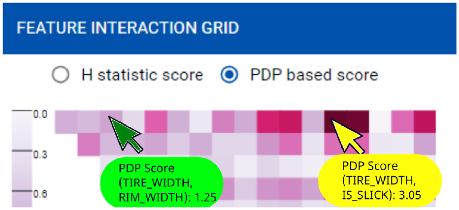
First four rows of the Interaction matrix. The yellow cursor points to the strongest interaction. The name of the features and the interaction score are displayed.
Individual feature contribution visualization
In

Individual feature contribution panel. ICE lines in blue. PDP in green. A click by the green cursor in Figure 4 populates the plot with second order interaction visualizations – yellow/red lines.
Beyond global methods, finer phenomena can be inspected using the ICE lines (blue lines in Figure 5). For each point in the dataset, a line is created by varying the independent feature stepwise and fixing the values of all other features.
Figure 1(d) shows two ICE plots with the Partial Dependence (PD) line in bold green. The left plot presents a general descending trend (PD) for
User interaction
What-if query specification
Starting from Figure 1(a), the user can express a what-if query by pulling a few sliders to set the values of selected input features. The similarity score in the top right corner of the data input panel (Figure 1(a)) shows how close the new input configuration is to the training data. The underlying ML model is queried for a prediction. Figure 1(b) is updated to reflect the new prediction textually at the top and graphically, by adjusting the position of the red cursor, the related confidence box and histogram. The values of the input features are also cascaded to any related charts, for example, the red cursor in each ICE line chart in Figure 1(d). This helps the user to locate the prediction in the feature space. While only the top most important features are visible by default in Figure 1(a), the user can interactively display more features (Figure 2(c)). The interaction heatmap in Figure 1(c) is expanded accordingly to include additional rows and columns. Likewise, the related ICE line charts are added (Figure 1(d)). Since what-if analyses are often based on trial and error,
Figure 6 shows three candidate tire designs, yielding the same prediction value (76.2). The user can decide which alternative suits best her needs, based on other, unmodeled criteria such as cost or manufacturing constraints.
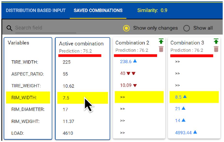
Three combinations showing the same prediction level (above red line) but with different solutions. The reference is the active combination (first column); the scents (triangles) and equality (>>) are with respect to the active combination.
Drilling down into statistical interactions
Continuing the analysis in Figure 1(c), the user’s attention is drawn to a few dark cells in the heatmap corresponding to pairs of strongly interacting features. By clicking on any cell, the individual feature contribution visualization in Figure 1(d) is overlaid with a set of new lines, colored using a yellow-to-red gradient. While the X-axis of the line chart corresponds to the selected row in the heatmap, the color encodes the level of the second feature, that is, the column in the heatmap. We chose to display feature names on demand only when more than five features are shown in the heatmap, to avoid label clutter. We also do so because feature names tend to be very long in our context of use, and truncating them is not helpful. The color scale is shown on the right side of the plot. These lines correspond to the second order partial dependence lines according to a predefined grid, for example, a decile-based grid. The user may hence inspect the trends of these lines and identify the regions where statistical interactions occur.
Technical implementation
Evaluation
Our evaluation methodology was inspired from existing efforts in categorizing and guiding evaluation in visualization research.81,105–111 Referring to Lam et al.,
105
we evaluated
User study
Methodology
We ran a first pilot study with 11 engineers, aiming to assess the usability of
This study led to a small-scale deployment of
Six months later, we ran a second pilot study, preregistered at https://osf.io-clickable, to evaluate the improved software in a real use context, that is, with tire engineers and tire related data. We started with a training session aiming to introduce the main functionalities of
Participants
The training was organized with 10 engineers, all of whom were domain experts in tire acoustics from the Goodyear organization. The median experience was 13 years with an inter-quartile range of 10 years. Two of them have previously created ML models and two more have participated in ML model validation. The remaining six have no experience with ML. All participants were co-located and used commodity 17″ laptops. More demographic information is provided in the Supplemental Material.
Focus group
After the training, the domain experts took part in a semi-structured focus group, 112 in the form of an open discussion around prepared questions in relation to our research objectives and domain-specific tasks. One of the co-authors facilitated the discussion while another one took notes. We also recorded participant voices, later transcribed and analyzed question by question. Each answer was split into one or multiple semantic units (one idea per unit text). 113 Following a “peer debriefing” method, 114 three independent coders labeled these units, and then met and agreed on the following set of tags: utility, UX, learnability, enjoyment, extensibility.
The
In what-if discussions, the tool can be used to answer customers on the spot rather than postponing the analysis. “It will help create a data-driven way of replying to customers.” Besides providing a prediction, “knowing the uncertainty is very valuable.” This will further allow to build trust in predictions (DST3). In this regard, the PD line visualization also was appreciated, with a participant saying: “Referring and following it would provide really good feedback in conversations with customers.” Regarding the what-if capabilities, the users liked the real-time model probing and its smoothness (“I like the speed of the tool”). This capability was even more interesting for younger engineers, who say they “don’t have the knowledge base to fall back on.” The visualization of statistical interactions was perceived as having a high added value as it allows going beyond guidelines. “More information on a specific variable can be extracted if a guideline rule is wrong.” Knowledge externalization and model explainability “helps from a fundamental understanding to better comprehend the sensitivities and which factors are most important.” Other comments on this topic include: “It provides a simple way to understand a model” or “Leveraging data that I never accessed expands my capabilities beyond my personal knowledge/experience.”
The
In terms of
The
Exit questionnaire
The post training questionnaire took the form of a 7-level Likert scale survey
115
(see Supplemental Material):1-Strongly disagree; 2-Disagree; 3-Somewhat disagree; 4-Neutral; 5-Somewhat agree; 6-Agree; 7-Strongly agree. Its creation and analysis followed the best practices.116–118 Where suitable, the question replaced (“Agree”) by (“Useful”). Each Likert scale was composed of several Likert items (sub-questions) that were closely related. We analyzed the results using the one-sample t-test
119
and its non-parametric equivalent, the one-sample sign test.
120
This is due to conflicting opinions regarding whether Likert scales should be considered as ordinal or numerical.116–118 We applied both strategies, and in each case,
Summary of the anonymous exit questionnaire.


The columns comprise the Likert scale ratings: Strongly Disagree D–(1), Disagree D-(2), Somewhat Disagree D(3), Neutral N(4), Somewhat Agree A(5), Agree A+(6), Strongly Agree A++(7). Descriptive statistics are displayed in the following columns, including mean, median, standard deviation, interquartile range, one-sided t-test p-value (prob > t), sign test p-value, and the number of items answered for each corresponding Likert scale (sub-questions × number of participants). Heatmap annotations are expressed in percentage out of N. The descriptive statistics, such as the mean, are computed based on the rating values, that is, Strongly disagree = 1 and Strongly agree = 7.
Case study
This case study aims to observe and report on how
Problem solving
Car manufacturers, provide tire performance specifications including a list of metrics to be met during the tire design phase, for example, acoustics and mileage for a tire fitment on a specific vehicle. This is a common trait in all industries where users specify a set of desirable product characteristics. In this section, we will focus on a hypothetical yet realistic case where meeting the customer target requires, for instance, the tire’s first vertical oscillation mode (natural frequency) to be below 70 Hz. To the layperson, we highlight that all actions presented below relate to influencing tire mass or stiffness. Classical mechanics show that the natural frequency in a mass-spring set up can be expressed in the form
Knowledge externalization and exploratory analysis
Engineers in tire acoustics must give recommendations to reduce tire noise. They usually make suggestions based on company guidelines or simulation tools. Often, these guidelines can be generic and high-level. Other practices include the comparison with previous projects, experience sharing and potentially back-to-back analysis.123,124 These methods work but are time-consuming and add a data retrieval burden. Yet, drawing conclusions from few data points is more risky. Experts need a vast domain knowledge to answer such requests. Before using and trusting the model (DST3), both experts sought to verify that the model agrees with physics. They inspected and confirmed the most important features (DST1) but also audited the actual vs. predicted plot. Next, the PD lines (in green) were analyzed. The amplitude and direction of change with various features were inspected, looking for directly or inversely proportional relations. “The green line is showing a trend which is already good, this is something I was looking for!,” an expert said. The directions and amplitudes made sense and were confirmed for most features. Another observation was linked to the inspection of the ICE lines (Figure 1(d)) for tire width. One can observe various patterns in the data. For instance, a group of lines has a falling trend, reaches a minimum then goes up. Others exhibit a plateau or a rising trend, then go down. “This means that there are groups of tires that behave in some way and others differently. Based on hundreds of tires, it’s really good!.” To explain this difference, for instance in Figure 5, we can see that these two trends are reflected and are grouped by rim width.
One of the experts made another hypothesis linked to a temporal evolution of another noise metric. In essence, she thought that due to progress made in the past years, this metric increased until it reached a peak and then plateaued. This trend was easily confirmed in
Discussion and conclusion
In the past decade, many visualization-assisted ML tools have been proposed. While many techniques and visualization tools can explain the learned model, or create what-if scenarios, to our knowledge, none supports the analysis of statistical interactions.
Limitations
Currently,
The feature interaction metrics used by
Instead of shipping a closed list of pretrained ML models, some of our study participants wanted to use the tool with improvised models. Similarly, users might prefer a different arrangement of the sliders, which are currently sorted based on model’s feature importance metrics. Users might be accustomed and/or grouped to some preferred order and this poses visual search challenges. We will improve the flexibility of
Some users also wanted a more detailed instance-based view of the data. The tool currently allows to inspect individual data points only by mousing over the line plots or scatter plots.
Applicability beyond tire design
Nevertheless, it is reasonable to believe that our approach is transferable to other application areas where regression models are used to make predictions based on multiple inputs. This is justified by the fact that four out of five tasks (DST) that we support with
Research opportunities
We base our thoughts for future work on our experience while developing
Single versus multi-model approaches
The field of
Provenance and storytelling
When using what-if tools, users typically aim to reach one or a few working solutions to their problem. Often, beyond the interaction with the system, these outcomes are discussed, in other contexts with other colleagues or with management representatives. To maintain a consistent and structured dialog, information related to the provenance 129 of the solutions is beneficial. The presentation of these solutions as a narrative storytelling 130 can further increase the cohesion of the solutions with the overarching goal. Therefore, we call for more work in integrating provenance analysis and storytelling with what-if tools.
Dimensionality reduction (DR)
Lessons learned for what-if tools
Reflecting on 30 months of development of
Instant feedback
Systems such as
Explainability mechanism
When exploiting complex models, their outcomes might be unpredictable or conflicting with expected behavior. What-if tools need to support the end users in understanding how the application reached its output. This will further enhance their trust in the system and allow for constructive criticism, for example for improving the underlying models. In our case, besides the classical ICE, ALE and Partial Dependence visualizations, we use the concept of statistical interactions to support this goal.
Comparative analysis
The ability to create and save multiple scenarios is essential in the context of what-if tools. The users need to be able to effectively visualize and reload previous states effortlessly during a working session and beyond. In the context of product design, we relate such a need to the creation of several virtual designs before manufacturing. Iterating from a previously saved virtual design and comparing it to the current design is a standard need in such contexts. The selection of a saved design among multiple prior designs needs to be affordable. The user needs to be supported in the choice of one of the saved alternatives for instance by having some visualization that helps in assessing the related model prediction or its configuration compared to others. We could even argue that the history or provenance information of the saved virtual designs could be of interest.
Feedforward information
The simplest what-if tool could probably allow for the creation of multiple scenarios by trial-and-error. We argue that this method would be too tedious in the context of product design and could lead to a loss of user engagement. We believe that the user needs to be accompanied in their search for a solution. We use and recommend the use of scented widgets displaying feedforward information to guide the user in the design space. Visual cues need to be available and affordable to the user for reaching their final goal and anticipate on actions.
Automation and need
Another consideration that needs to be taken into account when creating what-if tools is whether there is a real need for such a tool. We think typically of situations where optimization engines could provide successfully the expected results and the need for a what-if tool is not fully justified. Like data visualization is not always the most-suited solution for data-centric problems, a what-if tool is suitable when an algorithm (e.g. optimization algorithm) would require more information than is available to solve the problem, and/or the task is not fully clear (see the information location and task clarity dimensions described by Sedlmair et al. 132 ). However, users need to benefit of as much automation as possible to reach their goals. They should focus on their decision making process without being distracted by usability issues. Nonetheless, automation must be carefully designed to not alter the exploratory nature of the what-if tool.
Realism
Often, models will provide a prediction even if the inputs do not make sense in reality. For example, a model that predicts maximum speed of a car based on a number of inputs such as car brand, engine type and, year of production, could accept an input such as a V8 diesel engine from 1992 on an electric car. While such an input is semantically void, the model will still provide a prediction. The industry is gradually adopting virtual design to reduce waste and needs to provide new and virtual inputs to models which can fairly interpolate/extrapolate. Users need an indication of the realism of such an input in light of the existing data/reality, or even the ability to compare and interactively select the most similar, yet realistic data points. Today,
Maintainability of what-if tools
What-if tools use models behind the scene. While model-agnostic approaches provide a good separation of concerns between the visual user interface and the underlying models, an obstacle still exists in the way of long-term deployment of what-if tools. Indeed, such deployment raises classic software architecture considerations in terms of versioning and compatibility issues for both the what-if tool and the models. An even better separation of concerns and maintainability could be achieved through a microservices architecture, 135 that is use individual APIs for each of its models to avoid such issues in future.
Interoperability
Lastly, what-if tools need to be integrated in broader ecosystems where other software solutions are used by domain experts. What-if tools need to be interoperable, for example by their ability to load and export common data formats. Users could, for instance, extract data from the system and use it in their own presentations and storytelling.
General lessons learned
Visualization guidelines and preregistration
When designing visualization systems together with domain experts, the visualization researcher needs to exploit existing practical guidance. Throughout our project, we proactively recognized and confirmed most of Sedlmair et al.’s pitfalls, 132 which helped greatly in our collaboration and developments. In addition, we found it helpful to preregister our evaluation/validation protocols. This allowed us to be better prepared and to spot potential methodological flaws early on.
Pre-existing software environment
When creating a new visualization system, the visualization researcher should analyze the software already in use by the target population, including commercial applications. This simplifies the discussion with domain experts, as they often refer to visualizations and methods available in this type of software. This will also facilitate discussions about change management with the target users. The risk of having a comment such as “but this already exists in software X” is hence mitigated. An example of this in our case was the JMP statistical software. 89 This might also help to delineate the new contribution. Knowledge about company software development practices is also important to facilitate the deployment of the new application, for example, to ensure its compatibility with existing orchestration tools.
Be or work with a liaison
The design of effective visualizations relies on a sufficient knowledge of the field for which the software is intended. When the visualization researchers have no background in the target field, it’s crucial to be immersed in the domain and work with field experts. Sitting in a few meetings to gather requirements is not enough. Such collaboration must result in a team member taking the role of the liaison, 80 that is, a person with sufficient knowledge of both the target field and the visualization field to facilitate the interdisciplinary communication required for a successful project.
Supplemental Material
sj-pdf-1-ivi-10.1177_14738716231216030 – Supplemental material for Interact: A visual what-if analysis tool for virtual product design
Supplemental material, sj-pdf-1-ivi-10.1177_14738716231216030 for Interact: A visual what-if analysis tool for virtual product design by Vasile Ciorna, Guy Melançon, Frank Petry and Mohammad Ghoniem in Information Visualization
Footnotes
Acknowledgements
We would like to thank Prof. Seppe vanden Broucke from KU Leuven for authorizing the use of his H-statistic code, 136 and Alexandre Dillon for GUI improvements. We thank Julien Vaissaud for the fruitful collaboration on integrating acoustic ML models and his great feedback. We thank Dr. Peter Kindt and Dr. Doris Maus for their precious comments as domain experts and their availability for the case study.
Funding
The author(s) disclosed receipt of the following financial support for the research, authorship, and/or publication of this article: This work was supported by the Luxembourg National Research Fund (FNR) grant #14221651 and the Goodyear Innovation Center Luxembourg (GICL).

Supplemental material
Supplemental material for this article is available online.
References
Supplementary Material
Please find the following supplemental material available below.
For Open Access articles published under a Creative Commons License, all supplemental material carries the same license as the article it is associated with.
For non-Open Access articles published, all supplemental material carries a non-exclusive license, and permission requests for re-use of supplemental material or any part of supplemental material shall be sent directly to the copyright owner as specified in the copyright notice associated with the article.
