
Abstract
The development of web surveys has been accompanied by the emergence of new scales, taking advantages of the visual and interactive features provided by the Internet like drop-down menus, sliders, drag-and-drop, or order-by-click scales. This article focuses on the order-by-click scales, studying the comparability of the data obtained for this scale when answered through PCs versus smartphones. I used data from an experiment where panelists from the Netquest opt-in panel in Spain were randomly assigned to a PC, smartphone optimized, or smartphone not-optimized version of the same questionnaire in two waves. I found significant differences due to the device and optimization at least for some indicators and questions.
Introduction
One attractive feature of web surveys, compared to more traditional modes, is the large numbers of possibilities in terms of visual and interactive features, use of images, videos, and so on. The development of web surveys has been accompanied by the emergence of new types of scales, like drop-down menus, sliders, drag-and-drop, or order-by-click scales. Other even more innovative formats have been developed: sum control, 3-D rotation, virtual purchase, and the like (see http://www.netquest.com/en/software/online-survey-technology.html). All of these forms have been used to make surveys more attractive and user-friendly and to enhance respondents’ survey experience. In some extreme cases, these innovations have led to what is sometimes referred to as surveys “gamification.”
However, when these formats were developed, web surveys were exclusively completed with PCs (desktops or laptops). Thus, they were created to perform well on large screens with good visibility and Internet connections. Recently, though, more and more respondents started answering web surveys through mobile devices (mainly tablets and smartphones). Even if this was not planned by the researchers or fieldwork companies, this is the so-called unintended mobile respondents phenomenon (de Bruijne and Wijnant 2014; Peterson 2012). This phenomenon, which is growing very quickly in many different countries and panels (Callegaro 2010; Revilla et al. 2016; Wells et al. 2013), has generated two main reactions: from online fieldwork companies and from survey researchers.
Looking first at the online fieldwork companies, in the majority of cases, I decided to develop a version of the questionnaire optimized for mobile devices, sometimes called “responsive web survey design” (de Bruijne and Wijnant 2013:2). In this optimized version, the survey program adapts the layout depending on the screen size of the device used to complete the survey so that respondents do not need to zoom in or to scroll horizontally. Rather, the buttons’ size is increased. All in all, the optimized layout is intended to make it easier to read and answer the survey using small devices. However, for some question formats (e.g., grids), it is difficult to optimize the layout in a way that keeps it similar to the PC version. A similar problem appears for new scales that were developed for PC web surveys and where the visual layout is fundamental.
Second, considering the researchers, the topic of mobile web surveys has generated a lot of interest and continues doing so. Many studies consider the new challenges for designing web surveys linked to the use of mobile devices (e.g., Baker-Prewitt 2013; Fuchs and Busse 2009; Mavletova and Couper 2016) or compare different indicators and question formats across PCs and mobile devices (see, among others, Buskirk and Andrus 2014; Lambert and Miller 2015; Mavletova 2013; Mavletova and Couper 2013; Peterson 2012; Toepoel and Lugtig 2014; Wells et al. 2014). However, previous literature focuses mainly on more classic question formats (e.g., radio buttons or open questions). Very little research has been done to study the comparability of the results for specific web scales across PCs and mobile devices, even if these newer formats play a crucial role in the attractiveness of the web mode.
This article focuses on one of these web-specific scales: the order-by-click. In this format, respondents have to choose out of n items the first x according to a criterion indicated in the question: For instance, what three brands do they prefer. The respondents have to click on the first item they want to select, then on the second one, and so on, until the required number is reached. If they want to change their ranking, they can unselect an item by clicking on it again.
This question format has been already studied by Revilla et al. (2014). They compared it with two alternative ways to ask respondents for a partial ranking of a list of items. However, this previous study only focused on PC web surveys. My aim is to compare the results obtained using this format with PCs and smartphones studying four dimensions: compliance with the instructions, score of the item, position of the first item, and response times. I focus on smartphones because, compared to tablets, they are much more frequently used in the panel where the experiment was implemented, as shown by Revilla et al. (2016). In addition, larger differences are expected between smartphones and PCs.
The article continues as follows. The next section introduces the data used for this comparison, the following section provides the main results, and the last section summarizes and discusses the main findings.
Data
The Experiment
Panelists with Internet access through both PCs and smartphones were invited to participate twice in the same survey. The two waves were separated by one week to reduce the possibility of changes in opinion and at the same time to avoid memory effects. Previous literature offers different advice about the time necessary to avoid memory effects (from only 20 minutes to months): An intermediate position was adopted. All respondents who finished completing the first wave were invited to participate in the second one. In each wave, respondents were randomly assigned to a PC, a smartphone optimized version (SO), or a smartphone not-optimized version (SNO, similar to the PC version).
Because of the random assignment, we can expect these three groups to be similar, except for sampling errors. Thus, any significant difference across the groups in a given wave suggests an effect of the condition (i.e., the device of completion or the optimization). This is the first way to look at the results (between subjects).
A second way to look at the results is to look at differences across waves for the same respondent (within subject) in relation with the conditions. Combining both waves, we obtain the nine groups shown in Table 1.
The Nine Experimental Groups.
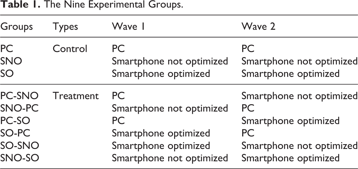
The control groups provide information on potential changes across waves, which can be linked to the repetition of the survey (e.g., lower motivation in wave 2 because panelists already answered the same questionnaire in wave 1). The differences between waves in the treatment groups should be interpreted taking into account the potential differences observed in the control groups. Using the groups PC-SNO and SNO-PC, we can study the effect of the device. Using SO-SNO and SNO-SO, we can study the effect of optimizing the smartphone survey.
To maximize the proportion of respondents answering to both waves and with the required devices, the introduction of wave 1 included: two questions to select respondents having Internet access through both devices, a third question to filter out panelists who do not want to commit themselves, and an indication that the incentive will be higher in wave 2.
In addition, if respondents tried to answer from a different device than the one assigned, they were automatically stopped by a warning message until they connected through the right device.
The Fieldwork
The experiment was carried out in Spain by the online fieldwork company Netquest (www.netquest.com). In the first wave (February 23–March 2, 2015), 3,317 panelists were contacted. Of these, 2,720 got to the introduction page. One hundred eighty-six were filtered out for not having Internet access through both PC and smartphone and 119 for not accepting to commit themselves. Two hundred ninety-six were required to continue from a different device than the one they started with but did not do the switch. A total of 1,843 panelists answered the first survey question after all the filters and 1,800 finished the survey, which was the objective (nine groups of around 200 respondents each). Cross quotas for age and gender were used to guarantee that the distribution for these variables in the sample was similar to the one observed in the panel. All panelists who completed wave 1 were invited to participate in wave 2 (March 9–18, 2015). Out of the 1,800 panelists, 89.4% finished the survey. The 1,608 respondents analyzed were divided as follows: 188 in the PC control group, 179 in the SNO control group, 187 in the SO control group, 170 in the PC-SNO group, 182 in the SNO-PC group, 165 in the PC-SO group, 184 in the SO-PC group, 179 in the SO-SNO group, and 176 in the SNO-SO group.
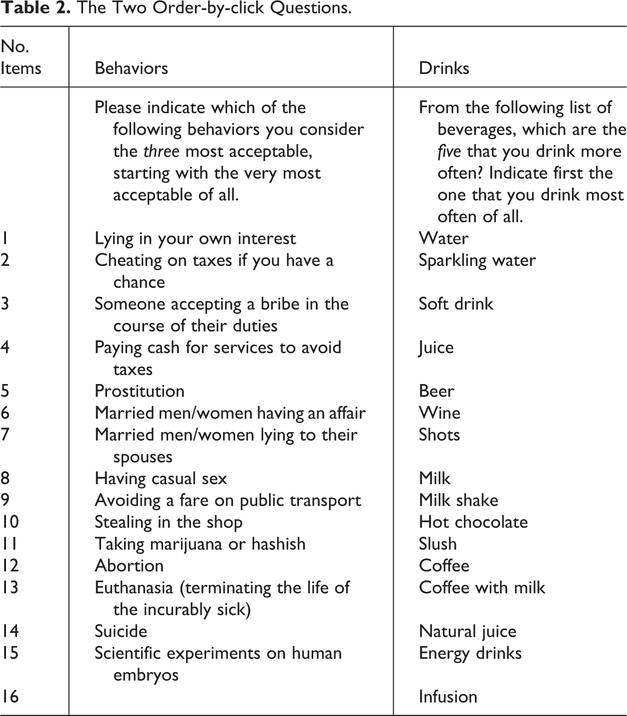
The Order-by-click Questions
This article studies the two order-by-click questions present in this survey of around 100 questions. Table 2 presents these questions.
The Two Order-by-click Questions.
In order-by-click questions, the order of the different options is often randomized across respondents to avoid some options being selected more often because of their position. However, for the purpose of this experiment, I did not randomize the order of the items within each question. This allows us to look at possible systematic position effects.
In the PC and SNO versions, the items were presented in two columns as follows: Item 1 was in the left column at the top, item 2 in the central column at the top, item 3 in the left column in the second row, item 4 in the central column in the second row, and so on. Moreover, the column on the right-hand side indicated the ranking with the selected items. In contrast, in the SO version, to avoid horizontal scrolling, everything was fitted in only one column: Item 1 came at the top, followed below by item 2, and so on. No summary of the selected items was proposed.
The complete questionnaires are available at http://goo.gl/g9gAE4 for PC, http://goo.gl/5jF2vr for SO and http://goo.gl/4c9d1C for SNO. Online Appendix 1 provides screenshots of the “behaviors” question for all three versions. In the SNO, what is visible on the screen really depends on the level of zoom. Besides the device characteristics, we can expect these differences in the questions’ presentation to affect answers across the experimental conditions.
Main Results
Comparison of the Three Split-ballot Groups in Wave 1
This section focuses on the data from wave 1 and considers differences across split-ballot groups for different indicators.
Compliance with the instructions
The first point studied is: Did respondents respect the instructions (i.e., did they select three behaviors/five drinks as required in the questions)? It was not possible to select more than the required number of items. However, it was possible to select less. Selecting fewer items than required can be seen as missing values or noncompliance with the instructions. In both cases, this suggests a lower data quality.
Table 3 provides the proportions of respondents in wave 1 who selected x items in each question.
Percentages of Respondents Who Selected x Items.

Note: p Value (PC-SNO) indicates the p value for the test of difference in proportions between the PC and SNO groups (prtesti command in Stata version 12). Idem for p value (PC-SO) and p value (SO-SNO). The rows in boldface correspond to the number of items asked for each question. SNO = smartphone not optimized; SO = smartphone optimized.
In the behaviors question, significantly fewer respondents properly followed the instruction in both smartphone conditions, whereas in the PC group, almost all panelists did. This difference is mainly due to a higher proportion of panelists who did not select any item in the smartphone conditions (answer missing completely).
Also in the “drinks” question, significantly fewer respondents properly followed the instructions in both smartphone groups, with an even lower compliance in SO (significant). This might be because it requires a higher level of efforts to answer through the smartphone, particularly in terms of scrolling, and even more in the optimized version of the questionnaire. Moreover, the proportion of panelists following the instruction is lower in all groups: Even in the PC condition, up to 14% of panelists did not comply with the instruction. There were 11.1–24.2% of respondents who selected three items instead of five. Since the drinks question came after the behaviors one, this suggests that there is a carryover effect of the first question on the second one. Some respondents may recognize the format the second time and answer the question without reading the instruction again.
Total score of each item
A common way to deal with data from order-by-click questions is to compute a total score for each item, which is a sum of the percentages obtained times a number of points corresponding at the position in which the item was chosen. This score gives an indication of the overall importance of an item and provides a ranking without repetition. More exactly, I compute the following:


where pi = proportion of respondents who selected the item in the ith position, i = 1, 2, 3, 4, 5.
Table 4 shows the total scores for each item by split-ballot group in wave 1. The items are ordered by their total score for the PC group (highest score first).
Total Score of Each Item (Ordered by Score for PC).
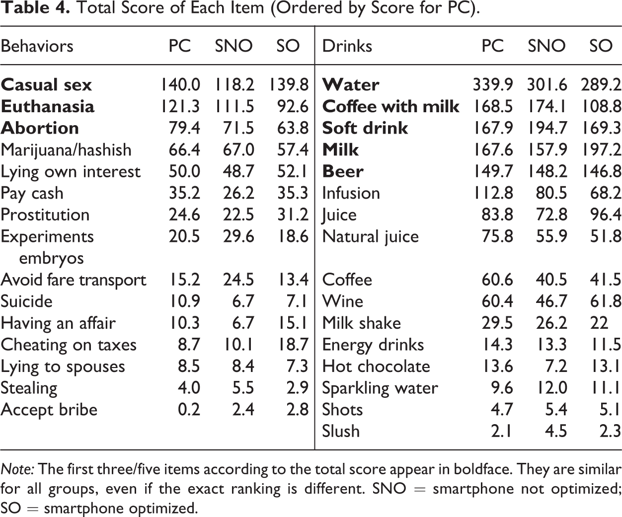
Note: The first three/five items according to the total score appear in boldface. They are similar for all groups, even if the exact ranking is different. SNO = smartphone not optimized; SO = smartphone optimized.
Even if the scores vary slightly, the item with the highest total score is identical in all three groups. For the behaviors question, the second to fifth items are also identical for the three conditions. Then, a few differences are observed, but the overall ranking is quite similar. Since this question focused on the top three, we can conclude that the main result is not affected by the device used to complete the survey and the optimization of the survey for smartphones.
For the drinks question, the item with the second highest total score differs across groups. The total scores are also quite different. However, the same drinks are in the top five. Only the exact order differs. Looking at all 16 beverages, some differences in ranking are observed across split-ballot groups, but all in all, quite similar conclusions can be reached about which beverages are most commonly consumed. Depending on the level of precision needed for the results (i.e., drinks in the top five or exact order), the use of different devices to answer the survey can be tolerable or not.
Position of the first item selected
Since the order of the different options was not randomized, we can determine if respondents have a higher tendency to select as first option one of the first items or not and if this depends on the device used and on the optimization of the questionnaire for smartphones. I also examine whether more respondents select options shown on the left column in the PC and SNO versions. Table 5 gives the percentages of panelists who selected in position number 1 (i.e., most acceptable behavior or beverage most often consumed) an item that pertains to the first, second, or last third on the list, as well as an item that was presented on the left in the PC and SNO versions (position with odd number in Table 2).
Percentages of Panelists Who Selected in Position 1 an Item that Pertains to the First, Second, or Last Third of the List and an Item that Was Presented on the Left in the PC and SNO Versions.

Note: The percentages of the first 5 positions 5–10/11, and the last 5 do not sum to 100 because of missing values. The order of the items for each question is indicated in Table 2. For PC and SNO, items 1 and 2 are on the first row, items 3 and 4 are on the second row, and so on. For SO, the items are one after each other (only one by row). SNO = smartphone not optimized; SO = smartphone optimized.
When comparing PC and SNO, there are no significant differences for both questions. Even if the visual presentation of the question is similar, in SNO surveys, it is necessary to zoom in. Consequently, it is difficult to see all items on the screen without scrolling horizontally. Thus, I expected items presented on the left to be chosen more often. However, this is not supported by the results. The difference found for “position in left column PC/SNO” is between SO and the other groups: When there are several columns, the left options are more often selected than when everything is in only one column. But there is no additional effect for the SNO group versus the PC group. There are also no differences due to the position (first, second, or third part) of the item between these two groups.
When comparing SO with the others, some significant differences are found, most of all for the behaviors. In particular, fewer respondents chose an item in the last part of the list in the SO group for the first rank. Therefore, the current way to optimize the order-by-click questions actually creates differences across devices.
Response times
Besides the answers themselves, I consider the response times as indicators of respondents’ efforts to answer to the questions. Because it is necessary to scroll and/or zoom in the smartphone versions, I expect respondents to take longer to answer when using this device. In the SO version, zooming in and scrolling horizontally are not necessary. However, respondents need to scroll down much more than in the SNO condition. Thus, I do not expect large differences in response times for the two smartphone versions. Table 6 shows the median response time in seconds.
Median Response Time per Question (in Seconds).
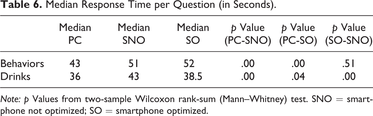
Note: p Values from two-sample Wilcoxon rank-sum (Mann–Whitney) test. SNO = smartphone not optimized; SO = smartphone optimized.
The median response time is significantly higher for the smartphone conditions as expected. This suggests that the effort required to answer order-by-click questions is higher when using a smartphone. However, the way these questions are currently optimized does not systematically reduce the time needed to answer such questions: The optimized and nonoptimized groups only differ significantly for the median response time of the drinks question. It would be interesting to investigate alternative ways to optimize such question formats for smartphone devices.
Changes from Wave 1 to Wave 2
So far, I have focused on the comparison of the split-ballot groups in wave 1 (between-subject comparison). Since our experiment included two waves, we can also compare the answers of the same respondent across waves (within subject comparison). Thus, for each respondent, I compare the individual ranking (top three behaviors and top five drinks) in both waves. There are many different possible outcomes of the comparison: The ranking may be exactly the same, include similar elements but in a different order, or include only some elements that are similar but others not, and so on.
Table 7 focuses on the two extremes: exact same ranking (“three out of three” or “five out of five”) or no elements at all in common (even not in a different rank). It reports the proportions of panelists in each of these two situations: The first one indicates very consistent respondents, whereas the second one identifies very inconsistent respondents.
Proportion of Respondents (in %) Who Answered Exactly the Same for All Ranks and Who Answered Completely Different Items in Both Waves.
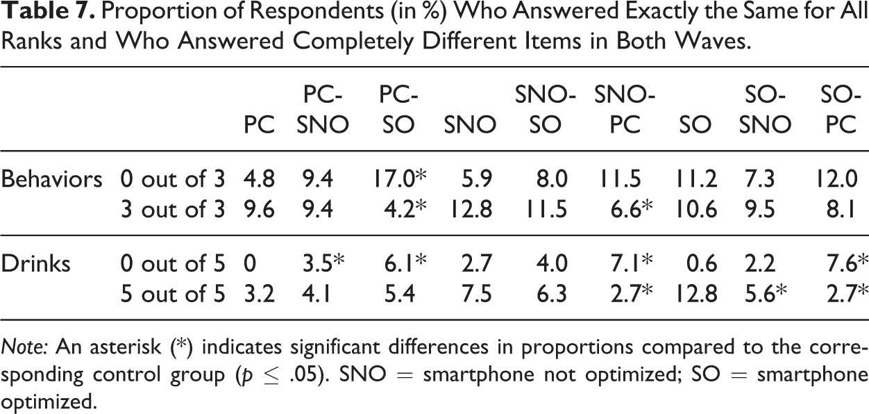
Note: An asterisk (*) indicates significant differences in proportions compared to the corresponding control group (p ≤ .05). SNO = smartphone not optimized; SO = smartphone optimized.
Compared with the PC control group, in the PC-SNO group, the proportions of panelists giving a completely different ranking increase for both questions. When, in addition, the survey is optimized for smartphones, these proportions increase even more. This might be linked to the changes made in the layout of the question for the optimized version. Similar patterns can be observed when comparing to the SNO or the SO control groups: Changing the device and/or the optimization of the survey usually lead/leads to an increased proportion of respondents with completely different rankings. At the same time, it often leads to a decreased proportion of respondents providing exactly the same ranking.
Discussion
One of the reasons why web surveys are attractive is that they allow the use of new kinds of scales that are more visual, interactive, and user-friendly. However, with the increased participation in web surveys through mobile devices, one can wonder how these new web scales can perform on smartphones in particular. Using data from an experiment in Spain, this article compares the results for order-by-click questions, when the participation takes place through PC, SNO, and SO.
Looking at the data for wave 1, I found more missing values and less compliance with the instructions in both smartphone groups. Using a total weighted score to rank the items, I saw that the top three behaviors were the same for the three groups. For the drinks, the same five drinks appeared in all groups, but the exact order differed. Concerning the position of the item, differences emerged between the SO version and the others. The median response time was significantly higher for smartphones respondents.
Comparing the answers across waves, I saw more respondents with completely different rankings and fewer respondents with exactly similar rankings when changing the device and/or the optimization of the survey.
The results are not completely different across conditions. However, there are some significant differences in response behaviors (e.g., for compliance, response time, or rankings, depending on the needed level of precision). Thus, this suggests the importance of being careful about using order-by-click scales in opt-in panel web surveys with both PC and mobile participation.
The scope of this experiment was limited to panelists of an opt-in panel in Spain who have Internet access through both PCs and smartphones. Further research could study what happens in a probability-based online panel and/or for panelists who do not have access to the web through several devices. Replications in other countries and with different order-by-click questions (e.g., with fewer items) would be necessary, too, to test the robustness of our results. Also, it would be interesting to investigate other kinds of mobile devices, in particular tablets.
Moreover, one major issue is the way the order-by-click questions are optimized in this experiment. I followed the usual layout that the fieldwork company uses, which is similar to what many opt-in panels use. However, I believe that this format is not optimal for smartphone devices (e.g., need to scroll down a lot, no summary of the ranking) and even less so if we want to combine and/or compare results from surveys completed through different devices (different presentation). My recommendation would be to develop a new optimized form of order-by-click questions that is more similar to the PC version. However, this is not so easy because of the screen limitations for smartphones. Thus, an alternative could be to modify the layout for PC surveys as well as for smartphone surveys in such a way that the order-by-click questions are easily readable on both types of devices and minimize the visual differences between both.
Since the use of mobile devices to complete surveys is growing, I believe that if researchers want to continue taking advantages of the possibilities that the Internet offers for conducting surveys (interactivity, large range of visual options), they need to think more deeply about how to adapt better some of the specific web scales to the challenges of a participation with small screens and virtual keyboards and test this further. This may require changing not only the format of these scales for the mobile devices but also a revisitation of their current format for PCs to achieve a higher comparability of the results. Similar results are expected for other web-specific scales, like drag-and-drop or sliders. Even so, it is possible that these new scales will lead to overall lower data comparability and data quality.
Footnotes
Acknowledgments
I am very grateful to the Netquest team, in particular to Carlos Ochoa, for their support in planning and collecting the necessary data, to Daniele Toninelli for his special help, especially in designing the experiment, and to the editor and three anonymous reviewers for their helpful comments on a previous draft of this article.
Declaration of Conflicting Interests
The author(s) declared no potential conflicts of interest with respect to the research, authorship, and/or publication of this article.
Funding
The author(s) received no financial support for the research, authorship, and/or publication of this article.
References
Supplementary Material
Please find the following supplemental material available below.
For Open Access articles published under a Creative Commons License, all supplemental material carries the same license as the article it is associated with.
For non-Open Access articles published, all supplemental material carries a non-exclusive license, and permission requests for re-use of supplemental material or any part of supplemental material shall be sent directly to the copyright owner as specified in the copyright notice associated with the article.