
Abstract
Three new commands for data reduction—
Keywords
Introduction
Reducing a dataset to another dataset containing summary or other statistics is an old problem. A century ago, the point was emphasized by Fisher (1925, 6-7): “No human mind is capable of grasping in its entirety the meaning of any considerable quantity of numerical data. We want to be able to express all the relevant information contained in the mass by means of comparatively few numerical values.” Fifty years and more ago, Bevington (1969) and Ehrenberg (1975) used data reduction in the titles of their texts. Many more authors might have done something similar, had reference to data analysis not become the prevailing fashion.
Data reduction has been addressed in Stata by official commands such as
A sequel to this column is planned that will focus on various plots that start with quantile displays, showing all the data for a single variable or group in order. Examples in this column provide a taste of this approach.
The approach to correlation confidence intervals of Cox (2008) is broadly similar. Type
The rest of the article gives a more detailed overview of the three commands (section 2), followed by some examples (section 3), a more formal statement of syntax (section 4), and detailing of options allowed (section 5).
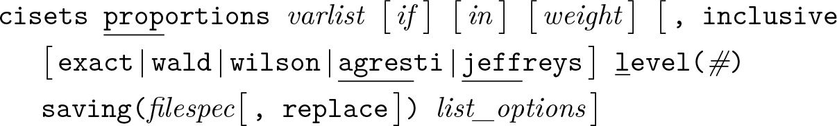
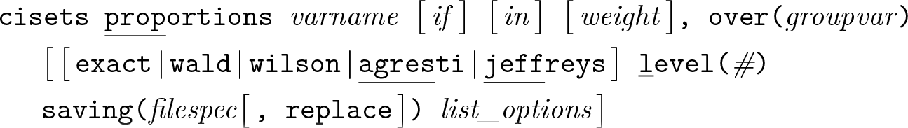
Overview of cisets, pctilesets, and quantilesets
Scope
There are two flavors to each command.
If a numeric variable list, varlist, is supplied, then results are calculated for one or more variables in that list. This is called the variables syntax.
If one numeric variable, varname, is supplied together with an
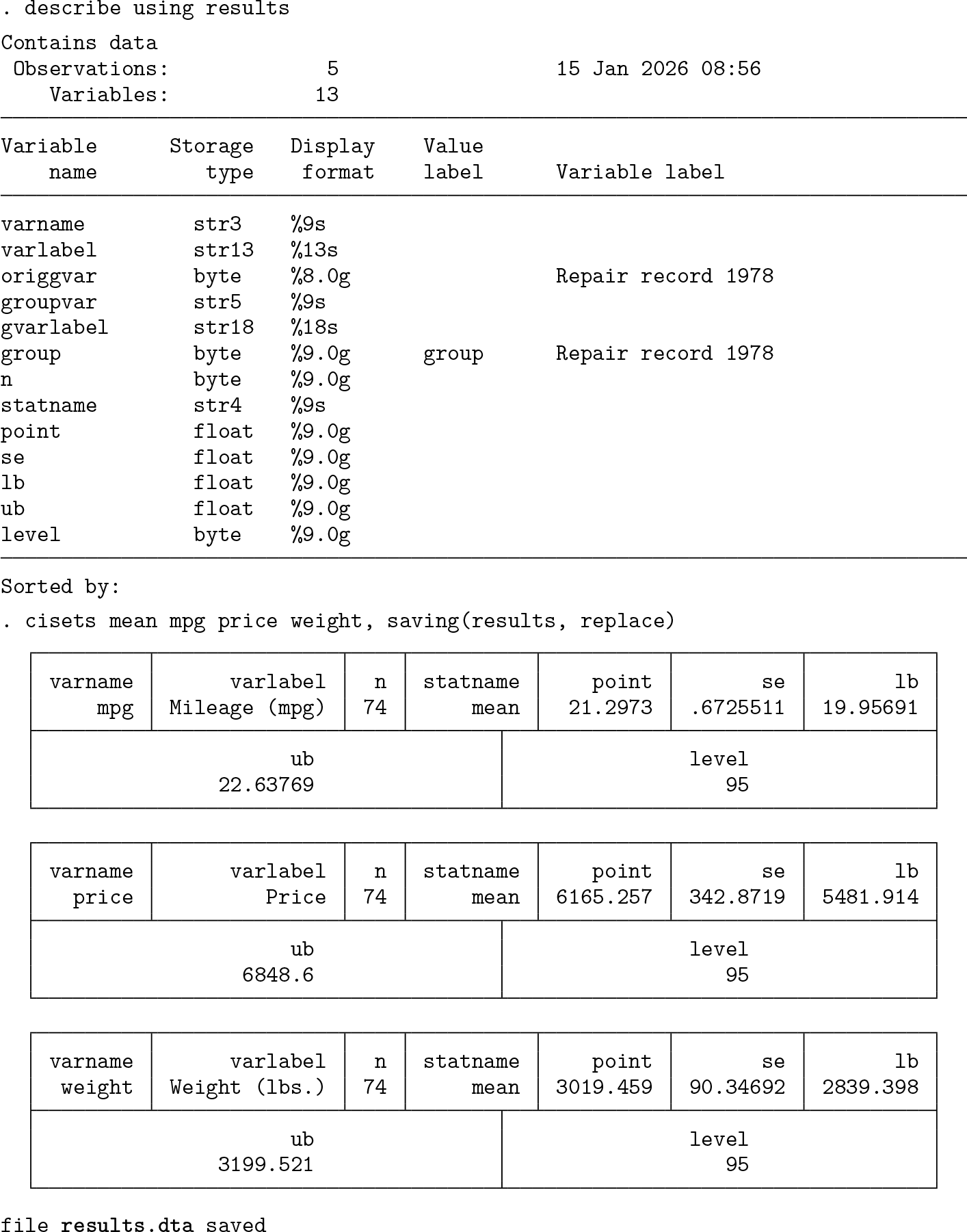
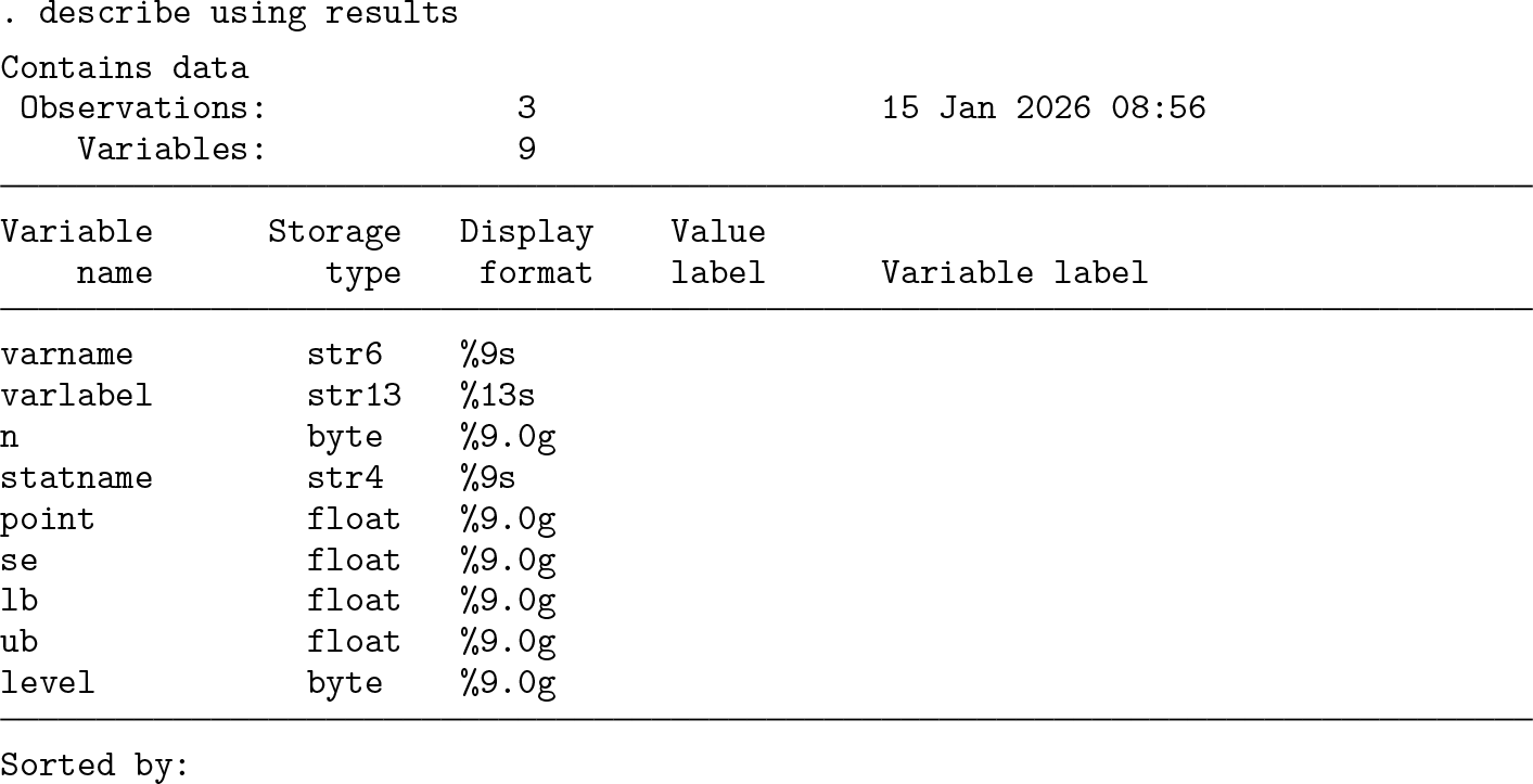
The set referred to by each command name is a temporary reduced dataset consisting of results for each variable or group named. Optionally, but also usually, the dataset of results may be saved for later use.
Variables in each results set
All commands
(Groups syntax only)
(Groups syntax only)
(Groups syntax only)
(Groups syntax only)
n is a numeric variable holding the number of observations used in the estimate.
cisets and pctilesets only
cisets only
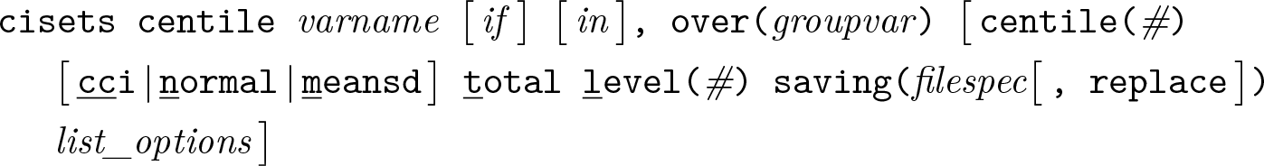
(Subcommands
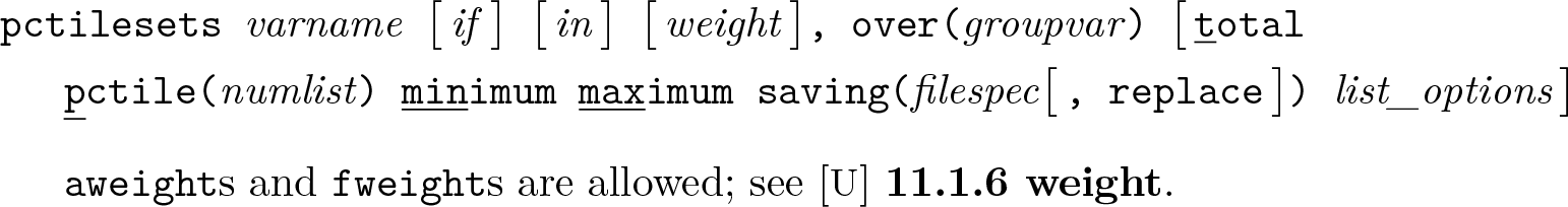
pctilesets only
Any or all of min,
quantilesets only
One or more quantile variables named
Why both pctilesets and quantilesets?
As stated,
More on quantiles and percentiles
The ideas of quantiles and percentiles have been developed in different if complementary directions. Some notes follow that discuss the main ideas, various uses of those terms, and key Stata commands and what they offer. You may wish to skip or skim, depending on your interests and whether the material is familiar.
As explained, for example, by Cox (2024b), the term quantile has acquired related but distinct meanings. One meaning refers to all the values of a variable sorted or ordered in magnitude, the order statistics, especially when plotted, usually against the quantiles of another variable or as estimated for a candidate fitted distribution. This is the sense behind official commands quantile,
The related but distinct meaning foremost in both
Much of the rationale for the Mata function
In official Stata, the commands for estimating particular quantiles include
In practice, the term percentile is typically used in this sense of quantile, as a summary statistic or as a parameter estimate defined by the percent of values lower. Usage has often departed from any implication that there are 99 distinct percentiles for percents 1(1)99 (or 101 if the minimum and maximum are regarded as the 0 and 100% percentiles). Thus, many statistical people would feel no discomfort in regarding, say, the 2.5% and 97.5% points as also being percentiles. For a menagerie of related terms, from tertile onward, see Cox (2016). To the list given in that article may be added pentile = quintile (5 bins implied), decentile = decile (10), hexadecile = suboctile (16), ventile = vigintile (20), and trentile (30).
Yet another meaning of quantile is to refer to the bins, classes, or intervals they delimit, as when the first quartile is the lowest quarter of a distribution. That meaning is not directly implied by any command introduced in this column.
Strategy
Thus, the approach is one of providing a building block that may be useful directly or if combined with other building blocks. Flexibility is needed because so many different problems may be of interest, not just comparison of results for different variables or of results for one variable for different groups but also comparison of results for several variables and several groups, and so forth. Many projects call for or at least would benefit from comparison of parameters (say, different kinds of mean), comparison of intervals for different confidence levels, comparison of different methods for estimating intervals or quantiles, and so forth.
At first sight, a results set may seem repetitious. With a little experience, you will see that such repetition is often helpful when combining such sets. In any case, you can always ignore what you do not need. Similarly, you can use
Graphical and other applications lie downstream of each command, as discussed in section 3 and as will be shown in more detail in a later column. Helper commands include myaxis to sort on some criterion (Cox 2021) and
Ignoring inapplicable data
As in the official command
As in the official command
Examples
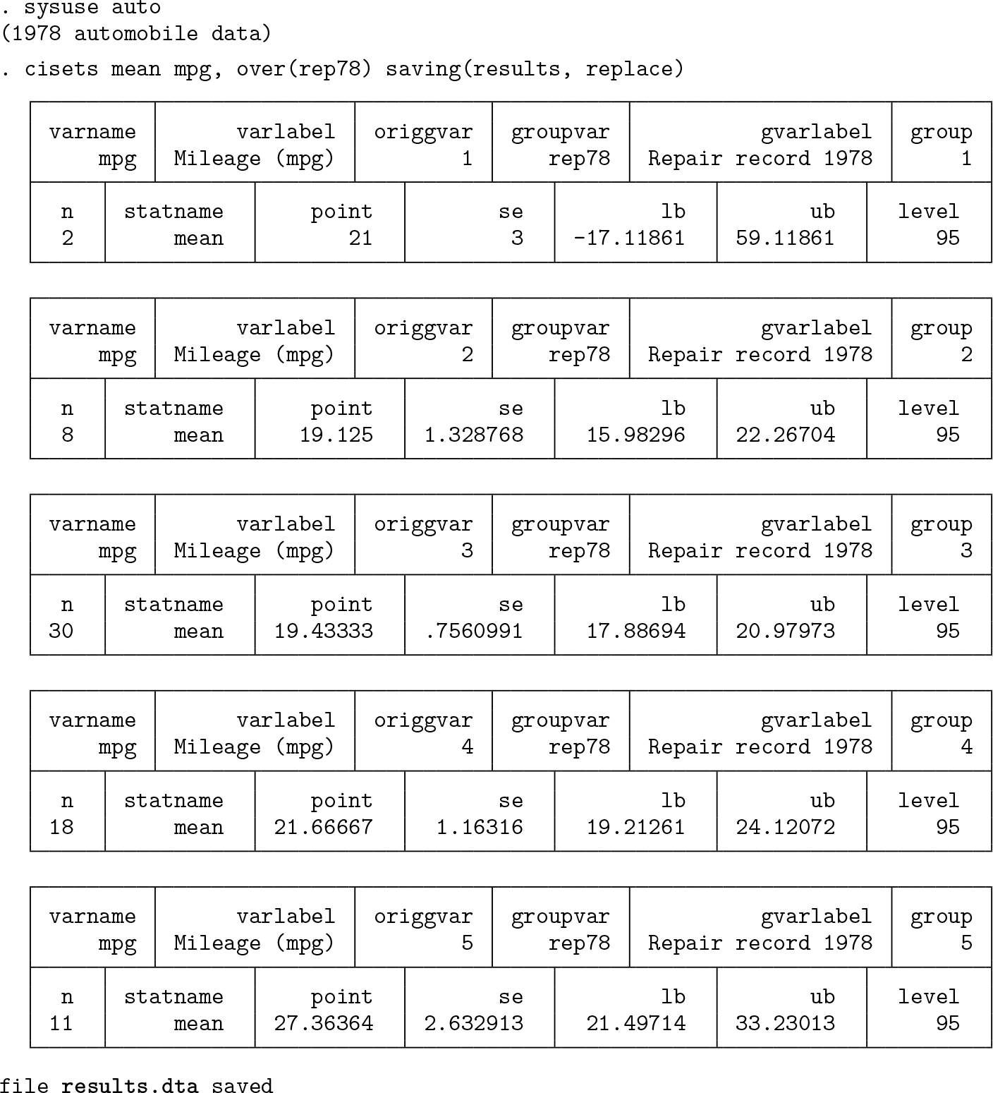
Using cisets
For first examples, we use cisets to produce confidence intervals for variables in
We could use the same approach for producing confidence interval sets for other summary measures, as already explained in section 2.1. As one variation among many possible, let’s look at medians and keep going all the way to graphic display. The median is the default result for
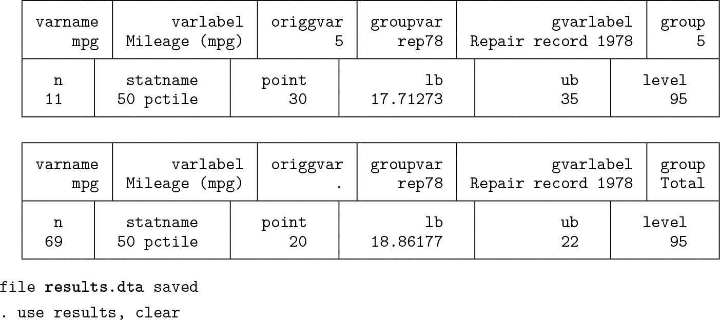
The default statistic name,
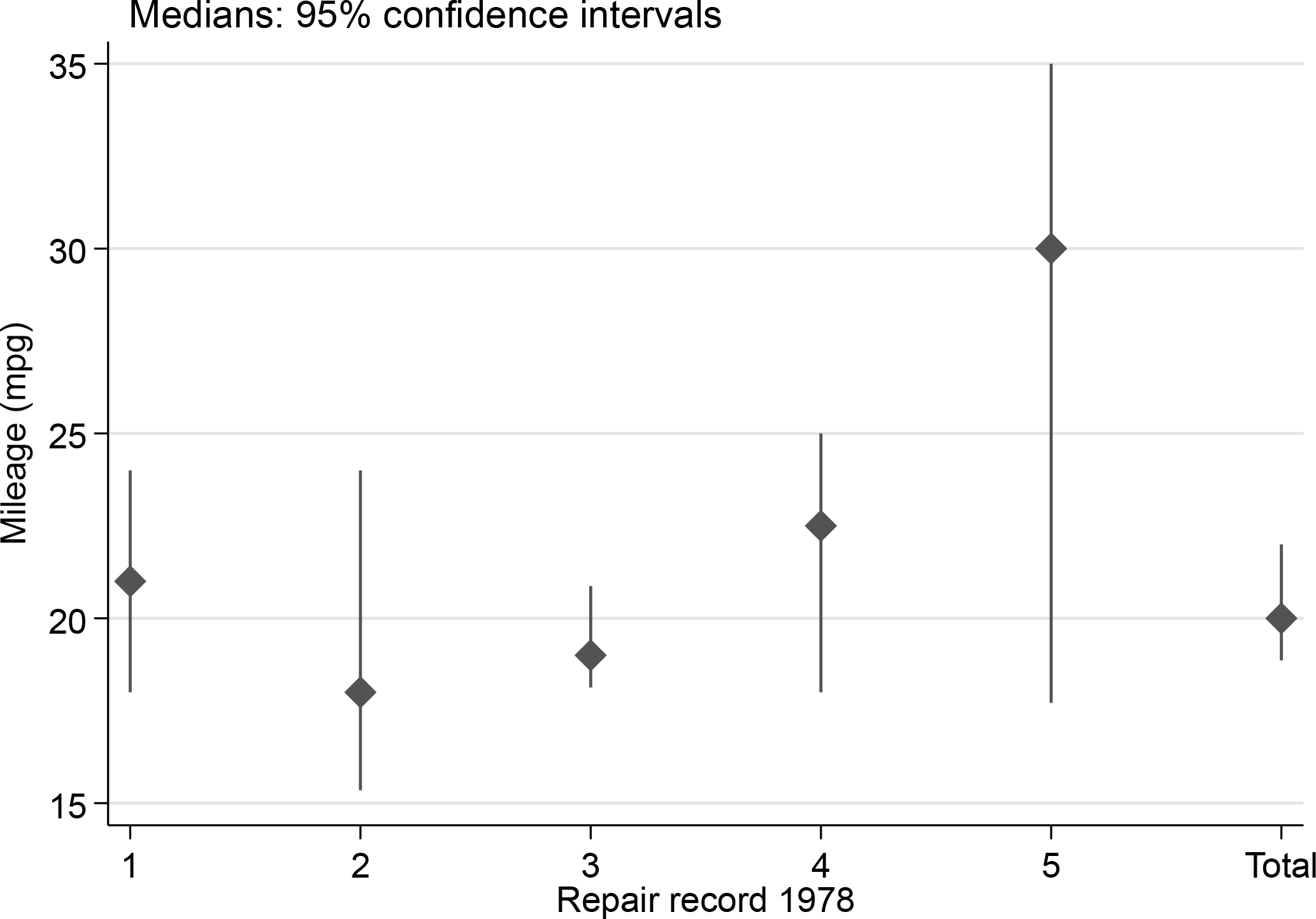
Median miles per gallon for various levels of repair record and for all observations, together with 95% confidence intervals
You may not be familiar with the ‘ = ‘ syntax documented at help macro. When we invoke a variable name in that way, as in the calls to the
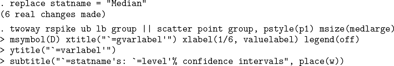
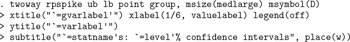
From Stata 19 onward, the code can be abbreviated using the command twoway rpspike, which combines range and point elements. Here is that alternative syntax. Because the graph produced is identical to figure 1, it is not repeated here.
You might prefer a horizontal display. The
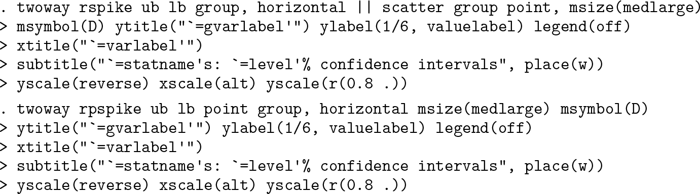
The graph produced is also not shown here to save space.
It is good practice when reporting confidence intervals to tell people about sample or subsample sizes, although that is often not done. Sample size is always saved by
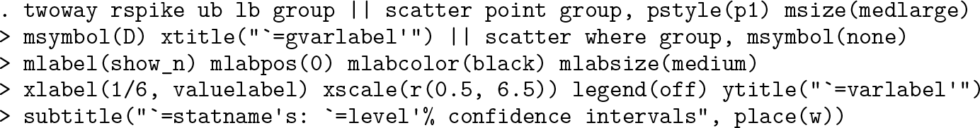
The overall range across confidence intervals on the display will be the difference between the maximum upper bound and the minimum lower bound. Here the sample sizes are displayed at one-tenth that range below the smallest value on the display. We add a prefix n = to each sample size. Your choices may differ, which is much of the point: the style here is to customize a display as you wish (figure 2).
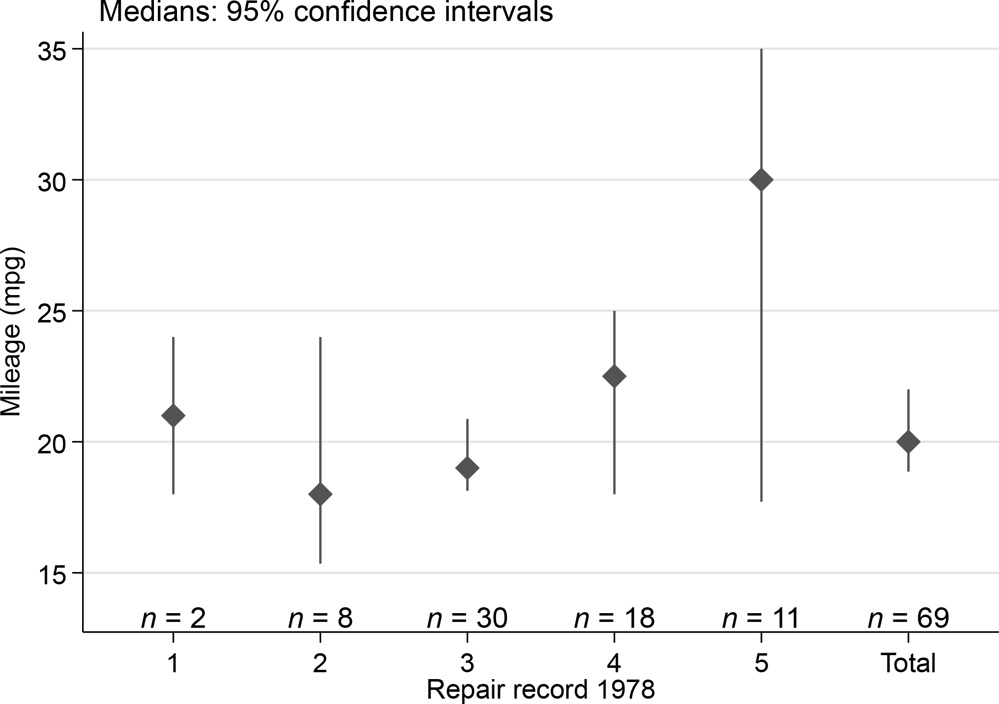
Median miles per gallon for various levels of repair record and for all observations, together with 95% confidence intervals and subset sizes. This is similar to figure 1, except that subset sizes have been added.
The alternative call using
Yet another way to show confidence intervals is to use range bars rather than range spikes (figure 3).
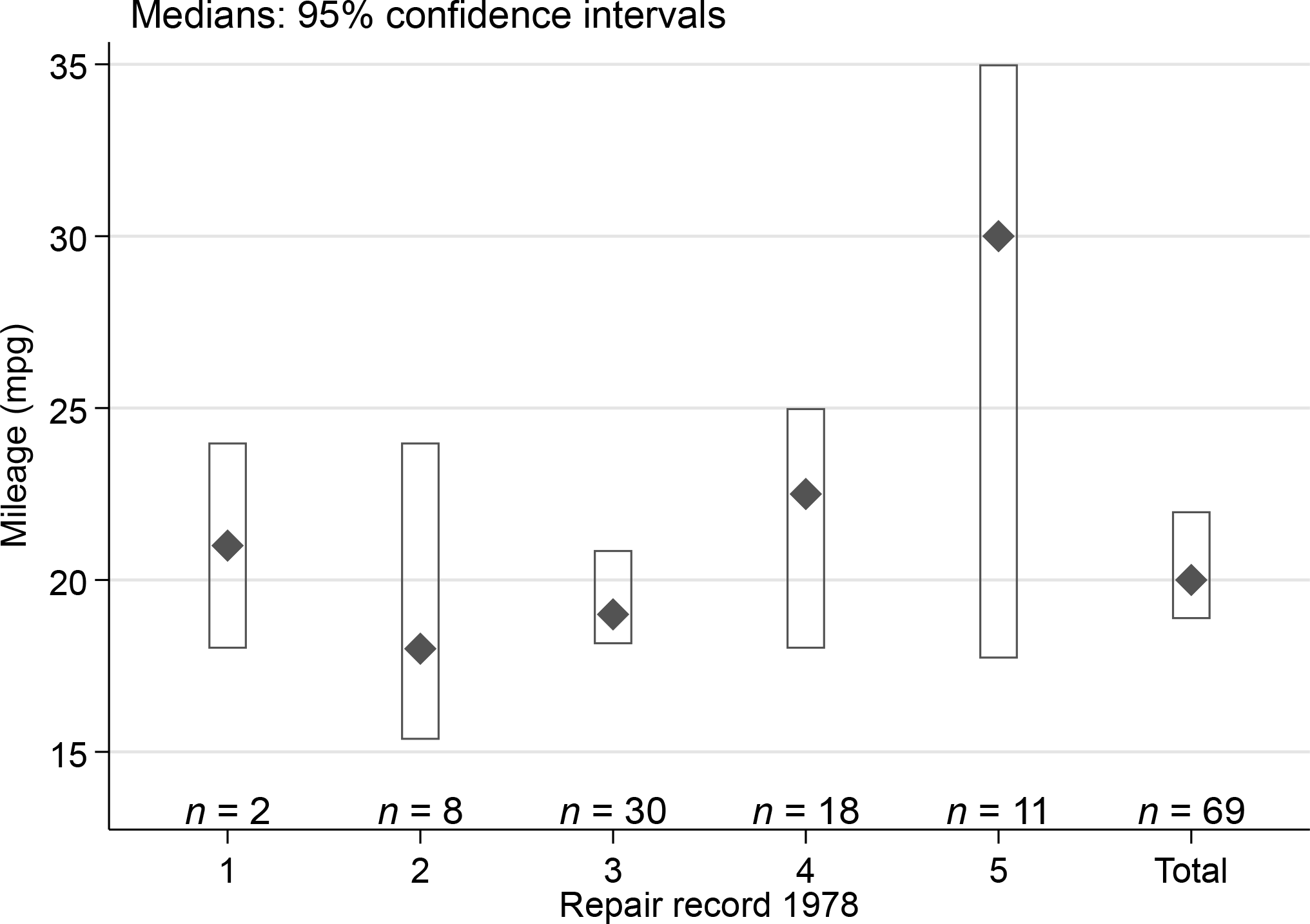
Median miles per gallon for various levels of repair record and for all observations, together with 95% confidence intervals and subset sizes. This is similar to figure 1, except that confidence intervals are shown by range bars.
Let’s back up for a brief discussion of ways to show confidence intervals.
In statistical graphics, showing confidence intervals—or their antecedents and relatives under various names such as error bars—has a history over decades, if not centuries. That history does not seem well documented.
Intervals of ±1 and ±2 probable errors were displayed on a combined histogram and dot or strip plot by Wood and Stratton (1910, 427).[1] The probable error in their work is in essence the estimated distance between the center of a symmetric distribution, taken to be normal, and each quartile. It was, in terms more usual now, calculated as the standard deviation multiplied by 0.67. For a more precise evaluation of that multiplier, use invnormal(0.75) in Stata. If you know of an earlier graphical use, I would be delighted to learn about it.
A similar device with intervals of one probable error on histograms was used by Brunt (1917, 1931) in his text.[2] Brunt used a multiplier of 0.6745, which is a little more accurate, although for graphical purposes the difference is likely to be immaterial.
In terms of Stata’s own
Otherwise, showing point estimates with markers or point symbols using, say, the scatter command and the intervals with capped spikes using something like
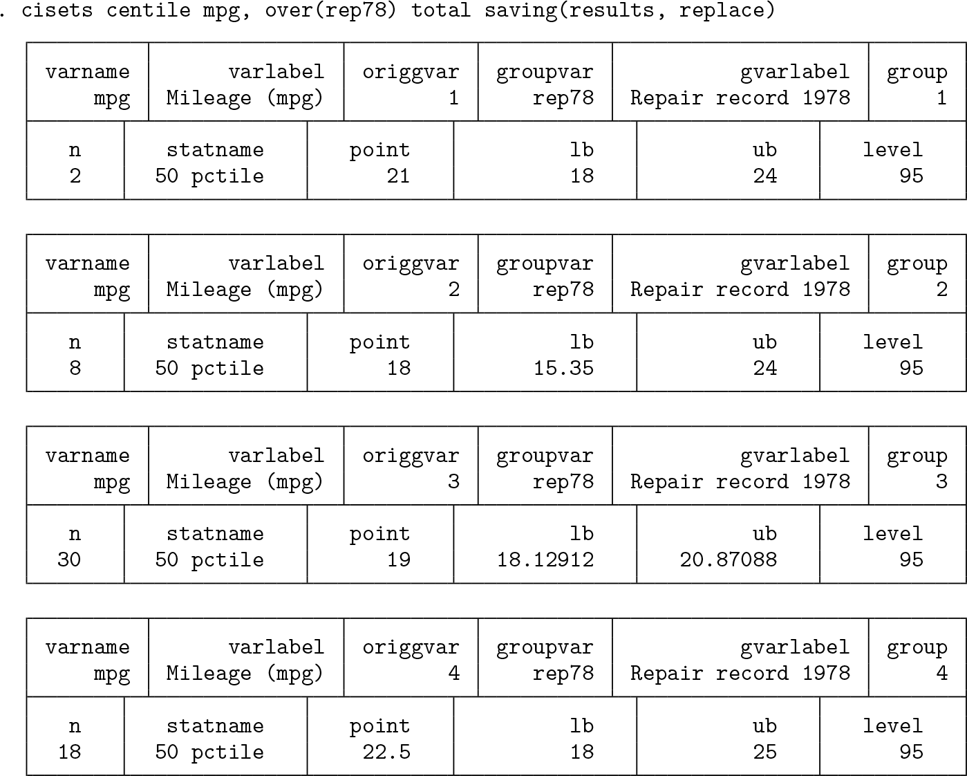
Using pctilesets
We illustrate with a dataset of discreetly anonymous mathematics marks from Mar- dia, Kent, and Bibby (1979) and Mardia, Kent, and Taylor (2024). The appearance of a second edition of a text 45 years after the first should encourage all technical authors. Although the data were given as separate variables, reshaping them to a group structure is driven here by what will be easier for producing graphs.
By default, the string variable
The graph shown now by way of illustration is a variation on a box plot. Beyond the possibilities offered by
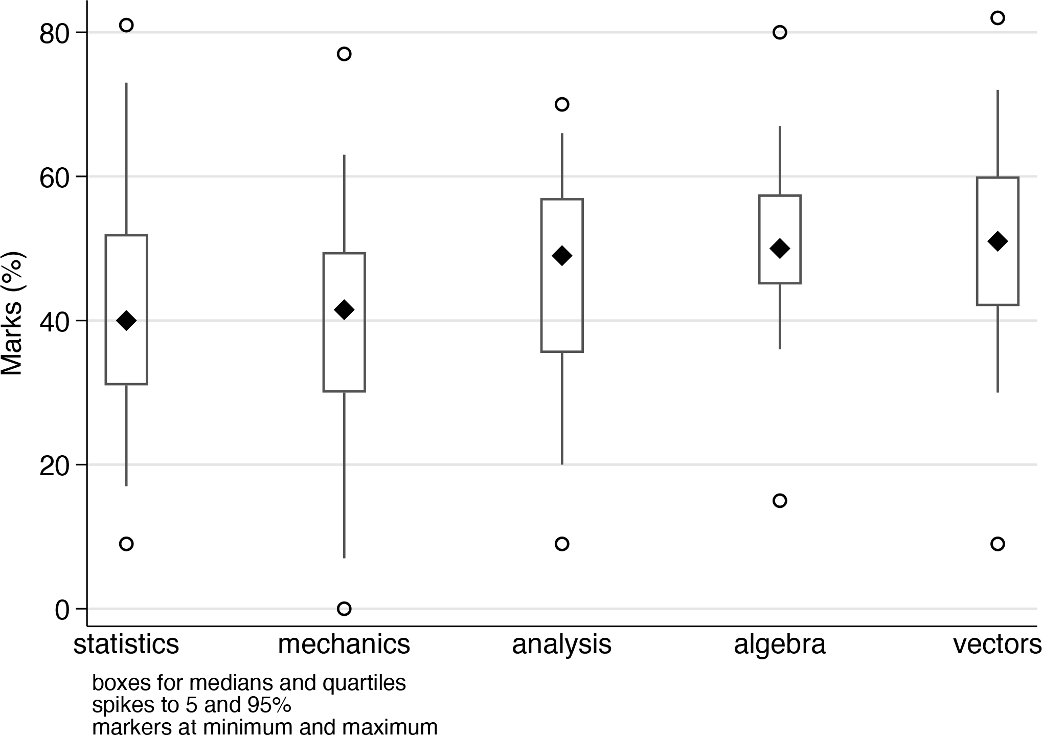
A variant on box plots with conventions explained in a marginal note
The attitude here is very simple: researchers are in charge and can devise their own display for their own purposes. But nonstandard designs certainly need to be explained too.
You would need to use
Those motives naturally could both hold in a particular project.
As an example of motive 1, we will include calculation of octiles as well as other measures previously mentioned. The octiles (strictly, first and seventh octiles) correspond to cumulative probabilities 0.125 and 0.875. The term octile with this statistical meaning appears to have been introduced by McAlister (1879) in a brief but important article, which is better known for introducing lognormal distributions, although without the latter term.[3]
Octiles were used by Crowe (1933) in an early precedent of the box plot, starting a tradition of frequent use of box plot ideas in geographical and climatological literature that was flagged by Cox and Jones (1981). They were also used by Matthews (1936) and Grove (1956). Many such references were given in a review of Crowe’s work and its influence by Johnston (2019). The homely term eighth was introduced by Tukey (1970, chap. 12) for one version of octiles. Eighths are among the so-called letter values; see Cox (2016) and its references for more detail on those.
Whatever the name, the point of showing an octile range graphically is no more and no less than to show where the central 75% of the distribution lies, just as the point of showing a quartile range (the interval bounded by the quartiles, with length the interquartile range) is just to show where the central 50% lies. Using these particular intervals is inevitably a little arbitrary, for which the main defense is that we also show the entire distribution.
As an example of motive 2, it is sufficient to use the default method named for Tukey, calculating quantiles that correspond to cumulative probabilities (i — 1/3)/(n + 1/3) for rank i and sample size n. This choice goes back at least to Tukey (1962a,b) and is mentioned, if a little indirectly, in Mosteller and Tukey (1977, chap. 5). There is a connection between this rule for plotting positions and advice in Tukey (1977, 496-497) on quite how to work with counted fractions. Hoaglin (1983, 44-49) explained that and gave a more detailed discussion. A key point is that to a good approximation, the median of the distribution of any particular order statistic is at the point where the value of the cumulative distribution function is given by this recipe. See also Baath (2013b,a) for entertaining blog posts on plotting counted fractions and Kerman (2011a,b) for related technical developments, some of Bayesian flavor.
For data here, we revisit the leading example given by Parzen (1979) in an article that is the starting point for the intended sequel. He used data on annual snowfall in Buffalo, New York, for 1910 to 1972 (63 years). The original data had been used earlier in PhD theses. Although they were not included in Parzen’s article, they have somehow become widely available since then and frequently used as a sandbox in articles and software. An especially convenient source is Miecznikowski (2019), which reprints the original data together with data for 1973 to 2015 (43 more years).
So we use
We are going to use quantile plots for the main display but with box plots to the left and right of each period, 1910-1972 and 1973-2015. To do that, we need somewhere to put them.
Here and elsewhere, the code was produced in steps. What is presented now is divided into chunks to ease printing and understanding. First come chunks of code for the box plots, including median symbols and octile spikes.
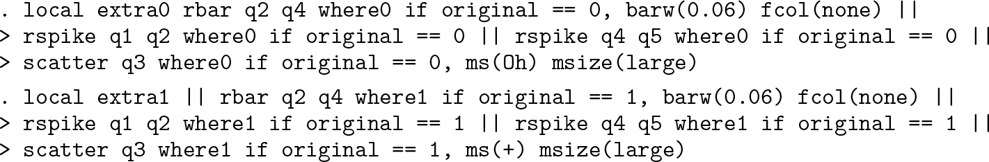
Although any differences are very small, it is appropriate to override the default plotting position. The syntax
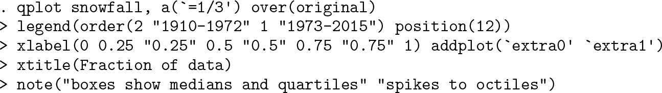
Figure 5 shows that the distribution has changed between the two periods. The later period shows higher level and spread and a lengthening of the tail of high values. The quartile boxes and octile spikes match that pattern.
Snowfall at Buffalo, New York, 1910-1972 (data used by Parzen [1979]) and 1973-2015. Superimposed quantile plots are combined with display of medians, quartiles, and octiles for 1910-1972 (left) and 1973-2015 (right).
The focus here is on Stata technique, specifically graphical technique, with no intent to provide a self-contained climatological case study. Two simple disclaimers deserve mention. First, the division at 1972 and 1973 is purely a matter of when Parzen’s data stopped and has no climatological rationale. Indeed, the climate is better thought to be evolving fairly smoothly rather than jumping from one state to another. Second, a serious case study would need to consider a battery of climatological and other physical predictors, not just year of occurrence.
We close our examples with more illustrations of what can be done with the machinery now in use.
The first quantile plot many researchers meet in their statistical education is often a normal quantile plot in which one axis shows what is expected in a sample of the same size from a normal distribution, as standard normal deviates, with units (value — mean) / standard deviation. This plot has many other names, such as normal probability plot, normal scores plot, probit plot, rankit plot, fractile plot, and yet others: some people prefer Gaussian to normal. A normal quantile plot can be useful even if there is no strong expectation that data are, or even in some sense should be, normally distributed. The point was well put by Hills (1974, 28): “It can be useful to plot an observed distribution against the standard Gaussian even though there is no question of it being Gaussian in shape. The motive is that it is easier to study a distribution by comparing it with a standard shape than just by looking at it.” The help file for
This plot is quite easy with
Another natural addition is an axis using metric units for the convenience of readers in most countries of the world. In a nutshell, 1 inch = 25.4 millimeters (mm)
Figure 6 is the result.
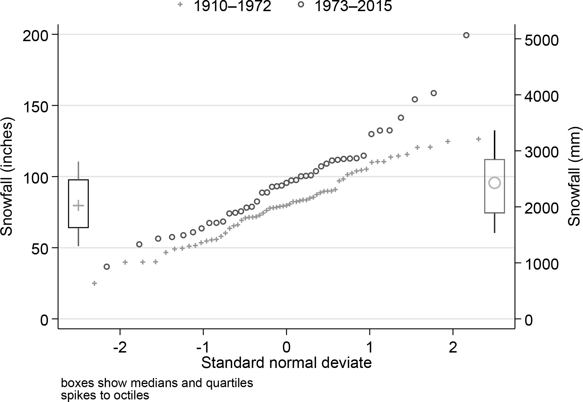
Snowfall at Buffalo, New York, 1910-1972 (data used by Parzen [1979]) and 1973-2015. Superimposed quantile plots are combined with medians, quartiles, and octiles for 1910-1972 (left) and 1973-2015 (right). Differences from figure 5 are the use of a normal horizontal scale and an extra axis showing labels in mm.
Confidence interval sets for various summary statistics
Variables syntax

Groups syntax

Variables syntax

Groups syntax

Variables syntax
Groups syntax
Variables syntax

Groups syntax

Variables syntax

Groups syntax

Variables syntax

Groups syntax

Variables syntax

Groups syntax

Variables syntax

Groups syntax
Weights are not allowed with
Percentile or quantile sets for selected levels
Variables syntax

Groups syntax
Quantile sets for selected probability levels
Variables syntax

Groups syntax

Options
All commands
(Variables syntax)
(Groups syntax)
(Groups syntax)
list_options are any options of
cisets only
(
(
(
Only one of the following options may be specified.
pctilesets only
quantilesets only
Conclusion
An intended sequel will reverse the emphasis, taking these reduction commands as merely means toward graphical ends. It will focus on the graphical ideas, placing them in a fuller historical, statistical, and scientific context and giving more depth and detail.
Programs and supplemental materials
To install the software files as they existed at the time of publication of this article, type
Supplemental Material
sj-txt-1-stj-10.1177_1536867X261450274 - Supplemental material for Speaking Stata: Three commands for data reduction
Supplemental material, sj-txt-1-stj-10.1177_1536867X261450274 for Speaking Stata: Three commands for data reduction by Nicholas J. Cox in The Stata Journal
Supplemental Material
sj-dta-1-stj-10.1177_1536867X261450274 - Supplemental material for Speaking Stata: Three commands for data reduction
Supplemental material, sj-dta-1-stj-10.1177_1536867X261450274 for Speaking Stata: Three commands for data reduction by Nicholas J. Cox in The Stata Journal
Footnotes
Notes
About the author
Nicholas Cox is a statistically minded geographer at Durham University. He contributes talks, postings, FAQs, and programs to the Stata user community. He has also coauthored 16 commands in official Stata. He was an author of several inserts in the Stata Technical Bulletin and is Editor-at-Large of the Stata Journal. His “Speaking Stata” articles on graphics from 2004 to 2013 have been collected as Speaking Stata Graphics (2014, College Station, TX: Stata Press). He is the Editor of Stata Tips, Volumes I and II (2024, also Stata Press).
References
Supplementary Material
Please find the following supplemental material available below.
For Open Access articles published under a Creative Commons License, all supplemental material carries the same license as the article it is associated with.
For non-Open Access articles published, all supplemental material carries a non-exclusive license, and permission requests for re-use of supplemental material or any part of supplemental material shall be sent directly to the copyright owner as specified in the copyright notice associated with the article.