Abstract

In 1862 the painter Gustave Courbet proposed to the critic Saint-Beuve that Paris be decorated with monumental outdoor paintings on specially dedicated edifices such as railway stations and churches; replacing the imagery of medieval cathedrals, these cityscapes were to be ‘picturesque, moral, industrial, metallurgic–-: the saints and miracles of the new society’. 1 The concept was encyclopaedic, in tune with the positivist and omnivorous culture of nineteenth-century Europe. It would never be realised as a purely artistic project, but it did find expression through commercial advertising. In particular, the expansion of the playbill into the theatrical poster provided colour, information and sensation throughout the urban scene, offering its own secular brand of miracles and saints.
If a playscript, stage design or performance is taken to be a text, the playbill, poster or flyer is interpreted by some semioticians to be a ‘paratext’. Its intention is to convey ‘contextual signals of genre’, or, more simply, ‘instructions for use’. 2 The theatrical event is given a spin by it, assigned a specific genre, touted to be a particular kind of phenomenon; the audience is preconditioned to act on this information or advice, responding to the event along the lines set down by the paratext. In her examination of the playbill, Mariana Net reads the intent of the paratext as stimulation of the audience to receive the artistic communiqué in a more ‘active’ manner; it may also lead it to devise its own fiction which then interacts with the fiction of the performance. 3 Jacky Bratton, for her part, argues that one should see the playbill as central to understanding an ‘intertheatrical’ reading of a ‘single night in the theatre’. Bratton reads the process backwards, with the playbill providing access to ‘the expectations and disposition of the audience, their personal experience of theatre’. 4
Early Posts
In a pre-literate society, criers and heralds were the purveyors of official announcements and news, but in the post-Gutenberg world this task began to be shared with print. The first printed announcement appeared in France in 1482. Royal heralds were supplemented in September 1539 by an order for the monthly posting of edicts on parchment in large letters, attached to a tablet in all sixteen sectors of Paris and in the most frequented places. Mention of a French show poster exists from 1599; the earliest French printed playbill to survive is from 1629 but it is pre-empted by a German one from 1628, as well as a Spanish manuscript bill of 1619. 5
By 1692 certain persons in France were granted official authorisation to do the posting. 6 Organised in 1722 and under police supervision, these bill-stickers wore a little apron, carried a small ladder, a paste pot and a brush, and had to display a copper badge lettered Afficheur. Mercier, in his Tableau de Paris, compared them to Academicians, since they were limited to forty and had to be able to read and write, but otherwise required no training or talent. ‘A bill-poster is the emblem of indifference. He never reads what he posts nor cares. He may have advertised theatres for thirty years without ever having set foot in one.’ They were forbidden to put up any ‘profane poster’ or announcements of romances or plays on the walls of churches or convents. 7 Two copies of every poster relating to proclamations or book sales had to be deposited with the Royal Library and the communal town hall, with the bill-poster's name at the bottom. Those who posted without authorisation were punished as ‘rebelles et perturbateurs de l’ordre public’. 8
Despite the illiteracy of much of the populace, London from the reign of Elizabeth I to the Interregnum was awash with playbills, providing the title always, the time or date usually, the theatre or company mostly, and the genre occasionally. The earliest were brief, hand-written on hand-made paper measuring seven by 3 in. In 1587, a license for ‘the only ympryntinge of all manner of bills for players’ was granted to John Charlewood by the Stationers Company. 9 John Northbrooke in his treatise against theatrical performers (c. 1579), complains, ‘They used to set up their bills upon posts some certain days before to admonish people to make resort to their theatres’; anti-theatricalists objected that they encouraged ‘inconstancy’, diverting pedestrians from more profitable and moral occupations. 10
The practice of bill-posting resumed when the theatres returned in the Restoration, for Pepys’ diary records on 24 March 1662: ‘I went to see if any play was acted, and I found none upon the post, it being passion weeke.’ 11 Long before performers’ names were added, playbills were printed in two colours, red for a tragedy, black or, more generally, purple, for a comedy. David Garrick was the first actor whose name appeared in oversized capital letters, 2 in. high, when he became manager of Drury Lane. 12 By 1754 The Connoisseur claimed one might judge from the size of the capitals the salary of the player. (When French actors were billed in exceptionably high letters it was known as en vedette; hence the term vedette for a star or headliner.) 13
In London, theatrical playbills could be both posted and distributed by hand, even flung into coaches. The criers were generally women who also sold fruit at the doors of playhouses when they opened. Their wares doubled as both posters and programmes. The bills carried the titles of the play and the name of the performer, were printed at the expense of the theatre and retailed ‘at one penny the bill, unless fruit is bought, when, with the sale of half a dozen oranges, they present their customer a bill of the play gratis’
14
(Figure 1).
‘Buy a Bill of the Play. Theatre Drury Lane’. A copper-plate from Richard Phillips, Modern London (1804). Source: Author's collection.
The advertising methods of strolling players resembled those practiced by Vincent Crummles: ‘large playbills pasted against the walls and displayed in windows’, smaller hand-bills, often hand-written, ‘for further particulars’, and the personal distribution of tickets for ‘bespeaks’, which canvassing Nicholas Nickleby considered ungentlemanly. On the day of Miss Snevellicci's benefit, The crier was sent round in the morning to proclaim the entertainments with sound of bell in all the thoroughfares; extra bills of three feet long by nine inches wide were dispersed in all directions, flung down all the areas, thrust placarded on all the walls too, though not with complete success, for an illiterate person having undertaken this office during the indisposition of the regular bill-sticker, a part were posted sideways, and the remainder upside down.
15
In Paris, the placement of bills was organised hierarchically, with government edicts enjoying pride of place; the theatrical bills for the Opéra were centred most prominently, with those for fairground entertainments off to the side. State orders were printed soberly on white paper, while social announcements might be hand-coloured. State-subsidised theatres were identifiable by the tint of the paper: red for the Hôtel de Bourgogne, green for the Hôtel de la Mazarine, yellow for the Opéra, green for the Opéra Comique. 16 One memoirist of the First Empire recorded of the columns in the Palais-Royal, ‘As soon as I see the red, blue, green, yellow or blue letters, I run, I draw out my tablets, I grab my pencil.’ 17
Such bills were meant to be read, not simply to catch the eye. Before the Revolution, the standard size of playbills was 20 by 50 cm, sometimes rarely more than 30 cm. They carried only the name of the plays and their authors, prices, time and instructions to servants as to when carriages were to be called. Martinet the print-seller in Rue du Coq-Saint-Honoré was the first to put advertising in his shop window; he also sold pamphlets and plays at the Théâtre du Vaudeville, which were shouted in the intervals. 18
Theatres preferred poster advertising over newspapers because print advertisements were heavily taxed and poorly circulated; moreover, editors often disapproved of hyperbole. Besides, posters were accessible to a wider public, including those who might have been excluded from attendance by class or purse. An awareness of a play or a performer could be aroused even in those who could not experience them in ‘the flesh’. What Tiffany Stern writes of Shakespeare's London applies as well to the nineteenth-century metropolis: ‘a play, first met as an advertisement, would have been viewed not in the theater, but in the context of the aggressive, non-moral world of the post, with its promotional strategies and its equality of dubious subjects’. 19
It has been claimed that once playbill letterpress became highly descriptive of the performance, ‘it boosted the art of acting up another rung on the social ladder, for it brought to that art the force of literary argument’.
20
It was usually composed by the manager himself and, in the absence of graphic illustration, allure had to be provided verbally. William Charles Macready's father was known for the magniloquence of his playbill prose. His text for Pizarro referred to ‘the pervading effects of its resistless power … The sense aches with pleasure, while, at the same time, the heart melts with sympathy and the mind is entranced with something bordering upon vision supernatural.’
21
That these florid word-portraits were read carefully is attested to by Dickens, who recalls in his life of the clown Grimaldi, On that eventful day, when new pantomimes are played for the first time at the two great theatres, and at twenty or thirty of the little ones, we still gloat as formerly upon the bills set forth, tempting descriptions of the scenery in staring red and black letters, and will fall down upon our knees, with other men and boys, upon the pavement by shop-doors, to read them down to the very last line.
22
Put out Red-letter'd Bills, and raise your Price You'll lure a select Audience in a trice.
23
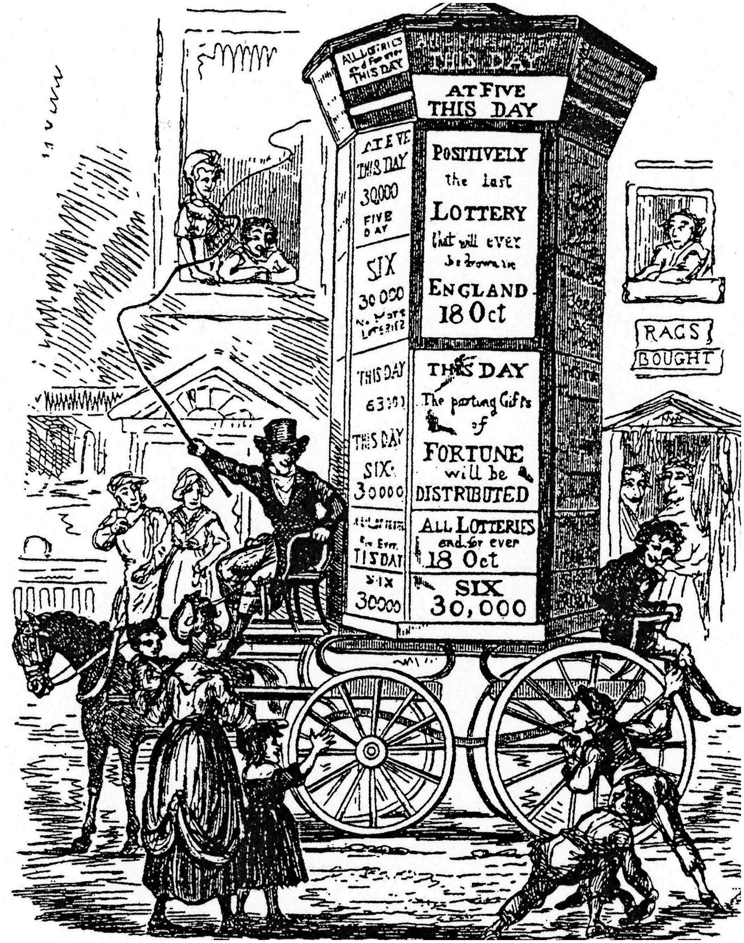
Surrey Theatre bill-posting, advertising The Elephant of Siam and the Fire Fiend (1824). Source: Author's collection. A Harris column advertising the lottery. Wood engraving from William Hone, The Every Day Book (1825–26).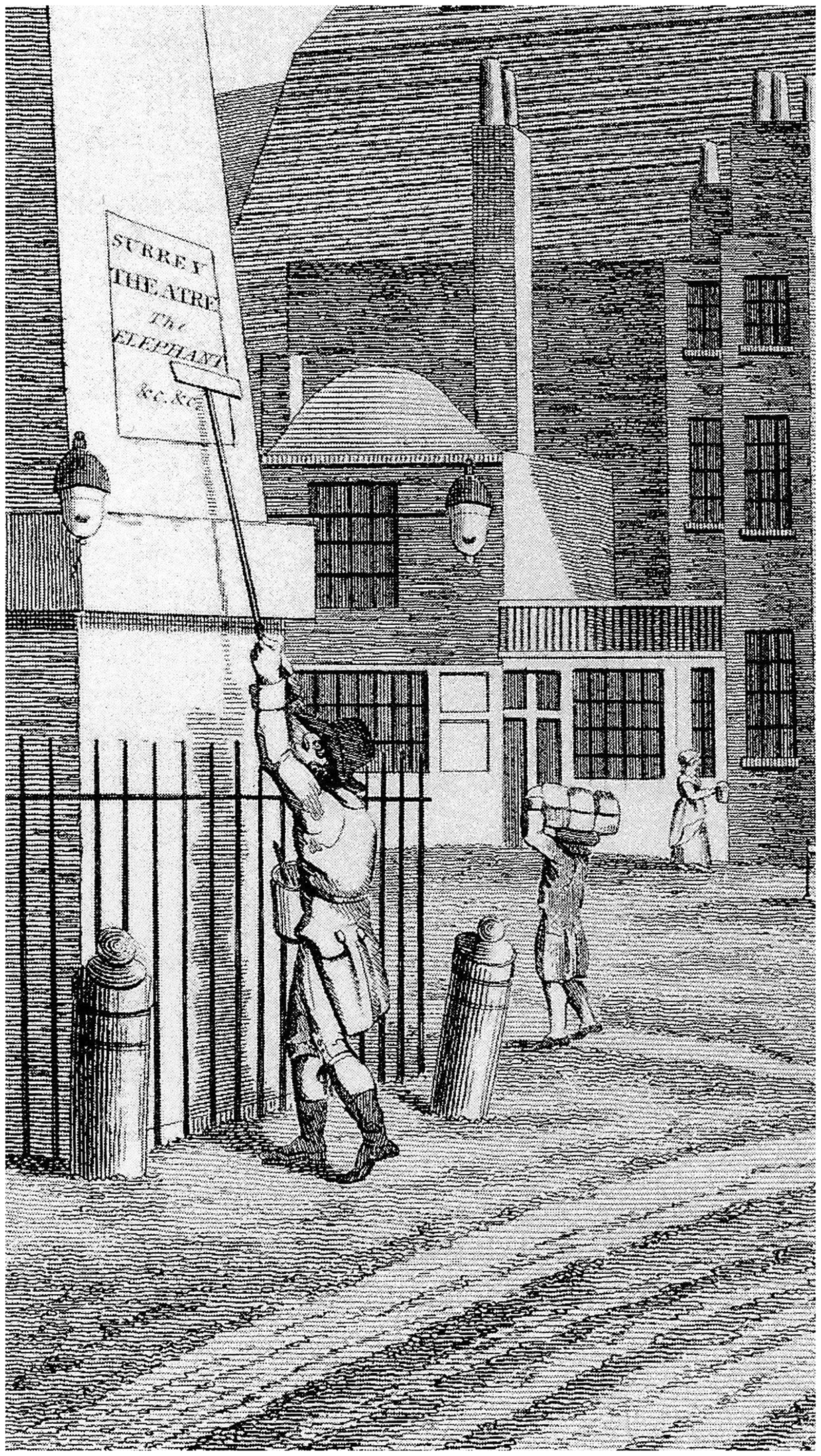
The bill-poster and his work were, by the nineteenth century, familiar features of urban life, his activity a form of street theatre. A children's picture book revealed that The Billsticker, with brush and paste, Always appears to be in haste.
27
the hurrying workers who will not give a second glance to an Oriental garbed in dazzling gorgeousness, or even to a dime-museum off duty, will stop at the sight of a sign-painter, and, putting all business or occupation aside, will gaze on him in seemingly helpless fascination.…
28
In a society in which recycling was a necessity of life, bill-posting also gave rise to ancillary trades. In France there were décolleurs d'affiches who would rip off placards or handbills and sell their spoils to paper manufacturers. 31 The melodrama Les bohémiens de Paris by D'Ennery and Grangé (1843) opens with an urban vignette, featuring, along with a safety-chain seller, a bootblack and a cane vendor, an afficheur. After he posts an advertisement for a pawnshop, another character comes along and pastes the address of his own business over that on the poster, thus saving the expense of printing and distributing. 32
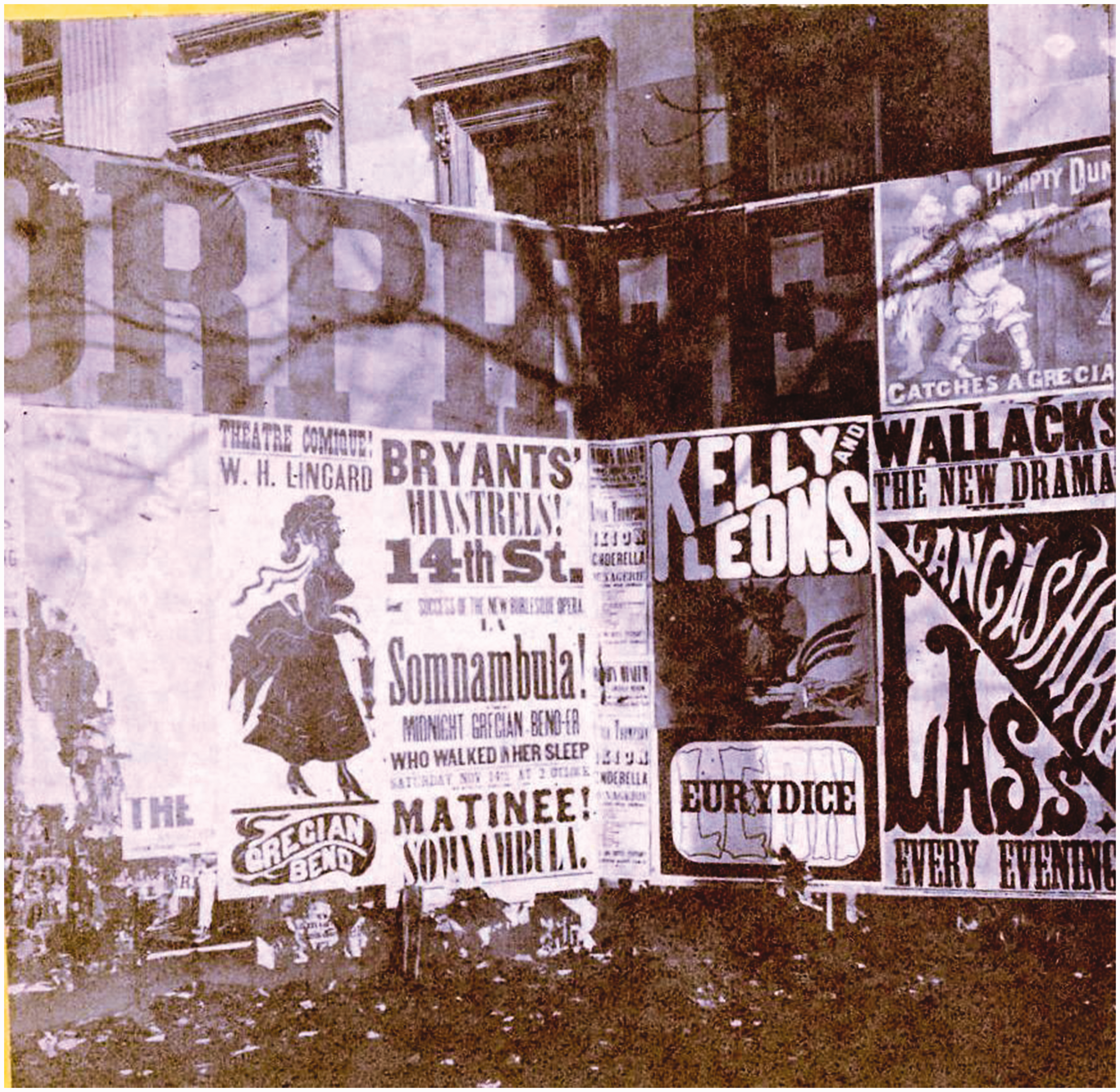
During the 1830s and 1840s, ‘external paper-hanging’ became epidemic. John Orlando Parry's well-known painting A London Street Scene (1835) reveals a palimpsest of fences and buildings overburdened by contending and overlapping messages and images (Figure 4). Their ephemerality is contrasted with the permanence of the dome of St Paul's. In his cyclopedic survey of London (1843), Charles Knight provided a prose equivalent of Parry's painting, singling out the playbills for special comment. There are coloured specimens of typography, in juxtaposition with which the puny letters of our pages would be like a snug citizen's box placed beside the pyramids of Egypt. There are rainbow-hued placards, vying in gorgeous extravagance of colour with Turner's last new picture. […] Lastly, there are Bills o' the Play, lettered and hieroglyphical, and it is hard to say which is the most enticing […] a Domestic Tale, in the shape of one man shooting another on the quarter-deck of a vessel in flames, off the coast of Van Diemen's Land, with emigrants and convicts of all shapes and sizes crowded on the shore; or the grand fight between grenadiers and Jacobite conspirators, in the Miser's Daughter; or Jack Ketch, caught on his own scaffold; or a view of the tremendous Khyber Pass, as it may be seen nightly at the Queen's Theatre, with Lady Sale at the top of it brandishing a pistol in either hand, beneath the cocked and levelled terrors of which a row of turbaned orientals kneel on either side of the heroine.
33
John Orlando Parry, A London Street Scene, 1835. Water-colour. Source: Sir Alfred Dunhill Collection.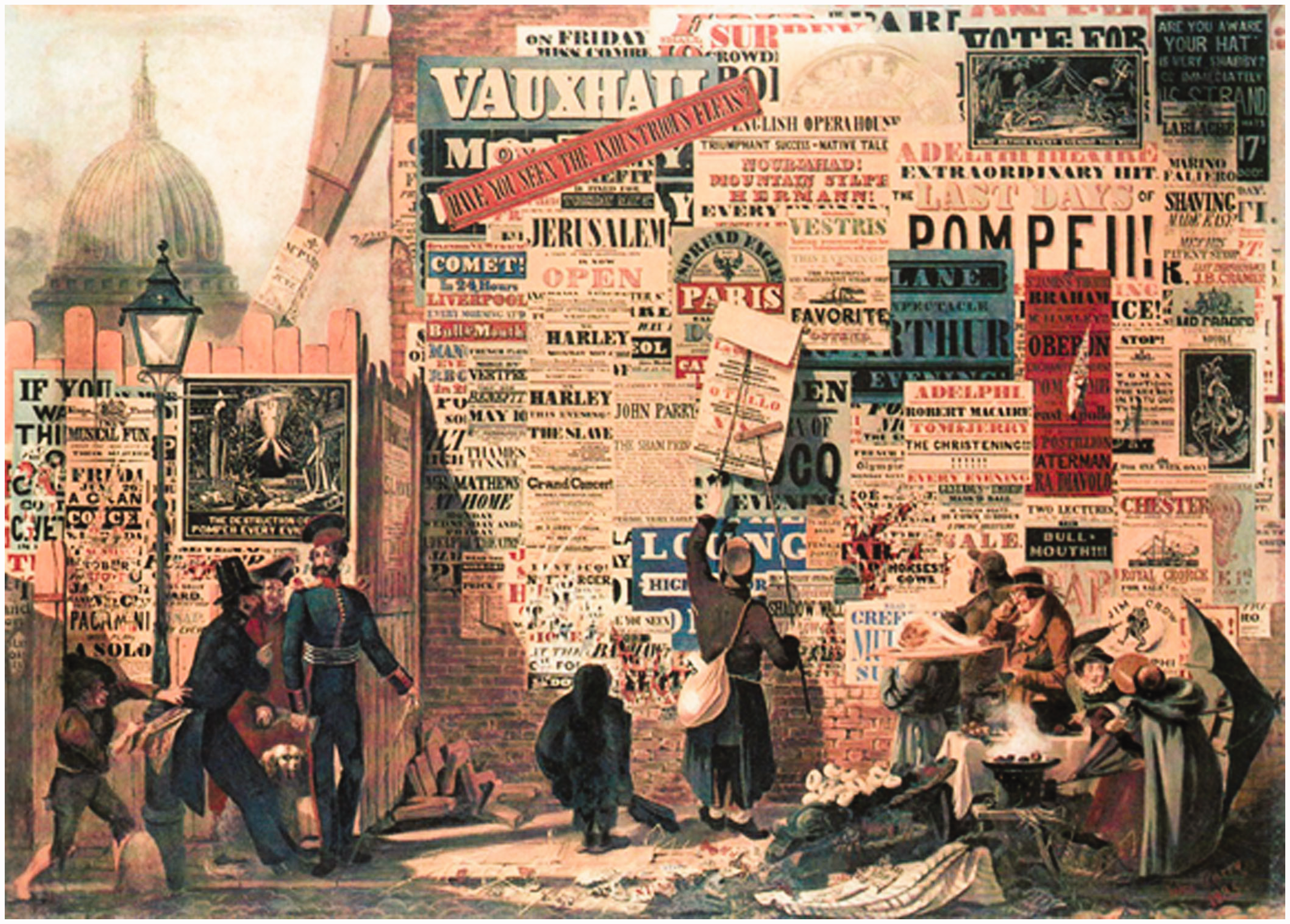
Enter Lithography
Knight's description suggests that playbills were strikingly pictorial, but this is a late development. Before 1820 one English bill in a thousand might be illustrated, and that was usually an advertisement for a circus; there were hardly more than ten illustrated posters in a thousand between 1820 and 1830, and twenty or more in a thousand between 1830 and 1850. 34 A reporter for the New York Herald, John Tryon (d. 1876), is credited with composing the first illustrated show bills in the United States, a single sheet printed in black ink, when he ran a job printing office. 35
All this changed spectacularly with Aloys Senefelder's invention of lithographic printing. Single-stone lithography coloured by hand appeared in North America as early as 1819, 36 and what began as a medium for artists soon underwent commercial exploitation. This is a cross-over typical of nineteenth-century American culture: an innovation or discovery intended for aesthetic or altruistic ends is almost immediately co-opted for mercantile purposes; in the process it becomes perfected and more widely available. One of the standard histories of the medium makes it explicit: ‘There was not a single chromolithographer of any significance who did not earn part of his income from creating or printing lithographic advertisements.’ 37
Only in America did lithographic advertisement flourish so profusely. The coloured French posters that covered Parisian walls between 1840 and 1860 were still wood engravings using wallpaper techniques and employed chiefly by fancy goods shops. In Great Britain, the most common use of lithography was for illustrated music covers, which displaced engraved titles by the 1840s and anticipated continental practice by some years (it didn't become usual in Spain, for instance, until the late 1880s). 38 In Russia theatres in Moscow and St Petersburg were government monopolies from 1854 until 1881, and posters remained a monopoly of the Imperial Theatres Printing House even after that. They were strictly letter-press, and those in the provinces, often hand-written, were even more Spartan in format, only gradually allowing typographical variations. 39
The first glimmerings of an American entertainment industry can be discerned in the avidity with which the circus and the theatre seized upon new technologies of publicity, but British managements showed less enthusiasm. Not until 1863 did William Smith, manager of the New Adelphi Theatre, publish a book entitled Advertise: How? When? Where? and that was in emulation of Barnum. The application of chromolithography to British theatrical advertising was slow to be adopted. It was considered to be no good for poster work meant for hoardings unless the bills were small; the American method of combining several small sheets to create one large one was relatively unknown. Benjamin Webster, an earlier manager of the Adelphi, introduced coloured posters produced by woodblocks around 1848, but they and their imitations were so garish that protests appeared in the newspapers. (Owing to their cheapness, woodblock continued to be used for circus posters as late as the 1970s, when they were converted to offset printing methods. 40 ) Around the time of Smith's book chromolithographed posters were introduced by the American actor E. A. Sothern. Dion Boucicault and J. L. Toole took to them, 41 but even then the prominent firm of David Allen & Sons did not adopt them until 1877, at first for pantomimes (pantomime posters had a reputation for being lurid). 42 The work was done on transfer paper, and the posters were not drawn directly on the stone until 1884, an innovation, it should be noted, introduced by a worker returning from the Strobridge Company in America. 43
A major obstacle to this innovation in England was, according to the brothers Pennell, a snobbish art establishment which objected to ‘the greasy daubs of lithography’. 44 Antipathetic to any form of industrial reproduction, John Ruskin warned those who would be artists to allow no work of lithography to cross their thresholds. 45 Chromolithography was condemned by such arbiters of taste as Edwin L. Godkin, editor of The Nation, as a pernicious device for democratising art, lending pseudo-connoisseurship to hoi polloi and thus diluting culture. In the U.S., ‘chromo’ became a byword for anything out of date or in poor taste. 46 Consequently, coloured lithography in the United Kingdom was long limited to programme covers and performance souvenirs. The last two items were, of course, available to audiences only after they were already in the playhouse.
From the outset, American printing introduced innovations, and the foremost innovations were directly connected with theatrical advertisement. Jonas Booth, the first printer to specialise in show work, was also the first owner of a steam-powered press in North America, using composition rollers for inking type. Similarly, the first lithographed title page on sheet music in the United States was the work of a failed actor. David Claypoole Johnston, once on stage in Philadelphia and Boston, turned to engraving in 1825; he came to be known as the American Cruikshank. Johnston was soon joined by dozens of lithographers turning out large quantities of topographical, portrait and caricature prints, in addition to song sheets, parlour decorations and, not least, advertisements. 47
By 1854, New York had as many as sixty lithographic firms. Cities throughout the Midwest, such as Cincinnati, home to the giant United States Printing & Lithograph Company, became bustling centres of activity. Iron printing presses made possible larger typefaces and new letter forms. ‘Display’ faces such as the ‘fat face’ – what we now call ‘circus type’ – were meant specifically for posters. 48 Although the first chromolithograph produced in America was made in 1840 by an English migrant William Sharp, its growth was promoted by the influx of German immigrants, particularly after the political upheavals of 1848; they included skilled and industrious artisans who could keep Senefelder's traditions alive while working on the cheap.
In France, colour lithography was so exclusively identified as an American technique that around 1880 French circus posters, the first to deploy a complex visual system for a socially mixed audience, were printed by a prolific firm known significantly as Affiches américaines Charles Lévy. 49 Colour printing of posters came late to Germany and again as an American innovation: in 1869 Ernst Litfaß printed for the Zirkus Renz a hundred copies of a polychrome poster for a guest tour of the Siamese twins Chang and Eng, the letterpress translated from English. 50
In the United States, the spread of lithographed theatrical advertising accompanied both the decline of resident stock companies and the rising exploitation of the theatre as a serious commercial speculation. In the early 1870s, the combination system, the practice of moving large theatrical companies and their stage paraphernalia from city to city in their entirety, came into vogue. These combinations proliferated throughout the 1880s and 1890s, since they offered opportunities for minor actors to star and for enterprising promoters to capitalise on loosely knit variety shows. Their scores were a farrago of pre-existing hits that might have a brief moment on the New York stage, but could enjoy a long and successful run in the provinces. 51 ‘Every “team” that had a specialty act of fifteen minutes duration wanted a play built to fit it and went around telling friends that they guessed they’d go starring next season.’ 52
The combination system led to the birth of the theatrical advance agent, whose job it was to prowl the town searching for the most favourable spots for advertisement, securing privileges from contractors of buildings under construction, transporting his billboards and posting team, and setting them up over Saturday night, so that churchgoers might see them on their way to their devotions. He also had to compute how much billing paper was required and in what variety, and have it shipped. Over time, theatres acquired their own specific locations, built their own billboards and turned the posting over to companies that made this a specialty. 53
The slapdash coverage of the Snevelicci playbill would be ineffectual as cities became conurbations and railways could bring larger productions with elaborate scenery and costumes across a wide expanse of country. To herald one's arrival, more reliable and dynamic advertising was required. The success of a travelling show depended so closely on the splendour and ostentation of its advance publicity that printing became one of the largest items of expense in what was now known as the show business. A ‘teaser campaign’ for an ordinary theatrical performance, would lead with a large-sized poster, plus two smaller ones providing more information, followed by a couple of three sheets pasted in front of the hall where the performance was to take place. By the 1860s, affluent theatres blazoned small lithographed posters and hanging cards, but now the six-sheet poster, 90 × 40 in., was common, whereas half a century earlier the standard size had been 12 × 8 in. 54
Only the larger circuses could afford to carry a sizeable inventory of coloured three-sheets, and among them lithography was big business. Since the Puritan tradition had left small towns devoid of colour or imagery, the arrival of the circus ‘with paste-pots and brushes and ladders and ponderous burdens of huge sheets of paper laid in thick folds like cloth’ fascinated country boys as they watched bill-stickers ‘with an almost superhuman speed transform old Squire Calkins's long board-fence into an orgy in the primary colours.…’
55
(Figure 5).
A placarded fence in Christchurch, New Zealand, 1866. Source: Courtesy of Chris Brickell, University of Otago.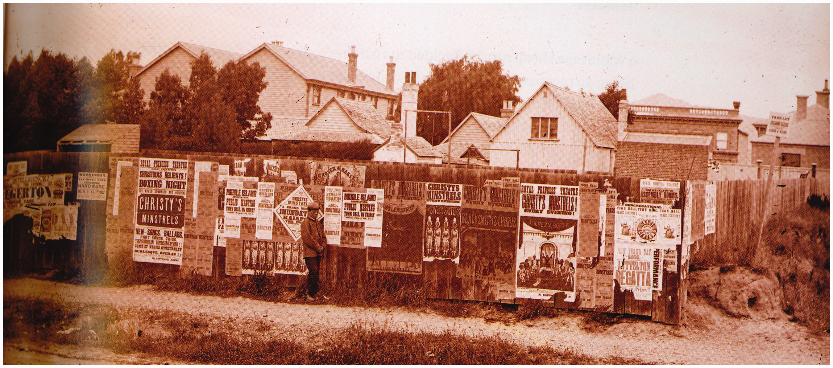
By 1875, eighteen lithographers visited U.S. towns in advance of circuses. 56 The showiest show paper took the firmest hold on the public imagination, and particolored broadsides quickly replaced the more staid and dignified announcement bills, in stage parlance, ‘flooding the town with dodgers’. (A ‘dodger’ is U.S. slang for a small poster or handbill.) One old hand recounts that a certain circus manager was successful precisely because ‘his outdoor advertising in every variety was something stupendous … The paper was all lithographed, every sheet of it, and the window work was simply out of sight.’ 57 Frank Kelsh of L. B. Lent's New York circus had a coloured three-sheet prepared for each performer, who was also heralded by a lithographic portrait in black. These latter were to suggest legitimacy like ‘hall shows’ and reassured merchants who wanted nothing ‘circus’ in their windows. 58
Few legitimate shows, however, could, ‘bill it like a circus’. A leading manager such as M. B. Leavitt, who had six to eight shows on tour at any given time, disbursed no less than $60,000 a year for job-printing and bill-posting.
59
In 1885, a theatre in a Midwestern town of 35,000 inhabitants, with a bill that changed almost every night, spent $15 a week on bill-posting, compared to $28.50 on newspaper advertising
60
(Figure 6).
A bill to George S. Gibson, bill-poster from the Old Colony Railroad Co., 1 September 1884, for transporting posters and ‘dodgers’. Source: Author's collection.
By 1905 the annual cost of bill-posting for a New York theatre ran from $100 to $200 a week, or $4000 to $5000 a season. 61 In England a city like Manchester or Birmingham might require an outlay of £35 per week or nearly £2000 for the whole tour. 62 Managers of more limited means had recourse to stock books with reproductions of scenes from the standard repertory; ready-made billboard paper bought from these sources could bear a streamer with names, dates and places pasted across it. 63
Cities became plastered with commercial messages (Figure 7). (The theatrical profession did not use billboards in the summer, though the circus did.) But this essentially public aspect of the poster was also one of its drawbacks, for, in addition to the vagaries of weather, it was subject to municipal ordinances restricting its display. In most municipalities, licenses had to be paid to the proper authorities, and in many smaller towns, bill-posting was a monopoly jealously maintained. New York City officials tried to relegate theatrical posters to a set of hoardings near City Hall Square, to no avail (Figure 8) and the frequent injunction to ‘Post No Bills’ was more honoured in the breach than in the observance. Renting out hoarding sites became a profitable practice, and in late Victorian London a billboard near a railway station might go for £1500 (£200–300 per annum was more common).
64
The practice of ‘sniping’, that is ‘calling attention to your theatrical wares by making use of ash barrels, old sewer pipes, anything, in fact that happens to lie in the street unguarded’, became common, and in the early 1890s led to Homeric battles in Manhattan between the bill-posters and Italian immigrant subway workers, armed with iron pipes, protecting the immaculosity of their pipelines.
65
Rag-pickers on Third Avenue, New York City, 1896. Photograph. Source: Alice Austen House, Staten Island, New York. Billboard near City Hall Plaza, New York, c. 1869. Half of a stereopticon slide. Source: Author's collection.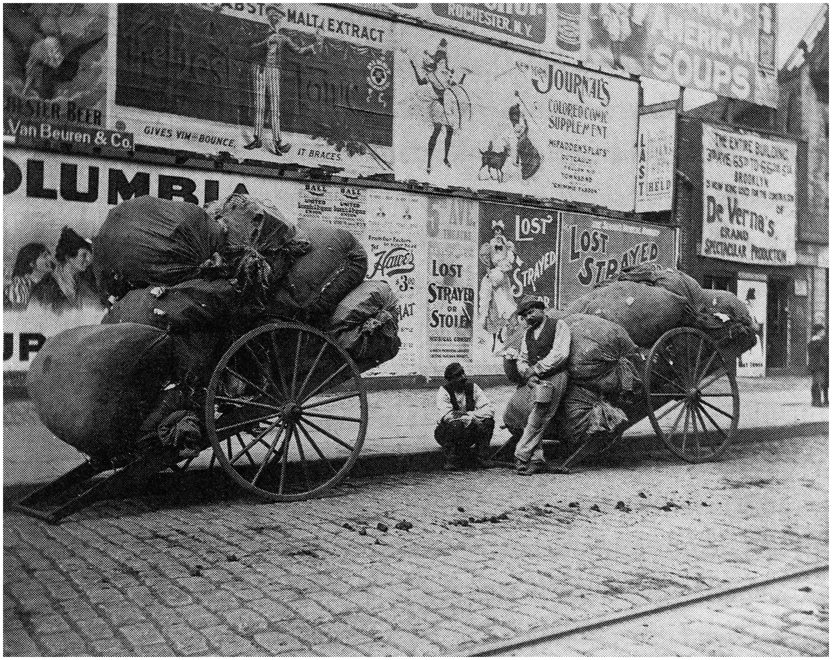
Bill-posting on the road could cover an American city with a population of four hundred thousand with eighteen to twenty thousand sheets; the bill-poster got three cents a sheet for posting and $1 per hundred for distributing lithographs, so ‘a theatrical attraction like Charles L. Davis is a bonanza to the bill-poster’
66
(Figure 9). Davis was so open-handed a customer that the C. W. Crane Theatrical Engraving Company bought advertising space in the professional trade journal the New York Clipper to announce that ‘MR. CHARLES L. DAVIS has given us an order of his engravings for the coming season, consisting of nine, twelve, eighteen and twenty-eight sheet cuts in five colours.’
67
This Maecenas of the paste pot was the richest American actor of the late nineteenth century, a pioneer of what were known respectfully as pastoral plays and sneeringly as ‘uncle’ plays. He built up a 45-minute variety sketch, the adventures of a farmer in predatory Manhattan, into Alvin Joslin, and made so much money on this single piece that in 1890 he built the Alvin Theatre in New York, reputed to be America's best appointed playhouse, especially in the matter of the dressing rooms.
68
A lithographed trade card showing ‘Alvin Joslin’ inspecting a portrait of his creator Charles L. Davis. Source: Author's collection.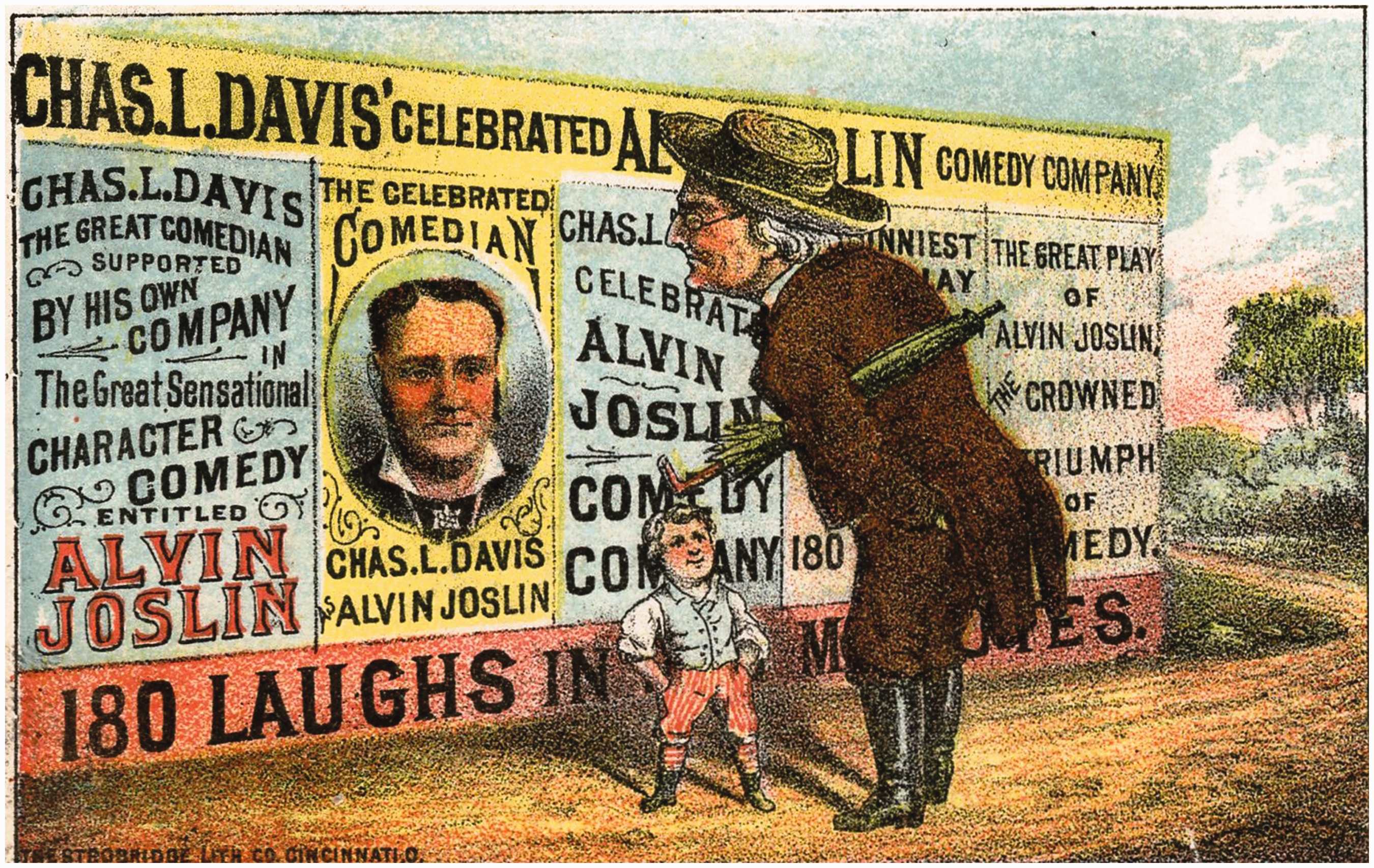
Columns and Kiosks
Civic legislation attempted, without much success, to curb unregulated bill-posting. As early as 1581 the Lord Mayor of London had enjoined citizens from fixing ‘anye papers or breifes uon anye postes, houses, or other places … for the shewe … of anye playes’. 69 In London, the Metropolitan Paving Acts of 1817 and 1839 licensed hoardings and monitored bill-posters, while outlawing direct writing on walls and bill-sticking without the permission of a building's owner. In 1862 the United Kingdom Bill-Posters Association was founded, ensuring police protection for licensed hoardings. 70 In Vienna official billboards were erected, but failed to prevent what was known as ‘wild’ bill-sticking. 71
In addition to problems of illegibility and ephemerality, traditional posting was unhygienic (Figure 10). From the dawn of history, walls were the sites of public urination and defecation. In pre-modern England there were ‘pissing posts’, set up to encourage a directed flow, where bills could be stuck. Men were expected to read them as they relieved themselves
72
(Figure 11).
‘Picture of Human Laws’. This French engraving shows a sign-painter admiring and contradicting his work, which reads ‘No Depositing Refuse Here under Penalty of a Fine’. Source: Author's collection. ‘Modesty Alarmed’, a French caricature c. 1820. One of the posters advertises ‘Odorless Portable Pits’. Source: Author's collection.
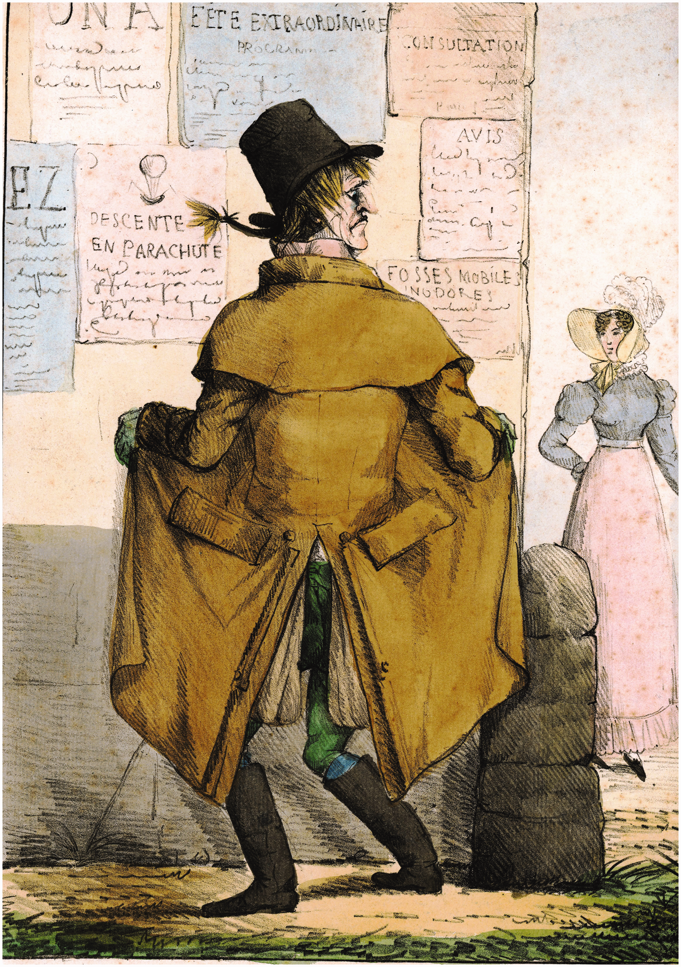
Therefore, in order to read a posted bill close up, one had to imperil one's shoes and offend one's nose. In Paris the bornes (bollards) where garbage was dumped also put the pedestrian in jeopardy. At the time of the Revolution Mercier had warned, It is not prudent to read a poster, high or low, at the corner of a borne: it is a bait which has its peril. More than one reader is obliged to interrupt his reading precipitously and to run away in the middle of an informative sentence; which destroys the reflection owed to any reading, even that of bills. One sometimes thinks oneself in safety behind a borne. There, one seems to brave the danger and read in peace; but most bornes have been hollowed-out by the little depression on top. While you are being informed stuff passes through the hollow formed, and you carry away the muck on your leg.
73
The first privately organised attempt to reform both uncontrolled bill-posting and unsanitary conditions was made by the Berlin bookseller and publisher Ernst Litfaß.
75
In Paris the biggest posters were those of the conjurer Henri Robin with letters 5 ft high, but Litfaß outdid him. For an 1849 Berlin trade fair he mounted a poster of dimensions over 6 m × 9 m, a Gigantenzettel hung between two carpets in Kroll's emporium, with Litfaß in huge letters.
76
Litfaß's most profitable customer was the circus manager Ernst Renz, and in 1854 the two men visited Paris together. In their new role as flâneurs, they were awestruck by French boldness in advertising. As we walked along the Boulevard du Temple one afternoon, I noticed at its end even from a distance a building on a diagonal, from whose steep roof something white was shimmering at us, which we soon recognized as a logo of the magician Bosco written in gigantic letters on the roof itself. It is hardly possible to devise a more powerful and effective poster, but a giant city needs such giant advertisements. In general the lever of the poster is used by a commercial Parisian in a way whose audacity we Berliners lack. In the evening Bosco has illuminated with gas lights the whole frontage of the building in which he gives his performances, so that a blinding torrent of light cut a swath and like a luminous magic miracle announced the master's art which held sway inside the building.
77
It was Renz who suggested to Litfaß the concept of advertising columns and invested 24,000 marks in the project.
78
The latter submitted a petition to the Berlin Chief of Police Carl Ludwig von Hinckeldey on 5 December 1854 for a concession to erect a hundred advertising columns on state-owned land, with thirty of them serving as urinals and fifty as public water taps; official notices would be posted for free, but a fee would be charged for private advertisers (Figure 12). No other posting would be legal, and the monopoly would pass to the municipal authorities in 1880.
‘Berlin's New Advertising Columns’, showing their alternative uses as a ‘Pissoir’ and a ‘Covering for a Fountain’. Lithograph by F. G. Nordmann, showing the first Litfaß column, erected in Münzstraße, Berlin, 15 April 1855. Source: Reproduced in Wilfried E. Schoeller, Ernst Litfaß der Reklamekönig (Frankfurt am Main, 2005).
The timing was perfect, and the proposal was particularly relevant in Prussia. After the labour uprisings of 1848, there was a desire for social control, particularly in the burgeoning cities. A swelling populace, the enormous growth of the work force in heavy industry, new mercantile enterprises meant that a vast mass of humanity, various in its ways of life, had to be brought under control by civic institutions. There was a push to organise the everyday routine along precise and punctilious lines. Between 1845 and 1855 Berlin had seen the creation of the Landwehrkanal, five omnibus lines, rail lines to Hamburg and Dresden, street lighting, telegraphs, the first public library, industry and trade organisations, professional fire-fighting and street-cleaning, and a waterworks for safe drinking water. At the same time, the city, like London and Paris, stank and means were sought to ameliorate the problem.
79
Because, concurrent with a boom in the production of handbills and posters, anti-government flyers had proliferated in Berlin during the 1848 uprisings put down by the police, unauthorised bill-posting had been banned the following year (Figure 13). The control of communication represented by the Litfaß column was a less brutal means of censorship: while purporting to be democratic, offering a platform to anyone willing to pay the fee, it carefully influenced opinion. Public expression and legal control went arm in arm. It was also a surreptitious means of taxing opinion, creating a very modern paradox.
‘Does he want to advertise conspiracies?!’ The policeman is arresting a bill-sticker for posting an announcement of Schiller's play The Conspicacy of Fiesco in Genoa. Düsseldorf caricature, c. 1848. Source: Author's collection.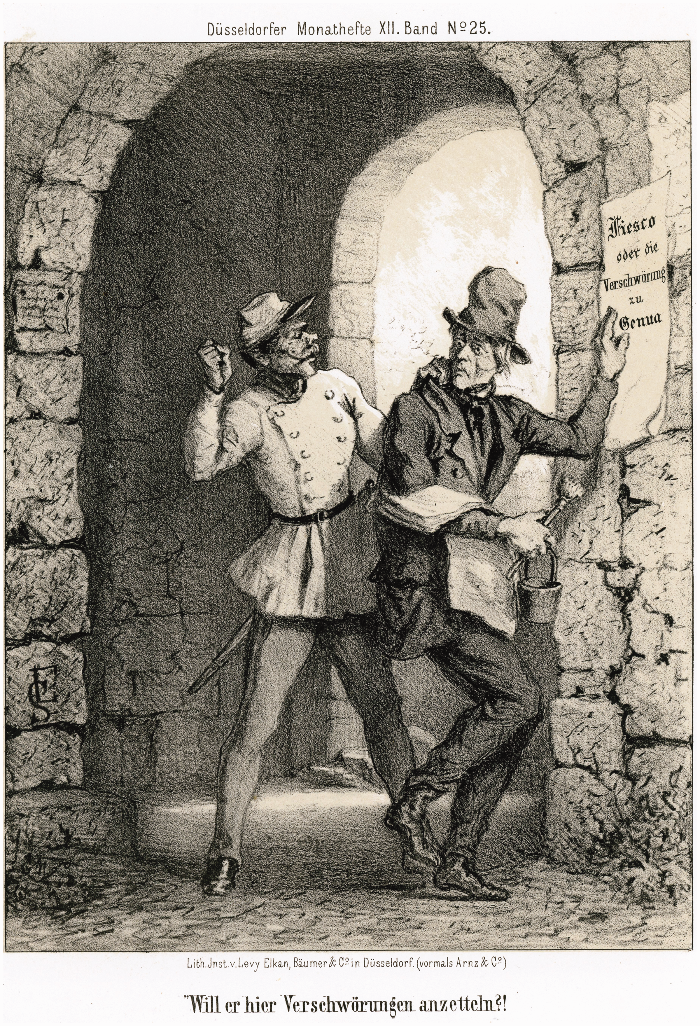
On 1 July 1855 the first Litfaß column in Berlin was inaugurated with music and festivities. They were painted a uniform green and composed, not of wood or cast iron, but of the lighter, more portable sheet iron, another modern touch. Overnight police and volunteers had torn down all vestiges of bills and placards from walls, fences and trees. The police determined the new poster format, available in quarto, folio, double folio and other sizes. The fee for a hundred quarto posters was five silver groschen; a daily summer posting of twelve to fifteen items per column could earn the concessionaire an annual gross income of two to three and a half thousand thalers. Litfaß became a rich man, and by the time of his death in 1874 his columns were familiar street furniture throughout Germany (Figure 14). Grimm's German dictionary of 1854 had already defined Werbebild (pictorial advertisement) as ‘modern: a poster on the Litfaß column’.
80
By the time of Walter Ruttmann's film of 1927, Berlin Symphonie einer Großstadt, the ‘Fat Ladies’, as they were nicknamed, had become permanent features of public life, consulted like the morning newspaper.
A Litfaß column in the Alte Waage [Old Scales] section of Braunschweig, showing the glaring contrast between its modernity and the medieval town. Source: Author's collection.
Litfaß had been pre-empted in some degree. A revolving octagonal poster column, lit from within, had been patented by George Samuel Harris in London in 1824. It was portable, and, owing to the transparency, the message could be read even in foggy or rainy weather.
81
It advertised lotteries exclusively, and when they were suppressed in 1853, so were the Harris columns. A similar ‘transparent’ was inaugurated by Harel, the manager of the Paris Ambigu for the benefit performance of Le juif errant.
82
So-called Moorish columns had been installed in Paris in 1839, wooden panels attached to urinals. Under Napoleon III in 1854 this was improved by screening the interior and lighting it within by gas; but even a later replacement of masonry by cast iron failed to silence objections to the nuisance.
83
Count Baciochi, general superintendent of theatre, set up a competition to come up with a new structure devoted exclusively to advertisement. The winners of the competition, Richard Morris and his son Richard Gabriel, were printers and promoters of Parisian entertainment. Inspired by Litfaß, they proposed ‘advertising columns’, topped with a green cast iron ornamental dome to protect the posters from the rain; the interior was to store bill-posting and street-cleaning equipment. Some of these columns also served as newspaper kiosks,
84
thus communicating information in two formats. Baron Haussmann awarded Morris père et fils the monopoly for the next decade, provided they (Figure 15) cover the costs of building the columns and posting the advertisements. By 1898 there were 225 Morris columns in Paris, yielding the city 100,000 gold francs a year in revenue.
85
Similar structures cropped up in cities from Geneva to San Francisco.
The Morris column in Square Louvois, Paris, c. 1900. Postcard, B. F., Paris. Source: Author's collection.
The modernity of the advertising column was manifest in more than its paradoxical amalgam of social control and demotic messaging. Its circularity and its permanence altered pedestrian movement. Baudelaire had praised the flâneur, strolling the modern city as fancy took him. He might easily glance at a wall poster and then move on. The column entices him to stop a while, walk around a fixed point and enter into discussion with others (Figure 16). Traffic patterns are altered and individual mobility is subsumed into a social and civic habit. Journalists portrayed the columns as symbols of a happy life: round, colourful, extroverted. They were praised as municipal picture books, albums, illustrated newspapers, the modern equivalent of Comenius's Orbis pictus or rather an Orbis cleister, a pasted world in which potentially everything can be pictured, verbalised or commercialised. The problem with this rosy view is demonstrated by a cartoon of Heinrich Zille of 1924, in which a group of urchins and streetwalkers misinterpret an advertisement for Handel's Samson as that for a prize fight.
86
A Morris column in postwar Paris. The plays advertised signal this as 1955. Magazine photograph. Source: Author's collection.
The columns’ rotundity allied them to other optical devices, the diorama, the laterna magica, and especially the panorama. As Walter Benjamin noted in his Passagen work, ‘the Panopticon [Panorama] is a manifestation of the Gesamtkunstwerk … Pan-Optikon: not only does one see everything; one sees it from all sides’. 87 The column does not present a visual absolute; one has to see it in the round, an element that has caused it to be compared to Ibsen's modern man Peer Gynt: throughout his life, he takes the advice of the Boyg to ‘go round about’. Like the onion he peels to its empty core, the layers of paper on the advertising column offer a sense of the transient, the ephemeral.
Baudelaire had declared ‘variety’ to be the material and ideal form of appearance, the sine qua non of modern life.
88
At first glance, the poster-plastered wall illustrates this principle of simultaneity. Its display is literally a collage, whose elements have nothing to say to one another. The contradictions of an advertisement for liver pills next to one for a minstrel show, or of the fight for attention between disparate formats and messages, creates a crazy quilt (Figure 17). One English commentator observed of the conjurer Anderson that The great Wizard of the North may be seen in red and blue posters, in company with my Lord Bishop of Exeter, or stuck up alongside of the flaming announcement of a Love Feast, or a Missionary Meeting for the conversion of the Kaffirs, or the Crowfeet Indians. We have seen D. P. Miller [of the Adelphi Theatre, Glasgow] quietly covering a Noble Lord.
A side of the Alhambra Theatre, Leicester Square, London, 1899. Source: Aerofilms of Boreham Wood.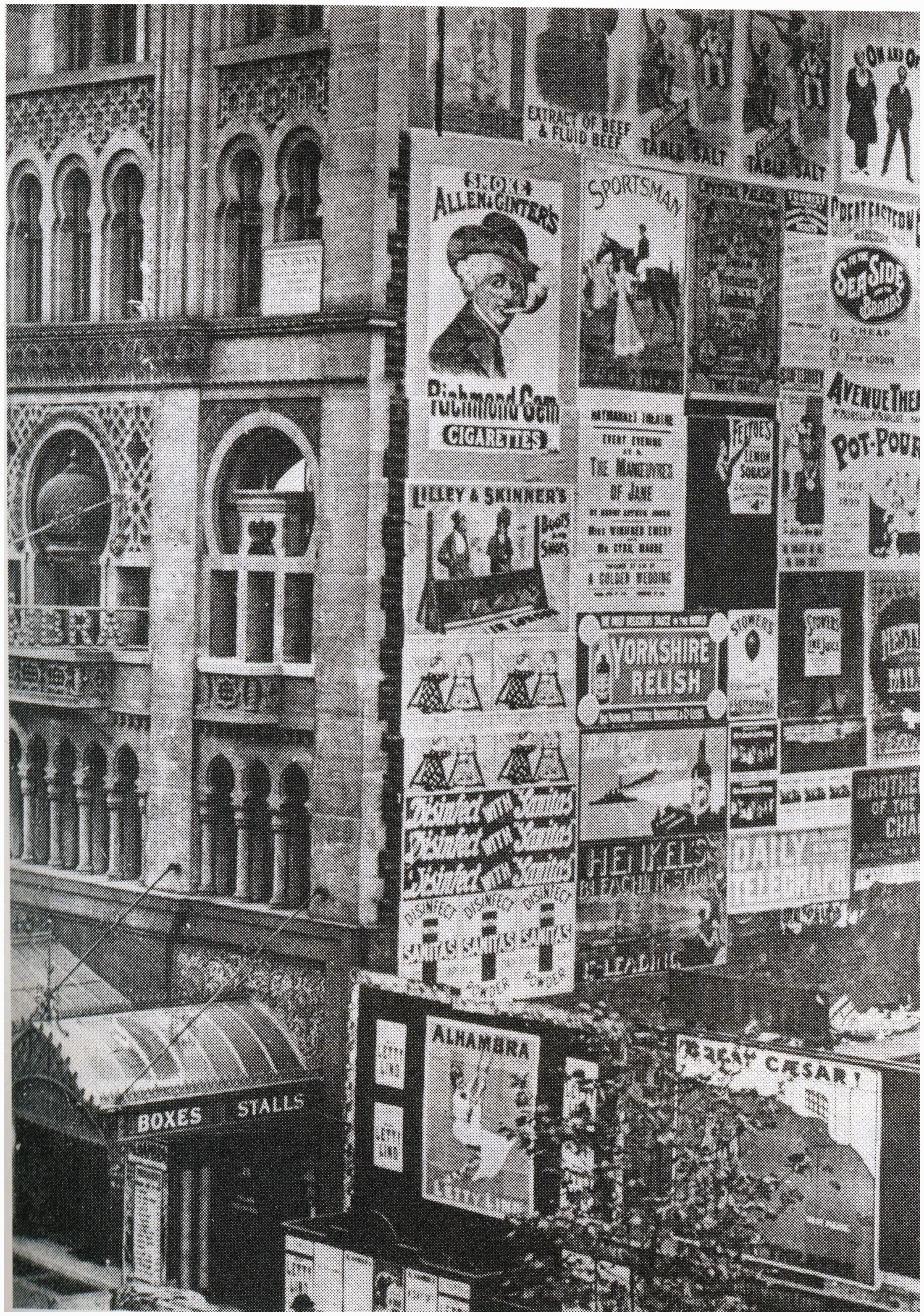
The advertising column attempted to cure this ‘skin disease of the cities’ 90 by regularising and standardising the patchwork of public utterance. It offered limitation by bringing together in the public space what had hitherto been widely and promiscuously distributed. The miscellany remained, but, moderated by concentration at a single point, it lost its encyclopaedic aspect. 91 A major difference between the Litfaßsäule and the Morris column was that the latter was dedicated exclusively to advertising theatrical, circus, musical and, eventually, cinema performances.
Finally, the advertising column intensified the primary function of the poster, to provide information. As cities grew into conurbations with a multifarious populace of residents and visitors, the need for shared knowledge became urgent. If the individual was to navigate among strangers, recognisable landmarks were required. The topographical frequency of the advertising column provided what the music-hall historian Peter Bailey calls ‘knowingness’, a circuit of meaning travelling among a public or audience, allowing it a common fund of understanding and a collective identity. 92 A shifting, disparate aggregate can thus become a community. Bailey suggests this is a key factor in the emergence of the modern. The call to be ‘up-to-date’ (a Victorian commercial coinage), au courant, abreast of the latest thing, was answered by the proximity of the advertising column. The information it purveyed might be superficial, but it enabled city dwellers the illusion of mastering the complexities of modern life.
The Outdoor Art Gallery
As urbanites enjoyed more leisure, newer forms of entertainment proliferated. Audiences were socially varied in their educations and backgrounds, particularly at circuses, variety performances and comic opera. By 1892 London had 550 places of amusement, which could accommodate a million people nightly, and theatre was its largest single employer. 93 In response the proliferation of posters became so prodigious that in the 1850s and 1860s people of taste wrote to the papers to complain. There was also resistance to the new advertising columns, not simply an instinctive hostility to the modern. They were attacked as garish and glaring, tasteless, impractical shrines to commercialism. Householders objected to having to them outside their front windows, although most columns were erected in non-residential areas. 94 Aestheticians objected to a reversal of values, in which the humdrum and the transient triumphed over the sublime and the eternal. The enlargement of urban space, dynamic movement by steam, the change of natural daylight rhythms, the rapid acceleration of all living conditions had forced art into the background. By the end of the century, one French commentator declared the poster ‘the epitome of instability: it breeds incessantly, keeps changing, and lacks substance’. 95
In Baron Haussmann's Paris, with its newly widened boulevards, there were complaints that the columns, along with trees and gas lamps, created a hedge, preventing pedestrians from seeing the street traffic. Outrage at the posters and the glass panes with their ‘insane colours, furious reds, hair-raising greens and yellows that make you run away’ led to a two-day war in June 1869, when ‘kioskoclasts’ attacked the columns with cudgels and iron bars
96
(Figure 18). Like the Eiffel tower, however, something once denigrated as a disfiguring eyesore would soon become a beloved emblem of Paris.
‘The Kiosk War. Anonymous Society of Friends of Friends of the Arts for the Extinction of Kiosks, Ltd. … We’d like to know if maybe the kiosks started it.’ Cartoon by Bertaut. Source: Author's collection.
In contrast to the conservatives who regarded a poster as ‘a blister which draws an audience’,
97
there were those, such as the playwright Ludovic Halévy, who declared, ‘The most beautiful landscape is a wall covered with posters.’
98
Between these two extremes fell the opinion that, even if art had to be subservient to commerce, posters might be improved and thereby improve the taste of the public. The painter Hubert Herkomer argued that the street might become an art gallery if established artists produced alluring pictorial advertisements directed at an enlightened public: The theatrical advertisements are intended to lure people into the best seats in the house. Now the hideousness and vulgarity of pictorial advertisements seem an insult to the understanding of our thinking and educated classes – an insult hurled at them from every spare wall, scaffolding and conveyance.
99
Frederick Walker's poster for The Woman in White, London, 1871. Source: Author's Collection.
Only one large-scale copy was made, with a couple of smaller versions, and the drawing was replicated on the programme cover. For a long time, however, no one in the English-speaking world sought to build on Walker's achievement. Isolated instances by Herkomer, Luke Fildes, H. S. Marks and Sir John Millais remained anomalies. Meanwhile, the association of the poster with sensation drama remained intimate. Collins himself wrote that sensation was a means ‘to stagger the public into attention’. 102 The creation of an effect expressed a materialistic view of aesthetics that allowed for the manipulation of a response. This applied to advertising as well as literature, art and theatre, thereby transforming the cultural marketplace. Martin Meisel views this appeal to the emotions and the emphasis on strong effects as a direct challenge to classical harmony. 103
It is ironic that the first attempt at an artistically designed poster was for a sensation drama, since the proliferation of sensation on the late nineteenth-century stage meant that its representation on posters would be less than subtle. As in modern movie trailers, the most lurid and gripping moments made frequent appearances, with climactic scenes of violence, disaster and characters in extremis thrust into the foreground (Figure 20). Moments of slapstick comedy or intense emotion were at a premium, with as much action as possible. The images and the letterpress on lithographed posters keyed up prospective audiences to receive intense sensation. Following the example of the circus, theatrical companies broadcast hyperbole with an open hand.
Advertising cut for a one-sheet poster for True to the Core, a play about the Armada by D. A. R. Slous (1866). From Specimens of Show Printing Being Facsimiles in Miniature of Posters Cuts (Philadelphia: J. H. Alexander, c. 1870). Source: Author's Collection.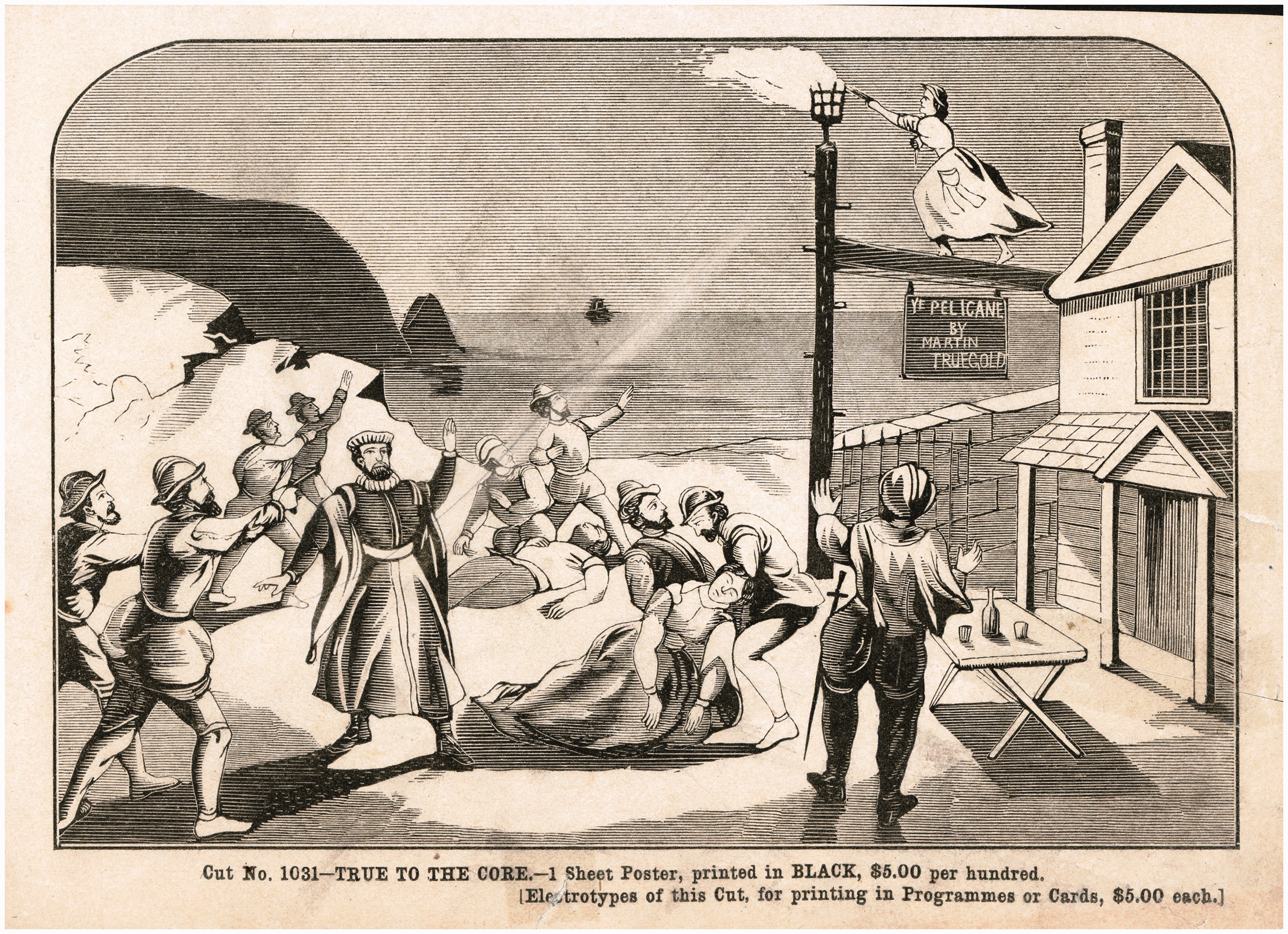
Posters promised ‘new and elegant scenery’ (The Creole), ‘wealth of magnificent scenery’ (Alone in London), ‘carloads of beautiful scenery’ (Lost in London), ‘mighty, massive, magnificent and picturesque scenic equipments’ (The Ensign).
104
Such puffery not only assured the spectators that money had been spent on their behalf but they also acted as invitations to armchair touring, the play serving as a travelogue. Alone in London offered views of the Houses of Parliament, Westminster Bridge and London by Gaslight, inter alia; Cheek offered Madison Square, New York, by electric light; The Ensign revealed ‘A view of Havana harbour by moonlight’, ‘The President's Library at the White House’ and ‘The spar deck of the frigate, San Jacinto’. ‘Realistic and startling effects’, (The Creole), i.e. new mechanical processes, were inserted into the plot. Among the Pines displayed ‘the old sawmill in actual operation’ (a trend following the success of the climactic rescue from the buzz-saw in Blue Jeans), while The Fire Patrol allured, not only with ‘a genuine fire-patrol wagon and horses’, but ‘a ponderous gold stamp mill and ore crusher and operator’. At its most hyperbolic, advertising suggested that the spectator would be transported to another dimension. Like the gaudy banners outside a sideshow tent, they promised the extraordinary and stimulated the imagination even of those who did not pay the price of admission (Figure 21).
Charles Dana Gibson, The Seed of Ambition, 1903. Magazine illustration. Source: Author's collection.
The difficulty of subjugating such advertisements to the demands of high art was the prevailing theory that primary colours such as red, blue and yellow fatigued the eye and had to be blended to provide rest and modulate white areas. 105 Yet advertising lithography rejoiced in ‘bright colours, mustard yellows, indigo blues, dazzling checks and the newly popular aniline-based mauves and magentas that literally seize the viewer's attention’. 106 The previously mentioned disdain for lithography as an artistic process delayed the refinement of the poster in England and North America. With the exceptions of Lester Wallack and Palmer & Abbey, actors and managers assumed that the general public would not accept anything but flashy, ill-executed wood-block prints; improvement was also resisted by conservative German-born lithographers, who preferred their products to look machine-made. 107 Little or nothing was done to encourage ingenious design, leading one American commentator to lament, ‘Our bill-boards are generally an unwieldy mass of letters interspersed with crude and thoughtlessly placed figures.’ 108 In such a climate, ambitious artists were loath to put their names on posters. The impresario Charles Cochran, visiting the U.S. as late as 1891, could be appalled by the lack of taste in design and colours on hoardings. Figures looked like tailors’ dummies and the backgrounds were taken from old German stereotyped photographic reproductions of scenes from plays. 109
The development of the art poster in Europe is a familiar theme: Chéret, Willette, Toulouse-Lautrec and so many others seized the opportunities afforded by advertising to publicise their own imaginings. Enterprising managers in the English-speaking world attempted to import the idea with limited success. Horace Sedger saw a handsome poster for the comic opera La Cigale et la Fourmi at the Paris Salon, and tried to import it for his production at the Lyric Theatre. The David Allen Company needed 32 stones, each measuring 60 × 40 in. and weighing half a ton, to accomplish the task. They decided photography was more useful. 110
Chéret designs appeared in New York in 1894 for a revival of The Black Crook, but in England artistic renderings of the female form, both artistic and workmanlike, often met with objections. In London, a Chéret-style chorus girl on the front seat of a tandem bike provoked angry letters, and in 1889 the Indecent Advertisement Act was passed. The following year the United Bill Posters Association condemned the display of daggers, pools of blood, beds and female breasts. The National Vigilance Association called for the repeal of the Westminster Aquarium's license because of a poster of the ‘suggestive’ gymnast Zaeo in flesh-coloured tights with her armpits in full view. 111
Such rear-guard actions were rarely effective. By the end of the nineteenth century, the pictorial poster, now an object of mass production, was ubiquitous. The haphazard pasting had been supplanted by integrated publicity campaigns.
112
From walls, shop windows, cloth banners and giant billboards it had moved to stationary columns, the sides, roofs and interiors of buses, and virtually every available surface, intruding into one's field of vision, creating a new form of landscape whose letters and images demanded attention and interpretation (Figure 22). Marius Vachon referred to ‘le salon de la rue’, commenting, ‘If the polychrome posters were suddenly to disappear, we would all have the sensation that something essential is missing in the daily life of Paris.…’
113
Atget, Rue de l'Abbaye, Saint-Germain-des-Près, 1898. Photograph. Source: Bibliothèque natinonale de France.
A tacit dialogue took place between the message and its recipient; within a brief space, both of time and place, the compelling imagery made a concentrated effect, not unlike a poem. The lurid images could become imprinted on the memory, enhancing, even substituting for the phenomenon advertised. Nicholas Daly points to Augustus Mulready's sentimental painting Remembering Joys That Have Passed Away (1873) (Figure 23) in which a ragged crossing-sweeper and a match girl in the snow admire a pantomime poster on a wall near Covent Garden. Its message seems to be that the marvels recalled by the advertisement offer them both the consolations of the imagination and the disappointments of unrealised desire. (In the background another poster brings us back to reality by saliently advertising The Streets of London. Last Night, Day by Day.)
114
Augustus Mulready, Remembering Joys That Have Passed Away, 1873, oil painting. Source: Guildhall Art Gallery, City of London.
The public discussion of the aesthetic proprieties of posters comprised more than a debate over popular versus high art. It concerned the suitability of art in a public space not intended for it. Commerce, ethics and aesthetics became inextricably entwined. When Roger Marx issued his five volumes of portfolios Les Maitres de l’affiche between 1896 and 1900, he echoed Courbet when he referred to the social, moral and artistic value of ‘mural chromolithographs’. ‘The picturesqueness of narrow alleys has been succeeded by the picturesqueness of broad, variegated modern thoroughfares; it is a scene which also has its beauty and of which the poster is the essential element.’
115
Unwittingly evoking Mulready's panto advert, Marx compared the poster-clad city to a transformation scene in a féerie, because its juxtaposition of different vignettes is equally ephemeral. This new art required strong arabesques and lines legible from a distance, brilliant colours that could stand up to daylight. The result would be a fortuitously created museum, by turns exquisite, vulgar, witty and absurd. Writing from Florence, even John Ruskin had to capitulate: the fresco-painting of the bill-sticker is likely, so far as I see, to become the principal Fine Art of Modern Europe: here, at all events, it is now the principal source of street effect. Giotto's time is past … but the bill-poster succeeds.
116
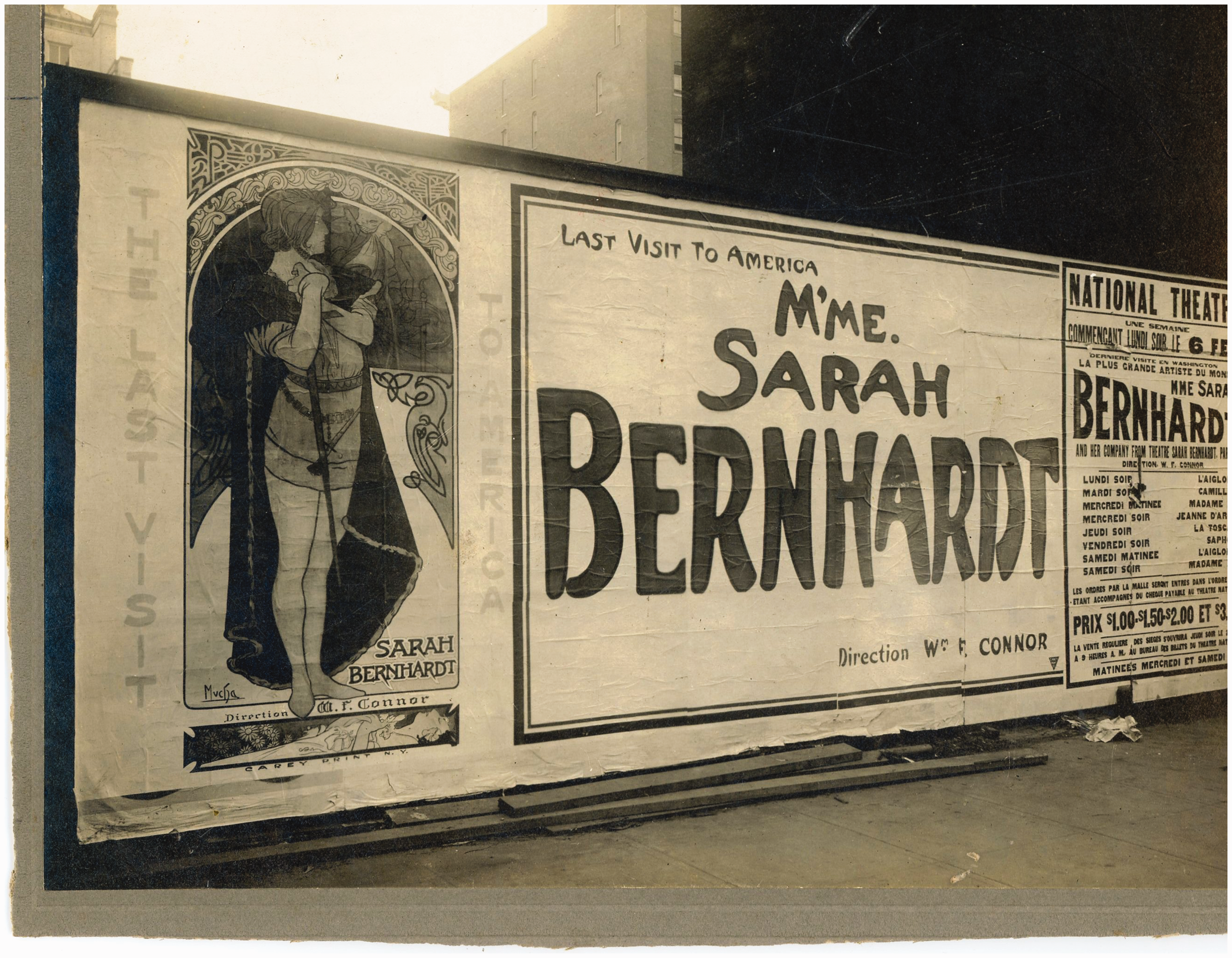
A poster for Sarah Bernhardt's farewell tour to North America, National Theatre, Montréal, 1917. Source: Author's collection.