
Abstract
The 2006 Lebanon War presented a rare opportunity to explore how the three major US news magazines visually covered a distant conflict in which the US was not directly involved. Time, Newsweek, and U.S. News & World Report faced the challenge of how to fairly report a conflict that was dominated by one side – Israel. A quantitative content analysis revealed that the military conflict and human interest frames dominated visual coverage of the seven-week war. By emphasizing the war’s negative impact on Lebanon and its people, the news magazines provided a largely American audience with a proportional visual representation of the conflict. Only 11 percent of the images showed the injured and dead, which is consistent with other war studies. This article discusses how the news magazines visually framed the war, why images of Hezbollah and protests were rarely seen, and why many casualty images included women and children.
Introduction
Most Americans have never traveled to the Middle East, let alone experienced a war there. Instead, newspaper and magazine articles serve as one of the main ways they learn about events in that often turbulent part of the world. The images that accompany these articles are particularly important because they help readers grasp the reality beyond the text they read. A young American mother finds casualty totals sad, but she aches when she sees the corpse of a Lebanese toddler. An Army veteran relates to the grim look of duty on an Israeli soldier’s face.
Visuals also help shape readers’ perceptions of the world. A study of Pulitzer Prize photos from 1942 to 2002 (Kim and Smith, 2005) revealed that the most dominant theme in the international category was warfare and coups. Readers are often left with the impression that the world beyond America’s borders is violent, chaotic, and hopeless. Overcoming this impression requires visual storytelling that authentically represents war and other conflicts, with a goal of promoting understanding. Journalists trying to achieve that authentic representation have relied on the traditional news value of balance, taking care to report all relevant viewpoints. But what if balance obscures rather than promotes understanding? Are journalists always beholden to report all sides of a story in equal measure? What role does proportionality play in their decisions?
The 2006 Lebanon War 1 presented a rare opportunity to explore these questions. The seven-week conflict began on 12 July 2006 when Hezbollah, a leading radical Islamic movement, kidnapped two Israeli soldiers and killed eight. Israel responded with air strikes and its first ground invasion of Lebanon since its 2000 pullout. This short but intense conflict severely damaged Lebanese infrastructure, displaced about 25 percent of the Lebanese population, and killed 1,200 Lebanese civilians, with nearly a third estimated to be women and children. Media coverage of war is always a challenge because of issues of access, censorship, and propaganda efforts by all sides, but this war presented a special challenge to the media – how to fairly report a conflict that was anything but balanced.
The role of proportionality in photojournalism – defined in this research as picturing two (or more) sides unequally so as to roughly reflect the relative effect of an event or conflict – is a topic ripe for study. A review of the literature did not reveal any research on the role of proportionality in journalism. This study strives to fill that gap by conducting the first analysis of visual coverage of the 2006 Lebanon War in the three major news magazines – Time, Newsweek, and U.S. News & World Report. Using quantitative content analysis, this study measures what frames were used to visually report the war, the proportion of coverage given to Israel and Lebanon, and how frequently images of the injured and dead appeared.
Literature review
The power of news images
Photographs command more attention than words alone. An article illustrated with an image seems more important and deserving of attention than one without a photograph (Domke et al., 2002). Images are processed more quickly than words alone because text requires a linear logic, while visuals elicit a spontaneous emotional response. Eye-tracking studies show that readers enter a newspaper via the headlines and visuals (Garcia and Stark, 1991), with photographs being the most common point of entry (Mendelson and Thorson, 2004). Images help readers make sense of the news (Fahmy, 2005b) even if they do not read the accompanying text (Peterson and Spratt, 2005).
Images enable viewers to retain more information than text alone (Brosius, 1993; Graber, 1990). Because images alone or text-and-image combinations are easier to recall than text-only stories, they can lead readers to favor one viewpoint or perspective over another (Zillmann et al., 1999). Fahmy (2005b), for example, found that when either the Arabic-language Al-Hayat or the English-language International Herald Tribune selected photos that humanized victims of a tragedy, the effect was to emphasize feelings of loss and guilt among readers. Conversely, to de-emphasize an issue, both newspapers selected photos that focused on material destruction and weaponry rather than victims.
Photography’s power to influence does not necessarily lead to a deeper understanding of the issues portrayed (Rosen, 2005). Griffin (2004) argued that most news photography reinforces existing ideas and stereotypes rather than revealing new information or perspectives. Griffin and Lee (1995) found that news magazine photos of the 1991 Gulf War reproduced traditional patterns of war imagery, similar to what Perlmutter (1992) identified in high school history textbooks: War imagery was mostly US centered and focused on military power and technology rather than battlefield images or the horrors of war. A study of the early weeks of the Iraq War revealed that print, broadcast, and online news images reflected a patriotic perspective – a pattern observed at the outset of previous conflicts from the Civil War to the Gulf War (Schwalbe et al., 2008).
Graphic imagery in war photographs
Despite technological advances and embedded journalists, modern war photography has shown the same relatively clean images devoid of combat, death, or destruction as those taken by British photographer Roger Fenton during the Crimean War, one of the first conflicts captured in photos. Since the Vietnam War, few published images have shown wounded or dead US troops (Keith et al., 2008; Ottosen, 1992; Trbic, 2006). The 1991 Gulf War was touted as a conflict that the public could witness firsthand via 24-hour cable news, but the absence of graphic imagery led Griffin and Lee (1995: 813) to label the war as ‘one of the most effectively censored and controlled media events in modern history’. During the Lebanon War, British newspapers showed mourners and coffins (23% of images in The Times, 30% in The Guardian) more often than death (4% in The Times, 13.4% in The Guardian) (Parry, 2010). Just before and during the 2003 invasion of Iraq, journalists were closer to the fighting and had more freedom than during the 1991 Gulf War, yet Griffin (2004) found that pictures of combat, casualties, and war dissenters were mostly absent from the three US news magazines.
The lack of graphic war imagery is not surprising. Recent history is full of political leaders who, afraid of losing public support, took measures to control the publication of images of suffering, loss, and death (Rosen, 2005). And for good reason: Because pictures affect viewers emotionally more than text alone, images can carry the same persuasive weight as established facts (King and Lester, 2005). War images in particular are ‘among the most powerful visuals known to humankind’ (Zelizer, 2004: 115). Faced with the high toll of death and suffering that war exacts, the public might well lose its appetite for war and withdraw support.
Fairness and balance
Definitions of fairness and balance have traditionally focused on the need to tell all sides of an issue or conflict. Scholars define ‘balanced coverage’ as the equal or nearly equal treatment of two or more sides in a news story (Fico and Drager, 2001; Fico et al., 1994). Kovach and Rosenstiel (2001), however, rejected fairness and balance as journalistic principles because they are too abstract and subjective to be useful. Fairness cannot be measured, they wrote, and including all relevant viewpoints sometimes leads journalists to mindlessly balance a story as if it were an algebraic equation, thus distorting the story for the audience. If viewpoint ‘A’ is included in a story, journalists might automatically seek viewpoint ‘B’, with little regard for issues of proportionality or credibility.
Balanced coverage should not mean equal coverage, wrote Bishop (2003), but rather coverage proportional to the reality it represents. He cited President George W Bush’s 2003 visit to St Louis, where several hundred people gathered to protest against the Iraq War, along with a handful of war supporters. But that evening’s local television news gave equal time to both protesters and supporters, giving the incorrect impression that both sides had equal numbers. ‘The amount of space in a newspaper – or time on television news – about a particular aspect of a news story has to be in proportion to its importance in the story’ (Bishop, 2003: 3). Raymer (2006) noted that it is rare for every side of a story to merit equal weight, pointing out that the mindless application of the ‘fair and balanced’ formula to shooting and editing photos could be an abdication of journalistic duty.
Likewise, giving equal space to skeptics of climate change in elite US newspapers led to biased coverage that favored a minority view over well-established scientific findings about anthropogenic warming (Boykoff and Boykoff, 2004). Similarly, Boykoff’s 2005 analysis of US newspaper coverage of global warming revealed that balanced reporting, which the author defined as presenting both sides of a story, often in equal measure, ‘greatly amplified the views of a small group of climate contrarians who contest the notion that humans are contributing to changes in the climate’ (p. 87). This distortion implied a raging scientific debate when, in fact, overwhelming scientific consensus showed human contributions to climate change. Framing climate change as uncertain becomes problematic for the public, which receives much of its knowledge about science from the mass media (Grundmann, 2007; Wilson, 1995).
Issues of fairness and balance in news photo coverage of war include when, how, and why to include graphic images, especially of the wounded and dead. According to Barringer (1998), published images of the wounded and dead generally have two things in common. First, those pictured have died at human hands rather than in natural disasters or from other causes. Second, those pictured tend to be distanced from the reader, either physically (as in distance from the camera) or psychologically (as in the dead of other countries rather than US citizens).
Framing theory
Framing theory underlies this study. As a purely technical device, issue (or message) frames serve as a central organizing theme or story line (Berinsky and Kinder, 2006) that link different ideas into a ‘package’ for the audience (Gitlin, 1980; Luther and Miller, 2005). As a strategic device, framing imposes meaning on a set of facts by virtue of how they are organized for the audience (Baylor, 1996). The process of organizing information requires symbol-handlers, including the media, to decide what information will be selected, emphasized, or excluded (Dimitrova and Strömbäck, 2008; Entman, 1991, 1993; Iyengar, 1991; Jha, 2007). Excluding some information reinforces the selected information because the audience no longer has access to alternative viewpoints (Entman, 1993). This ultimately leads the audience to a particular line of reasoning or outcome (McCombs and Ghanem, 2003; Scheufele, 2000). For example, the media influenced the public’s perception and recollection of the Iraq War by selecting certain frames over others: The news media could select to show the American perspective rather than the Iraqi, emphasize victory and heroism instead of loss and failures, elaborate frames of freedom rather than destruction, and exclude images of the injured and the dead. (Schwalbe, 2006, paragraph 18, emphases in original).
The shooting and editing of photographs illustrates framing theory in action, starting with the initial decision about which events to cover and ending with the choice of photos to publish and how to present them (Perlmutter and Wagner, 2004). Many factors affect the composition, selection, and production of images: Depictions of war … are invariably the product of a complex combination of political pressures, negotiations with governments over media policy and access, negotiations with military censors, negotiations between photographers and editors, exchanges among editors along the transom, and the implications of various production contingencies – from time and space limitations, to page design and video packaging constraints, to image cropping and scaling. (Griffin, 2010: 35)
Multiple pressures and considerations also play a role in the selection of certain news frames over others. News framing is about competing interpretations, and the news media is a key arena in the contest for political influence as newsmakers compete in sponsoring frames favorable to their cause (Wolfsfeld, 1997). Gamson (1989: 158) regarded ‘all senders – whether journalists or sources’ as frame sponsors. The nature of the issue and the general political situation might give advantage to certain actors over others as they gain prominence in the media (Gamson and Modigliani, 1989). Wolfsfeld (1993) suggested that the media can have the most influence in conflicts where the antagonists are not equal. As each side tries to promote its own interpretation, the news media are often the only means for bringing attention to the weaker side.
Because framing is inherent in all storytelling, it plays a major role in journalism. Boaz (2005) called framing the primary device by which the media shape public opinion and the public agenda. Frames can be episodic (isolated news events that lack broader context) or thematic (provide background and social context to issues and events) (Iyengar, 1991). Frames tend to change over time, moving from initial episodic frames to more thematic themes as coverage of an issue matures. Frames also become thematic through the use of repetition (Luther and Miller, 2005), which can make some images more memorable than others (Fahmy, 2005b). Thematic framing gives context to an issue or controversy (Jha, 2007), thereby presenting a more complete picture (Dimitrova et al., 2005).
Since the media’s representation of issues can sway public opinion, framing is particularly important in wartime. Neuman et al. (1992) observed that the frame used most often by the US news media is conflict between individuals, groups, or countries. This frequency is to be expected because conflict is one of the news values that gatekeepers use to determine how much prominence to give a story or photograph. How frequently a news frame is used is important because it can make the justification for war more salient to the public (Boaz, 2005). Some war frames are more likely to create a sense of justification for invasion. When the US-led coalition invaded Iraq in March 2003, for example, American and British television framed the conflict as brave US and British troops bringing freedom to oppressed Iraqis, while Arabic viewers saw news dominated by wounded and screaming Iraqi women and children as well as captured troops on both sides (Hanley, 2003).
Many scholars have addressed the visual framing of war by the mass media. To the best of the authors’ knowledge, however, the only scholarly article that has examined the visual framing of the 2006 Lebanon War is Parry’s (2010) comparison of two British newspapers. The current study attempts to help fill that gap by analyzing the visual frames in Time, Newsweek, and U.S. News & World Report. Unlike the conflicts in Afghanistan and Iraq, the United States was not directly involved in the Lebanon War. This distance affords the opportunity to study whether the visual coverage was fair and balanced – a subject that scholars have not addressed with regard to photos. In addition, this distance provides an opportunity to examine whether the three news magazines depicted the injured and dead in greater numbers than in other wars. It is important to note that Israel remains a close ally of the United States, which could contribute toward media bias in the visual coverage of the Lebanon War.
Hypotheses
Several studies (e.g. Griffin, 2004; Griffin and Lee, 1995; Neuman et al., 1992; Perlmutter, 1992; Schwalbe, 2006, 2013) have shown that the US news media generally frame war coverage in terms of military conflict rather than revealing alternative perspectives, such as protests, damage and destruction, and the human toll. As Griffin (2004: 399) found in his study of Iraq War visuals in the three US news magazines, ‘photographs prime and reinforce prevailing news narratives rather than contribute independent or unique visual information.’ This suggested the first hypothesis:
The Lebanon War was an asymmetrical conflict, pitting the state of Israel against a small, militant religious sect. Israel dominated, with twice as many troops and a well-developed arsenal that included 402 combat-capable aircraft and 76 warships. By contrast, estimates put Hezbollah’s arsenal at 13,000 rockets. Israel bore just 14 percent of the injuries and casualties and suffered a tiny fraction of property loss compared with Lebanon. This disparity between combatants provides a rare opportunity to study the proportionality of images representing each side. Although some US news outlets tried to portray the relative effect of the conflict on both countries and their citizens, Raymer (2006) noted that it was more common to see coverage that gave both sides equal coverage without furthering the public’s understanding of a conflict that was anything but balanced. This led to the second hypothesis:
Zelizer (2005) observed that news consumers have seen fewer graphic war images in the last decade. Keith et al. (2008), for example, found that only 10 percent of more than 2,500 war images from US television news, newspapers, news magazines, and online news sites in the early weeks of the Iraq War showed injury or death. This suggested the third hypothesis:
Method
To test the three hypotheses, the authors conducted a quantitative content analysis of 186 photos of the 2006 Lebanon War published in Time, Newsweek, and U.S. News & World Report. Every issue of the three magazines was coded between 12 July 2006, when Hezbollah fighters attacked a group of Israeli soldiers patrolling the border, and 8 September 2006, when Israel lifted its naval blockade of Lebanon and the conflict formally ended.
As noted by other scholars (e.g. Griffin, 2004; Griffin and Lee, 1995), news magazines provide a unique perspective on unfolding events for millions of readers. These weekly news digests compress the previous week’s events into thematic story lines more than daily newspapers do. Their longer news cycle affords more detailed analysis (Griffin, 2004) and abundant visual imagery. While a newspaper article might include just one picture, a news magazine might publish several large color images or a photo essay.
The current study uses the image – a photograph, map, graphic, or other visual related to the Lebanon War – as the unit of analysis. The literature offers a rich tradition of scholarly research that focuses on images without referring to the text. In recent years, scholars have developed methodologies to analyze visual framing only (see, for example, Fahmy, 2005b; Griffin, 2004, 2010; Griffin and Lee, 1995; King and Lester, 2005; Perlmutter and Wagner, 2004; Schwalbe, 2013). The coders referred to the captions to identify the subject, location, and photographer of each image. Every image was coded into one of 43 categories based on categories used by Griffin and Lee (1995) and Schwalbe (2006, 2013). The graphic nature of each image was coded according to categories developed by Parry (2010).
This research draws on frames considered replicable from other framing studies of war (e.g. Dimitrova and Strömbäck, 2005; Dimitrova et al., 2005; Schwalbe, 2013). The military conflict frame emphasizes the combatants. This definition was operationalized by coding for troops and arsenal, both in combat and not in combat, as well as Hezbollah youth in militia training, POWS, detainees, and hostages. The violence of war frame focuses on the results of conflict. This definition was operationalized by coding for damage and destruction to vehicles, streets, buildings, and other man-made structures, as well as injured or dead troops or civilians. The human interest frame focuses on the noncombatants. This definition was operationalized by coding for civilians and humanitarian relief workers. The responsibility frame places emphasis on the person or party responsible for events. This definition was operationalized by coding for the leaders who played a role in the war, such as Ehud Olmert, Israel’s prime minister, and Hassan Nasrallah, secretary general of Hezbollah. The protest frame emphasizes opposition to war. This definition was operationalized by coding anti-war protests, pro- or anti-Hezbollah displays, and anti-Israel displays. Images that did not fit into these categories, such as maps, historical photos, and editorial cartoons, were coded as other.
Of particular interest is the issue of proportionality as it relates to balanced coverage. The current study defines ‘balanced coverage’ as the equal or nearly equal treatment of two or more sides in a news story (Fico and Drager, 2001; Fico et al., 1994). Since the literature review did not reveal a definition of ‘proportionality’ as it relates to photos or print news, this study defines ‘proportional coverage’ as treating two (or more) sides unequally so as to roughly reflect relative effect. In most measurable areas of the Lebanon War (property damage, economic costs, injuries, and loss of life), Lebanon endured at least twice as much suffering as Israel. The visual coverage, therefore, would be proportional if the images showed Lebanon about twice as often as Israel. Coverage that is balanced (equal) or skewed in favor of Israel would be considered a distortion of the reality it seeks to represent. The current study operationalized the definitions of ‘balanced’ and ‘proportional’ by coding images for the nationality or location of leaders, troops and arsenals, POWS, detainees and hostages, protesters, civilians, and the injured and dead.
One of the authors coded all 186 images in the three news magazines. A second person coded 50 (27%) of the images, which yielded a Scott’s pi of 0.948. Selecting the proper sample size to test intercoder reliability depends on many factors, but the rule of thumb is at least 50 units or 10 percent of the sample, whichever is larger (Lombard et al., 2002).
Findings
Before the individual coding categories were grouped into frames, they revealed interesting information about the visual coverage of the Lebanon War in the three US news magazines. All three gave similar visual prominence to the conflict on the cover: two covers each for Time and Newsweek, one cover for U.S. News & World Report. Of the 186 images coded, Time (37.9%) and Newsweek (35.6%) published the most, followed by U.S. News & World Report (26.4%). These results are similar to those found in a study of Iraq War images published in the same magazines (Time 42.2%, Newsweek 39.4%, and U.S. News & World Report 18.4%) (Schwalbe, 2013). The largest single category was Lebanese civilians (15.2%), followed by damage and destruction (11.6%), and civilians who were not Israeli or Lebanese (6.1%). Israeli civilians appeared in 4.5 percent of the images (see Table 1).
Frequency of war-related images in Newsweek, Time, and U.S. News & World Report during the 2006 Lebanon War (N = 310*).
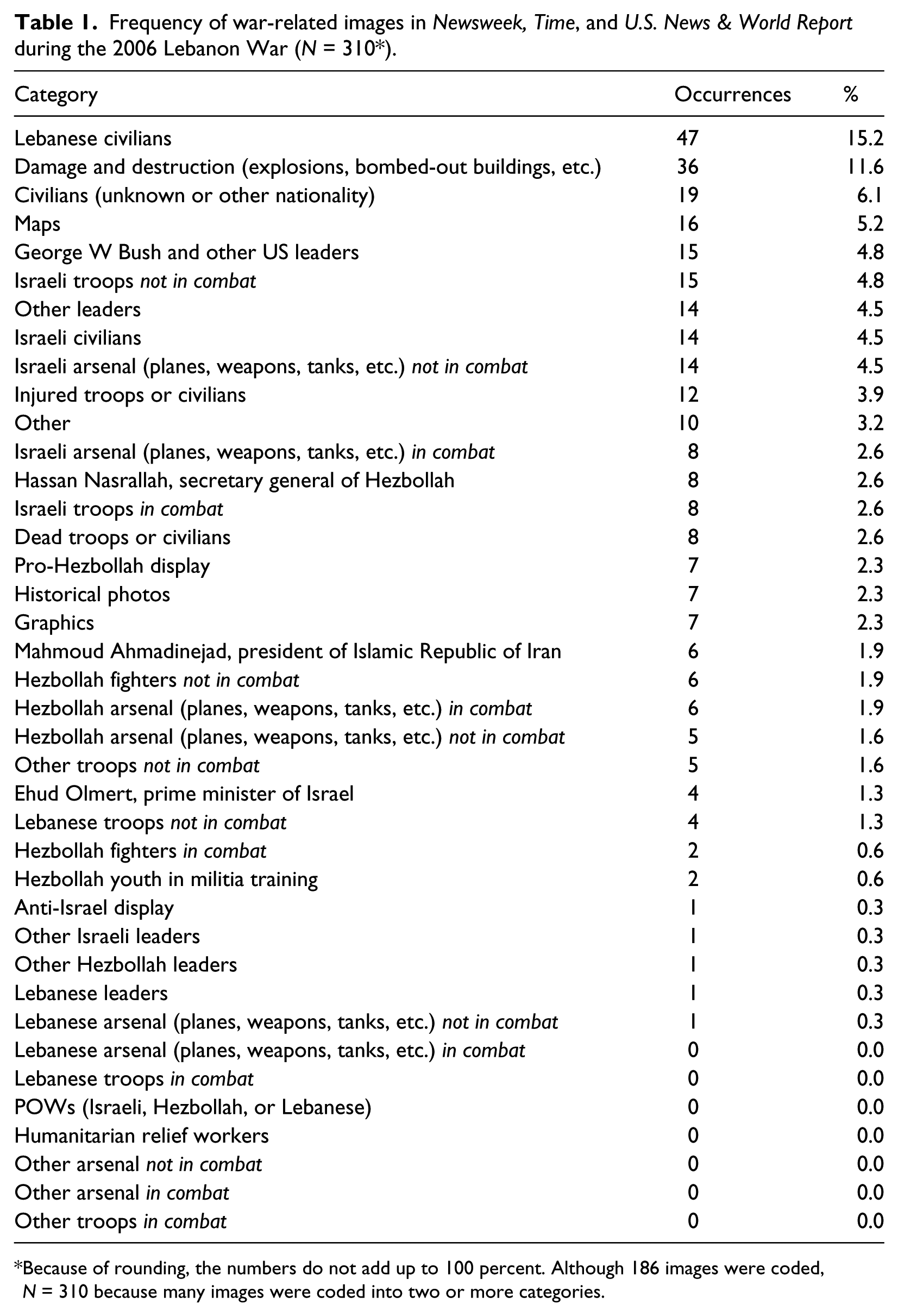
Because of rounding, the numbers do not add up to 100 percent. Although 186 images were coded, N = 310 because many images were coded into two or more categories.
About 59 percent of the images depicted the triad of weapons, troops, and civilian and military leaders. This figure is consistent with other studies of images published in the same three newsweeklies. This triad accounted for 57 percent of the visuals during the Gulf War (Griffin and Lee, 1995) and 58 percent of the images during the Iraq War (Schwalbe, 2013). Like the images of the Gulf War and the Iraq War, protesters (3%), the injured (3.9%), and the dead (2.6%) did not figure prominently in the Lebanon War visuals.
Visual frames
H1, which predicted that conflict would be the most common frame in the visual coverage of the 2006 Lebanon War in the three major US news magazines, was partly supported. Coding all 186 images yielded a total count of 310 frame occurrences because one image could be included in more than one category (Parry, 2010; Schwalbe, 2013). For example, an image of Lebanese civilians surveying damage in Beirut from an Israeli raid was included in both the human interest and violence of war frames. Of these 310 frame occurrences, human interest and military conflict appeared most often, followed by the violence of war, responsibility, other, and protest (see Table 2).
Changes in frames in Newsweek, Time, and U.S. News & World Report during the 2006 Lebanon War (N = 310*) (% in brackets).
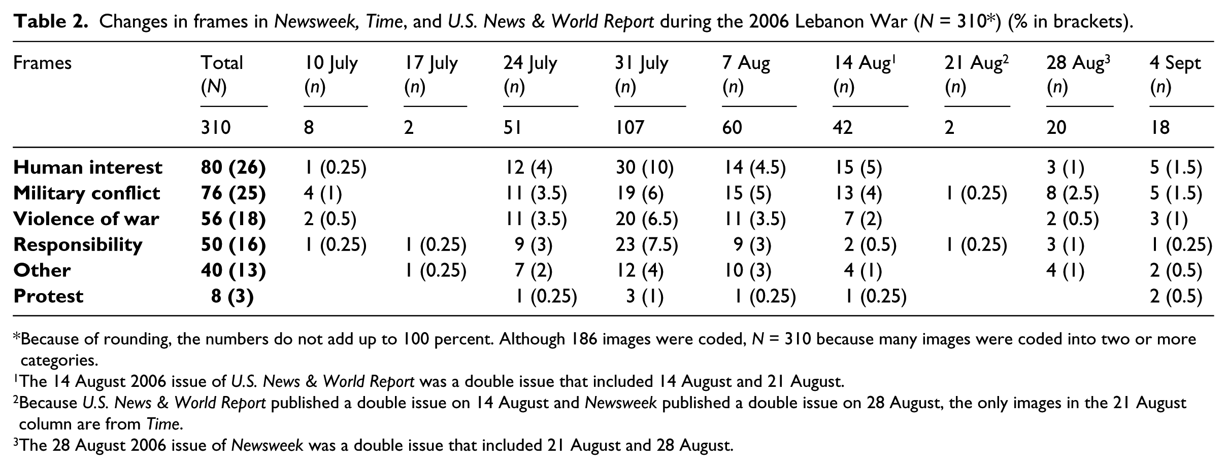
Because of rounding, the numbers do not add up to 100 percent. Although 186 images were coded, N = 310 because many images were coded into two or more categories.
The 14 August 2006 issue of U.S. News & World Report was a double issue that included 14 August and 21 August.
Because U.S. News & World Report published a double issue on 14 August and Newsweek published a double issue on 28 August, the only images in the 21 August column are from Time.
The 28 August 2006 issue of Newsweek was a double issue that included 21 August and 28 August.
Although scholars such as Iyengar (1991) have shown that frames tend to change over time, the current study revealed that the human interest and military conflict frames occurred most often throughout the war. The military conflict frame appeared most often during the first week (4, or 50% of the 8 occurrences) as coverage focused on Hezbollah’s firing rockets at Israeli border towns to create a diversion for an anti-tank missile attack against Israeli Humvees patrolling the border. In the fourth week the human interest frame led the coverage (30, or 28% of the 107 occurrences). The most likely explanation for the prominence of the human interest frame that week is that all three news magazines included in-depth coverage of the conflict in the Middle East, producing more images than any other week of the war − 107, or 35 percent of the study sample. That was twice as many images as Week 3 (51 images, or 16%) and Week 5 (60 images, or 19%). This in-depth coverage might have given editors the space to focus on human interest images without neglecting the military aspects of the conflict.
All the frames except protest occurred with similar frequency. This consistency can likely be attributed to similar journalistic norms and beliefs, news routines, political leanings, and sources of images at the three news magazines. With regard to the latter point, news organizations often rely on wire services instead of sending their own photographers to conflict zones. In fact, the same image sometimes appeared in two different newsweeklies.
The responsibility frame appeared nearly three times more often (31 occurrences, or 10%) in Newsweek than in Time (13, or 4%) and five times more often than in U.S. News & World Report (6, or 2%). This high number can be attributed to the fact that the 31 July issue of Newsweek included images of US President George W Bush, British Prime Minister Tony Blair, and other members of the international community who were trying to help resolve the Lebanon conflict and assist civilians (see Table 3).
Frames by news magazine during the 2006 Lebanon War (N = 310*) (% in brackets).
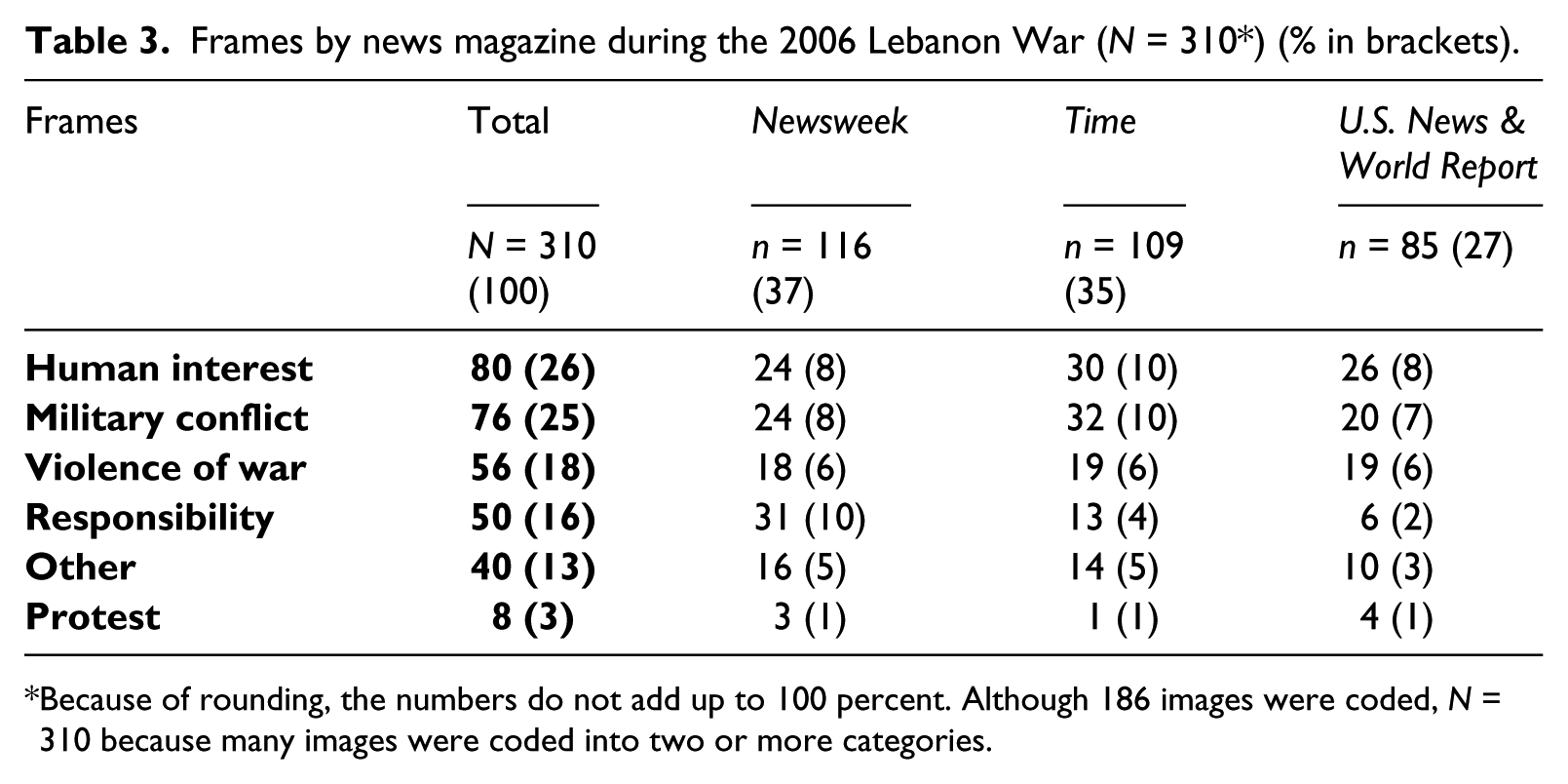
Because of rounding, the numbers do not add up to 100 percent. Although 186 images were coded, N = 310 because many images were coded into two or more categories.
Only eight images (3%) fell in the protest frame. While there were no protests against the war itself, there were photos of seven pro-Hezbollah displays and one anti-Israel display. Four of the protests occurred in Lebanon, two in Iran, and two in unidentified locations.
Proportional visual coverage
H2, which predicted that about half the images in the three news magazines would depict Israel and the other half Lebanon, was not supported. Instead, images of Hezbollah or Lebanon appeared almost twice as often (80, or 65.6%) as images of Israel (42, or 34.4%).
Proportionality should translate to a measurable difference in photo coverage, with more images showing the effect of the war on Lebanon, which bore the brunt of the fighting. Overall, Lebanon suffered twice the economic losses and twice as many air strikes, causing nearly a million civilians to flee the country – twice as many as Israel’s refugee population. Of the 36 images of damage and destruction, 25 (69%) were in Lebanon, seven (19%) in Israel, and four (11%) in other or unknown locations. This finding reflects the fact that most of the fighting took place in Lebanon. Of these 36 images, half (18) depicted bombed-out buildings and debris-filled streets. A quarter (9) showed fire and smoke, while the remaining quarter (9) featured a smashed bridge, wrecked vehicles, bombs exploding at Beirut International Airport, a ruined mosque, and a girl surveying her damaged room (see Table 4).
Differences in the impact of the 2006 Lebanon War on Israel and Lebanon.

Central Intelligence Agency (2007) The World Factbook. Available at: https://www.cia.gov/library/publications/the-world-factbook/index.html
BBC News (2006) Middle East crisis: Facts and figures. Available at: http://news.bbc.co.uk/2/hi/middle_east/5257128.stm
Agence France-Presse (2006) The heavy human and economic cost of Lebanon War, 14 August. Available at: http://www.lebanonwire.com/0608MLN/06081441LAF.asp
IISS Military Balance/Jaffee Center for Strategic Studies (2006) Armed Lebanon (illustration). Newsweek, 31 July: 24.
The arsenals (illustration) (2006) Newsweek, 7 August: 27.
Amnesty International Report 2007 (2007) Lebanon. Available at: https://www.amnesty.org/en/region/lebanon/report-2007
The Associated Press (2007) Army chief says Israel may have to confront Hezbollah attempts to re-arm. International Herald Tribune, 21 February. Available at: http://www.iht.com/articles/ap/2007/02/21/africa/ME-GEN-Israel-Hezbollah.php
Although the visual coverage was weighted toward Lebanon, images of the injured and dead did not reflect its heavier losses. Lebanon’s civilian injuries were seven times greater than Israel’s, with 25 times as many civilian casualties. Of the 20 images of the wounded and dead in this study, nine (45%) depicted Lebanese victims, seven (35%) portrayed Israeli victims, one (5%) included both Israeli and Lebanese dead, and three (15%) showed victims whose nationality could not be determined. It should be noted that if the three unknowns were added to either of the other groups, the results would still not reflect the actual casualties. A chi-square analysis showed it was extremely unlikely (p < .001) that a pattern this different from the casualty percentages would have happened by chance.
The source of each image was coded. Other than 10 images that were coded ‘unknown’, the remaining 176 were credited to Western sources, including staff photographers, stock agencies, newspapers, and wire services such as Reuters and Associated Press. This finding indicates the lack of a Western bias in favor of Israel.
Images of the injured and dead
H3, which predicted that only a small number of the news magazine images would depict the wounded and dead, was supported. As expected, they comprised just 11% (20) of the 186 images. U.S. News & World Report published the most (8 images), followed closely by Newsweek (6 images) and Time (6 images). Time and U.S. News & World Report presented balanced visual coverage of Israeli and Lebanese injuries and casualties (6 images each). Newsweek included fewer images (4) of the injured and dead, but they reflected Lebanon’s heavier losses (three Lebanese vs one Israeli) (see Table 5).
Images of the injured and dead in Newsweek, Time, and U.S. News & World Report during the 2006 Lebanon War (N = 186) (% in brackets).

Central Intelligence Agency (2007) The World Factbook. Available at: https://www.cia.gov/library/publications/the-world-factbook/index.html
The Associated Press (2007) Army chief says Israel may have to confront Hezbollah attempts to re-arm. International Herald Tribune, 21 February. Available at: http://www.iht.com/articles/ap/2007/02/21/africa/ME-GEN-Israel-Hezbollah.php
A Newsweek illustration that included body counts of both Israeli and Lebanese casualties was coded as ‘Israeli & Lebanese’.
The identity of some of the injured and dead images could not be identified. For example, an image in U.S. News & World Report’s table of contents showed two unidentified persons grieving over a coffin. The picture did not include a caption identifying the nationality of the mourners or the deceased, so this image was coded as ‘unknown’.
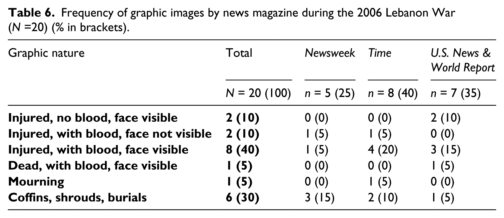
Of those 20 images, 10 portrayed men or unidentified victims, three were of women, four showed children, and three included both women and children. Most of the injured and dead (16 images, or 80%) were photographed close to the camera. Eleven of the images were graphic, showing bloody or blood-splattered victims. No blood, however, was visible in two images of the wounded. The remaining seven images depicted mourning, shrouded corpses, or coffins. No clearly identifiable Hezbollah casualties were coded (see Table 6).
Frequency of graphic images by news magazine during the 2006 Lebanon War (N =20) (% in brackets).
Discussion
Visual frames
This study found that much of the visual coverage of the Lebanon War in the three US news magazines focused on the military conflict frame. Other researchers have noted similar findings in newspapers (Dimitrova and Strömbäck, 2005), on the internet (Schwalbe, 2006), in textbooks (Perlmutter, 1992), and on television (Neuman et al., 1992). However, the heavy use of the human interest frame differs from the results obtained by Griffin and Lee (1995) and Griffin (2004) but is consistent with studies by Schwalbe (2006) and Dimitrova et al. (2005), who found increasing use of the human interest frame as war unfolds.
Although the US supports Israel, the fact that it was not fighting in this far-off conflict might account for some of the differences in visual coverage. As other scholars (e.g. Griffin, 2004; Schwalbe, 2006; Schwalbe et al., 2008) have noted, at the outset of US conflicts from the Civil War to the Iraq War, visual frames reflected a patriotic perspective, partly by embracing a conflict frame. The current study was dominated by the conflict frame and, almost from the onset of hostilities, the human interest frame. This finding indicates that US news magazines seem more likely to portray people involved with or affected by war when the US is not directly involved. When the US is a combatant, the human interest frame is not as predominant early in the war (Dimitrova and Strömbäck, 2005; Neuman et al., 1992; Perlmutter, 1992; Schwalbe, 2006).
Protests comprised just 3 percent of all images. Luther and Miller (2005) suggest that demonstrations tend to mirror the needs of political and economic elites, with media outlets conferring legitimate status on movements that do not threaten the established societal consensus. The news magazines did not depict any of the organized protests in San Francisco, Detroit, or Washington, DC. This lack of coverage might reflect the US government’s strong support of Israel in the war, or perhaps the lack of US involvement meant news magazines did not devote many pages to the conflict, thus leaving little space to show anti-war demonstrations.
Proportional visual coverage
Rather than balanced (equal) coverage, the three news magazines published almost twice as many images of Lebanon as Israel. Lebanese civilians appeared in three times as many images as did Israeli civilians. This finding is important because, as Zillmann et al. (1999) observed, images can lead readers to favor one viewpoint over another. Readers of the three news magazines were exposed to a significantly higher percentage of Lebanese-related visuals, which reflected the greater suffering and destruction borne by Lebanon.
Since most of the fighting took place in Lebanon, US photo editors probably received a preponderance of images from there. Even if editors strove for balanced coverage, the greater number of images would lead toward more Lebanon-related coverage. In addition, limited access might have skewed the coverage. The Israeli military tried to restrict photojournalists’ access to its troops, and Hezbollah shunned photo coverage of its fighters (Calame, 2006).
Combatants often try to dominate the news media (Wolfsfeld, 1993) by controlling journalists’ access and preventing imagery that generates sympathy for the enemy (Griffin, 2010). Israel and its supporters sponsored frames that competed in the ‘symbolic arena’ with those of Hezbollah and Lebanon (Wolfsfeld, 1997: 54). Hezbollah’s closed, secretive sect managed the image and the message it wanted to convey more effectively than did officials in Israel’s open, democratic society (Kalb and Saivetz, 2007). Although Israeli officials tried to control the ‘informational environment’, as the powerful tend to do during asymmetrical conflicts (Wolfsfeld, 1993: 2), journalists managed to avoid military censorship and obstruction (Kalb and Saivetz, 2007). Hezbollah, which had one iron-fisted spokesman, took a different approach to media access. It has been accused of directing journalists to the newsworthy stories and images most likely to arouse sympathy for its cause, including the deaths of Lebanese civilians.
Images of the injured and dead
Hezbollah’s attempt at propaganda was not entirely successful, however, because the proportional coverage of the Lebanon War did not extend to the injured and dead. Given that seven times as many Lebanese as Israelis were wounded or killed, the fact that a similar number (9 Lebanese and 7 Israelis) were shown in the news magazines amounts to a propaganda victory for Israel in this sphere. One factor that might have affected this finding is the lack of images that could be clearly identified as Hezbollah, despite an estimated death toll of 250 to 600 fighters. Since Hezbollah fighters do not wear uniforms or other identifying markers, it is possible that some of the injured or dead who were coded unknown could, in fact, be Hezbollah. In addition, photojournalists’ greater access to the Israeli side of the war likely produced more images of Israeli casualties (Kalb and Saivetz, 2007).
This finding contradicts the assumption that US editors are more willing to publish graphic images if they depict people in other countries (Kobré, 2004). The news magazines’ limited portrayal of the injured and dead echoes the findings of other studies of war images in US newspapers (King and Lester, 2005), news magazines (Griffin, 2004; Schwalbe, 2013), television news outlets (Aday et al., 2005), and across media (Keith et al., 2008).
Multiple pressures and considerations influence a photo editor’s rejection or acceptance of a graphic image for publication (Reese, 2001). These factors range from the individual’s news judgment, self-censorship, personal ethics, and political leanings to the newsworthiness of the image, the context and circumstances of the suffering, the perceived value of the lives affected, and audience expectations (Bissell, 2000; Fahmy, 2005a, 2005b). US photo editors try to avoid offending their audiences and advertisers with too much gore, which has led to the publication of fewer graphic war images (Zelizer, 2005). Although images of suffering provide a rare connection with victims who are seldom seen (Parry, 2010), readers can grow weary of frequent depictions of casualties (Moeller, 1999). While US photo editors tend to shield readers from disturbing photos, foreign media in general are more likely to show graphic images (Raymer, 2006). Al-Jazeera, for example, claims its audience expects to see gore and dead bodies during a war (Sharkey, 2004).
Professional practices, editorial policy, and competing news values also shape and limit what images are considered newsworthy, how they are prioritized, and how they are framed (Reese, 2001). Photo editors operate within the parameters and expectations that conform to photojournalistic conventions (Schwartz, 1992), national interests (Parry, 2010), and ‘professional standards of non-involvement, balance and objectivity’ (Griffin, 2010: 35). European editors, for example, do not wring their hands over ‘fairness and balance’, which is a favorite metric used by US journalists to decide what to print or broadcast (Raymer, 2006). During the Lebanon War, many US gatekeepers said they kept ‘a rough balance over time’ of the images published or aired during their news cycle (Manly, 2006: C4). A producer for ABC’s World News with Charles Gibson, for example, tried to tell both sides of the story by airing one segment from Israel and one from Lebanon during each newscast. After Time magazine published side-by-side photos of a crying girl in an Israeli emergency room and the shrouded corpse of a boy in Qana, managing editor Richard Stengel said an aesthetic balance rather than an ideological one guided the placement. ‘It’s not about taking sides’, Stengel said, ‘but about the terrible poignancy for people on both sides’ (quoted in Manly, 2006: C4). The New York Times was one of the few media outlets that tried to portray the relative impact of the war on both countries and their citizens (Calame, 2006). It published about eight times more photos of Lebanese than Israeli coffins and corpses. ‘We try to reflect what happens on the ground’, said foreign editor Susan Chira. ‘We are extremely conscious of the death tolls. It would be unfair to truth to do otherwise’ (quoted in Calame, 2006, paragraph 6).
Almost all the injured and dead in the three news magazines were photographed close to the camera, which contrasts with Barringer’s (1998) observation that they tend to be far from the camera. However, these images were of Israelis, Lebanese, and Hezbollah – foreigners who possessed the psychological distance from an American audience that Barringer referenced.
Although images of the injured and dead comprised a small percentage of the visuals, women and children were prominently featured, which corresponds with the realities of a war in which they suffered a third of the casualties. Of the 20 images portraying the injured or dead, half included women, children, or both. In other conflicts, however, female civilians have largely been invisible (Keith and Schwalbe, 2010; Nikolić-Ristanović, 2002). One explanation could be that many of the 5,640 people injured and killed in Lebanon were women and children. In addition, women and children tend to represent innocent, vulnerable figures who need to be rescued or protected, so they often become the subject of war photographs (Moeller, 2002; Wells, 2007). Another explanation could revolve around access. Although predominantly Muslim, Lebanon is home to more than 17 religions, including Roman Catholic, Greek Orthodox, and other Christian faiths. This religious and cultural diversity might make it easier for photojournalists to gain access to women and children while covering the war. Finally, the inclusion of injured or dead women and children might also stem from Hezbollah’s propaganda efforts to direct journalists to civilian deaths among the Lebanese (Kalb and Saivetz, 2007).
Limitations and future studies
Since this study relied on manifest content, generalizations cannot be made beyond the content and medium studied. Another limitation is the inability to determine which factors affected the proportionality of the visual coverage. Future research could include in-depth interviews with photojournalists and photo editors to provide insight into whether proportionality stemmed from political leanings, emotional pull, access, space restrictions, and/or editorial decisions related to newsworthiness, context, dignity, and audience concerns. A further limitation concerns allegations of photo fraud by freelancer Adnan Hajj, who covered the war for Reuters until 7 August 2006. At least one of his digitally altered images was included in this study. Future research could explore the ethics of staging and manipulating war images.
Several other areas are ripe for study. First, this research could be expanded to include images from other media platforms. It would be illuminating to see if the proportional coverage seen in Time, Newsweek, and U.S. News & World Report was reflected in news coverage on television, in newspapers, and on the internet. Similarly, further research could examine whether the role of proportionality applied to text as well as to images. Also of interest would be a study of how news outlets in different countries addressed proportionality. Would a Lebanese or Israeli editor have had concerns about proportional coverage as a way to responsibly report the news? If not, how did editors living in a war zone handle the proportional reality of the Lebanon War?
It is hard to imagine any scenario where an authentic representation of the day’s events is more important than when covering war. Images from the battlefield are especially important in shaping the public’s opinion of war and government policies. This study revealed that both the military conflict and human interest frames dominated the visual coverage of the 2006 Lebanon War in the three US news magazines. This is a striking finding because Iraq War studies have found that the human interest frame did not become dominant until later in the conflict. It would appear, then, that the US news magazines are more inclined to portray the people affected by a distant war when the US is not directly involved. These frames, combined with a proportional presentation of the war’s impact on the combatants, provided a largely American audience with an authentic visual representation of those turbulent seven weeks – something that has not been found in portrayals of wars in which the US has been involved. Proportionality as a measure of war journalism is likely to become a more prominent concern as globalization and terrorism change the nature of 21st-century warfare.
Footnotes
Funding
This research received no specific grant from any funding agency in the public, commercial, or not-for-profit sectors.