




Abstract
This article provides a set of recommendations, selected from the systematic literature review carried out, regarding signage systems for healthcare institutions that can be used for designing or redesigning more competent signage systems. The signage systems in healthcare settings are usually poorly designed due to the expansion of the original facilities, a lack of awareness of existing guidelines by the developers, and a lack of agreement between the existing recommendations. There are several guidelines and recommendations available in the literature; however, each work was developed for specific cultural contexts, so there is a lack of uniformity among them. Hence, there is a need to uniformize the guidelines for signage design in healthcare, in order to provide supportive information for developers to build and implement effective and efficient signage systems. This study examined the available literature on the subject and established a set of guidelines organized in categories to help the design process. A literature review was conducted, and 34 selected publications were analyzed from which recommendations were created. A best practices manual was also studied and used as the analytical framework to establish the design categories of the developed recommendations. This review resulted in guidelines divided into nine design categories that should be considered in the design and implementation process of signage systems in healthcare facilities.
Research shows that an improved hospital design can reduce stress of both patients and staff, increase efficacy of care, improve safety, and consequently improve the health outcomes of patients and overall healthcare quality. Much of the available literature indicates that an efficient spatial layout and an effective signage can have positive effects on perceptions of patients concerning the overall service (Chambers & Bowman, 2011; Ulrich & Zimring, 2004).
As patients have greater access to information and take on more responsibility for their health, their demands to participate in their own hospital experiences grow (Carpman & Grant, 1993). Some scholars claim that designing supportive healthcare environments can enhance the recovery process and the psychological state of patients, mainly the elderly. Designers can help create these environments by considering the way users interact with the setting, which will therefore require user involvement in the design process. Besides the healthcare services of a hospital, users require also assistance in terms of wayfinding.
Trulove, Sprague, and Colony (2000) defined the term wayfinding as “navigating from one place to another” and as “a very basic activity, one in which people engage throughout their lives.” They suggest that wayfinding should be a problem-solving activity, in which decisions are made through the interpretation of a system of navigational features that should contain clear paths with visual, verbal, and auditory clues.
One can say that wayfinding is a system represented by physical and graphical signs that help users to make sense of where they are and how to get to the place they are looking for. Karimi (2015) claims that research has shown that various aspects related to navigating and the layout of the buildings affect wayfinding and can consequently result in navigational errors.
Basri and Sulaiman (2013) say that the “frustration caused by wayfinding difficulties not only provokes a negative opinion of the physical setting but that it also affects the perception of the public itself and the services offered in that setting” (p. 264). Changing the design of signage can be a way to improve user wayfinding abilities. Passini (1996) also shared this opinion when he argued that wayfinding difficulties can result in negative opinions of the physical setting, as well as undermine the name of the institute. Users end up having a negative experience due to getting lost in the building, miss an appointment because they were lost, or other problems resulting from a lack of synchronization between the wayfinding elements. To be effective and efficient, signage must be considered within the big picture of a wayfinding system, which means that its design and development should include and explore all wayfinding considerations and take signs into account as well as the different characteristics of the users who visit and circulate inside healthcare settings.
Hughes and Brown (2015) found that people value being able to ask staff for directions. However, this is negative in terms of costs and time spent by staff giving directions to users. To overcome this, some institutions implemented methods created by Planetree, which is a nonprofit organization that provides education for patient-centered healing environments (see http://planetree.org/reputation/). One of the strategies is to train all staff members to give directions in an appropriate way. However, if elements like signage or landmarks are not well designed or implemented, the staff will continue to have difficulties in giving directions effectively (Rechel, Buchan, & McKee, 2009). For example, Mora, Oats, and Marziano (2014) highlighted a study conducted by Ulrich in an American hospital with 604 beds, which showed that almost 4,500 hr per year were lost due to disoriented users asking for directions. This study says that in 2004, the costs due to disorientated users were estimated at US$202,000, which was equivalent to an annual salary of a junior doctor. This means that even with a trained staff, if the physical elements of the wayfinding system are not efficient, the navigation difficulties will continue and the users will continue to lose their way.
To overcome such costs and impacts on the human resources, the signage systems need to be in coordination with the other features of the wayfinding system, such as the architecture, landmarks, and so on. When poorly combined, there will be major navigation issues, which will result in negative consequences for the institution itself. Passini (1996) pointed out that: The ease of circulation within a building, the time saved by not having to consult confusing information displays and even the liberation from time consuming direction-giving by staff, are issues of building efficiency and have financial impacts that, admittedly, are not easy to calculate. (pp. 319–320)
The purpose of this article was to assess the existing literature regarding the design of signage for healthcare, with the aim to select guidelines that can be used by the stakeholders involved in this design process. The result is a compilation of recommendations for the design of healthcare signage systems, gathered from the literature and organized in design categories.
Method
Literature Selection Criteria
The selection of the literature was based on four criteria: (1) the studies should focus on wayfinding or signage systems for healthcare and should help answer the question: What are the characteristics and design requirements that signage should comply with? The studies must identify characteristics or problems from which recommendations can be created; (2) the studies could be peer-reviewed studies (research articles and literature reviews), best practices manuals (existing guidelines for healthcare signage), or regulations; (3) the research studies should include quantitative or qualitative research methods; and (4) all studies should be in English.
Databases and Search Steps
This literature review conducted from January to March 2016 accessed Science Direct, Scopus, and Springer databases, which provide public access to their documents. We extended the search to Google to include regulations and best practices manuals. The process was divided into four steps for selecting the literature, as shown in Figure 1.
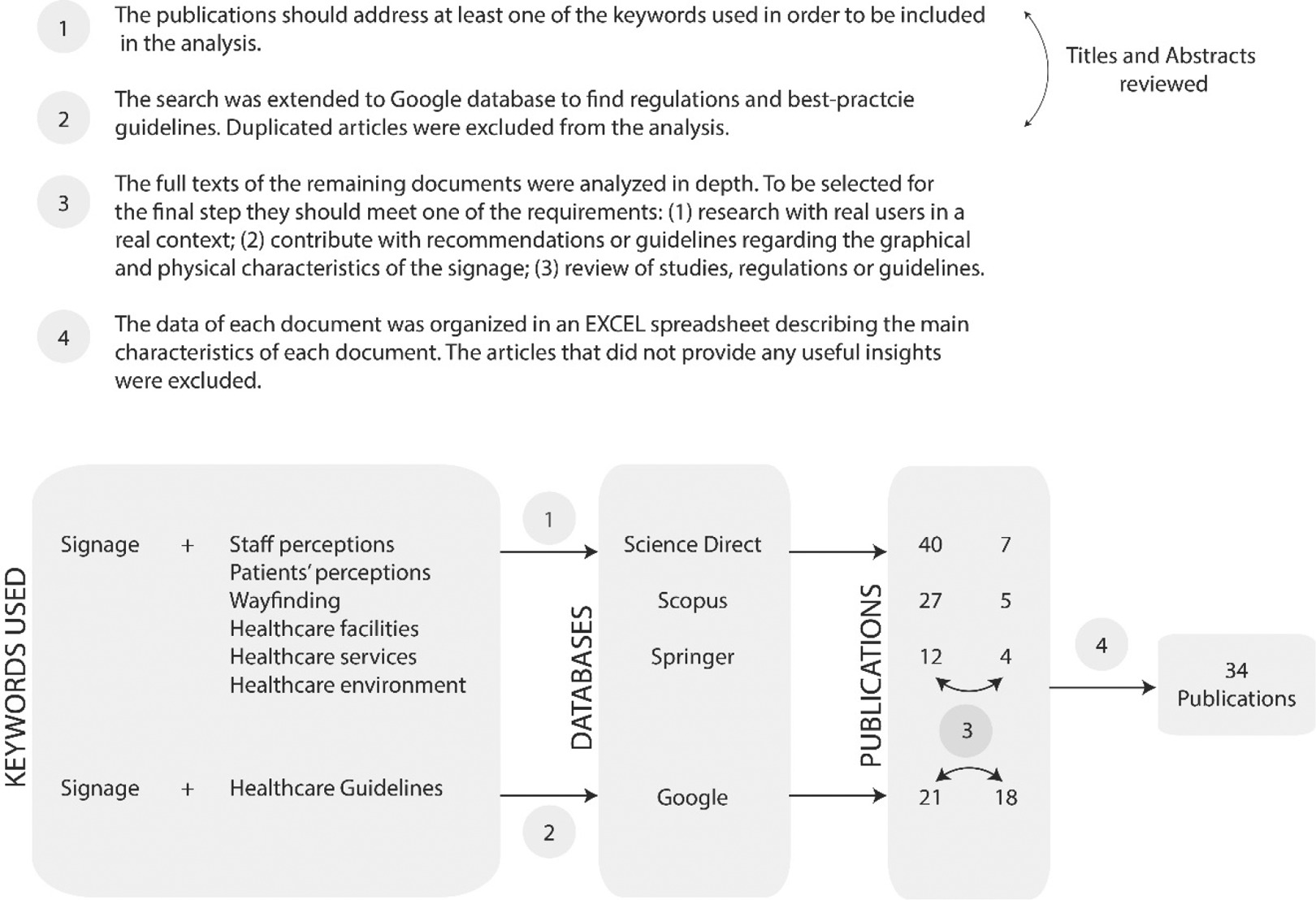
Literature review process.
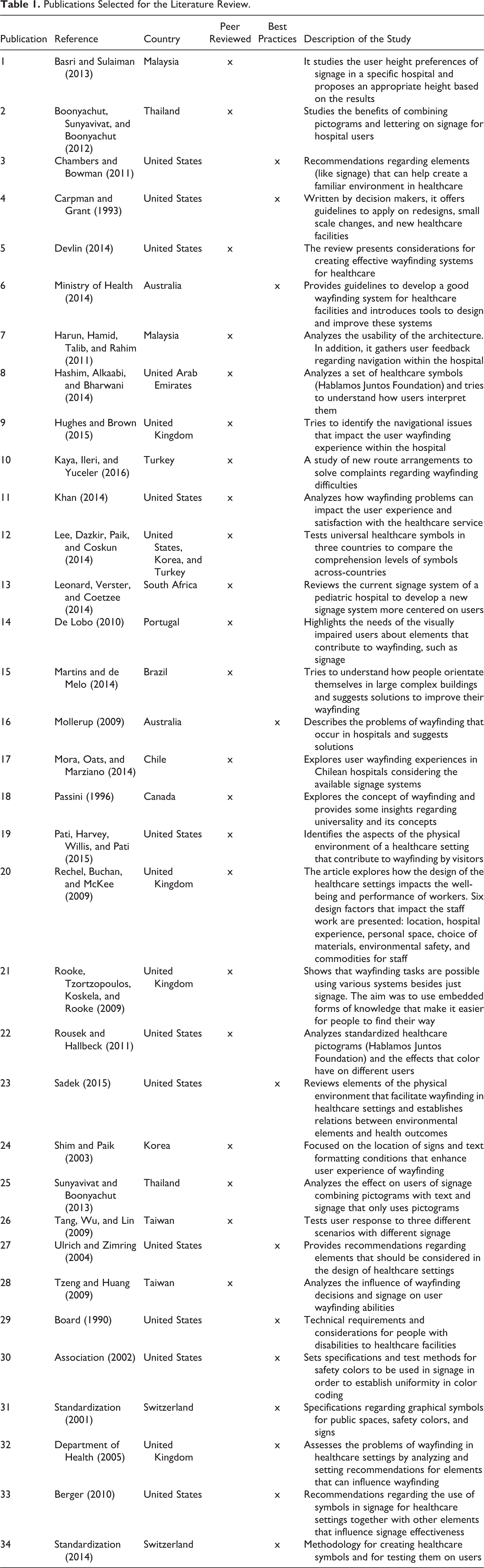
In the first step, we selected studies addressing at least one of the keywords. In the second step, we extended the search to Google to find regulations and best practices manuals, and we excluded duplicated articles. In the third step, the full texts of the remaining articles were analyzed in depth, through a full reading of each document. We assessed the quality of the articles through the criteria that articles should contain one of the following aspects: (1) research with actual users through qualitative or quantitative methods, and the methods used and results obtained should be fully described; (2) specific guidelines or recommendations relating to the graphical and physical design, as well as their implementation, for signage systems in healthcare institutions; and (3) review of existing literature regarding wayfinding and signage systems, as well as available policies that could contribute to the guidelines. In the final step, data from each document were organized in an Excel spreadsheet that contained the type of study, the place of publication, and the description. Table 1 provides an organized source of the contents of the articles and helped to reduce the number of publications to 34.
Publications Selected for the Literature Review.
Analytical Framework
The analytical framework used to create the recommendations is a manual of best practices focused on effective healthcare signage systems and was developed by the Department of Health (2005) in England. It was developed through extensive reviews of books, articles, together with the application of surveys on healthcare and nonhealthcare settings, and opinions of experts. Although we could not find any specific criticisms to this manual, a report published by Ham, Berwick, and Dixon (2016), from The King’s Fund in England, mentions that many of the policies adopted might have placed England at the vanguard of improving the quality of care. It says that it will take time for the implemented policies to demonstrate results in the National Health Service (NHS), as occurred in other organizations that sought similar improvements. However, there are claims that the NHS “remains a great source of hope for nations committed to health and health care” (Ham, Berwick, & Dixon, 2016, p. 29). It suggests that the NHS is a good example to follow, which leads one to believe that the proposed guidelines by the Department of Health (2005) have contributed to its success. In the Department of Health (2005) manual, 12 design recommendations are given for developing signage systems: (1) typeface and type style, (2) type size, (3) text layout and grouping, (4) text and arrow alignment, (5) emphasizing information, (6) multiple language or dual terms, (7) symbols, (8) use of color, (9) positioning of signs, (10) methods of construction, (11) illuminating signs, and (12) special recommendations.
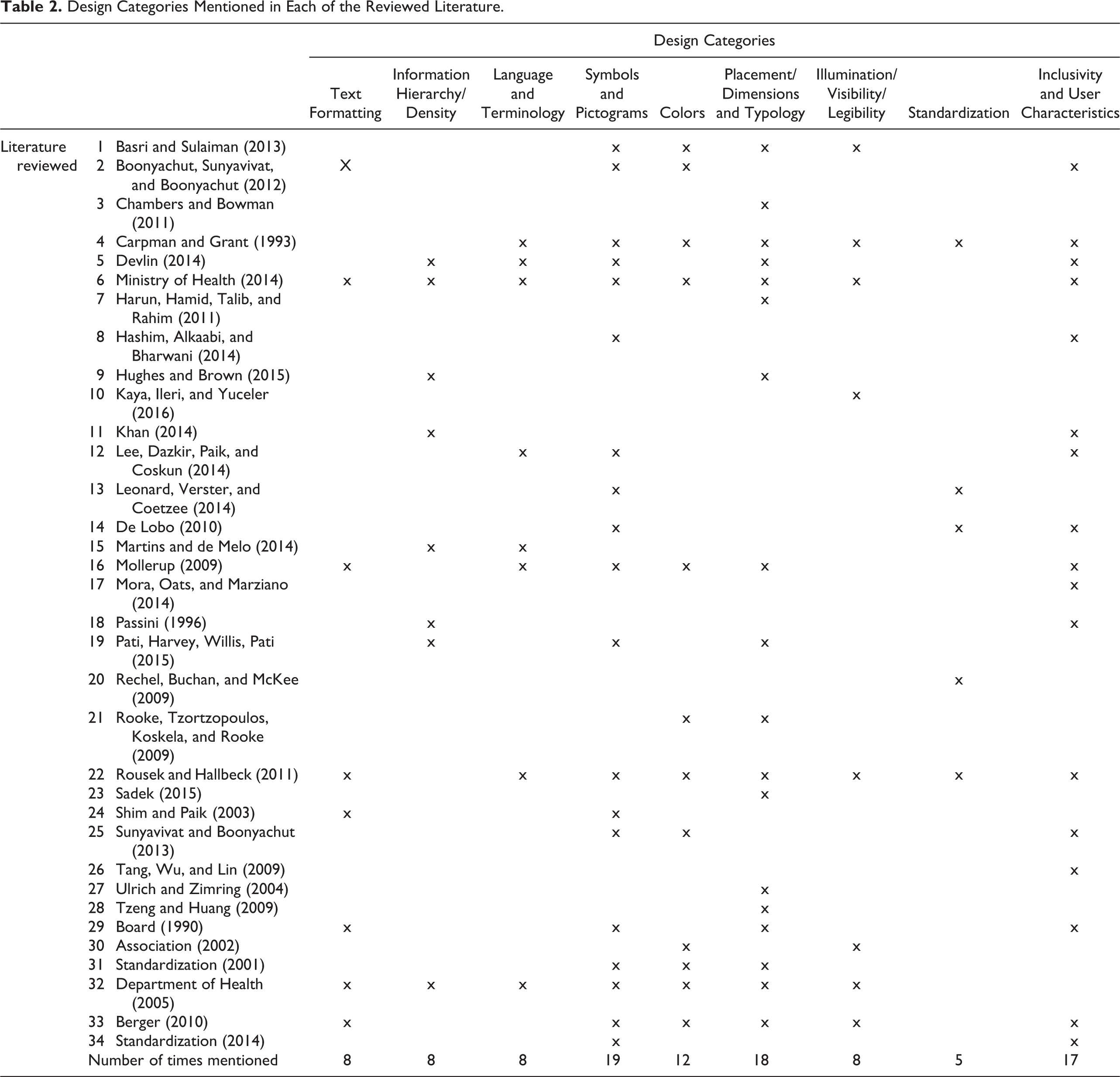
To create the desired recommendations, we have merged with the design categories defined in the aforementioned framework some relevant information from the remaining literature. We found that some of the design categories were also mentioned in other literature, but the categories were different or grouped in different ways. We synthesized and regrouped the categories from the Department of Health into nine categories: (1) text formatting; (2) information hierarchy and density; (3) language and terminology; (4) symbols and pictograms; (5) colors; (6) placement, dimensions, and typology of signs; (7) illumination, visibility, and legibility; (8) standardization; (9) inclusivity and user characteristics. The first four categories suggested by the Department of Health (2005) are grouped into one single category, named text formatting which contains all the information on typography. The 9th, 10th, and 12th categories are now designated as placement, dimensions, and typology of signs, associated with sign typology, location, mounting dimensions, and so on. A new category, named standardization, regarding standards and regulations (Category 8) was added. The ninth category presents recommendations for including users with disabilities. The documents collected from the databases were analyzed, in order to see which design categories were mentioned in each study and which ones were the most frequent (Table 2).
Design Categories Mentioned in Each of the Reviewed Literature.
Results
A good wayfinding system goes beyond signage itself, and to have a positive impact on user wayfinding experience, these systems must be combined with other physical features. Wayfinding systems are a result of a combination between architecture (layout, floor configuration, etc.); landmarks (statues, paintings, etc.); colors, lighting, signs, people (verbal instructions, etc.); technologies (digital signs, smart phone applications, tactile ground surface indicators, Braille sign systems, etc.); and so on (Ministry of Health, 2014). In the following sections, recommendations are presented concerning the signage system as one of the features to consider when designing the wayfinding system of an institution.
Recommendations for Text Formatting
Signs should be designed and positioned so that they can be easily seen (Ministry of Health, 2014), and to ensure signage visibility and legibility, the viewing distances, fonts, lights, and layout of information must be planned. According to Boonyachut, Sunyavivat, and Boonyachut (2012) and Mollerup (2009), typography has the most influence on user comprehension of directions. The text size will vary according to its font; fonts with wider letter spacing will be able to use smaller text sizes, while condensed fonts require larger sizes. It is important to test the text size and its legibility at the location (Ministry of Health, 2014).
Also, Rousek and Hallbeck (2011) and Shim and Paik (2003) claim that the alignment, font type, font size, layout, and grouping can influence the way users interpret the message. Likewise, the consistency among all signage is extremely important, since each type of information should appear in the same format and layout throughout the whole setting (Ministry of Health, 2014) and in all signs (Berger, 2010). The Department of Health (2005) recommends specific font types (like Frutiger or Helvetica) and suggests the use of uppercase and lowercase letters to enhance reading or the use of bold or regular typefaces to differentiate information. Similarly, the document from the Ministry of Health (2014) mentions that sans serif or typefaces with unobtrusive serifs should be used with consistent thickness and spacing between letters and words. The document Americans with Disabilities Act 1990 (U.S. Access Board, 1990) gives specific recommendations on the proportion of the letters and finishes to ensure contrast and enhance legibility (Table 3).
Recommendations for Text Formatting.

Recommendations for Information Hierarchy and Density
Devlin (2014) and Hughes and Brown (2015) refer to the planning needed regarding the typology of signs to use and the frequency with which they should be applied, in order to avoid overload or lack of information that is valuable. Hughes and Brown (2015) say that, when signage is too dense, inconsistent, or too redundant, it results in anxiety and stress for the users, which results in inefficient wayfinding. Khan (2014) tested seven different routes to three services and found that the amount of signage influenced user travel behavior. The author found that increasing the number of signs increases patient travel time, distance, number of stops, number of looking arounds, and of askings the staff for directions.
Martins and de Melo (2014) claim that information should be hierarchically organized. Information should be listed according to the degree of importance, and primary or secondary information should be emphasized by using colors, typefaces, or other methods. Different text weights, layouts, and colors can add or remove emphasis; for example, larger text implies more importance, while smaller text can mean less importance. This hierarchy can also be given through a variation of scales and position of some elements relatively to others (Ministry of Health, 2014). Pati, Harvey, Willis, and Pati (2015) found that when signs show multiple destinations, users expect them to appear in the same order as on the directional signs. The fact that many authors refer to this reveals the importance of consistent and logical layout of information on signs (Table 4).
Recommendations for Information Hierarchy and Density.

Recommendations for Language and Terminology
Mollerup (2009) stated that the terminology used on signs is too often an ignored tool to help the users and is one of the main causes of their wayfinding difficulties. Also, Carpman and Grant (1993) claimed that the medical and technical terms on the signs, many times, are not understood by the users. Ministry of Health (2014) suggests that clinical department titles should be avoided as the difficult and long words can easily be confused (such as orthodontics, orthopedics). So, it considers that descriptive and clear names should be used to create names easier to pronounce and remember. Similarly, Rousek and Hallbeck (2011) claim that the language used should be easily understandable, and long sentences, abbreviations, or difficult words should be avoided (Sunyavivat & Boonyachut, 2013). To overcome such barriers, many studies, as the one by Lee, Dazkir, Paik, and Coskun (2014), suggest the creation of a universal pictogram-based system, to be tested among users, to assess levels of comprehension. The Department of Health (2005) also recommends the combination of text with pictograms or colors (Table 5).
Recommendations for Language and Terminology used in Signage.

Recommendations for Symbols and Pictograms
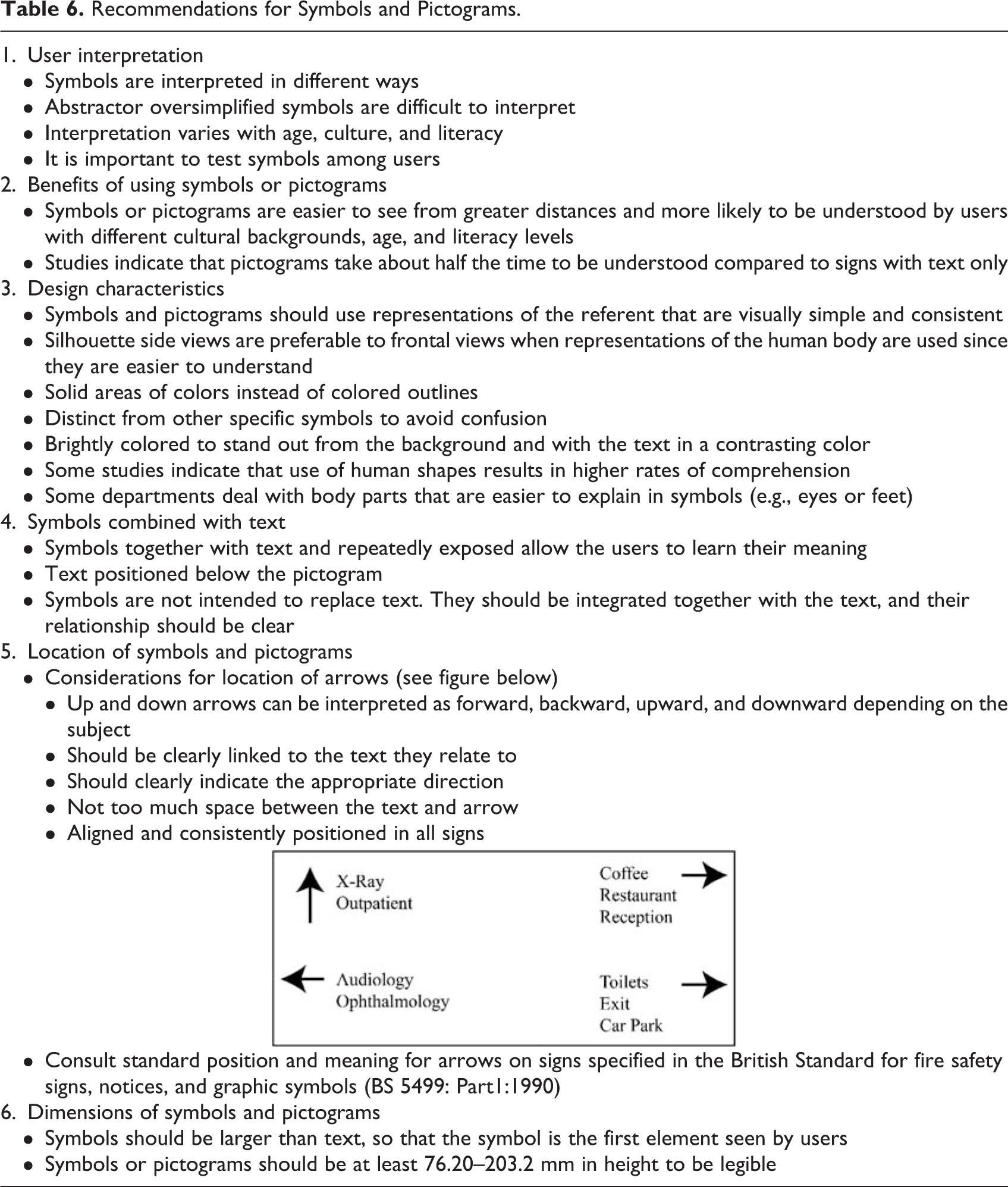
Seventeen of the articles reviewed, advocated the use of symbols or pictograms on healthcare signage, and suggested recommendations for their design. Many argue that communication is increased, when symbols are legible and easily understood by the user (Boonyachut, Sunyavivat, & Boonyachut, 2012; Lee, Dazkir, Paik, & Coskun, 2014; Leonard, Verster, & Coetzee, 2014). Hashim, Alkaabi, and Bharwani (2014) also claim that pictograms are more beneficial since they are more prominent, more noticeable, and easier to remember than texts. 1 De Lobo (2010) also claims that there is a growing need for developing universal and recognizable symbols. Other authors, like Chambers and Bowman (2011) and Department of Health (2005), argue that further the development of pictograms and symbols, it is crucial to test them among the users as they can be interpreted in different ways, mainly due to different cultural backgrounds. To reduce difficulties in interpretation, Pati et al. (2015), Rousek and Hallbeck (2011), and Shim and Paik (2003) suggest that text should be used together with symbols, as this would facilitate their understanding, enhance interpretation, and help decipher their meaning. Summing up, symbols should be tested among the users, accompanied by text, larger than the text displayed on the sign, with a simple and clear design, and, for some symbols, in accordance with the ISO 7001 standard (Table 6).
Recommendations for Symbols and Pictograms.
Color Recommendations
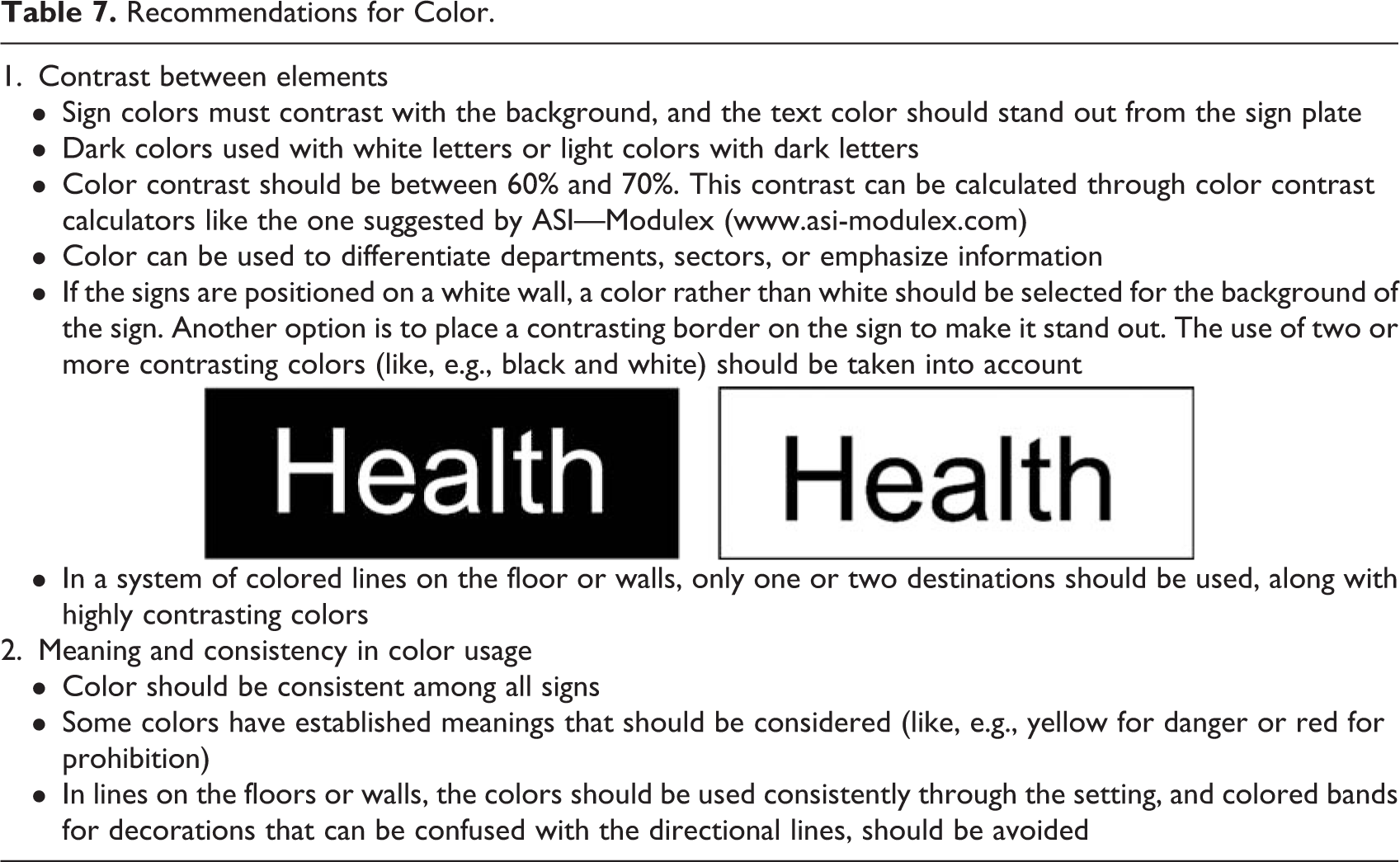
The main problem in the use of colors is the lack of consistency in their use (Rooke, Tzortzopoulos, Koskela, & Rooke, 2009). Consistency not only for the colors used, to which there is no standardization, but also between the colors used on the signs and the colors on the brand of the institution. Department of Health (2005) and the document Americans with Disabilities Act 1990 (Board, 1990) say that if well applied, colors can help differentiate departments and emphasize information to help the user. Furthermore, the use of color to reinforce information can improve its clarity on the signs; however, colors must be consistent from sign to sign and consider the established meanings of certain colors; for example, red is associated with emergency signs (Ministry of Health, 2014). Using colors requires planning, for example, some facilities often use colored line systems (on the floor or walls) to help guide the user; however, in large healthcare facilities, it is almost impossible to use them without creating a complexity of colored lines throughout the building (Carpman & Grant, 1993). Also, the way colors are perceived should be studied, as these settings receive a wide variety of users (Table 7).
Recommendations for Color.
Recommendations for Placement, Dimensions, and Typology
The design, location, and placement of the signage also seem to impact user wayfinding (Sadek, 2015). Tzeng and Huang (2009) claim that well-placed signage will help users arrive at the destinations with less difficulty and less questions to the staff. Basri and Sulaiman (2013) and documents such as Americans with Disabilities Act 1990 (Board, 1990) have specific recommendations for the appropriate height and placement of signs. Additionally, the norm ISO/FDIS 3864-1:2001 (E) (Standardization, 2001) provides a formula (Table 8) to help calculate the distance at which signs should be positioned. Although the suggested formula can help in sign placement, it should not be used as a strict rule since the location itself depends on other factors. In general, signs should not be positioned right before or after an intersection point, as this will create confusion to the users. They should be visible from all directions and all viewing angles should be considered (Ministry of Health, 2014). Also, Chambers and Bowman (2011) and Ulrich and Zimring (2004) gave some reference distances and recommendations for positioning signs. The Department of Health (2005) and Berger (2010) offer insights about placement and dimensions for directional, identification, and location of signs.
Recommendations for Placement, Dimension, and Typology of Signs.

Recommendations for Illumination, Visibility, and Legibility
This category (Table 9) is extremely important, as light can affect the visibility and legibility of signs (Basri & Sulaiman, 2013; Rousek & Hallbeck, 2011). The illumination of signs can be internal (light source within the sign), and it should have illuminated text on a nonilluminated background as this increases legibility and visibility of the text, or external (light source projected onto the sign) in which care must be taken in order to avoid reflection or glare, as shadows created by the light can reduce legibility (Ministry of Health, 2014). Along with signage placement, another factor affecting sign legibility is the surface finish. Some materials can reduce legibility, for example, bright materials can produce glare (Rousek & Hallbeck, 2011). Some of the studies provide specific recommendations regarding levels of light, the use of artificial or natural light, the material finish on signs, and ways to avoid or reduce the glare or reflection (Association, 2002; Berger, 2010; Department of Health, 2005).
Recommendations for Illumination, Visibility, and Legibility.

Recommendations for Standardization
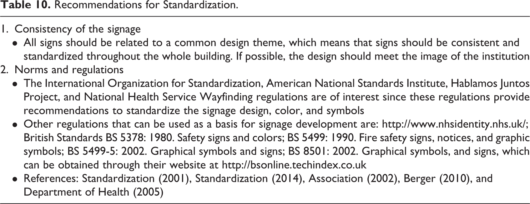
There is a huge need to create universal and standard guidelines for designing and implementing signage systems in healthcare. Leonard, Verster, and Coetzee (2014) found that, to be effective, signage needs to be consistent and under a standardized design throughout the whole building. Rousek and Hallbeck (2011) mention two specific regulations that should be used, which are The American National Standards—ANSI Z535.1-5 (National Electrical Manufacturers Association, 2002) and the norms ISO/FDIS 3864-1:2001 (E) (Standardization, 2001) and ISO 9186-3 (Standardization, 2014). Although the abovementioned standards are mainly specific for safety and regulatory signs, some of the information can also be useful for navigational signage. For example, the Americans with Disabilities Act (Board, 1990) document, although it was developed for inclusive purposes, has a specific section related to signage. Some specific best-practice manuals like the Universal Symbols in Health Care Workbook (Berger, 2010) and Wayfinding Guidance for Healthcare Facilities (Department of Health, 2005) can be useful guides and can contribute to create the regulations needed for standardization (Table 10). Although there are general regulations concerned with signage systems, the developers of healthcare facilities would certainly benefit from new or refined policies based on recommendations or manuscripts like the ones described above. There are a lot of policies related to regulatory or safety signage, but less is available for the graphical, physical, and implementation characteristics of the signage for healthcare settings.
Recommendations for Standardization.
Recommendations for Inclusivity and Characteristics of the User
This specific design category (Table 11) groups the inclusivity of disabled users like the blind, color-blind, visually impaired people, and the elderly (De Lobo, 2010). The elderly are a huge proportion of the population that use these facilities, and so, additional measures, such as trained staff, assistive technologies, and architectural elements, should be considered when designing the navigational signage in these settings (Ministry of Health, 2014). These users and the ones with temporary or other permanent disabilities lead to specific concerns in signage design and implementation. Harun, Hamid, Talib, and Rahim (2011) mentioned some characteristics of the users, like age, language, cultural background, and literacy levels, which should be considered. They suggest that alternative wayfinding systems can be applied to complement the traditional signs, for example, talking signs, interactive maps, and so on (Harun, Hamid, Talib, & Rahim, 2011). The signage systems should be analyzed through the eyes of the users and, as mentioned by Kaya, Ileri, and Yuceler (2016):
Recommendations for Inclusivity and User Characteristics.

The elements contained in a signage system have to be compatible with the elements of landscape architecture, illumination system, visual identity and architectural design of that particular venue, and the wayfinding system has to be built in a way so as to respond to the requirements of the target audience. (p. 35)
Discussion and Conclusion
This review focused on the influence that signage can have on user wayfinding abilities and experiences within healthcare services. Some of the findings could be the basis for recommendations, as they contributed with specifications for developing and designing new signage systems for healthcare. Recommendations on text formatting and layout, and on symbols and pictograms, seem to be the most important as they are the ones with the most impact on the users. The characteristics of the text influence the way people understand written messages, and many times this is the most important part of the signage. Also, by associating symbols or pictograms, the inclusion of users with disabilities can be enhanced. Keeping in mind that the context in which the signage will be implemented should be considered and analyzed as each case has its own particularities.
The manual from the Department of Health (2005) was developed with direct interaction with healthcare users, and more studies like this are needed to provide a better understanding of how users experience and interpret the signage and how those experiences can contribute to produce better designs for wayfinding systems. The Department of Health manual provides tools to help evaluate current signage systems, and moreover, it offers tools that can be the basis to involve the user in the process, particularly, quantitative and qualitative tools to apply in a real context. Hence, it can help define the tools to involve users in the process of design and development of signage systems for healthcare. Many recommendations result from the application of postoccupancy evaluation studies in which recommendations are generated based on the stakeholders’ experiences of the buildings. In such environments like healthcare, the use of trials and postoccupancy tests can make a real difference.
Much of the literature reviewed is focused on patient needs, and little or no literature is focused on the staff and visitors, which also constitute a large group of users. Visitors tend to be forgotten, and they rarely use the facilities so their needs for signage can be huge compared to a patient who regulary uses the setting. Carpman and Grant (1993) mention a study entitled “Wayfinding design research: respecting the needs of patients and visitors,” where the largest source of stress was for visitors trying to find their way inside the hospital. Also, for the staff, the signage available can be important to help provide accurate directions to the users. The level of evidence regarding the needs of these two groups in the literature is scarce and more research is needed to create signage systems that serve the various different users.
Limitations of the Study
It is possible that relevant databases were overlooked, and with the keywords and inclusion criteria, some recommendations may have been disregarded or lost. Although we tried to retrieve the most important information, the limited access to the literature may have limited the numbers of documents analyzed.
Implications for Practice
The nine categories of recommendations (text format; information, hierarchy and density; language; symbols; colors; placement, dimensions, and typology; illumination, visibility, and legibility; standardization; and inclusivity) created in this work bring suggestions for designing the graphical and physical characteristics of a signage system for healthcare settings, as well as for its implementation throughout the setting. Suggestions from the literature on methods to collect user opinions and perceptions (quantitative and qualitative) and methods to test the solutions made for the problems identified by users. The application of these methods means that the users are involved in the process of signage development. The guidelines and recommendations presented here make it easier for the developers of new or renewed signage systems to create elements that meet or exceed the user needs for their wayfinding tasks. Besides its benefits for the users, some of the recommendations and guidelines presented for wayfinding can reduce costs for the institution (costs with staff time wasted on providing directions, costs with lost users that end up increasing the time wasted, etc.).
Footnotes
Authors’ Note
The authors declare that they did not need any approval since this study did not involve human subjects.
Declaration of Conflicting Interests
The authors declared no potential conflicts of interest with respect to the research, authorship, and/or publication of this article.
Funding
The authors disclosed receipt of the following financial support for the research, authorship, and/or publication of this article: This work was supported by “Fundação para a Ciência e a Tecnologia,” in Portugal, through a PhD grant with reference PD/BD/52348/2013 financed by national funds from “Ministério da Educação e Ciência” in Portugal and by the European Social Fund through the POPH—QREN—Typology 4.1—Advanced Training. This work was also supported by the Project NORTE-01-0145-FEDER-000022—SciTech—Science and Technology for Competitive and Sustainable Industries, cofinanced by “Programa Operacional Regional do Norte” (NORTE2020), through “Fundo Europeu de Desenvolvimento Regional”.
