
Abstract
Supervisory Control and Data Acquisition (SCADA) is a computer software architecture that collects, analyzes, and delivers real-time production data to an accompanying human-machine interface (HMI) display. SCADA displays can help ensure efficiency in industrial settings by allowing users to monitor and control production processes, see system issues, and directly interact with equipment or devices (e.g., sensors, motors). However, SCADA displays tend to be highly complex and cluttered with data and interactive components. In this research, we conducted an evaluation of various SCADA displays available online using Neilson’s ten usability heuristics. The findings revealed that those displays scored poorly in the evaluation, indicating the need for redesign concepts that prioritize user needs. We then provide redesigned displays, conduct computational modeling to ensure the effectiveness of the redesigns, and propose a set of SCADA display design guidelines aimed at improving those displays to support user needs and, ultimately, improve user performance.
Keywords
Introduction
Supervisory Control and Data Acquisition (SCADA) is a computer-based control system that is widely used in various industries, including manufacturing, power generation, and water treatment. Its primary purpose is to enable remote monitoring and control of production processes and equipment to ensure safe and efficient operations, reduce downtime and maintenance costs, and improve overall performance in industrial settings (Vavra, 2023). SCADA systems consist of hardware and software components that facilitate data collection and presentation: Real-time data is collected using sensors and devices connected to mechanical hardware and is then presented on a centralized display. Users can view real-time data, issue commands to equipment and devices, and receive alarms and notifications for issues that require attention. These features help users take prompt corrective actions, ensuring that the system runs efficiently, safely, and reliably.
SCADA displays are an essential component of the system allowing users to view real-time information about the status of processes and control parameters such as temperature, pressure, and flow rate. SCADA displays can be configured to provide various information, including real-time process values, historical trends, alarms, and other critical information (Meyers, 2022). Therefore, SCADA displays can be highly complex and cluttered with data and interactive components. Although users of SCADA displays are often experts on the systems, effective design of SCADA displays is still critical to their ability to provide users with a comprehensive, utilitarian view of the data. While standards for SCADA design do exist (e.g., ANSI/ISA-101.01-2015 and IEEE Standards for SCADA and Automation), a plethora of deviations from these standards can be found across industries.
In this work, we evaluate a set of SCADA displays found online using usability heuristics, provide a limited redesign that adheres to the heuristic principles and evidence-based color guidance, conduct computational modeling to ensure the effectiveness of the redesigns, and propose a set of SCADA display design standards aimed at improving those displays to support user needs and enhance user performance.
Nielsen’s Ten Usability Heuristics
Nielsen's ten usability heuristics (listed below) offer valuable guidelines for evaluating the design and usability of software applications, websites, and other interactive systems (Nielsen, 1994). Heuristic evaluation provides a framework for identifying potential design issues that may impact user performance, effectiveness, and/or efficiency. By adhering to these heuristics, designers can create user-friendly displays that enhance user experience and improve overall performance.
Visibility of system status: The system should provide appropriate feedback to keep users informed of system status or processing within a reasonable amount of time.
Match between system and real world: The system should use language, icons, and concepts familiar and aligned with the users and the real world.
User control and freedom: The system should provide clearly marked exits so users can undo and redo actions and exit or cancel an action at any time.
Consistency and standards: The system should be consistent and follow established design patterns and standards.
Error prevention: The system should be designed to prevent errors or problems from occurring in the first place, using confirmation dialogs or input validation.
Recognition rather than recall: The system should be designed to minimize the user's memory load and require minimal effort, such as providing clear and concise instructions. The users should not have to remember information from one part of the interface to another.
Flexibility and efficiency of use: The system should accommodate both novice and expert users by allowing shortcuts and customizable settings.
Aesthetic and minimalist design: The system should be visually appealing and not cluttered with unnecessary information or features.
Help users recognize, diagnose, and recover from errors: The system should provide clear and concise error messages that use plain language (no codes), indicate the problem precisely, and suggest an actionable solution.
Help and documentation: The system should offer clear and concise documentation and help resources that are easily accessible to users when needed.
These heuristics provide general guidance rather than specific guidelines for assessing or designing specific displays (e.g., SCADA). Here, we thoroughly examine the ten heuristics and present design guidelines tailored specifically to SCADA displays.
Color Guidance
Color is essential in interface design as it can be used to effectively organize information. The proper use of color extends beyond aesthetics to support users across various work environments by reducing eye strain, enhancing comfort, and promoting sustained user awareness (Kim et al., 2019). In general, the number of colors used should not exceed six. Further, text should be presented using achromatic colors, reserving primary colors for specific information, such as alerts. This is particularly important in time-sensitive, high-pressure environments where rapid decisions based on real-time information are necessary. The strategic use of color contributes to visually appealing and functionally optimized interfaces, resulting in improved usability and system awareness.
Computational Modeling
Computational models that simulate human visual processing and attention are another method by which displays can be evaluated to ensure that they are aligned with task priorities, effectively highlighting important information, and reducing visual clutter. Two such models that are often used to evaluate display designs are clutter and salience. Clutter models calculate a "feature congestion" score expressing the amount of visual information in the display from which an estimate of the time required to locate information in the display can be derived (Rosenholtz, Li, & Nakano, 2007). Salience models identify areas in the display that attract visual attention, such as brighter regions (Harel, Koch, & Perona2006). Comparing baseline to redesigned displays using these models allows designers to objectively measure improvements in their design and/or identify information-dense areas to target for redesign.
Method
SCADA Displays
Due to the proprietary nature of SCADA systems and associated software, accessing SCADA displays containing real-time data for research is challenging. As such, a representative sample of publicly available SCADA displays were found online and used for the analyses reported here. For the purpose of this study, these SCADA displays were categorized into three types: electrical line diagram, data-laden, and mechanical. One representative display of each type was selected for evaluation and anonymized to protect the identity of the specific system. Anonymization involved removing identifying details (e.g., logos) and data while preserving information location and general styling (see Figure 1).

Baseline Electrical Line, Data-Laden, and Mechanical SCADA Displays (Left) and Associated Redesigns (Right).
Procedure
Nielsen's ten usability heuristics were used to evaluate the three anonymized SCADA displays, with the goal of identifying potential usability issues and heuristic violations. The heuristic principles were then leveraged in the redesign of each of the three SCADA displays. Finally, to evaluate the potential effectiveness of the redesigned displays at organizing information and prioritizing attention to support user needs, clutter and salience models were applied to the baseline and redesigned displays and compared.
Results
In the sections that follow, we present the results of the heuristic evaluation of the three baseline displays followed by their respective redesigns, which aim to address violations found in the baseline displays and improve their overall effectiveness. We then propose a set of SCADA-specific guidelines for adhering to each of the 10 usability heuristics and present the computational modeling results for the baseline and redesigned displays.
Heuristic Evaluation of Baseline Displays
The heuristic evaluation revealed that all three SCADA displays fared poorly in terms of the majority of Nielsen’s ten usability heuristics (1 met, 6 unmet, and 3 inconclusive).
Visibility of system status (Met): All three SCADA displays utilized color coding to convey system status, such as using green to display a positive status and red or yellow to convey problematic areas. As users rely heavily on SCADA displays to keep them informed of system status, the use of colors conveys this information effectively, enabling users to make informed decisions and take appropriate actions in real-time.
Match between system and the real world (
User control and freedom (Inconclusive): Because evaluators could not interact with the SCADA displays, there was insufficient evidence to determine whether the designs allowed users to correct mistakes and backtrack their steps.
Consistency and standards (
Error prevention (Inconclusive): As the evaluator could not interact with the SCADA displays, there was insufficient evidence to determine whether the design effectively communicated errors to users, provided actionable suggestions, or prevented users from making errors.
Recognition rather than recall (
Flexibility and efficiency of use (
Aesthetic and minimalist design (
Help users recognize, diagnose, and recover from errors (Inconclusive): As the evaluator could not interact with the SCADA displays, there was insufficient evidence to determine whether the design provided error messages that use plain language and suggest an actionable solution.
Help and documentation (
Redesign
Based on the issues documented concerning the baseline displays, the three SCADA displays were redesigned, as shown in Figure 1 (right). These redesigned displays adhere to Neilson's ten heuristic principles and introduce several new features and functions. Noteworthy enhancements include limited use of color, red alerts for improved visibility, an Undo button, a standard toolbar, a scroll wheel, and mouse navigation for efficient searching within the system. Furthermore, the redesign incorporates a Help menu, a modal dialog, alert pop-ups, and other helpful features. These modifications aim to enhance the overall usability and effectiveness of the SCADA displays.
Proposed SCADA Design Guidelines
Visibility of system status: Provide real-time updates or notifications alerts when there is a change in the system. Present “at a glance” graphs or high-level data, such as downtime or system degradation, for quick assessment. Utilize progress bars to indicate updating processes, giving users awareness of progress. For data-laden displays, a circle wedge metaphor can be used to show last update time and anticipated time of next update. This method helps users track dynamic changes in data-rich displays.
Match between system and real world: Use recognizable icons and symbols to represent common actions or features, such as a "battery" icon to represent the device's battery status or an "x" icon to indicate deleting/canceling functions. Provide a system map on screen when the system is part of a larger set of interconnected components, such as in the case of the line diagram. Use precise, concise, and easy-to-understand terminology (e.g., “Clear All,” “Main Valve,” “Generator”) that aligns with users’ knowledge and expectations, avoiding jargon or technical terms that may be unfamiliar. Provide clear and intuitive navigation that aligns with real-world concepts, such as using the "Back" button to return to the previous page or "Undo" to reverse the last action.
User control and freedom: Allow users to customize settings and preferences (e.g., font size, background theme). Enable easy navigation for users to move back and forth between pages or screens. For systems with large spatial extents, such as line diagrams, allow flexible navigation controls (e.g., zoom in and out) with keyboard and mouse controls. Allow users to mute noncritical audio and notifications to give them control over their environment and reduce distractions, such as when a planned event occurs that sets off multiple alarms and may cause unnecessary distractions.
Consistency and standards: Use a consistent design language and visual style, such as the same color palette, typography, and layout. Use consistent and standardized terminology, keyboard shortcuts, and accessibility guidelines. Maintain consistent navigation patterns and menus, including a standardized menu structure and labeling.
Error prevention: Utilize a confirmation dialog to allow users to confirm actions and provide an option to cancel if necessary. Provide real-time validation of user inputs by highlighting errors or preventing invalid characters in a field. Implement constraints to prevent users from entering invalid or nonsensical inputs. When users attempt to input incorrect or nonsensical data, display informative error messages explaining the expected input format or data requirements. Ensure buttons, links, and menu items have clear and descriptive labels. When users perform irreversible or safety-critical actions, tailor the buttons in the warning message to reflect the intended actions. Provide clear and concise documentation, help files, and error messages to assist users in understanding system functionality, resolving issues, and effectively utilizing the software or platform.
Recognition rather than recall: Automatically populate form fields with data the user has previously entered or selected. Provide a history of previously viewed pages or actions, allowing users to recall their recent interactions quickly and easily with the system. Provide contextual information or hints to help users understand how to complete a task or navigate a system. Organize menus and navigation hierarchies logically and intuitively.
Flexibility and efficiency of use: Allow users to create and customize their keyboard shortcuts or hotkeys to improve efficiency (that do not interfere with standard shortcuts). Provide quick access to commonly used functions or actions. Allow users to perform only the necessary functions relevant to their position.
Aesthetic and minimalist design: Use clean and simple layouts with minimal shifts in contrast to reduce clutter (except for alerts and warnings). Use a limited color palette with consistent color schemes. Noncritical or nonfunctional mechanical elements should be styled and designed using low-contrast colors to reduce clutter.
Help users recognize, diagnose, and recover from errors: Provide clear and concise error messages that describe the problem and suggest actionable solutions to help users troubleshoot and resolve issues. Highlight the specific fields or areas where errors occurred. Provide suggestions or resources to help users correct errors, such as links to help content or related resources.
Help and documentation: Provide comprehensive user manuals and contact information for support or customer services in a standard, easy-to-find location (e.g., top-right of screen).
Computational Modeling
Feature congestion clutter and graph based visual salience computational models were used to assess the visual clutter and salience of the displays and compare the SCADA baseline displays to their redesigned counterparts.
Clutter
Table 1 presents a comparison of the feature congestion clutter scores for each display as computed by the clutter model (Rosenholtz, Li, & Nakano, 2007). This analysis revealed that the baseline displays had relatively high feature congestion, while the redesigned SCADA display was improved by over 50% in terms of visual clutter compared to each of the baseline displays.
Feature Congestion Score and Percent Change Across Redesigned Displays.
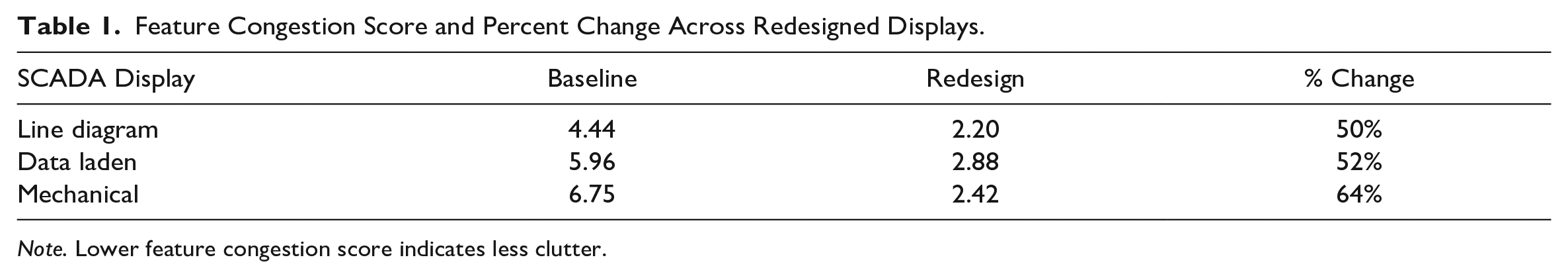
Note. Lower feature congestion score indicates less clutter.
High "feature congestion" scores suggest that users would take longer to find specific information on the displays due to excessive visual elements. The feature congestion score can be used to estimate how long it would take a theoretical user to detect when a piece of information is absent or present in a display (Rosenholtz, Li, & Takano, 2007). Table 2 indicates that each redesigned display was estimated to save search time over the baseline display.
Time In Seconds to Search Display When Target Information Is Absent and When It Is Present.
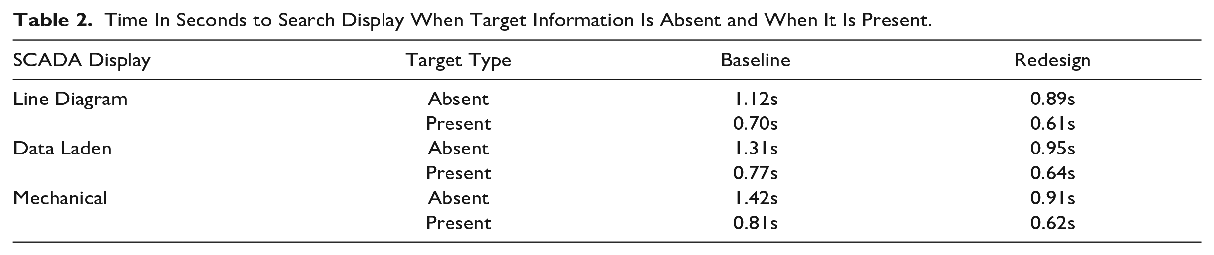
The percent improvement over the baseline displays when target information was absent ranged between 21-36% and when target information was present ranged between 14-24%. These improvements indicate a decrease in clutter and enhance the ease of information retrieval within the redesigned displays.
Salience
Figure 2 illustrates the output of the graph based visual salience model (Harel, Koch, & Perona, 2006). The baseline displays are shown on the left and exhibit high salience across the sidebars of the electrical line diagram and data laden displays, which correspond with menu and other non-critical features. This analysis showed that less critical information on the displays attracted more visual attention, as evident in the brighter regions, compared to critical information. These findings suggest that the SCADA displays failed to effectively emphasize important alerts and prioritized information, making it difficult for users to quickly identify crucial data and their relative significance. In contrast, the redesigned version on the right increases the salience of important alerts over non-critical information. As a result, the salience of the redesigned display is better aligned with task priority and users’ needs.
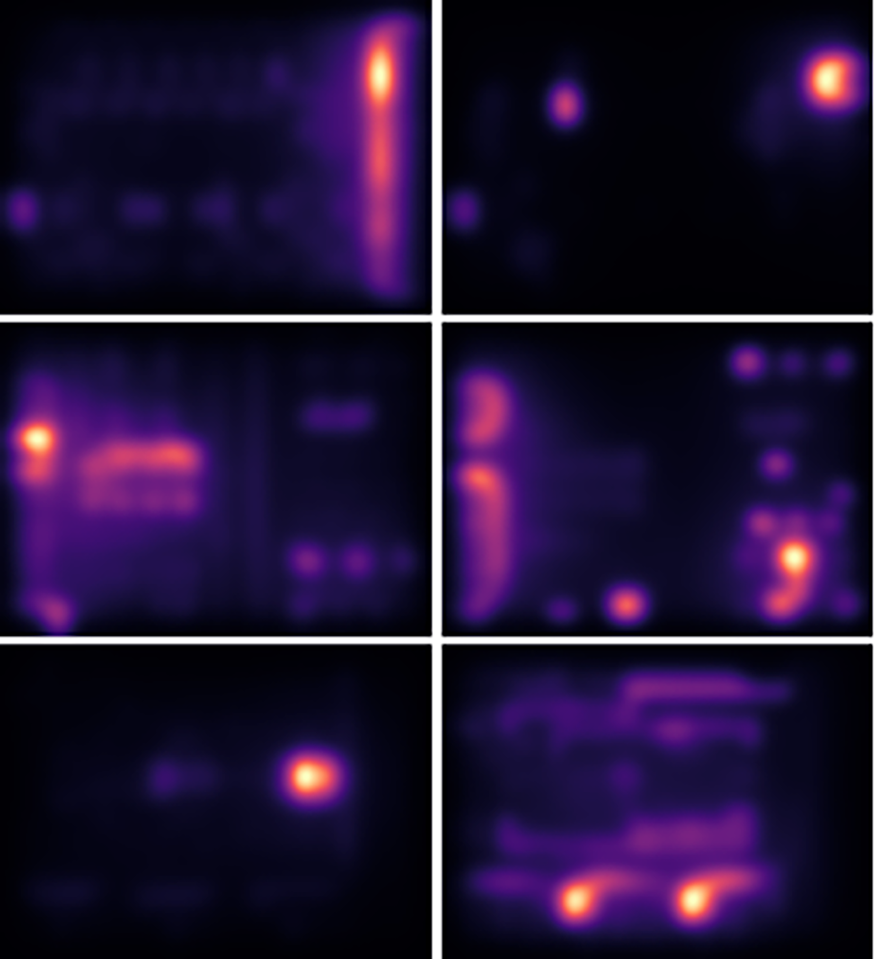
Results of the Salience Computational Visual Model Analysis for Baseline Displays (Left) and Redesigned Displays (Right).
In summary, the clutter and salience modeling results provide evidence of objective improvements achieved through the redesign of the SCADA displays.
Discussion and Conclusion
In this work, we evaluated SCADA displays found online according to well-established heuristics principles and color guidance. During our analysis, common issues were discovered and used as the basis to redesign the baseline displays. Displays were then processed through computational clutter and salience models to compare the baseline to redesigns. With this analysis, we propose a set of SCADA-specific display design guidelines.
In general, all three baseline displays overused color and fared poorly in the heuristic evaluation, emphasizing the need for design guidelines that improve the user experience of SCADA displays. The tailored guidelines derived from the evaluation were used to redesign the baseline displays. The results from the computational clutter and salience modeling indicated that our redesigns substantially improved the displays over the baseline.
When designing SCADA displays, it is important for designers to consider the users' cognitive and perceptual abilities, skill levels, and process needs, as well as display integration with other systems. The design of the SCADA display plays a crucial role in its effectiveness, aiming to display a clear and easily understandable representation of relevant process data. Designers should adhere to SCADA-specific HMI standards and guidance to create an intuitive and practical interface that helps users manage and optimize industrial processes.
Footnotes
Disclaimer
This report was prepared as an account of work sponsored by an agency of the United States Government. Neither the United States Government nor any agency thereof, nor any of their employees, makes any warranty, express or implied, or assumes any legal liability or responsibility for the accuracy, completeness, or usefulness of any information, apparatus, product, or process disclosed, or represents that its use would not infringe privately owned rights. Reference herein to any specific commercial product, process, or service by trade name, trademark, manufacturer, or otherwise does not necessarily constitute or imply its endorsement, recommendation, or favoring by the United States Government or any agency thereof. The views and opinions of authors expressed herein do not necessarily state or reflect those of the United States Government or any agency thereof.
Funding
This material is based upon work supported by the U.S. Department of Energy, Office of Science, Office of Science under Award Number DE-SC0020819.