



Abstract
Individuated font selection, which can increase text reading speed, may be able to increase mathematical expression reading speed and influence reasoning accuracy. To investigate whether the same font that increases a participant’s reading speed enhances mathematical reading, we compared their speed in evaluating mathematical expressions as true or false presented in their fastest reading font as determined by empirical test and with a control font, Times Roman. Participants were faster in completing mathematical problems when using typography selected for individual readability, but no difference occurred in task accuracy, matching patterns previously seen in interlude reading. Future research should assess the impact of elements of time pressure, math complexity, numeric versus text-based questions, and associated math anxiety.
Introduction
Readability is a measure of how written text influences the ability to comprehend materials, reading speed, and engagement (Dale & Chall, 1949). For both physically printed texts and screen-presented texts, content readability can be increased by selecting shorter sentences in the passages, shorter words in the sentences, and familiar words (Perera, 1980). A growing body of work suggests that beyond content, typographical aspects of a document may strongly influence reading speed and comprehension, through format readability adjustment (Beier et al., 2022; Wallace et al., 2022; Wallace et al., 2022; Cai et al., 2022; Wallace et al., 2021). Individuated changes to typography, such as font selection, are possible on screen-based text in ways that are not practical in printed matter. One practical application of the flexibility afforded by screens is to provide better readability in screen-presented text by selecting typographic variables to match the reader’s needs.
Improving the readability of materials through customized typography has previously focused on text-based content. For example, ease of reading (Chaparro et al., 2010), assessing comprehension of passages (Cai et al., 2022; Wallace et al., 2021), reading speed (Blanc-Goldhammer & MacKenzie, 2018), or effectiveness of reading short text in complex environments (Sawyer et al., 2020; Sawyer et al., 2020). Specific elements of the typography can influence reading performance, such as case (Kember & Varley, 1987), spacing or spatial frequencies (Patching & Jordan, 2005; Paterson & Jordan, 2010), or the use of a sans-serif or serif font (Moret-Tatay & Perea, 2011; Arditi & Cho, 2005; Josephson, 2008). Manipulation of font size and font selection have been shown to increase reading speed (Cai et al., 2022; Soleimani & Mohammad, 2012). Individuation is necessary as one font does not optimize speed for all readers—one reader’s fastest font may be another’s slowest (Wallace et al., 2022). Specifically, typographic individuation can help a reader to find a format which promotes success in their reading task, and digital technologies can allow this format to appear across all a reader’s screens, such as files, applications, and devices. To determine one’s individuated font and spacing parameters, empirical testing is needed, but fortunately a short reading test can determine these. While there is a speed-comprehension tradeoff, this appears to be relatively small and thus optimizing for speed likely does not incur serious comprehension penalties, but more research is required (Wallace et al., 2021).
Previous assessment of the benefits of individuated typography has primarily focused on text-based or narrative content. However, we aim to seek if the same optimizations that work for increasing reading speed and processing also personally benefit speed-optimized numeric typography formatting, as in mathematics. Mathematics is complex for readers who may be much more fluent in terms of reading other written content, and this can lead to errors and an elevated level of anxiety associated with interacting with this type of material (Ashcraft & Krause, 2007). With mathematics already having been stigmatized as ‘difficult’ (Aschraft, 2002), an opportunity to minimize barriers to learning seems prudent to explore.
In our current work, we aim to evaluate whether individuated, format readability-oriented typography settings intended for increasing reading speed in narrative content increases speed of evaluating mathematical expressions. Investigating this allows us to assess if the benefits of speed-optimal typography are equally beneficial as task difficulty increases, as well as if speed-optimal typography adjustments may reduce state math anxiety. In this research, we study the performance of students evaluating simple mathematical expressions, as a first step towards understanding ways to use typography individuation in math more broadly.
Methods
Participants
We recruited a sample of 30 university students (M age = 19.56; 9 Males, 21 Females, 0 Other) from The University of Northern Colorado, a mid-sized public university. An a-priori power analysis was conducted using G*Power version 3.1.9.7 (Faul et al., 2007) to determine the minimum sample size required to test the study hypothesis. Results indicated the required sample size to achieve 80% power for detecting a medium effect (Cohen, 1988), at a significance criterion of α = .05, was N = 23 for a two-tailed t-test. Thus, the obtained sample size of 28 is adequate to evaluate the study hypothesis, that individuated font and spacing will increase the speed and/or accuracy when evaluating whether mathematical expressions are true or false.
Design and Procedure
Participants completed an online assessment (https://readabilitylab.xyz) to determine both their fastest font (Times, Roboto, EB Garamond, Montserrat, or Noto Sans) and spacing (-0.05, 0.0, +0.05, +0.10, +0.30 em) for a passage-length (approximately 150 words) reading task. Table 1 shows the number of participants with each font as their fastest, and the number with each spacing as their fastest.
Number of participants with each font or spacing as their fastest.

After participants determined their font and spacing settings, Participants evaluated two blocks of 80 basic arithmetic problems indicating whether each expression was true or false, one block utilizing a ‘standard’ typography setting (Font: Times; Spacing: 0 em) and one block utilizing their fastest typography settings based on the individualized initial assessment (Times, Roboto, EB Garamond, Noto Sans, or Montserrat). The arithmetic problems consisted of two pairs of two-digit numbers added together to a single solution that was either correct (e.g., 45 + 23 = 68) or incorrect (e.g., 10 + 15 = 26), 50% of the solutions were incorrect. The error in the computations was in 50% of the incorrect statements due to an error in the tens place, 50% due to an error in the ones place, based on Hunt and Sandhu’s previous work (2017). The blocks of problems were presented in random order, to mitigate order effects of typography settings [Times 0em then optimal; optimal then Times 0em]. Participants viewed the entirety of the problem set on a single scrolling page, and indicated whether each expression was true or false by pressing 0 to indicate incorrect, and 1 to indicate correct (Figures 1 and 2).

Average time required to complete the evaluation of a block of 80 arithmetic expressions. Participants completed the task faster when material was presented in their speed-optimal font.
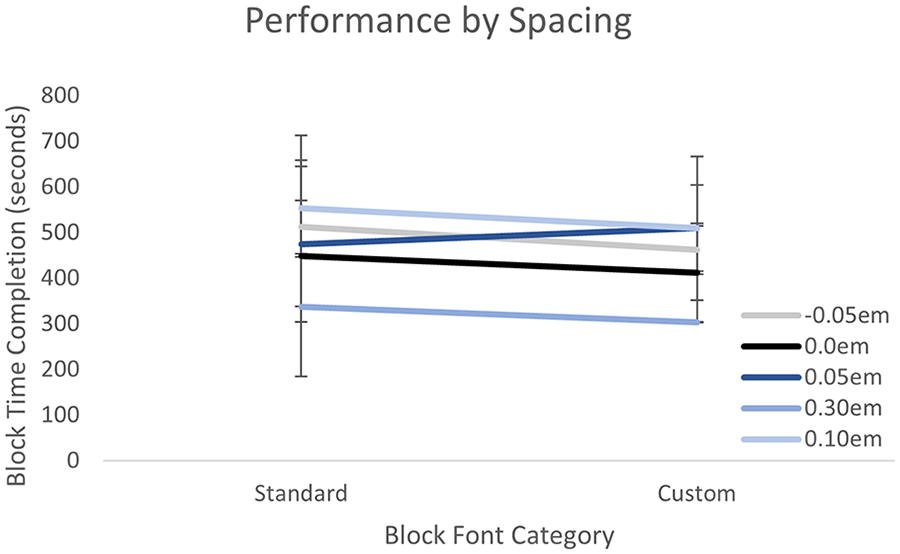
Average time required to complete the evaluation of a block of 80 arithmetic expressions based on spacing differences. Participants completed the task similarly when material was presented in their speed-optimal spacing versus the standard font spacing.
Results
Two participants’ datasets were removed due to their failure to complete the experiment, leaving 28. Participants with Times 0em as their fastest settings completed the study with the same settings twice. The most common fastest typography settings were predominantly Roboto and Times and +0.10em spacing. Participants completed the arithmetic in their fastest and ‘standard’ typography settings with similar accuracy (~94%), t(27) = 0.40, p = .348. For the most part participants were faster to complete the true/false arithmetic statement evaluation presented in their speed-optimal settings (M speed-optimal = 474.91s, M standard = 519.37s), t(27) = -1.82, p = .040.Removing the data for the two participants whose fastest font was Times 0em (and thus who completed the study with the same font and spacing settings in both conditions), and the effect was still significant, t(25) = -2.08, p =.024.
Discussion
We found that the speed-optimal individuated typography setting for paragraph-length text as determined by the online readability assessment increased student performance in a basic arithmetic task, significantly reducing their total task completion time, confirming our prediction. While we found no difference in task accuracy, this would be expected given the ease of the correct/incorrect mathematical expression identification task. This is in line with previous work which found that reading performance may be improved in either speed or comprehension, but not both (Chaparro et al., 2010; Wallace et al., 2022).
Format readability optimization is a new and rapidly growing area of inquiry, and the present work recommends several refinements to the methods used both for this specific topic, and more generally. Future research should assess performance at a micro-level (i.e., per-question), rather than measuring completion time for a complete set of questions. Assessing overall time informs overall performance but does not account for individualized pacing or breaks. In addition, testing fonts more commonly used in mathematics (i.e., Latin Modern, Lucida, Cambria) could improve the ecological validity of future work. The current work employs fonts previously tested by The Readability Consortium (https://thereadabilityconsortium.org/) and available in the free research tools that group makes available, but future work should assess both more conventional mathematical font choices, and new technologies in mathematical fonts, such as variable typefaces which offer other dimensions of adjustment within the same font.
Future work would be well advised to look more granularly at time, fatigue, and mathematics strategy. It could be hypothesized that reduced readability increases perceived difficulty. As perceived difficulty of math problems increases because of reduced readability, participants may spend more time during a break or while solving a single problem, which can be disambiguated by timing individual responses. Furthermore,
Finally, future research should look beyond mathematics to other non-traditional reading domains where those fluent with conventional written words may yet struggle. If mathematics can benefit from improvements in format readability, such as speed-optimal settings, findings such as these will allow us to continue to explore readability optimization’s role in the digitalization of the educational system.
This demonstration of the application of format readability, in the form of speed-optimal individuated typography into successfully transferring to a novel domain indicates that designers, researchers, instructors, and developers should consider investigating and implementing speed-optimal fonts and spacing in a variety of circumstances. As mathematics and other disciplines rely on technology-based education resources, we must investigate the nuances that will lead to the best success for students.
