
Abstract
This article investigates whether and how the demand for information at country and firm levels affects the selective use of key performance indicators graphs in corporate annual reports. Our study finds that the country-level and firm-level demands for information provide an incentive, rather than a curb, for a selective display of key performance indicators, which is an important concern in corporate communication and reporting. The external pressure from the demand for information seems to encourage, rather than discourage, impression management. We suggest that annual report readers should use graphical information with caution as companies are likely to provide a self-serving, nonneutral, account of their performance in those contexts where the pressure to perform is higher.
Introduction
Financial reporting is an important type of business communication where the language of accounting (e.g., the measures and numbers in financial statements) works in combination with the natural language to provide a full picture of the company’s performance (Crowther, Carter, & Cooper, 2006; Sandell & Svensson, 2016). In corporate annual reports, natural language comprises linguistic and nonlinguistic (e.g., visual elements like graphs) textualizations and contextualizations of the accounting numbers through descriptions and explanations (Crowther et al., 2006; Sandell & Svensson, 2016). Financial reporting is highly regulated. However, usage of graphs in corporate annual reports is generally voluntary. Graphs are, therefore, still one of the few places in the annual report where there is ample discretion. Yet they play an important role in determining the perception of the company (Penrose, 2008) and can affect both nonsophisticated and sophisticated accounting users (Dilla, Janvrin, & Jeffrey, 2013). Graphs were found to be impression management tools, used to systematically provide a favorable view of the company’s performance (e.g., Dilla & Janvrin, 2010; Falschlunger, Eisl, Losbichler, & Greil, 2015; Laidroo, 2016a). Empirical studies mainly focused on the relationship between usage of graphs of key performance indicators (hereafter KPIs) and company’s performance (e.g., Beattie & Jones, 1992; 2008; Dilla & Janvrin, 2010; Falschlunger et al., 2015; Laidroo, 2016a; Laidroo & Tamme, 2016), with little or no analysis on whether this relationship is affected by other determinants.
In order to address this gap, this study aims to investigate whether and how the demand for information at the country level and firm level influences the likelihood of impression management in corporate annual reports. The empirical investigation is conducted through a longitudinal analysis on KPI graphs in the annual reports of the largest nonfinancial firms headquartered in the four main European economies (France, Germany, Italy, and the United Kingdom) from 2006 to 2009. We choose to focus our analysis during the global financial crisis, as it provides an opportunity to analyze the factors that may affect the behavior of companies when they are exposed to intense public scrutiny and reputational threats (Brühl & Kury, 2016; Jones, Melis, Gaia, & Aresu, 2017; Laidroo, 2016b; Rim & Ferguson, 2017).
This study contributes to the literatures on impression management (e.g., Merkl-Davies & Brennan, 2007, 2011; Penrose, 2008) and the natural language in corporate communication (e.g., Beelitz & Merkl-Davies, 2012; Brühl & Kury, 2016; Crowther et al., 2006; Dunn, 2009; Sandell & Svensson, 2016). Prior literature has documented that impression management encompasses both the textual and visual aspects of annual reports (e.g., Beattie, 2014; Beattie & Jones, 2008). However, while there is a sizeable body of literature on impression management through narratives (for reviews, see Beattie, 2014; Merkl-Davies & Brennan, 2007), graphs have received relatively less attention (Penrose, 2008). Moreover, to our knowledge, this is the first study on impression management in corporate reporting to adopt a multilevel research design, by investigating whether and how the role of the demand for information, at the country level and firm level, affects visual reporting choices. Our empirical findings point out that the choice of using graphs to portray KPIs in annual reports does not develop in a vacuum. Our empirical analysis reveals that a higher demand for information at country and firm levels induces companies to be selective in KPI graphs’ usage for self-presentation purposes.
The remainder of this article is structured as follows. The next section presents a brief review of the literature on natural language and graphical reporting in business communication. This is followed by illustration of the development of the hypotheses. Then we present our research methodology, including sample selection, data gathering, and definitions of variables. Our findings are presented in the penultimate section. In the final section, we present our discussion and conclusion.
Literature Review
Natural Language in Business Communication
Preparers of financial documents (e.g., annual reports) are involved in disclosing company’s results. In large organizations, preparers are supported by the investor relations department/staff, which is composed of professionalized employees and consultants who report to the company’s top management (Bushee & Miller, 2012; Laskin, 2009). The investor relations function serves as a link between company’s top management and the financial community. It deals with the management of the communication of company’s related information to investors, financial analysts, and the media (Kirk & Vincent, 2014; Marston & Straker, 2001). It was found to play an important role not only in those smaller firms who seek visibility in the financial community (Bushee & Miller, 2012) but also in those large firms that do not face particular visibility barriers and already operate in a rich disclosure environment (Kirk & Vincent, 2014).
When disclosing company’s results, preparers have to work in a highly regulated environment. However, they can also voluntarily explain to the financial community why and how certain results have (or have not) been achieved. Corporate language comprises not only financial data and measurements (e.g., those displayed in the financial statements) but also natural language. Natural language refers to the various ways used by companies to make sense, explain, and justify a certain result (Sandell & Svensson, 2016). It leads to accounts that explain past or future events and are used to control external impressions (Beelitz & Merkl-Davies, 2012; Dunn, 2009; Scott & Lyman, 1968). Natural language comprises both linguistic (e.g., narratives) and nonlinguistic visual devices (e.g., pictures and graphs) (Sandell & Svensson, 2016). Visual devices help to convey corporate identity and values (David, 2001; Ditlevsen, 2012). They can operate independently from the text, or in combination with it, to express meanings conveyed less easily through the text (De Groot, Nickerson, Korzilius, & Gerritsen, 2016).
In corporate annual reports, natural language can help to explain, justify, and make sense of the financial measures that are provided in the financial statements and their notes (Sandell & Svensson, 2016). Companies voluntarily describe their performance using natural language in several parts of the annual report. For instance, the Chair’s and CEO’s letters in the first pages of the annual reports briefly explain the company’s strategies and values and its main results in the last financial year (Moreno & Casasola, 2016). However, natural language can also be used for impression management, when company’s performance is systematically presented in the best possible light (Clatworthy & Jones, 2003; Erickson, Weber, & Segovia, 2011; Poole, 2016; Sandell & Svensson, 2016). It may thus have a “promoting” public relations, rather than an “informing and reporting” function (Bhatia, 2010, p. 39). This helps companies to create or protect a desired image, influencing also their reputation (Bolino, Long, & Turnley, 2016; Rim & Ferguson, 2017). Self-presentations can also help preparers and organizations to control the impressions of themselves, with self-enhancing and self-confirming messages, being used as autocommunication tools (Christensen, 1997; Ganesh, 2003; Morsing, 2006; Schlenker, 1985; Spence, 2009).
The Main Features of Graphs and Their Usefulness in Corporate Annual Reports
Graphs are displays used to represent and analyze historical and forward-looking data. Based on a set of general rules, they “visually display measured quantities by means of the combined use of points, lines, a coordinate system, numbers, symbols, words, shading and color” (Tufte, 2001, p. 9). The most common types of graphs are histograms, bar, pie, and line charts (Beattie & Jones, 2008; Havemo, 2018). Histograms and bar-charts are mainly used to compare discrete values, while line graphs to display continuous trends (Ying Hill & Milner, 2003). Pie-charts mainly portray proportions and/or frequencies of a categorical variable (e.g., gender) (Kosslyn, 1989).
Graphs have two main explicit functions. They can be used to explore/analyze data or to present information to users (Cleveland & McGill, 1985). In business communication, graphs are generally voluntary, unaudited, presentational tools that can provide useful and neutral information, being effective to integrate information, make comparisons, and contextualization (Kelton, Pennington, & Tuttle, 2010; Vessey, 1991; Ying Hill & Milner, 2003). They attract the reader’s attention, being eye-catching and easy-to-read communication tools (Frownfelter-Lohrke & Fulkerson, 2001; Penrose, 2008; Tufte, 2001; Ying Hill & Milner, 2003). KPI graphs can help accounting users, including those with financial knowledge, to interpret information, by reducing their cognitive effort (Dilla et al., 2013) and allowing the use of their dominant sense, sight (Maas & Verdoorn, 2017).
Factors That Can Affect the Use and “Abuse” of Graphs in Corporate Annual Reports
Instead of being used as neutral communication tools, graphs have generally been misused in corporate annual reports to control the perception of the company, emphasize the company’s positive outlook and, possibly, manage the impressions of users (e.g., Beattie & Jones, 1992, Cassar, 2001; Cho, Michelon, & Patten, 2012a; Cooper & Slack, 2015; Dilla & Janvrin 2010; Frownfelter-Lohrke & Fulkerson, 2001; Laidroo, 2016a).
Selectivity is the primary impression management technique in graphical reporting (Beattie & Jones, 2008). It concerns the systematic association between graph usage and company’s financial performance (Beattie & Jones, 1992, 2000a; Dilla & Janvrin, 2010; Falschlunger et al., 2015). KPI graphs’ usage is selective when corporate annual reports include more graphs in case of company’s positive financial performance and less graphs when performance is less positive (e.g., Beattie, Dhanani, & Jones, 2008; Beattie & Jones, 1992; Laidroo & Tamme, 2016). Despite being legal, selectivity in corporate annual reports is a form of “abuse” as it violates the principle of comparability over time (Beattie & Jones, 1992; Di Pietra & Melis, 2016). By emphasizing positive and de-emphasizing negative information, it also violates the principle of neutrality as stated by the International Accounting Standards Board (2018), “A neutral depiction is not slanted, weighted, emphasised, de-emphasised or otherwise manipulated to increase the probability that financial information will be received favourably or unfavourably by users” (p. 16).
Empirical impression management studies mainly focused on selectivity (e.g., Beattie & Jones, 1992; Dilla & Janvrin, 2010; Falschlunger et al., 2015; Laidroo, 2016a; Laidroo & Tamme, 2016), with little attention on its determinants. However, KPI graphs’ usage in corporate annual reports, like any other form of disclosure, does not develop in a vacuum (Talbot & Boiral, 2018). Graphical reporting choices may be influenced by the context in which companies operate, including country-level institutional characteristics (e.g., Beattie & Jones, 2000b, 2001; Cho et al., 2012a) and firm-level characteristics (e.g., Beattie & Jones, 1992, 2008; Cho, Michelson, &Patten, 2012b). At country level, disclosure practices tend to reflect the underlying institutional influences that affect companies in different countries (Nobes & Parker, 2008). An important role is played by the country’s financial development, that is, “the degree to which national financial systems assess firms, monitor managers” (Beck & Levine, 2002, p. 160). At firm level, reporting choices may be affected by the demand for information raised by annual report key users, like financial analysts (e.g., Healy & Palepu, 2001).
Prior literature on usage of graphs in annual reports examined the role of some firm-level characteristics. For instance, larger companies were found to use more graphs in their annual reports (Cassar, 2001; Cho et al., 2012b; Laidroo, 2016a). Findings on the relationship between size and impression management are, on the other hand, mixed (Courtis, 2004; Moreno & Casasola, 2016; Oliveira, Avezedo, & Borges, 2016). Communication consultants may also have an important role in graphical reporting. They help annual report preparers by validating and offering credibility to the content and design of the reports (Beattie et al., 2008; Chaidali & Jones, 2017). Consultants are also likely to call for an increased use of graphs as they are strong eye-catching communication tools. In addition, company’s graphical reporting can be influenced by the media pressure, which drives public concern (Brown & Deegan, 1998). High media attention can be matched by a high use of KPI graphs to meet the demand of easy-to-read information. Graphs, indeed, are suitable for nonsophisticated readers, as their interpretation does not require sophisticated accounting skills (Cardinaels, 2008).
Graphical reporting in annual reports can also be influenced by the environment in which the company operates (Beattie & Jones, 2000b, 2001; Cho et al., 2012a; Talbot & Boiral, 2018). The company’s industrial sector can affect its graphical reporting either because of industry-related peer-influence or the need to conform to industry-specific expectations (e.g., Castelo Branco & Lima Rodrigues, 2006; Cho et al., 2012b). Last but not least, prior literature found that the country’s legal origin may influence impression management practices by affecting the organization’s perceived accountability (Cho et al., 2012a).
Hypotheses Development
The Influence of Country-Level Financial Development on Selectivity in Graphical Reporting
High financially developed countries are typically characterized by a large equity market (La Porta, Lopez-de-Silanes, Shleifer, & Vishny, 1999) and a higher capital market orientation (Pagano, Panetta, & Zingales, 1998). These institutional characteristics produce a higher need for companies to provide information to “anonymous” investors at a distance, as the demand for information about company’s performance is generally higher (Ball, Kothari, & Robin, 2000). In high financially developed countries the supply of information via the annual report is also likely to be better, as annual reports are typically the main source of information for shareholders not involved in management (Nobes, 1998). Disclosure requirements are also generally stricter and better enforced (Degeorge, Ding, Jeanjean, & Stolowy, 2013) and investor protection is stronger (e.g., La Porta, Lopez-de-Silanes, Shleifer, & Vishny, 2000). These institutional contexts reduce incentives to conceal poor company’s performance (Leuz, Nanda, & Wysocki, 2003).
A high level of a country’s financial development can, therefore, exert a “monitoring” effect and reduce the opportunity for impression management. For example, given the higher level of monitoring from the financial community, country’s financial development has been found to curb earnings management (Degeorge et al., 2013; Leuz et al., 2003). As earnings management was found to be positively associated with impression management (e.g., Aerts, Cheng, & Tarca, 2013; Godfrey, Mather, & Ramsay, 2003), country’s financial development could also curb impression management.
However, a country’s financial development is also expected to influence the incentives for impression management. In high financially developed countries, financial markets exert a stronger pressure to perform than in less financially developed countries (“pressure effect,” Degeorge et al., 2013; Yu, 2008). On the one hand, the excessive pressure to perform could increase accountability, but, on the other, it could also increase the incentives for self-serving reporting practices (Beattie & Jones, 2000b). As earnings management practices are more difficult in high financially developed countries (Degeorge et al., 2013; Leuz et al., 2003), companies could adopt alternative legal presentation techniques, such as expectations management (Liu, 2014) or impression management (Guillamon-Saorin, Garcia Osma, & Aerts, 2016).
By selectively using KPI graphs in the presence of a high country-level demand for information, preparers could, on behalf of their company, try to influence the financial community. Even when unable to affect the most sophisticated users, they can still simultaneously serve the interests of a public self (e.g., social approval) and of a private self (appearing more successful) (Greenwald & Breckler, 1985). In high financially developed countries, where the external pressure to perform is higher, impression management could thus aim to maintain or increase the status of annual report preparers and their organizations (e.g., Christensen, 1997; Christensen, Morsing, & Thyssen, 2013; Morsing, 2006), without necessarily influencing the whole financial community. Country-level financial development could, therefore, also contribute to increase the incentives for impression management.
Thus, we expect that
The Influence of Firm-Level Financial Analysts’ Following on Selectivity in Graphical Reporting
Among annual report users, financial analysts play an important role in demanding information about company’s performance (e.g., Degeorge et al., 2013; Healy & Palepu, 2001; Yu, 2008). They provide investors with information through their recommendations and interpretations of corporate plans and forecasts (Clatworthy & Lee, 2018). Hence, financial analysts can be representative of the demand for information at firm level (Bozzolan, Cho, & Michelon, 2015).
Because of the active participation of financial analysts in the information distribution process, self-serving financial reporting choices could be influenced by analyst coverage (Chen, Cumming, Hou, & Lee, 2016; Yu, 2008). Previous literature showed the mechanisms whereby financial analysts provide a monitoring effect to companies (e.g., Healy & Palepu, 2001; Jensen & Meckling, 1976). A high level of analyst coverage generally increases the intensity of monitoring (Degeorge et al., 2013; Liu, 2014; Yu, 2008) and creates a better information environment for a company (Healy & Palepu, 2001; Zhang & Aerts, 2015). Indeed, high analyst coverage was found to curb earnings management practices (Degeorge et al., 2013; Liu, 2014; Yu, 2008) and detect frauds (Chen et al., 2016; Dyck, Morse, & Zingales, 2010). Analysts were found to limit impression management via narratives (Guillamon-Saorin, Isidro, & Marques, 2017; Zhang & Aerts, 2015) as, when they find these practices “implausible” they make negative inferences about the company’s prospects (Barton & Mercer, 2005). According to this “monitoring effect” (Yu, 2008), financial analysts could discourage impression management (Chen et al., 2016).
However, financial analysts can also create excessive pressures to perform in the company they follow (Chen et al., 2016; Yu, 2008). Companies strive not only to meet and beat analysts’ thresholds but also to provide a favorable appearance of the company’s performance (Schleicher & Walker, 2010; Washburn & Bromiley, 2014). Preparers could be keener to control the perception of the company and enhance its portrayed performance, when analyst coverage is high (Schleicher & Walker, 2010). This self-serving use of KPI graphs in presence of a high analyst coverage could be due to two complementary reasons. Analysts seem to develop an expectation about firm performance (Sanders & Carpenter, 2003). Therefore, companies could try to drive their expectations by providing them with visual aids that induce positive impressions. Indeed, graphs’ disclosure biases were found to influence analysts’ forecasts in the short term (Muiño & Trombetta, 2009). This could be due to financial analysts’ limited time and attention which determine their focus on readily available indicators that summarize the existing information (Hirshleifer & Teoh, 2003; Merkl-Davies & Brennan, 2007; Muiño & Trombetta, 2009). However, financial analysts are sophisticated users. Hence, they might not be affected by impression management (Barton & Mercer, 2005; Dilla et al., 2013). Nonetheless, preparers of annual reports could still portray KPIs selectively for self-presentation purposes, that is, to maintain (or reinforce) their self-esteem and the organization’s one (Christensen, 1997; Christensen et al., 2013; Morsing, 2006; Schlenker, 1985; Spence, 2009). Self-serving graphical reporting strategies can have a self-enhancing role, leading to gratifications through a positive portrayal (Kjærgaard, Morsing, & Ravasi, 2011). When socially powerful stakeholders, like financial analysts, are present, concern over one’s public self is stronger (Greenwald & Breckler, 1985). Hence, a selective use of KPI graphs could be chosen to maintain social approval and/or reinforce company’s self-image and the preparer’s self-esteem (Morsing, 2006; Spence, 2009).
Therefore, we expect that
Research Method
Sample
We selected the top (by total assets) listed 50 companies, in each of the four European main economies by GDP in 2006 (Eurostat, 2015): France, Germany, Italy, and the United Kingdom. Our sample covers 200 companies (50 per country). We selected the largest companies as they are expected to be communication leaders (Beattie & Jones, 2001) and are highly visible by the public (Oliveira et al., 2016). Impression management tends to be more pronounced in these companies (Bozzolan et al., 2015; Merkl-Davies & Brennan, 2007). Financial companies were excluded because of the peculiarities of the financial industry in the usage of graphs (e.g., Laidroo, 2016a). The choice of the 2006-2009 period allows us to analyze a period in which companies and their managers are exposed to intense public scrutiny and reputational threats due to the occurrence of the global financial crisis (Jones et al., 2017; Laidroo, 2016b; Rim & Ferguson, 2017). Therefore, our final sample comprises 800 annual reports of 200 nonfinancial listed European companies.
Data Gathering and Definition of Variables
Data on graphs were manually collected from annual reports. We started by gathering page-by-page the title and page of each graph in the consolidated annual reports. Then, we associated each graph with a certain content using keywords. Following previous literature (e.g., Beattie & Jones, 2000a; Dilla & Janvrin, 2010), we classified as KPI graphs those that portray the following financial indicators: dividend per share (DPS), earnings per share (EPS), pretax income, and sales. We considered as KPI graphs only those that portray the group’s performance, rather than the financial result in specific divisions or geographical areas (Beattie & Jones, 2001). Our dependent variable (KPI graphs) is the natural logarithm of the number of KPI graphs in each annual report. 1
Variables of Interest
Data on the country’s financial development were gathered from Degeorge et al. (2013). The variable equals the values of the first principal component of two underlying measures of financial development, named “Finance-Aggregate” (Beck & Levine, 2002). The first measure represents the overall activity of financial intermediaries and markets, taking into account the value of credits by financial intermediaries to the private sector and the value of shares traded on the stock exchange. The second one is the overall size of the financial sector and refers to both private credit and market capitalization (Beck & Levine 2002; Degeorge et al., 2013). Thus, the variable “Financial development” is equal to the natural logarithm of the “Finance-Aggregate” index values.
Data on financial analysts were gathered from Thomson One database. Following prior literature (e.g., Chen et al., 2016; Liu, 2014; Yu, 2008), the variable equals to the natural logarithm of the number of brokerage houses that issue analyst reports about the company during the financial year before the annual report was designed and published.
Control Variables
We controlled for variables which prior literature found they may influence graphical reporting in corporate annual reports (see the “Literature Review” section). They were defined as follows:
Financial performance (return on assets; ROA). Financial performance equals to the ROA at the end of the financial year (Cho et al., 2012b; Moreno & Casasola, 2016), before the annual report was designed and published (source: Compustat database).
Size. Company’s size equals to the natural logarithm of total assets at the end of the financial year, before the annual report was designed and published (Laidroo, 2016a) (source: Amadeus database).
Consultant. This dichotomous variable equals 1 if the company discloses the presence of a communication consultant in the annual report, and 0 otherwise (source: annual report).
Media coverage. Media coverage equals to the natural logarithm of the number of printed articles published in the main financial newspapers in each country, during the financial year before the annual report was designed and published. To identify the articles about the company, we selected only those where either the name of the company or of its CEO appeared in the headline (Bozzolan et al., 2015). To identify those articles that focused on the company’s KPIs, we then selected only those articles where the name of at least one KPI appeared in the headline (sources: Factiva and the archive section of the newspaper website).
Industry. Firms were grouped, using the two-digit SIC codes (Cho et al., 2012b), in these six industries: mining and construction; light manufacturing; heavy manufacturing; transportation, communication and utilities; wholesale and retail trade; and other industries (source: Compustat database).
Years. Graphical reporting may change over time. It is a set of dichotomous variables which equal 1 if the graphs’ usage refers to the i year (i = 2006, 2007, 2008, 2009) and 0 otherwise.
Legal origin. The variable equals 1 if the country belongs to a common-law country (United Kingdom) and 0 if the country belongs to a civil-law country (France, Germany, and Italy; source: La Porta, Lopez-de-Silanes, Shleifer, & Vishny, 1998).
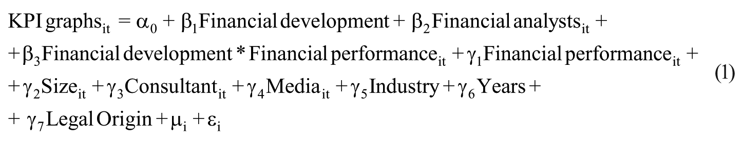
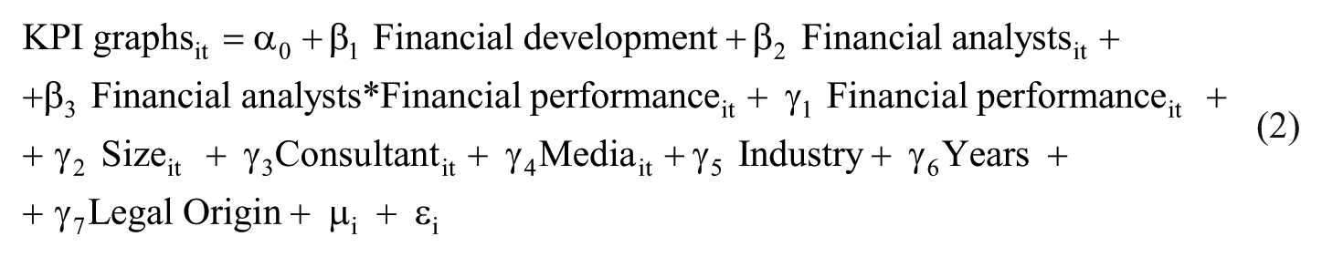
Models
As the decision to graph a specific KPI might be influenced by the company’s overall graphical strategy, single observations are not independent. Hence, ordinary least squares regressions with random effects, with the companies being the clusters, were run to test our hypotheses.
To test the stronger selectivity in the usage of KPI graphs in the presence of a higher country’s financial development and a higher analyst following, we added interaction terms, controlling for all the independent and control variables. More specifically, we added an interaction term of the variables “Financial development” and “Financial performance” to explain the incremental impact of financial performance on the use of KPI graphs when companies are headquartered in high financially developed countries (Hypothesis 1) and an interaction term between “Financial analysts” and “Financial performance” to explain the incremental impact of financial performance on the use of KPI graphs when companies are followed by more financial analysts (Hypothesis 2).
To test Hypothesis 1 on the influence of the country’s financial development on the selective use of KPI graphs, we used Model (1):
To test Hypothesis 2 on the influence of analyst coverage on the selective use of KPI graphs, we used Model (2):
To check for multicollinearity, we verified the level of correlation among the independent variables and the variance inflation factors (VIFs).
Findings
Descriptive Statistics
Table 1 reports the number of KPI graphs per country and year analyzed. Sales and pretax income are more commonly graphed than DPS and EPS. The most common KPI graphed is sales in all the countries except the United Kingdom, where pretax income graph is more widespread. U.K. companies generally portray KPIs more than their counterparts. The average number of KPI graphs is similar in the 4 years considered.
Number of KPI Graphs in Corporate Annual Reports—Analysis by Country and Year.
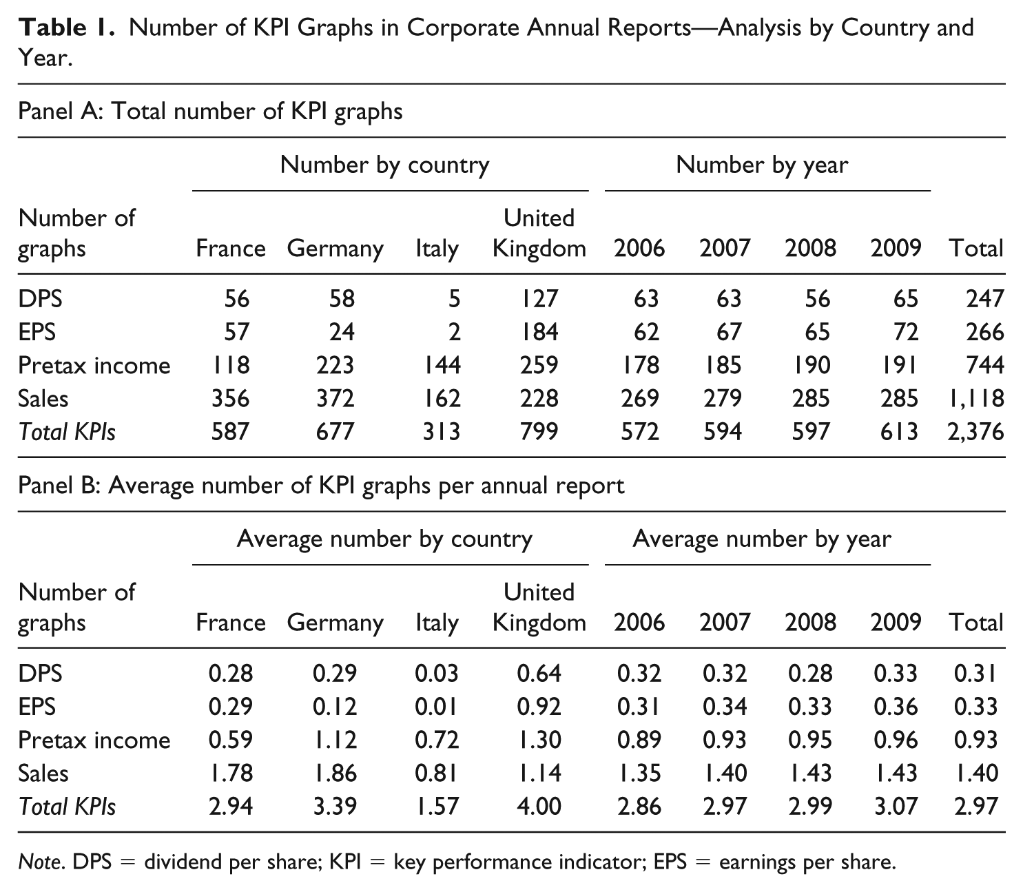
Note. DPS = dividend per share; KPI = key performance indicator; EPS = earnings per share.
Table 2 reports that German and U.K. companies are, on average, followed by more financial analysts (16.37 and 16.13 on average per year, respectively) than French (13.86 analysts) and Italian companies (7.46 analysts). However, some French and Italian companies have an ample analyst coverage (over 25 financial analysts per year). U.K. companies have, on average, a higher annual financial performance (ROA = 10%) than Italian, French (ROA = 6%) and German companies (ROA = 7%). The largest companies are those headquartered in France and Germany, followed by those in the United Kingdom. French companies are covered by financial media the most, followed by Italian and U.K. companies. In all the countries, except the United Kingdom, the most representative industry is heavy manufacturing. French and U.K. companies are more likely to disclose the presence of communication consultants in their annual reports. The country’s financial development is similar in Germany and the United Kingdom (0.95 and 0.96, respectively), while for France and Italy the level is substantially lower (0.69 and 0.13, respectively).
Descriptive Statistics of Country and Company Characteristics—Analysis by Country and by Year.
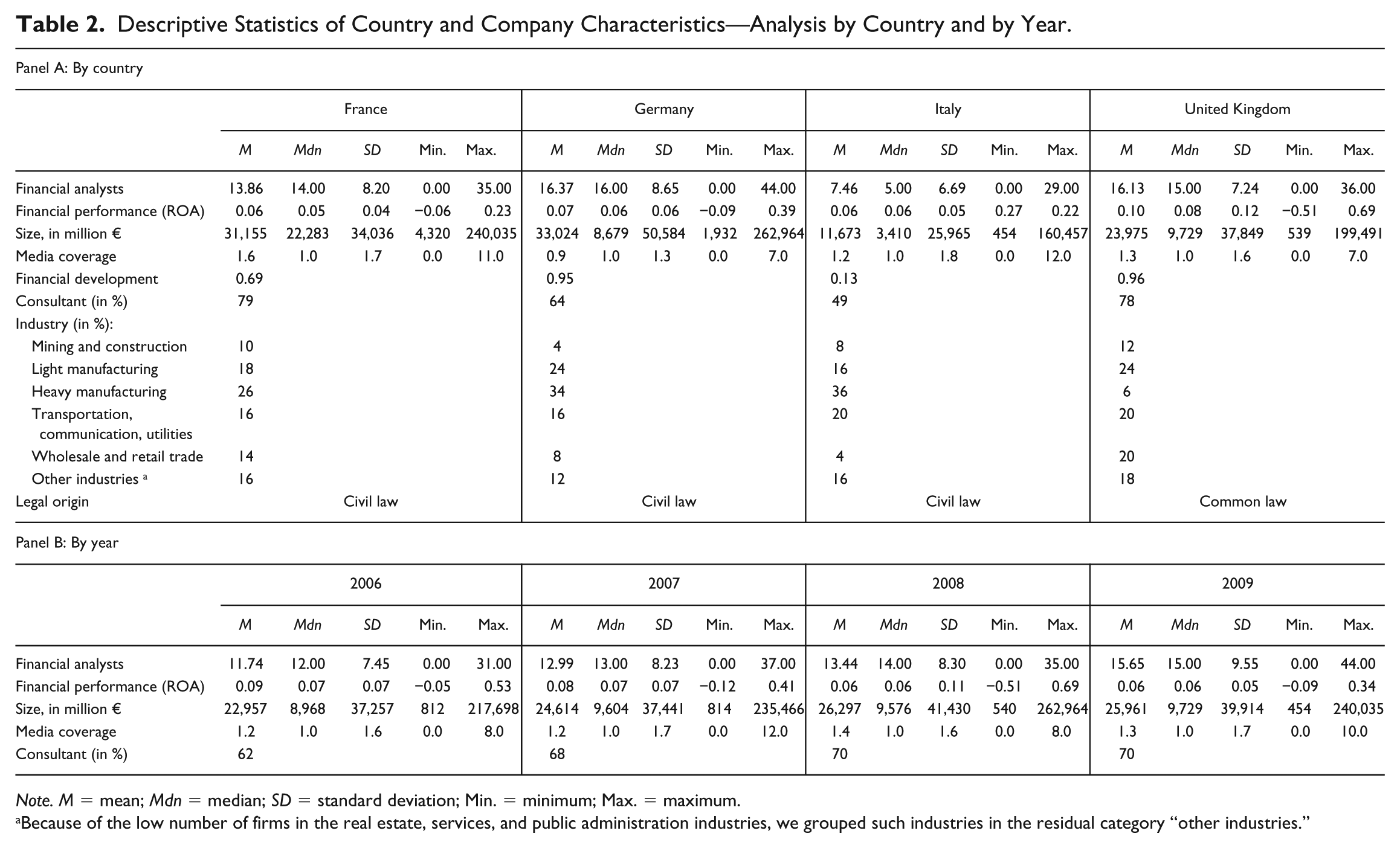
Note. M = mean; Mdn = median; SD = standard deviation; Min. = minimum; Max. = maximum.
Because of the low number of firms in the real estate, services, and public administration industries, we grouped such industries in the residual category “other industries.”
Table 2 also reports the levels of the variables of interest and the control variables in the 4 years analyzed. The average financial performance was highest in 2006 and lowest in 2008 and 2009. This reflects the performance decline connected with the global financial crisis. Companies were followed by slightly more financial analysts in 2009 compared with previous years. The disclosure of the presence of communication consultants moderately increased over time. Media coverage was highest in 2008 and 2009.
Table 3 presents the correlation matrix. Companies that graphed more KPIs are headquartered in high financially developed markets, are followed by more financial analysts, and have a higher overall financial performance. In particular, the association between the use of KPI graphs and financial performance is positive and statistically significant (0.24; p < .01). Therefore, in accord to previous literature (e.g., Beattie & Jones, 1992, 2000a; Dilla & Janvrin, 2010; Falschlunger et al., 2015; Laidroo & Tamme, 2016), we interpret this finding as evidence of selectivity in usage of graphs. Moreover, larger companies, those with higher media coverage and those which disclose to have a communication consultant generally include more KPI graphs. Independent variables do not have correlations with each other greater than |0.6|. Moreover, mean VIF values (mean and maximum values are reported in Table 4) are lower than 2 (with no individual value higher than 3.15), thus multicollinearity is unlikely to be a critical concern (Gujarati, 2003).
Correlation Matrix: Dependent and Independent Variables.
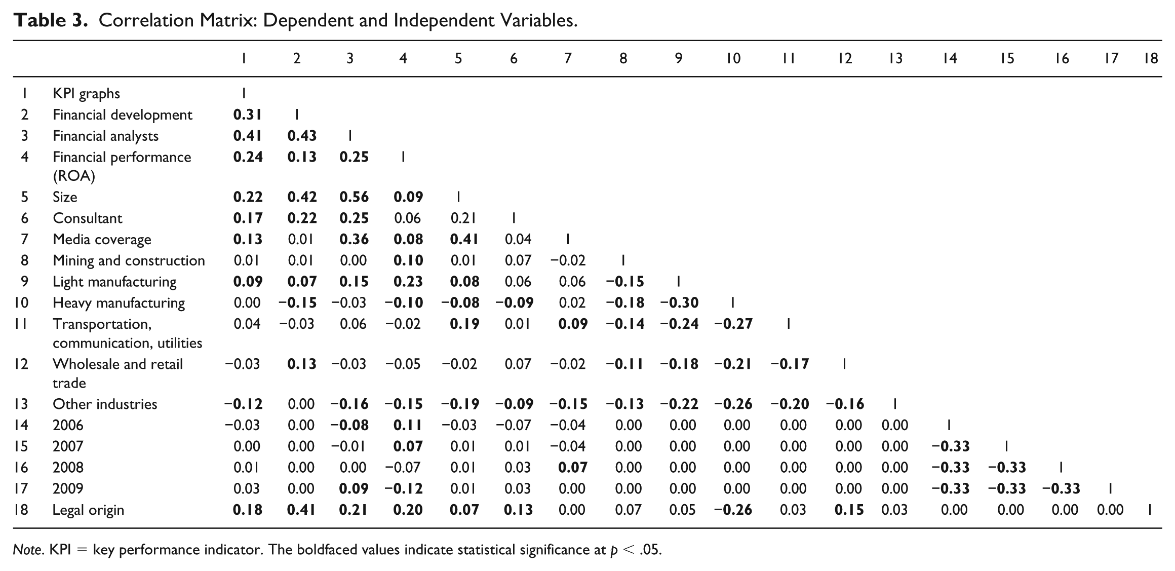
Note. KPI = key performance indicator. The boldfaced values indicate statistical significance at p < .05.
The Influence of Country’s Financial Development and Financial Analysts’ Following on the Selective Use of KPI Graphs in Annual Reports.
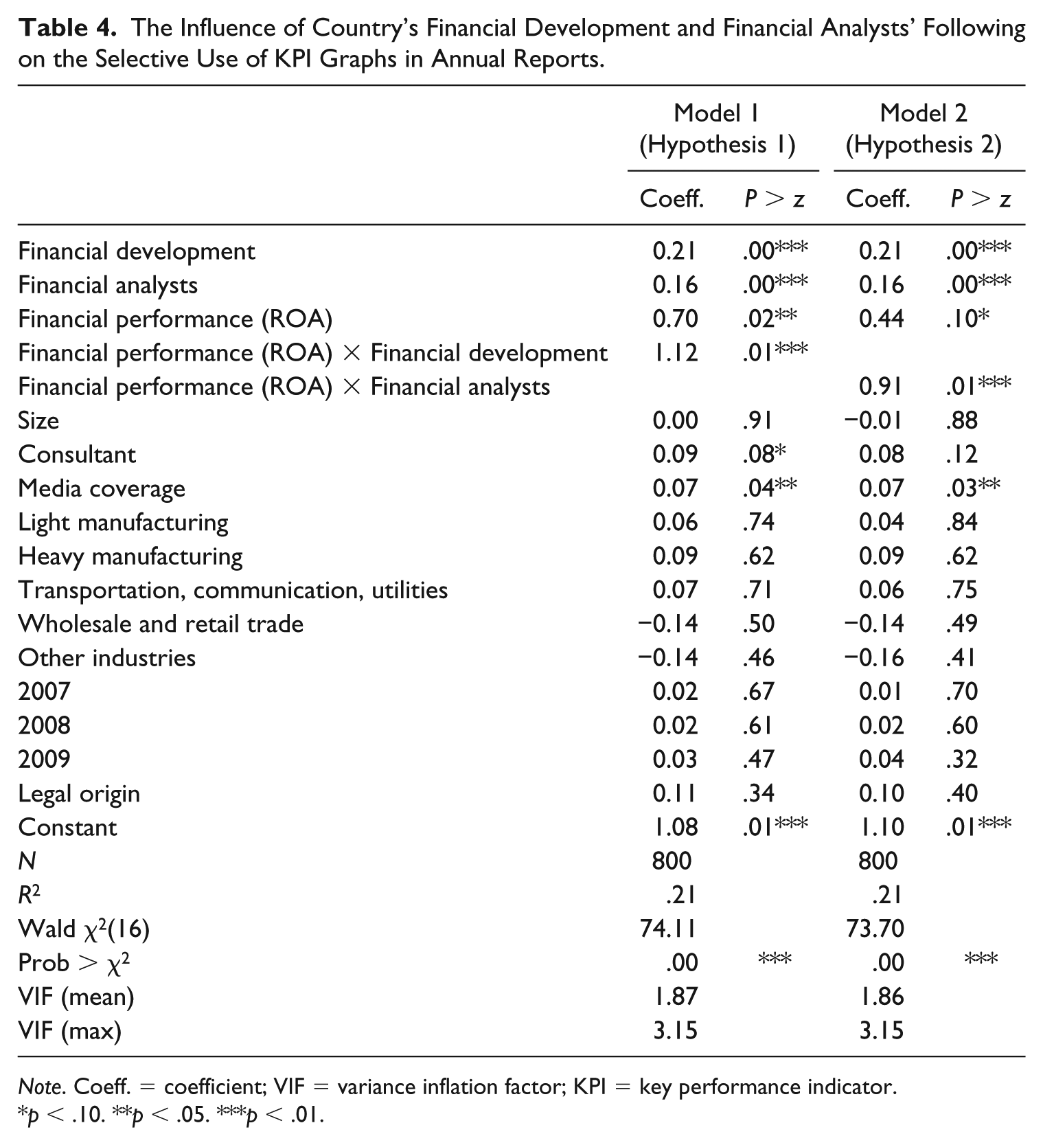
Note. Coeff. = coefficient; VIF = variance inflation factor; KPI = key performance indicator.
p < .10. **p < .05. ***p < .01.
Main Findings
Table 4 presents the results of the regression analyses. Selectivity, that is the association between company’s performance and KPI graphs’ usage, is significantly stronger in companies headquartered in high financially developed countries (p < .01, see Model 1). Thus, Hypothesis 1 is supported.
After controlling for other firm-level determinants (e.g., media coverage, communication consultant, and company size), selectivity is also significantly stronger in companies followed by a higher number of financial analysts (p < .01, see Model 2). Thus, Hypothesis 2 is supported.
Overall, the findings reported in Models 1 and 2 support the view that a high demand for information, both at country and firm levels, seems to create strong pressures over companies to perform and, consequently, increases the incentive for a selective use of KPI graphs, rather than represent a curb for this self-serving form of corporate reporting.
Figure 1 portrays two exemplary cases of selectivity found in the annual reports analyzed. Panel A represents, with an anonymized but real-life case, a selective use of KPI graphs of a company in a high financially developed country, followed by a relatively low number of financial analysts. This example illustrates how country-level financial development can create incentives to a selective use of KPI graphs, beyond firm-level demand for information. Panel B provides another, anonymized but real-life, example of a selective use of KPI graphs in a company headquartered in a relatively low financially developed country but followed by a relatively high number of financial analysts. This example illustrates how incentives at firm-level play an important role in the selectivity of graphs, even after controlling for the role of country-level financial development.
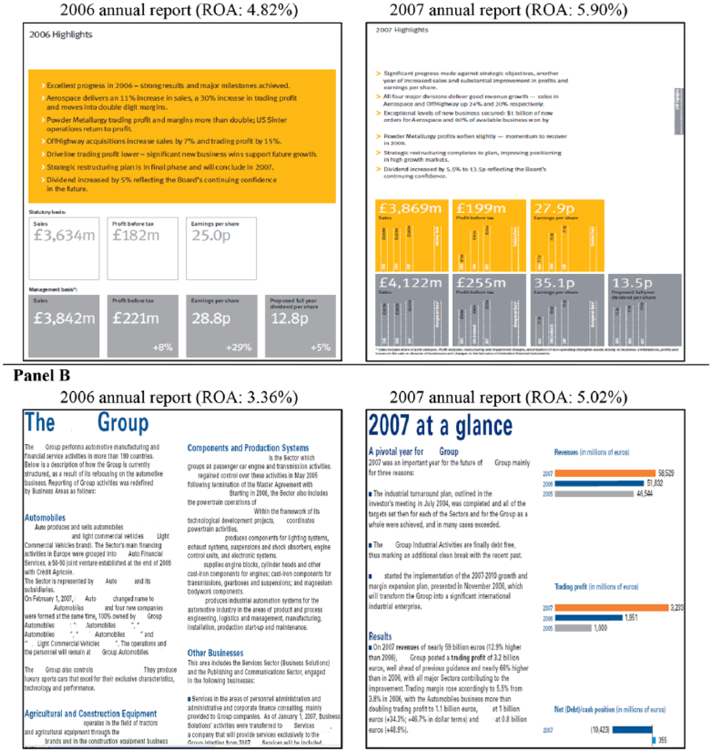
Two anonymized real-life cases of selectivity in the use of key performance indicator (KPI) graphs. Panel A presents a case of a company headquartered in a relatively high financially developed country. Panel B presents a case of a company followed by relatively many financial analysts.
Additional Analyses
We performed some additional analyses to control for the robustness of our results.
First, we conducted five sensitivity analyses on our dependent variable. The four KPIs (DPS, EPS, pretax income, and sales) were chosen following previous literature (e.g., Beattie & Jones, 1992, 2000a; Dilla & Janvrin, 2010). However, they were not the four most frequent financial indicators portrayed in the annual reports in our sample. Thus, we considered the four most frequent financial indicators portrayed in the annual reports in each country. This limits any potential bias because of the fact that prior literature mainly focused on Anglo-Saxon firms. Debt information graph was used instead of the DPS graph in France and Italy and capital expenditure graph in Germany (instead of DPS). The stock return graph replaced the EPS graph in France, Germany, and Italy. Alternatively, to expand our area of analysis, we used as dependent variable the four KPIs (DPS, EPS, pretax income, and sales) plus the other most common financial performance indicator graphed (stock return). We also split the four KPIs in two groups: earnings-related KPIs (pretax income and EPS) and other KPIs (DPS and sales), as preparers and analysts generally place greater importance to earnings-related measures of financial performance (Beattie & Jones, 2000a; Hirshleifer & Teoh, 2009). Selectivity in the use of KPI graphs in companies headquartered in high financially developed countries and/or with high analyst coverage is mainly driven by earnings-related KPIs. This result shows that companies might face more pressure to selectively report earnings-related measures that are more likely to be used by financial stakeholders. Other tests were run considering, as a dependent variable, one specific KPI (e.g., sales) graph. Selectivity in usage of graphs is more strongly associated with analyst coverage when EPS graphs are analyzed. This could reflect the fact that companies are aware that financial analysts give a priority, among KPIs, to EPS (De Jong, Mertens, Van der Poel, & Van Dijk, 2014). Finally, we considered, as dependent variable, the use of at least one KPI graph with a logistic regression. This is in line with some previous studies in graphical reporting (e.g., Beattie & Jones, 1992; Dilla & Janvrin, 2010). All these additional analyses provide further support to our main results.
Second, we used alternative specifications of the demand for information at country level. As a measure of overall country-level financial development, we used, instead of the absolute value, a dichotomous variable that equals 1 if the company is headquartered in Germany or in the United Kingdom and 0 if in France or Italy, as Germany and the United Kingdom have a very similar financial development (values are 0.95 and 0.96, respectively). Then, as an alternative measure of country-level demand for information, we also used the investor protection index developed by Djankov, La Porta, Lopez-de-Silanes, and Shleifer (2008). The values of this index are derived based on a survey where expert lawyers explained how investors were protected in a given country against potential director misconduct. Results are qualitatively similar to those reported in Table 4.
Third, to have a broader measure of analyst coverage, in line with prior literature (e.g., Chen et al., 2016) we measured financial analyst coverage through two alternative proxies: the natural logarithm of the number of analysts’ research reports issued for the company, and the natural logarithm of the number of individual financial analysts following the company. Our results remain qualitatively similar to those reported in Table 4.
Fourth, by adding two additional control variables, we investigated whether the length of the whole annual report and of the annual review, where most of the KPI graphs are located, affect graphical reporting. Previous literature has shown that annual reports are growing in size (e.g., Ditlevsen, 2012; Havemo, 2018), with the amount of voluntary material growing faster than regulatory material (Beattie et al., 2008). The increase in voluntary disclosure could drive an increase in usage of KPI graphs. Our main results on the determinants of the selective use of KPI graphs are, again, still consistent with those in Table 4.
Discussion and Conclusions
In a corporate reporting context, companies can benefit from the discretion they have in managing natural language by systematically providing a favorable view, through linguistic (e.g., narratives) and nonlinguistic visual devices (e.g., pictures and graphs) (Brühl & Kury, 2016; Merkl-Davies & Brennan, 2007; Sandell & Svensson, 2016). Graphs, in particular, have been extensively misused to control the perception of the company, emphasize the company’s positive outlook and, possibly, affect users’ impressions (e.g., Beattie & Jones, 1992; Cho et al., 2012a; Dilla & Janvrin, 2010; Frownfelter-Lohrke & Fulkerson, 2001; Laidroo, 2016a).
The article analyses selectivity, the primary form of impression management in graphical reporting, in usage of KPI graphs in the annual reports of large nonfinancial European listed companies. Our study provides evidence on the role of a previously unexplored determinant of impression management, the demand for information, using two specific multilevel measures (the country’s financial development and the firm’s analyst coverage) that can affect the perceived accountability organizations face. The demand for information might, on one hand, exert a “monitoring” effect reducing the opportunity for self-serving, nonneutral, presentations, but, on the other hand, creates more pressure to provide a favorable appearance of the company’s results. We found evidence of a "pressure" effect. A higher demand for information, at both country and firm levels, serves as an incentive, rather than as a curb, for a selective use of KPI graphs in annual reports.
This study contributes to the literature on impression management and to the studies of natural language in corporate communication (e.g., Beelitz & Merkl-Davies, 2012; Brühl & Kury, 2016; Crowther et al., 2006; Dunn, 2009; Frownfelter-Lohrke & Fulkerson, 2001; Merkl-Davies & Brennan, 2007, 2011; Penrose, 2008; Sandell & Svensson, 2016) by showing that impression management practices, more specifically, selectivity in the use of KPI graphs, are more likely in highly financially developed countries. These institutional contexts can exert a stronger pressure to perform, but, at the same time, can curb earnings management (e.g., Degeorge et al., 2013; Leuz et al., 2003). Therefore, preparers might opt for other self-serving presentational techniques to control the impression of the company and the self, provide an overall favorable impression of its performance and, possibly, manage the perceptions of users of annual reports. Also, this study finds that the selective use of KPI graphs is more likely when companies are followed by more financial analysts. While the presence of financial analysts following a company tends to curb earnings management (Degeorge et al., 2013; Liu, 2014; Yu, 2008), it seems to constitute an incentive for impression management. Investigating whether analysts’ decisions are affected by selectivity was beyond the scope of this article. However, we argue that annual report preparers may be affected by their presence as they are aware that analysts could be subject to limited time, attention, and other cognitive biases (e.g., Hirshleifer & Teoh, 2003; Merkl-Davies & Brennan, 2007) and might focus on easy-to-read indicators that summarize the existing information, rather than on detailed information (Muiño & Trombetta, 2009). Moreover, even if self-presentations may not necessarily mislead sophisticated users like analysts, they could still help to control the impressions about the company and the self. Indeed, not only do self-presentations involve people’s attempts to manage the impressions others form but also efforts to control the impressions of themselves, with self-enhancing and self-confirming messages (Ganesh, 2003; Morsing, 2006; Schlenker, 1985; Spence, 2009). Visual devices, like graphs, help to convey corporate identity and values (David, 2001; Ditlevsen, 2012). Pressures for misconduct in corporate reporting can also arise for nonfinancial reasons, including self-esteem and other egocentric motivations such as prestige (Chen et al., 2016).
A psychological approach to impression management may also help to interpret the higher selectivity in the presence of greater demand for information. Selectivity includes omitting to use graphs when performance is lower. By omitting to portray negative performance, preparers may control the impression of the company, provide a more favorable impression of its performance, and, possibly, divert attention away from the company’s negative news without being negatively judged by information users. Psychological literature has, indeed, documented that individuals generally judge a deceptive behavior based on omission less harshly than one which involves commission, like the exaggeration or fabrication of positive information (Van Swol, Braun, & Malhotra, 2012), because the former provides less material evidence of misconduct (DeScioli, Bruening, & Kurzban, 2011). Therefore, omission of negative information is unlikely to cause social blame, even among the most sophisticated annual report users (Jones et al., 2017). Even if preparers are not able to manage the impression of sophisticated users, there are no financial and social costs for getting caught. At the very least, they can control the impression about the company for self-presentation purposes. This is in line with the autocommunication’s main argument, whereby external communication by individuals and organizations is used to communicate to themselves and reflect and confirm their values and self-esteem (Christensen, 1997; Morsing, 2006; Schlenker, 1985). Impression management could be used to influence not only readers of annual reports but also preparers and organizations, and convince them that their performance, visually portrayed, is successful and legitimated (Hagen, 2008; Spence, 2009).
As a practical implication, we suggest annual report readers to be aware that companies can use graphs selectively without providing a comparable, neutral account of their performance. Caution is needed, in particular, in more financially developed institutional contexts and in those companies where the pressure to perform is higher, as the incentives for impression management are stronger. A clear guidance or rule on the use of KPI graphs within annual reports, such as the U.K. Directors’ Remuneration Report Regulations (2002; http://www.legislation.gov.uk/uksi/2002/1986/pdfs/uksi_20021986_en.pdf), 2 could also help both preparers and users to use and interpret visual information in respect of the principles of comparability and neutrality stated by the International Accounting Standards Board’s (2018) conceptual framework. For instance, policymakers could suggest companies to use the same KPI graphs over time, to allow consistency and limit selectivity. In exceptional cases, if the company wants to change the KPI information portrayed, the need for this change should be appropriately explained.
Our study faces the following limitations which provide opportunities for future research. First, we focus on the largest nonfinancial listed firms in the four most economically developed European countries. Whilst this choice assured adequate between- and within-country variation, enabling us to reach an adequate generalizability of the findings, a more comprehensive picture could be obtained by further studies on additional countries and/or smaller firms. Second, we focus on the company’s perspective. This choice, which is common in impression management literature (e.g., Beattie & Jones, 2008; Cooper & Slack, 2015; Merkl-Davies & Brennan, 2007) does not allow us to outline the reactions of the users. Future research might investigate how specific impression management practices affect users’ perceptions. Third, future studies can investigate more the elements of preparers’ self-esteem and company’s reputation (see, e.g., Brennan & Conroy, 2013) to indulge in impression management for autocommunication purposes (e.g., Chen et al., 2016; Christensen, 1997; Morsing, 2006; Schlenker, 1985). The investigation of this element should require an explorative qualitative analysis on individuals’ and organizational traits and reasons which entail impression management, rather than an archival-based, quantitative examination of corporate reports.
Footnotes
Acknowledgements
The authors thank Mike Jones for his helpful comments and suggestions on a previous version of the article. The authors are also grateful for the comments received from the participants at the 2014 International Academy of Management and Business Conference in Rome, the 2015 Financial Reporting and Business Communication Conference at the University of Bristol, and at the seminar series at the Essex Business School in 2016. The usual caveats apply. This paper is the result of a joint effort of the two authors. In particular, Andrea Melis wrote the sections on the Introduction, the Hypotheses development and the Discussion and conclusions, while Simone Aresu wrote the sections on the Literature review, Research method and Findings.
Declaration of Conflicting Interests
The author(s) declared no potential conflicts of interest with respect to the research, authorship, and/or publication of this article.
Funding
The authors gratefully acknowledge the financial support from Fondazione di Sardegna. Simone Aresu gratefully acknowledges Sardinia Regional Government for the financial support of his PhD scholarship (P.O.R. Sardegna F.S.E. Operational Programme of the Autonomous Region of Sardinia, European Social Fund 2007-2013 – Axis IV Human Resources, Objective l.3, Line of Activity l.3.1.).