
Abstract
According to one view, the rise of ocular-centrism in the West has reduced the faculty of vision to the cognitive, eliding the sensory aspect of seeing. But there is an important way in which visual experience feels a particular way and exerts, in a sense, a material force upon us. In other words, there is a particular character to the experience of seeing that can interact with us in an abstract, but extremely significant way. This helps to explain why the coercive cultural phenomenon of policy often targets visual expression or experience. The same would hold true, I argue, for other aspects of the sensorium. As a case study in Savannah, GA, this paper explores municipal and civic responses color in the context of urban streetscapes as sites of negotiating, promoting and reproducing “appropriate” sensibilities. I examine how the policing of something as seemingly mundane as house paint is undergrid by notions of restraint, vulgarity, and conformity and reflect hegemonic paradigms of normative citizenry, political interests, and property value. In examining the exertion of the political through the lens of the sensorial, and vice versa, we can explicate the phenomenological aspect of policy, tracking its operations on both cognitive and somatic registers.
Workers at The Sentient Bean, a popular coffee shop located just two doors down from 103 Park Avenue (see Figure 1), were so inundated with talk of the home’s new paint job that they decided to put out a notebook in which people could write their comments. Katherine, the owner of “The Bean” explained to me, “We just couldn’t get our work done! We were surprised by how much people had to say about this. Even tourists. Some people loved it and some people hated it, but everyone had an opinion about it.” Unfortunately the journal containing the record of public comments was destroyed, but local memory of the controversy surrounding the colors selected by the owners remains solid. But why? Why would the color of a single house provoke so much feeling? What might we learn by looking at the case of the “painted lady” from an anthropological point of view?
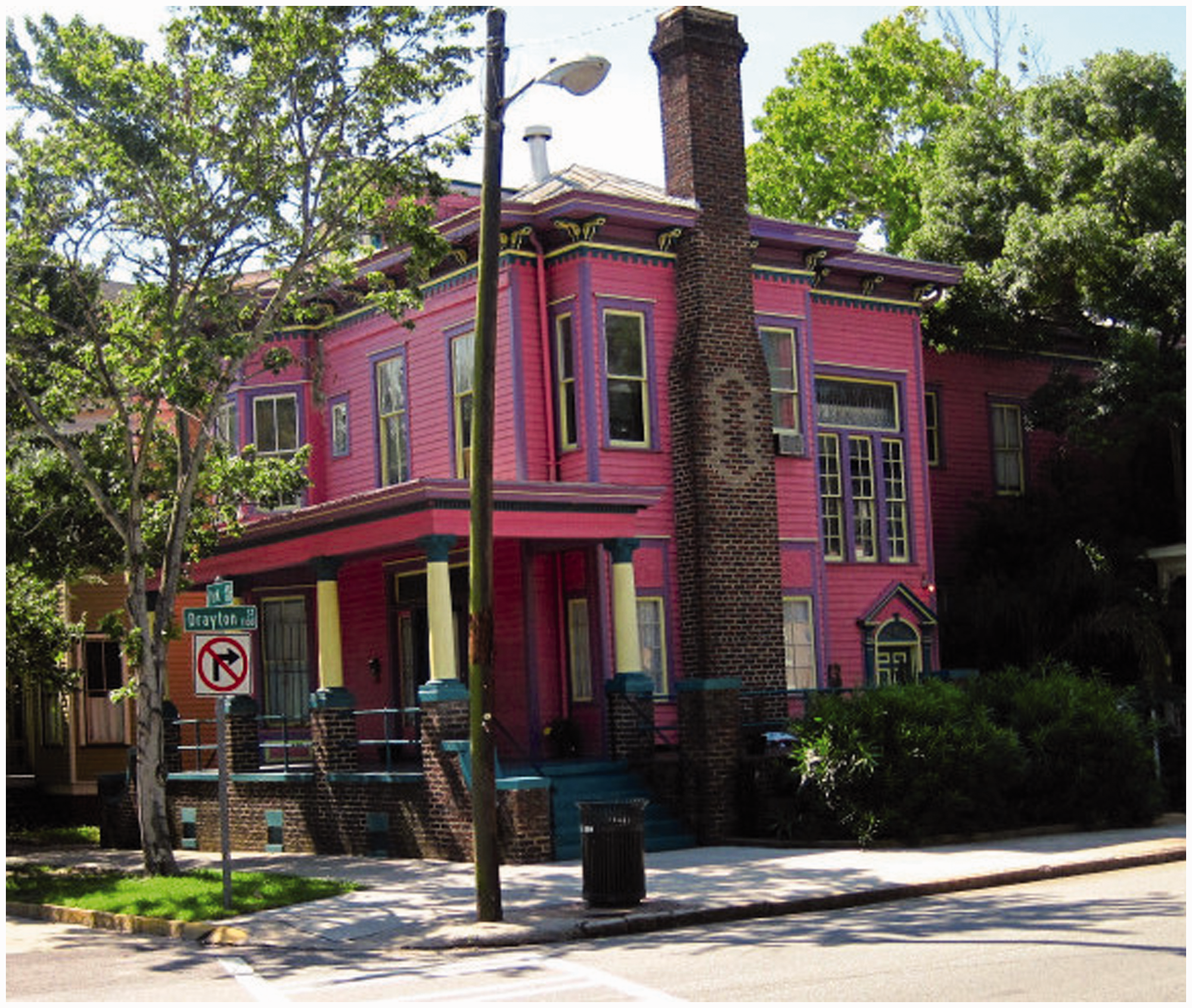
103 Park Avenue donning a purple, pink, teal, and yellow scheme in Savannah, Georgia.
Anthropologists are practiced explorers of questions concerning the exercise of political power, the construction and deconstruction of hierarchies, the circulation of ideologies, processes of subjectification, and the formulation, implementation, and circulation of policies. But while virtually all of what we know of the world, all of what we refer to as “reality,” comes to us through our senses, the way that power is aimed at, shunted through, constituted or resisted by the experience or conceptualization of the sensorium is not as clear as it could be.
If we combine a classically Marxist conception of human nature to include, as Frank Weyher writes, the human passions and emotions as fundamental, integrative aspects of our social nature, with Antonio Damasio’s writing suggesting that emotion and feeling play an important role in human reason, we are compelled to step back from a view of culture and the production of meaning as primarily cognitive phenomena and recast our methodological and analytic nets to capture the sensuous (Damasio, 2005; Weyher, 2012). And indeed, there are excellent anthropological analyses of the senses. Paul Stoller, Sarah Pink, David Howes, and Tim Ingold, among others, have each in their own way reconsidered the role of the sensuous, finding new ways to integrate sensory facets of the human condition into both theory and ethnographic practice. Here, a study of the sensorium—the entirety of the sensory apparatus—has emerged as an important site of research that entails sensorial politics, an anthropology aimed squarely at identifying points of contact between the senses and the political in contemporary society.
Color
The whole world appears to us in color. Could color be operating beyond the relatively superficial formal functional role we usually give it? How, for example, are politics exerted through color? It is not surprising that anthropologists have studied the perception of color since within the sensorium, vision is paramount. A comparative article examining whether or (to what extent) color/emotion synesthesia is universal or cultural appeared in the very first edition of American Ethnologist (D'Andrade and Egan, 1974) but most work on color has been from decidedly physiological and/or linguistic perspectives (see Baines, 1985; Bornstein, 1975; Casson, 1994; Davies et al., 1997; Hardin and Maffi, 1997; Hilbert, 1987; Kay, 2018; Manning, 2008).
As a semiotic issue, color is not an especially active area of study (except for when the term is applied to people in work on race and ethnicity), with Jane Schneider’s (1978) “Peacocks and penguins: the political economy of European cloth and colors” and Taussig’s (2009) What Color is the Sacred operating as fascinating exceptions that place color in political and historical contexts. Perhaps our difficulty in controlling, and even more importantly in understanding color as a phenomena, has not only presented challenges to the Western impulse for mastering and controlling the senses as Taussig argues (2009: 16), but has discouraged anthropologists from taking the world in and of color more seriously. 1
The apparently slack interest in the role of color as a cultural force by anthropologists is intriguing given the long, interdisciplinary history of the study of color elucidated so well in Eirik Hanssen’s (2015) discussion of color in the sensuous ethnographic film Leviathan. Hanssen’s review positions color as breaking the law of the excluded middle by being neither subjective nor objective; instead, it can be understood as what media scholar Sean Cubitt (2014) calls “projective,” “a projection of the world into our sensoria and of our sensations onto the world” (p. 112).
In thinking about my own experience with color as projective, I can understand how it might serve as a point of conformity and conflict. My own tastes run toward the ascetic, so I can empathize with others’ desire for a severely limited palette. I can appreciate the singular, minimalist energies of anorexics, junkies, the occasional dreadlocked sadhu and Hemingway’s writing. I am particularly inspired by the sculptor Fred Sandback who wrote of his highly conceptual practice that he “[had] a strong gut feeling from the beginning … of wanting … to make sculpture that didn’t have an inside” the result of which was “diaphanous” work that “almost ceased to exist.” 2 My own aesthetic preferences might appear at odds with an essay aimed squarely at a rehabilitating the messy, voluptuous, sensual interior world of feelings. But rather than focus on content, I want to call attention to the historical, and therefore political, construction of the (and by extension, my) senses, which as Sandback’s work suggests, feel a particular way, and thus exert, in a sense, a real material force upon us.
Sandback’s work is about “being in a place,” pedestrian everyday places that can be felt and actively engaged. In my view, the success of his work, so minimal and controlled, rests precisely on the fact that the thinking, feeling, sensing spectator is neither; s/he is messy, intuitive, somatic, and adventurous. It is probably not a coincidence that Sandback took a degree in philosophy before he became a sculptor: his applied philosophy shows us rather than tells us how we are in the world (Figure 2).
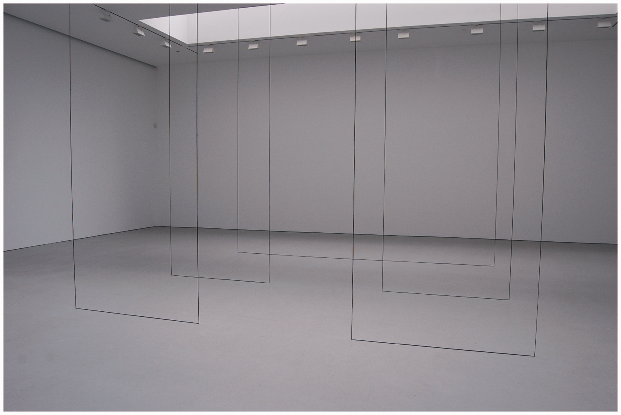
Fred Sandback; Untitled (Broken Triangle), 1999; black acrylic yarn; situational: spatial relationships established by the artist; overall dimensions vary with each installation. Installation view, Henry Moore Institute, Leeds, England, 1999. All artwork by Fred Sandback © 1999 Fred Sandback Archive. By permission of the Fred Sandback Archive.
Here we see color as a force in the sense that it shapes not just our moods, but our movements, motivations, and judgments in much the same way that anthropologists understand ideology as a material force. I would like to suggest that we apply lessons about the material forces of color taken from Taussig, Schneider and Sandback to the urban landscape. What happens if we take something as seemingly commonplace but ubiquitous as house paint and look for political insinuations? How might an anthropological treatment of paint reveal critical points within the logics of democracy, of capitalism, and of the social order? The study of color in this sense is somewhat uncharted territory, but in taking this one home at 103 Park Avenue as a point of departure, I will explore these questions, keeping in mind that selections of and reactions to house paint are shot through with histories of color theory, architectural practice, and ideology. An analysis of Savannahians responses to 103 Park Avenue suggests how paying greater attention to the sensorium (a panoply of feeling, affect, and emotion) that is so foundational to human experience reveals an underappreciated relationship between the sensual and the political. Ultimately I would like to suggest that there is a political dimension to something as radically mundane as house paint and further that the sensorial is foundational rather than epiphenomenal to the political.
From Savannah to San Francisco
In 2004, the local newspaper reported that as Steve Winn rode his bicycle down Park Avenue, he thrust his middle finger into the air and shouted obscenities in the direction of this home at the corner of Forsyth Park. When the 36-year-old contractor realized someone had seen him, his face flushed a deep crimson, “I just go a little insane every time I pass this place,” Winn said. “It makes my blood boil when I look at what they've done to such a beautiful home” (Staff, 2004).
In 1995, this 4000 square foot Victorian Italianate was valued by the city of Savannah at $45,390. 3 Two years and some improvements later, the Jenkins family purchased it for $189,900. Inspired by their travels to Costa Rica and research on San Francisco’s “Painted Ladies,” the couple transformed the exterior of the house from dull pinkish beige with grey trim to hot pink with purple trim accented by yellow and teal columns. This color deed elicited strong public reactions. An editorial in the local paper entitled “Colorful house goes far beyond bounds of taste” notes that “most homeowners…use good taste and judgment in their color choices…to restore and beautify this district” but here “the colors are so loud and extreme as to be visually assaulting” and further, that “ninety percent of the comments I've heard about … this house have been extreme and negative” (Bost, 2004). Emails to the Historic Victorian Neighborhood Association came by the dozens, some likening the house to a “massive bowel movement.” Other emails simply questioned whether the scheme was truly historical. Guides describe it as The Pepto Bismol House to tourists (Jim and Kim, 2013). There were similar reactions from residents when owners of the Sorrell Weed House located just few blocks away used colors (a tawny orange earth shade) that one neighbor described as “bolder than we are used to,” or that people “felt were not visually compatible with the historic district.”
Because of its location and history, Savannah has a unique natural, architectural, and cultural appearance. Located on the border of Georgia and South Carolina near the mouth of the Savannah River, Savannah proper is a town of around 150,000 residents (with a substantial metropolitan community). Her economy relies on manufacturing (primarily airplanes, paper, truck trailers, and bread), a large port (the fifth largest in the nation), military operations, and retail. There are also several universities, a massive transportation infrastructure, and a medical industry, with overall average managerial salaries of major industries falling between $80 and $100,000. These businesses make Savannah relatively wealthy when compared to the rest of Georgia, but a long legacy of structural racism also makes it a town of great inequalities (in 2016, just over 18,000 African Americans were living in poverty compared to just over 8000 white residents, with an overall poverty level (29.5%) significantly higher than that for Georgia as a whole (20.8%)). 4 The “downtown” area—where residential real estate is valued at about $275–$300 per square foot—is a National Landmark Historic District, which both attracts tourism and supports a culture of preservation.
Each year, over six million people visit to experience Savannah’s lax “open carry” alcohol rules, gridded urban plan, and antebellum architecture. Tourists know the “Hostess City” for its green squares and tall live oak canopy dripping with Spanish moss, its historical significance, its embrace of the LGBT community, and as a place for nursing southern eccentricities. The tourism industry—which generates over $1.5 billion annually and supports over 15,000 jobs—exerts tremendous pressure on the city in terms of taxation and policy that in turn shapes both cultural and built landscapes.
Rules about development are stringent “downtown,” where the boundaries of the National Landmark Historic District roughly correspond with the original urban plan for Savannah. Here, property owners must acquire a “Certificate of Appropriateness” from the Metropolitan Planning Commission (MPC) Historic District Board of Review before making visible changes to buildings (though property owners involved with the tourist industry receive more leeway, for example in terms of building height and window rules). The economic modus operandi of the board is explicit: it “exists to protect the values of property associated with history, unique architectural details or relation to a square, park or area within the Landmark Historic District.” 5
When the MPC does get involved in determining what colors can or cannot be placed on an existing building, as an MPC official explained, the paint “has to relate to surrounding structures according to common sense. The color has to be visually compatible. It cannot be too bold.” What does it mean to relate to surrounding structures? What constitutes common sense in this context? How do you determine what is visually compatible or not? What constitutes a bold color? The official stated when I pressed her for more details that “if it contextually works within the context of the area, then we approve it,” “colors should not stand out” or “impact the block in a negative way.” When asked to explain what it means to “stand out” or what constitutes “a negative impact,” she told me, by now quite irritably that, We just look at the direct context and the colors and base it on that. For example, a homeowner on L Street wanted to paint the trim on his front door bright green to match the door and we denied that request because it does not work in the context of the area.
Judgments about whether or not modifications relate to surrounding structures are handed down on a case-by-case basis but the board does not review anything outside of the Historic District. The house in question is located at the corner of two busy streets in the Victorian District (several blocks south of downtown) where here are not restricted by MPC rules about windows, shutters, wood, or paint color, pink, purple or otherwise. 6 But, for several decades now, residents both inside and outside of the Historic District petition MPC officials if what they are seeing does not please. For example, in 1989 Savannah home owner Bud Hall incurred the wrath of the review board when he painted his house in a way that angered neighbors; he created even more angst when he drew women, literally painted ladies, on plywood that he then mounted in his windows to protest rules about windows that required him to purchase expensive custom-made frames. A neighbor complained to the MPC review board about Hall's home, later stating to a reporter that “Hall is a creative individual. He has a talent that needs to be harnessed. What he has done might have worked well in San Francisco, but I am vehemently opposed to it” (Weimer, 1989). Here we see how taste and MPC policy are at times wielded by residents to discipline other residents, by the city to design the urbanscape, or by individuals as a form of critique against other residents and/or city policy.
Linking what the MPC might call inappropriateness to the urbanscape of San Francisco by way of denigration was not unique to Savannah. In Wilmington NC, neighbors took a homeowner to court when he painted his house purple and pink; the local newspaper carried an editorial entitled This is Wilmington, Not San Francisco. In both cases, neighbors are attempting to vilify color choices by conjuring what they see as San Francisco’s anything goes mentality as a negative comparison, and it is true that the zeitgeist of San Francisco is much more embracing of difference (aesthetic and otherwise) than towns like Savannah and Wilmington in the conservative South. But as it turns out, there is a connection between the painted ladies—Victorians decorated in three shades or more—of Savannah and San Francisco. But even in San Francisco, critics have at times cried foul.
Savannah, with Oglethorpe’s gridded street plan, was founded in 1733. 7 A century later, and way across the country, San Francisco’s city council was made official. Within five years, her gridded street plan was established to accommodate a rapidly growing population. The gold rush would bring in many more new residents who would have the capital to build homes, many of which would be completed in the same style of those in Savannah (Duchscherer, 2001). This was not a coincidence; part of the explanation for the coast-to-coast distribution of style had to do with the circulation of print media. Between 1855 and 1905, the popular Scientific American Architects and Builders Edition impacted taste and practice across the entire county, especially since the plates included floor plans that could easily be copied by a good carpenter. For example, by the mid-1850s, the Greek Revival style promoted in Scientific American was known not only in the South, New England, and the Midwest, but also in remote California (Delehanty, 2000).
For Victorian house styles built from Savannah to San Francisco, the Greek Revival was followed by the Gothic Revival and then the Italianate (like 103 East Park Avenue). Popularized by Pall Mall men’s clubs in London, the Italianate design was notable for its use of rescaled renaissance era forms, bay windows, asymmetrical porches, and towers with round panes (Delehanty, 2000: 15). But what about the use of color? Interestingly, the Greeks and Romans, from whom the inspiration for many aspects of these designs was initially taken, had painted their statues and architecture using bright mosaics and faux finishes inside and out. But, the “Greek prejudice”—the neo-classical misconception that the plastic arts of the classical era were raw and uncolored—was and still is quite potent (Forty, 1992).
A recent quarrel surrounding a Steamboat Gothic Victorian built in Savannah in 1899 by Cord Asendorf with the intention to “out gingerbread everyone in town” is instructive in this regard. Asendorf’s daughter lived in what is known as “The Gingerbread House” (a few blocks away from 103 Park Avenue) until the family sold the property in the early 1970s. She protested vehemently when the new owners painted the house in three colors, insisting that “the house had always been white.” The new owners, however, found a photograph that had been taken in 1904 showing the selfsame young Asendorf on the porch with her family; here, the house had been painted with at least three different colors (Pomada and Dutton, 1978:52).
A more well-known illustration of blind attachment to the Greek prejudice is noted in a case that was covered by national newspapers around this same time: during the 1970s Saudi sheik Mohammed Al-Fassi purchased a Sunset boulevard mansion in Los Angeles and decorated it in a “garish” manner (Kelly in Batchelor, 2000). As a celebration of classical artworks, Al-Fassi installed copies of Greek statuary that were painted, brightly and naturalistically, right down to the pubic hair. These vivid designs initiated a neighborhood battle that ended only when the house was burned by an arsonist and the statues were repainted white, correcting them for the hegemonic Sunset Boulevard mindset.
The emergence and subsequent persistence of the Greek prejudice does have an explanation. During the 15th and 16th centuries, artworks of the Greeks and Romans came to light as archaeologists excavated antiquities, but time had already erased the coloration. Renaissance artists like Michelangelo developed new artworks taking presumably unpainted sculpture as inspiration. Designers like Wedgewood took advantage of preferences for neutral, raw marble-like tones that were informed by upper class fervor around archeological discoveries (Forty, 1992; see also Pallasmaa, 2005).
Ongoing adherence to the “neo-classical” palette explains why the Savannah MPC official described appropriate color selections as those belonging to “the most subdued and neutral hues of any color family.” But, even in the 18th century archaeologists were questioning the notion of a white, raw marble antiquity. And today, more advanced technologies confirm that Greek and Roman artworks and edifices were not left as raw marble. They were festooned with bright color, pattern and visual effect.
An exhibition meant to celebrate these new findings opened at the Legion of Honor Museum in San Francisco in 2017. Gods In Color presented reconstructions of known Greek and Roman works as they were originally painted. 8 A review of the polychromatic show stated that “it’s startling and almost disillusioning to see classical structures and artworks, so often stripped of all color, in vivid, contrasting colors of blue, yellow and red” (Lee, 2017); this review, and others similar in tone, demonstrate the ongoing aversion of all things “garish” with a concomitant devotion to pallid hues. A preference for an imagined version of neo-classical order and neutrality remains the appropriate symbolic universe for the American bourgeoisie while all things dazzling or bright are relegated to a category of cheapness to be explored only in the guise of ironic slumming. House paint today, in clothing a house to announce its inhabitants, tends to follow this same logic.
The historian Paul Duchscherer (2001) writes that early San Francisco Victorians were white, grey and occasionally brown. Those that had a two-color scheme, he writes, employed a staid dark green, deep red or black trim. Or did they? By the mid-19th century, an animated search for (profitable) dazzling chemical solutions to coloration was underway (Taussig, 2000: 5). Materials such as an 1885 edition of California Architects and Builders News focusing on house color suggests a counter-narrative was bubbling up, in which younger architects adopted crazy “uncouth panels” of color or “gingerbread schemes” that resembled the “puffing, paint and powder of our female friends” (Pomada et al., 1978: 9). An 1887 editorial in the San Francisco Chronicle celebrated the use of yellows, red and all sorts of “unorthodox colors” on houses, concluding that “one is forced to admit that the town did look better for it” (Pomada et al., 1978: 11)
Efforts to popularize more festooned Victorians was quashed and by the first half of the 20th century, “landlady beige” was a popular shade on houses that were not destroyed by the 1906 San Francisco earthquake (Delehanty, 2000: 28). During this same era, Le Corbusier, the great figurehead of the Modernist style, proclaimed that whitewashing makes a house “honest and dependable” but more importantly, “extremely moral”; he opined that a decree to whitewash all of Paris would stand as a “police task of real statue and manifestation of high morality, the sign of a great people” (Le Corbusier, 1922 in Batchelor, 2000: 83). So even though critics agreed that raw marble tones “offered less to the hungry eye,” (Batchelor, 2000: 24–35) both academic and popular tastes in the urban landscape of San Francisco shifted towards decidedly neutral, monochromatic Modernist and Deco styles during this period.
Many of the Victorians who did survive the earthquake were razed, while others were taken down to make room for by post-war “cereal box architecture” (Delehanty, 2000: 25). The practice of demolishing existing Victorian structures (such as the elaborate Martin home (see Brammer, 1987, plate 32)) for redevelopment was not appreciably challenged until the 1970s when an ex-suburban generation that prized walkability and history began to advocate for restoration. Randoph Delehanty, the architectural historian for the Presidio, describes the gentrification of San Francisco in ways that align with a modernist bourgeois worldview in writing that these new urban homesteaders painted exteriors in “garish colors,” with the brightest hues reigning in Haight Ashbury. A foil to what became known as the colorist movement existed in “more restrained” approaches that predominated in other, less psychedelic (and more expensive) neighborhoods like Pacific Heights (Delehanty, 2000: 24–28). Perhaps Haight residents had taken Huxley’s comments on perceiving color in his Doors of Perception as inspiration: Mescaline, which liberates Mind at Large, raises all colors to a higher power (allows man to see anew the colors as they really are) and makes the percipient aware of innumerable fine shades of difference, to which, at ordinary times, he is completely blind. It would seem that, for Mind at Large, the so-called secondary characters of things are primary. Unlike Locke, it evidently feels that colors are more important, better worth attending to, than masses, positions and dimensions (Huxley, 1954: 7–8).
Perhaps these more bohemian residents were recognizing the ontological character of color suggested by Huxley, where color, usually shunted to the realm of the superficial, achieves foundational status. 9 The influential Bauhaus painter Johannes Itten had even earlier proclaimed that: “color is life: for a world without colors appears to us as dead. Colors are primordial ideas, the children of light” (Itten, 2000: 140–142). Color was thus understood by artists and other members of the creative literati to have a dynamic material force: their work sought to recognize the vital communicative, pragmatic potential of color and color practices. That is to say, their work operated on the idea that color exerts an effect; it does things. Color, and color perception, might even be understood in these contexts to be framed as an event, rather than a serendipitous quality of some other more foundational entity.
It is not surprising that these ideas did not make it into anthropology since we do not have a good track record of borrowing theory from artists (while artists have at times successfully mined content, methods and theory from anthropology for making and interpreting art). I suspect this has more to do with the way that the arts has been relegated to the upper echelons of the superstructural rather than anything having to do with expectations about the ability of artists to penetrate the nature of experience. In fact, anthropology and art both seek an improved understanding of the human condition and work to see what others perhaps do not. It is a pity that the practices have not come together with greater sustained enthusiasm since many artists and anthropologists have a shared interest in tracking relationships between nature, capitalism, and subjectivity. Both could certainly contribute to an interdisciplinary exchange on color in this context.
Anthropologists do know that, like nature, capitalism abhors a vacuum: and indeed, once the colorist movement was established, the field of color consultancy emerged. Color consultants were paid to help more bourgeois homeowners select palettes that were “less wild” (Delehanty, 2000: 9). Meanwhile, the push for a vivid urbanscape in San Francisco was encouraged by the publication of a series of popular books, especially Pomada et al.’s Painted Ladies (1978) which focused on Victorians adorned in three or more colors.
The colorist movement palette contained hues that critics claimed “faded in the strong California light and disrupted the landscape” (Delehanty, 2000: 30). Wealthier buyers eventually came and, as Delehanty has it, “Good Taste began to assert itself” (Delehanty, 2000: 30, capitals in original). 10 These more moneyed owners sought to blend into the street, using “neighbor friendly” pallates using “soft, pleasing colors” such as warm tan, dove grey, white and crème that recall the plain hues of ancient Greek statuary; a fourth color, “may be used sparingly” for the window sash (Delehanty, 2000: 30).
The Victorian Italianate plates chosen for inclusion in Delehanty’s text exemplify what Baudrillard describes as bourgeois color: nothing too spectacular or a threat to inwardness “…black, greys and white (whatever registers zero on the color scale) are paradigmatic of dignity, repression and moral standing” (Baudrillard, 1968: 31). As San Francisco became even wealthier during the silicon boom, homeowners have added gold leaf to distinguish otherwise neutral architectural flourishes. 11 As it turns out, the sculptures in The Gods exhibition at the Grand Legion were also gilded, at times rather extensively, and the gold made the bright tones pop even more intensely (Figure 3).

Gilded Victorian in San Francisco (with neutral colors and staid trim) of 2012. The Jon B. Lovelace Collection of California Photographs in Carol M. Highsmith's America Project, Courtesy of the Library of Congress, Prints and Photographs Division (http://www.loc.gov/pictures/item/2013630347).
What turns out to have been more in line with what Greek color practices were according to contemporary archaeological research, a perspective challenging Delehanty’s “Good Taste” describes the “courageous souls” of the early colorist movement as “[revolting] against sterile, inhuman, monoliths spreading architectural ooze over the downtown landscape” (Pomada et al., 1978: 7). Pomada notes that while early “dazzling damsels” aroused public ire on the basis of contradicting “tradition and aesthetics,” physically encountering one of these houses is like “inhaling pure oxygen”: it is “exhilarating…a sudden rush of pleasure” (Pomada et al., 1978). Rather than a disruption, Pomada shows how the rows of hued houses are celebrated as an “endless series of gems in the variegated necklace of San Francisco.” The only casualties of the colorist movement for Pomada and like-minded writers were the “wounded sensibilities of traditionalists aghast at what they called ‘victrocious colors’” (Pomada et al., 1978: 11).
These are the same kinds of sentiments echoed in public debates over 103 Park Avenue. But we are still left wondering why house paint that people only see in passing elicits such animated responses? What does the persistent use of strongly somatic language to describe reactions to paint suggest?
Sensorial politics
We have seen from scholars like Raymond Williams (1979) that “structures of feeling” associated with aesthetic experiences are also historical and political. Insofar as this is the case, aesthetic formations can not only operate as tools in the reproduction of the status quo, but can also offer an unusually powerful challenge to dominant ideological forms (see Eagleton, 1990). Color is one such aesthetic form, but as the color scholar David Batchelor argues, it has not only been the object of “extreme prejudice in Western culture,” it has remained largely unnoticed and unchecked, and yet so all embracing and generalized that it enrolls other prejudices in its service. Kept alive by philosophers, artists, art historians, and cultural theorists, this prejudice and its manifest form, the loathing of color, masks a fear of contamination and corruption. He further argues that “chromophobia” elicits the desire to eliminate color either by making it out as trivial, relegated to the supplemental, unnecessary, or merely cosmetic or dismissing it as the property of a “foreign” body—feminine, oriental, primitive, infantile, vulgar, queer or pathological (Batchelor, 2000: 22–23). Thus chromophobia renders color as either unworthy of serious consideration, as has happened in Anthropology, or alien, offensive, or even dangerous as suggested by many academic and public reactions to color on 103 Park Avenue and the precursors of San Francisco that inspired it. 12
What first drew me to this topic was that writing about house color was filled with chromophobic (and chromophilic) references to sensory experience—words like exhilaration, rushes of pleasure, boiling blood, diarrhea, colors as soft and pleasing, or threatening inwardness—that intimate a subjective what its like-nesses to the visual experience of the landscape (see Nagel, 1974). In other words, there is a significant and particular character to the experience of seeing color that interacts with more abstract, but equally coercive cultural phenomenon such as policy and class hegemony. We know that the political is economic, legal, historical and institutional, but here it also appears as sensorial.
In recognizing the importance of bodily subjectivity to the construction of the subject, William Mazzarella writes that despite the just so stories of modernity which both repress and romantically fetishize affect, it has not been—(and I would add, cannot be)—evacuated from an increasingly rationalized bourgeois world (Mazzarella, 2009: 294). Mazzarella goes on to argue that “any social project that is not imposed through force alone must be affective in order to be effective”: on one level public discourse is abstract and pertains to the formal, legal assemblage of citizenship and civil society, on another, it gets us “in the gut,” soliciting us as members of a sensuous social order (Mazzarella, 2009: 299). 13
House color fits squarely into this paradigm as a social project, but what I welcome most about developments in Batchelor’s work on color and the anthropology of affect is that even as they remain haunted by a kind of mind-body dualism, both explore the somatic aspect of perception (and the subjectivity that perception entails) that is outside of a strictly cognitive model of culture (and thus of politics). But, what, then, is the chicken and egg relationship of these two registers of experience, the sensory and cognitive? What if sensory experience, including that associated with visual phenomenon, turned out to be much more significant than most cultural theory usually allows? What if anthropologists were to consider thinking and (ir)rationality as functions of the sensorium (rather than the other way around)? What might this mean for future directions of cultural theory? If ideology is established first as a somatic affair enabled through the enculturation of subjects’ responses to the seemingly mundane (and masked as the merely cosmetic) landscape upon which ideas, values, policies and practices then and only then depend, then we have to develop better lenses with which to capture what we might call sensorial politics.
Anthropologists are extremely well suited to study the multiple ways in which the political is exerted through sensorial activity, though not that many of us focus on sensory activities. And we are not actively training students to make these connections either: in most introductory textbooks, sensory activities are often packaged as art (music, dance, and so forth) and left to the very last chapter that many faculty never get to—implicitly suggesting, of course, that these activities are not particularly significant. 14 There does however seem to be a growing interest in the intersection of politics and art, an area that is also garnering more attention by art historians. In his A People’s Art History of the United States (2014), Lampert explores political art made by artists who were trained in art schools and show work in galleries, but also by non-artists participating in movement culture (Lampert, 2014: p. ix). I suggest that a third source of politically engaged sensorial activity comes from ordinary citizens—like the Jenkins family—who may or may not consider themselves artists, activists or members of a movement but who are nonetheless and consistently inserting aesthetic, and thus sensory, events into the landscape.
But I would like to go even further than pointing out the potential of ordinary citizens like homeowners to choose house paint for implicitly (or explicitly) political aims. In his book Political Aesthetics, Crispin Sartwell (2010) argues that while some but not all art is political, all politics is aesthetic; at their heart political ideologies, systems, and constitutions are aesthetic systems, multimedia artistic environments… It's not that political ideology or movement gets tricked out in a manipulative set of symbols or design tropes; it's that an ideology is an aesthetic system, and this is what moves people, attracts their loyalty or repugnance, moves them to action or apathy. (p. 1)
As a thought experiment, I would like to imagine that the Cartesian meditation that helps legitimize a cognitive version of culture had concluded with sentio ergo sum rather than the cogito argument since while what the senses tell us can admittedly be doubted, that the senses tell us something at all is harder to question (as Spinoza so handily pointed out in his critique of Decartes). I am hopeful that this essay and the others in this volume will help advance a discussion about how and why Western subjects are constructed as primarily cognitive rather than sensory, and to what end. I have to wonder what an anthropology that follows Spinoza, or some other thinker whose work contradicts the basic tenets of the Cartesian worldview, might be in a position to discover. While we cannot yet know what an exploration like this would reveal, I suspect that prioritizing the sensorium in epistemology might resolve or even explode dilemmas associated with residual dualistic prejudices in the science of the mind and would speak to the purported relationship of chemical processes to mental states. 15 Antonio Damasio’s critique of Decartes from a neuroscience perspective provides additional support for experimenting with an anthropology that takes the senses as a launching pad for cultural analysis.
What I am proposing is an expanded study of the sensory by way of the political. And while we must recognize the intention of the ordinary citizen (at times out to simply paint a home), the meanings or even consequences of work often exceed one’s plans. 16 There is always a risk and an interpretive excess to the sensory, and that excess, insofar as sensory experiences happen in the world, is always about the negotiation of power because it always entails a consolidation of materials, education, intellectual property, history, ideology, value, and so on.
I have described Savannahians vehement responses to 103 Park, the design and exterior of which is in dialogue with the “painted ladies” of San Francisco. The color landscape in both places has been shaped by a history of aesthetic preferences, the Greek prejudice in particular, as exerted by middle and upper class consumers, taste-makers (critics, consultants, and architects), and others in more explicit positions of power (such as members of the MPC board who hand down pronouncements and tax breaks for appropriate design). These debates erupted in Savannah because the preferences and by extension position of those in power was contested by a counter-narrative of color. 17
So, in the same way that Sartwell shows how the political can only be explained by identifying its aesthetic underpinnings, the sensory is best understood by explicating how it is shot through with the political. The house (as much as “multisensory surround” as any explicit political movement) is its sensory features—color, design, and material—and the politics—cultural, economic, and legal—that produced it. At 103 Park, we see how the same tastes exerted by members of 18th century leisured classes who celebrated to the supposedly stable, clearly ordered Golden Age of the early Romans and Greeks reflected in neo-classical architectural and decorative styles produced by companies like Wedgewood (Forty 16–17), continue to shape color choices today: the Greek prejudice that prefers neutrals, shades that are “restrained,” and colors that “do not stand out in a negative way” are both indexes of and exercises of power by a class in control of the landscape (broadly conceived). Here, neither the sensory nor the political is privileged: both the political and the sensory are necessary to the production, circulation, and interpretation of culture. It is in fact the weaving together of the sensory and the political which constitute the warp and weft of the social fabric.
In taking house color as an example, we have (in a way, and, as always, again) been directed to a semiotic problem. Color can have a feeling and a meaning and retain a class connotation but it does even more than that: the perception of color can generate social responses. Color spurs people to feel, to sue, to imitate, to call local planning commissions, to complain in the newspaper, to appeal to the public against a felt offense, to shore up support by likeminded others, or to otherwise to take action. These actions produce public(s) (and potentially counterpublics), creating opportunities for community debates over key words such as “freedom” “private property” and “neighborhood” that index the critical points in a reigning social order.
Groups cohere around shared orientations, a shared sensorium, shared affect—exhilaration, disgust, fear or even joy. It is a place from which to articulate political positions. I always tell my own students that culture is both cognitive and somatic. Douglas and Isherwood wrote that essential function of language is its capacity for poetry; we shall assume that the essential function of consumption is its capacity to make sense… Forget that commodities are good for eating, clothing, and shelter; forget their usefulness and try instead the idea that commodities are good for thinking; treat them as a nonverbal medium for the human creative faculty (Douglas and Isherwood, 1979: 62). Perhaps we should now forget about both use and meaning, and treat the objects in the world as good for feeling.
Epilogue
The house at 103 Park Avenue was recently repainted. There have not been any articles in the paper, complaints to the MPC, or notebooks at The Bean dedicated to a discussion of this house. It is now dull mauve with muted trim; it is very appropriate. The hegemony of class preference for colors that “relate to surrounding structures” has been solidly reestablished.
Footnotes
Acknowledgements
I would like to thank Julian Brash, Jeff Maskovsky, Elsa Davidson, and Lisa Jaye Young for reading earlier iterations of this work. I would also like to thank Tom Kohler, Kristen Russell, and employees at the Savannah Metropolitan Planning Commission for answering my questions. Two external reviewers made many thoughtful suggestions for which I am most grateful.
Declaration of conflicting interests
The author(s) declared no potential conflicts of interest with respect to the research, authorship, and/or publication of this article.
Funding
The author(s) received no financial support for the research, authorship, and/or publication of this article.