
Abstract
Open data have come of age with many cities, states, and other jurisdictions joining the open data movement by offering relevant information about their communities for free and easy access to the public. Despite the growing volume of open data, their use has been limited in planning scholarship and practice. The bottleneck is often the format in which the data are available and the organization of such data, which may be difficult to incorporate in existing analytical tools. The overall goal of this research is to develop an open data-based community planning support system that can collect related open data, analyze the data for specific objectives, and visualize the results to improve usability. To accomplish this goal, this study undertakes three research tasks. First, it describes the current state of open data analysis efforts in the community planning field. Second, it examines the challenges analysts experience when using open data in planning analysis. Third, it develops a new flow-based planning support system for examining neighborhood quality of life and health for the City of Atlanta as a prototype, which addresses many of these open data challenges.
Introduction
Data collection has historically proven to be time-consuming and expensive (Axinn et al., 2011; Bifulco et al., 2014; DeLeeuw and Collins, 1997; Krieger et al., 1997). With the development of new technologies and advanced theories, several tools and algorithms have been developed together with new data sources for improving data collection techniques (Curtis et al., 2013; Seo et al., 2008). For example, some algorithms in geostatistics, such as Bayesian maximum entropy, can produce maps of estimated future water usage based on historical data and projections of future population density (Lee et al., 2010). Similarly, with the help of satellite imagery and image interpretation technology, analysts can collect land cover data for several square kilometers in a few hours, rather than doing field investigation that could take several months (Karnieli et al., 2008; Vittek et al., 2014).
Open data is attracting increasing attention in urban planning as new innovative ways for using such data are being developed (Balena et al., 2013; Bonatsos et al., 2013; French et al., 2017). Open data is assumed to be non-privacy-restricted and non-confidential data, which can be used or distributed by public without any charge (Janssen et al., 2012). One good example is the water database provided by the United State Geological Survey (USGS). This database provides real-time and historical surface water, groundwater and water quality data for all streams in the United States. It has been used to estimate nutrient and bacterial concentrations in water bodies and to help decision-makers efficiently manage watershed resources (Christensen et al., 2002). Another example is the census database provided by the U.S. Census Bureau. It offers characteristics regarding population and households at different geographic scales, such as the census tract and the block group, and has been used in myriad applications, such as in urban and environmental modeling and policy assessments (Mennis and Dayanim, 2013; Wang, 2008). However, the open data cannot be directly used without some preprocessing because of the variation in data accuracy, format, and scale (Arentze et al., 2007; Diesner et al., 2012).
While the domains of marketing or ecology have existing frameworks based on open data formats, the field of urban planning does not, to date, have a protocol for utilizing open data, specifically, for the type of analysis that advances research (Fleisher, 2008; Reichman et al., 2011). Where such protocols or frameworks exist, they usually address questions about open data production rather than open data analysis. The users of such protocols are data providers, rather than data analysts. Additionally, how open data can be used efficiently has not been adequately explored in the urban planning literature. Planning support systems (PSS) have been widely used for data management, modeling and planning support in the urban planning (Geertman and Stillwell, 2003; Geertman et al., 2015). However, the data for PSS are usually hosted locally and highly customized; hence difficult to use for other purposes. Therefore, in this study, we particularly focus on examining an open data-based community planning support tool to demonstrate how open data can be used in urban planning practices. We leverage prior work on the use of public participation geographic information systems (PPGIS) to develop a tool that people in the community can use to understand, modify and interact with spatial data about their community within a geographic information system (GIS) platform. Additionally, the concept of flow-based programming has been introduced as a framework for the tool described in this paper. It is a programming paradigm, which we expect will make open data analysis more intuitive and user-friendly. The goal is to offer a “proof-of-concept” for an understandable, easy-to-use, open data-based community planning support tool.
The rest of the paper is comprised of three sections. The next section discusses the current state of the use of open data in planning practice and scholarship. Section “The challenges in open data-based tool development” documents the challenges analysts experience when using open data in planning. In Section “Finding solutions through open data-based tool development”, a new open data and flow based tool for examining neighborhood quality of life (NQOL) and health in the City of Atlanta is examined as a potential “proof of concept” for integrating open data in participatory planning. Finally, the article closes with a concluding section highlighting the main findings and indicating directions that merit further efforts.
The current state of utilization of open data
Several national and state level legislations in the U.S. have made non-confidential government data accessible for public use. The primary goal of these legislations is to engage citizens, businesses, and other organizations in public-oriented decision making processes via access to more transparent public datasets. The Open, Public, Electronic, and Necessary (OPEN) Government Data Act was enacted in 2016, which makes the open data policy signed by President Obama in 2013 into law (Schatz, 2016). To date, at least 36 states have passed various legislations requiring state websites to provide data across departments (National Conference of State Legislatures, 2016). Additionally, public agencies have also emphasized the need for large private firms, such as Uber and Google, to release some of their data for public use (Vaccaro, 2016). These mandates have led to abundant machine readable and easy to access open data at national, state, and even city levels.
There are numerous sources of open data across different geographic scales. Some sources are already widely known and intensively utilized by many planning practitioners, while some others are less accessible due to technical difficulties in both downloading and converting data given their unfamiliar structure and format. In this section, we review and summarize the existing sources for open data at different geographic scales from nation-wide datasets to state and city level data sources. The URL links for national and state level datasets can be found in Appendix 1.
National level open data
National level open data source summary.

Among all data sources, the most frequently used data provider at the national level is the U.S. Census Bureau. Most planners utilize this national data source that contains demographic and socio-economic data aggregated to different geographic boundaries. Although the website of the U.S. Census Bureau provides a well-designed user interface for planners to download the targeted data, it remains quite labor intensive to download, maintain, and update the data for local planning purposes. Fortunately, the U.S. Census Bureau has already developed an application programming interface (API) for users to access the Census Bureau data automatically. However, not many planners are aware of this tool, and few planners are equipped with the programming skills necessary to take advantage of this application. The primary formats of this data source are .csv and .xls, rendering it quite user-friendly, due to the availability of software such as Microsoft Excel, SPSS, and ArcGIS, which can manipulate and analyze the data.
In addition to the Census Bureau data, we found many other sources that provide datasets covering the majority of the nation. The largest data providers are Google and different social media platforms, including Twitter, Facebook, and Foursquare. Google provides data by place, which includes hundreds of place categories such as elevation, street view, and a General Transit Feed Specification (GTFS). Among these resources, planning practitioners may find the place information resources to be the most useful. Place information resources offer location information about grocery stores, coffee shops, schools, banks, etc., which may be critical in analyzing community quality of life. For instance, it is quite easy to analyze how accessible fresh foods are in a certain community, using Google Place data. The Google GTFS data are also quite popular. The dataset is available in a standard format and provides machine readable transit data for most U.S. cities as long as the local transit system has been uploaded to Google. The dataset includes information regarding transit lines, stations, stops and headways/ service frequency. Most recently Google worked together with some public transit agencies to develop a real-time extension for GTFS data, which provides real-time operation information to the general public. Planners may utilize these data to evaluate transit service quality.
Social media companies also provide a great deal of open source data. Posts on social media have timestamps and are tagged with geo locations, as long as the user does not turn off the geolocation function. Posts cover diversified topics about people’s daily lives, their thoughts, and opinions. Data mining technologies, such as support vector machines, boosting and random forest trees, can all be used to extract targeted information from tweets, check-ins, and posts on various social media platforms. Planners may wish to examine attitudes toward plans, traffic conditions, and impressions about the quality of particular places as expressed in social media. The data from social media accumulate and grow over time but may require some effort and programming knowledge to make use of the data.
Some other websites offer valuable data regarding real estate and the built environment. For instance, Zillow, a popular real estate listing website, offers updated property information for both sale and rental purposes. Zillow’s downloadable data includes property sale records; house characteristics, such as year built, the number of rooms, lot size, and square footage, as well as some neighborhood-level information, including nearby school quality, crime, and risk of exposure to hazards. It is also possible to download historical property data from Zillow, which makes longitudinal analysis easier. Walk Score is another source that provides facts about the built environment. This website estimates walk score based on accessibility to different types of nearby facilities, road networks, and population density. In addition to the walk score, the website also offers transit scores based on GTFS data.
In addition to the above datasets, planners might use other national datasets such as Wunderground and the New York Times. Wunderground, for instance, has historical data about weather, which can be extremely useful when developing plans relevant to climate change. The New York Times offers archives of past news reports, making it easier to look into the important historical events in certain communities.
Those data sources can provide information at a comparatively high spatial resolution. Many planning related studies have already attempted to use these datasets in innovative ways. Google Street View has been used successfully in a variety of studies assessing street features, including traffic conditions, physical barriers, pedestrian safety, parking, active travel infrastructures, sidewalk amenities and presence of users. Rundle et al. (2011) audited the built environment using Google Street View. Odgers et al. (2012) captured neighborhood level characteristics that could influence the life of children using Google Street View. The results suggest that the measurements obtained from Google Street View are reliable and cost-effective. Kelly et al. (2013) hired graduate research assistants to manually extract a large amount of built environment information for both suburban and urban environments for public health analysis. The built environment data obtained from Google are highly acceptable according to statistical tests. In sum, the emerging studies suggest that Google Street View might serve as a reliable source for collecting a wide range of built environment data. Madaio et al. (2016) used Google Place data and machine learning tools to develop a model named Firebird to prioritize fire inspections in Atlanta.
Social media data has also been widely used in many studies to describe and understand the social dynamics of a city. Cranshaw et al. (2012) combined data from Foursquare and Twitter to classify people’s activity and behavior into different groups. The results were then compared with qualitative interviews and focus group results. The comparison between the quantitative and qualitative results revealed that social media could be a powerful tool to reflect subtle changes in neighborhoods. The analysis highlighted people’s activity pattern changes as they responded to variations in policies, developments, and resources. Frias-Martinez and Frias-Martinez (2014) proposed using geographically tagged tweets for urban land use detection. Their classification results, based on Twitter information, were subsequently validated by official land use datasets.
Walk Score data and calculation methods have been validated by several empirical studies (Carr et al., 2010; Duncan et al., 2011; Hirsch et al., 2013). Some studies introduced Walk Score into the traditional hedonic model to argue that people are willing to pay for a walk friendly environment around their homes (Cortright, 2009; Pivo and Fisher, 2011). While there is potential to conduct longitudinal real estate price change studies using data from both Walkscore and Zillow, few studies have taken advantage of these datasets beyond simple derivation of household characteristics (Blau and Haurin, 2013). Although there are currently heated debates over the quality of Zestimate, the property value estimates provided by Zillow, the general quality of household characteristic data that they provide are considered acceptable for analysis and can be used by planners (Wu et al., 2009).
To conclude, many national level open data sources in addition to U.S. Census Bureau data have already been widely used in many academic studies. However, their use in addressing the real-world planning problems have been limited.
State level open data
Many states have already developed official open data websites for users to access state-level open data. Almost all states provide open access to data to comply with governmental transparency protocols. The government-related data usually includes information on funding distribution and financial reports. In this study, we did not consider states that only have limited data dealing with budgets and expenditures. A total of 20 states were identified to have more extensive open data portals, which are tabulated in Figure 1.
State level open data summary.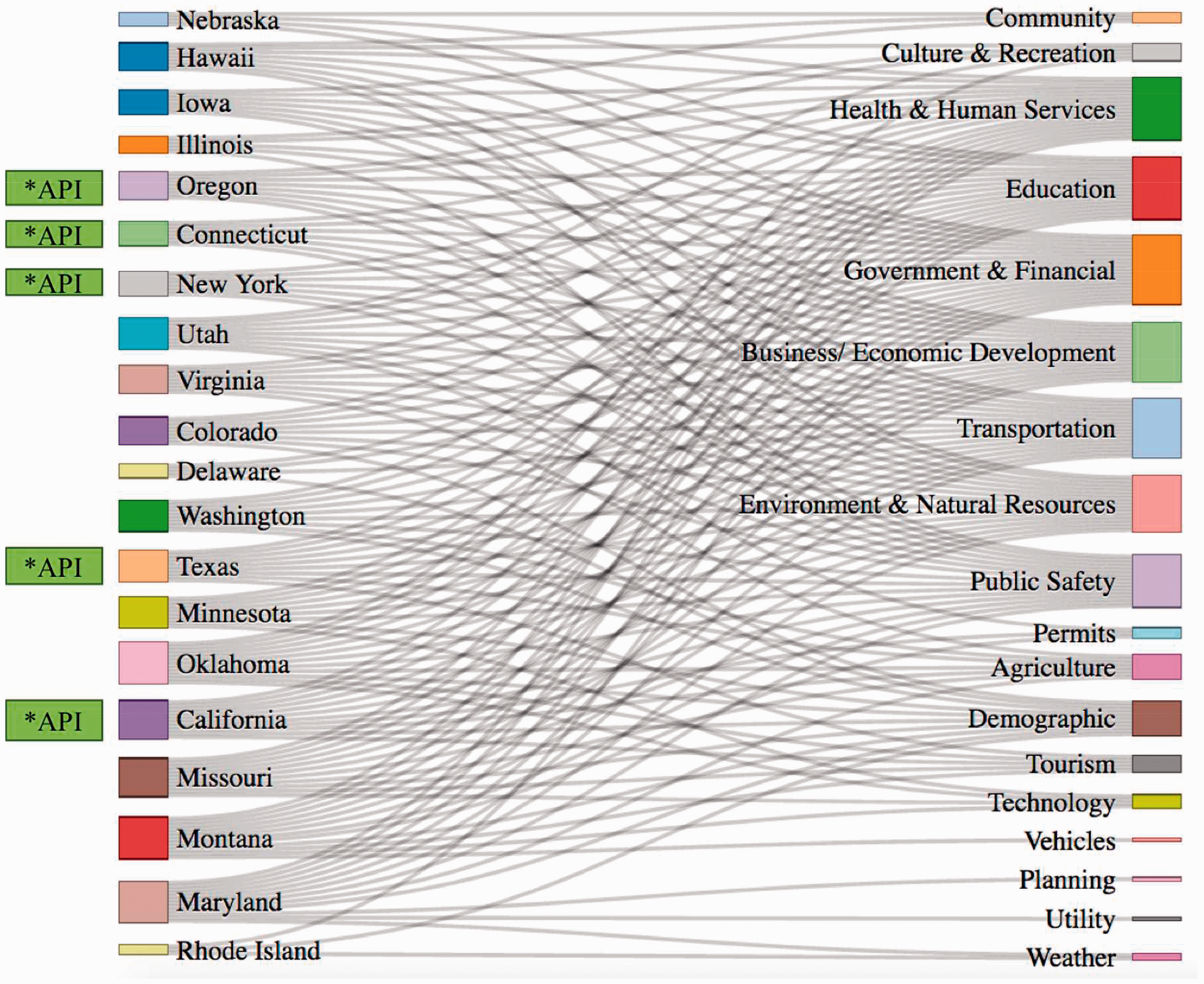
As may be expected, there is wide variation among states in the extent, resolution, and format of open data. Besides government and transparency related data, most of the 20 states with open data portals provide data for health and human services, education, transportation, business and economic development, environment and natural resources, and public safety, as illustrated in Figure 1. Meanwhile, some other types of data, such as demographic; agriculture; cultural, recreational and tourism; and technology also receive some attention at the state level, depending on the state. However, there is less data available for tracking urban utility services, business licenses and permits. The organization of data across states is not uniform. Some states list items such as permits and weather as independent categories while other states tend to move this type of data under an umbrella category, requiring users to dig further into the websites. Additionally, some states provide a wider range of data, while other states are still at the initialization phase of website development, as shown in the left column of Figure 1. For instance, States, such as California, Maryland, and Missouri, tend to have data available across various sectors. While, some other states only provide data covering less than five attributes. In all, there seems to be a trend for more transparent and data-driven government that is willing to open its data sources for public scrutiny.
Many state data portals provide APIs for developers to access data remotely. For instance, New York offers 28 APIs, and California provides nine APIs to help users navigate their datasets. These APIs make it easier for users to track, maintain and update the data.
City level open data
Many cities have already taken the first step to make datasets open and available online, regardless of whether they have an open data policy. The U.S. Open Data Census (http://us-city.census.okfn.org/), powered by the Open Knowledge Foundation, has a comprehensive list of open data available for various cities. The census calculates open data score for each city based on data quality, availability, and license conditions. The census evaluates data from 19 attributes, such as assets, budgets, crime, and zoning. Currently, this census provides information for up to 94 cities, with a total of 761 datasets. Approximately 25% of these datasets are open online. The census also provides a limited evaluation of the data quality available at the city level. For instance, some data on public safety are available online. However, the quality of data that are uploaded may turn out to be dramatically different from one city to the next. For example, some places publish a map on the distribution of crime, while other places provide GIS shapefiles showing the type, location, and timestamp of crimes by type. The machine-readable data, like GIS files, provide more information than the static image file, and therefore, more useful for data analysis. In addition to machine readability, the U.S. Open Data Census also assesses data quality based on data cost (some places charge for parcel data and zoning data) and whether the data are up to date.
Based on the open data census, New York City and San Francisco are top tier cities for open data, as their scores are much higher than the rest of the top 10 cities (see Figure 2). However, it must be noted that this census is crowd-sourced, indicating that the results depend heavily on people who provide the information about data resources to the census. If the information provider is not familiar with certain datasets provided by a city, then the results of the census may not be completely up to date. However, the census offers a platform to encourage the open data movement at the city level.
Top 10 cities with the highest open data score (source: http://us-city.census.okfn.org/).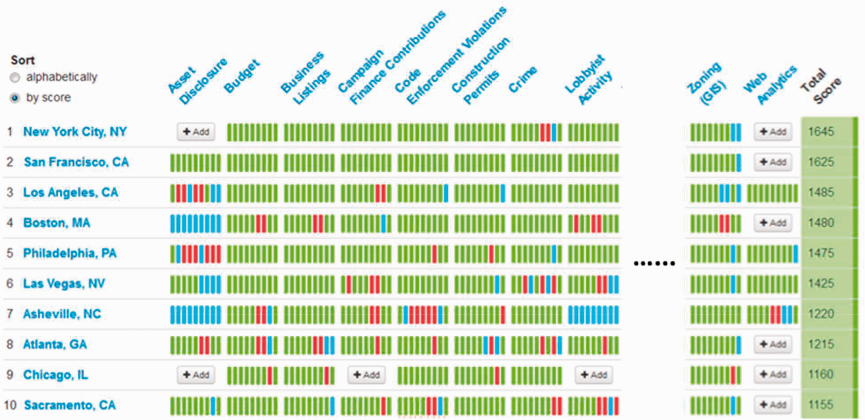
The challenges in open data-based tool development
Although open data across geographic scales have already been widely used in several academic fields, some barriers still exist that limit planning practitioners from utilizing open data. Open data accessibility is a big concern, particularly for some national level datasets. High-resolution national data are extremely large, rendering it difficult for users to download entire datasets. Often, data providers do not allow the manual download. For instance, the U.S. Census Bureau does not offer a link to let users download all the data they have. For this type of large dataset, users need to provide more specific information regarding the specific scope of data they are looking for. The U.S. Census Bureau offers a user-friendly interface for planners to create tables by topic and geographic location. Unlike the U.S. Census Bureau whose major purpose is to provide data to the general public, many national level data providers only provide an API for users to download the data. The use of an API for data downloads is more complicated than hitting a download button since a programming background is needed to write scripts for scraping data in large batches. This hurdle limits the use of open data that are only accessible via APIs. However, it is important to note that once a script is developed to download data using an API, the download process can be automated, which make it easier to update and maintain the data. Therefore, it will be of great value for planners if an application can be developed for accessing open data using APIs.
The second challenge in using open data is that most planners are not equipped to process some open data sources and formats. For instance, it is quite hard to process Google Street View and social media data without expertise in image processing and data mining machine learning models.
Third, most data downloaded with APIs are formatted into .json and .xml files. These data storage structures are not well-known to planners. The API accessible data are formatted using uniform code so that they can be transferred via the internet in a more efficient manner. Unlike the conventional Excel spreadsheet or ASCII data, these types of data tend to be highly machine readable but are not easily interpreted in the same way as raw text or numbers. Therefore, it is critical for planners to learn how to work with this form of data for their analysis and communication.
Finally, there are always some geographic unit mismatch problems. For instance, some data are available at the census tract level while others are available at the zip code level. However, planners are usually interested in community and neighborhood level statistics. Reconciling data among two different geographic units require simplifying assumptions about how the attributes of the data are distributed within each geographic entity (such as homogeneous density within the spatial unit). Additionally, some data are non-spatial and cannot be geo-located for neighborhood-based analysis.
Finding solutions through open data-based tool development
We developed a web-based application named Flow-based Planning Support System (FPSS) to address some of the challenges in using open data and provide an intuitive tool for indicator creation and visualization. Currently, the pilot application can visualize neighborhood characteristics of the City of Atlanta at the neighborhood planning unit (NPU) level using two indices – the quality of life index and the quality of health index. The application demonstrates how the impact of planning decisions can be visualized with the help of a platform that offers several options for examining neighborhood characteristics that directly affect residents’ health outcomes and quality of life.
The proposed FPSS system has two primary components: 1) a back-end, which helps to collect and refine data obtained from various open sources; and 2) a front-end platform, which includes a virtual sandbox for index calculation and a visualizer to visualize the index constructed or selected by users. In contrast to other PSS, the FPSS doesn’t require users to input commonly available datasets. Instead, the system automatically collects, updates, manages, and cleans data from various open databases in the backend. To be more specific, FPSS downloads data using either available APIs to existing data sources or from published URL links to the open data sources. The back-end processes then re-aggregate the open data to the desired geographic units selected by users. The reaggregated data/variables are then ready for use in the front-end virtual sandbox, thereby saving a considerable amount of time on data collection and cleaning processes. Given that, at the moment, many useful datasets are unavailable from open sources, the users have the option to upload their own datasets.
The FPSS virtual sandbox serves as a platform for users to define a study area, the geographical units, and select variables that are prepared and aggregated in the back-end. The selected data can be used to construct composite measurement indices for examining relationships and assessing effectiveness of potential planning decisions. The measurement indices are generally constructed from on a tree-based framework using different variables and aggregated indicators. For instance, the health index for the Atlanta’s NPU level is calculated from a framework illustrated in Figure 3. The framework uses two levels of attributes and different weights to generate the aggregated health condition of the neighborhoods. The calculation process itself can be burdensome. When the lower level variables are updated, the calculation for higher levels in the branch of that tree needs to be computed again to update the final neighborhood index. Additionally, when the structure of the index is more complicated than the neighborhood health (NH) index example in Figure 1, the data collection effort will occupy significant amount of time and human resources, which often are luxuries in many public sector and planning offices.
Example framework for composited neighborhood health index.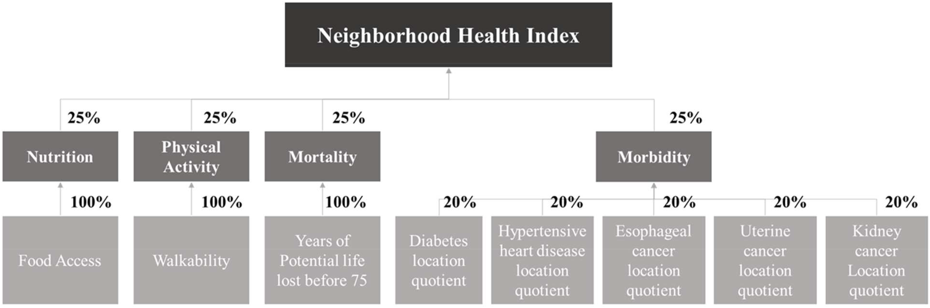
To address the challenges mentioned above, the FPSS virtual sandbox is designed to help construct, manage and update the tree-based composite planning indices more efficiently and intuitively. The FPSS virtual sandbox adopts a flow and graphic based index construction platform, which visualizes the structure of the intended index in real time, as shown in Figure 4. The users can conveniently add/remove variables by dragging the variables and operators into/out of the sandbox. Before using the virtual sandbox, users need to first identify study area and geographic units, by selecting the corresponding states or cities from the drop down menu in the “Study Area” Box, shown on the top left corner of the interface. The geographic units available for selection includes state, county, zip code, neighborhood, NPU, census tract, block group, and block. After determining the study area, the corresponding available variables collected from open source data will be updated in the “Data” Box. The users can then start to construct indices by dragging available variables from “Data” Box and mathematical operators from “Tools” Box into the virtual sandbox area. All the variables and tools will be visualized as node icons in the virtual sandbox, with corresponding variable names and tool information. The current activated tools include addition, multiplication, subtraction, and assigning weights or constants. The variables and constant nodes can be joined together by an addition or multiplication tool node in the virtual sandbox by dragging the nodes close to other relevant ones. The successfully connected nodes will be joined with edges. If two variables together with associated weights are joined using a multiply tool, they are multiplied together to form a new variable/index. Similar rules will also apply to the other tools that will be included over time. The users can update weights by clicking on the weight nodes and directly type in new values. Users can also hide or unhide substructure of the tree by clicking on the “parent” nodes of the branch. The structure of the index will remain unchanged, however, the users may find it easier to focus on unhidden branches of the variables.
The interface of “virtual sandbox”.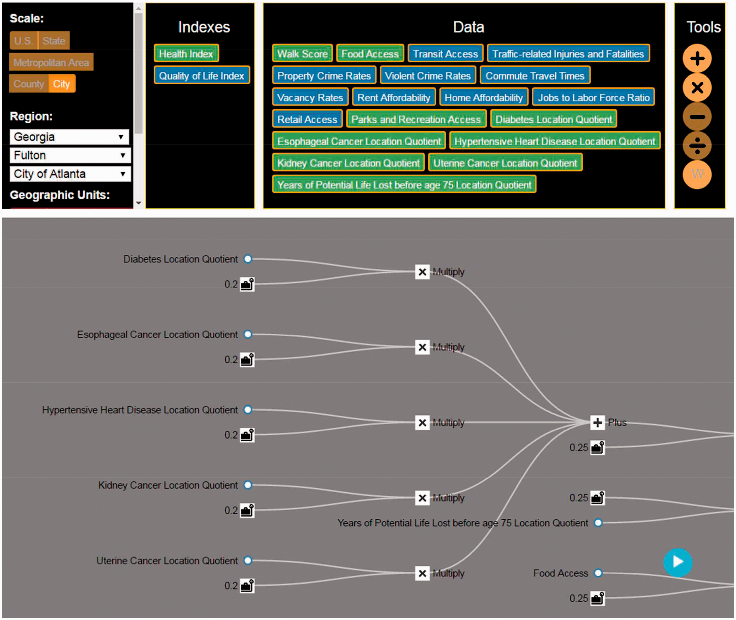
After constructing the composite index, the users can directly visualize the results by switching to the visualizer in the FPSS, which is activated by clicking on the blue circular button at the bottom right corner of the virtual sandbox. The major visualization component will be a thematic map at the selected geographic unit and scale. Based on the map, users can easily identify the spatial patterns of the constructed indices, as well as of other variables. Additionally, the visualizer also offers options for users to examine the descriptive statistics, scatter plots, and bar charts of the computed indices. The visualizer also provides the ability to compare among geographic units based on particular variables of interest or the final planning index. For instance, the visualizer can provide a bar chart to compare the health index for a selected neighborhood to that of the average for the city.
The front-end of the FPSS tool described above was developed using HTML and JavaScript. Several JavaScript libraries were used, such as jQuery and Google Map JavaScript API to support different functions. The back-end of the FPSS is designed to collect data from various open source data repositories, convert their format and geographic scale and perform calculations based on the structure designed by the users in virtual sandbox. The functionalities of the back-end were developed using Python 2.7 on Microsoft Azure.
To demonstrate the usability of the proposed platform, we used FPSS to generate quality of life and health condition indices for the neighborhoods in Atlanta. First, we designed the structure of NQOL and NH indices based on a review of the literature. The weights of variables that were included in the NQOL index were based on a citizen survey conducted by the City of Atlanta. The status of NH was based on measures of healthy food access, physical activity, mortality and morbidity in neighborhood populations, as shown in Figure 1. We programed FPSS to collect data from several different open source databases, such as housing data from the U.S. Census database and public safety data from the Atlanta Police Department. We manually uploaded the datasets that cannot be collected automatically from public servers. Microsoft Azure was used as the back-end platform for data storage and cloud computing. To develop the two indices in the sandbox, we first selected “city” as the scale of the project, region as “Georgia - > Fulton County - > City of Atlanta”. The geographic units selected was the NPU. The available variables are then updated in the “Data Box”. We constructed NH and NQOL indices by dragging variables and calculation tools into the virtual sandbox and configuring the weights tool. The variable tags in the Data Box are colored green when they are used in the construction of the current open (unhidden) index. The specification of the constructed NH index is illustrated in Figure 5 (the NQOL index is hidden and the variables used in that index are colored blue in the “data” box).
Construction of NH in FPSS sandbox.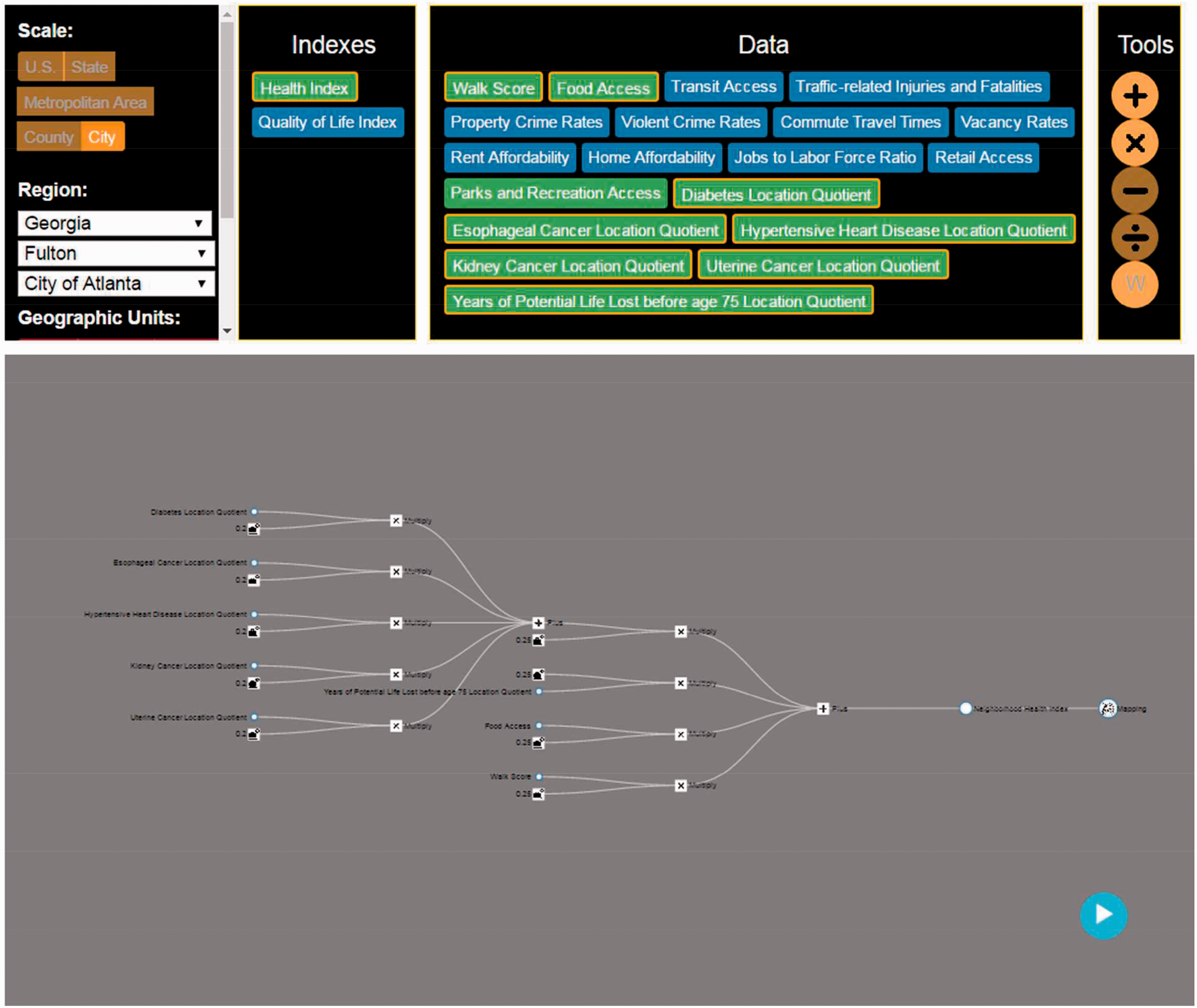
The constructed indices are visualized in the FPSS visualizer, as shown in Figure 6. The major mapping area displays a thematic neighborhood scale map for the NH index. The users can click on the index name tags on the top left of the map to switch between maps for different calculated indices. The thematic maps can help users identify particular clusters of interest in the study area. For instance, the map indicates that the health condition in urban center tends to be better than in the fringe neighborhoods. The visualizer also offers a search function for users to zoom into a specific address in the study area to further examine the values of the calculated indices at the place of interest. Moreover, the users can click on corresponding icons to activate bar charts (as shown in Figure 6), pie charts, scatter plots, tree charts, and spider charts to compare indices among different neighborhoods in Atlanta.
The visualization of the computed indices.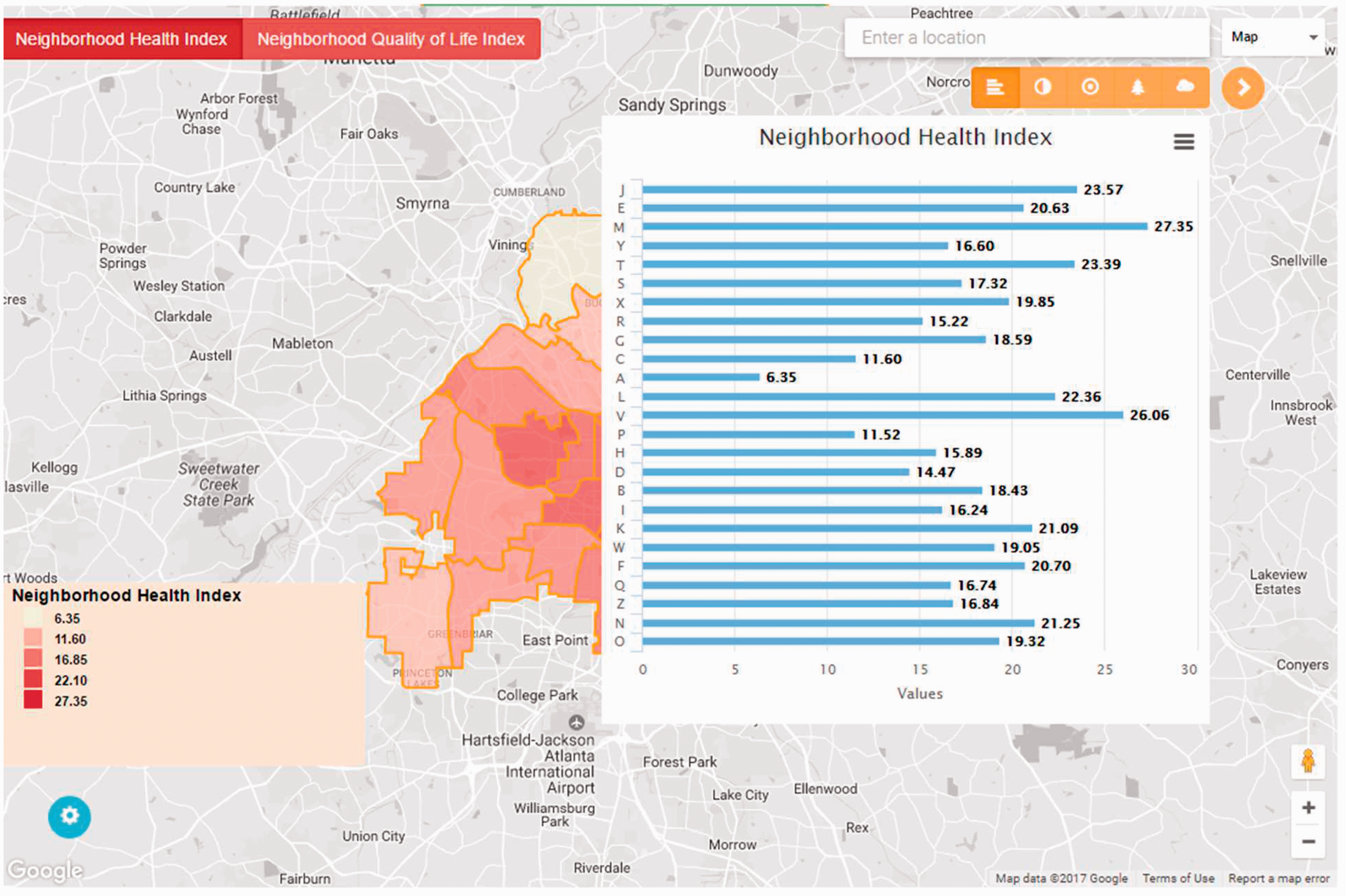
In the Atlanta test case, the challenges for accessing, cleaning and using open data were resolved through various approaches and tools at the back-end and front-end of FPSS. First, FPSS used U.S. Census API and some Python libraries (i.e. json and urllib) to connect the back-end database on Microsoft Azure to the public US Census server. This API offered an efficient way to download the data based on the census tract ID and to update data in real-time. Second, some python libraries for spatial analysis, such as shapefile and Fiona, were used in FPSS to transform data from census tract level to NPU level to resolve the geographic unit mismatching problem. The FPSS also used these libraries for conducting spatial analysis at the scale of NPU. Additionally, some Python libraries for data formatting, such as pyshape, json and csv, were used in FPSS to convert data with different formats, such as csv, json and shp. Finally, the use of sandbox and visualizer also demonstrates that FPSS front-end can help construct useful indicators, which can then be visualized, and updated in real-time.
Discussion
In this study, we demonstrated that the FPSS can be utilized to design, calculate, and visualize a set of composite planning indices at the NPU level for the City of Atlanta. This test case illustrates the conceptual and operational model of an open data-based PSS that offers an user-friendly tool to design and visualize place based indicators.
The Atlanta test case demonstrates that the FPSS is effective in collecting data from various open sources, such as the Census Bureau and Atlanta police department, in automatically converting the data to desired formats, and in rescaling the geographic units to the preferred resolution. The FPSS virtual sandbox adopts a flow-based user interface, which is intuitive, flexible, and can facilitate designing, calculating, and updating the composite planning index. Finally, the FPSS visualizer can illustrate the calculated index using thematic maps, charts, and tables to help stakeholders from different domains, especially those without planning backgrounds, to better inform their decision-making process.
However, like most applications, the current version of FPSS has its limitations that merit further improvements. First, the existing open data cleaning module in the FPSS can only achieve conversion among file formats such as txt, csv, and shp files. Other data formats, such as json and xml files, cannot be easily incorporated into the platform. These conversion gadgets have already been developed and can be incorporated into the FPSS in the future. In addition, the aggregation function of the FPSS can be advanced by integrating more geographic unit boundary data into the platform. Currently, the FPSS only supports the scale transformation between census and planning neighborhood unit. Later version of FPSS will include a new module to easily convert data from one geographic scale to another, if users can provide both boundaries, in either shp or json format. Furthermore, historical data are still unavailable in FPSS, which means the system cannot support longitudinal analysis based on indices for different time periods. The current datasets, used by FPSS, are the latest version of the original database. We expect that FPSS will include data across multiple periods and years in the future.
The fourth limitation of the FPSS system is that users, to date, cannot import local data into the platform, rendering it less flexible. Most planning decision-making processes need to account for data from various stakeholders in diverse sectors such as healthcare, education, private sector businesses, and municipal governments. Therefore, it is necessary for the platform to accept user configured data, which can then be incorporated into composite indices. Such functionality is currently under construction.
A fifth limitation is that open data from different sources are updated at different intervals. When such data are comingled, there could be a mismatch in the temporal aspects of the indicators that are created from the data. With the development of technology, open data in real-time is becoming a reality, and more and more new data will be produced as dynamic open data, reducing the temporal lags among different datasets. However, in this application, some of the open data have long update intervals while some data are static.
The sixth limitation is that there has been no user testing of this platform to check for usability and potential bugs. Usability testing is important because, as previously reported, PSS implementation has faced challenges related to insufficient diffusion in planning practice and a lack of acceptance among targeted users (Vonk and Geertman, 2008). These factors may also affect the user acceptability and functionality of the developed FPSS platform. By adopting the flow-based user interface, we expect to reduce some of these implementation concerns about PSS discussed in the prior studies. However, it remains critical to collect user feedback to validate and improve the system.
A final limitation of the FPSS is that the current computational tools in the system cannot support more complicated spatial analysis. For example, spatial queries like selecting data samples within a certain study area is unavailable in the latest version of the system. More advanced spatial query and joining modules will be included soon to make the system more powerful for practitioners.
Conclusion
This paper presents a novel open data-based community PSS that provides a platform for computing, mapping, and visualizing spatial data. To develop this application, we analyzed the current state of open data efforts in community planning related domains; examined potential challenges associated with effectively using open data in the planning process; developed several tools based on Python at the back-end of the application to address some of these challenges; and designed an interactive graphical user interface based on HTML and Javascript at the front-end to help in constructing, updating, and visualizing composite planning indices to better inform decision-making processes.
The flow-based application was applied to assess the quality of life and health in the City of Atlanta at the NPU scale. The two composite variables, quality of life and health, were created by aggregating information from 19 variables in nine categories. The users can explore the spatial variation of each variable in different ways, including a map with geographic locations, a chart with trend estimation and a table with real numbers. The Atlanta test case demonstrates that this application can help various users, including planners, researchers, government officials, and the general public, better understand community trends and be more critically engaged in the community planning process. Despite its promise, there is much scope for improvement, such as including a larger variety of supported data formats, incorporating longitudinal spatial data, improving data resolution, enhancing interface design based on user feedback and developing more comprehensive spatial query and joining tools.
Footnotes
Declaration of conflicting interests
The author(s) declared no potential conflicts of interest with respect to the research, authorship, and/or publication of this article.
Funding
The author(s) received no financial support for the research, authorship, and/or publication of this article.