
Abstract
Neighborhoods in US metropolitan areas experienced dramatic changes in racial composition during the 1990s and again during the 2000s. We ask to what extent does the recent period of neighborhood racial change reflect an extension of the local processes operative in the 1990s, processes characteristic of large metropolitan areas or the nation more generally, or reflect new dynamics. After classifying neighborhoods in US metropolitan areas into different types based on their racial composition and having harmonized a set of tracts to consistent boundaries, we use metropolitan-scale tract transition matrices from the 1990s to predict changes in neighborhood racial mix between 2000 and 2010. To capture scale effects, we repeat this using a set of pooled metropolitan-scale tract transition matrices and again using a national tract transition matrix. We show that the main dynamic at work across the metropolitan system is the underprediction of moderately diverse white majority tracts: i.e., in the 2000s, the rate of increase in the racial diversity of white majority tracts that transitioned from being predominantly white to moderately diverse was much higher than expected based on 1990s trends. In some metropolitan areas, shares of moderately diverse white tracts in 2010 are anticipated by their 1990s neighborhood dynamics, suggesting temporal stability and a locational specificity in these processes. Others experience a temporal rupture in these dynamics, and their moderately diverse white tract share is better anticipated by pooling transition information. The study also invites us to think about the nature of residential change currently taking place that we can capture in 2020 census data.
Introduction
In 1991, Paul Knox published a paper aimed at characterizing urban trends in the US such as the advent of private master-planned communities, high-tech corridors, mixed-use developments, “festival” settings, and postmodern architecture. Knox (1991) coined the idea of a “restless urban landscape,” a notion that we extend in this essay to the changing nature of neighborhood racial diversity. Between 1980 and 2010, the racial and ethnic demography of the US altered dramatically. While shares of blacks remained much the same, the proportion white declined and shares of Asians and, even more notably, Latinos increased rapidly. These changes were reflected in many areas of the country but especially in the racial makeup of urban neighborhoods.
While these overarching demographic shifts are easy to characterize, the alterations playing out on the ground are not so simple. In the 1980s, 1990s, and 2000s, many neighborhoods in US metropolitan areas became more racially diverse. At the same time, however, those very same metropolitan areas were also home to racially homogenous parts of town that had stubbornly nondiverse neighborhoods. Holloway et al. (2012) have described this as the “both-and” of segregation and diversity. Rather than thinking about segregation and diversity running along a two dimensional continuum, they assert that it is more productive to think how segregation and diversity are being simultaneously produced. Holloway et al., of course, were not the only scholars to pick up on this. Logan and Zhang became aware of contemporary trends that, in their words, lead down “pathways” toward both “separation and diversity” (Logan and Zhang, 2010; Zhang and Logan, 2016). Pinto-Coelho and Zuberi (2015) describe these developments as the emergence of “segregated diversity.” Others, too, report on similar tendencies in both the US (e.g., Clark et al., 2015; Fowler et al., 2016; Krysan et al., 2017) and the UK (e.g., Catney, 2016; Harris, 2014, 2017; Johnston et al., 2015).
The analysis reported in this paper extends these strands of research. We argue that the shift of residential racial geographies to simultaneously reflect both segregation and diversity accelerated and diverged after the 1990s. Using Census data from 1990, 2000, and 2010, we compare the observed patterns of residential racial diversity in the 2000s with that which would have occurred had rates of change remained as they were in the 1990s. We weigh the utility of three counterfactuals using transition matrices. These transition matrices tally the Census tracts that changed classification during the decade and also count the number that did not. Specifically, we contrast the observed changes in the 2000s with three different sets of predictions to answer the following questions. Is the process of neighborhood change temporally and spatially stable across large metropolitan areas? Are the changes in neighborhood composition observed in these metropolitan areas in the 1990s predictive of changes experienced a decade later? Is the process of change broadly similar across metropolitan areas? Or is it specific to these places?
The essay proceeds as follows. We first briefly summarize the intellectual history of studies that use neighborhood transition processes to gain insight on the changing nature of racial segregation in US metropolitan space. We then consider why some of the main forces that engender neighborhood racial change might not operate uniformly across the US metropolitan system. After outlining our own methodological approach, we use local, national, and a pooled set of metropolitan area transition probabilities from the 1990s to predict neighborhood racial change in the 2000s. We show variations in the predictive success of each approach by tract type and metropolitan area, paying particular attention to the prediction errors for moderately diverse white tracts in each model.
Background
US metropolitan areas are less residentially segregated now than they were a few decades ago. These changes have several roots and include the effects of the Fair Housing Act of 1968; the end of the Great Migration of blacks from the South to northern metropolitan areas and subsequent population shifts from the more segregated northern cities toward less segregated metropolitan areas in the South and Southwest (Glaeser and Vigdor, 2012); a small but significant melt in attitudes toward neighborhood racial mixing (measured by, for example, alterations in white opinions; Denton and Massey, 1991); and the demographic diversification of the US shaped by the post World War 2 growth of the Latino population along with the 1965 immigration act that opened the door to significant immigration from south, southeast, and east Asia. Black/nonblack residential segregation peaked in 1970 (Glaeser and Vigdor, 2012), and scholars began to observe racially diversifying neighborhoods starting in the 1970s (e.g., Denton and Massey, 1991; Lee and Wood, 1991).
Three earlier studies frame our own research on the changing nature of racial residential segregation and diversity in the US. Denton and Massey (1991) were among the first to use transition matrices to study US residential neighborhood racial alteration. They identified a growing complexity in the ethnic/racial structure of most urban neighborhoods suggesting that researchers should shy away from two-group models to capture the dynamics of residential racial segregation. One of their key findings concerned the spatial behavior of whites: tracts losing whites followed from the increasing presence of multiple nonwhite groups, a structural form that their analysis was able to identify as increasingly present in many neighborhoods.
Alba et al. (1995) were interested in the neighborhood racial dynamics in the New York metropolitan region in the 1970s and 1980s, the demography of which was being reshaped by the arrival of recent immigrants. The specific motivations for their study were the relatively stable indexes of dissimilarity that contrasted with the considerable neighborhood churn they observed. Among other things, they used population change by racialized group over the 20-year period to predict 1990 patterns. This exercise predicted well the number of 1990 racially diverse tracts (tracts that were, on average, 33% nonwhite) but performed poorly in other areas—specifically, it underpredicted the decline in mostly white tracts.
Both these investigations point to the importance of paying attention to the neighborhood dynamics of whites to gain purchase on overarching patterns of metropolitan neighborhood change. Does more recent scholarship follow along the same lines? Zhang and Logan (2016) examined racial residential neighborhood change between 1980 and 2010. One focus of their analysis was a transition matrix comparison of observed and projected neighborhood alterations for white and so-called Global (highly mixed) neighborhoods (what they saw as the two extremes of diversity). Projections were based on the change that might have been expected should the neighborhoods have followed the metropolitan average demographic shift for each racialized group. The share of white tracts was projected to drop considerably in all metropolitan areas following general demographic trends. The actual change, however, significantly outpaced the predicted decline. Zhang and Logan concluded their essay with two cautions. They noted, in all types of metropolitan areas, a persistence of nonwhite neighborhoods. Further, they observed that mixed neighborhoods were still subject to white exodus, leading them to speculate about the effect of future white residential dynamics on overall patterns of neighborhood diversity.
We seek to explore white and other neighborhood dynamics from a different standpoint than Logan and Zhang. Their technique creates a broad suite of mixed neighborhood types that identifies a range of combinations of groups showing the decline in all white neighborhoods and the growth of a variety of neighborhood types that include whites and varying combinations of other racialized groups. This change is notable but it conveys an impression that white neighborhood space is fading and being replaced by mixed residential spaces. We are more skeptical. Ellis et al. (2017) agree that white segregation is diminished but is best characterized as being refashioned through adaptations in white dominated neighborhoods to the increases in diversity in their metropolitan contexts. White neighborhoods with low diversity (i.e., over 80% white) are transitioning to accommodate increases in diversity, but these are modest changes and occur in a way that often maintains neighborhood white majorities.
Our new investigation of these white neighborhood transitions, and the broader patterns of neighborhood racial change, centers on the question of whether these dynamics are stable in space and time. Focusing attention on the 52 largest US metropolitan areas in 2010, we ask if the rate of change between types of neighborhoods, categorized by their dominant group and level of diversity, in the 1990s is predictive of changes in the 2000s. We do this in three ways:
Using transition probabilities in each metropolitan area i between 1990 and 2000 to predict transitions in each metropolitan area i between 2000 and 2010. Using a pooled metropolitan 1990s transition matrix, built from all neighborhoods in the largest 52 metropolitan areas to predict transitions in metropolitan area i transitions in the 2000s. Using a national transition matrix, built from all neighborhoods in the country, from the 1990s to predict metropolitan area i transitions in the 2000s.
This sets up the investigation of several related issues. First, we assess if the pace of neighborhood change is consistent across time. If the 1990s changes in neighborhood classifications are similar to those in the 2000s, then we will find that observed tract distributions in 2010 resemble those predicted on the basis of 1990 transition probabilities. We will also be able to detect which types of neighborhood evolutions in the 2000s are best predicted from patterns observed in the 1990s.
Second, comparison of the predictive accuracy of different transition matrices at different scales tests whether the processes of change in the 2000s in each large metropolitan area are best forecasted by its own neighborhood transition probability matrix in the 1990s or by transition matrices measured at broader scales. If pooled large metropolitan area or national transition matrices anticipate alterations in a metropolitan area’s tracts as well or better than those from a metropolitan-specific transition matrix, it suggests the existence of a common system of neighborhood change across metropolitan areas rather than place-specific processes.
The idea of using transition matrix information gleaned from changes outside a metropolitan area to estimate changes in a specific metropolitan area aligns with the idea of pooling information from related or larger spatial contexts to enhance predictive power. Such methods feature in Bayesian spatial estimation strategies where priors borrow strength from some form of spatial dependency (Congdon, 2007). Here we explore the possibility that information in transition matrices computed from the national scale or pooled large metropolitan areas contains information that can improve prediction locally. This may occur, for example, as forces that drive neighborhood change, such as immigration, diffuse from metropolitan areas with more established immigrant populations to those with shorter histories of immigrant settlement. Immigrant populations in “new immigrant destinations” expanded in the 1990s but perhaps not enough to force changes in their neighborhood categorizations reflective of these demographic transformations. For this reason, 1990s metropolitan-specific transitions may fail to predict the growth of Latino dominated tracts and the increasing diversity of white residential space in new destinations by 2010 because these changes were unobserved, or rare, in the 1990s. Such transitions are likely observed at higher rates elsewhere in the 1990s, meaning broader scale 1990s transition matrices might better forecast new destination metropolitan area neighborhood changes in the 2000s.
The spatial diffusion of immigrant populations is not the only possible rationale for tapping the power of these broader scale transition matrices. Others include the redistribution of black populations through migration and the possibility that attitudes to diversity and residential preference percolate from metropolitan areas that are more open to neighborhood racial difference to those that are less so. For these reasons, higher rates of transitions in white-dominated residential space in some metropolitan areas in the 1990s may foreshadow neighborhood transition patterns in other metropolitan areas a decade later.
Methods
In contrast to the array of existing segregation measures designed to capture the extent to which groups residentially live apart from one another, our approach measures the degree to which different racialized groups share the same residential neighborhoods. We join a growing group of scholars with related agendas (e.g., Clark et al., 2015; Johnston et al., 2009; Zhang and Logan, 2016). We devised a taxonomy that made sense in the US context and its associated civil rights legislation. Our classification scheme is inherently geographical, allowing us to develop an interactive web-based atlas (www.mixedmetro.com) from which to analyze how residential neighborhood racial segregation and diversity unfolds across space and time.
We use a common method of evaluating compositional diversity—scaled entropy. Our scheme developed from a set of explorations of scaled entropy of ethnic/racial composition across six racialized groups (whites, blacks, Asians, Latinos, Native Americans, and others). These racial groups reflect what was observable in the 1990 Census, with definitions in the 2000 and 2010 Census modified to conform as closely as possible. We allocate individuals reporting multiple racial categories in the 2000 and 2010 Censuses to single racial categories using minority preference proportional weighting. Holloway et al. (2012) and Wright et al. (2014a) provide more details.
The entropy measure of tract diversity is:

Furthermore, we identify the numerically dominant racial group in the low-diversity and moderate-diversity tracts. With six racialized groups, this taxonomy produces 13 neighborhood classes: six low diversity types, six medium diversity types, and one high diversity type. Although Native Americans and those claiming to be “some other race” enter into the entropy calculations, the number of metropolitan tracts where American Indians are the numerically dominant group is very small. There are no metropolitan tracts where people who claim “some other race” represent a plurality.
Counts and means of entropy and group share of major tract categories in US metro areas with populations >1 million in 2010.

LDW: low diversity white; MDW: moderate diversity white; LDB: low diversity black; MDB: moderate diversity black; LDA: low diversity Asian; MDA: moderate diversity Asian; LDL: low diversity Latino; MDL: moderate diversity Latino; HD: high diversity.
The mean values of scaled entropy and group percentage share reveal distinct breaks between the categories. Temporal trends suggest small shifts in these means. Mean entropy rises in some tract types but not others. In all classes defined by a dominant group, the dominant group share is stable or declines slightly by 2010. More interesting for our purposes is the change in the counts of tracts in each category. White tract types are the most numerous in any year but low diversity white tracts tumble by 2010 to about half the number they were in 1990. The count of moderate diversity white tracts almost doubles between 1990 and 2010, becoming the most numerous type of tract by 2010. The count of low diversity black tracts is relatively stable while the number of Latino tracts, particularly those that are moderately diverse, grows rapidly. By 2010, moderately diverse Latino tracts are the third most numerous tract type, behind low and moderate diversity white tracts, and exceed the count of any black type.
Our primary interest is in the temporal stability of the process of neighborhood change—the transitions between tract types—that produce these shifts in counts of tract types in large metropolitan areas. Are the neighborhood changes between tract types in the 1990s predictive of the changes in the 2000s? Are these changes best predicted using a metropolitan-specific transition matrix (i.e., predicting metropolitan area i’s tract changes in the 2000s based on that metropolitan area’s tract’s changes in the 1990s) or an alternative transition matrix, derived either from national or pooled large metropolitan area tract changes in the 1990s. We estimate the distribution of tracts in each metropolitan area i in 2010 as follows:

National transition probability matrix, 1990–2000.

LDW: low diversity white; MDW: moderate diversity white; LDB: low diversity black; MDB: moderate diversity black; LDA: low diversity Asian; MDA: moderate diversity Asian; LDL: low diversity Latino; MDL: moderate diversity Latino; HD: high diversity; LDNA: low diversity Native American; MDNA: moderate diversity Native American.
The shading and bolded diagonal cells help communicate the outlines of those dynamics. The diagonal is the probability that a tract in a particular category does not transition to another category from 1990 to 2000. The upper left shaded quadrant delineates transitions among low diversity tract classes, and the lower right shaded quadrant does the same for moderately diverse tracts. The stability of low diversity tracts is higher than for those with moderate diversity, but the probabilities of transition from low diversity tract to moderate diversity types generally exceeds the reverse transition (compare unshaded upper right and lower left quadrants). For example, the probability of transition from low diversity white to moderate diversity white exceeds the reverse probability. Overall, Table 2 suggests residential diversification, albeit uneven, among our tract types.
Residential racial change in large metropolitan areas
Figure 1 charts the observed tract share change in large metropolitan areas from 1990 to 2010 by major tract category. It also includes three additional bars for 2010 that represent the predicted tract share using the three transition matrix scales: metropolitan area, pooled metropolitan areas, and nationwide. Not all tracts types are shown as some classes have trivial counts.
Observed and predicted percentage share of tracts.
The main dynamic at work in these metropolitan areas is the transition taking place from low diversity white tracts to white tracts that are moderately diverse. Low diversity white tracts dropped from 65% of the total to 34%. At the same time, the proportion of moderately diverse white tracts almost doubled, increasing from 19% to 34.5%. Moderately diverse Latino and Asian tracts also increased considerably across this time period. Note also the stability of black tracts with low diversity. These neighborhoods are typically greater than 80% black and, of all our tract types, their count changed the least between 1990 and 2010.
The three types of predictors exhibit some variability but the principal story is this: they all underestimate transitions to white tracts that are moderately diverse in 2010, and all mostly overpredict the other transitions. The pooled metropolitan version forecasts the 2010 shares of moderately diverse black and low diversity white tracts the best but performs relatively poorly when used to predict the metropolitan shares for moderately diverse Latino and Asian tracts as well as those we consider highly diverse. This makes sense because changes in neighborhood concentrations of Latinos and Asians (and highly diverse neighborhoods) do not occur evenly across these large metropolitan areas but tend to be concentrated in a few. Not surprisingly, the metropolitan-specific predictions perform best with respect to these three tract types.
The predictions based on the transitions drawn from the entire national pool were outperformed in every instance except one: low diversity black tracts. In contrast, all three predictors performed consistently in the case of low diversity Latino tracts. The three forecasts hardly vary at all in this instance, with all three overestimating the actual number of low diversity Latino neighborhoods in 2010.
Geography of prediction error
Fit of observed to predicted tract shares, metropolitan areas with populations >1 million in 2010.

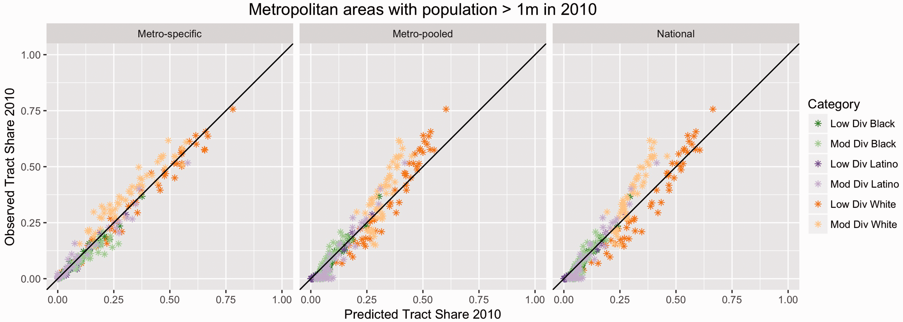
2010 Predicted versus 2010 observed tract shares.
Distinctive patterns of metropolitan area under- and overprediction are noticeable if we focus attention on Figure 2 with neighborhood category in mind. The patterns by tract type in Figure 2 suggest that trends in category-specific under- and overprediction across methods replicate the general trend measured in the “All” category models. The metropolitan area-pooled and national models overpredict at low tract shares and underpredict at large tract shares, a trend confirmed by their coefficients in Table 3. With the exception of the moderately diverse white case, however, metropolitan area-specific predictions do not follow this pattern: intercepts are zero or near zero and slope coefficients are less than one, indicating the best predictions are at low tract shares and a tendency to overpredict at higher tract share. This suggests two things that the best predictive method for most major categories at low tract shares is likely to be the metropolitan area-specific model but that each model type introduces different biases as tract shares increase.
As Figure 2 shows, the tract type with the clearest pattern of bias across methods is moderately diverse white. Figure 1 revealed that each prediction method substantially underpredicts the aggregate share of moderately diverse white tracts in 2010. Figure 2 unpacks this failure, revealing patterns of prediction error by model. It shows the metropolitan-specific model has a distinctive bias, underpredicting moderately diverse white tracts almost everywhere. The metropolitan area-pooled and national models overpredict moderately diverse white tracts in metropolitan areas with low tract shares of this neighborhood type but underpredict them at higher tract shares.
The assessments of fit in Table 3 add precision to these comments. The metropolitan area-specific model’s moderately diverse white tract intercept and slope coefficients imply the greatest underprediction at low shares of this tract type, diminishing but never fading entirely in metropolitan areas with the largest observed moderately diverse white tract shares. Note the distinctiveness of the intercept for the moderately diverse white metropolitan area-specific model relative to the same model for other neighborhood categories: for moderately diverse white, this estimate is significantly and substantively positive, suggesting levels of underprediction of moderately diverse white tract shares of around 8% in metropolitan area’s where these shares are low. The metropolitan area-pooled and national models imply a transition from overprediction to underprediction at around a 10%–15% moderately diverse white tract share, depending on the model. Contrary to the metropolitan area-specific model, underprediction is most acute in these broader scale models in metropolitan areas with the highest share of moderately diverse white tracts.
The results so far suggest a mixed picture with respect to each model’s predictive ability for categories other than moderately diverse white. For moderately diverse white tracts, each model underestimates the share of these tracts but in different ways depending on their share of tracts in a metropolitan area. Figure 3 explores the tradeoffs between the bias and fit of each model for moderately diverse white predictions for each large metropolitan area. The panel on the left arrays metropolitan areas from largest overprediction to largest underprediction of moderately diverse white tract share in 2010 using the metropolitan area-specific method. The middle panel uses the ordering for the metropolitan-specific panel to chart the same over and underprediction for the metropolitan area-pooled model; the right-hand-side panel does the same for the national method. The bars colored red identify which method best predicts the moderately diverse white tract share in 2010 by metropolitan area.
Moderate diversity white residuals.
All but 4 of the 52 metropolitan-specific model predictions underpredict the metropolitan area’s share of moderately diverse white tracts in 2010. This bias is reduced for the metropolitan area-pooled (38 underpredictions) and national (41 underpredictions) models. The summary statistics at the top of each panel confirm the narrower range of the metropolitan area-specific predictions but also its larger overall underprediction bias than for the metropolitan area-pooled model. Unsurprisingly, the metropolitan area-specific model provides the best prediction in most cases. It yields the smallest residual in 30 metropolitan areas, whereas the metropolitan area-pooled and national models fit best in 11 metropolitan areas each. That broader scale models fit better in some places provides support for the idea that prior decade neighborhood dynamics from elsewhere enhances prediction.
The combinations of metropolitan areas for which each model provides the best fit and in the patterns of residuals suggests a complex fusion of local and broader scale processes driving moderately diverse white tract dynamics. Three metropolitan areas, with different combinations of racialized groups and segregation levels, are illustrative. Detroit has the highest metropolitan area rate of segregation between whites and blacks in 2010 (dissimilarity (D) = 74), a large black population share (23.6% of total population), and small Latino and Asian populations (3.9% and 3.9%, respectively). 1 The metropolitan area-specific model is the worst performing model here, underpredicting moderately diverse white tract share in 2010 by 8 percentage points while the best model, the national, is almost perfect. Minneapolis has a much smaller black share of the population than Detroit (8.4%) and lower levels of segregation (D = 50.2); its Latino and Asian population shares are slightly higher than in Detroit (5.4% and 6.4%, respectively). But it looks like Detroit in the large underprediction of its moderately diverse white tract share in 2010 by the metropolitan area-specific model, and the much better performance of one of the broader scale models, in this case the pooled-metro model. Seattle approximates Minneapolis in having a smaller black population share (6.8%) and low black–white segregation (D = 45.6) but has larger Latino and Asian populations (9% and 14.3%, respectively) than does Minneapolis. The metropolitan area-specific model yields a small underprediction of moderately diverse white tract share in Seattle in 2010. The other models predict large declines in the share of these tracts there.
Although Minneapolis and Detroit differ in racial population shares and segregation levels, they appear to have experienced a similar rupture between the 1990s and 2000s in moderately diverse white tract formation. Their transformations in white neighborhood space in the 2000s are better anticipated by trends experienced elsewhere in the 1990s than by their own prior decade neighborhood dynamics. Seattle, in contrast, appears to be following a path better anticipated by its 1990s transition probabilities rather than that predicted by the broader scale models.
Seattle’s experience, and that of many other large new immigrant destinations (e.g., Las Vegas, Charlotte, Dallas, Denver, Phoenix, West Palm Beach, Washington DC, and Portland), undermines our expectation that new immigrant flows are upending the neighborhood dynamics of white residential space in these places. In all these metropolitan areas, the metropolitan area-specific model fits best, meaning that their shares of moderately diverse white tracts in 2010 are best forecast using local information. Broader scale transition matrices that capture greater possibilities for the fusion of growing Asian and Latino populations into white tracts, by including information from places that have previously undergone such immigrant-led white majority neighborhood change, offer no improvement.
Such patterns and other variations in the best fitting model signal that finding systematic explanations for changes in moderately diverse white tract share across metropolitan areas is a challenge (cf. Ellis et al., 2017; Wright et al., 2014b). If we shift focus to the pattern of over- and underprediction in the metropolitan area-pooled model, disregarding best fit, one geography is legible, however. This model consistently overpredicts moderately diverse white tract shares in 2010 in the older industrial metropolitan areas of the Midwest and Northeast (e.g., Cleveland, Milwaukee, St Louis, Cincinnati, Pittsburgh, Buffalo, Rochester, Providence, Hartford), places still largely comprising a white majority that is mostly suburbanized, a substantial black minority, and below-average shares of Asians and Latinos. Borrowing information from other metropolitan areas results in overprediction of moderately diverse white tracts in these places because such pooled models assume they have a sufficient presence of Asian and Latino populations to move into white residential space. Smaller populations of Asians or Latinos also reduce the possibility they can buffer a growing black presence in white residential spaces. Such buffering enhances the willingness of whites to accept increased numbers of blacks in their neighborhoods (Logan and Zhang, 2010).
Conclusions
This paper has assessed the predictive capacity of three counterfactuals that forecast the shares of different types of neighborhoods in 2010 across a set of classes using neighborhood transition information from 1990 to 2000. The three scenarios performed with different levels of precision, but each failed most conspicuously in underpredicting moderately diverse white tracts in the combined set of large metropolitan area tracts in 2010. This finding suggests something changed with respect to trends in white dominated neighborhood space in the 2000s vis-a-vis the 1990s.
The underprediction of moderately diverse white tracts varies by the metropolitan area and prediction methods. Metropolitan-specific predictions, which forecast a metropolitan area’s 2010 neighborhood distribution using its 1990s transition matrix, provide the best fit to observed shares of moderately diverse white tracts. This fit is biased, however, underpredicting shares of this neighborhood category in almost all metropolitan areas. The metropolitan area-pooled and national methods, which use information from broader scale transition matrices in the 1990s to predict 2010 metropolitan area neighborhood distributions, fit less well to observed shares of moderately diverse white tracts, but, in the metropolitan area-pooled case, evince less underprediction bias.
These differences in bias and fit yield a complex geography of best fitting model for moderately diverse white tracts. For most metropolitan areas, the metropolitan area-specific model provides the best fit despite its broad underprediction bias. In others, the broader scale methods work best. In some metropolitan areas, shares of moderately diverse white tracts in 2010 are anticipated by their 1990s neighborhood dynamics, suggesting temporal stability and a locational specificity in these processes. Others experience a temporal rupture in these dynamics and their moderately diverse white tract share is better anticipated by pooling transition information, suggesting a foreshadowing of their 2000–2010 white neighborhood dynamics in other places a decade earlier.
Beyond these issues of model fit, the results from all three models imply a break in the evolutionary dynamics of white neighborhood space between the 1990s and the 2000s. We speculate that white segregation is being remade, no longer manifesting itself in heavily white neighborhoods, but reconfigured in more diverse, but still white majority, spaces (cf. Ellis et al., 2017). The results of our forecasting exercise at the metropolitan scale show that this process plays out unevenly across places. With our simple ordinal pair of white dominated categories, an obvious extension of this project would be to unpack those categories in more detail and explore more precisely where this “line” is being redrawn and how it might be contingent on metropolitan area mixtures of racial populations.
Another expansion of this type of work would be to use this technique to consider what changes might take place in the current decade. We would be interested to see if the drive toward greater tract diversity was sustained over the 2010s, especially in the shares of moderately diverse categories of all types. The lack of predictability for moderately diverse white tracts between the 1990s and 2000s suggests that forecasting shares of these tracts in 2020 is of particular interest. To have greater confidence in predicting the evolution of that residential space, and of other types, in the future we must build better models to forecast the new dynamics of moderately diverse white space in the 2000s.
Footnotes
Declaration of conflicting interests
The author(s) declared no potential conflicts of interest with respect to the research, authorship, and/or publication of this article.
Funding
The author(s) disclosed receipt of the following financial support for the research, authorship, and/or publication of this article: The Eunice Kennedy Shriver National Institute of Child Health and Human Development (Award 5R24HD042828) and a CompX Grant from the Neukom Institute at Dartmouth College helped make this research possible.