




Abstract
When mapping relationships across multiple spatial scales, prevailing visualization techniques treat every mile of distance equally, which may not be appropriate for studying phenomena with long-tail distributions of distances from a common point of reference (e.g., retail customer locations, remittance flows, and migration data). While quantitative geography has long acknowledged that non-Cartesian spaces and distances are often more appropriate for analyzing and visualizing real-world data and complex spatial phenomena, commonly available GIS software solutions make working with non-linear distances extremely difficult. Our Relational Reprojection Platform (RRP) fills this gap with a simple stereographic projection engine centering any given data point to the rest of the set, and transforming great circle distances from this point to the other locations using a set of broadly applicable non-linear functions as options. This method of reprojecting data allows users to quickly and easily explore how non-linear distance transformations (including square root and logarithmic reprojections) reveal more complex spatial patterns within datasets than standard projections allow. Our initial release allows users to upload comma separated value (CSV) files with geographic coordinates and data columns and minimal cleaning and explore a variety of spatial transformations of their data. We hope this heuristic tool will enhance the exploratory stages of social research using spatial data.
Keywords
Introduction
Our world is filled with digital mapping technologies, from drone-based remote sensing to simple smartphone apps changing the face of contemporary cities. However, despite ever-increasing access to geospatial tools, these tools tend to enforce narrowly Cartesian spatial models, where Web Mercator pin-maps and standardized GIS workflows have steamrolled older, more heterogeneous geographical imaginations. This mode of analysis can be counter-productive where spatial relationships are more complex, relational, and multiscalar. In considering the relationships between places, the first mile of distance is fundamentally different from the hundredth, or the thousandth. Scholars in geography and other disciplines have untangled these non-linear effects of distance on the relationship between places, but visualization capabilities have lagged behind theory. To address this issue, we built the Relational Reprojection Platform (RRP), an interactive tool for highlighting spatial relationships across scales missed in Cartesian visualizations. 1
In the remainder of this article, we will describe the visualization gap we intend to fill with RRP, then describe its components in detail. We begin by discussing this project’s inspiration from previous work in analytical cartography. Next, we explain the mechanics and interpolation techniques of the platform, before concluding with two representative case studies to illustrate how RRP may be useful for the urban analytics community. We conceive of RRP as a component of an exploratory spatial data analysis (ESDA) workflow, as a way of understanding spatial patterns in point data related to a central location. However, rather than the output being a statistical metric, RRP produces a rigorously constructed visualization that can aid in understanding a variety of types of spatial relationships, and create intermediary visuals to help in the analytical process or be further processed into more polished maps via our Scalable Vector Graphics (SVG) output function.
Background
This project was conceived in a workshop hosted by Luke Bergmann and David O’Sullivan in 2018 on “Geographic Imagination Systems” (see also Bergmann and Lally, 2020; O’Sullivan, 2024), brainstorming new kinds of visualizations for problems posed in our own research in Critical GIS and urban analytics (Thatcher et al., 2016). Our initial drive to build RRP stemmed from our frustration with the supremacy of standard GIS logic in spatial visualization, and the relative decline of the more bespoke pre-GIS “analytical cartography” experiments (Tobler, 1976) of the 1960s and 70s, many of which are difficult if not impossible to replicate or extend using commercial GIS software. Going back to the novel ways in which relative distance was visualized by quantitative geographers of that era, we were inspired to look forward, realizing that the proliferation of open-source tools for spatial analysis and visualization could allow us to create new work inspired by this tradition. Worth special mention are Torsten Hägerstrand’s “Migration and Area” illustrations (1957; see also Bunge, 1962) that recalculate distances from Asby, Sweden using a log-azimuthal projection, along with Bill Bunge’s use of reprojection in Nuclear War Atlas (1988) to assert the propinquity of nuclear threat. Ultimately, in our quest for better visualization of what Pip Forer (1978) calls “plastic” and relational spaces, we built a tool to fit our own needs. Relational Reprojection Platform is one of multiple parallel attempts to expand the visual vernacular with which we approach non-Cartesian data (for irregular grids, see Lally, 2022; for mapping with limited coordinate access, see Westerveld and Knowles, 2020).
Methodology
We chose to develop the RRP prototype in R because of its well-developed spatial data analysis ecosystem of libraries, useful IDE (RStudio), and established system for developing interactive web applications (Shiny). For very large datasets there may be performance limitations to this approach, given the number of steps involved in parsing and reprojecting the data. The following is a breakdown of the major computational components of the code, succeeded by a walk-through of RRP visualization interface.
Computation
We use the following R libraries: shiny for building our interactive web application; tidyverse for data manipulation (dplyr) and chart visualization (ggplot2); geosphere to determine geographic bearing between points for converting between Cartesian and polar coordinates; gmt (Generic Mapping Tools) for the geodist() function calculating geodesic (great circle) distances between coordinate pairs; ggforce for plotting distance band circles (using the geom_circle() function) and scico for colorblind-friendly continuous color ramps for our output images.
Because RRP runs as an interactive Shiny app, the code is divided into two main parts: the server side, in which computation is completed, and the user interface (UI), in which user-facing inputs and resulting outputs are arranged. Relational Reprojection Platform translates tabular data into schematic maps using azimuthal projections with non-linear distance transformations in three major computational steps: reading in and validating user-uploaded data; reprojecting the resultant Cartesian coordinates into polar coordinates; and re-calculating point distance and attribute values based on multiple non-linear transformations.
Presently, data uploaded to RRP must be a CSV (comma separated values) file containing the following information for each data point: a name or id, latitude, longitude, and at least one attribute field with numerical values. Because the system is designed to display data relative to a specific point, the input CSV must also contain a binary field with a single “1” value designating the central point.
To operationalize the dataframe made from the CSV input, we apply a flexible algorithm with our dfparser() function. dfparser creates a usable dataframe, df2, by sorting submitted columns into the correct categories, through a series of flags assigned through a for loop. First the function parses common column names (e.g., “latitude” vs “lat” vs “y”), then it flags by data ranges to identify latitude, longitude, values, and point names. The function allows for multiple point names and data values that subsequently show up as changeable options in the UI. Next, the function creates a distance matrix, calculating the great circle (Haversine) distance in kilometers from the center to each point in the dataframe and saving it as the new column distance. The function’s output is a list containing the modified dataframe, the center point name and coordinates, and sub-lists of usable label and value columns.
The next step modifies the distance matrix created by dfparser() in order to orient the data around the center point. This works by re-calculating distances based on polar—as opposed to Cartesian—coordinates, to facilitate distance transformations from the center point. Using geosphere, the code calculates the bearing of each point from the center and converts to polar coordinates from 0 to 360 (0 is due East, 180 is due West, etc.). These values are then put into df2 in a new field, ctrPtMathbearing, which when combined with our existing variable of distance from the center, constitute polar coordinates for each point.
Once the data is prepared, the remainder of the code is devoted to different types of transformation for distance functions and attribute values. Given that different spatial processes have different distance decays associated with them (Taylor, 1971, 1983), the code pre-defines some common transformation formulae for selection in the UI. For each transformation calculation, the code takes the reprojected data and converts the bearings and rescaled distances into Cartesian coordinates for plotting purposes. The default distance transformation (great circle) takes the calculated bearings and plots them relative to the center point, resulting in a simple stereographic (azimuthal) projection. The other options replot coordinates on a logarithmic scale, square route distance, and custom distance. The custom distance transformation is made up of three linear functions, linked by user-defined “near” and “far” distance breaks.
Relational Reprojection Platform’s interface also allows users to manipulate the size of plotted points by value. These symbols may be resized by square root interpolation (default, since this allows for areal values to scale appropriately), logarithmically, or left unscaled (not good practice for most data). If a value transformation is selected, the scaled value column is applied to the size parameter when plotting the points in ggplot2.
Visualization
The application UI is built in Shiny (Figure 1). The example dataset that loads when a user starts the application shows remittances to India from workers around the world (World Bank, 2017). On the left-hand side of the interface is a sidebar containing the options for the various map parameters, allowing users to update choices and see the results in real time. The schematic maps produced are a reprojected series of points plotted with a series of great circles (each 1/10 of the maximum distance) to highlight the differences in distance decay functions. Screenshot demonstrating the RRP interface with World Bank remissions data.
The first widget in the sidebar, “Upload Data File,” allows users to choose an input CSV file from their computer. The next section contains four checkboxes that alter the look and feel of the output: whether the data is labeled and whether overlapping labels are rendered. “Show Center” places a small bulls-eye icon on the center point, even if the data value is zero. In the example data, there are no remittances from India to India, so without checking this box the center of the chart is blank. The last check box, “Remove Zero values?” toggles whether zero values are displayed as null gray (default) or excluded.
The next widget is a drop-down menu for selecting the visualization themes: currently “Light Theme,” “Dark Theme,” and “Mono Theme” (grayscale). The following pair of drop-down menus allow users to manually select which data column and which label column to use. Below these options is a simple plot of the data points by longitude (X) and latitude (Y), intended as a quick quality check on the input file.
The next portion of the sidebar contains user controls for the calculations described above. The radio buttons under “Value Interpolation” allow users to rescale the symbol point sizes, while the “Distance Interpolation” radio buttons control the distance decay function. Below the interpolation options are the “Symbol Size Range” slider, used for adjusting maximum and minimum point sizes for the data. If Distance Interpolation is set to “Custom,” an additional slider appears for users to define the parameters of the piecewise linear functions described above, called “distance cut points” in the interface.
Finally, an “Export SVG” button at the bottom of the sidebar allows users to export a layered SVG file to use for further design iteration, especially useful given the constraints around labeling and overlapping points that would be difficult to fully address in the code. The rest of the interface is taken up by two lines of text that tell users the maximum great circle distance from their center to any point in the dataset; the spacing between the plotted concentric circles; and the name, latitude, and longitude of the center point.
Use cases
To illustrate how RRP might be useful in urban analytics and spatial data science, we will now walk through a real-world dataset. The two maps shown in Figure 2 show the origins of one-star Yelp reviews from continental U.S. users for Comet Ping Pong pizzeria in Washington DC, the center of the infamous #Pizzagate conspiracy theory, building on previous research on the political economy of local reviews by one author (Payne, 2021). Demonstration of RRP using a logarithmic distance transformation, showing the home locations of Yelp reviewers of Comet Pizza before (a) and after (b) the emergence of the #Pizzagate conspiracy theory.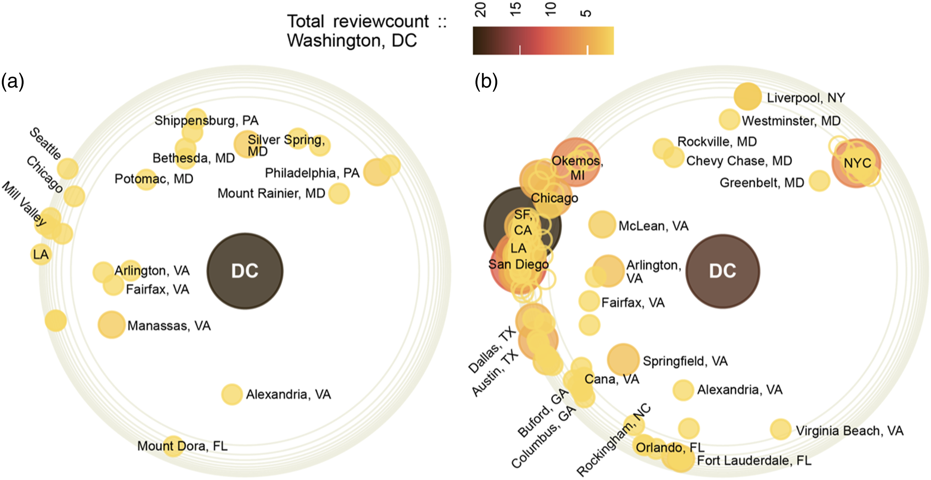
Figure 2(a) shows reviews left from 2007 to October 2016, while Figure 2(b) shows reviews after November 2016, when online misinformation actors falsely alleged that Hillary Clinton advisor John Podesta and others abused children at the restaurant. The distance transformation for both images is logarithmic, which provides more detail for the pizzeria’s D.C.-area environs than farther away, aligning with expected customer trends in retail location theory. While not all bad reviews were hyper-local in the pre-#Pizzagate period, the vast majority are clustered around the pizzeria’s real-world location. In Figure 2(b), this spatial footprint widens far beyond the Eastern Seaboard. In the logarithmic view, the extent of this shifted influence is immediately apparent from the wreath of data points outside the first circle. In this case, the fact that 2A looks much tidier than 2B is deliberate; the logarithmic transformation fits the expected distance distribution of customer-reviewers under normal conditions, but not post-Pizzagate. The “messiness” of 2B viscerally demonstrates the discrepancy in spatial patterns of reviewers between the two time periods, unlike a more conventional map projection of the same data. Likewise, when looking at the Indian remittances data using the square root distance transformation, the close ties to distant North American countries are clear, without diminishing the strong migrant labor relationship between India and its neighbors in the Persian Gulf; the schematic approach reveals multiple types of relationships operating across different scales.
Conclusion
Relational Reprojection Platform’s codebase resides in a public GitHub repository where future collaborators may lend their skills to build the tool out further. Planned features for the platform moving forward include making file input more robust in order to accept GeoJSON and to support upload of simple vector basemaps (to improve output interpretability). Ultimately, by publishing this platform, the authors hope to encourage heuristic exploration of data relationships through distance reprojection.
Footnotes
Declaration of conflicting interests
The author(s) declared no potential conflicts of interest with respect to the research, authorship, and/or publication of this article.
Funding
The author(s) received no financial support for the research, authorship, and/or publication of this article.
