
Abstract
Visualization is a useful technique in data analysis, especially, in the initial stage, data exploration. Since high-dimensional data is not visible, dimensionality reduction techniques are usually used to reduce the data to a lower dimension, say two, for visualization. In previous studies, dimensionality reduction was investigated in the context of numeric datasets. Nevertheless, most of real-world datasets are of mixed-type containing both numeric and categorical attributes. In this case, a traditional approach could neither handle it directly nor output appropriate results. To address this problem, we propose a procedure for visualized analysis of mixed-type data via dimensionality reduction. Dissimilarity between categorical values is learned from the dataset and further used to measure the distance between mixed-type data points. In addition, we propose an approach to identifying significant features and visualizing patterns from the projection map chosen according to quality measures. Experiments on real-world datasets were conducted to demonstrate feasibility of the proposed method.
Introduction
Real-world datasets are usually high-dimensional. However, high-dimensional data suffer from curse of dimensionality and are difficult to analyze due to incapability of visualization and high computational complexity. Dimensionality reduction techniques which reduce the dataset to acceptable dimensionality become an important tool in data analysis. Specifically, dimensionality reduction facilitates visualization [1, 2], classification [3, 4, 5, 6], clustering [7, 8, 9, 10], compression of high-dimensional data [11, 12] and other applications [13, 14, 15, 16].
In the literature, a large number of dimensionality reduction techniques have been proposed, mainly including linear and nonlinear techniques [17]. To name a few, popular linear techniques include Principal Components Analysis, Locality Preserving Projections [18] and Factor Analysis. Linear techniques for dimensionality reduction assume that the data lie on or near a linear subspace of the high-dimensional space while nonlinear techniques do not rely on the linearity assumption. Nonlinear techniques include Multidimensional Scaling, Isomap, Maximum Variance Unfolding, Kernel PCA, Diffusion Maps, Multilayer Autoencoders, Locally Linear Embedding, Laplacian Eigenmaps, Hessian LLE, Local Tangent Space Analysis, Locally Linear Coordination, and Manifold Charting. Nonlinear techniques have the ability to handle complex nonlinear data.
Moreover, real-world data usually contain mixed data types, including numeric, ordinal, and categorical attributes. For instance, Table 1 shows a portion of attributes and records of dataset Adult from UCI machine learning repository [19]. As can be seen, the dataset includes categorical attributes such as Education, Marital-Status, and Relationship and numeric attributes such as Work-Hours, Capital-Gain, and Capital-Loss. Note that the Education attribute can be considered as an ordinal attribute as well.
Analyzing mixed-type data is not straightforward. Most of algorithms handle only one type of values, either categorical or numeric. Artificial Neural Networks, Genetic Algorithms,
Like the above-mentioned algorithms, current dimensionality reduction techniques were studied in the context of a single type of values, namely, numeric data and cannot be applied directly to categorical datasets or mixed-type datasets. Moreover, a data preprocessing process which transfers either type of the data to the other usually results in information loss.
A portion of the mixed-type real-world dataset Adult
A portion of the mixed-type real-world dataset Adult
In this paper, we address this problem by presenting a technique for measuring dissimilarity between mixed-type data points. Furthermore, we propose a procedure based on dimensionality reduction techniques for visualized analysis of mixed-type data involving numeric and categorical attributes. The procedure allows users to visualize and analyze mixed-type datasets interactively so that users can select the clusters on the projection map and then obtain statistic information or patterns from the selected clusters. This visualized analysis helps to realize how the mixed-type data are distributed and to observe which features are significantly different in one cluster from the others.
The organization of this paper is described as follows. We review the literature of dimensionality reduction and distance learning in Section 2. The detailed description of our proposed methods is discussed in Section 3. We examine the performance of our methods with experiments in Section 4. The conclusion is discussed in Section 5.
We briefly introduce some work which are relevant to our study, dimensionality reduction and handling of mixed-type data.
Dimensionality reduction
In machine learning, there are two main methods for dimensionality reduction: feature selection and feature extraction. Feature selection aims to find a small set
In this study, we take the perspective of feature extraction. In this regard, dimensionality reduction aims to reduce data dimensionality by transforming dataset
Many feature extraction techniques have been proposed, to list some, including linear techniques: Principal Component Analysis [33], Factor Analysis, Locality Preserving Projections [18], and non-linear techniques: Multidimensional Scaling [34], Sammon Mapping [35], Autoencoders [36], Curvilinear Component Analysis [37], Local Linear Embedding [38], Isomap [39], Manifold Charting [40], Maximum Variance Unfolding [16], Local Tangent Space Alignment [41], Diffusion Maps [42], Locally Linear Coordination [39], t-SNE [43].
A popular technique usually leads to many variants from the research following the original work to release constraints or improve performance. For instance, Kernel PCA (KPCA) [44] is the reformulation of traditional linear PCA in a high-dimensional space that is constructed using a kernel function. Hessian LLE [45] is a variant of Local Linear Embedding that minimizes the ‘curviness’ of the high-dimensional manifold when embedding it into a low-dimensional space, under the constraint that the low-dimensional data representation is locally isometric.
In addition to the above, the unsupervised artificial neural network Self-Organizing Map or SOM [46] can be used as a tool of dimensionality reduction as well, which maps high-dimensional data to a set of neurons organized in a low-dimensional space, typical two or three dimensions. The reason why SOM can be applied to dimension reduction is because the training algorithm of SOM preserves topological order of the raw data. That is, similar data instances are projected to the same or nearby location while dissimilar instances are projected to distant locations on the low-dimensional map. The coordinate of the neuron to which a high-dimensional data instance is projected is taken as the new value of the instance after dimensionality reduction. As a result, SOMs have been applied to visualized data analysis, including clustering [47] and classification [48].
Data preprocessing for mixed-type datasets
Most of the algorithms for data analysis handle only one type of values, numeric or categorical. When mixed-type datasets are encountered, a preprocess transforming one type of the values to the other is performed prior to using the algorithms. Numeric attributes are discretized before the algorithms for categorical data are applied. For example, the decision tree algorithm C5.0 splits a continuous attribute to a discrete one, making possible to partition the node, if the attribute is selected, to a limited number of branches during training. On the other hand, for the algorithms which process only numeric values, a typical method to transform a categorical attribute is 1-of-
Categorical attribute OS is transformed to a set of binary attributes by using 1-of-
The 1-of-
In addition to 1-of-
where
The example in Fig. 1, the dissimilarity between t1 and t3 with the 1-of-
A procedure for mixed-type data analysis
For visualized analysis of mixed-type data, we propose a procedure as shown in Fig. 2 which mainly consists of three major parts, dissimilarity learning of mixed-type data points, dimensionality reduction, and analysis of clusters characteristics.
A procedure for visualization and analysis of mixed-type data.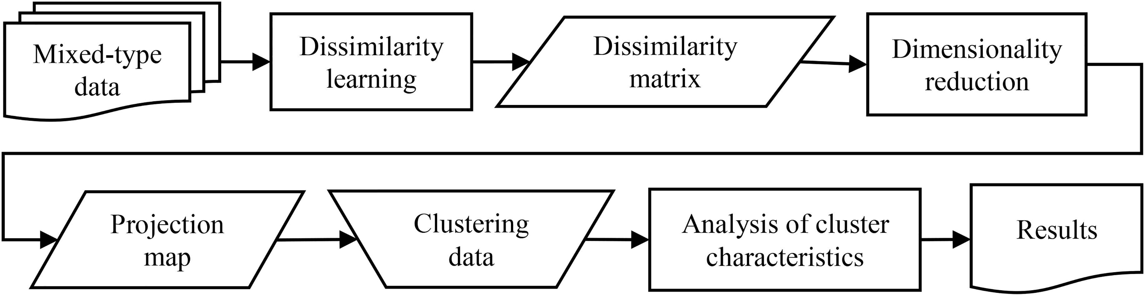
In the first step, dissimilarities between categorical values are first learned from the data. The result is further used to measure dissimilarities between mixed-type data points and then the pairwise dissimilarity matrix of the dataset can be constructed. In the second step, a dimensionality reduction method which takes the dissimilarity matrix as input is applied and yields a low-dimensional projection map. In the next step, the user performs data clustering on the map and analyzes characteristics of individual clusters according to quantitative metrics.
In the literature, many metrics have been proposed to evaluate clustering results [49, 50, 51], to name a few, Sum of Squared Error (SSE), the Davies-Bouldin index (DBI), and the Silhouette Coefficient. Users can adopt proper measures to check the quality of the clusters.
For mixed-type data, distance or dissimilarity between two data points cannot be measured directly without special treatment to categorical values. As mentioned earlier, the 1-of-
Inspired by the idea in the article of [52], we propose to learn dissimilarity between values of a categorical attribute from the dataset. In particular, the dissimilarity is measured according to the co-occurrence degree between the feature values and the labels of the class attribute. The method is referred to hereafter as COFC, i.e., Co-Occurrence between Feature values and the Class labels. Formally, the dissimilarity between two categorical values of an attribute is defined as follows.
where
The dissimilarity between every pair of distinct values in each categorical attribute is measured by Eq. (2). Then, the dissimilarity between two mixed-type data points can be measured by aggregating the pairwise dissimilarities between the two points including categorical and numeric attributes. In particular, the dissimilarity between two mixed-type points
where
According to Eq. (3), we can construct the proximity matrix for the mixed-type dataset. Specifically, assume
To reduce the dimension of data, many dimensionality reduction techniques have been proposed. In the previous section, we presented an approach to constructing the dissimilarity matrix of a mixed-type dataset. Therefore, as long as the reduction techniques take the matrix as input can be applied. In this study, we chose Sammon Mapping [35] since the algorithm is a well-known and has good performance on most of the datasets.
Sammon Mapping is a nonlinear method which attempts to preserve the dissimilarity between data when mapping the data points from a high-dimensional space to a low-dimensional space. Namely, the method builds an approximate configuration in the
Formally, suppose that
where
For a mixed-type dataset
Suppose that
where
Evaluating the projection maps
To evaluate the quality of dimensionality reduction and compare the results among different techniques, quantitative measures are used. In this study, we use classification accuracy, trustworthiness, and continuity.
Accuracy by k-NN
Suppose that data points with the same class label tend to gather in clusters in the data space. After dimensionality reduction, data points with the same class label should also gather in clusters in the map space if the dimensionality reduction algorithm has a good performance. In the map space, classification accuracy represents the extent of the relationship preserved after dimensionality reduction between data points, indicating the performance of dimensionality reduction.
The
We use
Trustworthiness and continuity
Trustworthiness
Specifically, if the
where
On the other hand, we can also measure the continuity of the projection with respect to the dataset. Continuity measures how the neighbors of a data point in the high-dimensional space is preserved in the low-dimensional space after projection. Formally, the quantity of continuity is measured by
where
The values of the two indices are in between zero and one. Larger values indicate better projection quality.
Data visualization and analysis
After evaluating the projection maps, we choose the one which has the highest
Data correspondence
After dimensionality reduction, the map contains projected data which have reduced dimensionality, say, two if the dimensional space is a plane. To explore the data, user can interactively cluster the data according to the distribution on the map as shown in Fig. 3.
User can interactively cluster the data on the map for further exploration.
The first step to data analysis is to establish correspondence of the data instances between the original and the reduced space such that we can retrieve its original attributes of the corresponding, reduced data point in the projected space. One way for the step is to retrieve the identifier of each point in the low-dimensional space. The identifier is also associated with the point in the high-dimensional space. As a result, when we choose a cluster which we want to analyze from the projection map, the correspondent data points in the original dataset can be identified. Finally, we can respectively retrieve the categorical and the numeric portion of the selected data from the dataset and proceed analysis.
For the portion of categorical attributes, we compute the distribution of the values in each of the attributes and also identify the mode of the distribution and its percentage. For the portion of numeric attributes, we compute the average for each of the attributes. Thus, from the results we gain insights into the characteristics of individual clusters and learn which attributes have significantly different values with respect to different class labels. The analysis is repeated for the other clusters until all of the clusters in the projection map have been analyzed.
The distribution of categorical values can be plotted as bar charts so that we can intuitively compare the distributions via visualization facilitating patterns identification. In summary, through analyzing individual clusters, we understand how the values are distributed and how the values might be related to class labels.
Quantitative comparison with clusters
In addition to visual inspection, to quantitatively compare the distribution of categorical values between clusters, we propose a measure which is adapted from the Kullback-Leibler divergence (KLD) [54].
KLD measures the difference between two probability distributions
To avoid zero on denominator, a smoothed KLD is used. We define
where freq(
In this study,
The result indicates the degree of the difference between two clusters on a categorical attribute. A large value indicates the difference between the two clusters is apparent.
Algorithm
We summarize the process and present an algorithm for our study in Algorithm 1, where
According to
Experiments
To verify feasibility of the proposed procedure, we implement a prototype system and conduct experiments with two synthetic and two real-world datasets. The prototype was developed with MATLAB R2013a on Windows 7.
Table 2 shows the statistics of the four experimental datasets used in this study, two synthetic, Syn1 and Syn2, and two real datasets, Credit Approval and Adult, taken from the UCI machine learning repository [55].
Statistics of the experimental datasets
Statistics of the experimental datasets
There are no missing values in the datasets used in this study. However, in real-world datasets, missing or noise values may exist. Noises will degrade the performance of the process and shall be corrected or removed. Missing values are not allowed in the proposed procedure and shall be imputed or removed. There are several data preprocessing techniques to handle noises and missing values. The readers can refer to the data mining textbooks [56, 51].
Projection maps of Drink8G2C2N by Sammon Mapping with 1-of-
Dataset Syn1
Dataset Syn1 shown in Table 3 has 1,600 instances of five attributes including two categorical attributes Drink and Dept, two numeric attributes Amt1 and Amt2, and one class attribute. There are four major groups each of which has 400 points. Most of group members have the same class label. For example, 90% of the first group have class label M and the rest 10% are randomly assigned with one of the other three class labels {E, D, H}. Categorical values are randomly assigned in each group. For instance, in attribute Dept, BM and IM are randomly assigned to the first group of 400 points with class label M. Similarly, the values of {Latte, Mocha, Cappu, Black} are randomly assigned to the group of 400 points with class M and the group of 400 with class E. For numeric attributes Amt1 and Amt2, the values in each group are randomly generated according to the Gaussian distribution with a designated mean and standard deviation.
Figure 4 shows the projection results which were colored according to the four class labels. The results with 1-of-
In Fig. 4a and b, the number of clusters in each of the four major colors is eight, corresponding to the combination of the categorical values in Drink and Dept, say, {Latte, Mocha, Cappu, Black} and {BM, IM} for the group with class label M.
By contrast, Fig. 4c, the result with COFC, clearly presents four clusters which corresponds to the four classes in Table 3. The reason for projecting the data to apparent four cluster in Fig. 4c is because the dissimilarity between categorical values computed with COFC is learned from the dataset. The method considers how each value co-occurs with the class label. Consequently, some values have small dissimilarity and some have large ones such that apparent clusters present in the original data space and so do in the projection space.
The pairwise dissimilarity between categorical values of attribute Dept is shown in Table 4. The dissimilarity between BM and IM is much smaller than that between BM and the other values since BM and IM mainly corresponds to class label M. Analogously, the same observations can be found to the other categorical values in Table 4 and in Table 5 as well. Recall that the dissimilarity between categorical values measured with COFC scheme in Eq. (1) depends on the class labels.
Synthetic dataset Syn1
Synthetic dataset Syn1
Distance matrices of dept
Distance matrices of drink
Figure 5 shows the VAT diagram of the original dataset. The diagram reveals cluster structures in the dataset. We can identify four large compact, apparent clusters in Fig. 5c and 32 small compact clusters in Fig. 5a, indicated by those dark squares. The cluster structures in the dataset are reflected in the projection maps of Fig. 4. The gap between some clusters in Fig. 4b is not apparent compared with that in Fig. 4a. It is reflected in the VAT diagram of Fig. 5b.
Table 6 presents the trustworthiness and continuity of the projections and shows those values dropped significantly in 1-of-
Trustworthiness and continuity of the projections of dataset Syn1 by Sammon Mapping
The VAT diagrams of Syn1 dataset with 1-of-
Dataset Syn2 shown as Table 7 consists of two categorical attributes Drink and Dept, one numeric attribute Amount, and a class attribute Class. Each group has 60 or 30 data points. For categorical attribute Drink, Coke and Pepsi are uniformly distributed in Groups 1 to 3. For attribute Dept, MIS, MBA, and FM are randomly assigned to Groups 1 to 3 as well. The numeric values are assigned according to Gaussian distributions like those in dataset Syn1. The class labels are also assigned like those in dataset Syn1.
Synthetic dataset Syn2
Synthetic dataset Syn2
Projection maps of Drink9mix v4 by Sammon Mapping with 1-of-
Figure 6 shows the projection maps of Syn2 by Sammon mapping with 1-of-
We label data points with group numbers, which are displayed by nine colors for identification. In all of the three projection maps, similar data points in the data space are projected in the same region. Take the region in the dashed circle of Fig. 6a as the example. The projected data correspond to the data points of Groups 7 to 9 in Table 7. That region contains six subgroups each of which corresponds to one of the combinations of {SD, VD, AD} and {Apple-Juice, Orange-Juice} along with numeric values. Group 7 has 60 instances while 30 in each of Groups 8 and 9. As can be seen in Fig. 6a, the number of blue points, corresponding to Group 7, is greater than those of the other two colors, corresponding to Groups 8 and 9, in the region. The same can be observed in Fig. 6b and c.
Pairwise dissimilarity between categoricalvalues of Attribute Dept with COFC
Pairwise dissimilarity between categoricalvalues of Attribute drink
The VAT diagrams of Drink9mix v4 Dataset with 1-of-
The map of 1-of-
Figure 6c, the result with COFC, clearly presents three major clusters which corresponds to the three classes in Table 7. In each of the three clusters, we can identify three subgroups each of which associates one color. Each of the subgroups corresponds to a group in Table 7. For instance, the bottom one of the left-most cluster is Group 3 in Table 7. The reason for projecting the data to apparent three clusters in Fig. 6c is again the dissimilarity between categorical values computed with COFC is learned from the dataset. The dissimilarity between categorical values varies as can be seen in Tables 8 and 9.
Figure 7 shows the VAT diagram presenting the dissimilarity between mixed-type data. Those eighteen dark squares in the diagonal of Fig. 7a corresponds to those eighteen clusters in Fig. 6a. Figure 7c indicates that clusters are not so compact as those in Fig. 7a. In fact, from Fig. 6c we can see three clusters in form of strip.
Table 10 shows trustworthiness and continuity values of the dimensionality reduction. When
Trustworthiness and continuity of the projections of dataset Syn2 by Sammon Mapping
Trustworthiness and continuity of the projections of Adult1600 by Sammon Mapping
Classification accuracy of k-NN on dataset adult in the data and the map space
Projection maps of Adult 1600 by Sammon Mapping with (a) 1-of-
Dataset adult
The original Adult dataset has 48,842 data points of 15 attributes consisting of eight categorical, six numeric, and one class attribute. There are 76% of the data with the class label of “
Distribution of the categorical attributes in clusters of Adult 1600 projected by Sammon Mapping with COFC. The values in X-axis of Education from the left to the right, respectively, are {Preschool, 1
Figure 8 shows the projection maps of Adult1600 by Sammom Mapping with the three schemes for categorical attributes. The results with 1-of-
Table 11 lists trustworthiness and continuity for the projection and indicates that COFC preserved the neighborhood relation better than 1-of-
Table 12 shows classification accuracy by
Mode and its percentage of categorical values and average of numerical values in individual clusters by sammon mapping with cofc
KLD values for attribute Education of clusters of Adult1600 by Sammon with COFC
KLD values for attribute Marital_status of clusters of Adult1600 by Samm on with COFC
KLD values for attribute Relationship of clusters of Adult1600 by Sammon with COFC
We interactively clustered the data on the map in Fig. 8c to six groups (refer to Fig. 9) and analyzed the data in individual clusters. The results are presented in the following tables and figures. Table 13 shows the mode and its percentage of categorical values and the average of numeric values in each cluster. The clusters were sorted according to the percentage of class label ‘
As regards Fig. 9, some distributions of categorical values in clusters are quite different from one another. For instance, in attribute Education, C1 have totally different values, Doctorate and Prof-School, from C2, Bachelors and Masters, and also considerably different from C3 and C6. Significant differences can also be identified across clusters in attributes Marital_Status and Relationship as well. According to the results above in Tables 11–13 and Fig. 9, we consider that Sammon Mapping with COFC is effective on handling the mixed-type dataset Adult1600 and interesting patterns can be identified.
Projection map of dataset Australian by Sammon Mapping with (a) 1-of-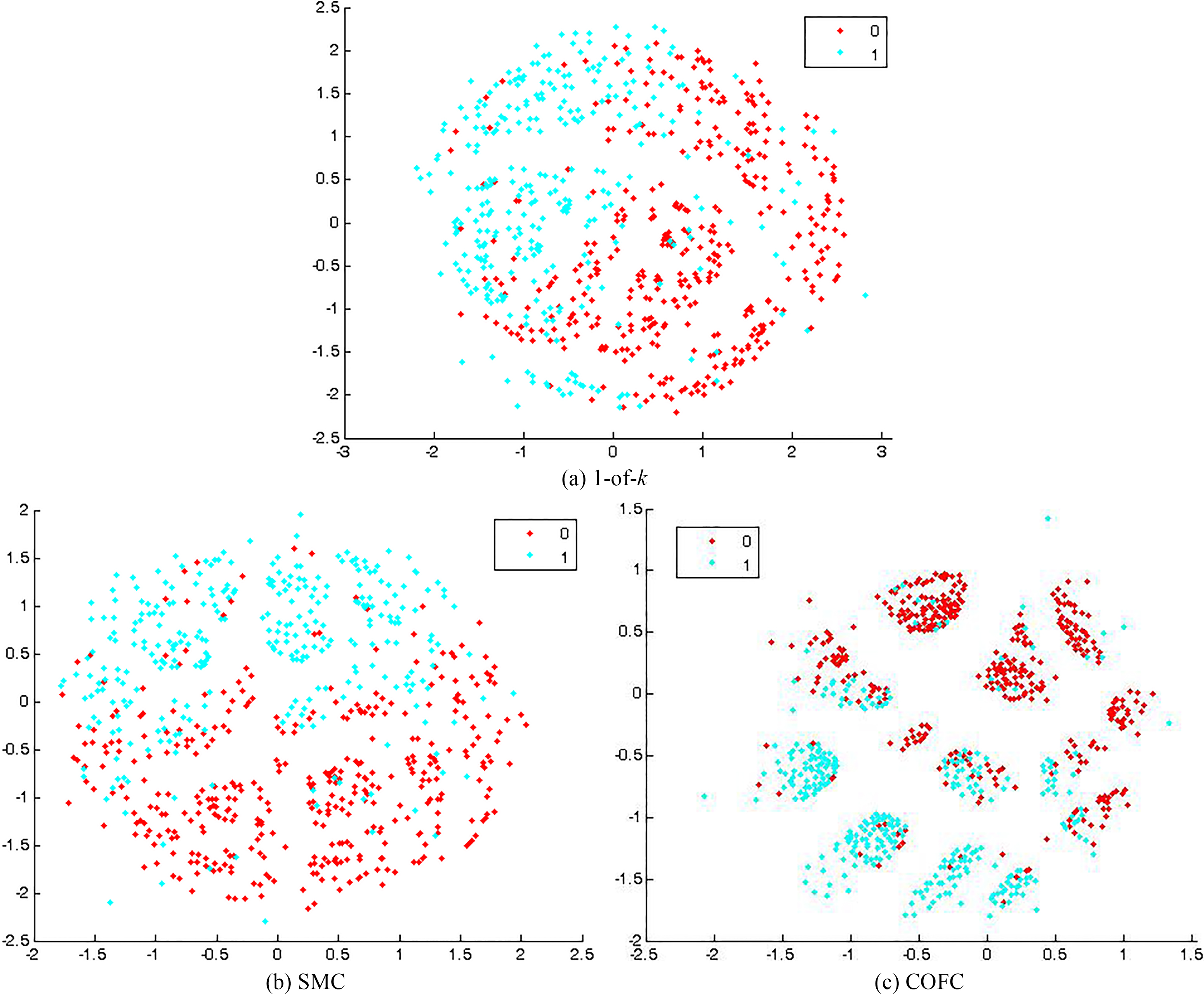
For quantitative comparison of the distributions of categorical values in individual clusters, Tables 14–16 show the pairwise symmetric KL-divergence (KLD) values for each categorical attribute, respectively. Corresponding to Fig. 9, the value of C1 and C2 in Table 14 for attribute Education is relatively large while those in Table 15 for Marital_Status and 16 for Relationship are quite small. C2 and C6 have the largest difference in Education, C3 and C5 in Marital-Status, and C3 and C6 in Relationship.
Figure 10 shows the projection results of dataset Credit Approval. The results with 1-of-
Trustworthiness and continuity of the projections of dataset Credit Approval by Sammon Mapping
Trustworthiness and continuity of the projections of dataset Credit Approval by Sammon Mapping
Table 18 presents classification accuracy by
Classification accuracy of k-NN on dataset Credit Approval in the data and the map space
Averages of numerical values and class distribution in individual clusters of Credit Approval dataset projected by Sammon Mapping with COFC
Distribution of categorical values in clusters of Credit Approval projected by Sammon mapping with COFC.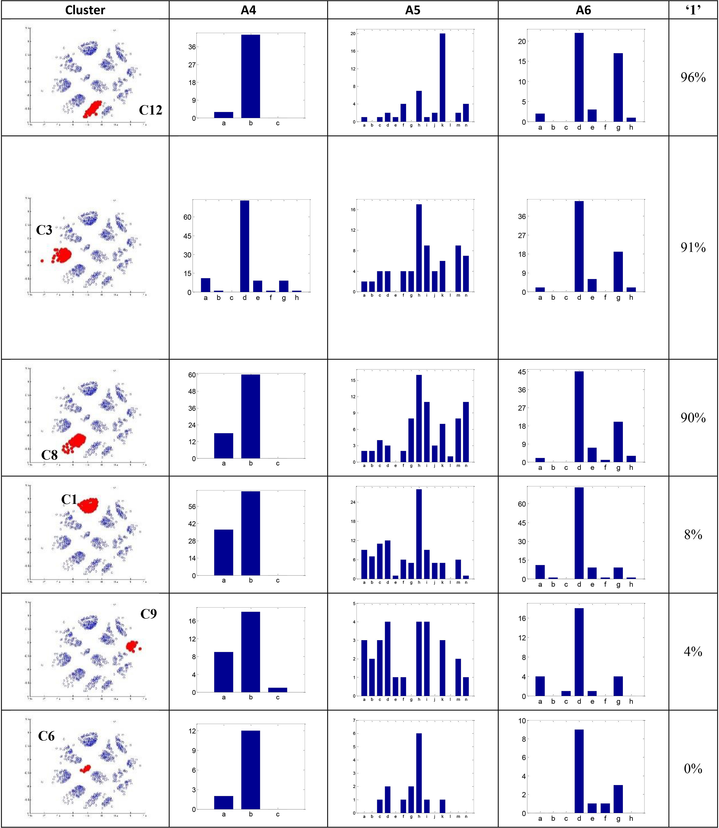
We visually identify and interactively label the clusters on the projection map of Fig. 10c. Thirteen clusters were identified. Refer to Fig. 11 for part of the clusters. From Table 19, it is interesting to see that most of the clusters have data points with the same class label. C12 has 96% of the data with class ‘1’ while C6 has none. Analysis was performed on individual clusters and detailed outcomes were presented in the following.
Mode and percentage of categorical values and class distribution in individual clusters of Credit Approval dataset projected by Sammon Mapping with COFC
KLD values between clusters for attribute A4 of Credit Approval by Sammon with COFC
KLD values between clusters for attribute A5 of Credit Approval by Sammon with COFC
Table 19 shows the average of each cluster for each numeric attribute. The order of the clusters is sorted decreasingly by the percentage of class label ‘1’. The dataset has 43% of the instances with class 1. Most of the clusters have class distribution significantly different from the dataset. In addition, some interesting patterns can be observed. The averages of the clusters with large percentages of class 1 are mostly larger than those with smaller percentages of class 1 in A2, A3, A7, A10. For A8 and A9, the clusters with a large number of class 1 have a value of one while those with a small number usually have a value of zero. The only exception is C6 in A9, which has a value of one.
KLD values between clusters for attribute A6 of Credit Approval by Sammon with COFC
Table 20 presents the mode and its percentage of categorical values in each cluster. In A4 and A6, the modes of the clusters are the same with that of the dataset. It is interesting that several clusters have the mode different from the dataset in A5. The dataset has the mode ‘h’ of 15% while C12 has ‘k’ of 44%.
Figure 11 shows the distribution of the categorical values in several clusters. Due to the space, we show only the most significant results, the top three and the bottom three clusters which have the largest and the smallest percentages of class label 1 in Table 19.
To quantitatively compare the distributions of categorical values in clusters, the symmetric KLD values were calculated and the results are shown in Tables 21–23. A large KLD value indicates the distributions are quite different between two clusters. For the example of A5, comparing C6 to the other five clusters in Fig. 11, C6 and C9 have the largest KLD value, i.e., 0.312, and C6 and C1 have the smallest value, 0.115.
In this study, we proposed a procedure which integrates a dissimilarity learning scheme from the data for categorical values into dimensionality reduction in order to visualize and analyze mixed-type datasets. After projection onto a low-dimensional space, users can interactively perform data clustering followed by data analysis. Two indices trustworthiness and continuity can be used to assess quality of the projection. Characteristics of individual clusters are extracted by taking the modes for categorical attributes and the means for numeric attributes. In addition to visual inspection, to quantitatively compare the distribution of categorical values between different clusters, a revised Kullback-Leibler divergence was used. The experiments on two artificial and two real datasets by Sammon Mapping dimensionality reduction demonstrate that the proposed procedure is feasible. The analysis results provided users insights into the structures of the real-world mixed-type datasets, especially, the relationship between feature attributes and the class labels.
To make the proposed procedure practical and suitable to large datasets, some issues need to be tackled in the future. Time complexities for dissimilarity learning between categorical values and calculating the dissimilarity matrix between data points are both
Footnotes
Acknowledgments
This research is supported by Ministry of Science and Technology, Taiwan under grant MOST 104-2410-H-224-011 and MOST 105-2410-H-224-007.