In building a graphical model, accuracy in edge detection for the model structure is crucial for the quality of the model. We explored methods for improvement of false discovery rate(FDR) by devising an estimation procedure which is more data sensitive under some condition. The estimation is made by applying an EM method where the parameters include the density function under the null hypothesis (no edge) and the location parameters of the density functions under the alternative hypothesis (presence of edge). Our method is compared favorably with a most popular FDR tool in numerical experiments. We applied our method for analysing gene data of 800 genes and built a network of vector autoregressive model for the data.
Graphical models [44, 25] are useful for representing inter-relationships among the variables involved in a model where the interrelationship can be cause-effect (or asymmetric) relationship or association (or symmetric) among others. A variable in a model can be causally related to another variable and in an associative mode with a third. These inter-relationships in a model are easily read when they are represented in a graph. When all the relationships are causal, we use arrows to represent them in a graph, and lines when they are associative. When both types of the relationships are present in a model, both types of edges appear in the graph of the model.
Whether the relationships are symmetric or not, their strengths can be expressed in terms of partial correlation coefficients (PCC’s) [44]. So structure learning of a graphical model is indispensable to testing if the PCC between each pair of the variables involved in a model is zero. This is where the false discovery rate (FDR) method plays a key role [19, 18, 14, 16].
Graphical modelling methods have been proposed by many authors [42, 2, 43, 41, 45]. As the model size gets larger, we in many cases run into a small data problem in modelling. The PCC’s are estimated, in a small data situation, by applying a non-parametric approach [35] or a Bayes shrinkage approach [27] among others. So we can obtain estimates of partial correlations for graphical modelling. Once the estimates are obtained, they are used as a measure of edge strength between nodes (i.e., variables) in a model structure. Detecting the edges which are strong enough as many as possible while controlling the overall type 1 error is the main goal in this line of work. In this line of work, the type 1 error refers to false discovery of edges. For simplicity, we will call the edge which is strong enough a non-zero edge and a zero edge for the edge which is not strong enough.
Our proposed process for an improvement of FDR involves estimation of the distribution under the alternative hypothesis of non-zero edges. We took the alternative distribution as a mixture of normal distributions. The initial values of the estimates of the locations of the normal distributions are based on the estimates of the partial correlations. This is a main difference between the proposed and the existing methods in which a single distribution, such as a uniform distribution, is usually assumed for the alternative distribution. The proposed process performed favorably in comparison with the methods well known in literature.
The paper is organized in 8 sections. In Section 2, we briefly review FDR methods and graphical Gaussian models. In Section, 3, an EM (expectation and maximization) method for mixture distributions is described. We then extend the EM method to our problem. In Section 4, we describe our proposed method. We apply the Parzen window approach for determining initial values to be used in the EM algorithm of our method. Once the estimates are obtained, we compute the error rate along with the density curves under the null and the alternative models. Performances are compared in Section 5 through numerical experiments between the proposed and a most popular standard method. The comparisons are made using ROC curves and a discrepancy measure between graphs. The experiments show favorable results for the proposed method. The proposed method is applied to real data in Section 6. Discussions are made in Section 7 concerning the proposed method from several aspects. Finally, conclusions are made in Section 8 with some summarising remarks.
Related works and graphical Gaussian model
In a simultaneous hypothesis testing problem, we try to control the family probability of type 1 error. This problem was addressed by many authors as a multiple comparison problem where many treatment effects are compared with a control [32, 11, 12, 30]. Modified versions of -statistics were proposed as test statistics for the problem with a view to keep the family probability of type 1 error under control.
As the number of treatments increased, a new method was developed [4] with introduction of FDR to handle large-scale simultaneous hypothesis testing problems and several improvements have been made on this method [19, 14, 1]. This approach is based on the assumption that the test statistics are iid (independent and identically distributed) so that the p-values are uniform random variables under the null hypothesis of no treatment effects.
This assumption on the p-values, however, is often misleading in the sense that the p-values may not be iid at all. For instance, the null model may be misspecified or the test statistics may not be independent to each other [17]. This concern on the assumption made a larger availability of the FDR method possible by using test statistics such as -score, -score, or correlation coefficient for computing the FDR [17, 39, 3].
A variety of FDR methods have been developed. Most of them were based on -values with estimations made on null proportions and null probability models [37, 33, 38, 7]. Strimmer [39] developed a unified version of the FDR method which is available with p-values as well as test statistics such as -scores, -scores, and correlation coefficients [26]. After a comprehensive comparison study of commonly used FDR methods, the unified version of the FDR methods was instrumented into an R package ‘fdrtool’ which was compared favorably with other FDR methods. Sun and Cai [40] proposed a data-driven procedures that aim to minimize the false non-discovery rate subject to a constraint on the FDR. They assumed that the data are generated from a two-state hidden Markov model and devised a test statistic called the local index of significance instead of the -values.
FDR methods are indispensable to graphical modelling for microarray analysis for causal relationship between genes [6, 36, 31]. In this analysis, PCC’s were used for building a vector autoregresive (VAR) model. The strength of the causal relationship is measured by the PCC’s.
The PCC is used for structure learning of a graphical Gaussian model(GGM) also [10]. Let be a random vector whose probability model is a GGM. As for the GGM, the PCC’s are obtained from the inverse sample covariance matrix of (Whittaker 1990). If we denote the PCC between and by , means conditional independence between and given the remaining components of . This conditional independence is represented by “no edge” in the model structure of the GGM. If , then the conditional dependence is represented by an edge between the nodes of the two variables. The decision on the state of edge (presence or absence) is made through a FDR procedure.
EM algorithm with multiple alternative models
Consider a problem of building a GGM model of the normal random vector . Denote by the total number of the variable pairs, i.e., . For notational convenience, we will simplify the index of , , to for . Let the estimate of be denoted by .
We will assume that the ’s are from different models, . We will call a null model in the sense that it is a probability model when and an alternative model for the ’s when . Let be the -th component of for . Let be the parameter in , .
is weighted by in the probability model of as
where . In other words, is a mixture of and the alternative model is given as a mixture of with weights , .
Let and . Then, a simplified version of Eq. (1) is
Let the latent variable be defined as
where and .
The probability of is defined as the -th component of weight. In other words,
Then the -th component of is given by
where is the location parameter of . Then, the probability Eq. (1) of can be written as
As shown in Eq. (3), it is reasonable that the distribution of is defined as a mixture of models.
The probability model of the complete data , , , is given by
The MLE (maximum likelihood estimator) of is obtained by applying an EM algorithm as follows. We denote the complete-data log-likelihood of by
Let the estimates of obtained at the -th EM step be denoted by . Then the classification probability of is estimated as
Note that
Let . Then we can update using and by maximizing as
Therefore, for ,
Convergence of this EM process is well established in literature (Dempster et al. 1977).
Now we specify ’s for our problem of structure learning of a GGM. As for , we will assume the distribution of which was derived by Hotelling (1953) when as given by
It is worthwhile to note that for the pdf . We will consider the mixture Eq. (1) for ’s with in Eq. (7) and as the pdf of for .
With this specification of ’s, is redefined as
The EM procedure as described in Eqs (5) through (6) is modified in accordance to the above specification of ’s.
As for the E-step, we update the estimate of , for and , as
Once these updates, , are obtained, we can get updates of the weights, , by
Then we can update the other components of as follows:
If we denote the MLE of by which is obtained as a result of the EM process, we can see that
can be interpreted as the estimate of , as the estimate of , as the estimate of , and as the estimate of where the subscript means that is from model .
The initial values for the estimates in the EM process are obtained as follows. We assigned 0.5 as the initial value for and for the other ’s. The initial values for ’s are assigned as the Parzen window method suggests. Those for ’s are assigned by using the Fisher’s -transformation for stability [20, 21]. And the initial value for is obtained as an MLE based on the empirical distribution in a neighborhood of 0.
Proposed method for edge detection
Once the MLE’s are obtained for the mixture Eq. (1) with parameters in Eq. (8), we have the estimate of the probability model as
Let be denoted simply as . The estimate of suggests that the null weight is estimated as and the classification of the sources of ’s will be made based on the estimates as follows:
If , then is classified as it is from . Otherwise, is classified as it is from some of ’s, .
Selection of by the Parzen window method
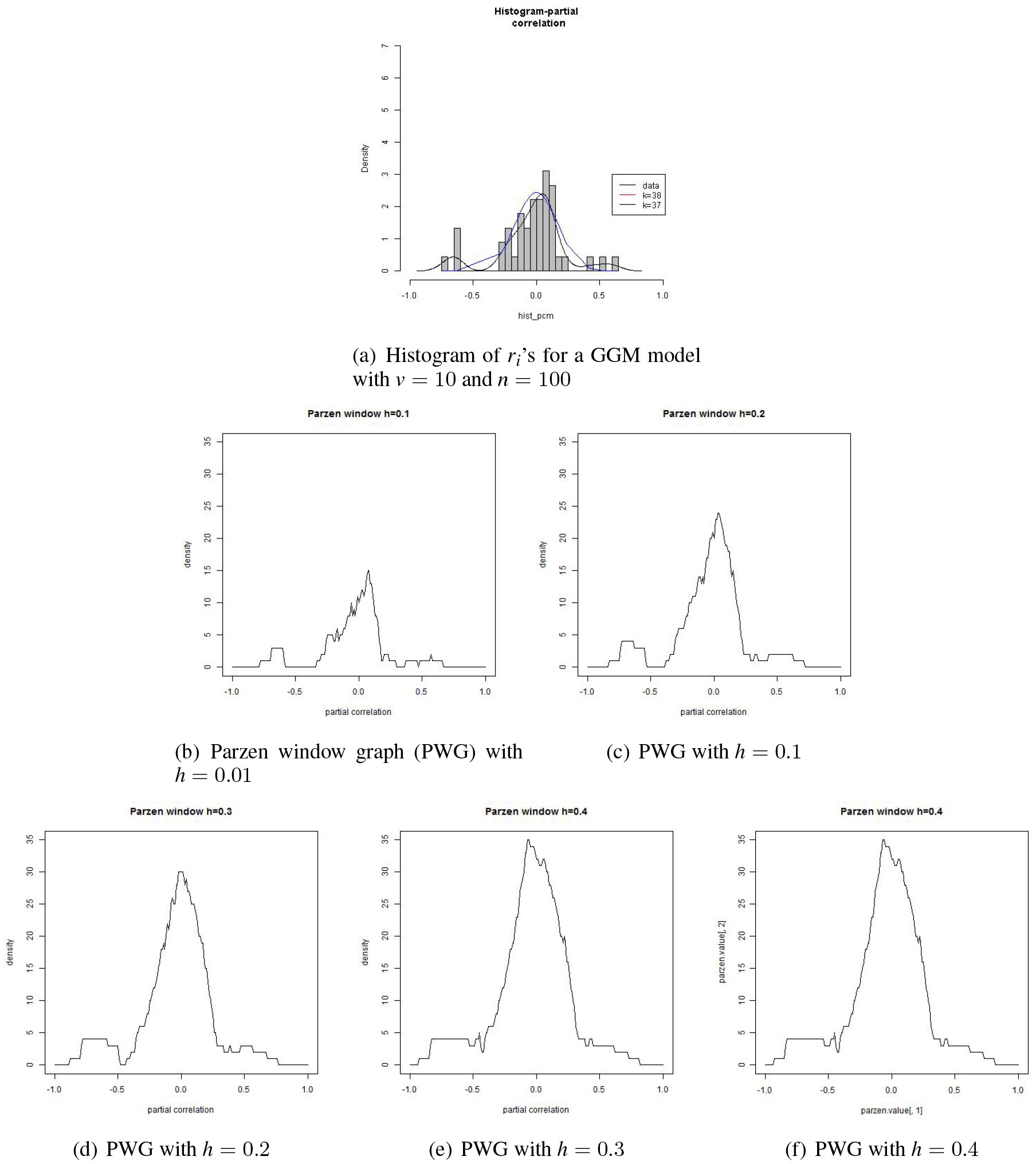
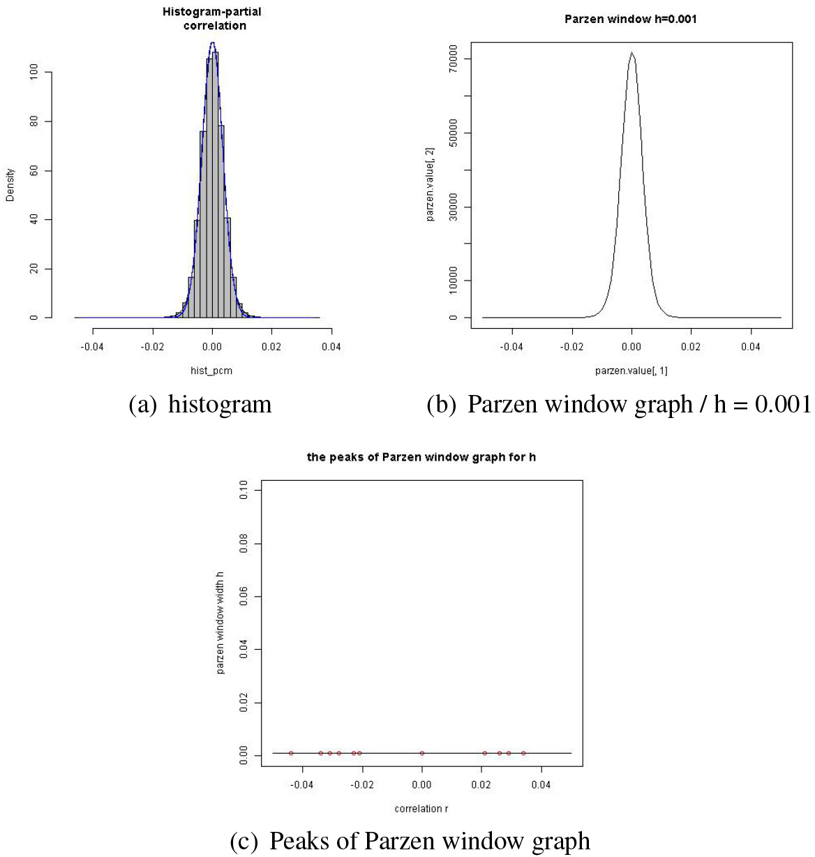
In the above EM process, the alternative model is of component models where is predetermined. We will describe how is chosen through the Parzen window method with examples. Suppose we have a set of ’s from a data set of size generated from a GGM model of variables. The histogram in panel (a) of Fig. 1 is of the ’s. The Parzen window method is used for drawing a smoothed version of the histogram.
Suppose we use a kernel function (or window function) defined as
Then the function defined as
will yield a smoother version of the histogram as the window width increases. As increases, the ’s close to each other will produce a larger value of . As an extreme case, when , for .
The panels (b) through (f) of Fig. 1 illustrate how the shape of the Parzen window graphs (PWG’s) changes as the window width increases from 0.01 to 0.4. One of the merits of the Parzen window method is that we can get a rough clue about clusters of values by examining the PWG’s.
Histogram and Parzen window graphs with the window width .
When , the PWG displays most of the individual points. But when , we can see 3 clusters, 2 small clusters with a big one in the middle. The cluster in the middle seems to be a mixture of two clusters, a small cluster being attached to a big one from the negative side of the latter. In this respect, four clusters seems reasonable when . When , 3 clusters seem reasonable. Since we assume a null model around 0, we are interested in the number of small clusters on the shoulders of the big cluster around 0 for the value .
Suppose we took as suggested in panel (c). Then in the EM process, we use the mode or the mean of each cluster as the initial value for the estimate of . As indicated in this illustration, a larger would blind us from smaller clusters, which might lead us to worse initial values for the EM process. It goes without saying that an appropriate value of be selected for a successful estimation. It is rather recommended, from our experience, that a larger than necessary is better than a smaller . We will see an instance of this in the next subsection.
If we do the EM with a larger than necessary, a meaningful compromise takes place in the estimates of the weights . If a small cluster is ignorable, then the estimate of its weight becomes very small or the cluster is relocated, during the EM process, as merged to its closest cluster whose weight is larger. On the other hand, if is smaller than necessary, then it means that clusters neighboring close to each other get merged into a larger one, which may take place when is larger than desired. A main concern in this case is that some clusters that may be from close to the big cluster around , which may be from , may possibly lost at the initial stage of the EM process. This may deteriorate the edge detection accuracy.
There is no general guideline for a proper value of . Its value may be subject to the size of ’s and the empirical distribution itself. As for the kernel function, one may use a function such as a Gaussian kernel function which is more sensitive to the values so that the shape of is more reflective the data values. But the function in Eq. (12) is simpler and serves well our goal of choosing a value for , which we used in this work.
Edge detection and the number of ’s in
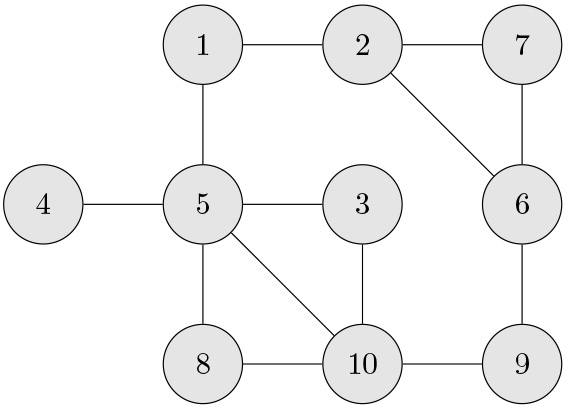
We will use the sample PCC’s, ’s, with their histogram in panel (a) of Fig. 1 to demonstrate the effect of on the edge detection. The PCC’s are obtained based on the data of size generated from the GGM in Fig. 2. As mentioned above, we chose when (panel (c) of Fig. 1) and when (panel (e)). The ’s are listed in Table 1 for the pairs of variables which are connected by an edge in the GGM model in Fig. 2.
Difference in edge detection between when and when
Edge
Detection
2
3
(1, 2)
0.528
Yes
Yes
(1, 5)
0.413
Yes
Yes
(2, 7)
0.616
Yes
Yes
(3, 10)
0.638
Yes
Yes
(4, 5)
0.646
Yes
Yes
(6, 9)
0.647
Yes
Yes
(8, 10)
0.734
Yes
Yes
(2, 6)
0.282
No
Yes
(3, 5)
0.259
No
Yes
(5, 10)
0.241
No
Yes
(5, 8)
0.211
No
No
(6, 7)
0.210
No
No
(9, 10)
0.201
No
No
We can see in Table 1 an apparent difference in edge detection between the two values, 2 and 3, of . As for the edges with their absolute values between 0.24 and 0.3, they were detected when but not when . The edges whose absolute values were smaller than 0.22 were not detected for either of the two values of .
A GGM model of 10 variables.
This is a merit of choosing a larger that the edges whose strengths, , are from are near the boundary between and have a higher chance of being detected with a larger . This is elaborated in detail in Section 7.
Partition of ’s for estimation for and
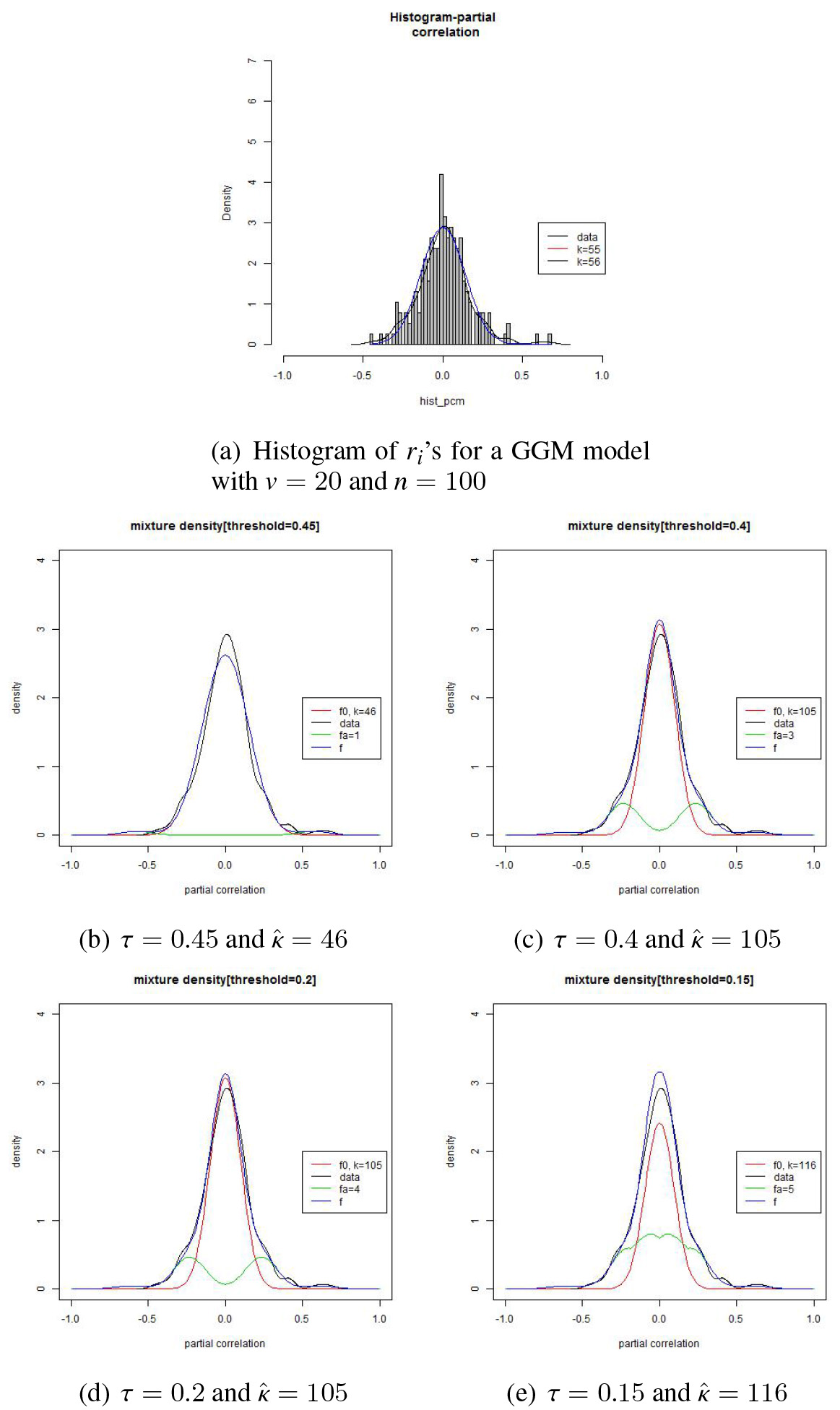
Partition of the set of ’s and estimation results based on data of size 100 from a GGM model of 20 variables.
In estimating parameters , we partition the set of ’s into three parts, , , and with . The set, say, in the middle is used for estimating the parameter of . We observe the estimates of decreases as the threshold increases. When begins to be contaminated with the ’s from , the estimate may begin to decrease, i.e., becomes sharper. As the contamination rate increases by a larger amount, the change rate will become larger.
The partition also affects the estimation for as well as ’s. When we take a too small value, then it is highly possible that the ’s from are contaminated with those from , which may end up with an estimate of with a relatively high density part mixed with . This phenomenon is depicted in Fig. 3.
The figure is based on a set of the sample PCC’s, ’s, which are based on a data set of size from a GGM model of size . We can see in the figure that when , is estimated based on the set of ’s that are contaminated with some ’s from . But when the set shrinks a bit with , the shape becomes sharper with increased to more than twice as large as that for (see panel (b)). If gets even smaller with , then we see a weird picture in panel (e). In this situation, the ’s from may be contaminated at a high rate with those from and so may contain inappropriate component ’s deep inside the region of ’s. This will end up with a smaller than desired value as is shown in panel (e). Also note that the shape becomes even sharper with a larger . This is a strong indication that is estimated based on a largely contaminated set of ’s.
Let be the set of ’s such that . By examining these four panels, we can see that and are more or less similar to each other and that the set looks an appropriate set for estimating . If one moves from down to , is now estimated based on a set of the ’s which are contaminated too much with those from . By monitoring this change of the estimates, we can safely use appropriate estimation results for edge detection.
Mixture pattern of and error rate
Estimation and error rate for the GGM mentioned in Fig. 3.
Let the error rate in edge detection be defined as
where ‘’ and ‘’ are the number of the edges which are falsely detected (false positive) and falsely undetected (false negative), respectively, and is the total number of the node-pairs. This error rate thus increases as the contamination rate increases. As an extreme case, the error rate will be 0 when there is a set which separates the ’s from perfectly from those from . In this context, the error rate is subject to the mixture pattern of the distribution of ’s. We will see a few examples of this phenomenon.
Estimation and error rate for a “sparse” GGM model of size 50 which is of 2% of all the possible edges.
Estimation and error rate for a “dense” GGM model of size 50 which is of 10 % of all the possible edges.
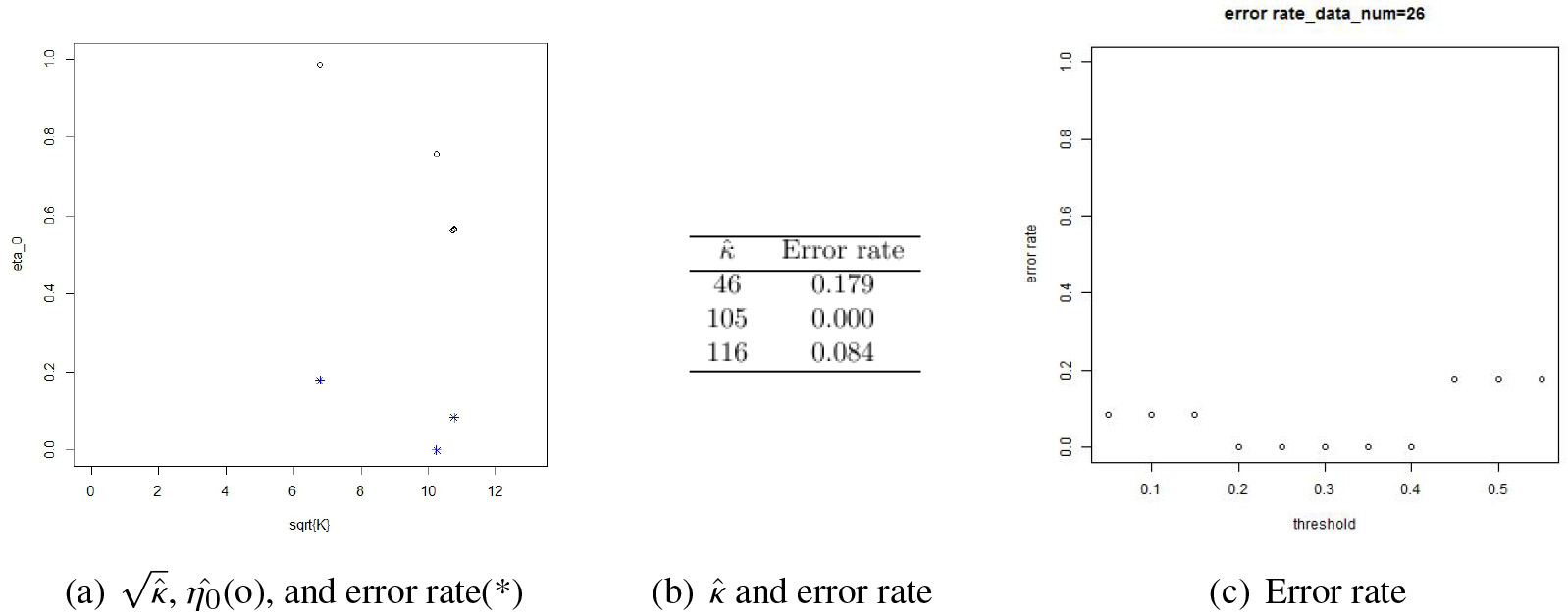
Figure 4 shows an edge detection performance based on a data set of size 100 generated from a GGM model of size 20. The error rate is 0 when with which corresponds to panel (d) of Fig. 3. In panel (c) of Fig. 4, we can see that the error rate varies as the threshold increases taking the minimum when . Panels (a) and (b) show the relationship among , , and the error rate. It is obvious that and move together. As increases, decreases since a larger means a sharper shape of the curve and this causes an increased proportion of , which in turn decreases the value. This phenomenon is manifested by circle points in panel (a). The error rates corresponding to the values are displayed in the lower part of the panel by asterisk points.
In Figs 5 and 6, we summarized experimental results from a GGM model of size 50. The model structure considered in the former figure is of 24 edges which are only 2% of all the possible node-pairs, , while it is of 123 edges (i.e., 10%) for the latter figure. For convenience’ sake, we will call the former model “sparse” and the latter “dense.”
The histogram from the “sparse” model suggests that the may be contaminated by deep inside the domain of . This is well reflected in the estimates for and in panels (e) and (f) of Fig. 5. The error rate is minimized when (see panels (a) through (c)). In panel (a), we can see an abrupt drop of at some point of . This means that as the set gets smaller, the set may hit some point of where a meaningful distinction takes place between and .
As for the data in Fig. 6, the values decrease in a continuum mode. This seems to reflect that the ’s are contaminated over a wide range of them. If this is the case, the smallest error rate may occur when is near since then the distinction between and can be made in a full scale. Note in panel (c) that the error rate is non-decreasing in .
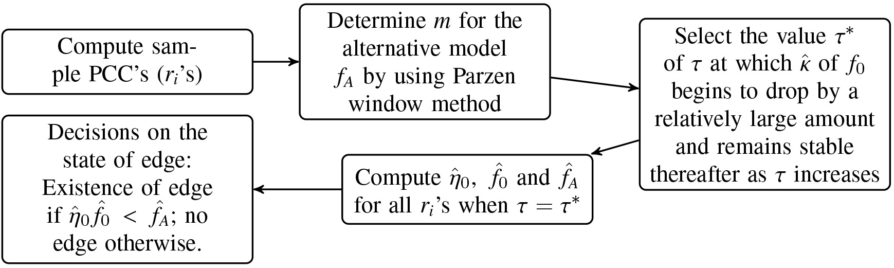
To sum, there is no general rule for a best edge detection. We can however recommend to monitor the values for a range of . may drop abruptly, smoothly, or in some way in between as increases. If we work with real data, we can’t get the error rate. But if we use the plot of and and monitor the patterns of the estimates of and as in panels (d), (e), and (f) in any of the above two figures, we may attain a reasonably good edge detection. Our FDR procedure is summarized in the form of a workflow in Fig. 7.
Performance comparison by numerical experiments
We compared our method with the standard FDR method by numerical experiments using data generated by the method described in subsection ‘Simulation setup’ of Schafer and Strimmer [35]. This method guarantees a positive definite covariance matrix for a given set of random variables involved in a GGM model. Once a GGM model is specified such as the one in Fig. 2, we generate data for the random variables involved in the model and the data is used for performance comparison.
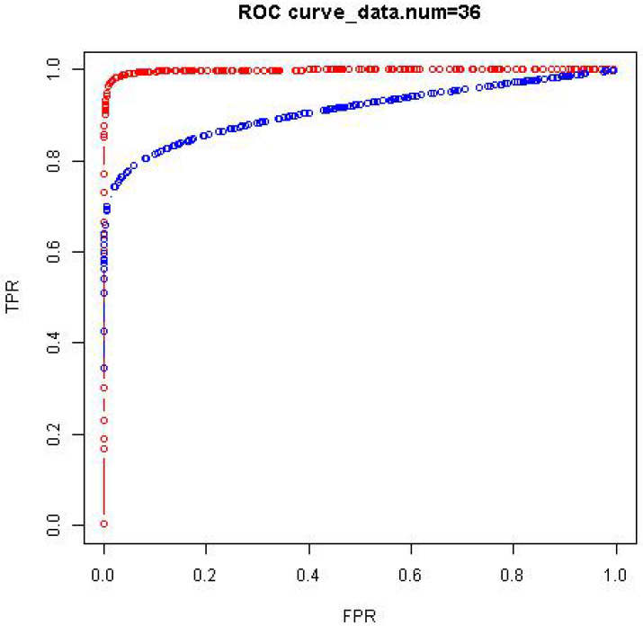
We generated 50 data sets of size from a given GGM model of size (i.e., ) and obtained a receiver operating characteristic (ROC) curve for each of the data sets. The comparison is then made using the area under the ROC curve (AUC). This comparison is given in Table 2 by taking the average of the 50 AUC values. The ROC curves in Fig. 8 are an example from the data sets. We ran numerical experiments of the same kind for GGM models of sizes 50 and 100 with similar comparison results that the proposed method has higher AUC values than the standard method.
Comparison of the proposed method and fdrtool using AUC. The AUC value is the average from 50 iterative experiments with and for each of the methods
Proposed method
fdrtool
Mean
0.994
0.898
Sd
0.004
0.012
Workflow of the proposed FDR procedure.
Comparison of the proposed method (in red) and fdrtool (in blue) using ROC curves.
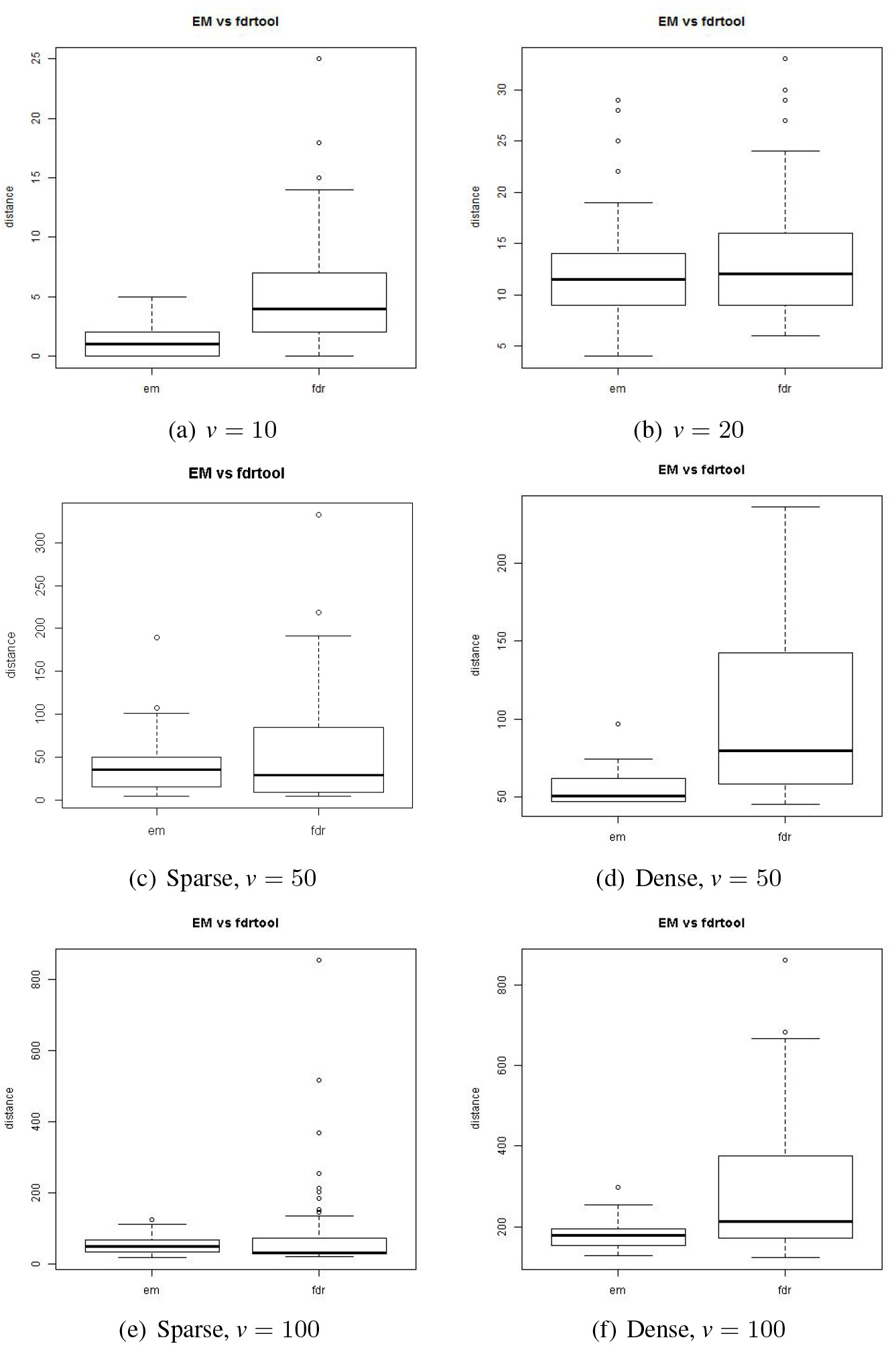
Discrepancy between the actual and estimated models. ‘EM’ denotes the proposed method and ‘fdr’ the standard method.
It is worthwhile to note that a ROC curve is of sensitivity and specificity which are both domain-specific ratios. For instance, if there are fewer true positive cases, then the sensitivity may vary by a larger rate. So we may need to use another measure so that we may have a better picture of an holistic discrepancy between two model structures. In this context, we define a discrepancy measure defined as
where
The measure is an index of structural discrepancy between a true model and an estimated or learned model.
For a performance comparison using between the proposed and the standard FDR methods, we considered GGM models of sizes . We further considered two types of model complexity for the model sizes 50 and 100. One type of the model is of 2% of edges out of all the possible node-pairs in the model structure, and as for the other type, it is of 10% of edges. For convenience’ sake, we will call the former model ‘sparse’ and the latter ‘dense.’ As it was for the AUC, 50 data sets were generated for a given model and as many values are obtained for the comparison using boxplots. The sample sizes were 100 for , and it was 200 for . These experiment results are summarized in Fig. 9.
We can see in the boxplots that the discrepancy is smaller by the proposed method than by the standard method for all the models considered.
Application to real data
Histogram and Parzen window graph for the gene data.
We applied the proposed method for graphical modelling of the gene data of Arabidopsis thaliana. The real data we used for the experiment is available in the package GeneNet in R programming language in Schafer et al. [34]. The data was originally obtained from microarray analysis of diurnal changes in the starch transcriptome in leaves of Arabidopsis thaliana [6, 36]. The original data of 22,814 probes, 11 time points, and two biological replicates were preprocessed and a subset of 800 genes were selected after filtering out all genes containing missing values and whose maximum signal intensity value was lower than 5 on a log-base 2 scale [31].
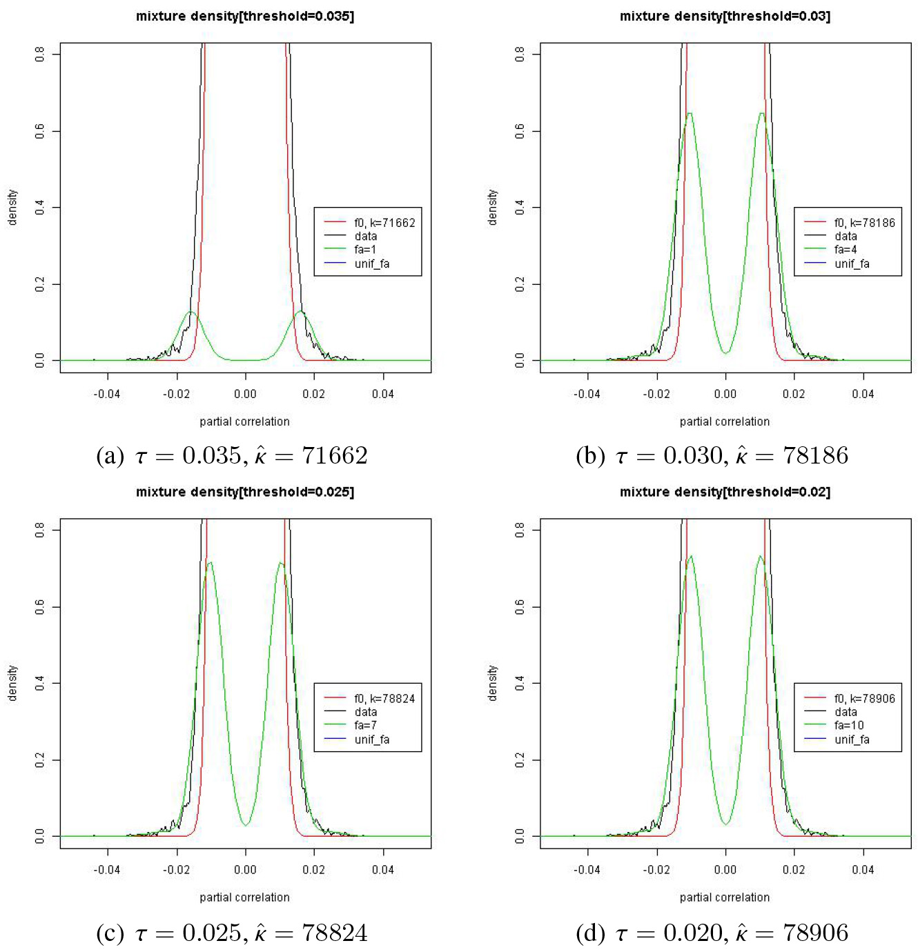
Estimation of and by the proposed method for the gene data.
The data was analyzed in Lee et al. [27] and fortunately we could get access to the values from these authors who obtained the PCC’s by applying a Bayesian shrinkage method. It is known that the genes are causally related in temporal order. So a vector autoregressive (VAR) model was assumed for this data and the autoregressive coefficients can be obtained as PCC’s. Since 800 genes are involved in the model, we need to deal with ’s for this data. Note that, for the VAR model of order 1, we need to consider all the possible autoregressive coefficients across genes.
Figure 10 shows the histogram and a Parzen window graph with in panels (a) and (b) respectively. Both of the graphs seem to indicate that the null model dominates with the alternative model almost ignorable. In panel (c), we can see some ’s scattered almost unnoticeably off a ‘huge’ stack of ’s around .
Estimate results of and are listed in Fig. 11 where the estimated curves are zoomed at the foot of . If we draw the whole curve of the estimates of and , it is like a picture of a 100 m-tall tree () with little trees (’s) at its foot which are less than 1 m tall. We can see that the alternative model meets the null model almost at the foot of the null model implicating a large value of . In Fig. 12, we can see in panel (a) that drops when moves from 0.030 to 0.035 with a slight increase of . This seems to indicate that there may be a small cluster of ’s from in the set while the ’s are mostly from in the set . Note in Fig. 11 that there is an apparent change in the shape of when moves from 0.035 (panel (a)) to 0.030 (panel (b)). In this regard, it is suggested that we use the estimates when for our edge detection for the model structure.
Summary of the analysis of the genes of Arabidopsis thaliana by applying the proposed EM method. ‘fdrtool’ represents the standard FDR method
Proposed method
fdrtool
Threshold ()
0.035
0.030
0.025
0.020
267.7
279.6
280.8
280.9
272.1
0.9989
0.9883
0.9864
0.9862
0.9969
The number () of ’s
1
4
7
10
0.0037
0.0037
0.0037
0.0037
Cutoff for rejection of null
1.3582 10
1.1148 10
1.1294 10
1.1283 10
1.2806 10
1603
4282
4599
4630
2287
Edge proportion
0.2505 (%)
0.6691 (%)
0.7186 (%)
0.7234 (%)
0.3573 (%)
Edge increment
2679
317
31
0.4186 (%)
0.0495 (%)
0.0020 (%)
Node degree
95 (%) (Hub-node)
24
32
33
33
26
Nodes with positive node degree
438
633
649
650
513
Comparison of and between the standard FDR method and proposed method.
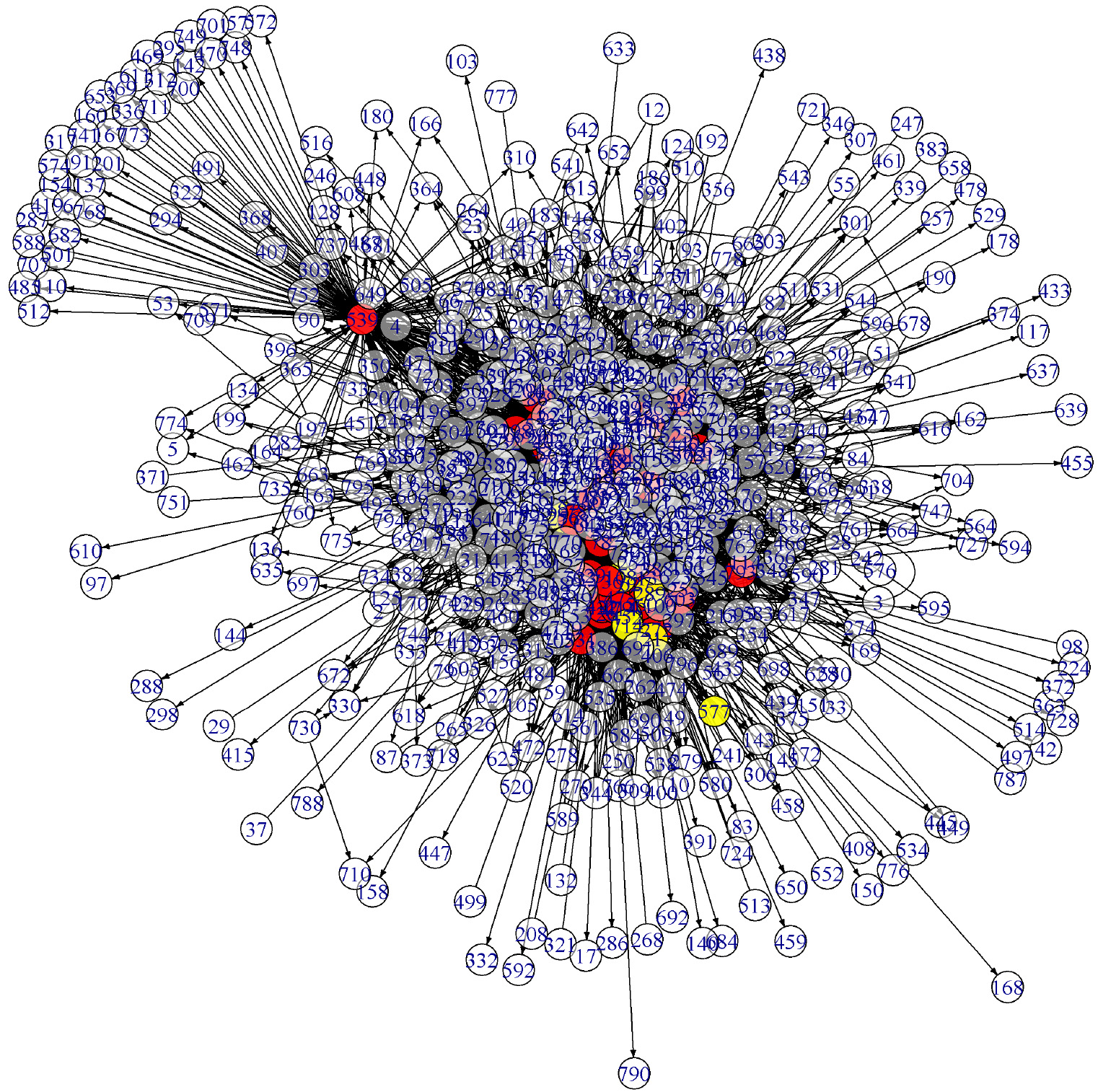
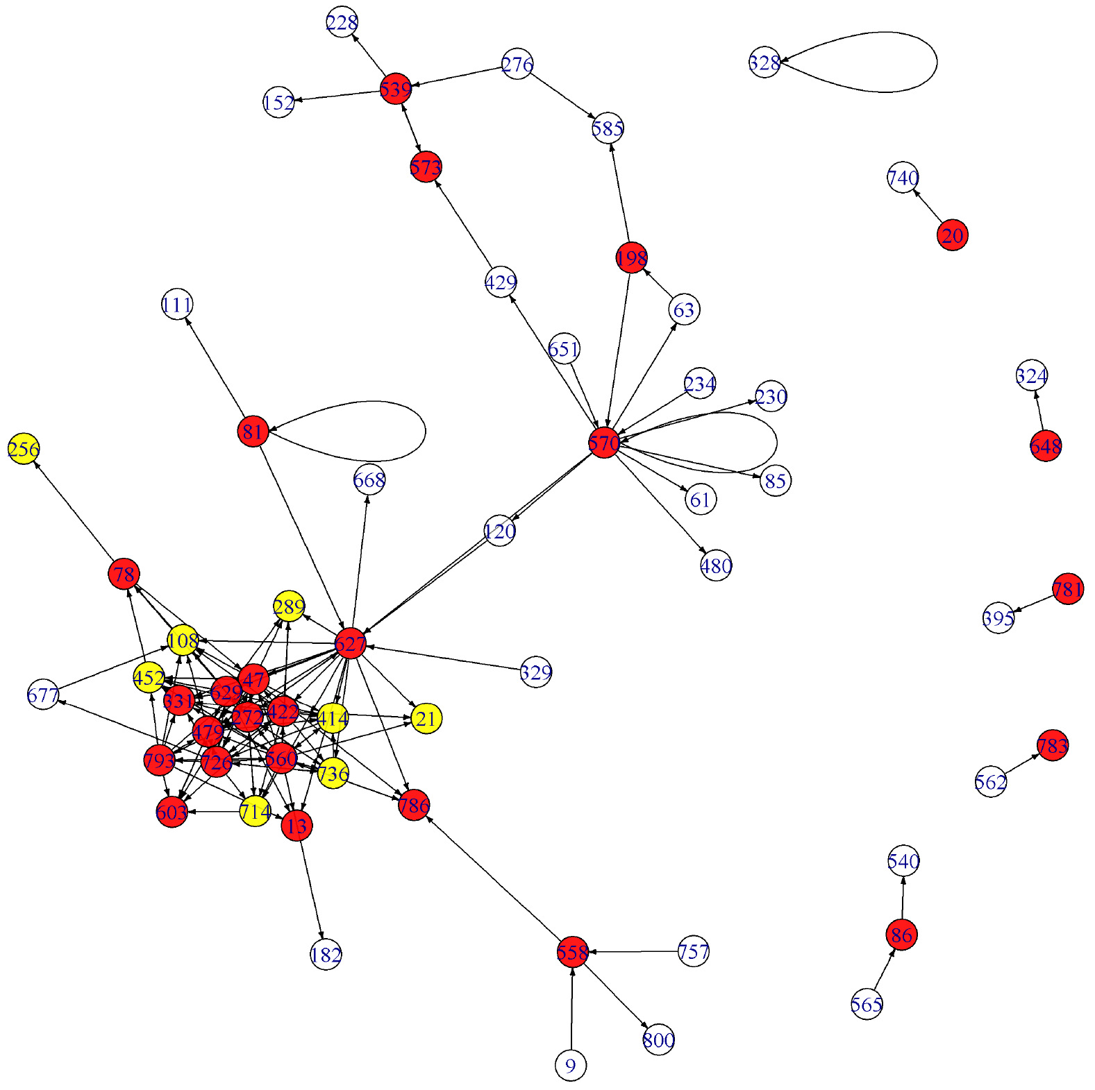
The edge detection result for the gene data is represented by a VAR network in Fig.13 in Appendix. Its subgraph with the nodes of the top 150 edge-strengths is given in Fig. 14 in Appendix. One may compare this graph with Fig. 13 in Lee et al. [27] which is obtained by the standard FDR method. The two graphs are more or less the same except that the genes labelled 198 and 573, for instance, are hub-nodes in Fig. 14 while they are not in Lee et al. (2016b).
A summary of the analysis of the gene data is given in Table 3. The results by the standard FDR method is given in the column of ‘fdrtool’ and they are as described in Subsection 5.3 in Lee et al. [27]. Note that when moves from 0.035 to 0.030, the detected edges increased from 1603 to 4282. 2679 edges are added and any further addition of edges is relatively small in number as moves from 0.030 down to 0.020. This phenomenon is closely related to that the cutoff for the rejection of (no edge) remains more or less the same for while it changes from 1.11/100 to 1.36/100 when moves from 0.03 to 0.035.
We cannot compare our method with the standard FDR method directly since the estimation is implemented under different conditions for the alternative model. But according to the result in Table 3 the result by the standard method is somewhere between our result obtained with and another obtained with .
Our method is available for an exploratory analysis of data since we could find a range of where a dramatic change of , if any, takes place. The set of genes responsible to this variation of may well deserve our attention for a further investigation.
Discussions
The proposed FDR procedure is different from the others in that we took the alternative model as a mixture of multiple normal distributions instead of one or two distributions. In case we use PCCs for FDR procedure, our interest is whether the correlations are strong enough (non-zero) or not (zero). We used the pdf in Eq. (7) for the null distribution (), which is introduced by Hotelling [24] as the distribution of correlations when . As for the alternative model, we considered a mixture of normal distributions and estimated it by applying an EM approach. In most of the FDR methods in existence, the alternative model is taken as a mixture of at most two distributions, one at each side of the null area.
It is worthwhile to note that the value of is affected by the locations and the amounts of the ’s which are regarded as from . By monitoring the values of , we could determine the location of ’s reasonably well where the contamination of with becomes far more influential on the estimation of . It is recommended that the threshold() between and be smaller than the location of ’s where decreases abruptly and not increases thereafter as increases.
The estimation of the proposed method is based on data. We applied the Parzen window approach in search of an appropriate number of , the number of the component models in the alternative model . We have seen that a larger value of than necessary would rather be recommended than a smaller value. In this way, we could make our EM process more data-based. A smaller than necessary may lead us to a larger error rate in edge detection by involving more than desired values for estimating .
In most of the preceding studies, was a main concern where [19], [15], or Hotelling’s distribution was assumed for the sample PCC [35]. On the other hand, no or a simple such as a uniform distribution was considered for . Once was estimated, was often taken as where is a smoothed version of the empirical distribution of and is the estimate of . This distinguishes our method from these methods in literature.
If we work with real data, there is no knowing about the error rate. But by monitoring , , and the curves of the estimates of and , we can possibly find the points of and where we may attain a best edge detection. The histogram from the “sparse” model suggests that the may be contaminated by deep inside the domain of . This is well reflected in the estimates of and in panels (e) and (f) of Fig. 5. The error rate is minimized when (see panels (a) through (c)). In panel (a), we can see an abrupt drop of at some point of . This means that as the set gets smaller, the set may hit some point of where a meaningful distinction takes place between and .
Concluding remarks
A main difference between our proposed method and the conventional FDR method is that we consider a mixture of multiple Gaussian distributions as the distribution for the alternative hypothesis (i.e., presence of edge) while a uniform distribution or the difference between the estimate of the null model and the smoothed version of the empirical distribution is used for the alternative in the conventional method. This difference makes our method more powerful when the model structure is sparse, i.e., the number of edges is not large considering the number of the nodes (i.e., random variables) involved in a model structure. Another reason for the mixed alternative model is that the relationship between a pair of random variables may have its own ground. For example, a functional connectivity between two brain regions may be different in strength from others due to some unknown neuro-biological reasons. If there are several of those pairs of brain regions, it would be desirable to regard them as random variables from a particular distribution.
The Gaussian distributions considered under the alternative hypothesis have their means near or at the estimates of the partial correlations at the initial stage of the EM process. At each step of the process, we obtain MLE’s of the null density function, the means of the Gaussian densities which are mixed into a density function under the alternative hypothesis, and the weights of the null density and the Gaussian densities. The process terminates when the full likelihood reaches its maximum.
Since the initial values of the proposed method are dependent upon individual estimates of the partial correlations, the method is in a sense sensitive to the data. With a view to control the level of data sensitivity, we used the variances of the Gaussian distributions in a stabilized form through the Fisher’s -transformation. For a large-scale problem with small data, the partial correlations are estimated by applying non-parametric or Bayesian shrinkage approaches [31, 27].
We compared our method favorably with the conventional method through numerical experiments for Gaussian graphical models whose model structure is given in an undirected graph. However, we can use the proposed method for causal graphical models of continuous random variables where the joint probability model is given as a product of marginal or conditional Gaussian models.
We devised a procedure of the proposed method where we can monitor the dynamic variation of the null and alternative density curves with the empirical distribution as a reference curve. This procedure helps us laying our edge detection process well based on data.
Although we ran numerical experiment using Gaussian graphical models of sizes up to 100 variables, we can safely anticipate favorable comparisons of our method over the conventional one for even larger models. This is because any single distribution as an alternative model can be approximated as a mixture of Gaussian densities and our method consists of an amphibious monitoring of dynamic change of the shapes of the null and the alternative models and their corresponding weights.
Footnotes
Acknowledgments
The research was supported by a grant from the National Research Foundation of the Republic of Korea (Grant No: 2020R1A2C1A01008767).
Appendix
Model structure representing causal relationship among the genes of Arabidopsis thaliana by the proposed method
Model structure representing causal relationship among the genes of Arabidopsis thaliana by the proposed method with . In this network, and .
Subgraph of the graph in Fig. 13. The nodes with the top 150 edge-strengths are involved in the graph.
References
1.
AubertJ.Bar-HenA.DaudinJ.J. and RobinS., Determination of the differentially expressed genes in microarray experiments using local FDR, BMC Bioinformatics5 (2004), 125.
2.
BayS.D.ShragerJ.PohorilleA. and LangleyP., Revising regulatory networks: From expression data to linear causal models, J. Biomed. Informatics35 (2002), 298–497.
3.
BenjaminiY., Discovering the false discovery rate, J. Roy. Statist. Soc. B72(4) (2010), 405–416.
4.
BenjaminiY. and HochbergY., Controling the false discovery rate: A practical and powerful approach to multiple testing, J. Roy. Statist. Soc. B57 (1995), 289–300.
5.
BickelP.J. and DoksumK.A., in: Mathematical Statistics. 2nd ed. New-York, CRC Press (Talor and Francis Group), 2015.
6.
CraigonD.J.JamesN.OkyereJ.HigginsJ.JothamJ. and MayS., NASCArrays: A repository for microarray data generated by NASC’s transcriptomics service, Nucleic Acids Research32 (2004), D575–D577.
7.
DalmassoC.BröretP. and MoreauT., A simple procedure fir estimating the false discovery rate, Bioinformatics21 (2005), 660–668.
8.
DempsterA.P.LairdM. and RubinB., Maximum likelihood from incomplete data via the EM algorithm, Journal of the Royal Statistical Society B39 (1977), 1–38.
9.
DempsterA.P., The direct use of likelihood for significance testing, Statistics and Computing7 (1997), 247–252.
DunnetC.W., Multiple comparisons procedure for comparing several treatments with a control, J. Am. Statist. Assoc.50 (1955), 1096–1121.
12.
DunnetC.W., New tables for multiple comparisons with a control, Biometrics20 (1964), 482–491.
13.
EdwardsD., in: Introduction to Graphical Modelling, New York, Springer, 1995.
14.
EfronB., Robbins, empirical Bayes and microarrays, The Annals of Statistics31 (2003), 366–378.
15.
EfronB., Large-scale simultaneous hypothesis testing: The choice of a null hypothesis, Journal of the American Statistical Association99 (2004), 96–104.
16.
EfronB., Local False Discovery Rates, National Institute of Health grant 8R01 EB002784 and National Science Foundation grant DMS-0072360, Technical Report N. 2005-20B (234), 2005.
17.
EfronB., Correlation and large-scale simultaneous significance testing, J. Amer. Statist. Assoc.102 (2007), 93–103.
18.
EfronB. and TibshiraniR., Empirical Bayes methods and false discovery rates for microarrays, Genetic Epidemiology23 (2002), 70–86.
19.
EfronB.TibshiraniR.StoreyJ. and TusherV., Empirical Bayes analysis of a microarray experiment, J. Amer. Statist. Assoc.96 (2001), 1151–1160.
20.
FisherR.A., Frequency distribution of the values of the correlation coefficient in samples of an indefinitely large population, Biometrika10(4) (1915), 507–521.
21.
FisherR.A., On the ‘probable error’ of a coefficient of correlation deduced from a small sample, Metron1 (1921), 3–32.
22.
FriedmanJ., Regularized discriminant analysis, Journal of the American Statistical Association84 (1989), 165–175.
23.
HastieT.TibshiraniR. and FriedmanJ., The Elements of Statistical Learning, Springer, NY, 2001.
24.
HotellingH., New light on the correlation coefficient and its transforms, J. R. Statist. Soc. B15 (1953), 193–232.
25.
LaurizenS.L., Graphical Models, New York, Oxford University Press, 1996.
26.
LeeN.KimA.-K.ParkC. and KimS.-H., An improvement on local FDR analysis applied to functional MRI data, J. Neuroscience Methods267 (2016), 115–125.
27.
LeeN.ChoiH. and KimS.-H., Bayes shrinkage estimation for high-dimensional VAR models with scale mixture of normal distributions for noise, Computational Statistics and Data Analysis101 (2016), 250–276.
28.
McLachlanG. and PeelD., Finite mixture models, New York, John Wiley Sons, 2000.
29.
McLachlanG. and KrishnanT., The EM Algorithm and Extensions, New York, John Wiley Sons, 1997.
Opgen-RheinR. and StrimmerK., Learning causal networks from systems biology time course data: An effective model selection procedure for the vector autoregressive process, BMC Bioinformatics8(Suppl 2) (2007), S3.
32.
PaulsoE., On the comparison of several experimental categories with a control, Ann. Math. Statist.23 (1952), 239–246.
33.
PoundsS. and MorrisS.W., Estimaing the occurrence of false positives and false negatives in microarray studies by approximating and partitioning the empirical distribution of p-values, Bioinformatics19 (2003), 1236–1242.
34.
SchaferJ.Opgen-RheinR. and StrimmerK., GeneNet: Modeling and inferring gene networks, R Package Version 1.2.11, 2014.
35.
SchaferJ. and StrimmerK., An empirical Bayes approach to inferring large-scale gene association networks, Bioinformatics21 (2005), 754–764.
36.
SmithS.M.FultonD.C.ChiaT.ThorneycroftD.ChappleA.DunstanH.HyltonC.ZeemanS.C. and SmithA.M., Diurnal changes in the transcriptom encoding enzymes of starch metabolism provide evidence for both transcriptional and posttranscriptional regulation of starch metabolism in Arabidopsis leaves, Plant Physiology136 (2004), 2687–2699.
37.
StoreyJ.D., A direct approach to false discovery rates, J. R. Statist. Soc. B64 (2002), 479–498.
38.
StoreyJ.D. and TibshiraniR., Statistical significance fir genomewide studies, Proc. Natl. Acad. Sci.100 (2003), 9440–9445.
39.
StrimmerK., Fdrtool: A versatile R package for estimating local and tail area-based false discovery rates, Bioinformatics24 (2008), 1461–1462.
40.
SunW. and CaiT.T., Large-scale multiple testing under dependence, J. R. Statist. Soc. B71 (2009), 393–424.
41.
TohH. and HorimotoK., Inference of a genetic network by a combined approach of cluster analysis and graphical Gaussian modeling, Bioinformatics18 (2002), 287–297.
42.
WaddellP.J. and KishinoH., Cluster inferences methods and graphical models evaluated on NCI60 microarray gene expression data, Genome Informatics11 (2000), 129–140.
43.
WangJ.MyklebostO. and HovigE., MGraph: Graphical model for microarray data analysis, Bioinformatics19 (2003), 2210–2211.
44.
WhittakerJ., Graphical Models in Applied Multivariate Statistics, New York, John Wiley Sons, 1990.
45.
WuX.YeY. and SubramanianK.R., Interactive analysis of gene interactions using graphical Gaussian model, in: Proceedings of the ACM SIGKDD Workshop on Data Mining in Bioinformatics, Vol. 3, 2003, pp. 63–69.
46.
ZweigM.H. and CampbellG., Receiver-operating characteristic (ROC) plots: A fundamental evaluation tool in clinical medicine, Clinical Chemistry39 (1993), 561–577.