
Abstract
We construct a model for the progress of the 2020 coronavirus epidemic in the United States of America, using probabilistic methods rather than the traditional compartmental model. We employ the generalized beta family of distributions, including those supported on bounded intervals and those supported on semi-infinite intervals. We compare the best-fit distributions for daily new cases and daily new deaths in America to the corresponding distributions for United Kingdom, Spain, and Italy. We explore how such a model might be justified theoretically in comparison to the apparently more natural compartmental model. We compare forecasts based on these models to observations, and find the forecasts useful in predicting total pandemic deaths.
Introduction
The onset of the coronavirus pandemic in early 2020 led to global anxiety. Everyone wanted to know what to expect. This was particularly true of governments, who had to plan public health policies, and other policy responses. The two primary time series of interest to policy makers are the daily number of new cases, and the daily number of new deaths. Related time series also played a prominent role in national discussions, such as the total number of hospitalizations, and usage of other resources.
The traditional approach to the time series of cases and deaths has been the compartmental epidemiological model, particularly the SIR model (Kermack and McKendrick). Here S
The SIR model is difficult to use, being a solution of a system of three first-order, but non-linear, ordinary differential equations. The system does not have a general closed-form solution, so solutions are approximated using numerical methods. The parameters of the model are based on educated guesses, such as the ever-changing value of the basic reproduction number,
Models produced early in the pandemic predicted catastrophe, with millions of deaths forecast in the United States by the model produced by the MRC Centre for Global Infectious Disease Analysis at the Imperial College (Imperial College model). Following its rejection by public health officials (David Adam), those officials used the model produced by IHME, the Institute for Health Metrics and Evaluation at the University of Washington (IHME model). Eventually, this predictive model was abandoned as well (William Wan et al), with the public health establishment deciding to rely primarily on actual observations.
An observer cannot help but notice the resemblance between graphs of daily new cases and daily new deaths, on the one hand, and probability distributions on the other. This suggests the possibility of fitting probability distributions to the data. We will explain why this task is impossible, what similar task should be done instead, and the challenge in justifying such a model theoretically.
Incidence distributions
Despite their superficial resemblance, the graph of the daily number of new cases or new deaths is not a true probability distribution, because the sum of the values of the daily numbers of new cases or new deaths is not one.
We choose to generalize the concept of probability distributions. Rather than insist that the measure of the whole space (popularly understood as “the area under the curve”) equal one, we relax this condition to require that the measure of the whole space be positive but finite. We denote the measure of the whole space by
During the pandemic,
An incidence distribution is
Given a series of daily new cases or daily new deaths, and a finite-dimensional family of probability distributions, we seek the best-fit incidence distribution that describes the data. This requires the identification of parameters from the family of probability distributions, in conjunction with the identification of
The next task is to identify a measure of goodness of fit, and an appropriate family of probability distributions. Some of the most common measures are the root mean square error (RMSE),
Distribution fitting has been attempted before, in accordance with Farr’s law of epidemiology. It is stated on page 97 of Laws of Epidemics (Farr): “It appears probable, however, that the small-pox increases at an accelerated and then a retarded rate; that it declines first at a slightly accelerated, then a rapidly accelerated, and lastly at a retarded rate, until the disease attains the minimum intensity, and remains stationary.”
Attempts have been made to fit normal and logistic distributions to epidemic data. Such attempts are thoroughly inappropriate, as these two distribution families are symmetric with light tails, whereas epidemic data tend to be quite asymmetric, with heavy tails. We propose a better alternative.
Generalized beta distributions
The generalized beta distributions (McDonald & Xu, 1995) form a very broad family of probability distributions with strong closure properties, and includes numerous familiar probability distributions as either special cases or limiting cases.
Generalized beta distributions are supported on Every Pearson distribution with bounded or semi-infinite support of the form The family of generalized data distributions is closed under positive scaling and under power transformations. That is, if
The generalized beta distribution family appears to be the smallest family of probability distributions with the above three properties. It has five parameters, as seen in the probability density function:
We note the following.
The parameters satisfy
The independent variable satisfies The support is bounded when The Pearson type I (beta) distribution occurs for The Pearson type VI (beta prime) distribution occurs for
Together with
We converted the search for the five bounded parameters into searches over unbounded intervals, replacing these five by
Another difficulty arose in computing the probability density function; the first two factors in the denominator are either extraordinarily large or extraordinarily small, mostly canceling out each other. To compute the product of the first two factors in the denominator, we computed the logarithms of the individual factors, added them, and exponentiated the sum. That is:
We used Excel’s function GAMMALN.PRECISE in the last computation.
Overview of data
Data were gathered from the Worldometers website (Worldometers). This process was somewhat problematic, because published data were subject to change as the various country health agencies updated their reports. Often, small changes would be published going back several weeks. Most changes were small in magnitude, however, and did not substantially affect the model parameters. Consequently, we chose merely to add new data, rather than continually revisit the previously recorded data for changes. Our primary interest is in demonstrating the feasibility of this model-fitting method.
We display, in two graphs, the weekly number of new cases of coronavirus per one million population, and the weekly number of new deaths from coronavirus per one million population, in the countries under study. In each graph, for each country, the data series starts on the first day when there is at least one case or one death per two million population. Figure 1 depicts weekly cases per one million population; Fig. 2 depicts weekly deaths per one million population.
Weekly cases of coronavirus per one million population.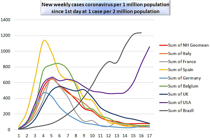
Weekly deaths from coronavirus per one million population.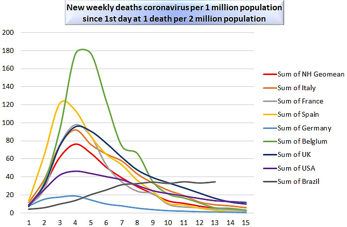
In addition to the United States, United Kingdom, Spain, and Italy, we also initially followed data from Brazil, France, Belgium, and Germany. These eight countries were chosen for study in early June, 2020 as having the highest impact of the pandemic upon the country and upon the world, by having the largest values (at that time) for the metric
A further time series was added, representing the geometric mean of the series for the northern hemisphere countries, to smooth out irregularities observed in only one country. Data is current to July 9, 2020.
The behavior of the western European countries is somewhat similar, enough to consider this group of densely-populated neighboring countries as a single cluster. In all the northern hemisphere countries in the graphs, the shapes of the deaths plots are very similar, with the exception of amplitude; the number of weeks to the peak is about four to five. The shapes of the cases plots are similar among the western European countries, again except for amplitude; the number of weeks to the peak is about four to six. Recall that time on both graphs is counted from the first day that cases or deaths respectively occur once for every two million population.
In the United States, deaths decayed steadily, but the number of cases underwent a second increase. This does not necessarily signify a “second wave”, but rather the effect of the large size and multiple climates in the United States, which drove the northern United States indoors in the cold winter, and the southern United States indoors in the hot summer. Thus, each region of the United States experienced its “first wave” during the period under study. It could be argued plausibly that such a curve could be understood more easily as a sum of two distinct functions, one representing a cluster of cases in the northeastern United States, and a second one representing the rest of the country.
Brazil, in the southern hemisphere, only reached its peak infection rate during its winter, which was summer in the northern hemisphere. Because of the delayed onset of the disease there, it will not be studied further herein.
For each country, we used 7-day centered moving averages to smooth the daily number of new cases and the daily number of new deaths; on day 3, we used a 5-day centered moving average; on day 2, we used a 3-day centered moving average; and on day 1, we used the observation itself. There are 120 days of smoothed data for cases, and 105 days of smoothed data for deaths (this required following the raw data for 123 days and for 108 days respectively).
Next, we used Excel Solver to fit the best (least RMSE) generalized beta distribution to the smoothed data for each country, for the cases series and for the deaths series, three times: once for
Results for the United States of America
Results for the United States of America
Results for the United Kingdom
For each model, we report the number of observations to date
We note that the exceptionally small levels computed for the
We further note that optimal models only occurred for
Results for the United States of America are given in Table 1; for the United Kingdom in Table 2; for Spain in Table 3; for Italy in Table 4.
Results for Spain
Results for Italy
We provide graphs of the best models for the United States, together with 95% prediction limits for new observations. Figure 3 depicts cases in the United States; Fig. 4 depicts deaths in the United States. The prediction of cases in the United States is the only example where the best-fit model has
USA cases, GB2 model, with 95% prediction interval.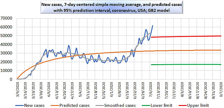
USA deaths, GB2 model, with 95% prediction interval.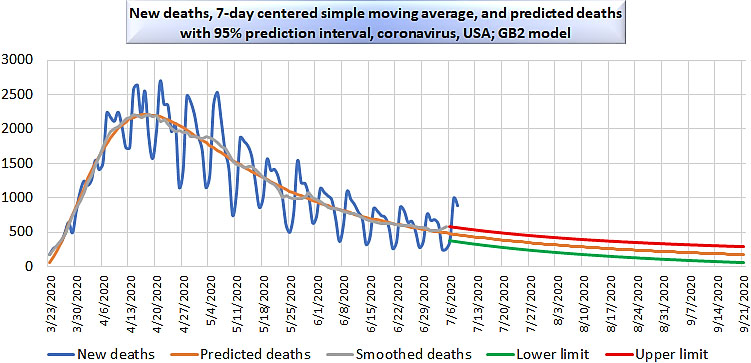
We provide Fig. 5 for comparison. This demonstrates what happens to the model once a second wave begins. In this graphic, daily deaths in the United States are extended to September 30, 2020, and centered moving averages to September 27, 2020.
USA deaths, GB2 model, with 95% prediction interval, to September 27, 2020.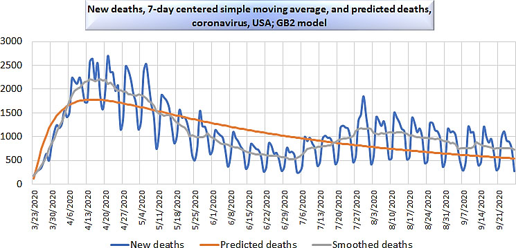
The use of a probabilistic model in forecasting the path of an epidemic requires discussion. At first glance, the compartmental model seems more natural. It reflects the dynamic nature of the reality of the epidemic. Individuals progress from susceptible to infected to recovered (or dead) with certain probabilities, as if in a Markov process. Unlike a Markov process, however, the probabilities associated with changing states themselves change over the course of time. This only adds to the difficulty of estimating the parameters of the model.
The use of a probabilistic model is recommended primarily by the appearance of the graph of the number of new daily cases or deaths. That resemblance is problematic, however. In the epidemic, the horizontal axis of the graph represents time. For a probability distribution or incidence distribution, the horizontal axis of the graph represents a random variable. To justify the use of a probabilistic model entails a fatalistic view of the epidemic. In this view, there is a total number of people who were destined to become cases or deaths; the random variable identifies the time at which their destinies as cases or deaths materialize.
This paradigm shift is an apparently strange perspective, inviting further commentary. One potential explanation is that the graph represents a sort of struggle for the population to reach herd immunity at or about
The ultimate test from the scientific point of view is how well each type of model explains the observed data. Another concern is the stability of these models as new data becomes available. In other words, we want to know how well models constructed from the first
Predicted and observed deaths per million population
Predicted and observed deaths per million population
Relative error of prediction, total deaths: one-month forecast, GB2 model
It has been our goal in this paper to present an alternative approach to modeling pandemic outcomes like new cases and new deaths, by fitting generalized beta distributions to smoothed or aggregated data. Most of the time, generalized beta distributions of the second kind had the best fit to the data, with
We note that the approximately 40-day duration between a threshold in cases or deaths and a local maximum in that variable did not hold throughout the world. Much lengthier delays between threshold and peak took place in the southern hemisphere, due to its seasonal opposition in comparison to the northern hemisphere. However, there was a lengthy delay in the northern hemisphere as well, for example in India, where the gap for new cases was more than five months from threshold to peak, and the reason for this discrepancy is worth exploring. In particular, it would be interesting to know if this discrepancy is related to the widespread use of hydroxychloroquine in India.
It is clear in October, 2020 that the asymptotically declining behavior of the functions graphed above does not accurately anticipate successive waves of new positive tests. It remains to be seen whether those are all symptomatic cases, or whether an aggressive testing regime, running 40 cycles in the PCR test, has uncovered inactive traces of virus from earlier infections. In either case, however, these multi-modal time series are better described as a sum of multiple generalized beta incidence distributions, rather than fitting one such function to the whole series. The modes of these components might very well turn out be fit themselves to a generalized beta incidence distribution, if the waves increase in magnitude, and then decrease in magnitude.
Models of this sort are incapable of detecting seasonality. If there is reason to suspect that a disease might become a seasonal phenomenon, like influenza, other information would be required to produce a reliable forecast.
All the reservations above lead to the question: of what use are such models? These models are useful for smoothing of observations and for short-term forecasts, probably no farther out than one month in the future when forecasting new cases.
However, it is remarkable that forecasts of ultimate total deaths by the end of the pandemic, made on the basis of data through July 9, 2020, turn out to be in the vicinity of total deaths as reported by October 26, 2020. Thus a pure generalized beta incidence distribution may well capture an intrinsic feature of the total deaths caused by a pandemic. Table 5 compares the forecast number of deaths per million population from the tables above, employing the GB2 model (
Table 6 displays even more clearly the usefulness of these models for short-term forecasts, giving the percent error in deaths based on the GB2 model from one month to the next. The median absolute value of the relative error of prediction in this table is less than 7%.
Footnotes
Acknowledgments
The author wishes to express thanks for the tremendous patience of his wife, Yan, as the author studied data set after data set, many of which she gathered. The author also thanks an anonymous reviewer who made suggestions that improved the clarity of the exposition.