




Abstract
Abstract
Proteomics is a rapidly emerging frontier in post-genomics medicine and biology, but the quantitative analysis and validation of proteomic data are in need of further improvements. Before selecting potential candidate proteomic biomarkers, it is important to understand the broader context of how biological processes are regulated under different conditions or in different phenotypes. The enrichment of proteomic data consists of extracting as much biological meaning as possible from curated, pathway-based, functional protein interaction networks. Currently, most of the enrichment tools are intended for microarray data and require parametric data, whereas proteomic data are often nonparametric. In this study, we aimed to select a suite of interactive tools that can enrich proteomic results with a graphical overview. This facilitated diagnosis and interpretation prior to further analysis. From a list of proteins, a network was constructed using a map of the most severely disrupted biological process, and the disease entity was then identified on the basis of clinical data. Taken together, this graphical and interactive method ranks potential proteins via functional analysis in order to improve the choice of biomarkers for validation with the following advantages: 1) It adds neighbor proteins that are not selected by mass spectrometry analysis, but could in fact be key proteins; 2) pinpoints the biological process most often involved; and 3) predicts the most likely disease on the basis of clinical data.
Introduction
Protein identification and quantification are only one-half of the proteomic story. The choice of statistical parameters for selecting candidates, their functional clustering, predicting their network interactions, scoring the pathways, and identifying the disease involved constitute the other half of proteomic investigations.
The choice of candidates for validation remains arbitrary, and is limited to a small number of proteins. For this reason, it is important to choose the most specific candidates for validation. To obtain a global overview of candidates, it is essential to have in silico tools that can be used to integrate experimental results (fold change, p value/FDR, replicates, variability, correlations) and functional biology data from curated databases (interaction, function, biological process, pathway, and disease). Such an overview provides a better classification of the candidates, and makes it possible to select the most relevant ones for subsequent validation. We describe here an interactive graphical tutorial that integrates several existing programs in order to improve the selection of candidates.
In most cases, the programs developed for gene set enrichment analysis have been adapted to microarray data and require many chip sets and several thousand genes. However, proteomic data are often nonparametric, and implement only a few replicates, and just a few hundred proteins. We have investigated the existing computational tools, and have selected only those that are suitable for small data sets such as those found in proteomics.
Methods
Gene set enrichment
Gene set enrichment analysis is a widely used strategy for scoring gene sets on the basis of their differential expression and known pathway databases. This strategy has yielded a list of the best pathways between two biological states that include the greatest number of significant modulated genes (Allison et al., 2006). Several methods and tools have been developed (see the Supplementary Table S1 at http://www.liebertonline.com/omi.) Briefly, they differ mainly in their databases of known gene-sets [GO (Ashburner et al., 2000), KEGG (Kanehisa and Goto, 2000), Reactome (Vastrik et al., 2007), MsigDB (Subramanian et al., 2005)], and the statistical method used to assess enrichment (Sample randomization or gene randomization). For further details see two articles that describe the existing approaches and propose solutions (Luo et al., 2009; Merico et al., 2010). To date, few tools provide interactive exploration, and fewer still can be run using nonparametric data.
The Enrichment MAP program (Subramanian et al., 2005) is a network-based method for gene set enrichment and visualization, but it uses sample randomization and requires more than 8 gene chips per state. The GAGE program (Luo et al., 2009) is a generally applicable gene set enrichment tool for pathway analysis. It could be adapted for use with nonparametric data, and is able to handle data sets corresponding to different sample sizes or experimental designs, but it is not implemented using graphical tools. The GeneMANIA (Montojo et al., 2010), the ClueGO (Bindea et al., 2009), and Reactome FI (Wu et al., 2010) programs have all cytoscape plug-ins (Shannon et al., 2003; Smoot et al., 2011), and are graphical tools requiring only a gene list, but unfortunately they have at least two shortcomings: they do not consider either the gene expression profile nor the gene correlations.
Multi-correlation network analysis
Estimating the correlation between gene expressions is fundamental for clustering functionally relevant gene sets with a cellular pathway. Two closely-correlated gene expressions are likely to be involved in the same biological process (Langfelder and Horvath, 2008). Eight R packages were tested (see Supplementary Table 1) using our data. Only CORREP (Zhu et al., 2007) was able to cope with the small sample size, and it handles replicates as independent samples.
Disease-based network
A network of diseases associated with particular biological processes and the corresponding genes offers a platform for exploring the common genetic origin of many diseases in a single graph (Becker et al., 2004; Goh et al., 2007). The cBio Cancer Genomics Portal (Cerami et al., 2012) (http://www.cbioportal.org/) was used to overlap the gene expression profiles of twenty cancers (clinical data) with our experimental data (Supplementary proteinEXP.txt). This completed the map of the biological processes induced by the modulated genes, and was expected to help to shed light on the panel of genes that can lead to a particular disease.
Proteomics data
We assume that the protein list and its quantitative analysis had already been compiled (See Supplementary files: proteinEXP.txt, only-modulatedEXP.txt, Patient-profile.png at http://www.liebertonline.com/omi.)
The proteomic data consisted of 6 blood samples extracted from subjects corresponding to two occupational conditions: three (biological replicates) of them worked in a Radiobiology Department, and the other three (biological replicates) were administrative office workers. The general characteristics of the patients/volunteers are in Supplemental_Patient-profile.png file.
The institutional Ethics Committee approved the study. All participants were asked to complete a standardized questionnaire including items concerning smoking habits, alcohol intake, drug consumption, medical history, and years of employment.
Figure 1 shows the work-flow of our approach. It starts with quantitative expression data as in the Supplementary proteinEXP.txt file. From this table, the fold change, the FDR and the multivariate correlation were computed as described in the SupplementaryTutorial. The gene list was then submitted to Reactome FI plugin (Wu et al., 2010) through Cytoscape software (Shannon et al., 2003; Smoot et al., 2011) to predict the function interactions network (Fig. 2. Network with gray edges). The colors of the nodes were assigned by the cancer module from the National Cancer Institute (Wu et al., 2010). The pertinent gene were selected from this network, and submitted to the ClueGO plugin (Bindea et al., 2009) to annotate the functional network with the biological processes (Fig. 2. Biological process ellipse). The fold change was indicated by the color of the node borders (red: upregulated, blue: downregulated) and the false discovery rate (FDR) was indicated by the node line width.
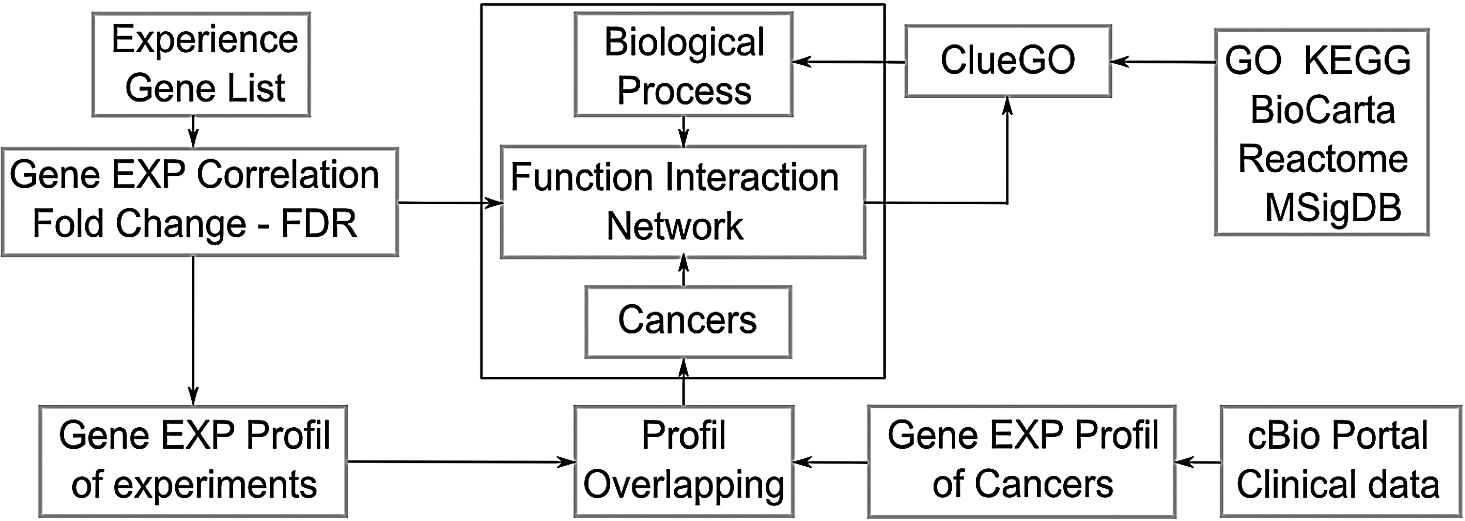
Work-flow of an enrichment network drawn using Inkscape.org..
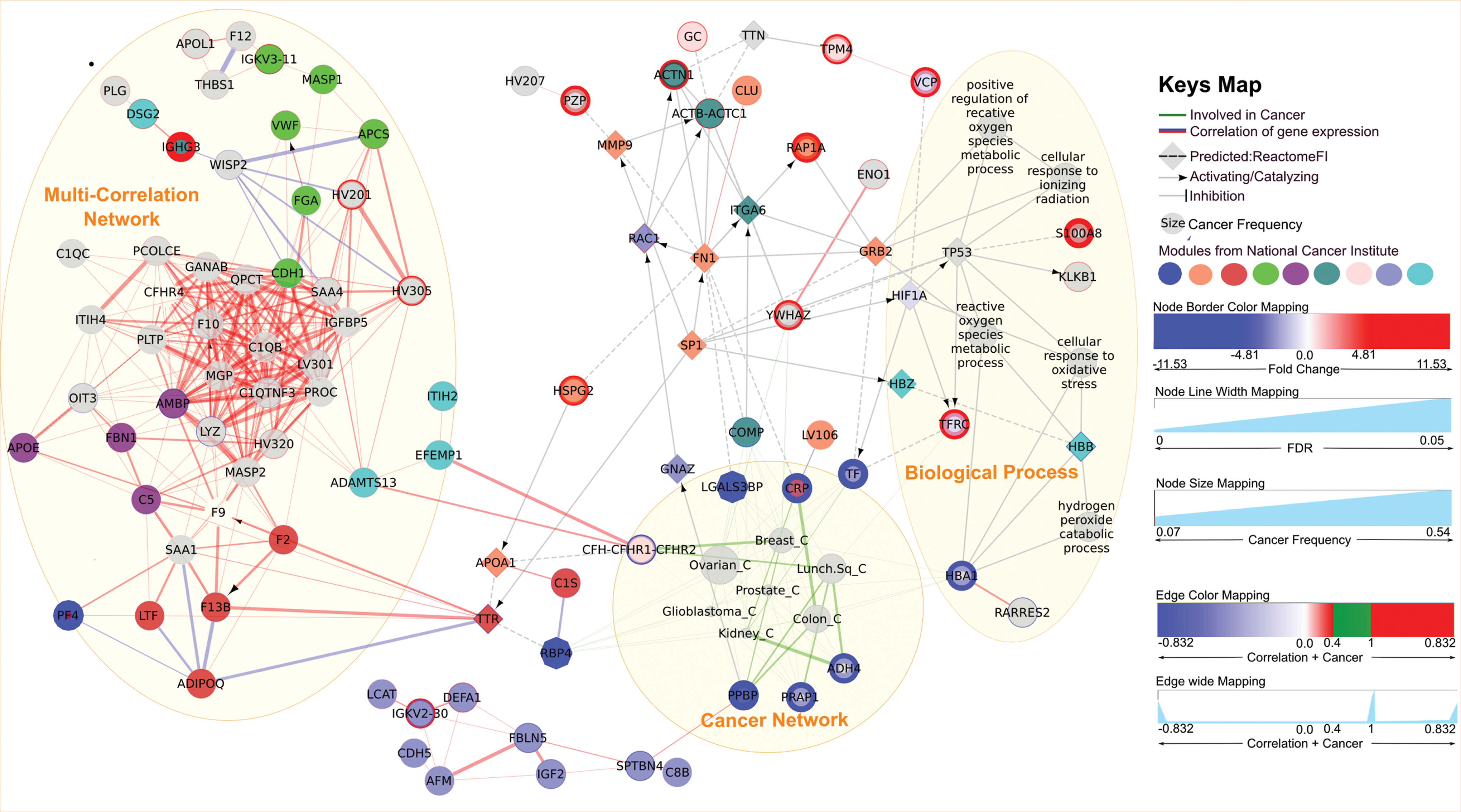
Enrichment network for human exposure to ionizing radiation. Network constructed using Cytoscape (Shannon et al., 2003; Smoot et al., 2011) software, ReactomeFI (Wu et al., 2010), and ClueGO (Bindea et al., 2009) plug-ins. The gene expression correlation was computed by the CORREP package, and the cancers were predicted using the cBio portal database. The node color was assigned by a cancer module from the National Cancer Institute (Wu et al., 2010). The edge color mapping was optimized; cancer node interactions are shown in green and the correlation interaction in blue (negative) or red (positive). The edge width line has been optimized to pinpoint the most frequently regulated gene in cancers or the most closely correlated gene expression.
The multivariate correlation analysis was done using the CORREP (Zhu et al., 2007) package. Two closely-correlated proteins (r >0.831) were linked with the edge shown in red or blue (Fig. 2. Multicorrelation network ellipse).
The gene expression profile was compared to the gene expression profile of clinical cancer data curated by the cBio Cancer Genomics Portal (Cerami et al., 2012) (http://www.cbioportal.org/). Only expression proteins profile that displayed more than 75% overlap with clinical cases were linked to diseases and merged in the same network (Fig. 2. Green edges, cancer network ellipse).
A 3-D enhanced version of this tutorial is available in Supplementary video at http://www.liebertonline.com/omi.
Results
Figure 2 shows the results of the enriched proteomic data. It is essential to follow certain rules to be able to decipher the information contained in Figure 2: (1) The nodes with colored borders represent the genes that are up- or downregulated in the example of proteomic analysis. (2) The square nodes are added by Reactome FI plugin in order to enhance the identification between genes and specific biological processes. (3) The nodes that are either large or small size (cancers) or which have thick borders (genes) are the keys to the network. (4) The thick and short edges are the best interactions to take into consideration.
The network has three node clusters (densely connected nodes). The multicorrelation network is formed mainly by proteins involved in blood homeostasis via coagulation cascades. Most of these proteins were identified by mass spectrometry, but not selected as being either up- or downregulated. However, it is important to note that some of them were closely correlated with key proteins (nodes with borders: up- or down-regulated). For example, EFEMP1 and ADAMTS13 were positively correlated with the CFHR2 protein, and SPTBN4 was positively correlated with PPBP.
The subnetwork of biological processes can be useful in two ways: (1) It shows that oxidative stress and ionizing radiation exposure responses are most likely, and (2) the interactions between these biological processes illustrate the proteins involved in the responses to these stress. This makes it possible to enhance the visualization of the roles and therefore provides the most useful biomarker.
The subnetwork of cancers illustrates the most frequent cancers and attracts some interesting proteins that could be a potential biomarkers. For example, ovarian cancer is the most frequent cancer (the biggest node), but it does not have any specific protein (there is no thick interaction with protein). In contrast, kidney cancer is not frequent (a small node), because the gene expression profiles of cases from cbio portal data-base do not match our expression profile (proteinEXP.txt), but it does display a strong interaction (short and thick edge) with ADH4 protein, which could therefore be the best candidate for this cancer (Fig. 3).

Zoom-in of the cancer network cluster. The most pertinent interaction is between the small cancer node and thick and short edge. It is the case of ADH4 and Kidney cancer: Kidney cancer did not involve many proteins but in major cases ADH4 was the most frequently altered gene. This means that the gene is predominantly altered in kidney cancer. In contrast, the gene expression profile of the ovarian cancer implicates many proteins (several connections) that cannot be specific for this disease.
Discussion
The biological processes selected by ClueGO show the most protein often involved to oxidative stress and ionizing radiation. This finding consolidates our approach based on proteomic data in which samples had been taken from individuals who may have been exposed to ionizing radiation while working in a Radiobiology Department. The Supplementary Table 2 lists the proteins with related diseases.
All proteins connected to P53 could be interesting to study. P53 was not included in our first list of modulated proteins, but it is involved in the four most interesting biological processes (Fig. 2. Oxidative stress and ionizing radiation response). For example, YWHAZ (14-3-3z protein) was identified as upregulated and it connects only to the ovarian and breast cancer nodes (female cancers). It seems to be a specific candidate, because it is not involved in many cancers.
The third cluster consists of cancers showing the greatest overlap of proteins expressed. Ovarian carcinoma was the most likely disease (biggest node, many edges), but it did not have any specific protein (many interactions with genes). In contrast, the clinical expression profile of kidney carcinoma did not overlap sufficiently (few interactions with genes) except with ADH4, which could therefore be specific. The wide edge between ADH4 and kidney carcinoma indicates that ADH4 is frequently altered in kidney carcinoma. The short distance between ADH4 and kidney carcinoma could be a second indicator of the specificity of ADH4 to kidney carcinoma (Fig. 3). If we check the statistics for kidney cancer (Supplementary Edge-Diseases.txt file—Kidney renal clear cell carcinoma) we can see that ADH4 rank first for both lung (99% of 178 cases) and kidney (99.7% of 368 cases) cancers. ADH4 is also frequent in ovarian cancer (83% of 316 cases). It was easier to reach these conclusions using the graph than from the tables.
Conclusion
This graphical and interactive method ranks potential proteins via functional analysis in order to improve the choice of biomarkers for validation. It is based on clinical data and adapted to small datasets. It could be used to enrich proteomic data, thus enhancing the choice of candidates for validation: 1) It adds neighbor proteins that are not selected by mass spectrometry analysis, but could in fact be key proteins, 2) it pinpoints the biological process most often involved, and 3) it predicts the most likely disease on the basis of clinical data.
Footnotes
Acknowledgments
I thank Prof. Vural Ozdemir for his main text amendment. I thank the two anonymous reviewers for their valuable comments which greatly improved the presentation of this work. I would like to thank Dr. Marc Edery for technical and scientific support, and Monika Ghosh for linguistic assistance. This work was supported by National Center for Nuclear Sciences and Technologies.
Disclosure Statement
The author declares that there are no conflicting financial interests.
References
Supplementary Material
Please find the following supplemental material available below.
For Open Access articles published under a Creative Commons License, all supplemental material carries the same license as the article it is associated with.
For non-Open Access articles published, all supplemental material carries a non-exclusive license, and permission requests for re-use of supplemental material or any part of supplemental material shall be sent directly to the copyright owner as specified in the copyright notice associated with the article.
