



Abstract
The emergence of urban Big Data creates new opportunities for a deeper understanding of transportation within cities, revealing patterns and dynamics that were previously hidden. Public transit agencies are collecting and publishing high-resolution schedule and real-time vehicle location data to help users schedule trips and navigate the system. We can use these data to generate new insights into public transit delays, a major source of user dissatisfaction. Leveraging open General Transit Feed Specification (GTFS) and administrative Automatic Passenger Counter (APC) data, we develop two measures to assess the risk of missing bus route transfers and the consequent time penalties due to delays. Risk of Missing Transfers (RoMT) measures the empirical probability of missed transfers, and Average Total Time Penalty (ATTP) shows overall time loss compared to the schedule. We apply these measures to data from the Central Ohio Transit Authority (COTA), a public transit agency serving the Columbus, Ohio, USA metropolitan area. We aggregate, visualise and analyse these measures at different spatial and temporal resolutions, revealing patterns that demonstrate the heterogeneous impacts of bus delays. We also simulate the impacts of dedicated bus lanes reducing missing risk and time penalties. Results demonstrate the effectiveness of measures based on high-resolution schedule and real-time vehicle location data to assess the impacts of delays and to guide planning and decision making that can improve on-time performance.
Introduction
Transfers between routes are often necessary in public transit systems. The expansion of city footprints can make direct routes difficult to provide (Knoppers and Muller, 1995). Configuring systems that include route transfers allows public transit providers to cover more space and time with fewer vehicles (Walker, 2012). However, transit delays, defined as a positive deviation of a transit vehicle’s actual arrival time from the scheduled time, are inevitable due to traffic, equipment malfunctions, external events and other circumstances. Transit delays causing users to miss intended transfers between routes imposes potentially significant time penalties on users, making the system less functional and desirable to use.
Until recently, scientific analysis of transit transfers has been limited, focusing on the users’ experience and transfer node design (Guo and Wilson, 2004, 2011; Sun et al., 2007, 2010), with limited investigation into real-time behaviour and system performance (Jang, 2010; Nesheli and Ceder, 2015; Nishiuchi et al., 2015). However, the context for scientific understanding of public transit is changing due to the emergence of location-aware and wireless communication technologies. These technologies allow public transit agencies to capture real-time data on vehicle locations across the entire transit system. Many agencies are publishing these data along with schedule data to enable public transit webpages and apps to make navigating the system easier for users. These data can also be leveraged to enable new scientific insights into public transit dynamics, including public transit transfers and the impacts caused by delays.
In this article, we develop measures for the evaluation of transfer performance in public transit systems using high-resolution schedule and real-time vehicle location datasets. Risk of Missing Transfers (RoMT) measures the empirical probability of missing transfers based on historical data, while the Average Total Time Penalty (ATTP) shows overall time loss compared to the scheduled trip. Unlike many former composite scores, RoMT and ATTP are intuitive to compute and understand; the measures are also easier to aggregate into different levels of spatial and temporal resolution and expand to other systems with real-time support. We implement these measures using high-resolution schedule and real-time vehicle location data from the Central Ohio Transit Authority (COTA) bus system in Columbus, Ohio, including both open data published in the General Transit Feed Specification (GTFS) format and administrative data derived from Automated Passenger Counters (APCs). We explore the patterns of RoMT and ATTP for different spatial and temporal resolutions, and simulate the impact of dedicated bus lanes on RoMT and ATTP. The results demonstrate the ability of RoMT and ATTP measures to leverage large-volume big data and assess the impacts of delays on transfers; not only can the measures guide planning and decision making to improve on-time performance, but they also provide important information for ordinary users about transfers’ empirical performance.
In the next section of this article, we review previous research on transfers from the perspectives of the data utilised and the analysis conducted. In the subsequent section, we introduce our data sources and methods. Following this, we show the results of the spatial and temporal analyses. We conclude this article with a discussion of the strengths and limitations of this study, and steps for future research.
Background
This literature review covers two dimensions of the development of measuring and analysing public transit transfers: data and measures. We first discuss two types of data sources: small data and big data. Following this, we discuss existing measures that use these data for transfer measurement and their different tasks and benefits.
From small data to big data
Small data
Traditionally, studies of public transit transfer properties and behaviours use data collected for specific research questions, often using dedicated survey instruments and location tracking via Global Positioning System (GPS) receivers. We call these datasets small data not only due to their smaller volume but also since they are often collected for a specific purpose. While small data are valuable and easy to interpret, there are several issues that limit their usefulness. First and most importantly, although most small data are carefully sampled, they often do not provide blanket coverage of an entire system, making it difficult to see broader temporal and spatial patterns. Since most small data are purposely created, they are also expensive and time-consuming to collect. For example, Guo and Wilson (2011) created and maintained special purpose station inventory and field survey databases. This requires substantial time and resources, often for a relatively small volume of data.
Another issue is the lack of universal standards and definitions, making comparisons difficult. Different transfer studies have varying definitions of transfers and their data (Guo and Wilson, 2004), limiting comparability. In addition, sampling frames are fragile, meaning that data collected for one set of questions cannot easily be repurposed for other questions (Miller and Goodchild, 2015).
An example of small data is stated preference (SP) data, used widely to support mode choice models (Guo and Wilson, 2011). Although many transfer assessment studies use SP data, the choice dimension is typically small, meaning that SP data may not be able to capture the full diversity of transfer situations (Bovy and Stern, 2012). Other semi-quantitative data collecting methods, such as on-board questionnaires, can also lack precision and reliability. The result of these imprecise data sources is that most studies provide a partial assessment of the system since it is difficult to have a detailed assessment at high spatial or temporal resolutions across the entire system (Guo and Wilson, 2011).
Big data
In the past, detailed, real-time performance data about public transit was difficult to acquire (Dessouky et al., 1999). However, this has changed due to the development of new data collection and sharing technologies. The widespread application of new information and communication technologies (ICTs) provides the technical support for what is often labelled big data (Hilbert, 2016). The definition of big data is diverse; a commonly accepted definition encompasses the ‘three Vs’: large volume, high variety, fast velocity (Chen et al., 2014). However, as Miller and Goodchild (2015) argue, in many applications, especially in urban science, the unique and valuable characteristic of Big Data is ubiquity: its widespread coverage and availability, often as a by-product of digitally-enabled operations and activities.
In public transit, inexpensive GPS receivers and wireless communication allow widespread tracking of vehicle locations in real time. These data are collected automatically on an ongoing basis by public transit authorities, meaning they are readily available without additional and prohibitive cost or effort. Meanwhile, the World Wide Web combined with data services allows sharing schedule and real-time vehicle location data. This technology revolution allows the possibility of more detailed investigation of transfer performance across an entire transit system.
However, big data also has limitations. As suggested by the characteristic ‘high variety’, these data are often heterogeneous in terms of structure, quality and support: diverse data sources, lack of metadata and lack of quality control all make big data challenging from a scientific perspective (Miller and Goodchild, 2015). Accordingly, standard protocols for sharing transit schedule and real-time data, such as General Transit Feed Specification (GTFS) (Google Developers, 2016, 2018), help to solve these problems.
From non-real-time measures to real-time measures
Non-real-time measures
Along with the data source’s development from small data to big data, we also witness the progress of measures from non-real-time measures to real-time measures. Non-real-time measures have a relatively low temporal accuracy; similar to Firmani et al. (2016)’s definition, we define this as the level of accuracy of the measure’s recorded time compared to the actual time. It represents the systematic error caused by the temporal delay of measurement.
For example, many non-real-time measures do not measure actual performance. Instead, they try to gauge static features, like transfer nodes’ design and transfer connectivity. For example, Guo and Wilson (2011) assess transfer cost based on both users’ and operators’ perspectives; they develop an index that measures each transfer node’s effectiveness based on additional transfer time and fare, and apply this to the London Underground system. Hadas and Ranjitkar (2012) combine transfer connectivity and travel time to represent the effectiveness of transfers. Although the non-real-time measures have been proven to be extremely useful to assess the static qualities of system design, the results, based on schedules alone, cannot represent the actual performance.
Some non-real-time measures also use second-hand data sources like stated preference surveys; their temporal accuracy is also low since the surveys are usually conducted long after the actual trips have been undertaken. For example, many researchers analyse users’ perceptions and attitudes about transfers (Guo and Wilson, 2004; Liu et al., 1997). These studies focus on measuring transfer penalties, namely how much and why people prefer not to take transfer trips; these penalties encompass a broad range of factors such as walking time, number of transfers in a single trip, waiting time, ticket fare and other environmental factors.
Real-time measures
On-board questionnaires can be considered as the first real-time measure; however, they are not widely used to study transfers due to the difficulties of acquiring abundant data. After the emergence of big data, automated big data real-time measures based on first-hand information with high velocity and large volume create new opportunities for transfer studies. For example, Nishiuchi et al. (2015) used data envelop analysis to derive measures to evaluate the efficiency of user transfers across transportation systems. The measure concentrates on the transfer stations’ commuting efficiency using users’ smart card real-time data.
Real-time measures have two major advantages. First, the recorded time has higher trueness. The recorded time is closer to the time of actual events: this is especially important for temporal analyses. Second, as we discussed in the last section, the measured value has higher trueness. Given the same measuring precision, since higher temporal accuracy can reduce temporal systematic error, it also suggests higher value accuracy. However, few research studies prior to the advent of Big Data have sought to assess transfers based on real-time performance and missing risk due to delays. Progress in data availability, real-time monitoring and other smart city technologies is making this topic an area of active investigation: researchers can now conduct more detailed analysis and develop more precise measures and models of public transit transfer performance (Hadas and Ranjitkar, 2012; Kujala et al., 2018). Real-time measures also require more responsive in-situ censors; additional data supports such as standard format and data streaming pipeline; and administrative support. All of these requirements entail extra technological and economic costs.
From this review, we conclude that big data and real-time measures are the future direction of transfer studies. This article contributes to this literature by developing measures of missing risk and transfer time penalties using high-resolution real-time big data sources. The new measures we propose are amongst the first to focus on transfers’ real-time performance due to delay, and the first to use bus systems’ actual real-time big data to calculate it.
Our new measures can demonstrate detailed patterns for any geographic and temporal resolution. While the small data sources can only present a homogeneous average pattern (Guo and Wilson, 2011), smart card data can analyse patterns during different hours (Nishiuchi et al., 2015) for both single specific and aggregated trips, but also on a daily, weekly or monthly basis.
Methodology
This section discusses the methodology in our study. We first describe our data sources; then we define public transit transfers from a time–space perspective and conceptualise the impact of vehicle delays as a problem in transfer synchronisation. Then, we discuss the methods involved in missing transfer risk measurement and analysis.
Data sources
In this article, we leverage two datasets for measures and analytics.
General Transit Feed Specification data
General Transit Feed Specification (GTFS) is a combination of two data standards: GTFS static and GTFS real-time expansion. GTFS static reports the schedule data for a public transportation system. GTFS static is now the de facto standard for public transportation schedules and associated geographic data (Google Developers, 2016). Public transit system administrations are encouraged to share their GTFS static publicly: by 2010, almost 85% of transit miles travelled in the US were covered by open data published by transit authorities (Barbeau and Antrim, 2013).
GTFS real-time expansion provides frequently updated vehicle location data. GTFS real-time includes two components: vehicles’ location; and trip updates, which contain vehicles’ arrival and departure time at every sequential stop. Moreover, the temporal resolution can be as high as one minute (Kujala et al., 2018). GTFS overcomes the disadvantages of both traditional data and unclean big data: it is high volume, frequently updated, publicly accessible, in a standardised format and covers the entire public transit system. These features make GTFS a good big data source for conducting real-time measures.
However, despite all these valuable features, GTFS data has limitations. In particular, its temporal accuracy is lower than other sources such as automated passenger counter data (discussed below). This is because GTFS real-time data feeds are updated based on a fixed temporal interval, rather than on the actual events of a public transit vehicle entering and leaving a designated stop. Consequently, the actual arrival/departure times may be different from the times recorded in the GTFS data.
Automated Passenger Counter data
Automated Passenger Counter (APC) data are generated by devices that are installed on vehicles to track and report transit ridership (Chu, 2010; Transit Wiki, 2019). These data often contain arrival and departure times at each stop. A major advantage of APC data compared to GTFS data is that the arrival and departure times are recorded at the stop as the events occur instead of being updated according to a specified temporal interval. However, APC data are not open; as administrative data, they are not available to the public via transit mobile applications. Moreover, they do not typically offer widespread coverage of the whole system. Instead, a subset of public transit vehicles are installed with APC devices, rather than the blanket coverage of GTFS data.
To leverage the positive features of both data sources, we merge raw APC data and GTFS data into a new combined dataset. We enumerate all GTFS trips while querying the APC database: if the corresponding trip is in the APC database, we override the record in the GTFS database to take advantage of the higher temporal accuracy of the APC data. Below, we provide results based on the merged APC-GTFS dataset.
Transfer synchronisation, desynchronisation and time penalties
Public transit transfers link generating trip and receiving trip. A user first boards a bus to start the generating trip, then alights to catch the next bus to start the receiving trip. The transfer itself can be characterised as: (i) a street-crossing transfer; (ii) a pavement-based transfer; or (iii) a non-walk transfer at the same stop (Hadas and Ranjitkar, 2012). Based on this categorisation, we can generalise the transfers as: (i) non-walking transfer, which does not require walking for the transfer; and (ii) walking transfer, which requires walking from the generating trip’s stop (which we label the generating stop) to the receiving trip’s stop (the receiving stop).
Synchronisation and desynchronisation
We further conceptualise transfer as a process of synchronisation: (i) the generating trip brings passengers to the generating stop; (ii) users then transition to the receiving stop; (iii) the receiving trip picks up passengers at the receiving stop.
Transit delays can result in inconsistent arrival and departure times, hence the desynchronisation of scheduled generating trip and receiving trip. For each transfer, we can measure the time penalty when the receiving bus is leaving; this is the time point when the desynchronisation happens. Due to desynchronisation between the generating and receiving trips at the receiving stop, the actual transfer can differ from the schedule according to the relative temporal order of the two trips’ arrival/departure times. Figure 1 illustrates this process using a time–space diagram.
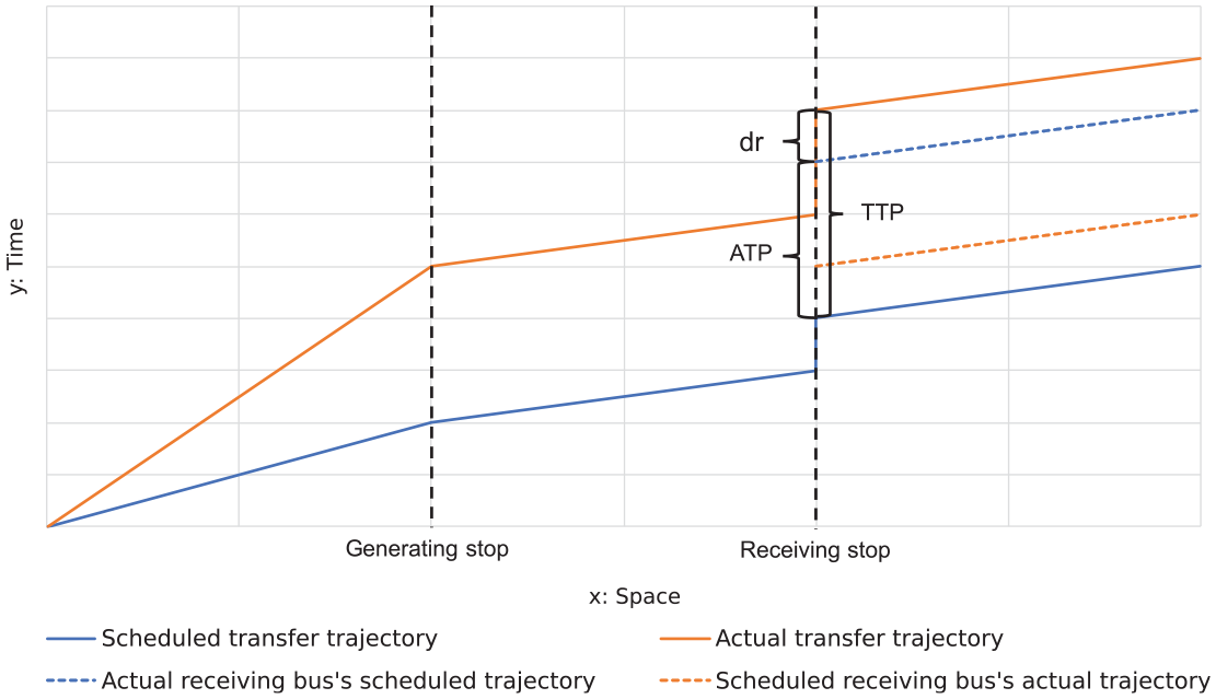
Time–space diagram of a delayed transfer and the corresponding scheduled transfer.
Due to the desynchronisation, the actual receiving bus can be different from the scheduled receiving bus. We can conceptualise the schedule of all buses running on the same route as an array of trips (a trip sequence array). We assume that the passenger will always take the first available bus. If the generating bus is sufficiently late, the passenger will miss the scheduled bus and need to take a later scheduled bus. Likewise, if the receiving buses are sufficiently late, the passenger can catch an earlier receiving bus in the trip sequence array. The desynchronisation degree (DD), an integer variable, measures a transfer’s desynchronisation in the trip sequence array: it represents the order number of the actual bus before/after the scheduled bus. For example, if the actual bus is the nth bus after the scheduled bus, the DD is n; if the actual bus is the nth bus before the scheduled bus, the DD is –n; if the actual bus is the scheduled bus, then the DD is 0.
Transfer time penalties
We calculate two types of potential time penalties for each transfer. The first is total time penalty (TTP):

where:
To quantify these two different types of delay, we decompose TTP as follows:

where:
The two parts of TTP’s decomposition, ATP and
Beyond a single transfer’s time penalty, we can expand the measure to a collection of transfers. The collection can have different spatiotemporal definitions depending on different purposes, such as transfers between two routes during an hour every day, or transfers at a stop during a year. We can measure the average total transfer time penalty (ATTP) for a collection of transfers

where:
Transfers: The good, the bad and the ugly
We classify all transfers into three types according to their real-time synchronisation performance. We can distinguish them by the receiving bus’s desynchronisation degree.
The good: normal transfers (DD = 0). A passenger getting on a normal transfer will catch the same bus as the scheduled transfer. Under this circumstance, ATP = 0, which means there is no additional time penalty, while the performance can still be different from the schedule due to the normal delay of the receiving trip.
The bad: missed transfers (DD > 0). The passenger will take a bus after the scheduled bus, hence will suffer from an additional time penalty other than normal delay. Under this circumstance, ATP > 0. The missed transfers have several scenarios: (1) the generating trip is delayed such that the user cannot catch the scheduled receiving bus; (2) the scheduled receiving bus is out of service; 3) the scheduled receiving bus is severely delayed after another receiving bus. Scenario 1 is the most common circumstance. For scenario 2, if the scheduled receiving trip is no longer running, the passenger must take the next bus. Likewise, for scenario 3, a severely delayed bus can be caught up by another bus on the same route scheduled after it. It is natural for users to take the closest bus despite the buses being out of sequence.
The ugly: pre-emptive transfers (DD < 0). During a pre-emptive transfer, instead of the scheduled bus, the user will get on a bus which should have arrived earlier than the passenger at the receiving stop. This is due to delays in the receiving buses. The passenger will naturally take the nearest bus regardless of the schedule. The ATP’s value can be negative, zero or positive; however, a negative ATP will not necessarily suggest a better performance since the TTP can meanwhile be positive. In fact, a pre-emptive transfer’s TTP does not guarantee to be worse than a normal transfer; it may achieve a better, same or worse performance depending on the synchronisation process. With some licence, we refer to these as ‘ugly’ since they are they are unpredictable with respect to impact.
Accordingly, we measure each transfer with a binary value


where:
Determining valid transfers
There are four policies for transfer scheduling in public transit systems: (1) unscheduled transfers; (2) scheduled transfers without vehicles waiting; (3) single holding strategy that lower-frequency vehicles wait for higher-frequency vehicles; (4) double holding transfer that both vehicles hold for transfers (Ceder, 2016; Knoppers and Muller, 1995). Many transit authorities, especially those that rely on buses, use an unscheduled transfer policy, meaning that there are few explicitly scheduled transfers in the GTFS static data. Moreover, in reality, transit users’ transfer behaviour and transit real-time apps will not strictly follow the scheduled transfers.
Consequently, we have to search empirically for possible transfers from the GTFS static data. Theoretically, any two trips at two stops which are proximal enough for users to access can be regarded as a valid transfer. This can be refined with passenger data that shows actual transfers; it is likely to be a subset of the valid transfers. However, the danger with this approach is that we may miss a potential transfer if it did not occur in the data.
Based on the data structure in the GTFS data, we define three levels of aggregation: stop, route and trip. Every trip is run according to a fixed schedule by a bus at a specific time. Trips with the same schedule can be aggregated into a route, and some routes can be bound to a stop. To find transfer schedule from GTFS schedule, we developed a hierarchical searching algorithm in the Python and MongoDB environment. Using the algorithm, we derived all possible stop combinations, route combinations and GTFS trip combinations. Only those combinations with near distance (Euclidean distance < 100 metres) and unique routes are selected for the transfer schedule: if there are multiple transfers with the same route combination and same generating stop, we only keep the one with the shortest walking distance to remove some redundancy, since passengers are most likely to walk to the closest stop for a transfer.
Analysis
We conducted a case study using data from the Central Ohio Transit Authority (COTA) bus system in Columbus, Ohio from February 2018 to January 2019. We acquired the General Transit Feed Specification (GTFS) schedule and real-time data via the COTA public application programming interface. COTA shared the Automated Passenger Count (APC) dataset from May 2018 to January 2019. When merging the APC and GTFS datasets, 45.06% of the total records were matched on average, meaning that roughly half of the GTFS data were updated with the more accurate APC data. Based on the GTFS alone, the average risk of missing (RoMT) over the study period is 7.14% (
We archived the data using a MongoDB database. The GTFS real-time data, APC data and their auxiliary databases total nearly one terabyte. Due to this large database size, we optimised and parallelised our code to deal with the computational burden. We also developed different summary measures based on varying spatial or temporal aggregations.
Spatial patterns
To investigate the spatial pattern of missing risk, we first conducted spatial aggregation, since trip patterns (each vehicle trip; the finest level of resolution) are too specific and not representative of broader patterns. We can aggregate in different ways. Naturally, route patterns are useful, which aggregate the trip combinations based on their route schedules. Stop patterns are also useful since the quality of transfers between stops is assessed and stop combinations are geographically distinguishable, making it especially crucial for visualisation. We concentrate on stop patterns in our analyses.
Figure 2 shows the spatial pattern of the RoMT and ATTP. It shows some differences between RoMT and ATTP’s spatial distribution, especially on High Street (the major north–south thoroughfare in Columbus, indicated by a red ellipse in Figure 2), and the northern downtown area (indicated by a green rectangle in Figure 2). Stops along High Street have relatively higher missing risk but also have relatively lower average total time penalty. This is likely due to traffic and other disturbances on this route elevating the risk, although headway between buses is short meaning the time penalty is small. Similarly, the high ATTP clusters on some roads in the downtown area and on some peripheral roads that do not have higher RoMT. Although the RoMT is low, the time delay can be high, especially for downtown, due to longer headways.
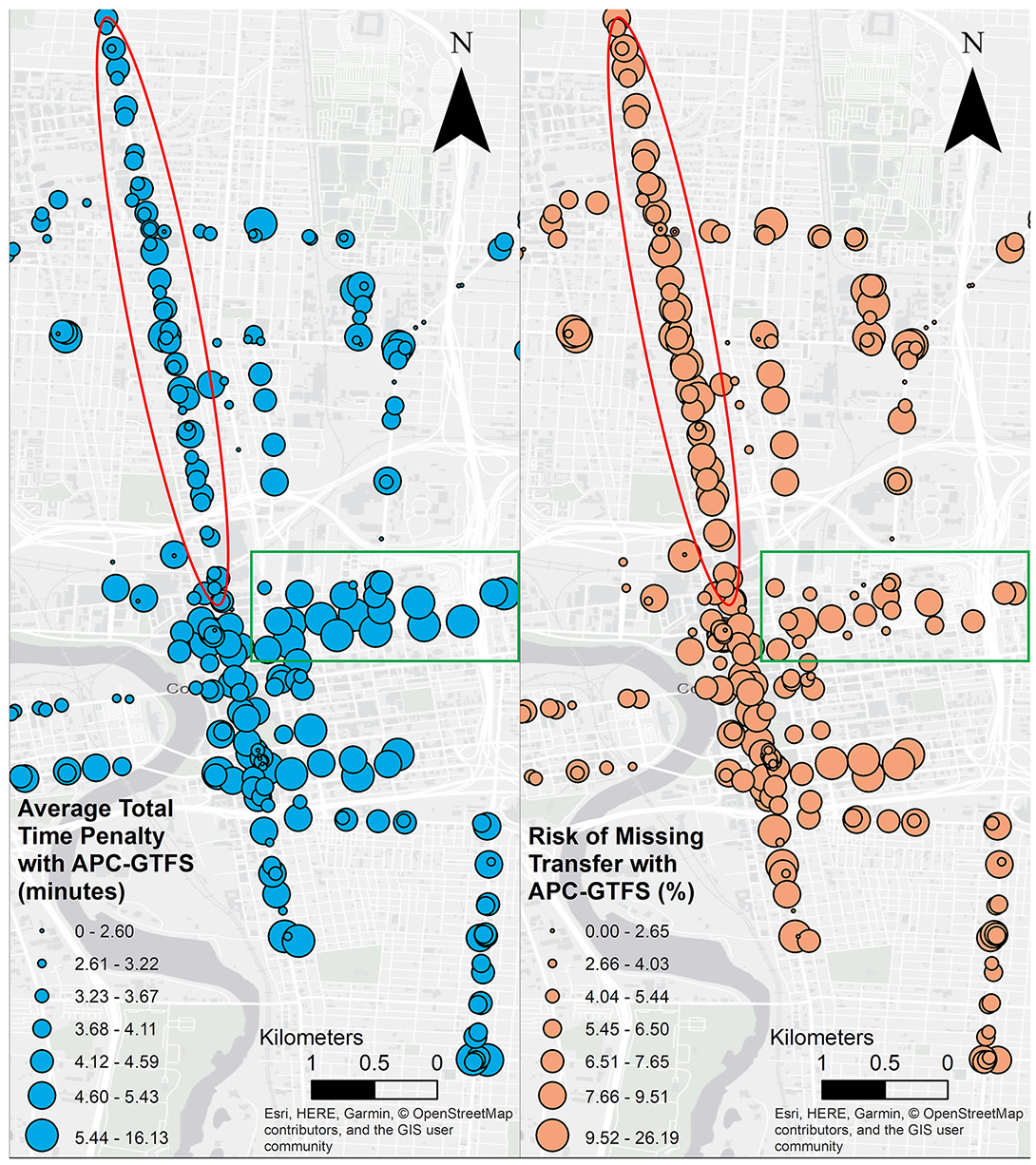
Spatial pattern of ATTP and RoMT (in quantile classification).
Temporal patterns
We now examine aggregate temporal patterns of risk of missing transfer (RoMT) and average total time penalties (ATTP). Figure 3 provides the monthly trends of RoMT and ATTP for both datasets. July, December and January show an overall low time penalty pattern. This can be due to better overall traffic conditions during summer and holiday season vacations. August is the worst month to take a transfer; this may be because it is when the academic year starts in a city with a massive university campus near the city centre.

Overall monthly RoMT and ATTP trends.
Figure 4 provides the aggregate trends by day of the week and frequency. We can see that the overall RoMT and ATTP peak is on Friday; Wednesday, Thursday and Friday exhibit higher levels of risk and time penalties, likely due to the overall traffic pattern in this city. Both measures are relatively low on weekends, as would be expected due to lower traffic congestion. RoMT and ATTP are relatively low on Mondays, possibly due to flexible working schedules and long weekends for some residents, leading to less commuting. However, we observe that Sundays have the lowest ATTP. Intuitively, frequency can be a significant factor accounting for the measures. We conducted Pearson correlation analyses on ATTP and RoMT and found no significant correlation with daily frequency: p-values are 0.38 for ATTP and 0.118 for RoMT.
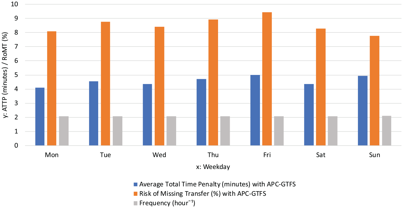
Overall weekday RoMT and ATTP trends and daily frequency.
Figure 5 illustrates the hourly trend. There are three major time periods when missing risk and penalties are high: mornings (8:00–10:00), evenings (17:00–19:00) and night hours (22:00–24:00). High risk and penalties during the morning and evening periods can be explained by overall traffic patterns during these busy hours. However, the night-time, with lower traffic, also displays high risk and high total time penalty. At night, as the risk increases and service frequency decreases, the time penalties are higher due to sparser scheduled services. In terms of frequency impact, according to the Pearson correlation analyses between each measure and the hourly frequency shown in Figure 6, ATTP has a significant negative correlation with the frequency, while RoMT has no significant correlation with the frequency.

Overall hourly RoMT and ATTP trends.

Scatter plots of ATTP (left side) and RoMT (right side) versus frequency.
Simulating the impacts of dedicated bus lanes
Dedicated bus lanes (DBLs) can provide benefits for a bus system by reducing delays due to automobile traffic. Without the disturbance of traffic congestion, bus rapid transit systems with separated DBLs can achieve rail-like performance (Li et al., 2009). We simulated the impact of DBLs on delays, missing risk and time penalties using the methods in this article.
We selected the COTA bus route number 2 as the target, since it has the most transfers and the most ridership in the system (see Figure 7). We simulate the impact of a DBLs by assuming that all the buses running on this route will behave according to the GTFS static schedule data after DBLs are in effect (i.e. no delay). This assumption is hypothetical, and the results represent an upper bound on the actual DBL performance. We analyse RoMT and ATTP’s changing trend before and after applying the assumption, and visualise the different spatial patterns (see Figure 7). Across all stops on the route, the DBLs will save 1.72 minutes (
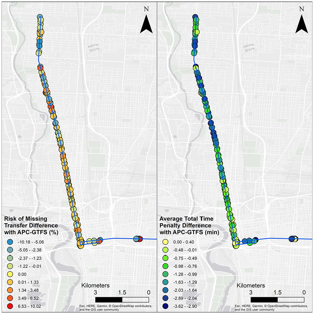
RoMT and ATTP difference after simulated implementation of a Dedicated Bus Lane.
Also, we calculated different impacts on the generating trips and receiving trips. We categorised all affected transfers into two classes: transfers with generating trip on the DBL (DBL-generating transfers) and transfers with receiving trip on the DBL (DBL-receiving transfers). DBLs will save DBL-generating transfers 2.25 minutes and 5.25% risk, while only saving DBL-receiving transfers 0.32 minutes and increasing the risk by 9.03%. The KS tests between the two types of transfers show significant differences for both measures (p-value
Conclusion
Big data create an unprecedented opportunity for more and deeper understanding of urban public transit systems and the study of transfers. However, due to a historical lack of attainable big data sources, few studies to date have focused on transfers’ on-time performance in a real-time context. Based on high-resolution GTFS and APC real-time and static data of huge volume, we developed risk of missing transfer (RoMT) and average total time penalty (ATTP) measures to assess transfer performance. RoMT and ATTP indicate the systemic quality of transfers and the corresponding potential time cost. These measures provide important information for transit system planners and administrators concerning transfers’ feasibility and quality and the user experience. Our spatial and temporal analysis using the COTA system as a case study uncovered both general patterns like overall traffic and transit system delay, as well as some unique patterns, such as high time penalty during the night-time due to larger headway. Additionally, we simulated dedicated bus routes’ impact on transfer performance. This suggested that even a single route DBL can reduce ATTP, especially for DBL-generating transfers.
With the support of big data, the RoMT and ATTP we have developed are a further step towards sustaining smarter public transit systems. Compared with existing indexes and measurement systems, the spectrum of the proposed measures’ audience is broad: besides academic and administrating purposes, ordinary passengers and open source developers are also potential users. Thanks to high-resolution public transit big data, we can calculate corresponding performance based on specific transfers as well as overall broad patterns:
At the application level, urban dwellers can query each transfer’s performance in their real-time transit apps and react correspondingly. Current mainstream transit apps do not show empirical risk and average time loss, especially for transfers over which users have no control. If a proposed transfer’s empirical performance is shown when the apps plan the trip, users can avoid high risk routes. This is similar to airline apps showing the on-time performance of air routes. Unlike some composite indexes that are hard to conceptualise, RoMT and ATTP are both intuitive since they use common metrics, namely probabilities and time.
At the management level, administrators can check the high risk and high time penalty areas and respond. With the support of real-time data and measures, transit authorities can make operational changes such as adding additional buses, enforcing bus timetables to reduce risk and planning flexible timetable adjustment. City planners can analyse spatiotemporal patterns of risk and time penalties. The patterns of proposed measures can demonstrate important information about the roads, transit system design and other transport and non-transport factors.
At the policy-making level, policy makers should compare different public transit systems’ transfer real-time performance across the US. Due to the high reusability and expandability of the indexes and the system, they can be easily implemented and applied to any transit system with published GTFS scheduled and real-time data without major modification. The common metrics also make intra-system and inter-system comparison much easier.
Future research direction can concentrate on smart and human sensors, generating abundant and high-resolution big data for analysis. Based on more precise and abundant data, there are more possibilities for more scientific planning, improvement and knowledge derivation of transfer activities and the transit system. Moreover, there are still several limitations for this article: though we compared datasets of different temporal accuracy, we do not have a good answer for how spatial accuracy will influence the results and how the overall impact of inaccuracy can be decomposed into the two factors. We also do not consider population and ridership factors; with transfer ridership data, we can incorporate these factors into the system.
Footnotes
Acknowledgements
The authors thank the Central Ohio Transit Authority (COTA) for sharing their data and ideas.
Declaration of conflicting interests
The author(s) declared no potential conflicts of interest with respect to the research, authorship, and/or publication of this article.
Funding
The Center for Urban and Regional Analysis (CURA) at The Ohio State University supported this research.
