



Abstract
Visual illusions have been a popular topic of study for a long time, but in recent years, a number of authors have questioned the coherence of this notion. This article deals in depth with ways in which illusions have been, could be, and should be defined and with various criticisms and different conceptions of the notion of illusions. After a review of definitions of illusions in the relevant literature, a more comprehensive but also more restrictive framework is presented, involving both veridicality and illusoriness, and is illustrated using two variants of a 2 × 2 scheme for the presentation of illusions. Many different aspects of illusions are discussed. A set of criteria for illusionhood is listed. Criticisms of the notion of illusions are presented, commented upon, and responded to. Conceptions of illusions differing from the one advocated here are discussed. Throughout the paper, novel variations of illusions are shown, and problems with accounts of some well-known illusions are noted. Examples of strong context effects which are not considered to be illusions are presented. It is concluded that the notion of visual illusions, suitably reformulated, is still viable.
Sensory illusions, and in particular illusions of the visual sense, have been known for a very long time (Wade, 2017). Illusory displays tend to cause bemused puzzlement and pleas for explanation by casual viewers and have attracted the attention of psychologists, philosophers, neuroscientists, physicists, and artists. Visual illusions have been the subject of countless research papers, many textbook sections, and several comprehensive treatises and collections (Calabi, 2012; Coren & Girgus, 1978; Da Pos & Zambianchi, 1996; Goto & Tanaka, 2005; Gregory, 2009; Luckiesh, 1922; Martinez-Conde & Macknik, 2017; Ninio, 2014; Robinson, 1972/2013; Shapiro & Todorović, 2017; Tolansky, 1964; Vicario, 2011; Wade, 1982, 2005; Wundt, 1898a, 1898b). Illustrations of visual illusions have appeared not only in practically every perception textbook but also in many textbooks of general psychology and cognitive neuroscience as well. Among many other resources, there is an annual best illusion contest (http://illusionoftheyear.com/); a comprehensive academic web site devoted to visual illusions (https://michaelbach.de/ot/); an ever-growing treasure trove of original, diverse, stunning, and elegant visual illusions (http://www.ritsumei.ac.jp/∼akitaoka/index-e.html); and a book teaching how to program visual illusions (Bertamini, 2017). They can also be found in many publications and on internet sites aimed at the general public and even in specialized galleries (https://www.museumofillusions.com/) for purposes of entertainment.
In everyday talk and non-scientific publications, the label visual illusions is generally used to refer, somewhat vaguely, to all kinds of surprising, intriguing, “common sense-defying,” and “brain-melting” visual presentations of very varied types. There have been several attempts to bring some analytic order into this “chaotic zoo” (Koenderink, 2017) by setting up a classification system (Coren et al., 1976; Gregory, 1997; Hamburger, 2016; Hecht, 2013; Koenderink, 2017; Menshikova, 2012; Vicario, 2011; Westheimer, 2008). However, in recent years, the appropriateness of the very notion of illusion has been questioned by a number of authors. Here are some relevant quotations: “There may be no meaningful way to distinguish between those perceptions that should be classified as ‘veridical’ and those that should be classified as ‘illusory’” (Rogers, 2017, p. 154); “It is hard to pin down what is being claimed in labeling an experience ‘illusory’” (Schwartz, 2012, p. 25); “The very notion of veridicality itself, so often invoked in vision studies, is void” (Koenderink, 2014, p. 5); “Notions of ‘perceptual errors’ have greatly impeded theoretical progress in perception theory” (Mausfeld, 2011, p. 29); “The implication of a departure between perception and reality has little to no justification in post-Kantian scientific discourse” (Morgan, 2018, p. 9). This type of attitude toward illusions is also reflected in the very titles of some papers: “The illusion of visual illusions” (Schwartz, 2012); “Delusions about illusions” (Rogers, 2014); “Why the concept of ‘visual illusions’ is misleading” (Purves et al., 2017); “Notions such as ‘truth’ or ‘correspondence to the objective worl’ play no role in explanatory accounts of perception” (Mausfeld, 2015); and even “Illusion research: an infantile disorder?” (Braddick, 2018).
Is the concept of “illusion” really such a totally hopeless muddle? What exactly is wrong with using this well-established label for well-known phenomena such as same-sized circles appearing to have different sizes (Ebbinghaus illusion), parallel lines looking non-parallel (Zöllner illusion), identically colored patches seemingly exhibiting different colors (simultaneous color contrast), and many others? In this article, my aim is to examine this notion, discuss various criticisms addressed at it, and formulate a conception hopefully immune to such criticisms. It is not unusual for concepts to have a central core and fuzzy boundaries, and here an attempt is made to put what I consider to be the central core of the notion of illusions in clearer focus and sharpen its boundaries. 1
Part 1 of the paper contains a review of traditional definitions of visual illusions and an analysis of their characteristics. In Part 2 a framework for illusions is introduced, which includes both illusoriness and veridicality. Illustrations and variants of this framework are presented, and a number of relevant issues are considered in depth. Part 3 contains discussions of several types of criticisms of the notion of illusions and provides some responses to them. Part 4 presents comments on several conceptions of illusions that differ from the one advocated here. Then, Part 5 provides a summary and conclusions, followed by some closing remarks in Part 6. The paper contains mainly analyses and conceptual issues so that experimental data and theories of illusions are not in focus. However, also included are some novel variations and several illustrations of challenges and problems for popular accounts of some well-known illusions. The paper is relatively long and touches on many illusions-related issues, which are interdependent in many ways. I have addressed a number of related issues in previous publications (Todorović, 2002a, 2002b, 2010, 2014b) but here the stress is on those aspects which are relevant for discussions of the notion of illusions and its criticisms.
1. Traditional Definitions of Visual Illusions
Before discussing various criticisms, it will be helpful to review how illusions have actually been historically defined in the relevant literature. In the following, I will cite a fair number of definitions, retrieved through an informal review of some authoritative psychological sources, followed by some definitions from the recent philosophical literature. Unfortunately, authors of candidate books and papers that I considered in the survey have not always bothered to actually define illusions or to provide compact, citable definitions. As will be shown later, psychological definitions of illusions tend to cluster in two groups, which will be labeled as “narrow” and “broad,” but there are also intermediate forms. The translations of definitions from German sources are mostly my own.
Although the insight that the senses may not provide reliable information about the world is ancient, the origin of a more general and systematic study of visual illusions is usually traced to a paper by Johann Joseph Oppel (1854/1855; see Wade et al., 2017 for a translation, and Phillips & Wade, 2014 and Todorović, 2017, for discussions of Oppel’s work). He introduced the term “geometrical-optical illusions” to denote those phenomena in which “the eye … is in error relative to the dimensions or directions of linear and angular sizes” (p. 4 in Wade et al., 2017). A number of later authors have adopted similar definitions, which are relatively narrow, compared with broader definitions presented later. For example, in a monograph on visual illusions, Wundt (1898a) defined this class of effects as “errors in the apprehension of spatial extents, directions, and differences of directions” (p. 55). Ebbinghaus (1913), in a lengthy and informative textbook section on illusions, introduced them as follows: when one observes simple plane figures, consisting mainly of only a few lines, often conspicuous differences are manifested between spatial relations as seen directly by the eye and as can be shown indirectly to be present by way of measuring aids. (pp. 51–52)
Switching to English language sources, in a textbook of psychology, Titchener (1928) described visual illusions as follows: “There are … certain simple arrangements of dots and lines that yield, in perception, a result markedly different from the result which measurement would lead us to expect” (p. 332). Woodworth (1938), in a widely recognized textbook of experimental psychology, defined illusions as “errors in apparent length, area, direction or curvature [which] occur in the perception of patterns of lines” (p. 643). In a later edition, Woodworth and Schlossberg (1954, p. 417) repeated this phrase verbatim. According to Rock’s (1975) excellent visual perception textbook, “Most of the well-known illusions can be considered to be either perceptual distortions of magnitude (length or size) or perceptual distortions of direction of lines” (p. 391). In a Scientific American paper on illusions, Gillam (1980) wrote that “Geometrical illusions are line figures in which the length, orientation, curvature or direction of lines is wrongly perceived” (p. 102). In a book on illusions, Wade (1982) stated that “Geometrical illusions are relatively small distortions of visual space. The distortions relate to size, shape, direction or movement” (p. 162).
In most of the books and papers listed earlier, the cited definitions were accompanied by a fair number of illustrations and discussions of various visual illusions involving mainly size, shape, position, and orientation. They generally involved a selection from roughly two dozen simple abstract two-dimensional (2D) constellations of lines and shapes, with many variations; such figures are contained in numerous sources in the psychological literature of the last 150 years. These illusion-inducing configurations were mainly introduced by and later named after researchers flourishing in the second half of the 19th century and the first half of the 20th century. A list of these authors includes Oppel, Kundt, Müller-Lyer, Brentano, Zöllner, Poggendorff, Hering, Wundt, Ebbinghaus, Münsterberg, Delboeuf, Jastrow, Judd, Baldwin, Fraser, Ponzo, Sander, Ehrenstein, Orbison, and others, well known to students of illusions. Only a few phenomena were not named after people but after appearance, such as the “twisted cord” or the “vertical-horizontal” illusion.
In addition to this class of geometric effects (hence Oppel’s label “geometric-optic illusions”), some configurations involving photometric effects are usually also counted as illusions. They include phenomena such as simultaneous lightness/brightness contrast and assimilation, Hermann’s grid, Mach bands, the Koffka–Benussi ring, the Wertheimer–Benary cross, the White effect, the Cornsweet illusion, and others. In an extension of Oppel’s terminology, a common label for these geometric and photometric classes of phenomena could be “geometric-photometric illusions.” However, I will mostly refer to them as classical visual illusions, even though some are of a more recent date. It is this set of effects which are my main focus in this article. What will not be considered here are related phenomena in the perception of chromatic colors, stereo vision, and motion and other temporal effects.
Note that most of the definitions of illusions cited earlier have a quite circumscribed area of application, in that they generally involve only particular types of visual objects (such as simple abstract 2D configurations), particular types of visual attributes (features) of these objects (such as size, shape, position, orientation, or color of their elements), and particular types of discrepancies (deviations of perceived features from corresponding objectively measured features). However, the psychological literature also contains much broader and more abstract definitions of illusions, which specify neither the types of objects, nor their features, nor the nature of the discrepancy in any detail. For example, Day (1984) defined illusions as “Consistent and persistent discrepancies between a physical state of affairs and its representation in consciousness” (p. 47). Gregory (1996) suggested that illusions could be defined as “Disagreement[s] with the external world of objects” or as “departures from truth, or from physical reality” (p. 503). Palmer (1999) defined illusions as “systematically non-veridical perceptions,” where “veridical” means “perception that is consistent with the actual state of affairs in the environment” (pp. 6–7); he also described illusions as cases in which “we perceive a situation that differs systematically from reality” (p. 313). Martinez-Conde and Macknik (2013) wrote that “Visual illusions are defined by the dissociation between the physical reality and the subjective perception of an object or event” (p. 4).
Some authors have used both broad and narrow definitions. For example, Rock (1975) preceded the narrow definition cited earlier with broader definitions, such as “non-correspondence between perception and the objective situation” (p. 391), or as follows: “An illusion is a sensory impression or perception that is false or incorrect. By incorrect is meant that what we see … does not correspond with the objective situation that can be determined by other means, e.g. measurement” (p. 390). Similarly, Gillam (1998, p. 95) used a narrow definition when she wrote that geometrical-optical illusions are “simple line drawings in which one or another perceived metric property is markedly erroneous,” but provided a broad definition when she stated that “The term illusion typically refers to a discrepancy between perceived reality and objective or physical reality.”
There is a parallel literature on illusions in writings of philosophers, and I will cite some recent work in the analytical tradition. For example, Smith (2005) defined an illusion as “any perceptual situation in which a physical object is actually perceived, but in which that object perceptually appears other than it really is” (p. 23). For Fish (2009), “illusions are cases in which a particular can appear to us to exemplify a property that it objectively lacks” (p. 146). Brewer (2011) defined a visual illusion as “a perceptual experience in which a physical object, o, looks F, although o is not actually F” (p. 8). Macpherson and Batty (2016) wrote that in illusions as traditionally defined “you perceive an object but you misperceive one or more of its properties” (p. 287). McLaughlin (2016) characterized illusions as follows: “Sometimes something looks some way to us that it isn’t. How it looks is not how it is. That happens whenever we have a visual illusion” (p. 233). Schellenberg (2018) wrote that “in the paradigmatic case of illusion, it seems to us that an object has a property that it does not in fact instantiate” (p. 15). These definitions are all similar and tend to be much less specific and thus broader than the narrow definitions in the psychological literature. However, they are somewhat narrower than the broad definitions in two respects: Instead of talking generally of “reality,” they focus on properties of single objects, and the notion of “discrepancy” is specified as objects not looking as they are. The discussion of the philosophical views is continued in Part 4, in which conceptions of illusions different from the one advocated here are addressed.
What can be concluded from this plethora (about two dozen, and more could be added easily) of definitions of illusions? In the psychological literature, the narrower definitions mainly just list the cases of perceptual distortions of various attributes in classical illusions, whereas the broader definitions aim to provide a succinct and general common characteristic of all these phenomena. In logical terms, the broader definitions are generalizations of the narrower definitions because perceptual distortions of physical specifications of positions, sizes, orientations, colors, and so on, are just particular instances of discrepancies between appearance and reality. The problem is that, as discussed in Part 3, there are a number of phenomena which fit the broader definitions but are usually not labeled as illusions in the vision science literature. The existence of such problematic cases provides a basis for the claim that the notion of illusions is incoherent. One way to meet this criticism is to argue that the broader definitions are too broad and include phenomena which are not classical illusions. Accordingly, in Part 2, I will attempt to formulate an approach to illusions with a narrower scope, but not just by listing cases of illusory phenomena but rather by identifying a number of criteria that characterize classical illusions. According to these criteria, illusions are indeed discrepancies from reality, but not all discrepancies from reality are illusions. In Part 3, I will argue in detail how the problematic cases fail to exhibit one or more of these criteria and will also address a number of other criticisms of the notion of illusions. However, I will first discuss what I see as a shortcoming of both narrow and broad definitions and propose how it can be amended.
2. An Augmented Framework for Illusions
The philosopher Susan Stebbing (1937) wrote that “There is no sense in saying that I am suffering from an illusion unless I know what it is not to be suffering from an illusion” (p. 129). Indeed, any definition of illusory perception logically implies a corresponding definition of its opposite, veridical perception, though this is seldom made explicit (but see Schwartz, 2012). Here, I will present a framework which is more comprehensive than the traditional definitions, in the sense that it includes both illusoriness and veridicality. The format is somewhat analogous to Aristotle’s twofold definition of both falsity and truth: “To say of what is that it is not, or of what is not that it is, is false, while to say of what is that it is, and of what is not that it is not, is true” (Metaphysics, 1011b25). In this analogy, truth corresponds to veridicality and falsity to illusoriness, and both are instantiated in two forms. The statements involving “what is” and “what is not” correspond to “reality,” and refer to certain objective, physical attributes, whereas the statements involving “saying that it is” and “saying that it is not” correspond to “appearance,” and refer to perceptual judgments of these attributes. Note that none of the previously cited definitions, broad or narrow, explicitly mentioned veridical cases, nor included two types of illusory conditions.
The proposed framework will be first described and illustrated in detail by presenting a number of illusions in a methodical fashion in two different but related formats. These are the dual target format, described in Section 2.1, and the single target format, described in Section 2.2. These systematic representations of illusions will be repeatedly referred to in subsequent discussions. Section 2.3 deals with the distal – proximal distinction and its relevance for illusions. Based on the examples and the discussions, in Section 2.4, the framework will be summarized in the form of a set of criteria which have to be met by illusory phenomena. That section will also address additional aspects of illusions.
2.1. The Dual Target Format
This section contains illustrations of the proposed scheme, as exemplified by three well-known illusions. As will be described later, the illustrations in this section involve pairs of target objects. The next section contains three illustrations of illusions using a single target object and a discussion of the relevance of the difference between the two formats. The stress in the following discussions is on the features of the common formats in which the illusions are presented, but some issues concerning their quantification and explanation will also be addressed, including additional illustrations of illusions.
2.1.1. The Müller-Lyer Illusion
The first example of the application of the “Aristotelian” illusion scheme is presented in Figure 1, illustrating the Müller-Lyer illusion. To introduce and clarify the structure of the scheme, this example will be described at pedantic length, and the subsequent descriptions will be much shorter because they follow the same format. Figure 1 is a 2 × 2 table consisting of four cells or cases, labeled A, B, C, and D. The cases are displays which contain target objects and contextual elements, including backgrounds. In this illustration, the target objects are pairs of horizontal lines (“shafts” or “axes”), and the contextual elements are the appendages at their ends, in the form of short lines. In Cases A and D, the appendages are perpendicular to the shafts, whereas in Cases B and C, the appendages subtend acute and obtuse angles with respect to the shafts, that is, they form inward and outward oriented “chevrons.” I hope that Herr F. C. Müller-Lyer 2 could forgive me for misusing his compound surname for purposes of convenient and concise designations of elements of his illusory configurations, by calling the lines with outward chevrons the “Müller lines,” which together with the chevrons form the “Müller figures” and the lines with inward chevrons the “Lyer lines,” which together with the chevrons form the “Lyer figures”; as a mnemonic aid, note that the word “Lyer” is shorter that the word “Müller,” just as the Lyer lines look shorter than the equally long Müller lines.
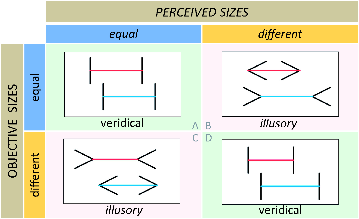
Müller-Lyer Illusion. The target objects are pairs of horizontal straight lines (“shafts”), presented in four cases. Objectively, the lengths of the two lines in a pair are either equal (top row, Cases A and B) or different (bottom row, Cases C and D). Subjectively, the lengths of the two lines are perceived as equal or nearly equal (left column, Cases A and C) or as clearly different (right column, Cases B and D). The impressions of their relative lengths are either veridical (Cases A and D) or illusory (Cases B and C).
The target lines have several features, such as their position, color, orientation, and so on, but in this illusion, the critical feature is their length, and the research issue is the comparison of their lengths. There are two types of comparisons, objective (physical) and subjective (perceptual or phenomenal). Objectively, the lines either have physically equal lengths or physically different lengths; subjectively, the lines can be perceived as either having equal lengths or different lengths. The two objective possibilities correspond to the first and second row of the table in the figure, and the two subjective possibilities correspond to the first and second column. The four cells of the table arise from crossing the pairs of objective and subjective possibilities.
Considering the objective relations, in the first row, the two horizontal target lines in Case A have physically equal lengths, and the two target lines in Case B are their duplicates, thus also being physically equal; in the second row, the target lines in Case C have physically different lengths, and the target lines in Case D are their duplicates, thus also being physically different. Considering subjective relations, in the first column, the two lines in Case A look equal with respect to length, and the two lines in Case C also look equal (or at least approximately equal; I will comment on this aspect later); in the second column, the lines in Case B and in Case D look different with respect to length, in a similar way. If “iso-longitudinal” is defined as “being equal with respect to length,” and “allo-longitudinal” is defined as “being different with respect to length,” then these relations can be expressed more concisely (if somewhat pompously) in the following way: In case A, actually iso-longitudinal lines look iso-longitudinal; in Case B, actually iso-longitudinal lines look allo-longitudinal; in Case C, actually allo-longitudinal lines look iso-longitudinal; and in Case D, actually allo-longitudinal lines look allo-longitudinal.
The arrangement of the four cases can be thought of as an implementation of a 2 × 2 factorial design. Furthermore, the four cells in the table are formally analogous to four cases in a 2 × 2 contingency table in the signal detection framework in which “equality” is the signal to be detected. Considering veridicality and illusoriness, in close analogy to Aristotle’s definition of truth and falsity, there are two cases in which the perceptual judgments are veridical and two in which they are illusory, located on the diagonals of the table. Veridicality obtains in Cases A and D (marked with pale greenish backgrounds): Case A involves veridical perceptual equality, corresponding to a hit in signal detection terms; Case D involves veridical perceptual difference (or absence of equality), corresponding to correct rejection. Illusoriness obtains in Cases B and C (marked with pale reddish backgrounds): Case B involves illusory perceptual difference (or absence of equality), corresponding to a miss; Case C involves illusory perceptual equality, corresponding to a false alarm. In statistical terminology, Case B is analogous to type 1 errors (wrongly detecting difference where it does not exist), and Case C is analogous to type 2 errors (wrongly detecting equality where it does not exist).
In the veridical cases (A and D), the contextual elements, the appendages, are equal for both targets, whereas in the illusory cases (B and C), they are different. Equality of contexts in the veridical cases would also be instantiated if the contexts were empty, that is, in case of plain lines with no appendages. Equality of contexts ensures that they are neutral, in the sense that they do not differentially affect the appreciation of the critical feature of the target objects, in this case their length; in principle, neutrality may also obtain for some instances of different contexts. In contrast, in the illusory cases, the contexts of the target objects are not only different, they are non-neutral and biasing, in the sense that they are associated with different effects on the perception of the critical features of the targets. Much more will be said about the role of context effects in illusions in later sections. For an earlier treatment of context effects, see Todorović (2010).
Figure 1 contains a presentation of the Müller-Lyer illusion. The next step is its quantification. How can the illusory impressions of length be expressed numerically? Consider Cases A and B, in which the two target lines have physically equal lengths, but whereas in Case A, the lines look equal or very similar, in Case B, the Lyer line looks convincingly and saliently shorter than the Müller line. One way, though not a particularly good way, to try to express this effect quantitatively, that is, to establish how much shorter one line appears than the other line, would be to ask subjects to report the ratio of perceived lengths of the two lines. For example, a subject might say that the Lyer line looks about 20% shorter, that is, that its perceived length is about 80% of the perceived length of the physically equally long Müller line. But although such a task could be used, it is usually not used, as it presupposes relatively reliable capacities to express perceived spatial relations quantitatively. However, there are other ways to quantify percepts which are less demanding of subjects. Consider Cases C and D, in which the lengths of the two target lines are different, but whereas in Case D they do look different, in Case C they look equal or nearly equal. When the lengths of the two physically unequal lines in Case C are measured, it turns out that the length of the physically shorter, Müller line, is 22% shorter, that is, that its length is equal to 78% of the length of the physically longer, Lyer line, which is a quantitative measure of the illusion. Thus, the strength of the illusion is expressed numerically not through subjective ratios of physically equal but perceptually different lines but through objective ratios of physically different but perceptually equal lines. Another way to quantify the illusion is to use two-alternatives forced-choice techniques, in which many pairs of lines are presented to subjects, according to a prepared schedule, and they are not asked to adjust their lengths or whether they look equal or not equal, but which line in the pair looks shorter (or longer) than the other line. This procedure yields a quantitative measure of the illusion, the so-called point of subjective equality of objectively different stimuli. It should be stressed that an important achievement of psychophysical research over many years since Fechner’s work in the 1860s was the methodological development of sophisticated techniques for reliable measurements of subjective impressions (see Kingdom & Prins, 2016).
In the preceding paragraphs, I have described ways in which the Müller-Lyer illusion can be presented in a systematic way and expressed quantitatively. The next, pressing question is how it can be explained. Theories are not in the focus of this article, but it would be incomplete without addressing some theoretical issues, as will be done at several places in the text. What is the cause of the salient discord of reality and perception in the Müller-Lyer illusion? It is fair to say that more than 130 years after the illusion was first demonstrated (Müller-Lyer, 1889/1981), we still do not know for sure—but not for a lack of interest, theories, and experiments! If anything, during this time, we may have accumulated too much data about this effect for a single theory to be able to account for it all.
An influential theoretical approach is to attribute the illusion to automatic effects of perspectival depth interpretations (Gregory, 1963). I will briefly describe this account and then present some counterexamples. The starting observation is that the two Müller-Lyer configurations look like projections of spatial dihedral or trihedral angles, such that the Müller figures are projections of concave three-dimensional (3D) corners and the Lyer figures are projections of convex 3D corners; this is in fact not quite true, because the shape of the projection depends on the position of the observer, and some of the configurations used in research could not in fact be projections of 3D angles, but I will disregard such objections here. Although not clearly stressed in some presentations of the perspective account, these geometrical features alone do not amount to an explanation of the size illusion. The reason is that the axes of convex and concave 3D corners can in principle have any length. For example, if you are sitting in your room and look outside your window, the length of the axis of the distant vertical convex 3D corner of the house across the street, projecting into the Lyer figure, can be much longer than the length of the axis of the nearby vertical concave 3D corner of your room, projecting into the Müller figure. What is needed is an additional assumption, which is that for some reason the axis of the convex angle would be located at a smaller distance from the observer than the axis of the concave angle, but in such a manner that their projections are equal. In such cases, the axis of the nearer angle would be objectively smaller, which is in qualitative accord with the perceptual fact that the Lyer lines look shorter than the Müller lines with equal axes.
An obvious objection to this account is that the illusory figures, as drawn on the page, do not convey any impression of 3D geometrical objects nor as being located at different depths. The response is that conscious impressions of 3D objects and their location in depth are not necessary for the effect to appear. Rather, due to our constant exposure to and experience of projections of 3D angles, the illusory configurations are assumed to be able to automatically trigger certain perceptual mechanisms which result in corresponding illusory impressions.
Many other objections to this type of account were raised in the literature. Here, I will present a particular type of objection. Note that the Müller-Lyer configurations are very sparse abstract visual stimuli, consisting only of a few lines. Thus, it might perhaps appear plausible that the visual system, confronted with such impoverished displays, would engage in various hypotheses as to what 3D scenes such drawings may implicitly represent. But what would happen if richer stimuli were used instead, which would offer more explicit constraints on possible 3D representations? In particular, what if such stimuli would convey scenes whose perspective structure is different from the one whose effects are supposed to be triggered automatically?
Two such examples are presented Figure 2. These displays are more elaborate versions of Case B in Figure 1. Due to addition of various visual features and cues, these figures convey the appearance of simple 3D scenes containing Müller-Lyer configurations. However, the perspective structure of the depicted 3D scenes is such that the two shafts are represented as being located at the same distance from the observer, rather than at different distances. Furthermore, the depicted objects are not concave or convex dihedral 3D angles but planar configurations depicted as vertical or as carved in flat stone. Nevertheless, the shafts, although physically equal, appear to have different lengths, very similar as in Case B. A perspective account purporting to explain the presence of the illusion in these displays would imply that unconscious, involuntarily triggered, implicit perspective cues would be able to override conscious, visually present, explicit perspective cues—which does not seem plausible.

Müller-Lyer Variations. Two displays demonstrating the existence of the Müller-Lyer illusion in drawings of scenes whose perspective structure indicates that the two Müller-Lyer configurations are at the same distance from the observer and that they are not projections of dihedral corners.
2.1.2. Achromatic Contrast
Figure 3 presents another example of an illusion presented in the 2 × 2 scheme, a classical color perception phenomenon, usually denoted as simultaneous lightness (or brightness) contrast. 3 It was described in the 1800s by the German playwright and naturalist Goethe and was studied extensively in its chromatic variants by the French chemist Chevreul, some years later. The target objects are two disks, the critical feature is their achromatic color or gray shade, and the research issue is the comparison of their shades.
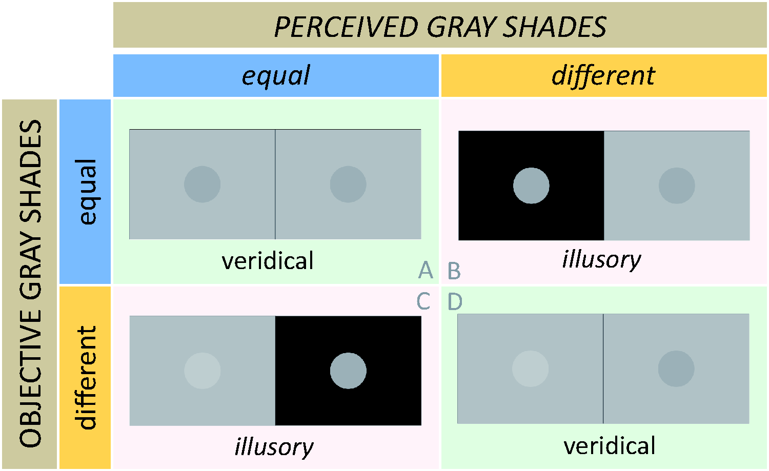
Lightness Contrast. The target objects are four pairs of disks. Objectively, the achromatic colors (gray shades) of the two disks in a pair are either equal (top row, Cases A and B) or different (bottom row, Cases C and D). Subjectively, their achromatic colors are perceived as equal or nearly equal (left column, Cases A and C) or as clearly different (right column, Cases B and D). The impressions of their relative gray shades are either veridical (Cases A and D) or illusory (Cases B and C).
In the first row (Cases A and B), the disks are physically “iso-achromatic,” that is, they have equal gray shades, and in the second row (Cases C and D), the disks are physically “allo-achromatic,” that is, they have different gray shades; the physical aspects of the gray shades of the disks can be described in terms of their reflectance and luminance, as discussed later. In the first column (Cases A and C), the disks look iso-achromatic or nearly so, and in the second column (Cases B and D), the disks look allo-achromatic in a similar way. In Cases A and D, the two disks are placed in equal contexts, that is, on equally colored backgrounds; in Cases B and C, they are placed in unequal contexts, that is, on differently colored backgrounds. In equal contexts, iso-achromatic disks appear iso-achromatic (Case A) and allo-achromatic disks appear allo-achromatic (Case D), whereas in different contexts iso-achromatic disks look allo-achromatic (Case B), and allo-achromatic disks look iso-achromatic or at least relatively similar (Case C). Thus, in terms of physical equality and difference (A and B vs. C and D), perceived equality and difference (A and C vs. B and D), veridicality and illusoriness (A and D vs. B and C), and the crucial role of equal versus different contexts, this scheme is formally identical to the scheme in Figure 1.
Whereas the quantification of the Müller-Lyer effect is straightforward, quantitative expressions of photometric effects for informal presentations such as in Figure 3 cannot be done properly without specialized instruments and calibrated screens. In the graphic software in which the display was constructed, if black is designated as 0 and white as 100, in Case D, the gray level of the lighter patch is 61 and of the darker patch is 50. These same two patches in Case C appear to have relatively similar gray shades. These numbers provide some relevant information, but they are neither luminances nor reflectances. The problem is not only in the input data, that is, that the perceived gray shades of the two patches in Case C could be made to appear more similar to each other, which could be done in a proper experiment. The problem is also that these values are not on a ratio scale. For one, the assignment of zero to black is arbitrary, because the corresponding luminance is not zero, degrading the scale to interval status. Furthermore, the transformation of screen luminance values into scale values is not likely to be linear so that the scale is at most ordinal. On top of that, the actual luminance values arriving from the display into the eyes of the observers depend on the technical specifications of the observers’ screen and the illumination conditions of the observation. Thus, it would be mathematically inappropriate to express the strength of the effect in terms of percentages, like in the Müller-Lyer illusion. Nevertheless, the two numbers provide a rough sense of the scale of the effect.
In the lightness contrast display in Case B in Figure 3, the two identical targets are embedded in different backgrounds, and therefore the luminance contrasts along the borders of the targets with the background are different. This feature can be considered as central for the explanation of the effect. However, it can be shown that this is not the only relevant feature of the illusion. The image in Figure 4A is another example of the phenomenon, displayed here for comparison. In Figure 4B and 4C, the targets and their immediate backgrounds are the same as in Figure 4A, so that the contrasts along the borders are also the same, but they contain additional elements in the form of fields of small stars. Compared with Figure 4A, in Figure 4B, in which the stars on the dark background are black and the stars on the light background are white, the difference in lightness of the targets seems enhanced, whereas in Figure 4C, in which the star fields are switched, it seems diminished. Todorović and Zdravković (2014) have reported experimental data confirming this effect in related stimuli. Problems with explanations of some related achromatic effects will be discussed later.

Variations of lightness contrast. A: Standard format. B: Enhanced contrast. C: Diminished contrast.
2.1.3. The Zöllner Illusion
Figure 5 presents an illustration of the Zöllner illusion, a phenomenon of orientation perception. This classical illusion is usually demonstrated using figures with several lines but to demonstrate it in the present framework pairs of lines suffice. These two lines are the target objects, similar as in Figure 1. However, here the critical feature is not their length but their orientation, and the research issue is the comparison of their orientations. The lines are objectively parallel (“iso-oriented”) in Cases A and B and objectively non-parallel (“allo-oriented”) in Cases C and D; however, they look parallel, or nearly parallel in Cases A and C, and look non-parallel, in a similar way, in Cases B and D. In Cases A and D, their contexts are empty, that is, the lines are plain, whereas Cases B and C contain contextual elements in the form of short oblique dashes crossing the lines, subtending different angles with them. It can be seen that this presentation scheme is formally identical to the schemes in Figures 1 and 3.

Zöllner illusion. The target objects are four pairs of straight lines. Objectively, their orientations are either equal (top row, Cases A and B) or different (bottom row, Cases C and D). Subjectively, their orientations are perceived to be equal or nearly equal (left column, Cases A and C) or clearly different (right column). The impressions of their relative orientations are either veridical (Cases A and D) or illusory (Cases B and C).
In Cases A and B, the lines are parallel, but whereas in Case A, they do look parallel, in Case B, they clearly look non-parallel. For a quantitative expression of this effect, note that in Cases C and D, the target lines subtend an angle of about 3° with respect to each other, and do look non-parallel in Case D, but in Case C, they look parallel or almost parallel. Why? 160 years after the illusion was introduced by Zöllner (1860, 1862), we still do not know. It is possible that it shares mechanisms with other orientation effects, such as the tilt illusion and the rod and frame effect, but these possibilities have not been explored much. The Zöllner illusion, although conspicuous, well-known, and often illustrated in textbooks, has received much less theoretical and experimental attention than the Müller-Lyer illusion.
Clearly, the illusory effect is brought about in some way by the presence of the oblique dashes. Some accounts favor the idea that acute angles between the lines and dashes are overestimated, and the obtuse angles are underestimated. However, as demonstrated by displays in Figure 6, the exact role of the dashes is not clear, as shown by various versions of the phenomenon discovered sporadically over the course of many years. Figure 6A is another version of the Zöllner illusion involving four parallel target lines crossed by dashes, used here for comparison. However, as shown in Figure 6B, crossing is not essential for the effect: Here, the parallel target lines also look non-parallel in much the same way as in Figure 6A, although the oblique dashes do not cross them but only touch them on one side, and thus the number of both acute and obtuse angles is halved (Hering, 1861). Touching is not essential either, as shown in Figure 6C, in which the target lines still look non-parallel, although they are not touched by the oblique dashes, so that no actual, visually specified angles between lines and dashes are formed at all (Oyama, 1975; Parlangeli & Roncato, 1995). Surprisingly, as shown in Figure 6D, even the target lines are not essential for the illusion, as the empty interspaces between the oblique dashes look non-parallel, in a similar fashion as the target lines in the preceding figures (Earle & Maskell, 1995)! This effect was clearly described long ago by Witasek (1899, p. 85), but he did not provide a diagram to illustrate it. Figure 6E is one of the several variations demonstrating that the illusion is still present when its components vary in luminance polarity (Todorović, 2014c). However, as Figure 6F demonstrates, in some variations, the illusory effect fails to appear, although the geometrical conditions seem to be equivalent to those in the other figures (Todorović, 2014c).

Zöllner variations. The illusion is present in all figures except 6F.
If there is a lesson common to the challenges and counterexamples to standard accounts presented in Figures 2, 4, and 6, and also in some subsequent figures, it is that studying illusions only in their best-known, traditional formats may mislead theoreticians to mistake some of their accidental characteristics for their essential features and thus to base their theories on misguided assumptions.
2.1.4. The Special Features of the Four Cases
The illustrations in Figures 1, 3, and 5 show how illusions belonging to different perceptual categories (length, color, and orientation) can be presented in the same formal framework. This format can also be used to present other classical illusions (see Todorović, 2002a, 2002b, 2010, 2014b, 2014c). Each of the four cases in the scheme has some special formal characteristics, regardless of the particular perceptual category in which it is instantiated.
Case A can be used as a control pattern to gauge the accuracy and precision of the perception of the studied visual feature (such as length, gray shade, orientation) with targets in neutral contexts. For example, two target objects could be presented which are different with respect to a critical feature, and subjects would be asked to adjust that feature of one of the target objects with the task to make it appear the same as the critical feature of the other target object. Case B involves a pattern in which illusions are usually presented and their existence is demonstrated to observers in which the target features are objectively equal (iso-) but appear different (allo-). Cases C and D involve two patterns in which illusions can be measured. These patterns correspond to nulling (Case C) and matching (Case D) tasks, variants of which are often used in psychophysical measurements. For example, a display such as in Case C can be generated by asking subjects to manipulate the critical features of the two target objects (such as their lengths, gray shades, orientations) in biasing contexts, with the goal to make them appear equal to each other, or at least to appear as closely similar as possible; that is, the task is to null their perceived difference. However, due to the presence of the biasing contextual elements, when perceptually equalized the two features will usually exhibit some physical difference, whose amount will be the measure of the illusion. On the other hand, a display such as in Case D can be generated by asking subjects to manipulate the features of two target objects in neutral contexts, such that they appear to exhibit the same look and perceived difference as in Case B, in biasing contexts, that is, to match their appearance; the corresponding physical difference will then serve as the measure of the illusion.
The constructions of the displays of the four cases in Figures 1, 3, and 5 were executed with such notions in mind, including informal attempts of nulling and matching, as follows. Case A was constructed first, by selecting a pair of physically identical target objects and placing them in neutral contexts, in which these objects veridically look equal. Next, Case B was constructed by embedding the same identical target objects in different, strong biasing contexts, to generate an illusory difference of their appearance with respect to a critical feature, such as length, gray shade, or orientation. The delicate next step was to construct Case D by selecting a pair of different target objects embedded in neutral contexts, in such a way that their appearance matches, as well as possible, the appearance of the two target objects in Case B. Finally, case C was constructed by using the same target objects as in Case D but embedded in non-neutral, biasing contexts, in order to null the difference in their appearance. These biasing contexts were the same as in Case B but switched for the two target objects: In Figure 1, the inward and outward chevrons were switched, in Figure 3, the light and dark backgrounds were switched, and in Figure 5, the orientations of the crossing dashes were switched. Thus, Cases B and C can be characterized as being “anti-symmetrical,” in that they involve inverse illusions produced by inverse contexts.
A problem with these informal procedures of stimulus generation in Figures 1, 3, and 5 is that although the outcomes of matching in Case D and nulling in Case C were more or less satisfactory or at least close enough for myself as observer, and for particular observation conditions, they may not be as acceptable for other observers, nor under different observation conditions, such as luminance or visual angle of the display elements. In particular, in Case C, in Figure 1, the two shafts may not appear to have exactly equal lengths, in Figure 3, the two disks may not appear to have identical gray shades, and in Figure 5, the two lines may not appear quite parallel; this is why I used the phrase “equal or nearly equal” throughout. However, the targets in Case C should at least look more similar to each other than the same two targets in Case D. In actual psychophysical experiments, all observers would be able to adjust the stimuli themselves and null or match their perceived difference to their own satisfaction. An advantage of two-alternative forced-choice procedures is that no potentially difficult matching or nulling is involved but at the cost of potentially difficult and possibly biased decisions about the existence and direction of differences between very similar stimuli.
2.2. The Single Target Format
The systematic illustrations of illusions in Figures 1, 3, and 5 all involved a pair of target objects, and the research issue was whether their critical features were equal or different, objectively, and subjectively. However, in some cases, illusions can be demonstrated with single target objects. In such cases, the research issue is whether a critical feature is present or absent in the target, or which of two values of a critical feature is present. Three examples of illusions in such formats are presented in this section using the same 2 × 2 scheme as in the preceding dual target examples.
2.2.1. The Zöllner Illusion
Figure 7 is a variant of the Zöllner illusion which essentially involves just the top lines from the four cases in Figure 5; choosing the bottom lines would have served the purpose just as well. The target objects are single lines, some plain (Cases A and D) and some crossed by oblique dashes (Cases B and C), and their critical feature is again their orientation. However, the research issue here is different than in Figure 5, as it does not involve the relation of orientations of the two target lines but rather whether the orientation of the single target line exhibits the presence of a particular value, in this case whether it is horizontal or not horizontal (tilted). Objectively, there are two possibilities, which are that the target line actually is horizontal (Cases A and B) or is not horizontal (Cases C and D), and the corresponding subjective possibilities are that the line is perceived as horizontal or nearly so (Cases A and C) or is perceived as not horizontal (Cases B and D). Veridical judgments involve cases in which the line is objectively horizontal and is perceived as horizontal (Case A), and when it is objectively tilted and perceived as tilted (Case D). Illusory judgments involve cases in which the line is actually horizontal but looks tilted (Case B), and when it is actually tilted but looks horizontal, or nearly horizontal (Case C). Thus, the formal structure of the presentation of the illusion follows the format of previous dual target presentations, including the role of objective and subjective features, veridicality and illusoriness, and the crucial role of context. Some differences between the formats will be discussed later.

Zöllner illusion in the single target format. The target objects are four straight lines. Objectively, their orientations are either horizontal (top row) or tilted (bottom row). Subjectively, their orientations are perceived as either horizontal or nearly horizontal (left column) or clearly tilted (right column). The impressions of their orientations are either veridical (Cases A and D) or illusory (Cases B and C).
2.2.2. The Ehrenstein–Orbison Illusion
Figure 8 illustrates a shape illusion, whose various forms were first studied by Ehrenstein (1925) and Orbison (1939), and which is closely related to the Zöllner illusion. The targets are single quadrilaterals, the critical feature is their shape, and the research issue is whether it is or is not a square. In Cases A and B, the targets are identical squares, and in Cases C and D, they are identical trapezoids. In Cases A and C, the targets look like squares, or approximately like squares, and in Cases B and D, they look like trapezoids. In Cases A and D, the background hatchings are horizontal and do not seem to affect the perception of the shapes of the targets. In contrast, in the presence of different, oppositely tilted hatchings, the square in case B looks like a trapezoid and the trapezoid in Case C looks like (or similar to) a square.

An example of the Ehrenstein–Orbison shape illusion. The target objects are four quadrilaterals. Objectively, their shapes are either square (top row) or trapezoidal (bottom row). Subjectively, their shapes are perceived as either square or nearly square (left column) or trapezoidal (right column). The impressions of their shapes are either veridical (Cases A and D) or illusory (Cases B and C).
2.2.3. The Induced Grating Illusion
Figure 9 is an illustration of the “induced grating” illusion (McCourt, 1982). The target objects are single stripes, the critical feature is their color, and the research issue is whether the colors of the stripes are uniform or not uniform. Case A involves a physically uniform gray stripe on uniform background; the color of the stripe appears uniform. In Case B, the same physically uniform stripe is embedded in a background which exhibits physical oscillations of luminance (“grating”). In consequence, the stripe itself appears non-uniform, exhibiting illusory sinusoid-like oscillations (“induced grating”). The objective and the subjective oscillations are in counterphase, that is, as the immediate background gets lighter the adjoining portion of the stripe appears darker and vice versa, suggesting a close relation of this illusion and lightness contrast. In Case D, a physically non-uniform stripe, which also looks non-uniform, is placed on uniform background. In Case C, the same physically non-uniform stripe looks (almost) uniform, due to counterphased physical oscillations in the background, which perceptually (almost) cancel the objective oscillations in the stripe.
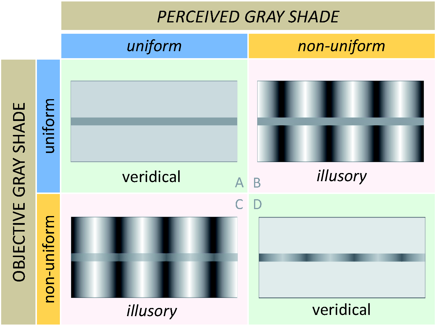
Induced Grating Illusion. The target objects are four stripes. Objectively, the achromatic color of a stripe is either uniform (top row) or non-uniform (bottom row). Subjectively, their achromatic color is perceived as either uniform or nearly uniform (left column) or clearly non-uniform (right column). The impressions of the uniformity or non-uniformity of the stripes are either veridical (Cases A and D) or illusory (Cases B and C).
In the induced grating example, the critical feature is uniformity, with two categories, one denoting the presence of a feature (“uniform”) and the other expressing its absence (“non-uniform”). The inverse presence–absence category pair “undulating” versus “non-undulating” could have served just as well as labels. Still another possibility would be to use presence–presence pairs such as “uniform” versus “undulating.” This type of labeling was used in the other two examples of single target formats, such as in pairs “horizontal” versus “tilted” and “square” versus “trapezoidal.” However, the presence versus absence labeling could just as well been used, such as “horizontal” versus “non-horizontal,” and “square versus non-square.”
It could be argued that these examples may not necessarily need to be described as involving single targets but rather relations between several targets or parts of targets to each other or to the background. Thus, in Figure 7, the judgment of the orientation of the target line could be based on the comparison of its orientation to the orientations of some background lines. This is true in case of Figure 7, but in actual experiments, this aspect is controlled, for example, by using circular backgrounds. In Figure 8, subjects may compare the tilts of the sides of the quadrilaterals, and in Figure 9, they may compare colors of portions of the stripes. This is true, but note that regardless of subjects’ strategies the tasks can quite naturally be described as involving features of single objects, such as their shape or the uniformity of their color, and thus provide legitimate examples of the single target format. The existence of this format raises a number of interesting issues which have not been explored much, although the existence of the two formats was essentially described long ago by Witasek (1899).
2.2.4. Canonical Norms in the Single Target Format
The crucial difference between the two formats of the illusion scheme can be described as follows: In the dual target format, the critical features of the two targets objects, which are both shown to observers, are compared with each other; in the single target format, the critical feature of the target object is compared with a feature which is not physically presented but is mentally represented, in the sense that it is not visually displayed as such, but that its perceptual meaning is familiar to observers from their experience. Thus, in the examples in Figures 7 to 9, it is presupposed that subjects know what the notions of horizontality, squareness, and uniformity with respect to colors refer to. These represented features can be described as canonical norms or internal standards, for the presented features to be compared with.
Not many such norms are readily available, and there are large differences between different categories of visual attributes with regard to their existence. For orientations, vertical and horizontal orientations are canonical, but none of the intermediate orientations is canonical, with perhaps the exception of 45° tilts. For sizes (lengths, areas, and volumes), there are a few man-made products which come in standard sizes and which could serve as canonical norms, such as wooden pencils and toothpicks (1D), playing cards (2D), and tennis balls (3D). For achromatic colors, white and black are canonical, but there is no canonical shade of gray. For chromatic colors, unique blue, green, yellow, and red can be taken as canonical; colors of some well-known natural or artificial objects, such as cherry blossom pink or Coca-Cola red, could also serve as norms to which a presented color would be compared. Finally, in the huge and diverse category of shapes, there are quite a few potential canonical norms: They include various geometrical shapes, for example, rectilinear, spiral, circular, square, cubical, ellipsoidal, and so on, but also natural forms, such as egg-shaped, pear-shaped, human-shaped, and so on. There are also supra-categorical norms, such as being uniform or non-uniform; this notion was applied to achromatic colors in the example in Figure 9, but it could in principle also be applied to other features and categories.
There are different ways in which observers may acquire and internalize canonical norms. The examples listed earlier are probably mostly based on everyday experiences and thus can be called experience-based norms. Another possibility is to use measurement-based norms. For example, one could ask subjects whether the orientation of a line is equal to or different from 30° or whether a line is 30 cm long or not. Such tasks have seldom been used and would rely on observers’ cognitive representations of measuring schemes; in cases in which the units are unfamiliar, such tasks would make little sense, for example, asking subjects whether the reflectance of a surface is 30%. Still another possibility is to use training-based norms. For example, one can first show subjects a set of lines of various orientations or lengths for them to remember and then in the test phase present single targets and ask which of the remembered orientations or lengths they have.
2.2.5. Geometric and Photometric Norms
There is an interesting difference between geometric and photometric features serving as norms and a corresponding important disanalogy between perception of space and color. For geometric features, such as orientation or shape, there are objective criteria which can be applied to determine whether a particular object conforms to a given norm or not, for example, whether a line is horizontal or tilted, or whether a quadrilateral is square or trapezoidal. For photometric features, this may be possible when a physical specification exists. For example, one could check whether a stripe has physically uniform color or not or test whether a color is genuine Coca-Cola red or not. However, in other cases, objective tests are not available for photometric features. In particular, there is no objective test for uniqueness of chromatic colors. I have not dealt with chromatic colors elsewhere in the paper, but they are used in this section because they nicely illustrate the difference between geometric and photometric norms.
Consider two psychophysical studies, one dealing with geometric perception and the other with chromatic photometric perception. In the first study, subjects are shown many rectangles on a screen, one after the other, which all have the same vertical dimension but whose horizontal dimensions are varied from trial to trial, and are asked to adjust the horizontal dimension until the figure looks like a square, that is as elongated neither in the horizontal nor in the vertical dimension; equivalently, ellipses could be used as stimuli and the task would be to adjust them to look like circles. In the other study, subjects are presented with a monochromatic light source whose wavelength is varied from trial to trial and asked to adjust the wavelength until it looks unique yellow, that is, tinted neither in the greenish nor in the reddish direction.
These two studies have analogous structures, but there is a crucial difference between them. In the geometric study, there are two steps in the analysis of results. The first step is to analyze the results of the study and calculate the mean of the lengths of all individual judgments of the adjusted horizontal dimension of the presented figures. The second step is to compare this mean to the fixed vertical dimension. In case of veridical perception, the mean of the horizontal adjustments should be about equal to the vertical dimension. However, Oppel (1854/1855, p. 39; Wade et al., 2017, p. 4) has remarked that it is well-known to school teachers of geometry that a geometrically exact square looks too tall, whereas a rectangle which is somewhat wider than it is tall, in his example about 6% wider, looks like a square. A number of studies of this so-called vertical–horizontal anisotropy have been performed in the meantime, but I am not aware of more recent work which used rectangles in this fashion; if Oppel’s observations are reliable, then in the geometric study, the mean of horizontal adjustments would be expected to be somewhat larger than the vertical dimension.
In the photometric study, the first step is to analyze the results of the study and calculate the mean wavelength for all judgments of unique yellow. Several studies of this type have in fact been performed, involving all four unique colors. The mean wavelength for unique yellow is about 575 nm, but the results are somewhat variable between colors, studies, and subjects within the same study (see Kuehni, 2004). The second step is … there is no second step! This is because there is nothing objective with which the empirically obtained mean chosen wavelength for the perception of unique yellow could be compared. There is no basis to proclaim a wavelength, such as, say, 580 nm, or any other wavelength, to be the true unique yellow, which would be compared with the performance of the subjects.
In the geometric study, there is an external criterion of correctness in the form of a mathematical definition of squareness; similar criteria exist for other studies of geometric illusions involving length, orientation, position, and the like. In contrast, in the photometric study, such an external criterion does not exist. Not only has no-one proposed a specification of objective unique yellow, or of any other unique color, but it is even unclear how such a specification could be provided in principle. Note that dispositional definitions, such as that surfaces are unique yellow if they are disposed to evoke impressions of unique yellow in observers, the likes of which are sometimes encountered in the philosophical literature, would obviously not be usable for this purpose. The definition of squares does not include any reference as to how they might appear; square shape is not defined as a shape that is disposed to evoke impressions of squareness in observers. An actually usable definition of unique yellow would be an observation-independent, reflectance- or wavelength-based, photometric specification—but there is not one. See Todorović (2003, 2007) for more detailed discussions of these and related issues.
The claim that there is no objective criterion for unique colors may be surprising or even counterintuitive, because colors of surfaces of objects appear to us as objective as their shapes or sizes, and the sensory salience of unique colors among mixed hues seems comparable to the sensory salience of squares among rectangles or circles among ellipses. However, the cause of the perceptual prominence of unique colors is not likely to be some unique physical feature that could be discovered some day. In fact, it is not necessary that such an external specification exists for a feature to serve as a canonical norm. Color uniqueness could be a purely internal norm, without an independent external counterpart. Its basis might be some characteristic aspect of neural processing in the visual system. The neural correlates of unique colors are currently not known, and they are probably not based on early levels of visual processing, but it is possible that they correspond to certain kinds of balances of neural activations at higher processing levels (see Neitz & Neitz, 2008). Such activations may be present in this particular form only in organisms with a particular set of spectral sensitivities of the three types of cones, as in typical human trichromats. However, there are also anomalous human trichromats, whose cones’ peaks of spectral sensitivities are somewhat shifted away from population typical values. Tests using the so-called Rayleigh match indicate that their perception of yellow is deviant, compared to typical trichromats. However, because there is no objective criterion, it cannot be said that their perception is incorrect. Consider a possible world in which evolution had produced humans which were predominantly anomalous trichromats: In that world, what in the actual world is called anomalous trichromacy would not be anomalous but normal or typical, and normal trichromacy in our world would be anomalous in theirs. Furthermore, in our own world, there are animal species with very different cone spectral sensitivities than in humans (Kelber et al., 2003). One can only speculate about their color experiences. They might inhabit ecological photometric niches in which colors are instantiated differently than in the human niche, with different loci for unique colors or no unique colors at all. Species with more than three types of cones might see colors unimaginable for mere trichromats, similar as some chromatic experiences of trichromats are not available for dichromats, who have two types of cones rather than three.
Interestingly, some philosophers have maintained that there do exist objectively unique colors, but they have not disclosed their values in nanometers. Instead, they have claimed that we may never find out what is the true color of a given chip. For example, Tye (2006) wrote that it is a color that “God knows precisely … but we may never know,” and Byrne and Hilbert (2003) wrote that they were “ … prepared to countenance ‘unknowable color facts’.” In contrast, I have argued that in such cases there is no color fact to be known (see Todorović, 2007; see also the philosophical discussions in Cohen et al., 2006, 2007).
2.2.6. Limitations of the Single Target Format
Given that there are two formats in which illusions can be presented, the question arises which formats can be used for particular illusions. It was shown that the Zöllner illusion can be presented in both formats (Figures 5 and 7). In that case, the single target format was simply a trimmed version of the dual target format, constructed by discarding one of the targets. Can this idea work for other phenomena, such as the Müller-Lyer illusion and lightness contrast?
Suppose that in Figure 1, the bottom lines and their contexts are eliminated from all four cases, and only the top lines and their contexts are left. Would the resulting trimmed 2 × 2 scheme be the appropriate single target format of the Müller-Lyer illusion? The problem is the lack of norms for size: Whereas in the Zöllner illusion in Figure 7, the horizontal orientation can serve as a canonical norm, no comparable experience-based standards seem available for lines of arbitrary length, in order to assess whether perception is correct. One way to attempt to circumvent this difficulty would be to assume that veridical perception ensues when the target lines are embedded in equal, neutral contexts, such as in Cases A and D, or versions of these stimuli in which the contexts are empty, whereas illusory perception occurs when the lines are embedded in different non-neutral, biasing contexts, such as in Cases B and C. This idea is defensible, but it is a theoretical stipulation, not an empirically obtained fact.
An analogous procedure to generate a potential single target format for lightness contrast (Figure 3) would be to discard one of the two patches in every case, say the right one. However, the same type of problem arises as for the trimmed format of the Müller-Lyer illusion: Just as there are no canonical norms for length, there are no canonical norms for gray shades either. There is also an intriguing additional issue, which is another example of disanalogy between geometric and photometric attributes, and involves the choice of the appropriate neutral context. Unlike for lengths, for colors there are no reasonable candidates for non-biasing, veridicality fostering neutral contexts. In the trimmed version of Figure 3, all patches would necessarily be placed on backgrounds, and the background’s color would affect the perceived color of the target. This is true even across the chromatic/achromatic dichotomy: Not only is there an achromatic contrast, that is, the same gray patch looks darker on white background and vice versa, there are also chromatic contrasts, in that that same patch will tend to look reddish on green backgrounds and vice versa, bluish on yellow backgrounds and vice versa, and so on. It should be noted that in special laboratory conditions, the effect of the background can be very strong. Wallach (1976) has shown that by manipulating only the background luminance, the same achromatic surface patch can be made to assume any appearance between black and white, that is, to span the whole standard achromatic gamut—and even go a bit beyond at both ends, including rarely seen deep blacks and luminous whites. It may not be a completely appropriate comparison, but a comparably strong effect in the perception of length, spanning the whole length gamut, would involve being able to cause the perceived length of a given line segment to vary, say, between the size of a dot and spanning the whole visual field, only by varying its context. However, the actual strength of a powerful effect such as the Müller-Lyer illusion under ideal conditions tends not to exceed 30% (Restle & Decker, 1977).
Although for color patches no appropriate choices for genuinely neutral, non-biasing backgrounds seem to exist, what can be done is to choose a background, such as black, or middle gray, or white, as a standard, reference condition. For example, in psychophysical studies, lightness is often measured by having subjects match the appearance of a patch to a chip on the achromatic Munsell Scale, which consists of a series of chips with calibrated reflectances increasing in perceptually uniform steps. These chips are standardly presented as arranged on a common white background, which enables comparisons across different studies. However, when the same chips are arranged on a black background, they look lighter (Zavagno et al., 2011), because the scale itself is prone to be affected by lightness contrast.
2.3. Distal and Proximal Features
Up to here, the notion of “physical” or “objective” attributes (or features) was used in a general and indiscriminate sense. However, in the vision literature, a distinction is made between two variants of this notion, which are usually labeled as the distal and the proximal attributes. Furthermore, although it is sometimes neglected, for each of these two different physical notions, there is a corresponding different phenomenal (“perceived”) notion. In consequence, there are altogether four types of visual attributes to consider: physical distal, physical proximal, perceived distal, and perceived proximal. Elaborating and clarifying these notions is very important for characterizing some aspects of classical illusions and also for analyzing illusions in pictures, as discussed in Part 3. See Todorović (2002a, 2002b) for more detailed earlier treatments of these issues.
2.3.1. Two Kinds of Physical Attributes
To illustrate the various notions of visual attributes and the relations between them, consider a basic situation consisting of an object, an observer, and an illumination source. To simplify things, let the object be an achromatic disk, let the observer be defined by a point in space, and let illumination be specified by the intensity of a light source. Consider first the physical aspects and the differences between physical distal and physical proximal attributes. Briefly, distal attributes refer to features of an object defined independently from observers and illumination conditions, whereas proximal (projected) attributes refer to features of the object which are defined with respect to locations of observers and properties of illumination, both of which can affect the characteristics of the projections of the object’s distal features, which constitute inputs to the sense organs of the observers.
The notion of physical distal attributes can be elaborated as follows. There are two types of these attributes, intrinsic and extrinsic. The attributes intrinsic to the object are its distal shape and distal size, which are geometric attributes, and distal color, which is a photometric attribute. For achromatic surfaces, which I will deal with here, its distal color is its reflectance, the percentage of light it reflects; this feature does not depend on the illumination conditions. These attributes are generally the defining, enduring, essential properties of an object, although they could change over time. The extrinsic attributes are the object’s location and orientation in space. These features are usually accidental and can easily vary over time.
The other category of physical attributes are physical proximal attributes. Briefly, they are the intrinsic distal attributes in relation to the observer’s current location and the light source’s current illumination of the object. They include the proximal (projected) shape of the object with respect to a given observer, its proximal (angular) size, and what is here called its proximal color. This is the amount of light the object reflects under a given illumination, and is called luminance for achromatic surfaces; unlike reflectance, it depends on illumination and changes when the illumination changes. The particular values of these three proximal attributes depend, on the one hand, on the corresponding distal attributes of shape, size, and color, but also, on the other hand, on the location of the observer with respect to the object and on its illumination. The distance of the observer affects the proximal size of the object, the view direction of the observer affects the object’s proximal shape, and the illumination of the object affects its proximal color. These two variables, observer location and object illumination, were called “orthogonal variables” by Epstein (1973) and “secondary variables” by Todorović (2002a). Here, I will use the term “moderator variables,” as these variables moderate the effects of the distal variables on observers. When moderator variables and extrinsic distal attributes of the object (its position and orientation) change, as they are prone to do, the proximal attributes of the object change as well, but its distal attributes remain the same.
All these aspects are standardly handled by 3D graphics modeling software. The user defines the distal attributes of an object, both intrinsic (shape, size, color) and extrinsic (position, orientation), as well as the moderator variables (the distance and direction of the camera and the properties of the illumination), and software calculates and renders the proximal attributes (shape, size, and color, and also location and orientation, which are not of interest here). Although the proximal physical attributes are defined with respect to observers, they have well-defined objective values, that is, they involve observer-dependent but purely physical quantities, defined by equations and calculable by software.
Note that the way these terms are defined here, the proximal attributes, just like distal attributes, are considered to be features of the objects themselves, but unlike distal attributes, they are different for different observer locations and illumination conditions. In this way two related but different notions—distal and proximal—of physical size, shape and color are ascribed to the same object. The differences between distal and proximal attributes are manifested in units of measurement: Distal sizes are measured in linear units, such as meters, whereas proximal sizes are measured in angular units, such as visual angles; distal colors (reflectances) are measured in percentages of reflected light, whereas proximal colors (luminances) are measured in amounts of reflected light arriving at the observer.
2.3.2. Two Kinds of Phenomenal Attributes
All the features discussed so far were a matter of geometry and physics. Consider now the corresponding perceived (subjective, phenomenal) attributes or features. There are two varieties, one corresponding to physical distal attributes and the other corresponding to physical proximal attributes.
The perceived distal attributes of the object refer to observer’s percepts, or visual impressions, of the object’s intrinsic physical distal features. They include perceived distal shape, perceived distal size, and perceived distal color (which, for achromatic surfaces, is their perceived reflectance or lightness). In the aforementioned example, observers might report that their impressions are that the actual shape of the disk is circular, that it has a certain physical size, and that its color is white. On the other hand, the perceived proximal features of the object, as defined here, correspond to the observer’s percepts of its physical proximal features. In particular, perceived proximal shape and size of the disk can be defined as the impressions the of shape and size of the region of the visual field subtended by the disk, as seen from the position of the observer; for example, the observer might judge the proximal shape of the disk to be elliptical, and to have a certain projected size. Perceived proximal color of the disk (which, for achromatic surfaces, is its perceived luminance or brightness) refers to the impression of the amount of light arriving from the disk to the observer (see Gilchrist, 1994).
The difference between perceived distal and perceived proximal features corresponds to Gibson’s (1952) distinction between the visual world and the visual field. It is sometimes expressed by referring to two different modes of perceiving or attending: the distal or natural mode, and the proximal or painterly mode. The distal mode is described as being characteristic of everyday perception, whereas the proximal mode seems to occur much more rarely, at least consciously, and to arise only in special circumstances, such as by artists in acts of producing drawings and paintings 4 and composing photographs (Lou, 2018; Perdreau & Cavanagh, 2013). However, it is the proximal features which constitute immediate retinal stimuli, and it is a perennial problem of perceptual psychology how proximal inputs eventually give rise to perception of distal features. In a classical but controversial view, perceived proximal features correspond to sensations, which are based directly on physical proximal features, and perceived distal features correspond to perceptions, which are regarded as results of further processing of sensations, such as involving unconscious inferences, in order to deduce the values of the physical distal features.
An alternative view with respect to judgments of proximal features is that they are not based on direct sensory readouts of proximal inputs (sensations) but on deliberate attempts to overcome outputs of constancy mechanisms underlying everyday perception of distal features.
More detailed discussions concerning the distal/proximal distinction are presented in Todorović (2002a, 2002b), including considerations of corresponding stimulus conditions, such as full-cue setups favoring distal judgments and reduced-cue setups favoring proximal judgments, the various ways in which distally and proximally focused instructions and tasks can be formulated and conveyed to subjects, and brief reviews of structures of results of experiments with distal and proximal features.
2.3.3. Studies Involving Both Types of Attributes
The distinction between the two types of features is best demonstrated in studies in which subjects are asked to report both distal and proximal features, explicitly distinguished in instructions, of the same targets in the same setup. However, there are not many such studies. One example is a size perception experiment by Gilinsky (1955, pp. 178–179), performed on a grassy terrain, which involved standard stimuli shaped as isosceles triangles, presented at various distances up to 4,000 ft from the observers, and a variable (test) stimulus also shaped as an isosceles triangle, located at 100 ft distance, whose size but not shape was varied through a mechanical contraption located in a large hole in the ground, invisible to subjects, which regulated its height above the ground. Two types of instructions were used: In “objective instructions,” subjects were asked to match the size of the variable stimulus to the size of the standard stimulus such that “if you measured both with a ruler they would measure exactly the same,” whereas in “retinal instructions” they were asked to imagine that the field of view is a scene in a picture or photograph … [you should] set the variable triangle [such] that the cut-out image of the standard triangle would be exactly equal to it in size—that the two images would actually coincide.
2.3.4. The Distal-Proximal Distinction and Illusions
What is the relevance of the differentiation of two types of physical attributes and two types of phenomenal attributes for illusions? The answer depends on the nature of the stimuli and the tasks of the subjects. In some cases, making this distinction may not be particularly relevant, whereas in others it is crucial in order to clarify issues and avoid confusions.
Consider Figure 1, the Müller-Lyer illusion. How would subjects understand the question whether the lengths of the target lines look equal or different, if unlike in the Gilinsky study, no further specification about the nature of the task is provided? It is most natural to interpret the question to refer to the distal sizes, that is, that the subjects assume that they are asked to compare lengths as measured with rulers on the screen or on the paper when printed. The overwhelming majority of subjects would not even be aware that there is a second possibility, and it would be a rare subject who would spontaneously adopt the painterly attitude and assume that the task refers to the comparison of the visual angles spanned by the lines, as seen from the vantage point of the observer. Furthermore, the difference in the interpretation of the task would not matter much anyway. The reason is that the distal and the proximal physical features in are congruent, meaning that in Cases A and B, the two target lines are both distally and proximally equal, and in Cases C and D, they are both distally and proximally different. It is likely that features which are judged to be distally equal/different would also be judged to be proximally equal/different, and thus distally veridical/illusory judgments would also likely to be proximally veridical/illusory; in other words, physical congruence should be reflected in perceptual congruence. Therefore, failing to specify the precise nature of judgments in instructions to observers, although perhaps conceptually deficient, may not make much of a difference for the outcome, and asking observers to simply judge “lengths” (rather than elaborating the distinction between distal extents and proximal visual angles), as has been generally done in such studies anyway, should be OK (Todorović, 2002a).
Consider now Figure 3, lightness contrast. Here, the medium in which the stimuli are presented can make a difference, to some extent. When the stimuli are printed on paper or other surfaces and are constituted by pigments, the natural, distal attitude is to assume that the question refers to their reflectances (corresponding to the distal task) rather than to their luminances (corresponding to the proximal task), although the latter possibility would also be legitimate. In this case, similar as in the previous example, the distal and the proximal physical features are congruent, as the patches which have equal/different reflectances also have equal/different luminances. On the other hand, when presented on monitors the situation is different in that the patches are constituted by emitted light and the reflectance of the surface of the screen itself is not relevant. It would seem that in such circumstances judging reflectances would not make much sense, but even in such cases the stimuli can look convincingly like real surfaces. However, in spite of this potential complication, in many experiments which use simple abstract stimuli, the subjects most probably are not cognizant of these differences anyway and rely on an indiscriminate notion of “gray shade” so that the presentation medium as such may not seriously affect the nature and structure of their judgments.
The congruence of distal and proximal variables in studies of classical illusions is the consequence of the equal values of the moderator variables for the two targets. In the Müller-Lyer illusion, the two target lines are usually at the same distance from the observer; in lightness contrast displays the two target patches usually receive the same illumination. In fact, congruence of distal and proximal features can be identified as an important general characteristic of classical illusions (see section 2.4.1).
The situation is much more complicated in two cases. First, if the stimuli are presented in real 3D scenes, at different distances, under different illuminations, and in different orientations. Second, if the stimuli are pictures, that is, 2D images which can be interpreted as representing 3D scenes, rather than just being abstract 2D patterns. The existence of illusions in such displays will be addressed in Part 3 in section 3.3, in which several such examples will be discussed. The analysis of pictorial cases is based on the understanding of some factors involved in real 3D conditions, which will be briefly addressed in the following.
2.3.5. The Distal-Proximal Distinction and Perceptual Constancies
For objects in real 3D scenes, physical congruence between distal and proximal features will not obtain if the moderator variables for different target objects are different. Thus two lines of equal physical distal lengths will have different physical proximal lengths, and vice versa, if they are located at different distances from the observer; in Gilinsky’s (1955) experiment, triangles of equal distal size had different proximal sizes when they were located at different distances. Similarly, two patches of equal reflectances will have different luminances, and vice versa, if they are differently illuminated. In addition, what is true for size and color is also true for shape: Two objects of same distal shape may have different proximal shapes, and vice versa, if they are oriented differently in 3D space with respect to the observer.
Moderator variables have a central role in studies of perceptual constancies. For example, in research on size constancy, the distance of target objects is manipulated, changing their physical proximal size, in order to study the effects on perceived distal size. In research on lightness constancy, the illumination of target objects is manipulated, changing their luminances, in order to study the effects on perceived reflectance. In research on shape constancy, the orientation of target objects is manipulated, changing their physical proximal shape, in order to study the effects on perceived distal shape. The similarities and differences between studies of constancies and studies of illusions can be formulated as follows. They are similar in that in both types of investigations the object of research is to study the effects of certain manipulations on perception of distal attributes of target objects; investigations whose specific goal would be to study the perception of proximal attributes are rare. Constancy and illusion studies differ in the nature and the effects of these manipulations. In constancy studies what is manipulated are moderator variables, the effects of which are changes of proximal physical attributes of target objects. In contrast, in illusion studies moderator variables are constant, and what is manipulated are contextual variables, which change the contexts of target objects but not their proximal physical attributes. For a detailed discussion and structural comparisons of constancies and illusions, see Todorović (2002b).
Given that in constancy studies the physical distal and proximal attributes are not congruent, providing appropriate instructions to subjects as to the nature of their task is more important than in studies of classical illusions. Although in everyday life the distal attitude is predominant, subjects in these experiments, confronted with the conditions of presentations and the nature of the stimuli, may spontaneously realize that a proximal attitude is also an option. If the task is not appropriately specified by the experimenter as being distally or proximally focused, subjects might need to figure out for themselves which attribute of the stimuli they are supposed to judge (Sedgwick, 1986; Todorović, 2002a). There are indications that this can in fact happen, and that insufficiently precise instructions may be understood by some subjects in the distal sense, by others subjects in the proximal sense, and by still other subjects as involving compromises between the two senses (see Baird, 1965; Joynson, 1958; Landauer & Rodger, 1964; Lichte & Borreson, 1967).
When the difference between distal and proximal features is properly specified in instructions, the corresponding judgments by subjects generally will not be congruent, but they may both be correct. For example, an observer may correctly judge that two physically equal lines presented at different distances are equal (in the distal sense, exemplifying size constancy) and also unequal (in the proximal sense). These are not contradictory judgments because distal size and proximal size are different attributes. Similarly, an observer may correctly and without contradiction judge that two physically equal patches presented under different illuminations have both the same achromatic color (in the sense of perceived reflectance, exemplifying lightness constancy) and different achromatic color (in the sense of perceived luminance). As for shape, the disk in the aforementioned introductory example can be correctly apprehended both as circular (in the distal sense, exemplifying shape constancy) and as elliptical (in the proximal sense); a related case, involving the perception of the shape of a “tilted penny,” is often discussed in the philosophical literature. Neglecting the distal—proximal difference in such cases can easily lead to confusions, both in conceptual analyses and in interpretations of experimental results.
2.4. Summarizing the Framework
In the preceding sections, a number of different effects were presented in a common form; related examples were reported by Todorović (2002b, 2010, 2014b). These phenomena fit the narrow definitions of illusions, as they involve features of visual categories of size, orientation, shape, and achromatic color. However, the way in which they were presented was meant to stress what were considered to be their shared, supra-categorical aspects. These aspects can be described in the following way. The basic characteristic of an illusory phenomenon is the existence of a visual constellation in which equal features look different (Case B). However, the converse situation should also be possible, that is, to generate instances of different features looking equal (Case C). Furthermore, corresponding veridical impressions should also exist, that is, equal features looking equal (Case A) and different features looking different (Case D). Moreover, the phenomenon in question should not be based on the existence of physical differences (distal or proximal) between features but rather on differences in their contexts.
The shared aspects will be expressed in an extended and more comprehensive fashion in the following, in the form of concisely formulated criteria for this class of phenomena. These criteria will be repeatedly cited and invoked in Part 3 and Part 4, in discussions and analyses whether certain phenomena fulfill them or not, and thus whether they are or are not illusions, according to the approach and framework adopted here.
2.4.1. Criteria for Illusions
A cluster comprising altogether nine criteria for illusions are formulated in this section, though some could be merged and others could be added. These illusion criteria are meant to express the central and essential features of the approach advocated here to the understanding of illusions. They involve the make-up of the 2 × 2 scheme and additional conditions involving the proximal/distal distinction and the role of contexts. As the 2 × 2 scheme can be regarded as analogous to a 2 × 2 factorial design, its make-up can be thought of as involving two factors and their interaction.
The first three criteria are grouped under the label “factorial criteria,” because they deal with the factors (or variables or dimensions) that are involved in illusions, as well their categories and the characteristics of the categories: The dimensions criterion: representing illusions involves two dimensions (factors); the objective dimension refers to physical attributes of target objects; the counterpart subjective dimension involves the corresponding perceptual (or phenomenal or perceived) attributes of target objects. The categories criterion: both the objective and the subjective dimension consist of two categories, one expressing the presence of a characteristics, and the other expressing its absence (or the presence of a different characteristics). The formats criterion: there are two formats in which illusions can be expressed; in the single target format, the categories involve presence and absence of an attribute of the single target object; in the dual target format, the categories involve presence and absence of equality (or, equivalently, absence and presence of difference) of attributes of two target objects. The crossing criterion: crossing the two dimensions results in a 2 × 2 scheme; two rows of the scheme correspond to the two categories of the objective dimension, and consist of two cases each; two columns of the scheme correspond to the two categories of the subjective dimension, and also consist of two cases each. The veridicality/illusoriness criterion: the two diagonals of the 2 × 2 scheme correspond to veridicality and illusoriness, and consist of two cases each. The four cases criterion: the four cases in the 2 × 2 scheme are: Case A: veridical perceptual presence; Case B: illusory perceptual absence; Case C: illusory perceptual presence; Case D: veridical perceptual absence. The distal/proximal criterion: there are two kinds of both physical and perceived attributes, the distal kind and the proximal kind, resulting in four combinations: physical distal, physical proximal, perceived distal and perceived proximal attributes. The congruency criterion: the physical attributes of the to-be-compared pairs of target objects are congruent, that is, they are either both distally and proximally equal (Cases A and B) or both distally and proximally different (Cases C and D). The contextual origin criterion: the origin of the illusory effects is not based on physical distal or physical proximal differences of target objects, but on the differences in their contexts.
2.4.2. Additional Features of the Framework
In this section, some aspects of illusions research are discussed which are not explicitly addressed in the preceding section. For example, in research of illusions, judgments about perceived equality may involve a degree of tolerance, such that the critical features need not look completely identical for the two targets but may also appear nearly equal, or as equal as possible, in particular in Case C. It is also assumed that the judgments about perceived difference involve a degree of distinctiveness, in that in Case B the critical features of the two targets should not appear just barely discriminable but rather visibly different, clearly exceeding the discrimination threshold for that feature. It is also generally understood that the conditions of observation of the stimuli are standard (such as reasonable distance of the observer from the observed content, adequate illumination, and central exposition) and that the observers’ visual capacities are normal or typical for the population.
Note that it follows from both the congruency criterion and the contextual origin criterion that the transition from Case A to Case B cannot involve the same distal stimulus but altered display conditions which would change the corresponding proximal stimulus. These include changing the following: the visibility of targets through masking, the retinal projection area of the targets, their distance, illumination, and spatial orientation. The same applies for the transition from Case D to Case C. In the present approach in these pairs of cases not only the distal but also the proximal features must be equivalent, and only context is allowed to change.
It is assumed here that targets and contexts subtend distinct regions of the visual field, as clearly separate, non-overlapping, and at most adjacent visual constellations. Physical change in the context region must not involve any physical change within the target region but may only affect the perceived values of some of its features, such as sizes, colors, or orientations. Furthermore, change of context must not induce an obliteration of the target area as a segregated perceptual object. An example in which this condition is violated is the following. First, start with a visual display consisting of a black square on white background; in this case, the target square and the context background are clearly discriminable. Next, do not change the target but change only the context by making the background black as well; in this case, the square would be annihilated as a visual object. Such contexts are not allowed in the present framework. A more subtle example of perceptual annihilation is furnished by illustrations of “hidden figures,” which are easily seen when isolated but are very hard to recognize as visual wholes when camouflaged in their surround, although they are optically fully exposed to view.
Ideally, it should be possible for any point in the visual field to be clearly assigned either to the target or to the context. This is not always fully the case, for example, in standard versions of the Müller-Lyer figures, drawn purely in black, the assignment of the tips of the arrowheads is ambiguous, as they could perceptually belong either to the shaft or to the chevron or be shared by both. This could be problematic for judgments of the length of the shafts; however, when the lines making up the figures are relatively thin, this is probably not going to make much of a significant difference. I have taken care in Figure 1 to use different colors for the shafts and the chevrons, to avoid such potential ambiguities. For the same reason in Figures 5 and 7, the target lines have different colors than the contextual dashes, and are drawn as optically continuous, whereas the dashes consist of two parts, separated by the target lines. In Figure 3, the circular outlines of the patches constitute the edges between the targets and the backgrounds and could optically belong to either of them or be shared, but perceptually there is no ambiguity, as they are not perceived as contours of the ground but of the figures, and belong to them.
It was noted in section 2.3.4 that the congruency of the physical distal and the proximal attributes in classical illusions probably entails their subjective congruency in the judgments of their distal and proximal attributes so that it might not matter much which attributes the observers are actually judging. However, the standard assumption is that what they judge are distal attributes, even if that is not specified in the instructions, so that illusions and veridicality involve judgments of distal, not proximal attributes. It is possible, though, to use explicitly proximal instructions and study “proximal illusions,” that is, veridicality and illusoriness of judgments of proximal attributes, but this is seldom done.
It is not assumed here that the touchstone of veridicality is the requirement that perception matches every minute portion of the stimulation, such that all judgments about every detail of a physical state of affairs must have precise phenomenal counterparts. Adopting such a maximalist stance would entail that practically all perception is illusory, making the concept of “illusion” all-encompassing and thus empty, as in this quotation: “Strictly speaking, the concept of illusion has no place in psychology because no experience actually copies ‘reality’” (Boring, 1942, p. 238). Rather, a minimalist stance on veridicality is adopted here, which only assumes that two types of judgments about a critical feature are true, as expressed in Cases A and D.
A potential criticism of this approach is that the categories involve the crudest possible nominal distinction, the one between equal and different values of features, objective or subjective, and neglects ordinal/comparative and quantitative aspects of illusions, which may be of central importance for theoretical purposes. However, it is not the aim of the proposed framework to dictate how illusory phenomena should be studied. Rather, its aim is to “guard the entrance” to the realm of illusions, that is, to set criteria for phenomena to be labeled as illusions in the first place. Phenomena which cannot be presented in this framework and do not fulfill all necessary criteria are not to be regarded as illusions or at least not as context-induced illusions. How phenomena which have been recognized as illusory are to be investigated properly is a different matter.
A related potential criticism is that Case D, involving different targets appearing as different, which is counted as a veridical judgment, is excessively indiscriminate, because objects can be different and can appear different in innumerably different ways. For example, the nominal judgment that (A) the lengths of two lines are different is certainly less precise than the ordinal judgment that (B) one is longer than the other, which, in turn, is less precise than the ratio judgment that (C) one is twice as long as the other; conversely, (C) can be falsified in more ways than (B), which, in turn, can be falsified in more ways than (A). Thus, there are gradations of precision in which a state of affairs can be characterized, which increases from (A) through (B) to (C). However, there are no corresponding gradations of truth: All of these judgments are either true or false, none is less or more true or false than the other, and each of them can be useful in certain circumstances. Furthermore, recall from the manner in which the four cases were constructed that the appearance of the two targets in case D was not meant to involve arbitrary differences but rather to exhibit a case of a veridical subjective difference which perceptually matches the illusory subjective difference of the two targets in Case B.
2.4.3. Symbolizing the Framework

Note that the differences between the four cases are confined to the distribution of the plus and minus signs. Veridicality in Cases A and D is constituted by the concordance of the equality/difference relations, meaning that in Case A both relations involve equality, and in Case D both relations involve difference, or absence of equality. Illusoriness in Cases B and C is constituted by the discordance of the equality/difference relations, in that in both Cases B and C, one relation involves equality and the other involves absence of equality. The two illusory cases are formally closely related, in that B can be transformed into C by exchanging the presence of equality with its absence (turning + into –), and vice versa. The same is true for the two veridicality cases, A and D. Thus, B and C express illusoriness in a complementary way, and A and D express veridicality in a complementary way.
Note that in this formal framework, veridicality and illusoriness are not expressed as direct relations between attributes in the objective and the subjective domain, that is, as across-domain relations, such as, say, +(F = F’) or −(F = F’). Rather, they are conceived of as higher order relations, that is, relations (of concord and discord, or agreement and disagreement) between relations (of equality or difference). In this context, “concord/discord” is a higher order inter-domain (or between-domain) relation, in that it compares relations between the objective and the subjective domain, such as comparing ±(F1 = F2) with ±(F’1 = F’2). On the other hand, “equality/difference” is an intra-domain (or within-domain) relation, in that it compares features within the same domain, such as whether F1 and F2 are equal or not, and whether F’1 and F’2 are equal or not; equality/difference is also a multi-domain relation, in that it can hold in different domains, such as both in the physical domain, between physical features, and also in the perceptual domain, between perceptual features. This approach enables expression of comparisons between states of affairs in the physical and the perceptual domain. The feature “uniformity/nonuniformity” is also multi-domain, in that it can also be applied both in the physical and in the perceptual domain. Such multi-domain features and relations offer intriguing links between apparently qualitatively different and seemingly conceptually incompatible domains, such as physics and phenomenology of perception; see Todorović (1998) for a brief discussion of analogous relations between phenomenology and neurophysiology of perception, that is, the mind–brain relations, an issue which is not discussed here.

As in the dual target format, the difference between the four cases is confined to the distribution of the plus and minus signs. The philosophical definitions of illusions, which involve an object appearing to have a property (+F’) which it in fact does not have (−F), correspond to Case C. In contrast, not appearing to have a property (−F’) which the object in fact has (+F) would correspond to Case B. However, these two cases are equivalent in the following sense: If the absence of an objective or subjective property (−F or−F’) is understood as the presence of another property (+G or +G’) and vice versa, such as when “not horizontal” is understood to be the same as “tilted,” and vice versa, then Case B is transformed into Case C, and vice versa, and Case A is transformed into Case D, and vice versa.
3. Critiques of Illusions
In this part of the paper, I will present, discuss, and respond to several criticisms of the notion of illusions. They involve topics such as discrepancies from reality, effective stimuli, pictorial displays, perceptual errors, and the relations of reality and measurements.
3.1. Illusions and Discrepancies From Reality
As noted before, the broad conception of illusions as discrepancies from reality can be criticized by noting that there are cases of discrepancies from reality which are generally not regarded as illusions. In this section, several types of such cases will be discussed, and it will be argued that according to the augmented framework, they are not illusions either. There are two main classes of such cases, involving non-detectable energies and indiscriminable stimuli.
3.1.1. Non-Detectable Energies
Some types of physical energies, forces and events, such as X-rays, magnetism, radio-waves, ultraviolet and infrared light, and the like may be present in our environment but cannot be registered by our senses. Such cases present a problem for broad definitions of illusions because they are discrepancies from reality which are not usually labeled as illusions but rather as limitations of our sensory systems (see Rogers, 2017). However, such phenomena are not problematic for the approach advocated here, because according to the augmented framework, they are not illusions either. Such cases could correspond to Case B in the single target format of the present framework, and thus to misses in signal detection terms, because we do not detect such energies when they are present. It might even be argued that Case D, correct rejection, is also instantiated, in a way, because when those energies are absent we, correctly, do not detect them. However, such phenomena fail the interaction criteria, that is, the requirements of being arranged in the form of a 2 × 2 scheme, and that is because the whole left column of the table is missing. In signal detection terms, there are no hits (Case A)—for example, we can never correctly detect the presence of X-rays through our senses, nor are there any systemstic false alarms (Case C)—we do not tend to have the wrong impression that X-rays are present when they are not. We simply do not know what detecting such energies would feel like, thus violating Stebbing’s criterion. Only organisms capable to actually detect these energies could in principle experience corresponding illusions. In contrast, expressed somewhat paradoxically, according to the augmented framework we cannot be wrong in this way because we could not be right. Note that in addition to failing the interaction criteria, these phenomena also fail the contextual origin criterion because in their manifestations no context effect is involved.
Similar considerations apply for registration of energies that our senses otherwise are capable to detect, but which cannot be perceived when they are present at subthreshold intensities; for example, we are not able to see things in the dark, even though they are physically present. Similar as for energies which can never be detected, such cases are not generally regarded as illusions but rather as limitations of the sensitivity of our perceptual systems. They would also not be classified as illusions according to the augmented framework, for similar reasons.
3.1.2. Indiscriminable Stimuli
There are pairs of stimuli that fall within detectable sensory ranges, and which can be registered on their own, but cannot be discriminated because their physical difference is below the resolution threshold of the sense organ. Like the previous examples, such cases are generally not regarded as illusions but as limitations of our senses. Like in the previous examples, they would not be regarded as illusions in the augmented framework either, but for different reasons. Such pairs may be regarded as examples of Case C in the dual target format, in that they involve physically different targets which appear as same. Furthermore, Case A may be constituted by pairs of physically identical stimuli which appear as same. However, Case D cannot be constituted because it would involve discrimination of two stimuli which are by definition indiscriminable. Furthermore, this phenomenon is not a context effect. The reason that in Case C physically different targets appear equal is not that they are presented in different contexts but that their difference is subthreshold. Therefore, Case B (equal targets looking different) cannot be constituted by applying inverse contexts from Case C to physically identical stimuli from Case A. Thus, threshold phenomena fail the contextual origin criterion, because they are not context effects, as well as the interaction criteria, because Cases B and D in the 2 × 2 scheme are missing.
In the previous example, the physical difference between the two targets is not only below the detection threshold but also relatively small in purely physical terms. Interestingly, there are phenomena, such as color metamerism, involving targets which are physically substantially different but still cannot be discriminated in perception. As an example, the light of any single spectral wavelength (Target 1) can be perceptually matched by a suitable combination of a triplet of primary lights (Target 2). Metamerism is another case of discrepancy between reality and appearance which is not an illusion according to the augmented framework. The reason is similar as in the previous example. Any pair of metameric stimuli could be assigned to Case C in the dual target 2 × 2 scheme because they involve physically different target objects which look equal. Furthermore, Case A could be constituted by an isomeric pair, that is, two targets which are physically equal and are perceived as equal. However, like in the previous example, and unlike classical illusions, metamerism is not based on context effects. The cause of the equal appearance of the different stimuli in Case C is not that they are embedded in different contexts, but that they induce equal reactions in the triplets of human cones. Therefore, for the same reasons as in the detection threshold example, metamerism fails both the contextual origin criterion and the interaction criteria. Note that metamerism is a limitation of the human trichromatic design and is not shared by optical instruments such as spectroradiometers, which can discriminate metameric pairs because they measure whole spectral distributions, which are different for the two members of a metameric pair.
Metamerism involves pairs of physically different but indiscriminable stimuli in the photometric domain. There are also formally analogous situations in the geometric domain. Consider the following stimulus pair: One is a 3D scene viewed through a window, and the other is a visually identical scene but seen in a mirror. In both cases, depth is optically well-specified but exists physically in front of the observer only in the first case but not in the second case. Such a stimulus pair might constitute Case C, different stimuli looking equal, and Case A could involve a pair of physically identical 3D scenes, or a pair of physically identical mirror images. However, such phenomena would not be considered illusions in the augmented framework for the same basic reason as in the previous examples, which is that they fail the interaction criteria and the contextual origin criterion. For similar reasons, stereoscopic stimuli, mirages, and trompe-l'œil works of art would not qualify as illusions according to the approach advocated here. Furthermore, realistic but not fully trompe-l'œil representations of 3D, such as paintings, drawing, and photographs would not qualify as illusions either. Note also that, unlike these effects, classical illusions do not involve seeing 3D where it does not exist, but rather misperceiving 2D features which do exist, such as size, shape, or color.
3.1.3. The Ames Room
A special case of a pair of stimuli which are different but geometrically indiscriminable (at least under certain conditions) are normal rooms and Ames’ rooms. For appropriately positioned observers, both rooms will look cuboid, but this would be correct only for the normal room and wrong for the Ames room. Such geometric metamers were called equivalent configurations by Runeson (1988) and facsimiles by Rogers (2010, 2014, 2017). Unlike all previous examples, this case of discrepancy between reality and appearance has usually been called an illusion. However, Rogers has argued that this label is inappropriate for facsimiles because no “seeing machine” could be able to register the difference between them. In contrast, in classical illusions, such as the Müller-Lyer illusion, a “seeing machine” not sharing the human susceptibility for this illusion would be able to register correctly that the two targets in Case B, which to humans look different, are actually equal, and that the two targets in Case C, which to humans look equal, are actually different.
Unlike previous examples, this effect does not necessarily fail the interaction criteria. In particular, an analogy with the Müller-Lyer illusion as illustrated in Figure 1 can be constructed as follows. The way to demonstrate the Ames room effect is to place objects (such as people) of equal heights in two different corners. To an observer opposite them, these two target objects will appear to have different heights, such that the object in the nearer corner (but not recognized by the observer as nearer) will look taller, because it subtends a larger visual angle but appears to be at the same distance as the person in the farther corner. This setup corresponds to Case B (equal objects looking different) in the 2 × 2 scheme. A Case C setup (different objects looking equal) can be constructed by placing an appropriately shorter person in the nearer corner, who would subtend the same angle as the further person and therefore appear to be equally tall. In contrast, in a normal room, two equally tall persons placed in the two corners would look equal (Case A), and two differently tall persons would look different (Case D). The veridical cases, A and D, involving normal rooms, correspond to cases of targets in neutral contexts in the 2 × 2 scheme, and the illusory cases, B and C, involving Ames rooms, correspond to cases of targets in biasing contexts. In addition, it could be argued that this phenomenon fulfills the contextual origin criterion, if normal rooms are regarded as neutral contexts and Ames rooms as biasing contexts.
However, the Ames room effect fails the congruency criterion, which requires that the two to-be-compared target objects are either distally and proximally equal (Cases A and B) or distally and proximally different (Cases C and D). The problem is that in this example in Case B, the two equal objects that appear different are physically distally equal but proximally different; conversely, in Case C, the two different objects that appear equal are physically distally different but proximally equal. In contrast, classical illusions obey the congruency criterion and do not involve such discrepancies between distal and proximal attributes. For example, in the Müller-Lyer configurations in Figure 1, in Case B, distally equal lengths are also proximally equal, and in Case C, distally different lengths are also proximally different.
The differences between the Ames room setup and setups in classical size illusions derive from the different roles of the moderator variable for size, which is the distance of the observer from the target objects. Whereas in classical size illusions, the observation distance is the same for both target objects and therefore the distal and proximal sizes are always congruent, in the Ames room setup, the distal and proximal sizes are not congruent because this distance is different for the two targets, and the perceptual effect is based on this difference.
Another difference between classical illusions and the Ames room effect is as follows. In the Müller-Lyer illusion in Case A, the two target lines look equal, and in Case C, the two target lines also look (almost) equal, and their lengths appear similar as in Case A; however, the full display in Case A and the full display in Case C, including both the targets and the contexts, are visually distinguishable, because the contextual elements, the appendages of the lines, are different in the two cases. In contrast, in the Ames room effect, the appearances of the full displays A and C are (ideally) completely indistinguishable because they are proximally identical and thus indeed no “seeing machine” could tell the difference; note, though, that in the Ames room, there still are ways to ascertain which case is which, but by using non-visual means, such as rangefinders, to measure the distances of the two corners of the room. Analogous considerations apply for Cases B and D.
In conclusion, according to the augmented framework, and in agreement with Rogers (2017), but for different reasons, the Ames room effect is not an illusion. However, because it fulfills several illusion criteria, it could be regarded as a near-illusion or an illusion in an extended sense. For example, rather than being a context-induced illusion, it could be classified as a moderator-induced illusion. However, such potential extensions of the augmented framework will not be pursued here.
Finally, related considerations apply for failures of perceptual constancies, which are usually not called illusions. This agrees with the augmented framework because the conditions in such studies involve manipulations of moderator variables, so that proximal and distal features are not congruent, and thus they fail the congruency criterion. Furthermore, constancies are not context-induced effects.
3.2. Illusions and Effective Stimuli
Illusion research is sometimes criticized for making misleading assumptions about effective stimuli in illusory configurations. For example, Rogers (2017) wrote that In the case of the figural effects such as the Hering, Zöllner, and Orbison illusions, they are classified as illusions because of a … limited definition of the stimulus that is based on the orientation of local stimulus elements. In doing so, we are making the assumption that the visual system is capable of parsing the visual world in this way in order to extract perceptual information … The Müller-Lyer illusion is regarded as an illusion because we perceive the lengths of the arrowhead shafts as different even though the shafts have the same physical length. However, once again we are assuming that the visual system is capable of measuring the lengths of just one part of the overall stimulus configuration (the shafts) and ignoring the remainder. (p. 150) The usual way of introducing the Müller-Lyer illusion is to say that the horizontal line bounded by outgoing arrowheads “looks longer” than the line bounded by in-going arrowheads. But how do we know? The naive assumption behind the “looks longer” assertion is that the image can be fragmented into horizontal lines and surrounding context, and that the observer can measure the length of just the lines. But if we carry out forced-choice psychophysics on the figure we find that this is just what the observer cannot do … Plainly, then, the observer cannot abstract the line from the surrounding context. We ask the observer to make a judgment based only the line, ignoring the context, and imagine that this should be easy, because it would be easy to do with a printed image using scissors. (p. 50)
In response, classical illusions are indeed context-induced phenomena. Thus, when we inspect the target region of the visual field, our impressions of its features, such as its size, shape, orientation, color, and so on, may not depend on the content of that region and its features alone but may also depend on other regions of the visual field, that is, on context. In light of such effects, it would indeed be naive to expect that the perception of visual attributes of target objects is independent from contexts. However, although such naiveté may be present in the general public, it is not a mark of academic illusion research. To the contrary, the very facts about context dependence are the results of many years of studying illusions and have been remarked upon from early on. For example, Müller-Lyer (1889/1981) himself suggested that “The lines are judged to differ in length because the judgment takes not only the lines themselves into consideration, but also, unintentionally, some part of the space on either side” (p. 266/134).
In accordance with the discussion in section 2.4.2, when observing displays such as Figures 1 to 9, readers should have no trouble to identify and turn their attention to target lines, disks, squares, stripes, and the like and parse them without difficulties as visual figures from their contexts. The need and ability to attend to targets in contexts in nothing unusual or out of the ordinary: In everyday vision objects are as a rule embedded in some context or other. There is no reason to assume that the presence of contexts in classical illusions would negatively affect the recognition of the targets themselves as visual objects. Furthermore, context dependence is not general but only affects the appearance of certain features of the targets. For example, appending chevrons to line ends affects the perception of their length but not of their shape or orientation or color, while changing the background color of targets affects perception of their own color rather than their shape, orientation, and so on. However, although subjects should easily identify the targets as such, it turns out that they are not able to process some of their features independently from some types of contexts. Investigating for which features and which contexts such effects occur, under what conditions, in which directions and to what extent, does not involve a priori assumptions about the role of contexts but is a matter of empirical discovery, and has been the job of academic illusion research for more than 150 years.
3.3. Illusions and Pictures
Recall that whereas real 3D setups may involve objects at different distances, under different illuminations, and in different orientations, with incongruent distal and proximal features, classical illusions as a rule involve abstract 2D displays and contain flat figures which are at the same distance from the observer, under the same illumination, and in the same orientation, with congruent distal and proximal features. However, a special class of flat images are pictures, such as photographs and realistic drawings and paintings, which can more or less successfully convey the appearance of 3D scenes and represent objects at different distances, under different illuminations, and in different orientations, with incongruent distal and proximal features. Some criticisms of the notion of illusions have involved considerations of such representational 2D displays and the question whether they involve veridical or illusory judgments. Three examples of such displays are discussed in the following: the checkered shadow, the Dalí chessboard, and the Ponzo illusion.
3.3.1. The Checkered Shadow
Figure 10A is my rendition of the well-known “checkered shadow” illusion by Adelson (1995). Patches A and B have the same luminance, but A looks darker than B. Is this an illusion? The answer is not straightforward and requires an examination of different interpretations of this image.

Checkered shadow illusion variations. Checks denoted as A and B have identical luminancebut different perceived shade of gray. A: Approximate reconstruction of original, with logical shadow. B: Mysterious shadow. C: Wrong shadow. D: Detached shadow.
Consider first a real 3D scene corresponding to this image. In that scene, which contains a partly shadowed checkerboard, A would be a dark check and B a light check, so that the reflectance of A would be lower than the reflectance of B; however, because B is in the shadow the luminances of A and B would be equal. As noted before, there are two modes of observing scenes, distal and proximal. In the distal or natural mode, the task of the observer is to judge the reflectances (distal colors) of the checks; judging A to be in this sense darker than B would be correct and an instance of lightness constancy, possibly based on a “taking illumination into account” mechanism, in which Patch A is recognized as a well-illuminated dark surface, and Patch B is recognized as a light surface in shadow. In the proximal mode, the task would be to judge the luminances (proximal colors) of the two checks; judging A to be in this sense darker than B would be incorrect because their luminances are identical.
However, Figure 10A is not a real 3D scene but a 2D image. Such images have two interpretations, as pictures conveying 3D scenes, and as 2D patterns containing patches of various colors, which in this case are achromatic shades. One might think that the picture interpretation corresponds to the distal mode and the pattern interpretation to the proximal mode, but this is not the case, because both interpretations allow for both modes, as explained in the following.
In the picture interpretation of Figure 10A, one option for the task would be to ask observers to judge the reflectances of Patches A and B as they would be in the conveyed 3D scene. This could be called a pictorial distal task. If observers would judge them to be different, they would be correct, because in that 3D scene the reflectances of the patches would indeed be different. This would be an instance of what could be called pictorial lightness constancy, based on conveyed illumination. The other option would be a pictorial proximal task, that is, to ask observers to judge the luminances of A and B in the conveyed scene. If the observers would judge the luminances to be different, they would be wrong because in that 3D scene the luminances would be identical.
In the 2D pattern interpretation of Figure 10A, one option would be to use a distal task and ask observers to judge the reflectances of Patches A and B as they are in the 2D image that they are observing. If the observers would judge the reflectances of the patches to be different, they would be wrong, as in the image their reflectances are equal. The other option would be a proximal task, involving asking observers to judge the luminances of A and B in the image itself. If observers would judge them to be different, they would be wrong.
Note the difference between the tasks in the two interpretations, as formulated here: In the picture interpretation, both the distal and the proximal task refer to how these features would be in the depicted 3D scene, whereas in the pattern interpretation, both the distal and the proximal task refer to how these features are in the presented 2D pattern.
As noted previously, in classical illusions, the distal and proximal features are congruent, though it is a standard assumption that judgments involve only distal features. On the other hand, in studies of constancies, the distal and proximal features are generally not congruent. For example, in the actual 3D scene conveyed by the checkered shadow image, due to differential illumination, reflectance and luminance of the two checks are not congruent (reflectances are different and luminances are equal), something that never happens in classical illusory displays. On the other hand, when the checkered shadow display is interpreted as a 2D pattern, reflectances and luminances of the two checks are congruent (both reflectances and luminances are equal).
Returning to the question whether the checkered shadow display involves an illusion, what can be said based on the preceding considerations? In the augmented framework advocated here, congruency of distal and proximal features belongs to criteria for a phenomenon to be an illusion. This criterion is clearly satisfied only in case of the pattern interpretation. If observers judge the two checks to have different reflectances in the 2D image itself they are wrong, and therefore the phenomenon is an illusion. On the other hand, in the picture interpretation, the congruency criterion does not seem to be fulfilled. However, as the congruency criterion is not a generally accepted principle and is only a part of the augmented framework, it need not be considered as binding and could be disregarded. In that case, in the picture interpretation, if observers would judge the two checks to be different they would be right, and that would be an instance of veridical perception. In sum, the checkered shadow would be an illusion under one interpretation and not an illusion under the other interpretation. This is a complication for the notion of illusions, but not a contradiction: Getting different answers is not problematic if you ask different questions.
The bigger problem, however, is that it is questionable that observers would engage in sophisticated analyses such as considering different interpretations of the displays and different natures of the tasks. Rather, they might base their judgments on some undifferentiated sense of “gray shade,” independent of possible interpretations or tasks, or possibly combining interpretations and amalgamating tasks. It would be interesting if experiments would be conducted with the checkered shadow as stimulus, using explicit instructions for observers, to try to sort out these issues.
How may this effect be explained? The difference in appearance of A and B seems to remain much the same even if observers deliberately try to change attitudes and engage consciously in different interpretations of the display. One way to account for this could be to invoke the compelling power of the pictorial interpretation and the involuntary activation of a pictorial “taking illumination into account” mechanism, whatever the intentions of the observes. However, there are reasons to doubt such an account. If it were correct, then decreasing the convincingness of the pictorial interpretation in which the two critical checks receive different illumination should decrease the strength of the illusion correspondingly. I have tried to achieve this informally in various ways (Todorović, 2006a), such as by removing the cylinder and thus making the shadow unmotivated (Figure 10B), by mirroring the cylinder and thus making the shadow illogical (Figure 10C), and more drastically by “ripping out” and displacing a critical portion of the scene, and thus destroying the cues for shadows involving the gradual penumbral luminance change and the geometrical continuity of the checkered pattern outside and inside the “shaded” region (Figure 10D), and also by combining these and other manipulations. However, none of these interventions seems to have affected the illusion appreciably. I will suggest a 2D pattern-based account of this effect at the end of the next section.
3.3.2. The Dalí Chessboard
Figure 11A presents a display which I call the “Dalí chessboard” (see Todorović, 2006a). It involves an effect related to the checkered shadow and raises similar questions concerning whether it is or is not an illusion. Checks A and B in the warped chessboard table in Figure 11A have the same luminance, but A looks distinctly darker than B.

Dalí chessboard illusion variations. Checks indicated by arrows have identical luminance but different perceived shade of gray. A: Initial version. B: Inverted curvatures of inflections. C: Inverted curvatures and luminances of inflections. D: Same geometry and photometry as initial version but lower contrast.
The analysis of the Dalí chessboard can proceed along the same lines as for the checkered shadow. Thus, like in that case, we can imagine a real 3D scene corresponding to this display. In that scene, A would be a dark check and B a light check so that the reflectance of A would be lower than the reflectance of B. However, in that scene illumination would come from above, so that the horizontal portion of the warped chessboard containing Check A would be better illuminated than the vertical portion containing Check B, and in consequence, their luminances would be equal. The transition of illumination strength, which in the checkered shadow is indicated by the penumbra, would in this scene be indicated by the gradual luminance changes across the loci of the smooth orientation changes (the “knees”) of the surface of the chessboard. Just as for the checkered shadow display, in the distal or natural mode, the task of the observer would be to judge the reflectances of the checks, and judging A to be darker than B would be correct and an instance of lightness constancy. In the proximal mode, the task would be to judge the luminances of the two checks, and judging A to be darker than B would be incorrect.
The 2D display can be interpreted in two ways, just as the checkered shadow display, and in both interpretations, two types of tasks could be presented to observers. In the picture interpretation, the pictorial distal task would involve asking observers to judge the reflectances of Patches A and B as they would be in the conveyed 3D scene. If observers would judge them to be different, they would be correct. In the pictorial proximal task, observers would be asked to judge the luminances of A and B in the conveyed scene, and if they would judge them to be different they would be wrong. In the 2D pattern interpretation, in the distal task, observers would be asked to judge the reflectances of Patches A and B as they are in the 2D image that they are observing. If observers would judge them to be different, they would be wrong, as in the image their reflectances are equal. The proximal task would involve asking observers to judge the luminances of A and B in the image, and if they would judge them to be different, they would be wrong.
Using the same logic as in the case of the checkered shadow, according to the augmented framework the warped chessboard effect would be an illusion. However, if the congruency criterion is disregarded, the effect can also be regarded as an instance of veridical perception.
How can this effect be explained? Obviously, the same “taking illumination into account” type of explanation could be proposed as for the checkered shadow. Note, though, that like in the case of the checkered shadow, deliberate attempts to switch interpretations seem to have little effect on the perceived gray shades of the two checks. Furthermore, like for the checkered shadow, variants of the display can be constructed which make such an account problematic (Todorović, 2006a). For example, consider Figure 11B, which contains a variant of the warped chessboard. Inspection of the figure indicates that, just as in Figure 11A, in the conveyed scene, the board is illuminated from above. However, the difference of gray levels of checks A and B seems smaller than in Figure 11A. Conversely, in Figure 11C, this difference seems just as salient as in Figure 11A, but inspection of the figure, in particular of the gradual changes across the inflections, suggests that the illumination photometry in the conveyed scene is not compatible with a single source of illumination from above. Finally, in Figure 11D, which is the same as Figure 11A, except that the overall contrast is decreased, there is still an impression that A is darker than B. However, unlike in Figure 11A, there is a very weak or completely lacking impression of illumination in this figure. Thus, it is questionable that a mechanism of “taking illumination into account” would be activated and could account for the lightness effects in these displays.
In this and the preceding section, I have questioned high-level mechanisms based on pictorial interpretations as accounts of the lightness effects in the checkered shadow and the Dalí chessboard. On the other hand, a 2D pattern account can be based on the fact that in all figures in both illusions, except Figure 11B, Patch A is adjoined on all its four sides by lighter checks and Patch B by darker checks. Thus, there is an alternative to the high-level explanation, according to which these illusions have little to do with 3D interpretations, lightness constancy, and taking illumination into account, but that they are simply instances of achromatic contrast in the 2D display, perhaps enhanced by the presence of luminance gradients (Todorović, 2006a). As for Figure 11B, note that both patches are adjoined by both light and dark checks, but for Patch A, the edges with lighter checks are longer than edges with darker checks, and for Check B, it is the other way around, explaining why the effect is in the same direction as in Figure 11A and C, but weaker; in Figure 11D, the effect is also weaker, but the contrasts with the adjoining checks are weaker as well. It remains to be established whether such a low-level explanation could fully account for the effect, and whether higher level theories should also be considered.
3.3.3. The Ponzo Illusion
Figure 12A presents the Ponzo illusion in its traditional form. The two horizontal lines have identical lengths in the image, but the top line looks longer than the bottom line. This abstract configuration of four lines could be regarded as a very simplified perspective rendition of a 3D scene containing two pairs of parallel lines, with one pair extending into the depth of the scene and projecting into the two long oblique lines in the image. A variant with the same four lines but with somewhat richer perspective cues, enhancing the pictorial interpretation, is presented in Figure 12B. There are also versions of the illusion involving still richer perspective scaffoldings, such as realistic drawings or photographs of railroad tracks, in which horizontal figures of identical size are added at different positions in depth along the tracks, which look distinctly different in size (e.g., Felin et al., 2017; Rogers, 2017).
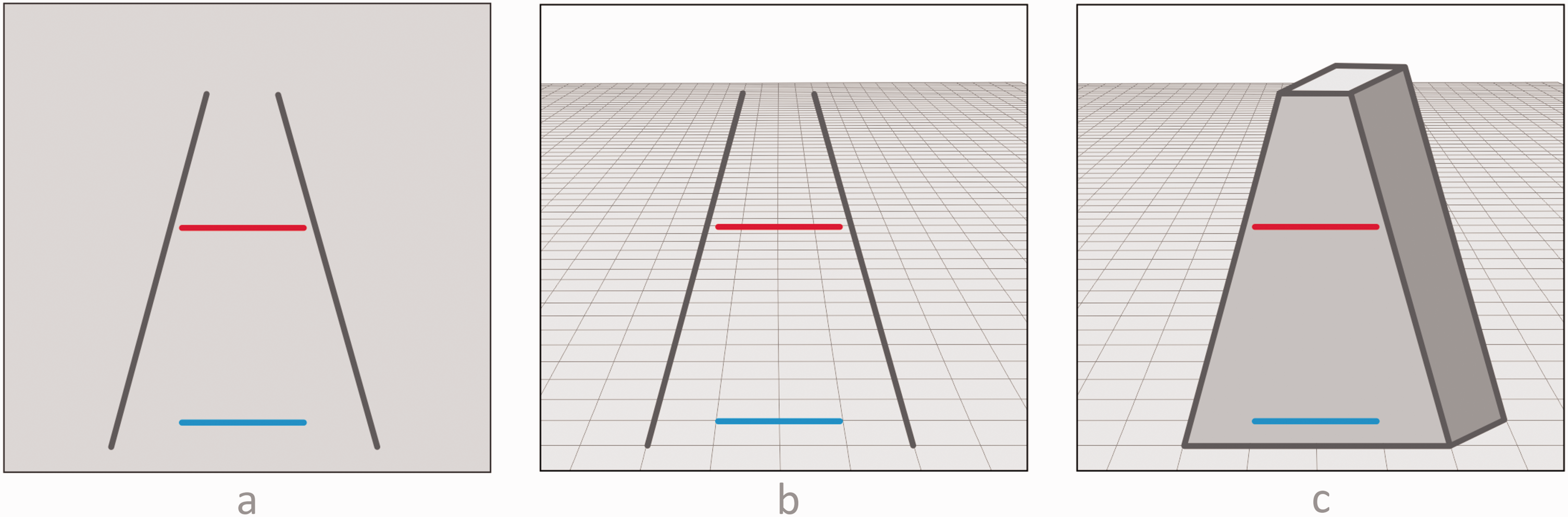
Ponzo illusion. A: Standard version. B: Standard version with added postulated perspective. C: Standard version with different added perspective.
A similar investigation of this effect as in the two previous cases can be performed, involving substituting photometric features with corresponding geometric features. In the geometric analysis, the moderating variable is not illumination but distance, the target objects are not checks but lines, and their critical feature is not gray shade but length; its distal version is not reflectance but length as measured by tape, and its proximal version is not luminance but length as measured by visual angle. With these substitutions in place, a fully analogous analysis can be implemented.
In the actual 3D scene corresponding to the image, the top horizontal line would be further away than the bottom horizontal line, and thus its distal length would be greater than the distal length of the bottom line, but they would have the same proximal lengths; this is analogous to the fact in the photometric effects that the less illuminated check has higher reflectance, but that the two checks have equal luminance. In particular, note that, based on the perspective grid in Figure 12B, the extent of the bottom horizontal line amounts to two grid units and the extent of the top line to more than three grid units, so that in the corresponding 3D scene, the top line would be more than 50% longer than the bottom line (assuming a rectangular grid). If observers would be given the task to judge the distal lengths of the lines in that scene, they would be correct if they would judge them to be different. Thus, one could claim that seeing the top line as longer would not be illusory but veridical (see Felin et al., 2017; Fisher, 1968; Rogers, 2017). The effect could be explained as an instance of a “taking distance into account” mechanism, based on perspective cues, analogous to the “taking illumination into account” mechanism invoked in the previous two cases. On the other hand, if the task were to judge the proximal lengths of the two lines in the 3D scene, then judging them as different would be wrong, because they subtend equal visual angles.
However, Figures 12A and B are not real 3D scenes but 2D images, which have two interpretations, as pictures conveying the 3D scene, and as 2D patterns of lines. In the picture interpretation, in the pictorial distal task, the observers would be asked to judge the lengths of the two lines as they would be in the conveyed 3D scene; if they would judge that the top line is longer than the bottom line, this would be correct and would be an instance of pictorial size constancy based on conveyed distance. The other option would be a pictorial proximal task, that is, to ask observers to judge the projected lengths of the two lines in the conveyed scene; if they would judge them to be different, they would be wrong.
As for the 2D pattern interpretation, note that in the display itself, the two lines have the same length, both distally (as measured on the display) and proximally (they subtend the same visual angle). The distal task for the observers would be to judge the lengths of the two lines in the image itself, and if they would judge them to be different, they would be wrong. The proximal task would be to ask observers to judge the projected lengths of the two image lines, and if they would judge them to be different, they would be wrong as well.
Using the same logic as in the photometric effects, according to the augmented framework, this effect would be an illusion in the 2D pattern interpretation. However, it could also be declared as an instance of veridical perception in the pictorial interpretation, if the congruency criterion is disregarded.
How can this effect be explained? The popular perspective-based “taking distance into account” explanation of the traditional form of the Ponzo illusion is not necessarily correct. Consider Figure 12C, constructed after a configuration used in an experiment by Newman and Newman (1974). It contains much the same basic arrangement of four lines as Figure 12A, but with some additional lines and surfaces, thus conveying a 3D scene, but different than the one in Figure 12B. In this scene, the two oblique lines are depicted not as extending into depth but as belonging to a plane perpendicular to the ground plane, and whose parts are thus at the same or similar distance from the observer; nevertheless, the illusory difference in length seems similar as in Figure 12A. Indeed, the illusory effect in the Newman and Newman figure was the same as the effect in their figure corresponding to Figure 12A. This outcome suggests that the illusory effect in the traditional Ponzo configuration may not be due to the perspective depth interpretation. An alternative possibility is that the effect is due to a 2D framing effect, such that the same extents look longer in a smaller frame than in a larger frame (Künnapas, 1955), due to contour interaction effects (Fisher, 1969, 1973; Yamagami, 2007). However, perspective cues, if they are salient enough, may significantly contribute to the effect. This is indicated by the fact that the strongest effect in the Newman and Newman’s (1974) study was found in a figure corresponding to Figure 12B.
As part of a criticism of the notion of illusions, Rogers (2017) has conceived of a series of “Ponzo-structured” setups, starting with a scene involving railroad tracks, then gradually impoverishing it visually by eliminating various depth cues, and finally ending up with a basic configuration. For example, one could start with a photograph with Ponzo motives, then diminish the perspective cues gradually to arrive at Figure 12B, and then diminishing them further to arrive finally at a constellation containing just four lines, as in Figure 12A. He then posed the question: “Using this hypothetical continuum as a basis, would it make sense to ask at which point our perception should be labeled as changing from veridical to illusory?” (p. 153). The answer is that such a point and the implied logical problem for the notion of illusions need not necessarily exist. The reason is that the hypothetical stimulus continuum would correspond to two interpretational continua, one pictorial, involving the conveyed 3D scene, and the other based on the 2D stimulus pattern. Each display along the continuum could be interpreted in both ways, and the judgment that the top line is longer would be veridical for the pictorial interpretation and illusory for the pattern interpretation. What would change along the continuum would be the naturalness of the two interpretations for the observer: At the start, the 3D interpretation would be easy to maintain and the 2D interpretation would be possible but perhaps more effortful; the former interpretation would gradually grow harder and the latter easier, in step with the increased impoverishment of the display. Even in the final, fully impoverished state corresponding to Figure 12A, according to the perspective theory, an implicit perspective interpretation should be possible because such an interpretation is claimed to be the cause of the illusion in that figure.
3.4. Illusions and Errors
All definitions of illusions have taken for granted the idea that vision can be erroneous. However, many authors have questioned this assumption (see Mausfeld, 2002, 2011, 2015). The basic argument is that the activity and output of the sensory system are not something to which the notion of error—or the notion of truth—could be properly applied. For example, in 1710, Leibniz wrote in his Theodicy that “The external senses, properly speaking, do not deceive us” ($65). Similarly, in his Anthropology in 1798, Kant claimed that “The senses do not deceive” ($11). In a more restricted context, Helmholtz (1896b) maintained that “The sense organ does not deceive us and does not act against the rules in any way, to the contrary, it acts according to its fixed, immutable laws and simply cannot act otherwise” (p. 100). Mach (1914/1959) expressed the same general idea when he wrote that “ … the senses represent things neither wrongly nor correctly. All that can be truly said of the sense-organs is that under different circumstances they produce different sensations and perceptions” (p. 10). Austin (1962) wrote that “our senses are dumb … [they] do not tell us anything, true or false” (p. 11). Travis (2004) claimed that “Perceptual experience is not as such either veridical or delusive … in perception, things are not presented, or represented, to us as being thus and so. They are just presented to us, full stop” (p. 65). Brewer (2006) wrote that “In perceptual experience, a person is simply presented with the actual constituents of the physical world themselves” (p. 169). Koenderink (2017) noted that “Presentations simply happen to a person … Presentations as such cannot be illusionary, because they are beyond true or false” (p. 119). Manzotti (2017) wrote that “In illusions, no perceptual error occurs” (p. 146). According to such views, the senses merely do what they do; sensory processes are just another class of organismic processes which simply happen, like digestion or breathing, and cannot be right or wrong as such.
If it is indeed true that the senses are innocent of both truth and error, is not the very notion of illusions in deep trouble? Not necessarily. Note that this conceptual move would not make the phenomena illustrated in Figures 1 to 9 and many related effects just pop out of existence and vanish. There still would remain the problem as to how they should be properly characterized. Where would the errors come from, if the senses are indeed innocent? A popular answer, offered by several of the authors cited here, is to attribute their origin to more “central” entities. For example, Leibniz went on in the above quote to claim that “it is we who deceive ourselves by the use we make of [the senses].” Kant maintained that “the error is always the fault of reason only.” Helmholtz concluded that “it is us who are mistaken in our understanding of the sensation.” Brewer claimed that “Any errors (…) are products of the subject’s responses to [the] experience (…). Error (…) is never an essential feature of experience itself.” Manzotti continued that “the mistake is a matter of misbelief.” Much the same idea was held by the originator of the term “geometrical-optical illusions,” J. J. Oppel himself; in the cited definition of this notion, in the portion of the text left out of the above quote (the “ … ” part) he qualified his statement that the eye is in error by adding “or more precisely, as with all so-called sensory illusions, actually the unconscious judgment of the mind.” Thus, the general idea is that errors in perception do exist, but that their source should be relegated from our sensory mechanisms to our judgments instead—or to our reason or intellect or cognition or mind or belief or “us” or the “personal level” or some such “higher” mental instance. In other words, this move does not delegitimize the notion of illusions, it just recategorizes it, and does not pose any existential threat to it.
Removing illusions from the realm of sensations and associating them with cognition, reason, belief, and so on, is not without its problems, though. One issue that would need to be clarified is what exactly would be the nature of the information that vision is supposed to simply “present,” such that it would be left for reason to sort out its truths and errors? For example, a glance at the displays in Figure 3 provides relatively detailed impressions about the shapes, sizes and colors of the patches and their backgrounds, and of their spatial arrangement. Does reason contribute to these visual experiences? It would be odd to maintain that perception of shape and color only arise by reasoning, that is, that the patches are seen as shapeless and colorless but judged by reason as circular and gray. But if vision already “presents” the shapes and colors that are seen, what is it that is left for reason to judge? Supposing that vision furnishes the information about the individual gray shades of the two patches, is the claim that it would be reason’s exclusive authority to compare their shades? Or would the impression that the patches look to have the same shade, or that they look to have different shades, rather just be part and parcel of the same visual process which “presents” the individual shades to consciousness?
In Figure 3, the pair of patches in Case B look similar to the pair of patches in Case D, and in both cases, one patch looks darker than the other patch, and in a similar way; however, only in Case D are the patches physically different, whereas in Case B they are physically equal. A physiological account of this effect could be based on neural interactions elicited by these displays in the visual system by both the patches and their backgrounds (e.g., see the computational model of Grossberg & Todorović, 1988). For example, at some level of the visual system, the two physically different displays could eventually cause equivalent neural activity distributions corresponding to the two patches; that is, in both Case B and Case D, the effective neural activity corresponding to one patch would be lower than for the other patch. This neural state of affairs would be the basis of the impression that one patch looks darker than the other patch. Analogous processes could perhaps also explain other visual illusions. Setting aside the question whether such explanations would be correct or not, note that in these mechanistic accounts only neural interactions and corresponding sensations would be involved, but no appeals to beliefs; invoking beliefs in addition would seem to be explanatory redundant.
Supposing that vision “presents” to higher cognitive levels both the information about individual colors, shapes, sizes as well as about their relations, what may remain for reason to do is to formulate beliefs concerning the states of affairs in the world, based on the information provided by vision. In Figure 3, propositions could be formulated expressing the beliefs that in Case B and in Case D, one patch is darker than the other patch. As it turns out, the latter belief would be correct and the former belief would be incorrect. Similar considerations apply for Cases A and C, concerning impressions of equality of gray shades. The same logic applies for Figures 1 and 5. Note, though, that such beliefs would amount to after-the-fact reports of judgments of certain aspects of the visual impressions, in no way constitutive of the genesis of these impressions or contributing to their explanation.
However, some problems would still remain. It is well known that illusions are cognitively impenetrable, which makes it doubtful that standard forms of belief are involved in experiencing them. For example, being informed, and correctly believing, and even knowing for sure that the two target lines in the Müller-Lyer illusion in Case B in Figure 1 have the same length has no effect on the fact that they appear different, even if one has drawn and repeatedly measured them oneself. Refusing to change beliefs in light of overwhelming evidence to the contrary would be irrational, and yet experiencing this illusion is quite widespread in the population. Similarly, you can stare at the two patches in Case B in Figure 3 as long as you wish, but even if you believe, and correctly so, that they are physically equal, your belief will have zero effect on the impression that their gray shades are different; moreover, this illusory perceived difference will be just as compelling as the veridically perceived difference of the two patches in Case D. In sum, analyses of illusions in terms of beliefs may not contribute much to their understanding.
3.5. Illusions, Reality, and Measurements
The most radical strategy to challenge the notion of illusions as erroneous discrepancies from reality is to question the notion of reality itself, in the sense of a single objective yardstick of truth, to which perception is to be compared, and to which it either conforms (veridicality) or does not conform (illusoriness). For example, Mausfeld (2002) asked: “What is the ‘true physical situation’? What is the reference frame for the beliefs and expectations that give rise to a distinction between ʹnormalʹ and ʹillusionaryʹ perception?” (p. 81). Schwartz (2016) wrote that Empirical research and theory start to run into trouble … when it is assumed there is a single way to characterize the reality or physical measurements to which veridical experience must agree…There is no privileged physical … specification of perception’s goal(s) and no unique standard for assessing correctness or truth. Nor is it obvious that one is needed. (p. 41) it is impossible to point to any one true way that things really are. Objects can be seen, described and represented in a large variety of ways … Various potential representations and expressions [of reality] are not necessarily mutually exclusive, but useful for particular purposes, making different features salient. (pp. 1051–1052) our perceptions almost surely do not track the structure of W [the world], which entails that some assumptions that we naturally make about W—such as that it has three dimensions of space, a dimension of time, and contains physical objects with properties such as mass and position—are almost surely false. (p. 1553)
As for the dichotomy of realities invoked by Gregory, Eddington, and Sellars, it is clear that normal human and animal perception is not directly involved with discerning atomic structures or collapsing wave functions but rather with handling everyday midsized objects and terrestrial scenes. Felin et al. (2017) seem to describe such an approach when they wrote that it “simply represents a pragmatic and empirical stance: objectivity only applies to what humans can actually touch and see (or verify)—thus circumventing any discussions that might get into metaphysics or the nature of reality” (p. 1051). But when illusions are considered, they claimed that it would remain true that there is no possible way to point to or verify any one objective reality against which we might test susceptibility to illusion or bias … We may be able to momentarily trap subjects into seeming illusions, into not seeing things in one specific and rational way that we might demand of them. But these illusions are only an artefact of demanding that perception conforms to one point of view, even though other views are possible, depending on the perspective. (p. 1050)
Does the multiplicity of potential descriptions of reality prove the conceptual bankruptcy of the notion of illusions? Not necessarily. Reality may indeed be describable in multiple ways, with different criteria of correctness, or none at all. However, once a particular description is chosen, unambiguous criteria for correctness can apply, with respect to that description. As an example, consider this observation by Koenderink (2012): The same sequence of keyboard presses may be interpreted as a password, a number, a word in the English language, some code, an assembler command, gibberish … Input structure is not intrinsically meaningful, meaning needs to be imposed (magically) by some arbitrary format. (p. 175)
Which interpretative framework would be relevant for illusion research? The obvious choice is for criteria of correctness to be supplied by physical measurements. To illustrate, suppose that Figure 1 is shown to observers. This display may be described in different ways, and different types of judgments may be made about it. However, once subjects are asked to judge whether the lengths of the two target lines are equal or not, the criterion of correctness becomes what the tape measure says about their lengths; the fact that other types of judgments could also have been requested or that different types of criteria could also have been applied is inconsequential. Criteria based on measuring instruments were used in all narrow definitions of illusions, cited earlier, and in most of the thousands of empirical studies of illusions. The question whether the data delivered by such tools appropriately reflect reality in some deeper sense is outside of the scope of this text and is irrelevant for its goals.
The tasks posed to subjects in studies of classical illusions generally involve various types of perceptual judgments concerning position, size, shape, orientation, position, and color. Neither the types of these judgments nor the corresponding correctness criteria are particularly unnatural or contrived. Deliberate engagements of our visual capacities for such purposes are not rare in our everyday traffic with the outside world. To illustrate, here are some examples which should feel familiar, and many more could be added (see also Schwartz, 2016): Which piece of cake on the plate is the largest? How distant is that cup from me? Can this sofa pass through this door and fit into that place in the other room? Can this piece of paper be inserted into that envelope? Can I still wear this suit? Will it fit into the suitcase, will the suitcase fit into the trunk of the car, will the car fit into the parking space? Are these two screws of the same size? Are they positioned at the same height on the wall, is the picture that hangs on them centered on the wall, does it hang straight or is it tilted, and is its top edge aligned with the top edge of that other picture? How big is that puddle of rainwater on my path? What is the precise direction of the bulls-eye as seen from my position in the shooting range? On the basketball court, what are the current directions and distances from me to the hoop and to the players from my team and the other team? How far from me is that car down the road, is it moving towards or away from me, and how fast is it moving? Is the wall paint in this room the same as in the other room? Does the paint in the bucket I brought match the paint on the wall?. The list could go on and on.
The main point here is that for many such questions there does exist a correct answer, which can be supplied by appropriate instruments, such as tape measures, protractors, photometers and other ways to ascertain values of positions, sizes, orientations, colors, and so on. To illustrate: There is a largest piece of cake, the sofa can or cannot pass through the door, the picture is or is not centered and it does or does not hang straight, my car will or will not fit into the parking place, the car down the road is or is not moving towards me, the paint in the bucket matches or does not match the paint on the wall. And so on. The truth is out there! Or at least some of it. And so on.
In everyday life, our primary strategy to answer such questions is not to rely on instruments but rather on our senses. Oppel used the term “Augenmaβ,” which translates as the “measure of the eye”; accordingly, one way to characterize visual illusions would be that they are deceptions of the measure of the eye. We usually have confidence in what our senses deliver in such situations, and generally base our decisions what to do upon their output; thus such perceptual judgments strongly affect and guide our immediate actions. To illustrate some questions, we “ask” from our senses: Which piece of cake should I grab? Can I reach that cup without standing up? Should I try to move that sofa out of this room or let it stay here? Should I relocate and reorient the picture on the wall? Should I try to park the car in that spot? Is it better to shoot the ball at the hoop or to pass it to a teammate, and if so, which one? Should I attempt to jump over that puddle on my path, or rather walk around it? Is it safe to cross the road? Should I use the paint in the bucket to paint that wall? And so on.
Properly registering the surrounding spatial layout is also of paramount importance for animals in their efforts to negotiate the environment and act in it. Whether an animal is right or wrong perceptually can make a big difference and have serious consequences for survival. For example, for a bear trying to seize salmons as they leap up river falls, for a chameleon projecting its long tongue over considerable distances to catch insects, or for a fox chasing a zig-zagging rabbit, the value of perceiving distance and direction of their prey as accurately as possible is obvious. Conversely, the accuracy of the prey’s information about the position of its predator is even more crucial, and adequate perception can literally be a matter of life and death—whereas misperception by predators could mean that they are going to miss the lunch, misperception by preys could mean that they are going to be the lunch.
It is important to stress that the approach to illusions advocated here does not embrace the idea that the primary and final purpose of perception is to reconstruct faithfully various aspects of the environment—and that illusions show what a poor job it is doing in attaining that purpose! The ultimate biological criterion is certainly not veridicality as such but rather adaptation, fitness, and survival. In situations in which such criteria are better served by distorting objective relations in the minds of perceiving organisms, they will definitely trump truth (see Mather, 2011, pp. 89–90). But sometimes it is truth that is adaptive, truth that serves fitness, and truth that promotes survival. This happens in situations, a few of which were cited here, in which the success and failure of behavior are likely to depend on whether perception is or is not veridical. The evolution of sensory organs throughout the animal kingdom was probably in part guided by the need to increase the precision and accuracy of corresponding perceptual capabilities in the service of better adaptation, fit, and survival.
Measuring instruments were developed precisely because for some important practical purposes instrumental measures tend to provide more trustworthy results about environmental states of affairs that are of interest to us than our own “measures of the eye.” If you want to build a house that will stand, you are better off relying on the stupid plumb bob than on your naked intelligent eyes for making sure that the walls are vertical. Or, if you plan to buy or sell a certain length of yarn or amount of firewood on the local fair, you will put your faith more into official weights and measures than into simply eye-balling the merchandise. For such purposes, it is sensible to accept what the instruments deliver as the ground truth and pronounce the senses as the guilty party in cases of disagreements. Although in our everyday dealings with the environment we primarily rely on our sensory judgments, if circumstances allow or demand we do check our perceptual intuitions against measurements by appropriate instruments—and we defer to them. Regardless how subjectively convincing it may look that the sofa could pass through the door—if the tape measure says it cannot, that is it, resistance is futile, there is no questioning the verdict of objective measures. 5
Of course, humans did not miraculously acquire unmediated access to ground truth just by using measuring tools. It is not the case that in contrast to senses, which give us only appearance, instruments magically deliver reality. The outputs of instruments are useless for us unless they provide some input to our sensory organs and are processed by our perceptual and cognitive systems. Thus, instruments, like senses, in the end deliver appearance—but appearance that we have reason to trust more than the senses, in certain respects. Moreover, even crude instruments have as a rule been designed in such a way that registering their outputs would involve Vernier-type tasks at which vision excels and for which intersubjective agreement is easily reached, such as discerning the position of a pointer on a scale or the alignment of two edges or notches.
It should be stressed that studying illusions as a research agenda does not necessarily commit vision scientists to—or against—any particular overarching perceptual paradigm (such as, say, “inverse optics,” “ecological psychology,” or “predictive coding”). Neither does it inescapably delude researchers to uncritically adopt the “measurement device conception of perception,” or lure them unawares into the “physicalistic trap” (Mausfeld, 2002). The senses are indeed not just measuring instruments—but for some important purposes in everyday life we ourselves use them in this role! In such circumstances, comparing perceptual judgments with instrument outputs is not arbitrary whim but makes eminent sense.
4. Differing Conceptions of Illusions
In Part 2, I have attempted to provide a coherent definitional framework for a subset of phenomena that have been called illusions, and in Part 3, I have argued that such a conception of illusions can be defended from various criticisms. The main characteristics of the augmented framework were illustrated with examples in Part 2 and concisely formulated in form of criteria listed in section 2.4.1. However, there is quite a variety of connotations that the term “illusion” has acquired in the psychological literature, which stress other aspects of this notion. In this part of the paper, I will try to clarify in what way the conception of illusions advocated here differs from other conceptions. I will comment on the views of illusions as trickery, as conscious, as surprising, as unexplained, as used in analytic philosophy, and finally on the relation of illusions to context effects.
4.1. Illusions and Trickery
Some authors who have studied illusions have strongly preferred not to use the term “illusion.” According to Weintraub (1979) “the word illusion connotes magic and deception” (p. 353), and he “eschews” it (Weintraub, 1993, p. 237), favoring terms such as “anomaly,” “misjudgment” and “misperception” instead (Weintraub & Schneck, 1986, p. 147). Wenderoth (1992) proposed that “It may be time to banish terms like ‘illusion’” (p. 150). Referring to some unsolved problems in visual perception, Morgan (1996) wrote that “We do not have the answers to these questions yet, but at least they make no reference to the concept of an illusion” (p. 42), preferring the term “perceptual biases” (Morgan, 2018). These other terms seem adequate and could be used if that is deemed to enhance scientific communication. However, the use of the term “illusion” is already well entrenched and, needless to say, not intended to carry any connotations of magic, deception, and trickery here.
4.2. Illusions and Awareness
Several authors (Hecht, 2013; Pasquinelli, 2012; Pinna, 2013; Savardi et al., 2012) have discussed the role of awareness of illusoriness of a perceptual content, “the fact that the subject who undergoes an illusion can … become aware that something is wrong with his experience, in a broad sense” (Pasquinelli, 2012, p. 61). Hecht (2013) suggested that the experience of a discrepancy should be a defining feature of illusions. Such experiences are indeed interesting phenomena in themselves. However, they are not part of the definition of illusions in the augmented framework. Uninformed and unsuspecting observers of illusory configurations such as Figures 1 to 9 would not be likely to spot anything remarkable in the simple, artless drawings. If attended to, some lines and patches might look to them to be same or different in certain respects, compared with other lines and patches, but there is nothing unusual about that. Thus, their impressions could be wrong without them being cognizant of that. In fact, we might all experience any number of illusions at any point in time but not be aware of that, as most of us do not walk around with tape measures, plumb bobs, protractors, and photometers, rearranging objects in our environment to check how they look in different circumstances. In sum, in the augmented framework, experiencing illusions does not necessarily involve awareness of illusoriness.
4.3. Illusions and Surprises
Illusions are sometimes characterized as visual phenomena which are surprising. They can be rather surprising indeed, which is likely the reason they are so popular; however, this cannot be their defining characteristics, if only because there are many surprising things which are not illusions. But why should illusions be surprising? Surprises are events which are unexpected in the light of past experience. Based on past experience, most people have apparently concluded that their senses are generally trustworthy. At the most basic, one tends to expect, without any conscious deliberations, that features which look equal/unequal actually are equal/unequal, and that is probably why cases in which they are unequal/equal are surprising. On the other hand, students of illusions, given their past experience, tend not to be surprised by variants of standard illusions, though even they can be surprised by novel ones. But, there are also converse cases: Given my experience with many variants of the ZölIner illusion, I was quite surprised to find that Figure 6F was not illusory!
On the other hand, some authors have denied that illusions need to be surprising. Thus, Austin (1962) asked: What is wrong, what is even faintly surprising, in the idea of a stick’s being straight but looking bent sometimes? Does anyone suppose that if something is straight, then it jolly well has to look straight at all times and in all circumstances? Obviously no one seriously supposes this. (p. 29)
4.4. Illusions as Unexplained Phenomena
Quite a few researchers have regarded illusions as currently unsolved perceptual riddles, which would lose their illusory status if their causes were understood. For example, illusions are said to involve an apparently inexplicable discrepancy between the appearance of the stimulus and its physical reality … As our understanding of visual phenomena increases, the range and scope of the effects known as visual illusions should contract. Ultimately, when we know exactly how the visual system works, visual illusions should no longer exist. (Coren & Girgus, 1978) Could it be that when we understand an effect sufficiently well we treat it as a consequence of how our perceptual system works, rather than an illusion, but until that point the effect is regarded as an illusion? In other words, perhaps illusions represent only those aspects of perception that we do not fully understand. (Rogers, 2014)
Such a conception of illusions is not shared in the augmented framework and is indeed quite foreign to it. I was surprised to discover that among researchers of illusions there were so many advocates of the notion that “not being explained” was not an accidental feature but rather an essential characteristic of visual illusions, an idea which never occurred to me. The way illusions are characterized in the augmented framework has little to do with whether or how they can or cannot be explained. Theorizing about illusions is fine, of course, but in the current state of our knowledge about illusions, theory-neutral definitions should be preferable to premature theory-based definitions. Theories of illusions have proliferated since the time they began to be studied. For example, only 7 years after he first reported his illusion, Müller-Lyer (1896) was already able to discuss accounts of this effect by six other authors; eventually, he concluded that “most of the opponents have proved each other wrong,” and maintained that his own account still stands. Nevertheless, a few years later Titchener (1901, pp. 321–328) listed 12 theories of the illusion. Even theories that temporarily prevail and are generally accepted in certain periods may be subsequently supplanted by other, very different theories. With theory-based definitions, the status of a phenomenon as an illusion or a non-illusion would have to be reassessed when theories change or are disproved by new findings, which is not a rare occurrence (Wenderoth, 1992). However, illusory phenomena are much sturdier beasts than our theories about them, and it does not make sense for them to swing in and out of the status of illusionhood, in step with the volatile alterations of the theoretical landscape. Thus, although it would certainly be desirable if different classes of illusions could be accounted for by different classes of underlying mechanisms, in the light of our current level of knowledge, my preference would be to avoid theory-based definitions as much as possible.
Classical illusory effects are certainly consequences of “how the visual system works”—how could they not be!—many aspects of which we have not figured out yet, but hopefully will one day. But when (if?) the Müller-Lyer illusion is finally pinned down to most everyone’s satisfaction as a particular consequence of how the visual system works, it will still be the case that it involves equal lengths appearing unequal and vice versa, which in the augmented framework will still characterize it as an illusion, albeit an understood one. Understanding and illusionhood are not mutually exclusive.
4.5. Illusions in Analytical Philosophy
According to the quotations from the philosophical literature cited earlier, in illusions an object appears to have a property which it in fact does not have, that is, it does not look as it is. There are two differences of such an understanding of illusions from the augmented framework approach advocated here: First, the philosophical definitions include many phenomena which are not illusions according to the framework, and second, they (appear to) exclude some phenomena which are illusions according to the framework.
As for the first difference, Calabi (2012, p. 2) listed four examples of illusions discussed by philosophers: “the crooked-looking oar, a seemingly greenish lemon, an apparently elliptical coin, and fuzzy-looking objects,” the illusions being constituted by the facts that “the oar is straight, the lemon yellow, the coin round, and a clearly defined object wrongly looks fuzzy to the short-sighted.” Such cases may be of interest to philosophers because of the epistemological issues they raise, concerning the reliability of the perceptually acquired knowledge of the world, but none of them fulfills the criteria of the augmented framework. As discussed earlier, the case of the coin does not involve an illusion but a confusion of distal and proximal attributes. As for the other three cases, they involve misperceptions of distal features, but none of them is a context-induced effect, a condition required by the augmented framework. Furthermore, they all violate the proximal/distal congruency criterion because they involve differences between the proximal features of the veridical and illusory cases. Thus, compared with the out-of-water oar, the shape of the projection of the half-immersed oar is modulated by refraction; compared with the lemon in daylight, the proximal, reflected color of the lemon is modulated (supposedly) by the green illumination; compared with cases of sharp, 20/20 vision, fuzziness is induced by the less than optimal relation between the refraction power of the lens and the size of the eyeball, which happens to be too big or too small. None of these examples would be particularly intriguing for most psychologists or neuroscientists because these effects are consequences of a proximal/distal incongruence whose causes lie either fully outside of the organism (oar, lemon) or inside the organism but before the light rays hit the retina (fuzziness) and are already fully accounted for by physical principles. In contrast to these pre-retinally caused effects, classical illusions are characterized by proximal/distal congruence and their causes are post-retinal and due to some organismic neural/psychological mechanisms.
Philosophical papers also count as illusions some cases which do fulfill the congruency criterion but not the contextual origin criterion. These are cases of mistaken identities, such as when counterfeit money is mistaken for government-issued money, when a wax figure is mistaken for a real person, or when a real person is mistaken for their identical sibling. Vision science has little to contribute to or gain from such cases.
As for the second difference between illusions defined according to the augmented framework and the philosophers’ definitions of illusions, note that the latter definitions imply that there is a “carrier” of the illusion, an object which has a feature that is misperceived. This view fits well with the single target format for presenting illusions. For example, in Figure 7 in Case B, the target line is the carrier of the illusion, as it appears to have an orientation which in fact it does not have, that is, it looks tilted although it is in fact horizontal; in Case C, it is the other way around. However, there are problems to apply this approach to some illusions presented in the dual target format. For example, consider the presentation of lightness contrast in Figure 3. Where exactly is the carrier of the illusion in Cases B and C located? Which patch appears to have a property that it in fact does not have? In a discussion of contrast effects, Tye (2000) wrote that “The colors things are experienced as having as a result of the contrast of the real color of the stimulus and the real color of the background are merely apparent. They do not really exist” (p. 156). However, note that in Cases B and C, both patches have backgrounds. Do the colors of both patches “not really exist”? What would their real colors be, and how could they be revealed? The problem is not limited to these simple displays but is pervasive. As noted before, any colored patch must always be positioned on some visual background or other (aside from Ganzfeld conditions), which can affect its appearance. When we look at an everyday scene with hundreds of colored regions bordering other colored regions, and thus potentially mutually influencing each other’s perceived colors, is it the case that only a few or even none of those colors may be real and actually exist—but we could never know which? For more detailed considerations of these issues, see Todorović (2007).
If it is not clear what is the carrier of the illusion in Figure 3, then there seems to be a problem for classifying the lightness contrast effect as an illusion, at least according to the philosophical definitions. In contrast, in the augmented framework, this phenomenon is a paradigmatic illusion, as it fulfills the required criteria. However, it needs to be presented in the dual target format in which no single target is the carrier of the illusion. Thus, diagnosing the presence of illusoriness in a constellation as a whole does not necessarily require that illusoriness be unambiguously located in any of its constituent parts as the carrier. For related considerations concerning perception of size and the Müller-Lyer illusion, see Schwartz (2012).
4.6. Illusions and Context Effects
Some authors have argued for a conception of illusions based on purely phenomenological grounds, without invoking the relation of percepts to the outside world or the notions of veridicality and errors. For example, after examining and dismissing several potential definitions of illusions, Reynolds (1988) proposed a definition according to which “An illusion is a discrepancy between one’s perceptions of an object or event observed under different conditions” (pp. 221–222), where “conditions” may refer to differences in stimulus contexts (spatial effects), stimulus exposure (temporal effects), and experiential contexts (cognitive effects). Similarly, Da Pos (2008, p. 183) stated that in illusions “one object appears with different or even incompatible characteristics under different viewing conditions,” where “incompatibility should only be established on a phenomenological ground.” Also, Hecht (2013) advocated a definition according to which an illusion is an actually experienced discrepancy, which may exist between two simultaneous percepts, between an occurrent percept and the memory trace of a percept, or between perception and cognition. Bruno (2012) advanced a related notion of illusions as perceptual inconsistencies.
Such views essentially define illusions as context effects. According to the augmented framework, classical illusions are indeed context effects. However, being context effects is just one among several criteria for illusions, as described in section 2.4.1. Therefore, it does not follow that all context effects are necessarily illusions. This is because context effects may exist which do not share all properties with illusions and therefore are not proper illusions, according to the augmented framework. In other words, the notion of context effects may be more general than the notion of illusions. In the following, illustrations of three phenomena are presented which involve strong context effects but which do not quite fit the illusion scheme because they do not seem to involve errors.
The following two figures illustrate two very different perceptual phenomena, but which can both be used to establish the same point in the context of the present discussion. Therefore, they will be illustrated first and discussed together afterward.
4.6.1. Contoured Gratings
Figure 13 contains nine “contoured gratings” (Marlow et al., 2015, 2019; Todorović, 2014a). In all figures, the interiors (central rectangular areas delimited on top and bottom by pairs of black horizontal lines) contain identical luminance gratings, which are the target objects. The gratings are triangular and consist of a sequence of three identical sections with an increasing and a decreasing luminance gradient. Beyond the top and bottom black lines, there are additional, exterior gratings with the same structure, whose extreme borders have differently curved shapes in different figures, which serve as different contexts for the interior gratings. These gratings are flat, 2D figures which convey the appearance of 3D surfaces. The characteristics of these perceived surfaces strongly depend on the shapes of the contours of the contextual gratings, all throughout the interiors, within the areas between the top and bottom black lines. These contour-induced context effects include salient differences in the perception of a number of features of the regions containing the interior gratings.
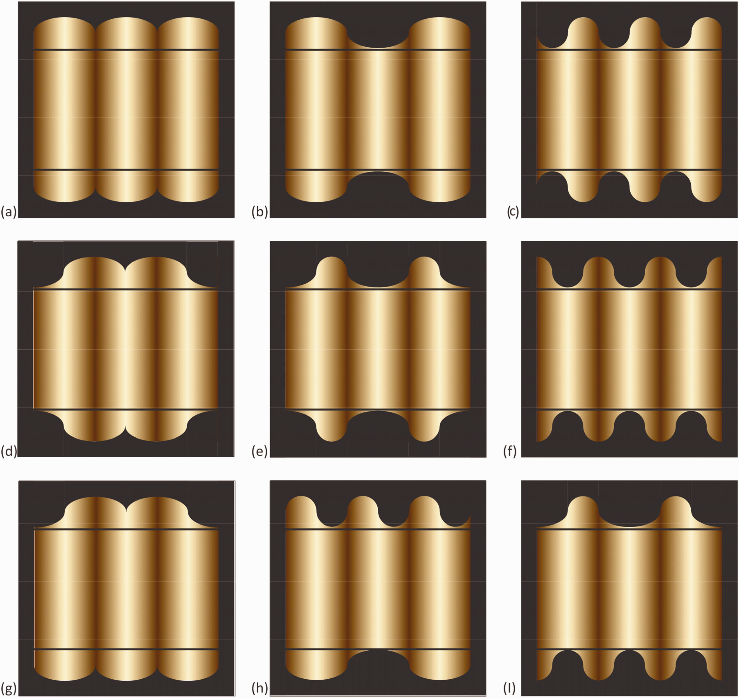
Contoured gratings. The portions of the figures contained between the black lines are identical, but their perceived reliefs, illumination, and other features appear different due to the differences in the shapes of the top and bottom contours located beyond the lines.
For example, the same portions of the interiors are perceived: as having convex and concave reliefs (Figure 13A vs. B); with lower and higher frequency of undulation (Figure 13B vs. 13C); with larger and smaller depth amplitudes (Figure 13B vs. C); with illumination coming from the front (Figure 13A and B), from the left (Figure 13C), and from the front and left and right (Figure 13E); and as made of materials which are uniform and shiny (Figure 13A), uniform and more matt (Figure 13C), and non-uniform (Figure 13D). The three stripes with the highest luminance in the interior gratings are perceived: as highlights positioned at tops of convex portions and bottoms of concave portions (Figure 13A and B), as high luminances at inflections (loci of curvature changes) of the reliefs (Figure 13C to E), and potentially as light sources in crevices (Figure 13D). The stripes with the lowest luminances are perceived: as low illumination in crevices (Figure 13A), as low luminances at inflections (Figure 13B and C), and as low reflectance paint (Figure 13D). In some cases (Figure 13F), prolonged observation may change the appearance of the figure drastically, from flattish and leopard skin like to shiny uniform bumps, just as in Figure 13A, but as observed through a curvy window. Note that whereas the shapes of the top and bottom borders of the exterior gratings in the top and middle row of Figure 13 are symmetrical, for displays in the bottom row they are different, constructed as combinations from different shapes of the top and middle row figures; these displays induce spatially contradictory and unstable, paradoxical appearances of the conveyed 3D objects, whose perceived reliefs may depend on attention and gaze direction of the observer. In sum, these displays indicate that shadings (luminance gradients) are massively ambiguous as sources of information about features of objects, and that contour shapes, acting as contexts, may provide effective constraints on potential interpretations of the shaded figures, possibly spreading from the borders toward the interiors. For further examples of contoured gratings, experimental data, and mathematical analyses of this class of figures, see Todorović (2014a).
Note that the target gratings and the context gratings are distinct visual objects, located in different regions of the visual displays. The target figure remains as an identifiable, visually segregated portion of the display, delineated by the vertical edges on the left and right and the horizontal black lines on the top and bottom, whatever pattern is added above and below it. The target gratings do form perceptually unified wholes with the context gratings, but this is similar to the way the shafts in the Müller-Lyer illusions form unified wholes with the chevrons.
4.6.2. Checkered Rings
Figure 14 consists of a 4 × 2 arrangement of eight displays which contain physically identical ring-shaped regions (the “checkered ring”), which look very different in different surrounding contexts (see Todorović, 2014c, for similar displays). The target figure is the checkered ring, which is composed of patches of two gray levels, identical in all eight figures. The contexts are quadratic meshes which are also composed of patches of two gray levels, which are different in different rows. The two meshes in the same row contain the same two gray levels but are inverses of each other, in that the lighter and darker squares are switched. The contours of patches in the rings and their surrounds are aligned, forming X junctions, whose photometric structure is an important determinant of the appearance of this type of displays (Adelson & Anandan, 1990; Beck & Ivry, 1988; Metelli, 1985; Singh & Anderson, 2006; Todorović, 2014c). The perceptual effect of the different surrounds is that the rings assume saliently different appearances in different contexts, depending on the different structures of the resulting X junctions.
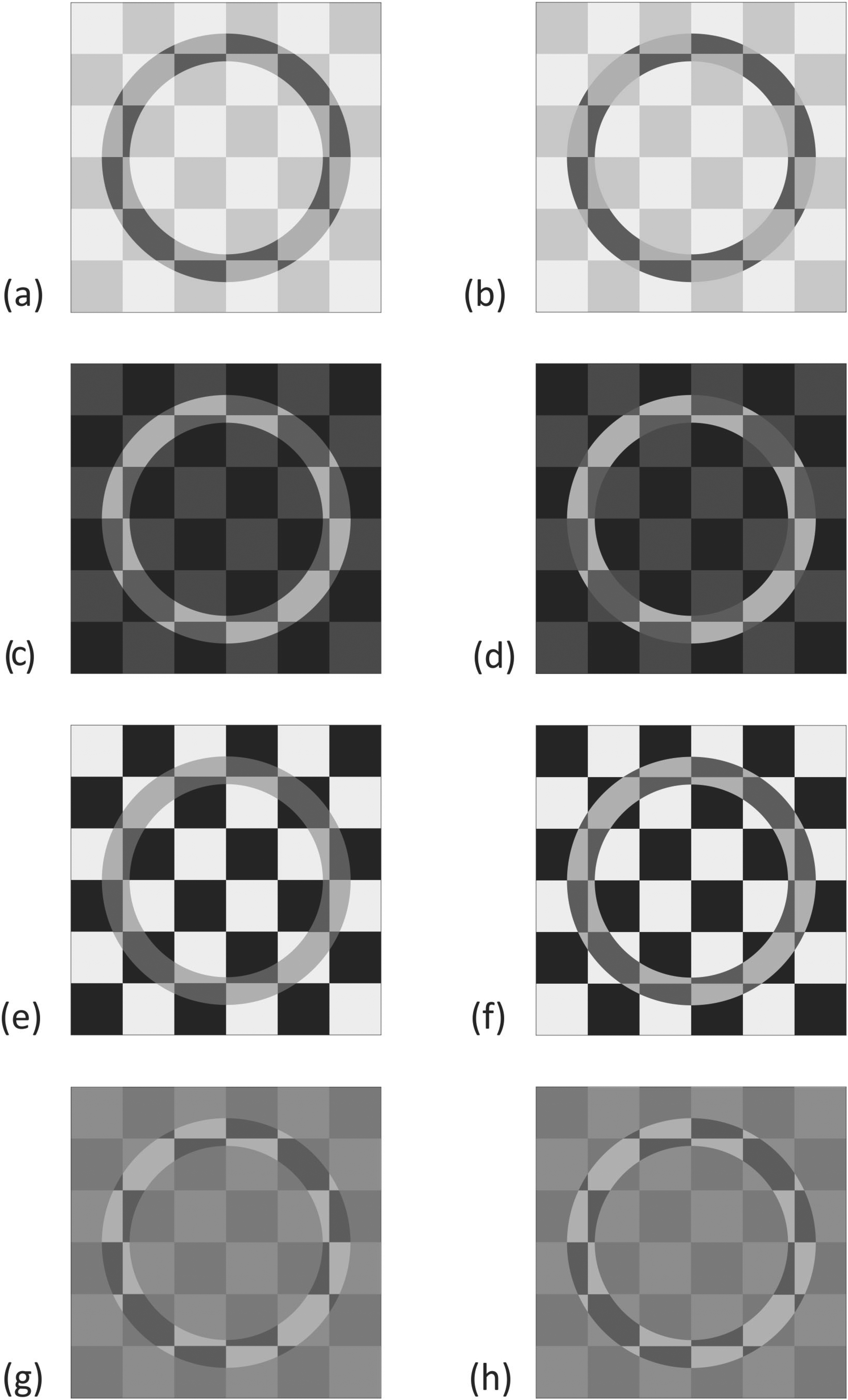
Checkered ring. The ring-shaped area is physically identical in all eight figures but is embedded in different visual contexts and as a consequence appears very different with respect to color, transparency, illumination, and depth layering.
In Figure 14A, the ring region looks like a ring-shaped transparency or shadow cast upon a chessboard pattern, which is composed of relatively light fields. In Figure 14B, with the luminances of the checks of the surrounding mesh switched, which involves changing the photometric structure of the X junctions, the appearance of transparency/shadow is gone, and the same region takes a different and more complex, stratified appearance: what one sees is a uniformly colored dark ring on white surround in the back, and a mesh of transparent light gray squares floating in front, with square holes between them; the ring appears as either in free view, through the holes, or as visible through the transparent gray squares. The appearance of Figure 14C is structurally similar to Figure 14A, but with inverse photometry, in that it looks like a ring-shaped spotlight cast upon a chessboard pattern with relatively dark fields. The appearance of Figure 14D, with luminances of the mesh elements switched, is structurally similar to Figure 14B, but with inverse photometrry: In the back, there is a light ring on dark surround, and in the front, there is a mesh of dark gray transparent squares, with holes in between, but in opposite places than in Figure 14B. In Figure 14E, the ring-shaped region appears as a transparent ring, more convincingly transparent than in Figure 14A, but which cannot be interpreted as a shadow or spotlight, in front of a high-contrast checkerboard. In Figure 14F, with the same but inverted background, the impression of transparency has disappeared, and the whole display looks like a flat mosaic. In Figure 14G, although it may not be appreciated immediately, the ring region looks like ring-shaped hole in a light gray transparent surface positioned in front of a chessboard pattern. In contrast, Figure 14H looks more like mosaic.
In sum, physically the same ring-shaped target region can look as a shadow (Figure 14A), as a spotlight (Figure 14C), as a dark region behind a mesh (Figure 14B), as a light region behind a mesh (Figure 14D), as a transparent region (Figure 14A and E), as a hole (Figure 14G), and as a mosaic (Figure 14F and H). These dramatic differences in appearance are due to differences in contexts and in particular due to the photometric differences of the structures of the X junctions along the inner and outer border of the ring and the mesh. The causes of these effects will not be pursued further here, but they are in agreement with the various psychophysical regularities of perception of achromatic transparency established in the relevant literature, some of which was cited earlier (see also Kingdom, 2011 and Gerbino, 2013).
Note that, similar as for the contoured gratings, the target rings remain as identifiable, visually segregated portions of the displays, whatever mesh they are embedded in. In none of the displays is there any ambiguity as to which portion of the 2D image belongs to the target ring region and which to the context region.
4.6.3. Discussion of Gratings and Rings
Should the strong context effects in Figures 13 and 14 be designated as illusions according to the augmented framework? There are two aspects to analyze here: First, like in some previous examples, the images in these figures can be interpreted either as flat 2D patterns or as pictures, conveying various 3D scenes; second, both single target formats and dual target formats should be considered. To anticipate, the analysis suggests that these context effects do not fulfill the criteria for being illusions.
In the single target format, there seems to be no reasonable way to identify and distinguish veridical and illusory cases, under either interpretation. When interpreted as 2D patterns, the contoured gratings in Figure 13 do not seem to exhibit any clearly incorrect impressions of their features; as for checkered rings in Figure 14, some of the physically identical local portions in different figures do tend to look somewhat different with respect to lightness, probably due to lightness contrast, but what is of main concern here are perceived global differences. When interpreted as pictures, the different figures do convey differently structured 3D scenes. In Figure 13, these scenes involve differences in perceived reliefs and a number of other features, as listed earlier; in Figure 14, they involve different constellations of depth stratification, transparency, and other features. However, there are no images for which it could be justifiably claimed that they “don’t look as they are,” nor is it clear what that would even mean for displays which convey 3D scenes. In sum, given that a basis according to which some of the displays could be proclaimed veridical and others illusory is lacking, and since illusoriness requires wrongness, these phenomena fail the veridicality/illusoriness criterion.
It may seem that figures in the bottom row in Figure 13 are exceptions, in that they convey impossible scenes; however, this is different from illusory displays, which convey scenes which are possible but some aspects of which are apprehended incorrectly. Similar considerations apply for other cases of impossible objects, such Penrose’s tribar, Escher’s stairs, Devil’s tuning fork, and others, which would not be regarded as proper illusions in the augmented framework. Ambiguous figures, such as the Necker cube, Rubin’s vase-faces, or the duck-rabbit, would not qualify as illusions either.
As for the dual target format, any pair of displays would provide an example of Case B, illusory difference: Equal objects looking different in different contexts. Furthermore, Case A is easily constructed by duplicating any of the displays in the two figures, thus involving equal objects looking equal. However, it is not clear how one could proceed to construct Cases C and D and thus fulfill the interaction criteria. For example, given the two displays in the top row of Figure 14 serving as Case B, it is not clear how one would construct two corresponding displays serving as Case D, which would convey the same impressions, but in neutral contexts.
Note that the manipulations in these displays satisfy the conditions for contextual effects discussed in section 2.4.2, in that they are exclusively confined to the context regions and leave the target regions unchanged. However, there is an important difference between these types of phenomena and classical illusions, as to which aspects of the targets are affected by differences of contexts. In classical illusions, the context effects generally involve quantifiable alterations of appearance of single visual features of target objects, often relatively modest, in one or the other direction, depending on the context, while their other features remain unaffected. Such effects include increasing or decreasing their perceived size (Müller-Lyer), lightening or darkening their perceived reflectance (lightness contrast), or tilting their perceived orientation one way or the other (Zöllner). In contrast, in the effects in Figures 13 and 14, different contexts induce a number of relatively radical structural and qualitative differences in the appearance of the targets and their parts. For example, the pairs of displays in each of the four rows in Figure 14 can be considered to involve inverse contexts, in the sense that the light and the dark squares in the meshes are switched; however, the corresponding difference in the appearance of the targets does not consist in oppositely directed differences of a single feature, such as size, gray shade, or orientation, but in a number of salient differences between the two scenes conveyed by the displays. Therefore, the standard procedures used in the studies of classical illusions do not appear to be easily applicable for such phenomena.
4.6.4. Perceived Gaze Direction
Figure 15A contains an arrangement of four cartoon faces in a 2 × 2 scheme which bears some formal similarities to the single target format but is different and somewhat misleading in certain respects, as will be detailed later; for a dual target format involving pairs of cartoon faces, see Todorović (2014b). The objective aspect is that in the two faces in the top row the irises of the eyes are geometrically centered in the eye openings, whereas in the bottom row, they are shifted rightward. The subjective aspect is that the perceived gaze of the two faces in the left column is direct, that is, directed (approximately) at the observer, whereas in the right column, the gaze is averted to the observer’s right side. In Cases A and D, the face cluster (the eyes–nose–mouth configuration) is centered within the elliptical head outline, whereas in Cases B and C, it is shifted laterally within the outline, to the right in Case B and to the left in Case C. The fact that identical eyes in different faces can be perceived to gaze in different directions (Case A vs. Case B, and Case C vs. Case D) was discovered long ago by Wollaston (1824), and this phenomenon is often labeled “the Wollaston illusion.”
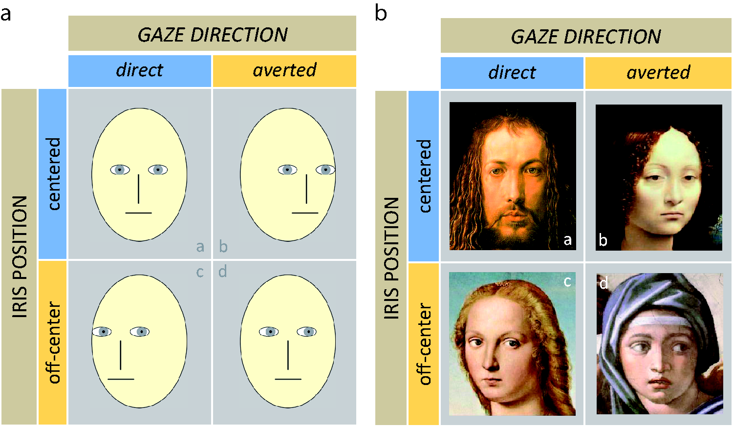
The dependence of perceived direction of gaze on iris location and head turn. A. Schematic faces. B: Renaissance portraits.
The phenomenon is clearly a context effect, but is it an illusion, according to the augmented framework? Note that if this effect were an illusion, then it would need to fulfill the veridicality/illusoriness criterion, and thus the corresponding 2 × 2 scheme would need to contain two cases, A and D, which exhibit veridical perceived gaze directions, and another two cases, B and C, in which perceived gaze direction would be illusory. However, in fact, all four cases are displays which convey broadly legitimate constellations of iris locations, head turns, and gaze directions. This fact is illustrated in Figure 15B, which presents four renaissance portraits with similar face constellations and perceived gaze directions as the cartoon faces in Figure 15A. Would anyone care to argue that whereas Dürer (Case A) and Michelangelo (Case D) knew how to depict gaze correctly, Leonardo (Case B) and Raphael (Case C) did not, and painted gaze illusions? In sum, illusions require errors, but as there are no errors in these displays, the scheme fails the veridicality/illusoriness criterion.
The context effects demonstrated in Figure 15 are different from the context effects in Figures 13 and 14, in that they do not involve pervasive structural alterations of appearance, but rather single quantifiable features. However, they are also different from all context effects discussed up to now, with respect to a feature that did not come up explicitly earlier. According to the dimensions criterion, the subjective dimension is a counterpart of the objective dimension, and the categories of the subjective dimension correspond to the categories of the objective dimension. This is the case for all 2 × 2 schemes in this article but not for the 2 × 2 table in Figure 15. In this table, the objective dimension is “iris location,” but the subjective dimension is not a counterpart to the objective dimension, such as “perceived iris location” but rather “perceived gaze direction.” These two notions are different, and it is important that they be distinguished, although they sometimes appear to be confused in the relevant literature. Also, note that the categories of the objective dimension, which are labeled as “centered” and “off-center,” and refer to iris location, do not correspond to the categories of the subjective dimension, which are labeled as “direct” and “averted” and refer to perceived gaze direction. Perceived gaze direction does depend on iris location but not only on iris location.
The difference between perceived iris location (which is the true subjective counterpart of objective iris location) and perceived gaze direction is manifested as follows. In Figure 15A, there are strong context effects for perceived gaze direction, which is quite different for Cases A and B, and also quite different for Cases C and D. In contrast, there is no context effect for perceived iris location! A little scrutiny reveals that the iris locations are perceived veridically, in that they look much the same, that is, centered, in both Cases A and B (as they are objectively), and also look much the same, that is, off-center, in both Cases C and D (as they are objectively); this is different from all other figures in this article in which scrutiny does not help much to perceptually escape the context effects. These considerations indicate that the displays in Figure 15 fail the factorial criteria and involve context effects but not classical illusions.
The main misconception in regarding the Wollaston effect as an illusion seems to be the implicit assumption that perceived gaze direction is the perceptual counterpart of iris location, and that it is only properly exemplified in frontally oriented heads, such as in Cases A and D, so that perceived gazes in turned heads, such as conveyed crudely by the shifted positions of the face clusters in Cases B and C in Figure 15A, and subtly and realistically in Figure 15B, must be illusory. This is simply false. Todorović (2006b) has shown that perceived iris location and perceived gaze direction involve different judgments: Given identical faces as stimuli and instructed to judge these two features, subjects provided qualitatively and quantitatively completely different reaction structures. For more analyses and experiments dealing with factors which affect perceived gaze direction, involving both realistic and cartoon faces, indicating that gaze direction is jointly determined by iris location and degree of head turn, see Todorović (2006b, 2009, 2017b).
5. Summary and Conclusions
The central theme of this article was the question “what are visual illusions?” The initial motivation was that recently a number of authors have doubted the legitimacy of that venerable notion. In Part 1 section, an informal historical review of definitions of illusions in the psychological literature has indicated the existence of two main types: According to broad definitions, illusions are general discrepancies of reality and appearance, whereas according to narrow definitions illusions are mismatches, in simple drawings, between observers’ judgments of features such as sizes, shapes, orientations, and so on, and their physical values, as specified by measurements. Adding some photometric effects to this group of geometric effects results in an enlarged set of phenomena denoted as “classical illusions,” which are the main focus of this article.
In Part 2, an augmented framework for illusions was presented, which includes both veridicality and illusoriness, characterized by a 2 × 2 scheme of four cases. Two versions of this scheme were presented. The dual target format, illustrated by three illusions in Figures 1, 3, and 5, involves comparisons of features of two target objects; in Figures 2, 4, and 6, some theoretically challenging variants of these illusions were illustrated. The single target format, illustrated in Figures 7 to 9, involves comparisons of features of single target objects and corresponding internal canonical norms; several issues specific to this format were discussed. The difference between distal and proximal features was elaborated, and its relevance for illusions was discussed. Based on all preceding considerations, the framework was summarized in the form of a set of criteria. Phenomena which satisfy these criteria were denoted as “contexed-induced” illusions, and it was hypothesized that many if not most classical illusions belong to this set. A number of additional issues concerning illusions were discussed, and a format for symbolizing some aspects of the framework was introduced.
In Part 3, a number of criticisms of the notion of illusions were considered. One criticism was that according to broad definitions, illusions are discrepancies of reality and perception, but that there are many such discrepancies which are not generally regarded as illusions. In response, it was argued that according to the augmented framework such cases are not illusions either because they do not fulfill one or more necessary criteria laid out in Part 2. Another criticism of illusion research was that it assumed that observers could judge features of objects independently from contexts. The reply was that such assumptions would indeed be inappropriate, but that they are not held by illusion researchers; rather, the dependence of certain types of features on certain types of contexts was empirically discovered. Still another class of criticisms has targeted illusory constellations which are not abstract 2D images, as in many classical illusions, but pictures, that is, representations of 3D scenes, for which it is not clear whether they involve illusions or veridical judgments. The reply was that such criticisms can be met by distinguishing pictorial interpretations and pattern interpretations of such displays. Illustrations and analyses of three examples of such displays were presented (Figures 10 to 12), including criticisms of some higher-level accounts of these effects. Another criticism was that it is inappropriate to apply the notion of errors to deliverances of sensory systems, and that illusions are errors of judgments. Some problems for this notion were discussed, but even if accepted, such a move would not endanger the existence of illusions as phenomena. The final criticism was that the idea of the existence of a single correct description of reality, with respect to which perception could be correct or be in error, is misguided. The answer was that although multiple descriptions of reality may exist, once a particular description is chosen, well-defined criteria of correctness and error can be defined. In particular, in accord with the narrow definitions of illusions, measurements provide reasonable criteria of veridicality of judgments involving features such as sizes, orientations, shapes, colors, and so on. Such judgments, which have been extensively studied in research on classical visual illusions, are not rare in everyday life, and deferring to measuring instruments in such cases is not problematic.
In Part 4, several examples of different conceptions of illusions that were found in the literature were discussed and compared with the approach advocated here. It was pointed out that according to this approach illusions have nothing to do with intentional deception and trickery; they do not need to be accompanied by conscious impressions of illusoriness; they can be surprising, but this is not their defining feature; it is not a necessary condition for them to be unexplained phenomena; definitions of illusions in the philosophical literature differ in important respects from the one advanced here; finally, although most classical illusions are context effects, the reverse is not necessarily true, and examples of strong context effects were presented which, for various reasons, would not qualify as illusions in the augmented framework (Figures 13 to 15).
The overall conclusion is that the notion of illusions, suitable reformulated, is not as problematic as is sometimes claimed and that its legitimacy can be salvaged, in particular in its narrow version. In contrast, broader definitions seem to be too broad and to include too many heterogeneous phenomena. When appropriately extended (including both veridicality and illusions) and restricted (satisfying a set of criteria), a notion of illusions can be devised which seems coherent and adequate. Nevertheless, the existence of different conceptions of illusions is legitimate, and it remains to be seen which conception is most useful.
6. Closing Remarks
This article has dealt with the issue what illusions are and how they can be adequately defined. It did not explicitly address the claim that even if the notion of illusions could be properly formulated, they still would not constitute a scientifically helpful concept (Braddick, 2018). For some reactions to this claim, the reader is referred to Todorović (2018), Shapiro (2018), van Buren and Scholl (2018), and Rogers (2019). However, a few remarks are appropriate here.
One of the central aspects of the notion of illusions, as it was stressed in this article, is the relation of perceptual judgments to objective states of affairs, that is, whether perception (here restricted to some visual features) is or is not veridical. A number of examples were listed of the relevance of this relation for the successful execution of various everyday tasks, important for negotiating the environment and sometimes for the very survival of humans and animals. The quest for getting a better grasp of what is going on around is one among the driving forces which have shaped the structure and function of the visual system throughout evolution. A stress on veridicality and illusions is also characteristic for philosophical discussions involving epistemology and related topics which deal with the role of perception for the acquisition of reliable knowledge about the world.
On the other hand, there are aspects of perception research for which such issues are less relevant. One among central endeavors in vision science is the elucidation of mechanisms which underlie the world-to-brain/mind-to-behavior chain/loop of events, that is, to provide an account of how environmental inputs to the eyes and their transformations at various levels of the visual neural system eventually lead to percepts and perceptually based judgments and subsequent actions. Whether these judgments turn out to be correct or incorrect will depend on the structure of the stimulus constellations, as illustrated in many examples here, in which veridical cases (A and D) were contrasted with illusory cases (B and C). However, the principles of processing of the stimuli are likely to be indifferent to external criteria such as veridicality. In other words, there is no reason to believe that the underlying mechanisms should be different for veridical and illusory judgments. In fact, a general guiding idea in illusion research is that the same processes that lead to veridical judgments for some classes of stimuli lead to illusions for other classes of stimuli. The main point here is that for the study of visual mechanisms, the more important question is not correctness or incorrectness of visual judgments as such but rather why and how certain types of stimuli lead to certain types of perceptual effects. Expressed from the perspective of the 2 × 2 scheme, the relevant grouping of the case pairs is not based on correctness of outcome, that is, A&D (veridicality) versus B&C (illusoriness), but rather on perceptual output, that is, A&C (subjective equality) versus B&D (subjective difference), which is orthogonal to the grouping based on stimulus input, that is, A&B (objective equality) versus C&D (objective difference). As we are used to regard our senses as generally reliable, the attention-grabbing phenomena are the illusory Cases B and C, in which the subjective and objective relations are in discord. However, closer scientific scrutiny often reveals that the mechanisms underlying the seemingly mundane veridical Cases A and D are also in need of explanation. For example, currently, we still do not have a good grasp on the neural foundation of such a basic feature as the perception of length, regardless of whether it is correct or incorrect. The mechanistic accounts of all four cases depicted in Figure 1 will be a by-product of deeper insights into this perceptual achievement.
The importance of the research of illusions was stressed already by Helmholtz (1896a): “It is especially those cases in which our impressions evoke in us representations which do not correspond to reality that are particularly informative for finding the laws of processes and ways through which normal percepts are established” (p. 96). However, the scientific interest of illusions for studying visual mechanisms does not lie primarily in their epistemological status, that is, that they involve incorrect judgments, but rather in the fact that they serve as a huge source of fascinating data on how identical stimuli can appear different in different contexts. Such phenomena virtually beg for explanations and provide salient challenges to our understanding of perceptual processes. However, as Titchener (1928) remarked, “The simplicity of the forms is, in fact, misleading; explanation is very difficult; and there is no present prospect of agreement among investigators” (p. 332). For Lindworsky (1929), illusions were enigmas felt as thorns in the flesh, presenting themselves “in broad daylight, as if to mock our inability to master them” (pp. 391–392). More recently, Gillam (2017) has concluded that Illusions are very difficult to explain. Local physiological effects first come to mind but tend not to be supported when their predictions are examined in detail. Functional theories have produced promising data but also encounter observations that are difficult to account for. Scene statistics seem like a promising technique to pursue further, but it is not clear what one should be looking for. (p. 72)
Footnotes
Acknowledgements
The author wishes to thank Patrick Cavanagh, Heiko Hecht, George Mather, Art Shapiro, Bob Schwartz, and Brian McLaughlin for very useful comments on a previous version of this article.
Declaration of Conflicting Interests
The author(s) declared no potential conflicts of interest with respect to the research, authorship, and/or publication of this article.
Funding
The author(s) disclosed receipt of the following financial support for the research, authorship, and/or publication of this article: This work was supported in part by grant ON179033 from the Serbian Ministry of Education, Science, and Technological Development.
