
Abstract
In this study, we proposed a GIS-based approach to analyzing hospital visitors from January to June 2019 and January to June 2020 with the goal of revealing significant changes in the visitor demographics. The target dates were chosen to observe the effect of the first wave of COVID-19 on the visitor count in hospitals. The results indicated that American Indian and Pacific Islander groups were the only ones that sometimes showed no shift in visitor levels between the studied years. For 19 of the 28 hospitals in Austin, TX, the average distance traveled to those hospitals from home increased in 2020 compared with 2019. A hospital desert index was devised to identify the areas in which the demand for hospitals is greater than the current hospital supply. The hospital desert index considers the travel time, location, bed supply, and population. The cities located along the outskirts of metropolitan regions and rural towns showed more hospital deserts than dense city centers.
Keywords
During the early months of 2020, the coronavirus disease 2019 (COVID-19) spread throughout the world and eventually caused many cities and countries to embrace stay-at-home orders and social distancing measures. According to the Centers for Disease Control and Prevention (CDC) definition, social distancing is where people remain 6 ft or more apart when in public to prevent COVID-19 transmission, the primary spread being through droplets. These microscopic droplets may become airborne, which can then be inhaled by susceptible people. There is evidence that COVID-19 is transmissible before significant symptoms like coughing or sneezing might appear ( 1 , 2 ). Many different cities and states declared “shelter-in-place” and “stay-at-home” orders to prevent people from having close contact with others outside of their households.
The city of Austin, TX, declared a state of emergency with regard to COVID-19 on Friday, March 13, 2020, which resulted in businesses closing their doors; full stay-at-home orders were announced on March 21, 2020 ( 3 ). The issuing of stay-at-home orders by the local government was expected to decrease the number of new COVID-19 cases per day from the corresponding decrease in human interaction. On April 27, 2020, the Governor of Texas announced that Phase 1 of reopening would begin on May 1, 2020, which would allow certain nonessential businesses to open if they followed the necessary social distancing measures ( 4 ). The definition of an essential business might vary from state to state ( 5 , 6 ). However, one constant—hospitals—are an integral part of city infrastructure, providing a wide range of care from basic check-ups and refill appointments to specific trained surgical procedures. With a growing number of urban populations, it is essential to know who is traveling to the hospitals and the level of accessibility the said persons have to their hospitals.
Research Objectives
Who traveled to Austin hospitals during the first half of 2019 compared to the first half of 2020?
Could a census block group be measured for its accessibility to a hospital?
The first question addresses who is traveling to the hospitals, as this information could provide the basis for a framework for studying how various demographics are/have been affected by COVID-19. Research has identified that COVID-19 has affected minority populations most in regard to health service use increases ( 7 ). Were a significant difference in visitor numbers between 2019 and 2020 observed, this could indicate that COVID-19 has affected certain demographic groups more than others. Distinguishing the demographics that changed the most during the pandemic could shed light on certain groups being mistreated, at a statistical level. Patients with severe symptoms require hospitalization, whereas others with less acute symptoms might stay at home. Therefore, if a particular demographic stands out among patient visiting patterns, this might indicate genetic or socioeconomic underlying reasons why certain groups were experiencing more hospitalizations.
To evaluate an individual’s accessibility to healthcare services, it is essential to know how long it takes them to travel to hospital. A person who lives far away from a hospital might not be able to reach it in time for the necessary procedures. However, a person’s ability to travel to a hospital does not mean the hospital will have the bed supply to accommodate them. The resulting equation is a balance between the demand for hospitals by the population versus the supply of beds a hospital can utilize. Furthermore, both the supply and demand factors are restricted by time. The more time it takes to reach a hospital, the less effect the hospital will have in providing the necessary healthcare to the citizens of the census block group. “The golden hour” is a commonly used term when referring to the care required by severe trauma patients; if they receive care for their injuries within 60 min in highly specialized hospitals, their chances of survival drastically increase ( 8 ). However, for much more common, frequently occurring cases, the time span for hospital care may be shorter. For example, a nontraumatic cardiac arrest patient has higher survivability if life support is provided within 8 min ( 9 ). Timing is therefore essential in providing services for people in need of critical care. A team of researchers found that patients in Hong Kong who lived further away from healthcare facilities underwent a significant delay in receiving their diagnosis and treatment for COVID-19 ( 10 ). However, there is a strict timeline in the event of a traumatic injury that requires patients to receive rapid hospital care to ensure survival.
There is also the urban aspect of traveling and traffic times. An ambulance in a rural area might be able to go farther in the same time frame than an ambulance in a high-density city owing to traffic and more complex infrastructure. For the purposes of calculating hospital accessibility, geographic information system (GIS) networks have been utilized to simulate average travel times to hospitals. Robin Haynes and his team in 2006 found that the car to hospital travel time estimated by GIS networks was not significantly different from the actual travel times ( 11 – 13 ). Therefore, the accuracy of the GIS networks was used tocreate the time areas from hospitals for 10- and 20-min radii. Any location within a 10-min radius of a hospital received a greater positive impact than a 20-min radius. Furthermore, a 20-min radius received a slightly greater positive impact than a location outside the interval.
Citizens’ accessibility to hospitals involves another problem: the limited supply with which the hospital can provide its services. A hospital has only a limited number of beds, yet thousands people potentially need to be served. In this increasingly common scenario, hospitals may be unable to provide the proper care to all citizens in a critical condition. Therefore, the bed number of each hospital was utilized in the calculations. Furthermore, the bed number is stable and hard to change without significant physical modifications to the hospital structure, which can take extended periods of time. The last consideration is the spatial movement of people to hospitals. In theory, a person would choose to travel the shortest distance to a hospital. However, because of competition, there can be multiple hospitals within urban centers, which helps to distribute high demand within a city. The impact of distance and time to hospital was considered in McGuirk and Porell’s research in 1984; hospitals further away were considered to be less effective than those nearby; the distant hospitals would still be considered for providing healthcare support, but at a lesser frequency than nearby hospitals ( 14 ). A calculation that combines the travel times and supply levels of neighborhood hospitals—the hospital desert index—is proposed in the current research. The objective ofthis index value is to provide a more in-depth understanding of which neighborhoods have access to healthcare services and which are lacking. The idea of the hospital desert index is based on a concept called transit deserts: situations in which the demand for public transit exceeds the public transit supply in an area ( 15 ). Therefore, a hospital desert is an area where the need for a hospital is greater than the current hospital supply. The hospital desert index is unique and creates a solid definition for the term hospital desert—the term hospital desert has been usedcasually based on the assumption of location. However, location is only part of the story of cities in hospital deserts. The hospital desert index considers location, bed supply, travel times, and population. The underlying rationale for the index was that by combining these variables a hospital desert map that accurately represents the lack of healthcare throughout the state of Texas could be developed.
Materials and Methods
Data Overview
The state of Texas was the area of focus for the study, where measurements were performed on the census block group level. The reason for such a wide scope was that the visitors and their home locations were the basis of the research. It was important to ensure a wide variety of people were represented in such a large and diverse state as Texas. The Austin, TX, hospitals were analyzed on several factors, such as the visitor count per demographic; the average visitor distance traveled was limited to Austin, that is, hospitals had to be within the city limits of Austin to qualify for analysis. This detailed microanalysis of hospital visitors could also be applied to other major cities. Austin was chosen because of its central location within the state, which means the vast majority of hospital visitors would be within Texas’s state boundaries. In addition, its central location would allow for greater visitor diversity, who could be traveling from different regions of the state for highly specialized care. However, the entire state was included in the macroanalysis to create the hospital desert index. This decision allowed rural and urban areas of the state to be compared for their accessibility to hospitals. Major cities on the border of Texas, such as Brownsville, El Paso, and Texarkana, were carefully evaluated to ensure any nearby hospitals were included in the calculations, ensuring all possible hospital supply was included.
A data collection company, SafeGraph, released cell phone data sets containing a week’s worth of information on human movement patterns collected by tracking visitors’ cell phones from their home census block group to a specific point of interest (POI). The weekly pattern data set comprises information that records specific POIs, their addresses, coordinates, block group numbers, number of raw visitors, and a list of the census block groups with their corresponding visitor numbers ( 16 ). Using these data, the researchers created a visual representation of the temporal and spatial patterns in Austin, specifically, it allowed them to see visitor demand originating from home census block group to each specific POI.
Data and Methods for Austin COVID Analysis
First, a Python script was created to analyze the SafeGraph data set. Implementation of the Python library of Pandas and NumPy was used in the script to scan the data and output selected data into comma-separated value (CSV) files. For this portion of the study, hospitals were limited to general medical and surgical hospitals (GMSH), as defined by the North American Industry Classification System (NAICS). This consists of any hospital with inpatient beds and the capacity to provide any nutritional needs during a patient’s stay ( 17 ). The weekly pattern data set was first trimmed down to hospitals within Texas; hospitals were then selected to serve as the place data points within Austin. There were 28 hospitals in Austin that met NAICS’s GMSH definition. The same 28 hospitals were then selected from SafeGraph’s weekly pattern data for both the first quarter of 2019 and the first quarter of 2020. The final CSV contained the longitude and latitude for each hospital. This allowed GIS software to display each hospital as a point. ArcGIS Pro was the primary GIS software used throughout this research.
The sum of the visitors was calculated for each week for each hospital for the 26 weeks. In addition, since the home census block group of each visitor was known, an approximation of the demographics for each visitor for each hospital was possible, and this approximation was performed using census data. The demographic data were collected from the Open Census Data bank, which SafeGraph created to facilitate researchers’ analysis of data, rather than accessing these data directly through the census website. The census data used were American Community Survey (ACS) results, which comprised 5-year demographic data trends from 2018 ( 18 ). SafeGraph states that their data set represents a random sample of the population who use cell phone devices, comprising about 10% of the total GPS-enabled cell phone devices in the United States ( 16 ). SafeGraph corrects the data set for potential sampling biases to ensure accurate sampling rates ( 19 ). For each census block group, the percent of people per the demographic groups of African American, Asian, Latino, Pacific Islander, and White (non-Hispanic or non-Latino) is displayed. Suppose the census block group calculates 4% of its population to be Latino: in that case, a sample of hospital visitors from that census block group should be represented by around 4% Latino visitors in the total visitor count. According to the ACS, the White population (i.e., non-Latino) is categorized under B02001e2, African American population: B02001e3, Asian population: B02001e5, American Indian population: B02001e4, Pacific Islander population: B02001e6, and Latino population: B03002e12. The full table of field descriptions can be found in ACS documentation ( 20 ).
Since the hospital’s census block group and the visitor’s home census block group were both known, this data set allowed for the calculation of the direct straight-line distance for each visitor. In addition, each hospital’s latitude and longitude was given in the CSV file. The SafeGraph weekly pattern data file lists the number of visitors and their corresponding home census block groups in the column “visitor_home_cbgs.” This column was pivoted and expanded into two new columns to allow for simpler and more accurate analysis of the data. Every week’s pattern data for the hospitals were then combined into one CSV file. ArcGIS Pro has a feature called Desire Lines, which creates spider diagrams. The lines of each hospital to the home census block group were then used to calculate the average straight-line distance of a visitor, and the results were totaled each week. The census block group centroids for Texas were created using the TIGER/Line shapefiles from the United States Census Bureau. In ArcGIS Pro, the “Feature to Point” tool calculated and output the centroid of each census block group. The weekly pattern shapefile was subsequently imported into ArcGIS, where the Desire Lines tool was used to create a spider diagram. If a hospital had visitors whose census block group matched one of the block groups in the visitor block group list, then a line would be created. Specific line colors represented the number of visitors who traveled that week. SafeGraph implements a data privacy method with all census block groups: if one visitor is observed, the data will not report it. However, if two or more visitors are observed but fewer than five, the data set gives the visitor count as four.
Data and Methods for Hospital Desert Analysis
In this section, we focus on identifying areas with low accessibility to hospitals. For this, the definition of a hospital was changed slightly from the traditional NAICS definition. Hospitals were categorized as having licensed beds to accommodate emergencies and overnight patients. Definitive Healthcare released the data set for these hospitals that comprise data on the specific number of licensed beds, staffed beds, and intensive care unit beds per hospital for the United States ( 21 ).
As mentioned, the hospital desert index includes the entire state of Texas as this allowed comparison of rural and urban areas. Major cities on the border of Texas were carefully evaluated to ensure any nearby hospitals were included in the calculations, as these border hospitals would add to the supply- and help buffer the demand levels. The benefit of calculations that included the entire state was that there would be no issues related to urban sprawl (e.g., a hospital desert study limited to Austin's city boundaries). There might be cases in which census block groups on the edge of the city limits might be closer to a major hospital outside the designated area than to those within. Here that census block group would have been penalized for failing to take advantage of the supply from the out-of-city-limits hospitals. This problem was avoided by creating an index for the entire state.
First, the hospital data set created by Definitive Healthcare was limited to hospitals only located within Texas, except for the two Texarkana, AR hospitals. Next, using the ArcGIS Network Analyst tool, the researchers were able to create service areas that utilized premade network service areas to generate time distanceto or from a certain point. In this case, a 10- and 20-min service area for a hospital included all the streets that could reach a hospital within the specific interval. The 10-min radius was based on how 8 min is the critical time frame for paramedics to respond to a cardiac arrest. If a significant other can drive the patient to the hospital, then this is a one-way trip ( 9 ). In addition, we decided to round up the time for unknown circumstances, thus creating the 10-min radius from the hospital that represented the potential for lifesaving care. However, some with fatal conditions might survive beyond this 8-min interval, but the golden hour rule exists because the best recovery results have been found to be within the first third of an hour of a traumatic injury; thus, the research also included a 20-min radius ( 8 ).
Next, each census block group was matched with its corresponding total population from the ACS data. Using the spatial join feature, the total number of citizens under each interval per hospital was calculated. These data were organized into two categories: the population within 10 min of the hospital (Pop10) and the population within 20 min (Pop20). To capture the total demand for 10- and 20-min service areas for each census block group, the population corresponding to overlapping features (i.e., time service areas) were summed and summarized in two columns on the CSV file. Time service areas are polygons in which the center is a hospital location.


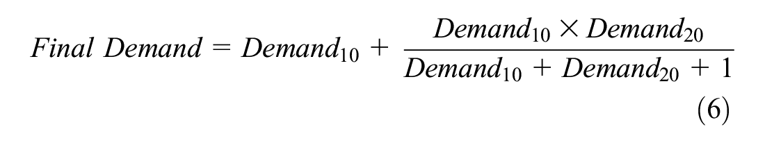
where Demand10 and Demand20 represent the demands within 10- and 20-min service areas, respectively. This formula allowed for people within the 10-min radius to be the primary focus and then for the population within the 20-min radius to be secondarily considered to travel to the hospital, keeping in mind that they affect demand to a lesser scale because of their greater distance from the studied hospitals. Next, each specific hospital demand was spatially joined to the census block group for which overlapping hospital demands were added together to give the census block group overall hospital demand. This procedure was repeated for the number of licensed beds. Licensed beds represented the supply of a hospital, because staff can be hired when needed, but the number of beds is limited by the number of licenses a hospital has. Most of these beds are not utilized or staffed in most cases, but if the hospital is facing a pandemic, for example, these beds can be removed from storage and used if the hospital has the corresponding license. A similar technique as was used to calculate the raw demand per hospital was implemented to calculate supply, but population was substituted by the number of licensed beds per 10- (Bed10) and 20-min radius (Bed20). The number of beds was distributed across the census block groups, over which the hospital polygons overlapped. If there was an overlap between two of the same time polygons, the bed supply was added together for the census block group where the polygons overlapped. The formula for calculating the supply for each hospital, in which the summation is all the overlapping hospital service area polygons at the census block group, is as follows:


where Supply10 and Supply20 represent the total number of licensed beds within 10- and 20-min service areas, respectively. The four unique columns—10-min supply, 10-min demand, 20-min supply, and 20-min demand—were utilized to calculate the final demand and final supply levels of each census block group. The supply or demand within a 10-min radius should theoretically always be less than for a 20-min radius; however, the 10-min radius should have more of an impact on the final supply or -demand because of being closer for the patient. For the final supply, the supply of beds with a 10-min radius was the census block group standard bed supply level. If the census block group contained any 10-min bed supply areas, the addition of these beds created the base level for the census block group. Demand was correlated to the CBG_Pop variables, and population correlates to B02001e, which comprises the total population of the census block group. This relationship exists because the demand of the census block group should be at least the population size of the census block group. This initial level was then augmented by a reduced amount created by the 20-min radius, which was limited by the levels from the 10-min radius. Furthermore, a “1” was added to the denominator as a fail-safe in case the denominator was zero,

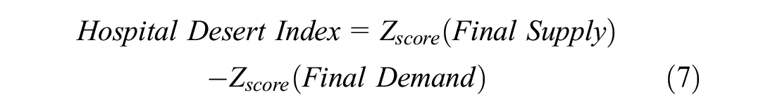
The final index is the z-score of hospital supply minus the z-score of hospital demand. Census block groups with a negative index indicate that the demand for services is significantly greater than the supply. These areas are called hospital deserts, as citizens will potentially lack the healthcare supply within the critical time limit during an emergency. Specifically, this numeric value needs to be less than −1. If the hospital supply is significantly greater than demand, for which the numerical value is greater than 1, then a census block isa “hospital oasis” owing to the people in this census block group having more than enough hospital supply. Lastly, the hospital desert index is categorized as “hospital adequate” if its value is between −1 and 1 as this would allow for the extremes of hospital deserts and -oases to be shown on the map.
Demo Hospital Desert Index Calculations
Figure 1 explains the calculations. This fictional area includes two hospitals red and blue. Each hospital has a Supply 10 (S10) level of 5, and a Supply 20 (S20) level of 10.

Visualization of Hospitals Red and Blue with corresponding time boundaries and supply.
In block group (BG) #1, both S10 and S20 of Hospital Red encompass the area, and this is the only supply in the block group. Therefore, when placing the values into Equation 5 the final supply for BG #1 is 8.125. In BG #2 there are overlapping sections, which means that each respected time supply is added together. The total S10 in BG #2 is therefore 5, and S20 is 20. Then, entering those values into Equation 5 produces a final supply of 8.846. For BG #3, there is no S10 value so this would be zero, however BG #3 is still within range of the 20-min travel distance so it will inherit the S20 values from Hospital Blue. The final supply for BG #3 would be zero. Last, BG #4 is similar to BG #1 in which only one hospital is within its boundaries and the final supply would therefore be 8.125. This process is then repeated, this time with demand values (not shown in Figure 1). Now, the final supplies of each census block group are z-scored based on one another, as in Equation 7. The final supply mean is 6.27 and the standard deviation 3.63. In this scenario, BGs #1, #2, #3, and #4 have a z-score supply of 0.51, 0.71, −1.72, and 0.51, respectively, and a z-score demand of 1, −1, 0, −1. Using Equation 7, BG #1 would be categorized as a hospital adequate zone since the value falls between the range of 1 and −1. BG #2 is also a positive number, but this time the hospital desert index is 1.7, so BG #2 is classified as a hospital oasis. BG #3 would be a classified as a hospital desert as the final hospital desert index is less than −1. Finally, BG #4 would be classified as a hospital oasis owing to the index being greater than 1.
Results
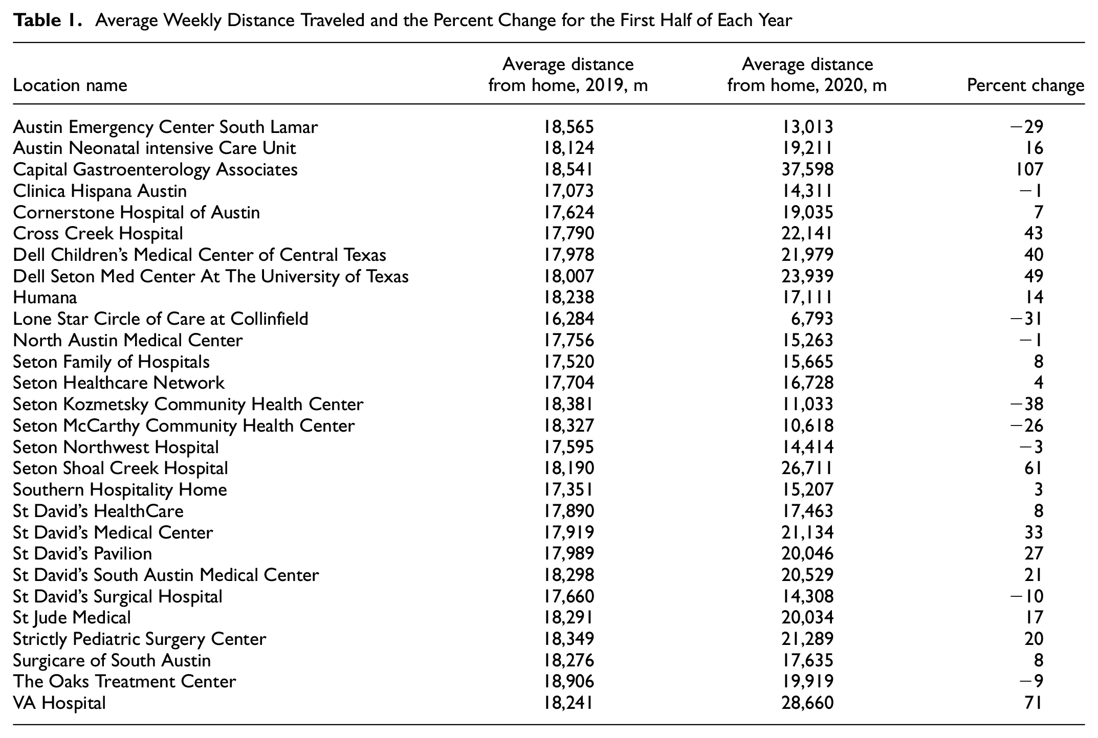
The demographics of each visitor were categorized into six subcategories: Asian, African American, American Indian, Pacific Islander, Latino, and White. The sum of these demographics equaled the total visitor count of each hospital. In addition, the percent change of total visitors between the first 26 weeks of both 2019 and 2020 was considered. A t-test was performed for each demographic group to see whether the mean visitor count was significantly different between the years. Furthermore, the average weekly visitor count of each hospital of each year was produced along with the percent change (Table A in the Appendix). The average weekly distance traveled for the first half of each year was then factored in, and the percent change was generated (Table 1).
Average Weekly Distance Traveled and the Percent Change for the First Half of Each Year
The coverage areas for 10 or 20 min travel time to a hospital can be viewed in Figure 3. The areas in green represent the zones in which it would take a person less than 10 min to drive to a hospital, whereas the areas in red represent those with the 20-min travel radius. Next, the process of calculating the hospital index was followed. Once the final hospital index was calculated, the census block group numbers were matched in ArcGIS to give a final pictural representation (Figure 4). The top metropolitan areas of Texas were zoomed in to capture their specific hospital index for further evaluation (Figure 5).
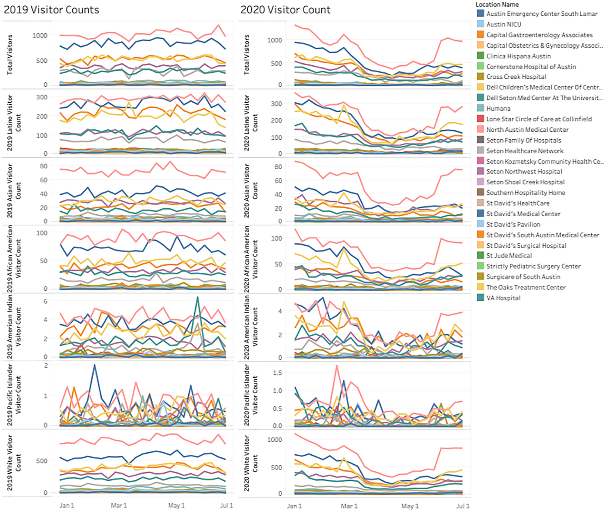
Number of visitors for each hospital during the first halves of 2019 and 2020, organized by visitor demographic.
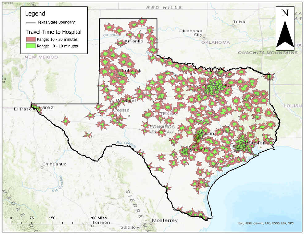
Travel times to hospitals within the state of Texas.
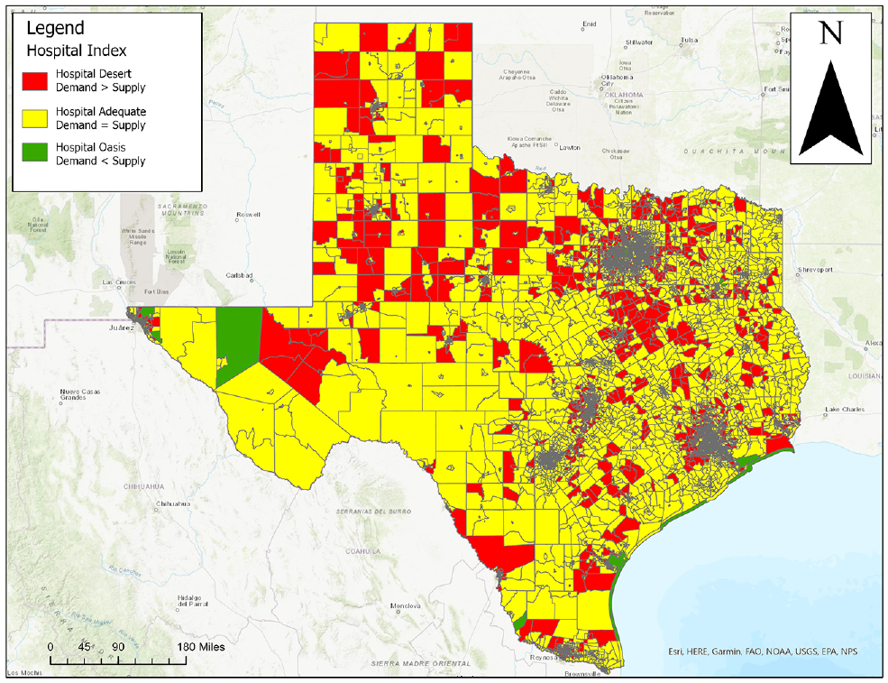
Hospital desert index for the state of Texas.
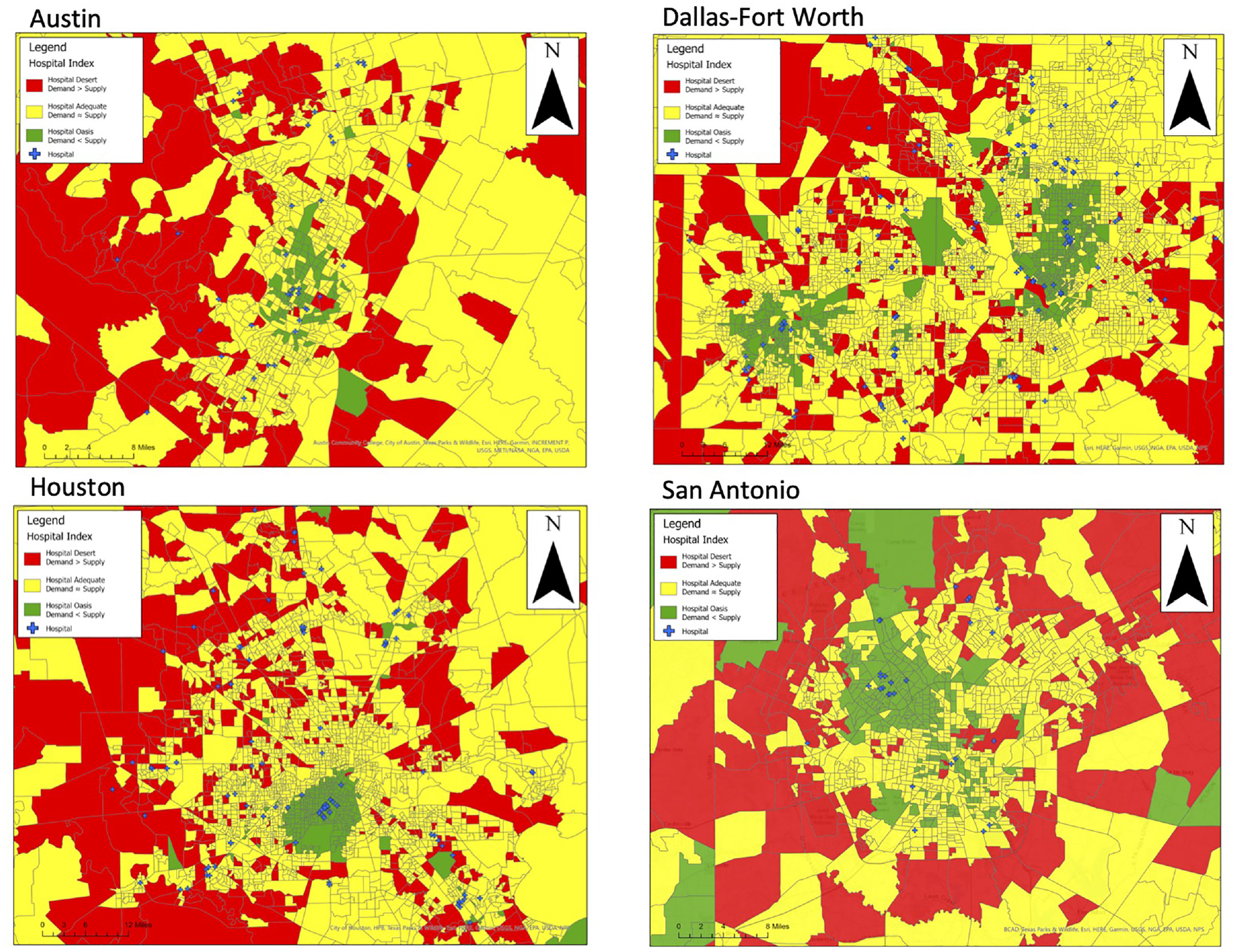
Hospital desert index for the cities of Austin, Dallas-Fort Worth, San Antonio, and Houston.
Discussion
The COVID-19 pandemic caused many urban hospitals to restrict the number of patients entering. Many hospitals claimed that the switch over to telehealth allowed people to receive healthcare at home rather than having to travel to hospital. It might be this switch to telehealth that is demonstrated in the drop in visitors, as shown in Figure 2. The drop in the number of visitors started in March and continued to the end of April 2020. This drop was confirmed by CDC: they state that there was a 154% increase in telehealth “visits” during the month of March 2020 compared with March 2019 ( 22 ). There were reports that people stopped visiting the hospital for concerns that were potentially minor owing to fears of contracting the virus ( 23 – 25 ). In addition, hospitals started restricting patient visitors, going so far as to even restrict parents at the bedside of pediatric patients ( 26 , 27 ). Most demographics showed a drop in their visitor counts to hospitals, except the Native American and Pacific Islander groups, which showed a similar trend to their 2019 visitor levels. This finding could be because these demographic groups represent a relatively low proportion of the Texas census block groups. From Figure 2 it could be concluded that people categorized as White by the U.S. census make up the majority of hospital visitors, statistically. The American Indian and Pacific Islander groups had population numbers in the single digits, which varied drastically between weeks. The other demographics showed a distinct peak when the COVID-19 restrictions began in hospitals and dipped when the restrictions were relaxed. However, the drop in the visitor count might not correlate with fewer patients being seen by the hospital. COVID-19 can result in long periods of hospitalization for some patients, in most cases up to 2 weeks. Although there was a drop in the daily visitor patterns, this could have been the result of patients staying; therefore, the number of visitors should be aggregated with the previous 2 weeks to produce a more realistic number. However, local news outlets in Austin advertised that patients could consult their doctor—via telehealth—even during the COVID lockdowns ( 28 ). This allowed for patients to be seen even for minor issues instead of physically visiting a hospital. Telehealth was a vital part of the healthcare system during the pandemic, so much so that President Trump expanded telehealth visits to include Medicare patients ( 29 ). The demand for telehealth increased to momentous levels, such that this would account for the significant dropoff in person visits. In addition, there may have been some patients who decided to push back their appointment with the physician until restrictions were lifted for in-person visits. The long stay required for COVID-19-infected patients helps to explain why hospitals were publicizing that they were reaching capacity, and informing many who would have previously visited a hospital that they should instead stay home. To sum the number of patients, the length of their stay must be known to ensure no one is added twice.
The first major design flaw in this study was the reliability of the cell phone data provided by SafeGraph. The SafeGraph weekly pattern data set counts a visitor if the location remains within the POI’s geographic boundary for a certain amount of time. This highly specific use of GPS might only be met through modern higher-priced cell phones. A higher-priced cell phone would have the necessary battery life and most likely the cell phone service to generate enough pings to a cell phone tower to determine all the locations visited throughout the day. Future research should try to obtain actual visitor counts from the hospitals to match the SafeGraph pattern data. This would allow for collection of specific details pertaining to which visitors physically traveled to the hospital and which accessed hospital services via telecommunication. Second, SafeGraph reports it captures around 10% of the mobile devices in the United States with its data collection methods; although this is a good portion of the U.S. population, it might not be sufficient to claim that the hospital visitor count went down ( 30 ). There is a possibility that a bias toward or against a certain demographic might have been implicitly integrated into the SafeGraph weekly pattern data. The demographics indicating low visitor numbers, such as the American Indian and Pacific Islander groups, might not have a high recorded population, but in certain regions they could make up a significant majority of the cell phone users. Furthermore, American Indians and Pacific Islanders generally comprise very low numbers in the continental United States.
Next, even if a visitor was from a census block group that is indicated to contain, for example, a high percentage of cancer patients, the individual him- or herself might not follow the majority statistic for the census block group. The same principle is in effect throughout the demographics. It is important to remember that in a high-density city area, there is a greater diversity of people. Although the average generally represents a good amount of people, it is crucial to acknowledge that an individual generating a visitor count to a hospital from any census block group might not be an accurate representation of their home census block group. For example, even when a visitor’s home census block group is indicated to have a high Latino population, the individual might be better represented by a census block group corresponding to a high percentage of Asian people.
Finally, the travel distance of the Austin hospitals was shown to have a significant increase between the first half of 2019 and the same period in 2020 (Table 1). However, nine hospitals showed a decrease in the distance traveled. The main difference between the two time periods was that 2020 experienced a lockdown of all businesses from COVID-19, and then beginning in May of 2020, some states like Texas implemented their gradual reopening plan. The 2019 visitor distance should be a good representation of a nonpandemic year. Whereas it would have been ideal to have multiple nonpandemic years to create a base standard, unfortunately, at the time of this study, no data from SafeGraph before 2019 were available. The COVID-19 pandemic forced telehealth via the Internet into the mainstream for a vast number of hospitals. Even though the telehealth visits might have accounted for a wide range of visitors, the drop in visitors could mean that the majority were hospital workers and not patients. The workers of city hospitals could be living out in the suburbs of the Austin metroplex, then commuting daily for their job. Furthermore, since the average distance of hospital travel increased, it is reasonable to assume that the short distances to hospitals from nearby residential neighborhoods decreased. Potentially, this shift could be evidence that if the visitors comprise workers more than patients, then these workers may be commuting from areas that provide a better quality of life (i.e., living experience, cost). In addition, hospital deserts could be explained by Christaller’s central place theory ( 31 ). Christaller’s theory posits that hospitals are located in the centers of cities because their services are required by the surrounding areas. This causes city centers to have a greater concentration of hospitals, and the suburbs to lack them, causing them to become hospital deserts.
The calculation of the hospital desert index showed great potential for future studies. The methodology of creating a hospital desert index could be expanded to account for other factors such as the number of hospital staff, hospital hours, or emergency wait times; as stated, the hospital desert index could be categorized by specific numeric values. The hospital desert index could reveal vulnerabilities in the healthcare of a city. For example, cities that do not have the necessary hospitalization capacity could be put under strain during times of a pandemic or epidemic. It was also demonstrated in the first half of the research that hospitals restricted their patient access to prevent capacity from becoming a burden to their facilities. Whereas COVID-19 exposed the constraints of a healthcare setting, this was tested once again with the delta variant, during which hospital admissions again increased. On October 12, 2021, the city of Austin returned to a Stage 3 health risk resulting from the increase in delta variant cases ( 32 ).
Areas with high demand for hospitalization and a low bed supply could be classified as a hospital desert. In such cases, the hospital desert index score would be less than −1. Areas with low demand and a high supply are hospital oases, with a hospital desert index greater than 1. Areas with similar supply and demand are hospital adequate: this would range between 1 and −1. Hospital adequate zones allow for the outliers and extreme values to be shown more distincly. Extreme values are more likely to indicate a hospital desert or hospital oasis than a value closer to zero, owing to a greater standard deviation. Figure 4 shows the state of Texas, and a few noticeable patterns are visible. The census block groups that are classified as hospital deserts seem to be in the cities that surround the city metroplexes. In addition, west Texas has more hospital deserts than east Texas. The high frequency of suburbs that are hospital deserts can be viewed in Figure 5. This is a pattern that holds up with most Texas cities. City outer parts seem to be in hospital deserts, whereas the middles tend to be hospital oases or hospital adequate. The main reasoning would be the traffic involved in traveling to downtown health areas that causes the census block group not to receive the hospital beds’ supply levels. However, the pattern of hospital deserts in the suburbs is avoided if there is a hospital complex near the outskirts of town. This scenario can also be observed for the city of Dallas.
Central Dallas is normally a hospital oasis, with many hospitals able to fulfil the demand within a reasonable time span. This hospital oasis pattern continues up north to the Plano and Frisco areas of the Dallas-Fort Worth metroplex. However, moving eastward from the Dallas city center toward Mesquite, TX, there seems to be more hospital adequate zones and hospital desert zones. The major reason for this is because traveling north from the Dallas city center, there is a string of hospitals along the Dallas North Tollway that provide ample supply to cover this section of the metroplex. Because the hospitals are located on this latitudinal highway, residents are prevented from accessing hospital supply from the east side of the city without traveling a greater distance. The suburban residents of the metroplexes are severely lacking access to hospitals as the hospitals tend to be located in the centers of the city. Future studies should investigate the demographics of the census block groups categorized in the hospital deserts versus those classified as residents of hospital oases. A future hypothesis would be that the wealthy neighborhoods located toward the center of cities are more likely to be hospital oases whereas poor neighborhoods further away are more likely to be in hospital deserts. The data for creating a hospital desert index are available for researchers. It is simply a matter of what variables should be included, and to what magnitude.
Research involving identifying the spatial accessibility of hospitals has been a growing trend because of the COVID-19 pandemic. Researchers and city officials want to know what areas are lacking healthcare resources. Examples include a study focused on measuring the spatial accessibility of COVID-19 healthcare resources for Illinois. Similar to the research presented in this research paper, the Illinois team used a z-score method for determining spatial accessibility. Some differences include the Illinois researchers’ expression of their hospital accessibility on hexagonal maps, whereas our research displayed accessibility on the census block group ( 33 ). Another research team focused their study area on Florida and decided to use a Moran’s I logistic regression to determine the areas of low hospital accessibility. The Florida team also decided to divide progress of the COVID outbreak into three sections: early, spreading, and stable ( 34 ). The Florida case study paper mentioned a drawback to their research was the scale, as their research worked at the zip code level. Furthermore, the paper noted how being able to track the movements of people on a real-time level could help policy makers make public health decisions.
A potential drawback to the creation of the hospital desert index first includes calculating the hospital supply. The bed supply of any hospital can be increased or decreased; however, this would depend more on whether there is space for a new bed and enough staff to support the patient. Furthermore, this demand is a theoretical demand for which people within a 10 and 20-min radius all need access to a healthcare facility. This also assumes that everyone is equally competing for healthcare. In some cases, a younger person might be less likely to go to a hospital in an emergency versus an elderly adult who might have developed more chronic conditions. A second drawback is that, although a person might be 10 min from a hospital, this represents one-directional time. Therefore, if a person lives in a 10-min radius from the hospital it could in theory take an ambulance a 20-min round trip to deliver the patient—one-third of the golden hour of survival. If a trauma patient was to survive, the person might need to be transferred to a more suitable hospital for specialized treatment. Time required for the ambulance to travel to certain areas will cause more hospital deserts in certain cities. However, it is important to note that many ambulances are navigating a city on patrol, so are more likely to be in the area of a trauma patient were such an incident to occur. There might be slight changes to the hospital supply as a result of patrolling ambulances preventing the census block groups farther away from hospitals from being areas of hospital deserts (considering the now-reduced travel times). Moreover, just because a person is in a hospital oasis or hospital adequate area does not mean that they will have rapid access to healthcare services; their nearest hospital could be far outside their vicinity owing to their specific health insurance. However, it might be difficult to create a database linking the major health insurances to the neighborhoods and to hospitals that accept specific health insurances. At the end of the day, patients with severe conditions will be served. The hospital desert index allows for health authorities to identify where to distribute healthcare resources (specifically, more hospital beds). City healthcare authorities should carefully analyze their city for hospital deserts for future planning. Furthermore, a hospital near a desert zone could imply that the hospital is not operating satisfactorily for the area’s hospital requirements. The hospital desert is an alternative to the “Health Professional Shortage Area” created by the Health Resources and Services Administration. Health Professional Shortage Area does use population and travel time, however, both factors are assessed on a subjective five-point scale ( 35 ). Furthermore, Health Professional Shortage Area calculations are on the county level, which is a large-scale macro view that could be problematic for public health officials to determine which areas of their city need more hospitals.
Conclusions
The beginning weeks of the COVID-19 pandemic, starting March 9, 2020, saw a drop in visitors for most of the hospitals in the Austin area. The decrease could be attributed to telehealth’s rise, yet people were still traveling to hospitals during the pandemic’s time frame. The average visitor distance increased compared with the distance levels of the respective time frame in 2019. Most of the demographic groupings of people traveling to the Austin hospitals showed a decrease in frequency by visitor count. However, demographics with low representation in the Austin area showed no change owing to the limited number of representatives. The change in visitors (Figure 2) was confirmed by running a t-test on each demographic group and on the total number of visitors per hospital. Therefore, a reasonable conclusion would be that most ethnicities were equally affected by COVID-19 as there was a drop in visitor count across the demographics compared with standard levels created by 2019. However, a possible data error is that only Texan census block groups were used for the home locations; this might have allowed for sampling errors to become more evident since this is on a local- rather than a national scale, as recommended by SafeGraph. The average Texan’s accessibility to a hospital was measured by creating the hospital desert index. Within this index there are three categories to define a person’s accessibility to a hospital: hospital desert, hospital adequate, and hospital oasis. A hospital desert is where the demand for a hospital is significantly greater than the hospital supply. A hospital oasis is a location where the hospital supply is substantially greater than the hospital demand. Hospital adequate is when a location is neither a hospital desert or -oasis; therefore, being in the middle ground may be a positive or negative outcome depending on the circumstance. To calculate the hospital desert index’s bed supply levels by hospital and population by census block group, the 10- and 20-min driving time radii were used. A noticeable pattern emerged in which the hospital desert areas tended to be on the outskirts of many metropolitan areas. A possible theory proposed by the researchers is that the suburban areas outside the metropolitan areas might comprise more financially disadvantaged citizens than urban areas within hospital oases; however, this would need to be investigated in a further study. Another noted observational pattern was that more rural areas such as the west Texas region had more hospital deserts and adequate hospital zones. Finally, the general location trend for hospital oases would be neighborhoods containing a hospital or within a short distance of a hospital. Future studies could incorporate a temporal horizon into the hospital desert index, adding a second quantifiable measurement such as the CDC health vulnerability index, or a more in-depth understanding of the demographics of hospital visitors. A limitation for future research would be that much of the data required are not publicly available to create a statewide index at the census block group level.
Supplemental Material
sj-docx-1-trr-10.1177_03611981221095745 – Supplemental material for Identifying Hospital Deserts in Texas Before and During the COVID-19 Outbreak
Supplemental material, sj-docx-1-trr-10.1177_03611981221095745 for Identifying Hospital Deserts in Texas Before and During the COVID-19 Outbreak by Junfeng Jiao, Nathaniel Degen and Amin Azimian in Transportation Research Record
Footnotes
Author Contributions
The authors confirm contribution to the paper as follows: study conception and design: N. Degen; data collection: N. Degen; analysis and interpretation of results: N. Degen; draft manuscript preparation: N. Degen, A. Azimian, J. Jiao. All authors reviewed the results and approved the final version of the manuscript.
Declaration of Conflicting Interests
The authors declared no potential conflicts of interest with respect to the research, authorship, and/or publication of this article.
Funding
The authors disclosed receipt of the following financial support for the research, authorship, and/or publication of this article: This project was supported by the Good System Grand Challenge and the Cooperative Mobility for Competitive Megaregions (CM2) center, both at The University of Texas at Austin.
Supplemental Material
Supplemental material for this article is available online.
References
Supplementary Material
Please find the following supplemental material available below.
For Open Access articles published under a Creative Commons License, all supplemental material carries the same license as the article it is associated with.
For non-Open Access articles published, all supplemental material carries a non-exclusive license, and permission requests for re-use of supplemental material or any part of supplemental material shall be sent directly to the copyright owner as specified in the copyright notice associated with the article.