
Abstract
Stallworth Williams introduces concepts of visual rhetoric and ethics for a classroom exercise in the analysis and revision of a sales letter. This article revisits Stallworth Williams’s proposed teaching strategies, suggesting that not only do students need to be instructed in elements of visual design, but they must also be taught to link those elements to specific decorative, indicative, or informative purposes. This method teaches students to design documents that meet shared goals (designer and recipient) and to recognize where designs fail in purpose, so revisions can be made using deliberate choice, based on a systematic framework.
The definition of visual rhetoric has changed over the past 10 years. Originally an offshoot of classical rhetoric (see Dragga & Gong, 1989), where editing of technical communication was fit to the classical rhetorical canons of invention, arrangement, style, and delivery, the term has been used to define communication through visual document elements, rather than textual ones. But visual rhetoric is more than simply draping a classical framework around a modern form of communication. The more recent definition is the effective use of visual elements for communicating information. The term used frequently is visual information design. Regardless of how we label it, effective visual communication is a vital part of business communication in the 21st century, and teachers have been addressing the need to find better ways of teaching their students how to incorporate visual elements for several years (Brumberger, 2005; Hilligoss, 1999; Hocks, 2003; McQuarrie & Mick, 1999; Phillips & McQuarrie, 2004; Scott, 1994). Unfortunately, much of this teaching focuses on awareness of visual elements, without providing a framework for making effective choices, and criteria by which to determine which visual elements most effectively serve a document’s overall purpose.
I propose that visual elements should be chosen not only with the primary purpose of the document in mind but also with an idea of what that particular type of visual element’s primary purpose is, and how that purpose adds to or detracts from the overall document purpose. For example, when a designer creates an advertisement, he or she will typically deploy an image (realistic drawing or photograph) related to whatever is for sale. Images naturally serve a dual purpose: (a) to evoke feelings in a potential customer relating to desirable object(s) but also (b) to actively focus potential customers on a specific point of information. Images are effective visual elements if (and only if) their natural purposes align with the actual document purpose, but they can fail or misfire if the image chosen somehow distracts from misaligns with actual document purpose.
To illustrate, Figure 1 is a good example of a well-chosen image. Not only is the focal point unmistakable (cupcake pointing to title text like an arrow), it is precisely suited to the nature of the document (a book of cupcake recipes).

A Well-Chosen Image for a Book Cover Design Clearly Supports the Overall Purpose of the Document
In contrast, the poster in Figure 2 is an example of a poorly chosen image. The image itself distracts from the text, because you cannot see what it is, and it is difficult to determine, without really stretching to find connections, how that image relates to the text.

A Poorly Chosen Image Confuses the Viewer by Creating Conflicting Focal Points and Having an Unclear Connection With the Text
The issues a designer faces in choosing an appropriate image that supports the overall purpose of the document are the same issues that arise when choosing any visual element. The designer needs to make visual element choices based on the natural purpose of that visual element. When he or she does not, communication breakdowns occur.
Another example of this difficulty was illustrated by Stallworth Williams (2008), who discussed a new classroom approach in which she added a discussion on ethics and what she termed visual rhetoric to better prepare her students for the multimodal communication that is now a part of the business world. One of Stallworth Williams’s purposes in introducing visual rhetoric and ethics discussions into her curriculum was to help her students “internalize the criteria for effective and ethical sales letters and [to] be able to easily recall these criteria when writing sales letters or other persuasive documents in the workplace” (p. 50).
Stallworth Williams’s method included classroom discussion about visual rhetoric (visual information design) and how various visual elements like typeface, graphics, layout, color, and illustrations add to the meaning of a design. This discussion culminated in an individual assignment to redesign a sales letter from a local clothing store implementing these concepts, including a written analysis of why the student chose his or her approach and any possible ethical implications of that approach.
Stallworth Williams is right to add discussion of both ethics and visual information design to her curriculum; however, like most discussions of visual design, this one focuses solely on making the students aware of the specific visual design strategies, like alternative typeface styles, white space arrangements, size differences, and bulleting. Furthermore, the sales letter revision given as an example of good design only presents alternative design choices that, for reasons that will be discussed in this article, can be further improved for clarity of purpose (see Figures 3 and 4). Thus, my goal is to extend the contributions of Stallworth Williams.
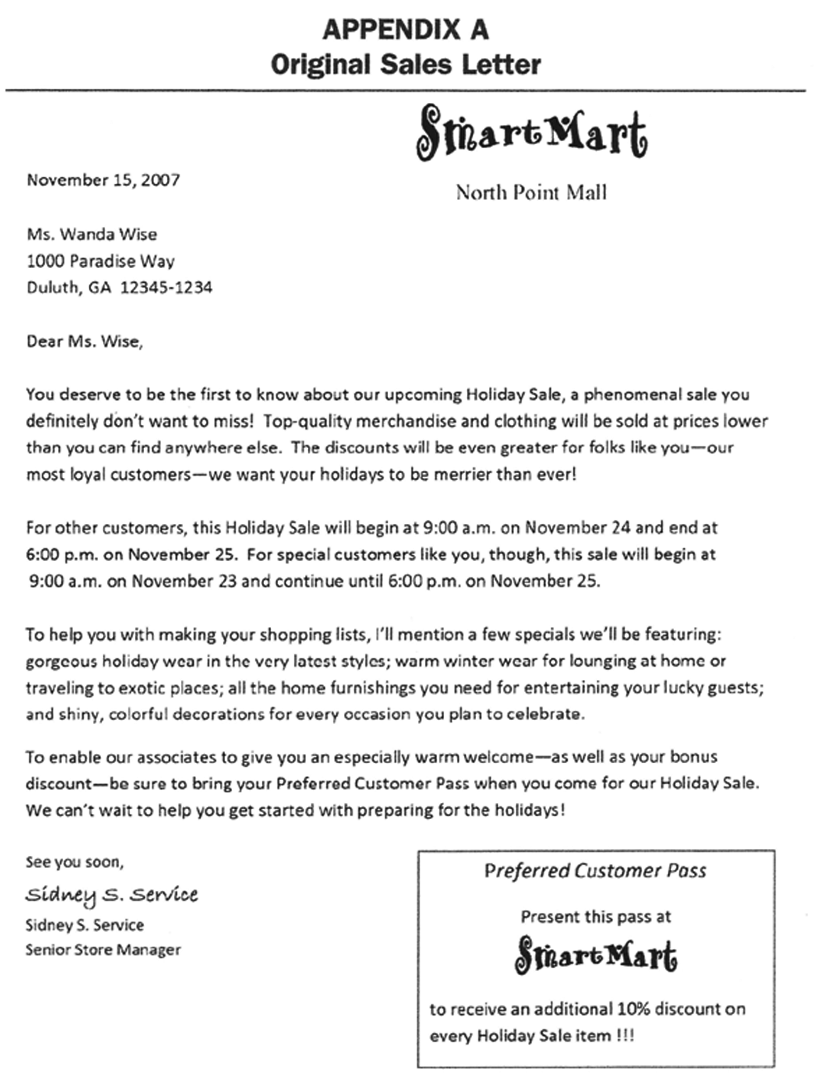
Original Sales Letter Used for Revision Assignment

An Example of One Revision
Given this analysis, I suggest that even though awareness of visual design choices is a good starting point for discussion, students must also be instructed in visual purpose and visual effect. Specifically, they need to know why a particular visual element has a specific effect on the viewer and, more important, to know how a design can go wrong if a visual design choice does not serve an effective purpose.
It is common both in visual design curricula and in other disciplines that include visual information design to limit discussion to types of visual elements and to show examples of what the teacher considers to be “effective” design. In fact, most teachers of visual information design acknowledge a certain amount of subjectivity they consider to be inherent in the visual elements chosen in order to achieve a certain effect. Stallworth Williams (2008) bases her discussion of visual rhetoric on Brumberger (2005), who acknowledges this specific problem: “the student is faced with an array of choices, and the process of modifying default values is often a time-consuming and irritating one that seems more linked to personal preference than to the rhetorical constraints of purpose and audience” (p. 319). In this case, Brumberger suggests that aligning visual element choice with “constraints of purpose and audience” will solve much of the subjectivity dilemma, but she does not offer discussion that links specific visual elements to those constraints. Without explicit links between visual design strategies and the purposes they tend to effectively serve (or fail to serve), students are left with the same subjectivity problem in choosing visual design strategies.
Stallworth Williams’s (2008) approach for this exercise is to discuss various sales letters, teach the students to recognize visual elements, and instruct them in how to emphasize key words or phrases in the text. Unfortunately, this discussion tends to focus only on indicative elements (i.e., typeface changes, font size changes, and bullet points use), whose primary purpose is to point to something other than the element itself. For example, a typeface change in style or size is only evident as it compares with the type next to it; bullet points are specifically used to point to the list text and should draw attention to that text, rather to themselves.
In many cases, too many unfocused indicative visuals can create an ethical problem. In the sales letter revision case, viewers who are compelled by the indicative elements (boldface text specifically but also boxed information and bullet points) to look here and look there in the letter are in effect forced to act without any clear purpose or beneficial effect. In other words, the viewer’s attention is drawn in many directions with no clear visual hierarchy that informs him or her of the author’s overall design purpose. Because the author has an ethical responsibility to communicate clearly, overuse of indicative elements effectively violates this ethical purpose.
Even generally speaking, to compel someone to act without any clear purpose or benefit is itself a possible ethical breach. Furthermore, there is a problem with the assumption that students automatically become better designers when they are merely made aware of visual design choices and possible ethical implications. That could be true, but there is no guarantee that this is true, without a method to help students understand specific effects of the visual elements and the purposes which those effects typically will and will not serve. A more typical outcome will be that students will stir the visual design elements together in random ways that will not be effective, and both they and the instructors may have difficulty articulating exactly why the overall result is not effective.
Framing the Revision Process
A different approach was suggested by Manning and Amare (2006), which we use to frame our discussion of the original sales letter and its proposed revision. Using a method based on the work of the philosopher C. S. Peirce (see Figures 5 and 6), Manning and Amare begin with the following introduction:
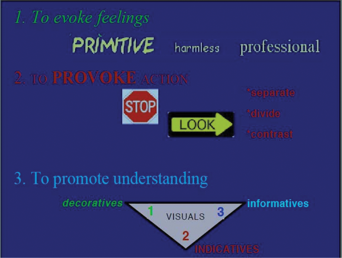
Visual-Rhetoric Goals Sorted Into Peirce’s Three Categories; Distinctive Colors and Fonts Used for Decorative and Indicative Purposes

Visual-Rhetoric Goals Sorted Into Peirce’s Three Categories; Color and Font Contrasts Restricted for the Sake of Informative Purpose
The philosopher C. S. Peirce (1839-1914) developed a variety of useful three-part typologies. One of these is the typology of rhetorical goals, as illustrated in Figure [5] and Figure [6]. Font choices, for example, are generally made to convey a particular visual feeling in a document and so correspond with the first goal of evoking feelings. Visual strategies that serve the first goal we refer to as decoratives. Visual strategies that serve the second goal, of provoking action, we refer to as indicatives. Bulleted lists, for example, specifically move an audience to the actions of separating, dividing, and contrasting otherwise undivided statements in the flow of understanding. (p. 195)
The use of decoratives (color, shape, lifelike images, typefaces) is to convey a specific feeling. These should be used sparingly and should be selected to promote the primary purpose of the document, rather than simply for visual effect or shock value. The purpose of any sales document is to persuade or motivate the recipient to be present at the sale and purchase something. Here, one of the best decorative elements would be an image, really a teaser, which convinces the recipient that he or she wants to see more items like the one pictured in the document. Manning and Amare (2006) continue,
Visual strategies that serve the third goal, of promoting understanding by making conceptual relationships visible, we refer to as informatives. Charts, graphs, diagrams, and tables have a concept-relational component, an informative component, that can be distinguished from whatever decorative and indicative properties that they also have. (p. 195)
For our purposes, the text itself is the informative component. The sales letter is meant to provide information about where the sale is located, when the sales event occurs, and what types of items will be on sale. This is the information that the student attempts to set apart by indicative elements; however, the sheer number of indicative elements has the viewer looking all over the paper, without structure to the order of information flow, culminating in what feels like information overload. This phenomenon occurs when indicatives are overused and is explained further by Manning and Amare (2006):
Ethical concerns can arise when decorative or indicative elements begin to interfere with the informative purpose of a visual. The color and font choices, for example in Figure [5] are potential distractions from the actual information. And effective revision might eliminate all of the color and most of the font contrasts, as in Figure [6]. (p. 195)
As discussed before, most visual design instruction focuses on the use of indicatives that help the designer use contrast, a principle of traditional visual design, to distinguish important information. The sales letter revision correctly chooses to set apart vital information using indicative elements (see use of white space, bullet points, and font size changes in Figure 4) but neglects the primary purpose of the document, which is to use the informative elements to provoke a specific action.
What becomes evident is that the vital information gets lost in a cacophony of indicative elements because the form of the document (a sales letter) is ineffective for its primary purpose, more so than because the decorative or indicative elements are ineffectively used, though they could be used more effectively. In other words, the first revision for this assignment might be to suggest that, given the document’s primary purpose, which is to motivate the recipient to put the document in a purse or pocket and go to the sale, a change of form (to a postcard) would better serve that purpose. Furthermore, judicious use of focused indicative and informative elements combined with a decorative teaser element completes the revision in a manner consistent with the document’s primary purpose.
Revising the Revision
As discussed previously, the primary goal for this document would be indicative—that is, it should attract the viewer’s attention and prompt him or her to action. In service of this primary goal, the document will need to provide some basic information to the recipient about the nature of the sale: the when, where, and what information discussed previously. Also, in service of the primary goal, the viewer should feel something good about the document that makes him or her want to attend the sales event; this secondary goal is served by decorative elements whose primary purpose is to evoke feeling.
It should be emphasized that the decorative and informative goals are subordinate to the indicative goal in this particular document, meaning that the feeling and information goals should be used to motivate the potential customer to go to the sale and buy something. In this case, the informative elements must provide enough information but not too much, and the indicative elements should focus the user on that information. The decorative elements should be used sparingly enough to not detract from the pertinent information but should evoke a desire to see more of the item depicted.
With the primary goal in mind, the designer can now look at the elements of the sales letter that will be used to meet that goal. This document has the following visual elements (see Figure 7):
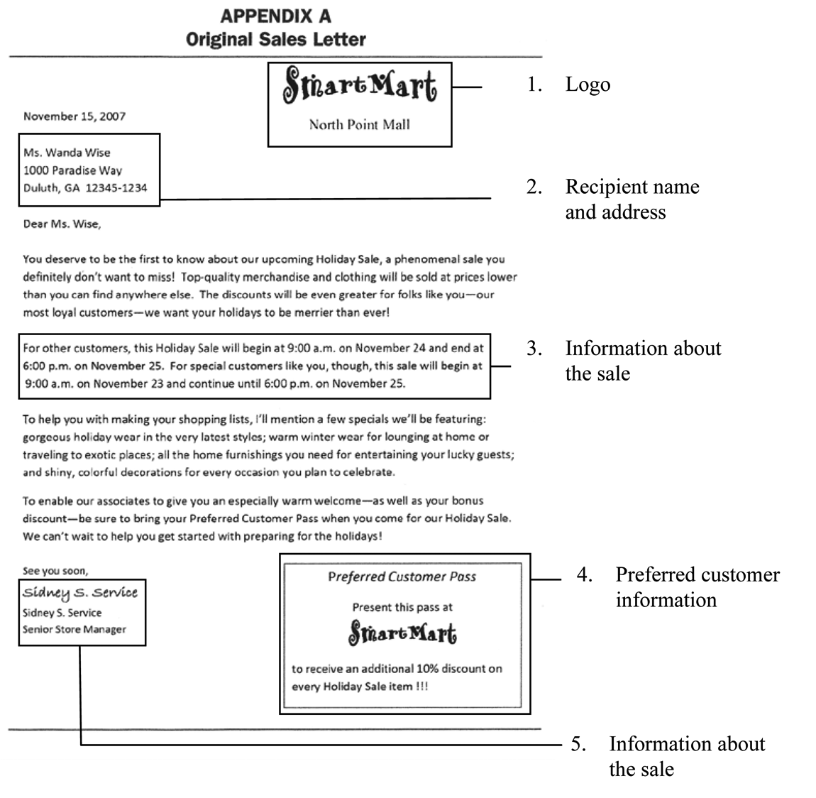
Original Sales Letter Visual Elements
Logo (store name and location)
Recipient name and address
Information about the sale (date, time, place, items that are on sale)
Information about the Preferred Customer sale (special day, hours, and need to bring letter to be allowed to participate)
Signature of the store manager (personal invitation)
The original document had a few design issues that Stallworth Williams’s students were supposed to address in their revision:
Form of document
Nature of pertinent information
Competition of focal points
Along with recognizing the need for information contrast, the original document incorporates an effective strategy by using a “personal touch” approach. This occurs where the designer has included the recipient’s name in the greeting and the letter looks like it is signed by the store manager. This aspect of the document should be carried through to the revisions, but the other three issues needed to be addressed by the students in their revised versions (see Figure 8, dashed-line boxes).
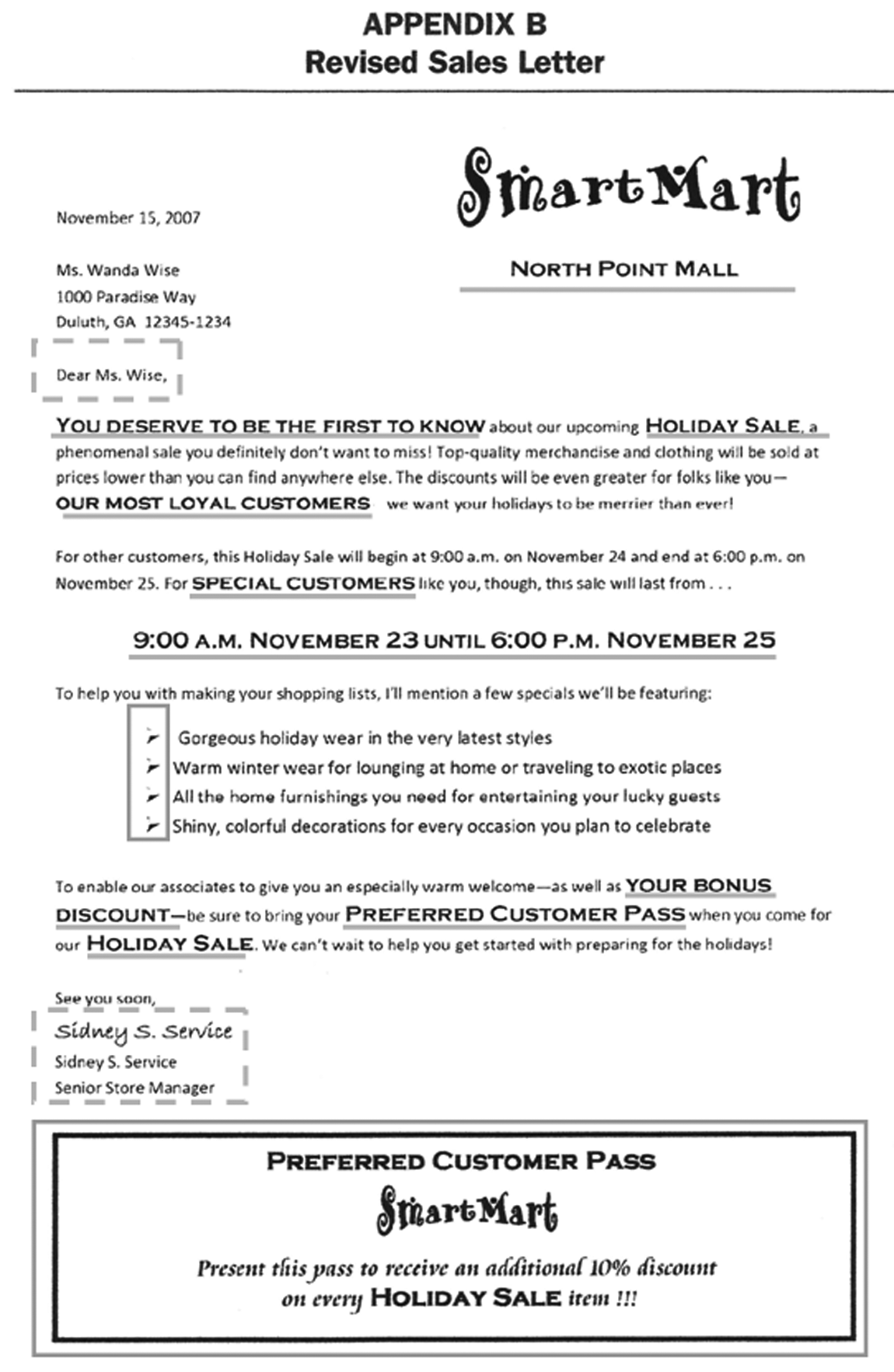
Student Revision: Green Indicates Effective Visual Element (Personalization) Retained From Original Sales Letter and Red Shows Overuse of Indicative Elements
The first issue, form of the document, is not addressed in the student revision, probably because the assignment asked the student to create a sales letter; however, the designer has an ethical responsibility to provide the best form for the purpose of the document requested by the client. Consequently, the designer should consider changing the form of the document to fit the purpose. Changing the document form to a postcard serves its indicative purpose better than the sales letter form does. A sales letter is printed on paper and folded up, hiding its information if it is opened at all. Cardstock is more durable, and a postcard is used more frequently as a sales document because the recipient can see the most important information immediately, rather than having to read the whole letter to extract that information.
The student revision given as an example (see Figure 8) has fixed some aspects of the second issue, pertinent information. The designer employs indicative strategies to contrast the important information from the rest of the text. But he or she emphasizes too many different phrases and ends up with several possible focal points. Indicatives must be used sparingly and be focused on a specific purpose; too many action-provoking elements will fatigue the reader and must be carefully chosen and carefully organized so that they point to a single coherent action rather than several discrete and fatiguing actions.
Also, the use of a bulleted list is a good strategy, typically, for chunking information that would otherwise be invisible in a text block. In this case, however, the bullets are a little too big (drawing more attention to themselves rather than to the phrases they are pointing to), the phrases themselves are too long to be read at a glance, and the construction of the phrases is not parallel (a proven strategy for information retention).
The issue of focal points is partly addressed too, in the revision. The size of the store logo at the top of the page is increased and the font style for the smaller text is changed, both good changes. The size of the preferred customer pass is also increased, but the student has kept the logo smaller, so there is a clear hierarchy of importance that draws the eye down the page. The issues I do have with these two elements are that the highly decorative text used for the Smart Mart logo is distracting, and the student uses several indicative elements in the preferred customer pass (bold, font style and size changes, and center-aligned text). Too many indicative elements move past the “pay attention” mode to a more irritating “look here! no, look here!” approach.
With these issues in mind, I will revise the sales letter to a postcard, as this type of document would better serve its intended purpose (see Figure 9). I remove all but the pertinent information and use indicative elements to provide structure and focus so that information is accessible at a glance. This form also removes the focal point issue because the postcard itself serves as the Preferred Customer pass and we only have to use the logo once per side: as the focal point on the front and subordinate to the image on the back.

The Stallworth Williams’s Article Sales Letter Revised as a Postcard
The front side of the postcard shows the following decorative elements:
Border around the card
Repeated border around sales information
Smart Mart logo changed to a simpler font
Typeface changes for the rest of the text to a sans serif face with minimal contrast
All these decorative elements influence the feeling evoked by the document. However, the more important goal is to make the information accessible, so both borders and fonts must be chosen so they do not distract the reader from understanding what the document is about: hence the simple layout and minimal contrastive elements.
The indicative elements are the changes in text size, the alignment of the text, and the box around the sales information. These elements draw attention by contrast and motivate the viewer to look at specific information. There are only three indicative elements. Minimizing indicatives makes sure the important information can be seen and keeps the viewer focused on reading. In fact, the front side of the postcard chunks the information in only two places and moves from top to bottom. Furthermore, the “postcard” ritual allows the viewer’s eye to easily process the indicatives that are there. In other words, because the recipient expects the addressee and return address information placed on the postcard in a specific way (addressee in the right, center of the card and return address in the upper left area), the recipient is able to take in all of the information at a glance and focus on the lower left box—information about the sale itself. Structured sequence for indicatives guided by ritual provides a framework for information to be visible at a glance and is subject to hierarchy, so the viewer knows what is most important.
The reverse side of the postcard is seen in Figure 10.

The Reverse Side of the Postcard Uses an Image Focal Point and Chunked Indicatives to Create a Framework for the Pertinent Information
The back of the postcard contains information about the nature of the sale and the terms of the preferred customer pass. But it is the image, a decorative, that will catch and hold the viewer’s attention, motivating the viewer to consider purchasing. Supporting the image as the focal point is the bullet list. Like the original revision, the use of a bulleted list is good for chunking information. In this case, we revised the language to be more parallel (adjective, noun sequences) and separated the bullet points to no more than three so they can be easily read at a glance. Furthermore, repetition of the logo and location means that the recipient will see the “where” information no matter how he or she picks up the postcard. These elements are used to make sure the viewer finds his or her way to the mall.
Conclusion
Analysis of visual elements in terms of decorative, indicative, and informative purpose makes it possible to teach students to create effective designs, meaning that the document meets the shared goals of designer, client, and recipient, if the designers carefully choose visual elements that actively serve the purposes specifically intended. When the designer understands both the primary document goal and the definition of each visual element based on the purposes they usually serve, he or she can choose visual elements that serve the overall goal of the document, thereby decreasing the level of subjectivity involved in the design process.
Stallworth Williams’s (2008) teaching approach is well focused on helping students begin to understand elements of visual information design. Students of business communication will be better able to succeed in the marketplace when they understand design elements and ethical practices for using them; however, like the majority of approaches to teaching visual design, the discussion is limited to the elements that can be used. The next step would be to educate students that certain visual elements work to achieve specific purposes. Teaching students to recognize visual elements and exposing them to samples of designs that use these elements will help the student’s awareness of what people consider “good” design. Teaching students to use specific elements because they know the characteristics that suit those elements for a specific purpose will help the student create ethical, effective documents that serve the shared goals of designer, client, and recipient. This method can not only inform the student but can also transform him or her into an effective designer.
Footnotes
This article was written in response to Stallworth Williams’s article in Business Communication Quarterly in 2008 concerning the revision of sales letters.
The author(s) declared no potential conflicts of interest with respect to the research, authorship, and/or publication of this article.
The author(s) received no financial support for the research, authorship, and/or publication of this article.