
Abstract
Infographics exist on nearly any topic you can imagine, proliferating in the digital age with social media. As this genre continues to explode in the business scene, business and professional communication instructors can no longer ignore showing their students infographics. After first defining the genre and outlining how it situates itself within business and professional communication, this article offers two approaches to increase awareness and exposure of infographics for students. The first focuses on an analysis assignment using infographics; the second focuses on a production assignment.
Infographics exist on myriad topics, and they have proliferated in the digital age. The hotel pricing index, how to design a business card, what a brand’s color choice says about a business, what large companies donate to philanthropic causes, or the changing roles of CIOs are just some of the topics illustrated in infographics. There is an infographic on almost every topic imaginable. In fact, there is even an infographic on the evolution of communication in business. (See Figure 1 for a partial excerpt to get a sense of the genre.)
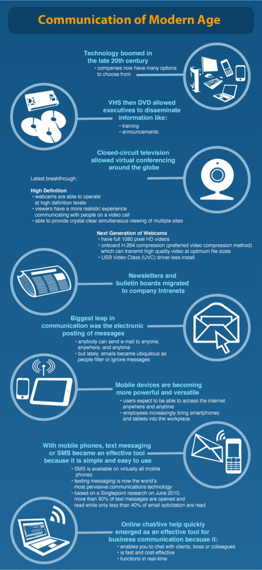
Excerpt of an infographic about the evolution of communication in business.
At one time, infographics were mostly quarantined to the pages of USA Today and similar newspapers. Since then, they have become a commonly used visual in professional communications. Beyond their rise in popular magazines such as Time and Newsweek, they have also become ubiquitous on social media outlets such as Twitter, Pinterest, and Facebook. A Google search for the term infographics at the writing of this article returns almost 17.2 million results.
Infographics have also blossomed in business, and business communication instructors should take notice. The genre now appears in many business contexts, including company websites, marketing campaigns, alumni newsletters, and annual reports. In fact, Wells Fargo (2013), BP (2013), Sony (2012), and JPMorgan & Chase Co. (2013) are just some businesses that include infographics in their annual reports. Some people even predict that infographic résumés will be the next big thing because they allow job seekers to represent themselves in quick visual snapshots for potential employers (Smiciklas, 2012).
As this genre continues to explode on the business scene, business communication instructors can no longer neglect introducing their students to infographics. Many aesthetically interesting infographics exist but lack rhetorical effectiveness and/or mislead the audience. We need to help students learn to judge the quality of existing infographics and create more effective ones on their own. After first defining the genre and outlining how it situates itself within business communication, this article offers two approaches to increase awareness of and exposure to infographics for students. The first focuses on an analysis assignment using infographics; the second focuses on a production assignment.
Defining Infographics
Infographics, as the mashed up words imply, are information graphics. They attempt to educate an audience about a specific topic or issue in a visually interesting and easily navigable manner through a combination of words and visuals. Infographics often communicate complex quantitative and/or qualitative information quickly for their audience. They typically combine data displays, lists, graphics, and other visual elements to make a point; they intend to inform, and frequently persuade, their intended audience about a focused topic.
Chances are you have encountered many infographics already. But in the event that you have not, check out Cool Infographics (http://www.coolinfographics.com), Good Infographics (http://www.good.is/infographics), Visual.ly (http://www.visual.ly), or Daily Infographic (http://www.dailyinfographic.com). These websites offer repositories of thousands of infographics, some with commentary on what makes the included infographics effective.
Another important element of infographics is that they function as stand-alone communication: An audience should comprehend the information from simply looking at it without seeking additional sources to understand it. Often, infographics use concrete ideas and images, or at least try to present abstract information in concrete ways. Some well-executed infographics can even rise to the level of being visual masterpieces; they are simply elegant such as “Death and Taxes: A Visual Look at Where Your Tax Dollars Go” (http://blog.visual.ly/the-federal-budget-visualized-death-and-taxes-2014/), “Manhattan Building Height: An Indirect Measure of Land Value” (http://www.radicalcartography.net/index.html?manhattan-heights), “The History of Film” (http://www.historyshots.com/film/index.cfm?s=cirk), or “Hurricanes Since 1851” (http://www.flickr.com/photos/idvsolutions/7840356344/), to name a few.
Infographics also present the illusion of trustworthiness due to their visual nature and presentation of statistical information. Many scholars (Kimball & Hawkins, 2008; Kostelnick & Roberts, 2010; Schafer, 1995; Schriver, 1997; Tufte, 2003) acknowledge that visuals have more emotional impact and are remembered longer than text. Therefore, some viewers are more likely to believe information presented on infographics even in instances where source material may be questionable and/or nonexistent. Since people give more affordances to these types of visuals, business and professional communication instructors need to help students be conscious of this issue while viewing infographics and help students make ethical choices when producing them.
Finally, one additional key feature of infographics is that they are static once published. This feature helps distinguish infographics from other types of information displays that exist on the Web. These other types, typically called dynamic displays or data visualizations, are often dynamic, meaning they can be changed easily with the introduction of new data or allow the user to manipulate parameters for what they are seeing on their screen. For example, The Baby Name Wizard (http://www.babynamewizard.com) generates data visualizations of popular baby names; many websites exist that show dynamic displays of the Iraq and Afghanistan Wars (such as http://www.spiegel.de/international/world/a-724000.html). These types of interactive displays often have sophisticated statistical software that generate their design output and so would necessitate business and professional communicators to have additional technical skills, which are beyond those of static infographics discussed in this article.
Moreover, the creation of these types of dynamic displays is outside the scope of what business and professional communication instructors can easily hope to achieve in an intro-level business and professional communication course. Business and professional communication students will most likely never be asked to create such sophisticated displays once they leave the academy (unless, of course, they are in fields that rely heavily on data visualizations). On the other hand, given the rise of infographics in the business world, students do need exposure to this genre, as they will probably be asked to interpret or create them in the workplace.
Situating Infographics in Business and Professional Communication
Infographics are not new, but their popularity within the business world is. From Egyptian hieroglyphics, to illustrations accompanying scientific discoveries, to sophisticated statistical mapping, to the department of transportation’s pictograms, infographics have always existed for various purposes. Today, new software applications put the power to create infographics in almost anyone’s hands.
The merging of images and words is a powerful way to communicate complex ideas quickly and efficiently. In Visual Thinking, Rudolf Arnheim (1969/1997) argues that people tend to separate perception and cognition, which establishes an artificial way to understand visual design. He asserts that visual perception is visual thinking and that audiences engage in a complex, though often quick, process when interpreting visuals. Infographics are effective because audiences can process visual information much more quickly than traditional prose.
Given the overload of digital information (Locker & Kienzler, 2012), this ability to process a message efficiently and clearly is often welcomed by audiences. From this quick processing, infographics gain power in our fast-paced digital culture where information always competes for our attention. In turn, Mark Smiciklas (2012), author of The Power of Infographics: Using Pictures to Communicate and Connect with Your Audiences, argues that infographics offer “improved comprehension of information, ideas, and concepts; enhanced ability to think critically and develop and organize ideas; and improved retention and recall of information” (p. 11). In addition to the ability to digest information easily from infographics, Smiciklas asserts that their “shareability” has also driven their success. That is, infographics are willingly shared because they are self-contained pieces of communication and do not require much time for audiences to comprehend them. In some ways, this “shareability” notion across a network of people connects with many of the topics in Business Communication Quarterly’s special issues on social networking (Dyrud, 2011, 2012). Through social media, infographics can be liked, posted, emailed, and tweeted with the click of a button.
As is the case with all visuals, infographics are inextricably intertwined with ethics, as many communication scholars have already noted about visuals and data displays (Kienzler, 1997; Rosenquist, 2012; Stallworth, 2008; Tufte, 2003). Because visuals generally earn more importance and emotional impact than their textual counterparts, many visual creators can easily mislead their audience (Kienzler, 1997). Infographics can readily present unethical information or distort data to make a stronger point and attract attention, suggests the senior editor at The Atlantic (McArdle, 2011). The information infographics offer needs to be trustworthy and should help an audience build trust in its creator and/or brand.
So do infographics really fit into business and professional communication courses? Yes, most definitely. Business and professional communication instructors should be receptive to the inclusion of infographics in their curriculum. Many scholars (Bernhardt, 1986; Brumberger, 2005; Kimball & Hawkins, 2008; Kostelnick, 1988; Kostelnick & Roberts, 2010; Rosenquist, 2012; Schriver, 1997) have already called for visual design strategies and issues to be taught in business and professional communication courses.
Moreover, the popularity of this genre shows no signs of slowing in business and professional communication. Instructors need to provide students with educational experiences that will make them successful on graduation. Part of this learning should include knowing the distinction between something being aesthetically pleasing versus being rhetorically effective. Even more specific to business and professional communication instructors is that infographics represent an extension of fundamental issues already touched on in our courses—presenting information clearly and succinctly, targeting audiences, defining clear purposes, developing ethos, understanding document design principles, using persuasion techniques effectively, branding, and conducting and summarizing research. Most of these topics are the core makeup of top-selling introductory business communication textbooks (see Bovee & Thill, 2010; Guffey & Loewy, 2012; Locker & Kienzler, 2012).
Furthermore, infographics also help highlight information literacy concerns—that is, teaching our students what information they need, determining where to find it, deciding its value, and using it effectively. Some already have argued that we need greater emphasis on information literacy in business communication courses (Decarie, 2012). Finally, as an added bonus, infographics can help instructors reinforce all of these concepts for students in a fun, engaging, and interesting way.
Approach I: Analyzing Infographics
Seeing the power and impact infographics can have on business and professional communication pedagogy, I offer this first approach as an easy way to integrate them into a course within one or two class sessions. The second approach, described later in this article, takes significantly more time and effort to integrate but builds on this first approach and will give students a much deeper understanding of the genre.
In this first approach, I ask students to analyze the genre of infographics. The objectives are for them to begin to understand the genre, comprehend informative and persuasive techniques, recognize the traits of effective document design, and understand the rhetorical situations of infographics.
Specifically, I spend about half a class period showing students a few of my favorite examples and discussing what makes them effective. Since infographics are added daily to the websites mentioned above, my favorites are always changing. However, in the past, I have used “Stolen Ideas: Apple Didn’t Build That” (http://visual.ly/apple-they-didnt-build-ideas-apple-bought-borrowed-and-stole), “Taking It to the Streets: A Guide to Marathon Running” (http://visual.ly/taking-it-streets-guide-marathon-running), “Are You a Mosquito Magnet?” (http://areyoua.mosquitomagnet.com/facts.html), and “The Anatomy of Health Insurance” (http://mphprogramslist.com/infographics/anatomy-of-health-insurance/). These infographics have interesting designs, contain qualitative information, quantitative information, and source references that are helpful for starting a discussion about the genre.
Next, I ask students to view as many infographics online as they possibly can outside of class. I suggest they investigate websites mentioned earlier in this article such as Cool Infographics, Good Infographics, Daily Infographic, or Visual-ly that offer thousands of examples of infographics. After exposing themselves to the varieties that this genre includes, students pick their top three favorites and answer the following series of questions:
What are the purposes of the infographics?
Who do you think are the intended audiences? What makes you say so?
How informational are the infographics?
How persuasive are the infographics? If you think they are persuasive, what would make them even more persuasive?
What original contexts would be most appropriate for the infographics?
What visual design elements make you attracted to these particular infographics?
What visual design elements, if any, detract from the main messages of the infographics?
To what extent do the infographics contain misleading information or data distortion?
To what extent are the visual design choices effective or ineffective? In what specific ways do the creators blend images and text?
To what extent overall are your three chosen infographics effective or ineffective given the audiences and purpose you have identified?
Students answer these questions in a memo addressed to me as their instructor; they submit the memos the next time we convene as a class. On the day the memos are due, I begin our discussion by displaying a few of their favorites onto the projection screen. Students describe to each other what makes their choice both interesting to view and rhetorically effective given its communication situation. After these short informal oral reports, we dissect a few of the infographics as a class to develop an awareness of the genre and to gain a deeper understanding of their effectiveness. This discussion helps students collaboratively reach a shared understanding of infographics.
Even though infographics may outwardly present themselves for a universal audience, they are not created from an arhetorical standpoint. Like all communication, infographics present information within rhetorical situations; they offer visual information to achieve a designated purpose for an audience within a given context. Students are quick to realize this fact, especially when someone reports on a favorite infographic for which others in the class have no interest (i.e., they are not the target audience).
Students also reach deeper understandings of the purposes of infographics and how they function. While the superficial appearance of infographics is that they have purely informational purposes, in reality, they have varying degrees of persuasive purposes as well. For example, an infographic that appears in a company’s annual report may outwardly look like an informational snapshot of the year in review. However, this infographic may also attempt to persuade the stakeholders that the company is doing well and that they should continue to invest in it.
During our discussion, I also ask students to make connections between the infographics we view and the other concepts we have studied so far throughout the semester. Many of them are quick to point out the importance of audiences and purposes, visual design techniques, and persuasive strategies. Overall, this first approach will, at a minimum, help expose students to the genre of infographics and enable them to think critically about the genre in a way they probably never have before. Students should begin to understand that beyond flashy designs, infographics need to be rhetorically situated and ethically sound to be considered effective.
Approach II: Producing Infographics
This second approach has students produce infographics. It is an optional add-on to the first approach and depends on how much time instructors can build into their calendar, as well as the major objectives instructors have for their business and professional communication courses. The assignment will last a little over two weeks.
For my course, I want to challenge my students to apply what they gained from the first approach outlined above. In other words, I ask them to shift from simply thinking, analyzing, and writing about infographics to actually producing them. I want my students to understand the possibilities of the infographic genre, the design challenges associated with visual persuasion, the necessary research, and inherent ethical concerns. This assignment in many ways probably builds on all of the other units an instructor may have already taught within a given semester.
This second approach of the assignment has three parts: a research proposal, the infographic, and a reflective evaluative memo. Each of these will be discussed in more detail below. The infographic is an individual assignment in my course, although it can easily function as a team assignment if instructors believe that will help their students excel.
Research Proposal
In the research proposal, students pitch the visual persuasion idea they want to construct with the infographic in roughly a 3 to 4 page memo. The purpose of this proposal is to prove that they have a good grasp of the project and have started the research. The proposal requires students to describe their idea by giving an overview of the story they want to show on their infographic, as well as outlining the purpose of their infographic, the specific targeted audience, and the contexts in which it will function. They also need to complete research by the due date because I ask them to include the specific statistics/quantitative data and qualitative information that they hope to represent on their infographic. In terms of information literacy, they also have to justify why they believe their source material is accurate and worthy of prominence on their infographic. Finally, the proposal contains a References section in APA that outlines the sources they used to gather the information that will be represented on the infographic.
The proposal also outlines why the specific chosen issue interests them. For the purpose of my assignment, I leave the topic/issue they will display fairly open-ended; students choose a range of topics. One student elected to construct an infographic for Choice Hotels International’s annual review since he was completing his internship for them. Another student, who was an officer in the swing dance club on campus, chose to make her infographic about the history of swing dance. An athlete created an infographic about the steps involved for high school students to be recruited to a NCAA program. Another student, who has Celiac disease, created an infographic about living gluten-free.
As you can see from this sampling, the issues students explore in my course offer quite a range. In another business and professional communication course, however, an instructor may want to put limitations on possible topics. For instance, he might ask students to create infographics only about social media or about a specific organization (campus, nonprofit, or business) or about something from within their field of study.
Infographic
For this part of the assignment, students create an infographic using visual persuasion about an issue of their choosing. They are required to include a strong and clear title, at least one data display of quantitative information (though more are acceptable), at least one display of qualitative information (though more are acceptable), and citations for all source material. Earlier in the semester, my students studied data displays, which is why using quantitative information is a required element of my assignment. However, if students do not get exposure to data displays in another business and professional communication course, the instructor may wish to omit this requirement.
Students are required to find an informative story within the qualitative and quantitative data and present it through a visual means on the infographic. For many of my students, this step is big compared to the first approach described above where they are simply analyzing the choices of a designer. They constantly have to grapple with issues of clarity, conciseness, tone, ethos, and design while trying to communicate effectively with the intended audience.
The students are able to combine simple shapes, select appropriate typography, and choose a color scheme to help make their information visually coherent. We constantly have discussions in class about how these visual choices need to fit with the overall purposes and audiences students are trying to reach with their infographics. If an instructor feels uncomfortable addressing visual literacy concerns with students, he may ask a fellow colleague or invite a professional graphic designer to give a guest lecture on visual design; this assignment nicely lends itself to creating interdisciplinary bridges.
For the actual design, the allotted size of their workspace is tabloid-size at a minimum, though some choose to use larger page dimensions to fit in more material. However, I constantly have to tell my students to narrow the amount of information that they want to include. While the amount of retail space they can use to create their infographic is rather large, they only have a finite amount of time during the semester to complete the project. This becomes one of the biggest challenges for the students: creating strong, concise, and cohesive visual information given the size and time constraints.
Students can choose any program to create their final infographic: Word, Excel, PowerPoint, InDesign, Illustrator, or Photoshop (or, most likely, any combination of these programs). While students can choose any program to create their infographic, those that use programs with vectoring capabilities are more successful in the end because their creations do not lose any resolution when scaling. Since a majority of infographics are found on the web, students are not required to print their final product; they just submit a PDF.
To help students through the thinking and designing process, I have them share initial drafts on the projection screen for their peers. These critique sessions allow my students an avenue for asking questions of their peers about their design choices and how to most effectively meet their rhetorical situations, since each element of the infographic needs to do some rhetorical work. When things are not making sense or not aesthetically pleasing, it becomes immediately clear to the author from the peer feedback. This time also allows me to address issues of ethics in terms of how students are visually presenting their researched information; for instance, the importance of including source material on the infographic or how to minimize data distortion in favor of better design. These verbal critiques are, I believe, one of the most effective exercises for helping students create better designs. Once the projects are near completion, students also write peer reviews for each other and have individual conferences with me to solicit more feedback before they turn in their final projects.
Reflective Evaluative Memo
After students finish constructing their infographics, they write a 1 to 2 page reflective evaluative memo. The memo serves a twofold purpose. First, it describes the rhetorical situation of their completed infographic, which for some students alters from the initial research proposal. They also outline the main information they are trying to visually portray, which makes grading their attempt much easier on my part. Second, the memo requires students to evaluate the effectiveness of their infographic based on the issues we discussed throughout the unit. This portion of the memo forces students to think about the larger issues I stress with this assignment—persuasion, interplay of visuals and text, ethos, document design, and succinct information.
Reflections
As with most assignments in my course, the results spread the gamut. Some infographics were amazingly designed and well suited to their rhetorical situation and utterly impressed me; others needed more time to eliminate some execution issues. For instance, some common trouble areas include lacking a clear organizational structure that leads a viewer through the infographic, cramming too much text in tiny spaces, using data displays that do not make a clear point, or missing consistency with similar types of text and/or visual elements.
Overall, students were pleased with their experience of analyzing and producing infographics, as they noted on an end of semester survey. They stated that the infographic assignment helped them tie together concepts from earlier in the semester. Students also suggested they were more engaged in this assignment because it was “fun” and because they had freedom over every element of the assignment, from choosing an issue to research to selecting information to include to designing the product. Finally, I should also point out that students were surprised with how much thought and work actually needs to go into infographics when at face value the genre can appear simple and effortless.
Incorporating the production approach of infographics into a business and professional communication course can be a fun substitute for a formal report assignment, since many of the same issues (writing proposals, researching, documenting and citing, etc.) are still addressed. As an added bonus to instructors, infographics are usually much less time consuming to grade than formal reports that span 15 to 20 pages of prose.
In conclusion, the experience has been rewarding for me as an instructor to see my students grapple with traditional business and professional communication concerns by revisiting the interesting infographic genre. Since infographics tie in easily with existing course content and structures, I encourage business and professional communication instructors to consider using the genre to help students see many fundamental business and professional communication course concepts.
Footnotes
Author’s Note
This article is based on a paper presented at the 77th annual meeting of the Association for Business Communication, Honolulu, HI, 2012.
Declaration of Conflicting Interests
The author declared no potential conflicts of interest with respect to the research, authorship, and/or publication of this article.
Funding
The author received no financial support for the research, authorship, and/or publication of this article.