
Abstract
Visualizations in organizational research have primarily been used in the context of traditional survey data, where individual data points (e.g., responses) can typically be plotted, and qualitative (e.g., language data) and quantitative (e.g., frequency data) information are not typically combined. Moreover, visualizations are typically used in a hypothetico-deductive fashion to showcase significant hypothesized results. With the advent of big data, which has been characterized as being particularly high in volume, variety, and velocity of collection, visualizations need to more explicitly and formally consider the issues of (a) identification (isolating or highlighting relevant data pertaining to the phenomena of interest), (b) integration (combining different modes of data to reveal insights about a phenomenon of interest), (c) immediacy (examining real-time data in a time-sensitive manner), and (d) interactivity (inductively uncovering and identifying new patterns). We discuss basic ideas for addressing these issues and provide illustrative examples of visualizations that incorporate and highlight ways of addressing these issues. Examples in our article include visualizing multiple performance criteria for police officers, publication network of organizational researchers, and social media language of Fortune 500 companies.
The rapid development and evolution of technology over the past decades has led to a massive amount of diverse data, which has come to be called “big data.” Although definitions vary, big data can be thought of as data whose scale and complexity go beyond typical database software tools, requiring new technical architectures and analytics to enable insights that unlock new sources of business value (McKinsey Global Institute, 2011). In other words, the size and complexity of the data require processing and analytic techniques that extend far beyond the typical approaches used in organizational research, where survey or interview approaches are the current primary ways of obtaining data. As big data become increasingly important for organizational insights, organizational researchers need to familiarize themselves with the different techniques and approaches used to analyze data.
In this article, we are interested in explicating techniques for big data visualization, primarily for the purpose of data exploration. Indeed, Tukey (1977) was a prescient advocate of using visualizations to explore and become familiar with raw data as a critical first step in scientific research; Kirk (2012) rightfully suggested that Tukey made an important point by underscoring the potential value of visualizations in forcing researchers to see what is not expected. Our primary goal is not to provide technical training on back-end systems or processes for extracting, organizing, and visualizing data, although we will point to relevant resources and, where possible, provide information in the appendix for producing plots in our article. Rather, our goal is to provide researchers with a high-level view of the issues involved with big data visualization, including challenges and key issues to consider. When organizational researchers have a broad understanding and an appreciation of the processes and requirements used to create such visualizations, we will be better able to generate appropriate visualizations, while also being able to collaborate with computer scientists and engineers to fully harness the potential of big data.
The structure of our article is as follows. First, we provide an overview of big data visualizations, exploring similarities and differences from traditional data analyses within organizational research; we also describe and differentiate the common terminologies used in visualization research (e.g., information visualization, visual analytics) that are relevant for big data. Second, we discuss core issues to consider in big data visualizations, including guiding questions and basic concepts. Finally, we illustrate common types of big data that may be of interest to organizational researchers and visualization techniques that can be applied. We consider the use of visualization in visualizing multiple performance criteria for police officers, publication network of organizational researchers, and social media language of Fortune 500 companies. The processes and issues encountered can be generalized to different phenomena and substantially larger data sets.
Small Data Versus Big Data Visualization
Big data can be contrasted with “small data,” or traditional qualitative and quantitative data, that are most frequently encountered within organizational research. From our perspective, the big and small data labels do not imply an underlying data dichotomy. Data run on a continuum from the small sample sizes included in case studies and qualitative evaluations, to massive datasets with high levels of complexity. However, to simplify communication, we make a distinction between the relatively small datasets that can be analyzed and visualized using standard techniques, and big data, which often require alternative approaches.
Small Data
There are several features of small data visualizations that researchers have been exposed to that may contrast with big data visualizations. Given the primary approaches of collecting data via surveys and interviews, the size of data is usually small and visualization of data is manageable with current exposure and training. Typical studies within organizational research commonly have median sample sizes of around 170 participants (Shen et al., 2011) and such data are usually manageable using the current data management and statistical tools (e.g., Excel, SPSS, SYSTAT, SAS, R) that researchers have received training to use. Given the size of the data, each data point for the entire group can be usually plotted in the visualization. For example, in a scatter plot, each data point can be visualized in a manner that is relatively uncluttered on a graph, with a single regression line summarizing the variable relationship. Visualizations do not need to consider massive data points and the levels of aggregation in a systematic manner.
While mixed methods are becoming increasingly used and recognized (Gibson, 2017; Williams & Shepherd, 2017), quantitative and qualitative research is rarely combined and visualizations have not traditionally considered both types of data simultaneously. Quantitative research is typically conducted using survey methodology, or more specifically self-reported scales, in which numeric data are recorded and analyzed quantitatively. Qualitative data are also undertaken in organizational research where interviews or qualitative data are coded (e.g., grounded theory; Martin & Turner, 1986). Few, if any studies, seek to visualize language data obtained from qualitative interviews. Yet, this issue of combining different data types is increasingly important given the rise of social media language analysis in organizational studies, where researchers need to develop ways to visually encode both quantitative (e.g., frequency) and qualitative (e.g., words) information.
There is also an analytic difference with small data as compared to big data. With small data, typical procedures involve a series of steps derived from the hypothetico-deductive model, where visualization occurs at the tail end to illustrate findings. Specifically, data are collected and described, inferential statistics are applied to test one or more hypotheses, and finally visualization of significant results are performed. Although there have been early proponents of using visualizations to explore data to provide simpler descriptions that reveal insights hiding beneath the surface (Tukey, 1977) and pioneers in formulating best practices in graphical methods through research in visual perception experiments (Cleveland & Cleveland, 1984; Cleveland & Devlin, 1980; Cleveland et al., 1982; Cleveland & McGill, 1984), visualizations are rarely explicitly considered as a means for exploring phenomena or used in an inductive process in applied research (Jebb, Parrigon, & Woo, 2017; Tay, Parrigon, Huang, & LeBreton, 2016). Closely related to this point, visualizations usually are static and retrospective. They are static given that there is little to no interaction between the visual presentation and the viewer. They are retrospective in the sense that data are captured from a single point or associations across a few times points in the past (e.g., archival data or data from a completed research project). There is less of an emphasis on visualization being an ongoing process where visualizations are generated in an interactive format as the data are gathered.
Big Data
Big data have certain properties that in combination distinguishes it from with small data. Big data are traditionally characterized by volume, variety, and velocity (Zikopoulos & Eaton, 2011). Volume refers to the vast amount of data that have to be managed and visualized; variety refers to the different types of data that are being collected, including text, numeric, location, and temporal data; and velocity is the rapid speed at which data are being produced. In synthesizing their review of the literature on big data, Gorodov and Guabarev (2013) noted that if a dataset can be characterized by at least two of these three properties it can be considered big data. Consequently, within their framework big data can belong to one of four distinct big data classes (i.e., volume-variety, volume-velocity, variety-velocity, and volume-variety-velocity) with certain select types of visualization more or less suited for visualizing data belonging to those classes (see Gorodov & Guabarev, 2013, Tables 1 and 2).
Each of these three big data characteristics has corresponding challenges that must be accommodated and considered prior to visualization. Because of the volume of the data, where are there a massive number of data points, the first issue in the context of big data is identification, which refers to the need to isolate or visually highlight relevant data pertaining to the phenomena of interest from possibly large numbers of extraneous variables. Identification also refers to the ability to visualize data at the relevant scale of analysis so that phenomena-relevant inferences can be made based on aggregated basic level units (Klein & Kozlowski, 2000). Due to the variety of data, the second issue is integration, which refers to the combination of different types of data to reveal insights about a phenomenon of interest. Given the velocity of data, the third issue is immediacy, in which it is possible to collect and analyze real-time data in a time-sensitive manner while being able to sort through the data to produce key insights. If linked to ongoing collections, visualizations can capture dynamic change over time, but visualizations need to be temporally sensitive and need to dynamically update to present the newly arrived data and allow end users to visually monitor changes.
One final major consideration when working with big data is interactivity. Interactivity is usually used interchangeably with interaction even though they are conceptually distinct: Interactivity denotes the quality of an interaction, whereas within this context interaction can be defined as the dialogue between actor and information through some visualization (Parsons & Sedig, 2014). Interactivity is particularly relevant to visualization of big data for two reasons. First, given the volume, variety, and velocity of big data, interactivity of visualizations becomes increasingly important as big data are analyzed not merely to validate theory deductively, but to uncover and identify new patterns. The former reflects one major purpose of data visualization as explanation and the latter reflects the other major purpose of data visualization of exploration (Kirk, 2012). Second, a key advantage of big data is their ability to “democratize data” (Sinar, 2015) via visualization to translate potential findings into easily accessible insights for a wide and at times nontechnical audience. As such, high interactivity (a) leverages the potential of big data by (b) providing an increasingly diverse audience with the ability to explore large datasets in ways that accommodate and respect their varying interests and aims and (c) consequently can be characterized as human-centered (Parsons & Sedig, 2014).
Big data visualizations are not necessarily distinct from traditional small data visualizations as many options renovate and reenvision past visualizations. There is less distinction, for example, in the case of summaries of categories (e.g., male vs. female) such as bar graphs, pie charts, and line plots. The same visualizations apply at the big data level and these likely will not fundamentally change. At the same time, with visualizations becoming more interactive in dealing with big data, additional elements (e.g., text) can be brought into visual summaries in bar graphs, pie charts, and line plots to allow for greater insight.
While big data visualizations may not be substantially different in some instances, traditional techniques used in small data visualization must also be altered to successfully incorporate these new dimensions in big data. One example where traditional techniques need to be altered would be in the case of plotting basic level units (e.g., scatter plots or social network graphs), where we need to consider issues that pertain uniquely to massive datasets because the plotting of, and drawing inferences from, individual data points becomes difficult. Another example would be in the plotting of social media language data where the data are not provided in a structured format for simple visualization.
Visualization: A Primer in Terminologies
Developing big data visualizations commonly requires collaborations beyond the field of organization science. Therefore, before proceeding further on the topic of visualization, it is helpful for organizational researchers to understand terminologies commonly used to differentiate various types of visualizations to facilitate communication in multidisciplinary teams. In organizational research, visualization is often synonymous with figures (e.g., bar charts, line plots) used in research papers or presentations. However, there are growing distinctions in the field of data visualization due to the complexity of data types and purposes of visualizations.
In our article, we use the term visualization broadly to encompass the functions of visualization (viz., how do we conduct big data relevant visualizations in the context of organizational research?). We do not seek to differentiate the specific areas in data visualization as they are less relevant for our purposes, but understanding these different terminologies can help organizational researchers clarify the goals of and needs for the visualizations. At the most basic level, a purist definition of data visualization refers to the visualization or representation of raw data. This can encompass a spreadsheet of raw numbers from an organizational survey. Because data almost always require some level of processing and abstraction to yield information beyond raw data, the term is also used interchangeably with information visualization, representing the continuum from processed to unprocessed “information.” Apart from scientific endeavors, information visualization is used in the context of marketing and communication, referred to as information graphics (or infographs). Principles of graphic design undergird infographs as much as principles of scientific interpretation. Scientific visualization is also a term commonly discussed in visualization although this regularly refers to visualizations of complex modeling in the physical sciences (e.g., engineering, physics) rather than social and behavioral sciences. Finally, visual analytics refers to a combination of “automated analysis techniques with interactive visualizations for an effective understanding, reasoning and decision making on the basis of very large and complex datasets” (Keim, Kohlhammer, Ellis, & Mansmann, 2010, p. 7). Visual analytics therefore encompass aspects of visualizations that we previously mentioned, including identification, integration, immediacy, and interactivity. Visual analytics not only contribute to the scientific process, but serve to illuminate organizational decision making (Fitzgerald & Dadich, 2009; Kohlhammer, May, & Hoffmann, 2009) and are most connected to big data methodologies.
Guiding Issues/Questions in Big Data Visualization
Because of the scope and type of research questions that researchers may seek to address with big data visualization, specific recommendations for each visualization lie beyond the scope of the article. Different visualization solutions may be necessitated for the given domain, dataset, problem, and user expertise. However, we believe that there are useful issues/questions that can provide broad guideposts for researchers to consider when embarking on big data visualization. The following issues/questions are based on the features of big data—volume, variety, and velocity—described earlier.
Identification: What are the main questions that the user intends to answer using the data at hand? What is the relevant unit of analysis for the given research area? Are there subsets of data that are more pertinent to the research question? A careful consideration of this issue can help researchers make decisions about visualizations that are most useful to the phenomenon at hand.
Integration: How can multiple data types be placed into a data analysis and visualization space? How can one integrate multivariate, multisource, and multidimensional data? Addressing this issue can help researchers develop the technical requirements for the visualization. It can also provide enhanced and compelling visualizations.
Immediacy: How do we link visual displays to ongoing data collection? How often do we need to update the information and visualizations given what we know about the phenomenon of interest? How do we visually display temporal information (i.e., changes over time or integrate time in the plot)? Answering these questions will provide a clear direction for tackling incoming data.
Interactivity: How can we enable greater dynamic visualization based on data streams? What are some of the key dimensions in the data that need to be able to be visually manipulated? Successfully creating visual interactivity will strengthen the use of big data visualizations as a means for inductive research.
While we are not able to address every broad issue and its associated set of questions in detail within a single paper, there are some basic ideas in visualization that would provide general directions for researchers. These basic ideas (and techniques) include understanding the different ways of processing data, visually dealing with a massive number of data points, identifying key features of interactivity and real-time visualizations, and recognizing attributes in visual presentation (e.g., visual layout and visual attributes). These basic ideas are addressed in the next section.
Basic Ideas
The basic ideas presented in this section seek to deal to the aforementioned issues of identification, integration, immediacy, and interactivity to some extent or another.
Data Processing
A first issue in data visualization is the data source and type of data available for addressing the research question. There are a variety of big data types that, not exhaustively, include mobile sensors, social media, video surveillance, video rendering, smart grids, geophysical exploration, medical imaging, and gene sequencing. While there are numerous possibilities for data visualization, we limit the focus of our article to unstructured data generated as real-world byproducts of human activities. Specifically regarding big data, organizational researchers are most interested in data that are person-generated and leave an artifact (e.g., emails, social media text, blogs, reviews, images, videos) and not computer-generated (e.g., Internet of things). These are selected because they are the most widely used and also often the most relevant to the interests of organizational researchers (see Woo, Tay, Jebb, Ford, & Kern, 2016).
Unstructured data require preprocessing in order to be used. Therefore, a first challenge to organizational researchers who are used to more conventional structured data (e.g., CSV files frequently based on survey data) is dealing with the structure of the data and putting them into a workable form. We point readers to other articles in this special issue on how to convert data source and data types into usable data streams (e.g., Deshon). There are also articles covering how to convert lexical data from social media feeds into quantifiable and visualizable data (e.g., Kern et al., 2016).
Dealing With Massive Number of Data Points
A second issue stems from the massive number of data points and attributes in big data. Many plots that conventionally display individual data points will need to be adapted in order to communicate key information. Displaying a high density of data points will not be informative, as random noise in the data makes overall patterns hard to discern. There are methods for reducing the data points, dimensions, and clutter in order to produce better visual information. One technique researchers may need to use a priori is the aggregation or simplification of data, in which data are aggregated (e.g., mean scores) to a defensible, higher level and visualization only occurs using aggregated values to summarize and/or reduce the number of visual units. Within organizational research, this may occur at the level of teams, organizations, geographic regions, or nations that can quickly provide an overview of the data. For instance, Figure 1 displays aggregated employment rates of individuals to the county-level. See the appendix for producing this plot in R.
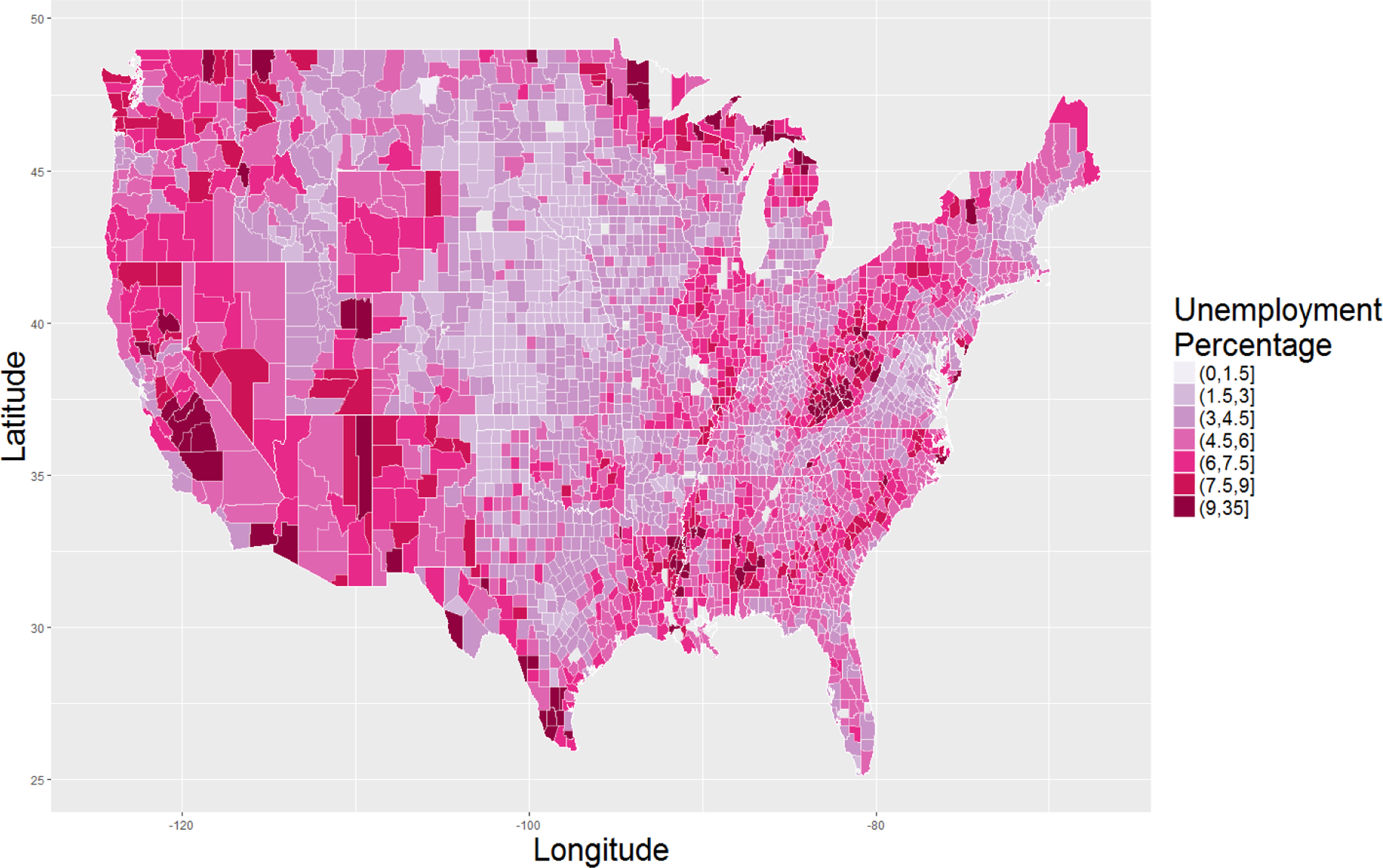
U.S. 2015 unemployment rates aggregated to the county level. Legend displays [lower bound, upper bound] unemployment percentages by color.
Another technique is to subset data to provide the ability to drill down to details of interest. There are several ways to subset data. One way is to randomly select a portion of the data. This is useful when one expects a random subset to be fairly representative of the entire population. Another method is to select only a portion of the relevant data rather than the entire data set. This requires some theoretical understanding of the construct. For example, the focus may be on underemployment and one could subset that specific subpopulation. Another possibility is to use different visual representation properties (e.g., colors, symbols) to subset different types of data if the goal is to obtain a general swathe of trends.
Jittering is a method to add random noise to the data samples so that points are not plotted at a specific location (which can result in too many overlapping points). For instance, when there are 5 points on a specific location (e.g., X = 4, Y = 5), jittering spreads them out. Jittering is most useful when there is substantial white space between specific data locations and may be useful in the order of thousands of data points (left), but perhaps not millions of data points (right; see Figure 2A).

Different methods of visualizing multiple overlapping data points. Note: (A) displays unemployment data from three different counties marked by their Federal Information Processing Standard (FIPS) county code, with data points jittered (blue) around their respective original (black) data; (B) represents data binning (random data, normal distribution); (C) represents alpha blending (random data, normal distribution); (D) represents contour plot overlays (random data, normal distribution).
Data binning is a technique for data visualization of grouping a dataset of N values into fewer than N discrete groups. This can occur in a two dimensional space where there are too many data point overlaps. The different forms of data binning include rectangular or hexagonal binning, with different shades representing the number of points within a specified area (see Figure 2B). Data binning can be extended to geographical maps (e.g., choropleth maps) where regions are shaded based on the quantity of the measured variable as shown in Figure 1.
Another method is the use of alpha blending in which points on the scale are slightly translucent so that multiple points will create darker regions resulting in some degree of contrast (Figure 2C). This can provide viewers with information about the density of data points. Another method is to use contour plot overlays so that density contour lines are included in the plot over the data points to visualize the total number of points in a specific area (Figure 2D). See the appendix for R code for these visualization techniques.
Visual Representation and Presentation
Third, because of the large number of data points and different types of data that will often need to be presented together (e.g., text and numeric data), greater attention will need to be placed on what can be called visual representation and visual presentation (Kirk, 2012). Visual representation is fundamentally about how data are best translated into visual elements and their attributes (form) given the visualization’s purposes (function) for the intended audience. One first major consideration is the choice of the general visualization type choice, of which there are many. Kirk’s (2012) comprehensive taxonomy of visualization types is particularly helpful since it is organized by intended function and consideration of data type (i.e., comparing categories, assessing hierarchies and part-to-whole relationships, showing changes over time, plotting connection and relationships, and mapping geospatial data); Sinar (2015) provides a selective review of this framework and points readers to other such taxonomies (e.g., Heer, Bostock, & Ogievetsky, 2010). Researchers seeking to obtain even more ideas about visualizations can refer to the Duke library resource, which provides examples and tools for the different layouts based on data type. 1 A second consideration in visual representation is that of the properties of the data (e.g., data types and quantities), which speaks to the third consideration of how best to facilitate the user in accurately grasping the insights the visualization offers. Facilitating users in accurately decoding visual representation requires, in part, considering their graphical literacy: Shah and Hoeffner’s (2002) review of this literature has shown graph comprehension depends on visual characteristics of graphs (see Mackinlay’s, 1986, research into visual perception accuracy for which visual representation attributes [e.g., position] best convey information for different data types [i.e., nominal, ordinal, and quantitative]); knowledge about graphs (e.g., schemas like independent variables tend to be on the x-axis in scatterplots); and familiarity with the substantive content area being visually represented, which informs expectations and ultimately shapes interpretation of graphs. Following general principles of and guidelines specifically for data visualization design (Kelleher & Wagener, 2011; Kirk, 2012; Sinar, 2015) is recommended since even recent classics in visually displaying information make recommendations (e.g., maximizing density of information conveyed; Tufte, 1990) that does not accord with those made in graphical literacy research (Shah & Hoeffner, 2002) and may not hold in the context of interactive visualizations (Parsons & Sedig, 2014).
Visual presentation relates to more macro-level concerns in data visualization creation (Kirk, 2012), such as the layout of visual elements (see above design principle citations). Graphs have been shown to be generally more persuasive than tabulated data (Pandey, Manivannan, Nov, Satterthwaite, & Bertini, 2014) and may facilitate communication across the sciences (Smith, Best, Stubbs, Archibald, & Roberson-Nay, 2002), but most data visualization software do not have easy ways to integrate important information about statistical significance (e.g., uncertainty estimates; Kelleher & Wagener, 2011) into the visualization itself, forcing users to rely on a perhaps faulty perception of significance that is not statistically supported (i.e., “optical significance”; Sinar, 2015). One direct solution to this issue that falls under the umbrella of visual presentation (Kirk, 2012) is the use of graphical overlays to convey statistical significance (Sinar, 2015). Graphical overlays are visual elements that are added to charts to aid in chart reading, such as reference structures (e.g., gridlines), highlights (e.g., outlines or arrows), redundant encodings (e.g., numerical data labels), summary statistics (e.g., mean), and annotation (e.g., descriptive text; see Kong & Agrawala, 2012, for a taxonomy) that allow the user to more readily and accurately perceive what the visualization is presenting. Another consideration related to visual presentation is interactivity, which some have argued is critical in unlocking the potential of big data for the interested user (e.g., Kirk, 2012; Sinar, 2015).
Interactivity
A fourth issue has to do with the possibility of conducting more inductive visual analytics with big data. With small data, visualizations are often used to corroborate results from a hypothetico-deductive approach. For example, displaying expected trends with data points (Grijalva, Harms, Newman, Gaddis, & Fraley, 2015) or exhibiting significant effects of moderation based on line plots (Tay, Morrison, & Diener, 2014). As such, organizational researchers are more familiar with static visualizations for showcasing results than interactive visualizations for inductively exploring trends within data. We propose that big data visualizations can serve to maximize the value of the data through discovering and informally assessing embryonic ideas through the use of interaction. Interaction can enable researchers to dynamically explore different areas of the data, detect patterns, and discern links among the data elements. For example, interactivity will require some level of appropriate data binning so that researchers are not overwhelmed with individual data points and it can maintain interpretability throughout the interaction (i.e., zooming in and out, panning, etc.). It also requires the use of efficient data structures and methods for data reduction and management in order to dynamically support the high volume and velocity of the incoming data (Keim et al., 2010).
Past research has suggested seven different types of interactive tasks users seek to do with information visualizations: (1) overview: provide overarching information of all the relevant elements; (2) zooming in and out; (3) filter: filtering elements that are not of interest; (4) details on demand: selection of elements provides specific information; (5) relate: highlighting elements that have similar attributes; (6) history: keep a log of actions taken to track visualization; (7) extract: subsetting data based on specific queries (Schneiderman, 1996). Two other frameworks related to interactivity are also worth considering. Soo Yi, Kang, Stasko, and Jacko (2007) provide a user-centered taxonomy of different categories of interaction techniques (i.e., select, explore, reconfigure, encode, abstract/elaborate, filter, and connect) that can be built into visualizations to allow users to manipulate and subsequently interpret the data in ways relevant to their aims. Parsons and Sedig (2014) offer a designer-centered taxonomy of essential properties of interactive visual representations (i.e., appearance, complexity, configuration, density, dynamism, fidelity, fragmentation, interiority, scope, and type) that creators should consider allowing users to manipulate given that the ideal values on any of them are dependent on the users’ abilities, preferences, and prior knowledge and experience. Organizational researchers seeking to build interactive visualizations for research and practical purposes should seek to design ways to incorporate these different functionalities for their data.
Real-Time Visualizations
A final issue involves the potential for factoring in the real-time nature of modern data feeds. With the advent of technology, data storage and processing has become cheap and accessible, and there has been much interest in generating massive amounts of real time data. The big data movement can enable researchers to perform analysis of data in real time, capturing dynamic change as it occurs. However, both accessing such data and visualizing real-time data add an additional layer of complexity. The visualizations created for streaming data require gracefully adjusting for new data so that a visual continuity is maintained between an individual’s current region of focus and the new data. This can be accomplished, for example, by applying data summarization techniques that summarize the new data and appending the summarized visual output to the existing visualization. Visualizations should also enable the detection of unexpected or new behaviors as new data arrives (Kohlhammer, Keim, Pohl, Santucci, & Andrienko, 2011).
Technical Tools
One final basic idea is what software package to use to begin the journey of data exploration using visualizations. There are too many visualization tools to manage to list, but the ggplot2 (Wickham, 2009) package implemented in the R statistical software environment (R Core Team, 2016) is particularly flexible and relatively easy to learn. Kirk (2012) directs readers to a website (http://www.visualisingdata.com/index/php/resources/) that is continually being updated with different visualization methods, and Sinar (2015) mentions some additional resources, most notably a website (https://sites.google.com/site/e90e50charts/) that offers a variety of templates in Microsoft Excel that can be used to visualize data.
Illustration 1: Performance Evaluation
In the first illustration, we focus on the traditional topic of performance evaluation to showcase how big data visualization can serve to aid in evaluating multiple performance criteria in an organization. This is an area where visualization can serve to effectively compare employees on multiple performance criteria. In general, as more performance criteria is being recorded and logged (e.g., project management systems, team communications, phone use, online transactions, behavioral traces), there is an increasing attention on developing effective systems for ongoing performance management (Rabl et al., 2012). We use the example of police officer data because they have traditionally been of interest to organizational researchers and there are multiple objective criteria (Cascio, 1977). Specifically, we demonstrate our work using police incident crime report data for a city in the United States logged by police officers. There is substantial variability in the type of incidents officers respond to and police departments are interested in examining ways to visually quantify the frequency of these responses. The visualization focuses on two aspects: How can we visually define and quantify the performance attributes for the officers across multiple criteria? How can we easily evaluate whether the organization is meeting their defined response targets and goals? While the number of officers in these data is relatively small, the interactive visualization is generalizable to a substantially larger dataset.
Data
The crime incident data used in this illustration were provided by a partner law enforcement agency in the calendar year 2015. There were a total of 150 police officers and 27,055 incident reports. Police officers logged incident reports that they responded to. There are a total of 232 different types of offenses (e.g., arson, assault, burglary, homicide, etc.) and each offense had an associated date and time of the incident. The data were anonymized with a unique identifier for police officers. Given that responding to some incidents (viz., offenses) may be relatively more important than others (e.g., responding to domestic disturbance may carry more weight than a noise complaint), the police agency conducted a survey among their officers and the public to rank order the different offenses. Based on the survey, the organization assigned initial weights to the different offenses indicating relative importance. This is shown in Figure 3 (right). For this example image, the weights have been randomized.

Pixel view visualization of incident by officer report data (unsorted data). Note: The (A) annotation denotes that offense scores have been encoded in a blue color scheme (see legend at bottom left). The (B) annotation marks the total offense score for officers across all offenses in a red color (darker equals higher scores) scheme. The (C) annotation indicates the total offense score for a given offense across all officers in a red color (darker equals higher scores) scheme.
Visualization
The goal is to visualize police officers by the number of incident reports for a specific time period. With regard to the issue of identification (of the relevant data), the relevant units of analysis are incident reports aggregated at the officer level over the year. With regard to the issue of integration (of data into the visual space), we implemented a pixel view visualization shown in Figure 3 in order to present the incident (row) by officer (column) data, where counts of each incident data type is aggregated to the officer level (see Figure 3). This enables researchers and organizations a concise method to visualize and compare the scores for the different officers. The offense score for a particular officer is computed by multiplying the number of offenses responded to by the officer (No) during the selected date range by the corresponding offense weight (wo). We utilize a sequential blue color scheme (Harrower & Brewer, 2003) and encode the score as a color for the corresponding pixel value (Figure 3A). Darker (lighter) blue colors indicate a higher (lower) offense score for the officers. We multiply the count per offense and officer by the corresponding offense weight to obtain the score for the offense and officer. The total score for the officer is obtained by summing over the individual scores for all offenses. This is shown by the following equation:

The total score for each officer is shown at the top of the pixel view visualization (Figure 3B) using a sequential red color scheme. Finally, the total score for each offense is shown in red color (Figure 3C). Darker (lighter) red colors indicate a higher (lower) total offense and officer score.
With regard to the issue of immediacy, the visualization is linked to daily ongoing incident reports. This enables the police department to obtain recent information about the various performance metrics of police officers. With regard to the issue of interactivity, the implemented pixel view visualization is interactive with the primary task of data sorting in the following ways: By total officer score: Users can sort the data by the total officer score as shown in Figure 4A. This allows them to determine the officers with high/low scores. By total offense score: Users can sort the data by the total offense score in order to determine the offenses that have a high score. This is shown in Figure 4B. By officer: Users can interactively sort the data by a particular officer in order to determine the offenses that s/he had the highest score for. An example is shown in Figure 4C. By offense: Users can interactively sort the data by a particular offense. This enables users to determine the officers that had high/low scores for the selected offense. An example of this interaction is shown in the image below for a specific offense shown in Figure 4D.
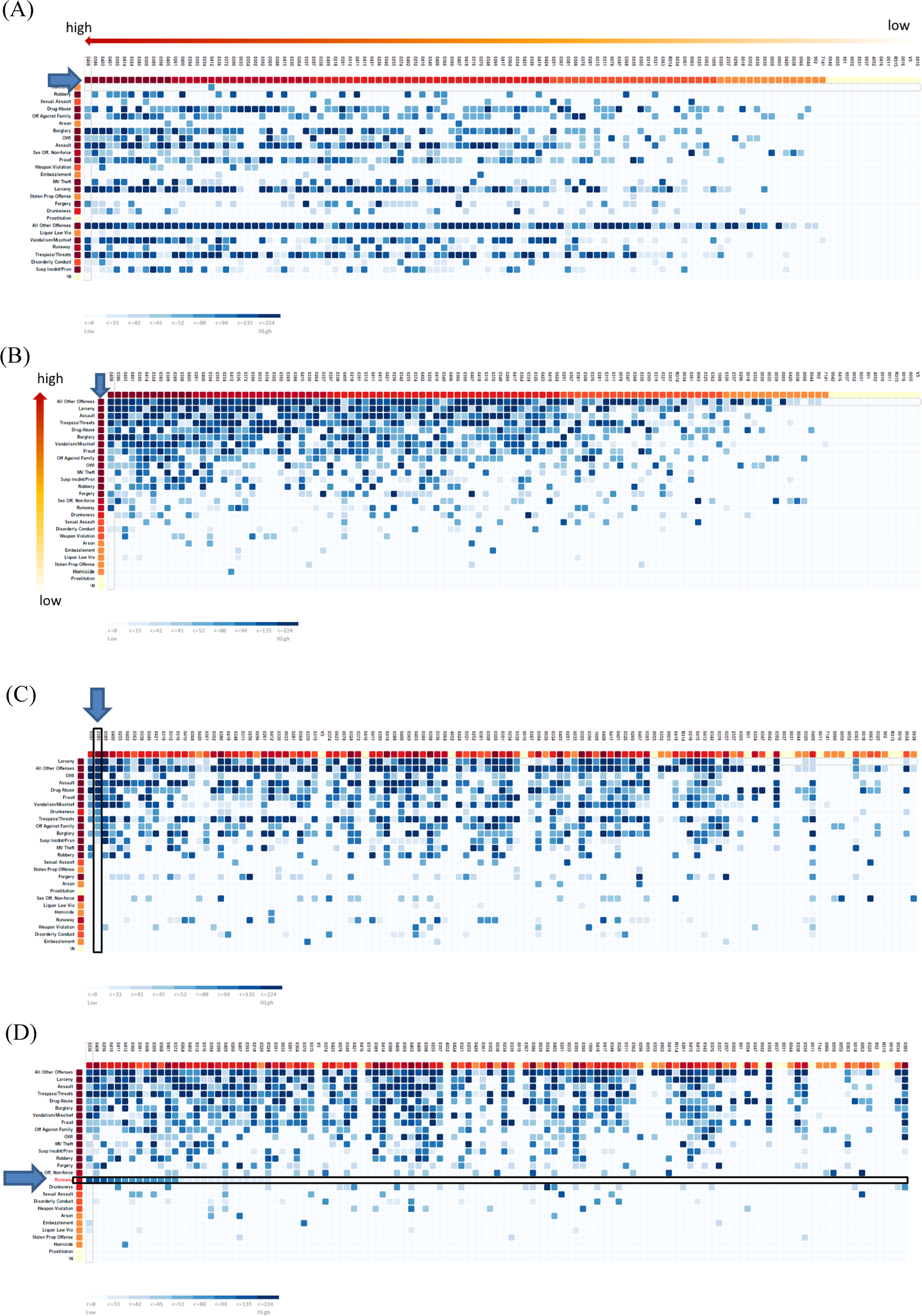
Pixel view visualizations of incident by officer report data with different ways of sorting data.
Notably, while the visualizations here depict different performance criteria for police officers, it is also applicable to other practical and research contexts. For example, visualizations can be used in context of assessment center ratings where we can obtain a visual representation of the scores of different performance-relevant dimensions by individual candidates. These can further be weighted by the relative importance of the underlying dimensions.
Illustration 2: Social Network Data
First, we consider social network data as social networks represent an important aspect of organizational research and capture convey a multiplicity of dimensions informing and predicting organizational behavior. From a resource perspective, social networks provide key informational and emotional resources for organizational members (Cross & Sproull, 2004; Kirmeyer & Lin, 1987); from a communication perspective, social networks represent information direction and flow between organizational members (Monge & Contractor, 1999); from a structural perspective, network structures are attributes that are operationalized to impact worker outcomes apart from worker attributes (Cross & Cummings, 2004). Considerable data now unobtrusively track such interactions, such as emails within organizations, project management messaging, service calls between a supplier and client, notices sent around an organization, and advertisements sent and consumed by people around the world. In this illustration, we utilize publication data of organizational scholars in organizational journals to showcase how visualizations can be used to not only present data, but also further understand collaborative authorships. These include understanding the overall structure of the network of publications and collaborations and who are more collaborative researchers in the overall publication network.
Data
Author data for publications over the past two decades (1997 to 2016) were collected from the journals Academy of Management Journal, Academy of Management Review, Administrative Science Quarterly, Organizational Behavior and Human Decision Processes, Organizational Research Methods, Organization Science, Journal of Management, Personnel Psychology, Journal of Applied Psychology, Journal of Business and Psychology, Journal of Organizational Behavior, and Journal of Vocational Behavior. Coauthorships in publications are operationalized as one instance of collaboration. Authors have multiple collaborations across these different journals. There were over 13,000 authors (nodes) with around 35,000 unique collaborations (edges) across the different journals.
Visualization
Because we are interested in examining collaboration across these different journals, we seek to use visualization to examine two issues. Namely, what is the overall structure of the collaborations? And who are collaborative researchers in the overall publication network? We use the software Gephi (Bastian, Heymann, & Jacomy, 2009), which is an open source software, to conduct the network visualization. Given the size of the data a simple plot of the data with nodes and edges would be difficult to interpret, as shown in Figure 5A. This plot shows a dense knot of nodes and edges with no discernible pattern. With regard to the issue of identification, in order to identify specific attributes of interest, we changed the layout of the graph to a force directed graph where smaller clusters are differentiated from the main cluster. We also use different colors to differentiate collaborations (i.e., edges) across the different journals. In addition, to cleanly present the collaborations, we do not display the authors (i.e., nodes). The plot is shown in Figure 5B where we find a dense knot of collaborations, or an inner circle (visually defined), in the middle of the graph and also find outer rings of collaborations. This reveals that authors publishing in organizational science may be in different collaborative strata; collaborations occur most often among authors in the inner circle whereas collaborations occur only occasionally for authors outside the inner circle.
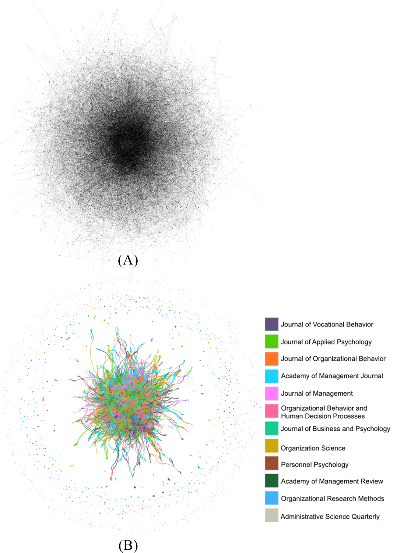
Plot of collaboration networks in top organizational journals. Note: (A) displays an initial plot of the collaborative network. (B) displays the same collaborative network using a force-directed structure and collaborations in different journals are distinguished by different colors.
The use of interactive visualization enabled us to uncover the inner and outer circles as shown in Figure 5B, which sparks new questions that a researcher may seek to investigate further: What are the characteristics of those in the inner circle as compared to those outside it? Are there demographic and institutional characteristics that predict these? Who are the authors within the inner circle? Finding all the answers to these questions lies beyond the scope of the current article as our goal is to underscore the application and utility of big data visualizations. However, showcasing how we can visualize author information within the inner circle can speak to the issue of integration across different data like text (i.e., author names) and numeric (i.e., number of collaborations) data and we seek to demonstrate this.
In order to understand if the inner circle of authors have different levels of collaboration, we first identify only node data in the inner circle. In Figure 6A, we display nodes that are differentiated by size and color. Larger nodes and nodes that have a greater degree of red represent authors with a greater number of collaborations. There is a large scatter of nodes that are overlapping but range in size. This shows that even within the inner circle, there are different degrees of collaboration. Determining who the most collaborative authors are within this circle could reveal what author characteristics might be most associated with collaborativeness. To achieve this, we hide the nodes and display only author names, where the size of the author names are weighted by the number of collaborators. The display in Figure 6B shows that there are several highly collaborative authors: Paul Spector, Gerrald Ferris, Timothy Judge, and John Hollenbeck. However, it is difficult to visually identify other author names because of the dense clustering in the inner circle. To address this issue, we restructured the data to an open structure to reduce the number of clusters overlapping in the inner circle. We also removed the visualization of edges. In Figure 7, we see that within the inner circle, there are multiple clusters of collaborators and authors that are proximal to each other have published more together. There may be several research questions that this visualization generates: To what extent are collaborations the result of sharing a common institution (presently or in the past)? Related to this, are there geographic trends in these collaborative networks? It appears that being in a field for a longer time is associated with the number of collaborations but are there also other characteristics that are associated with the degree of collaborativeness, such as the type of training scholars received in their PhD (e.g., business schools, labor and employment relations, industrial/organizational psychology)?
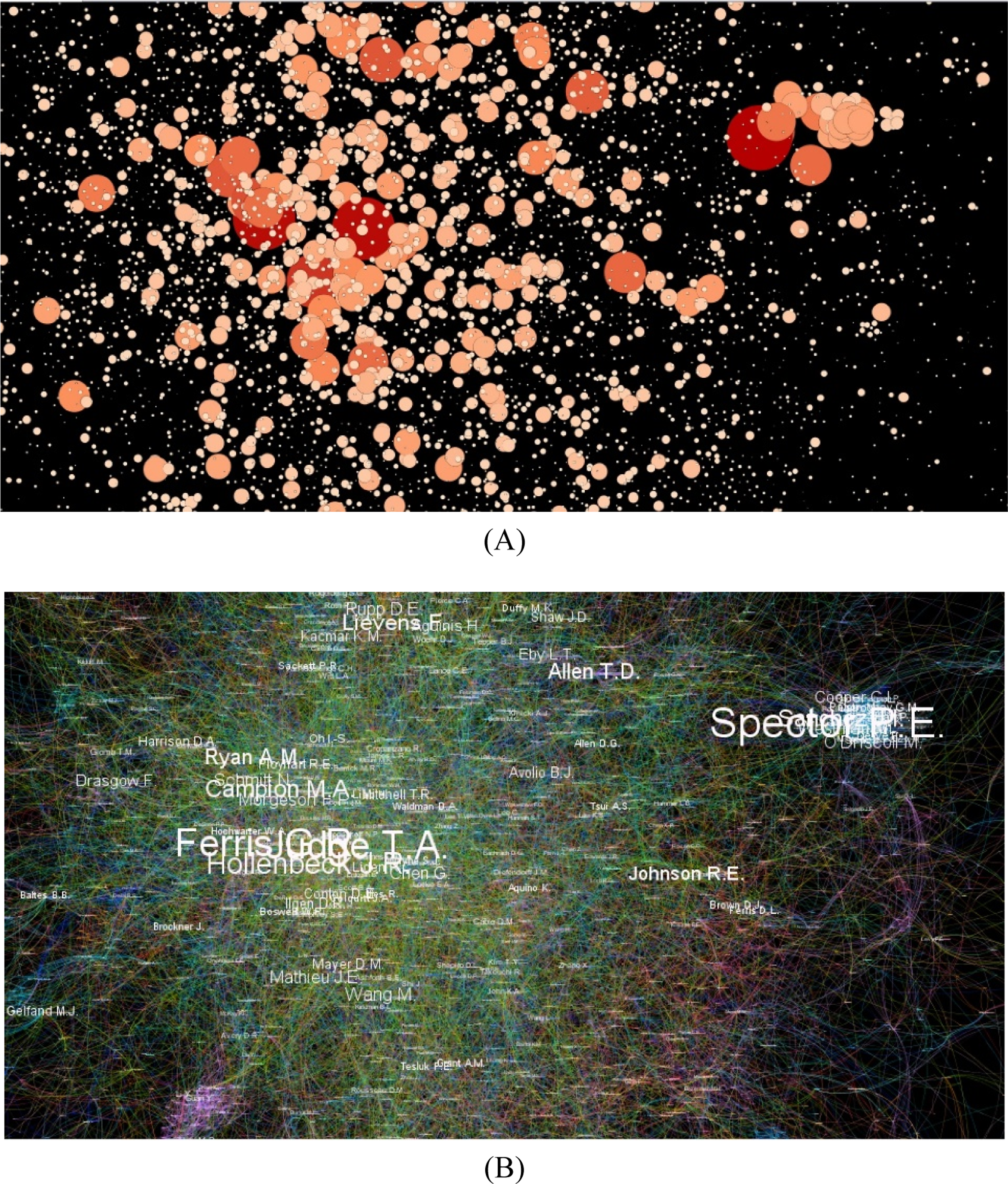
Inner circle of authors publishing in top organizational journals. Note: In (A), larger circles represent authors with greater numbers of collaborations. In (B), larger author names represent authors with greater numbers of collaborations and different color ties represent authorship collaborations in different journals.
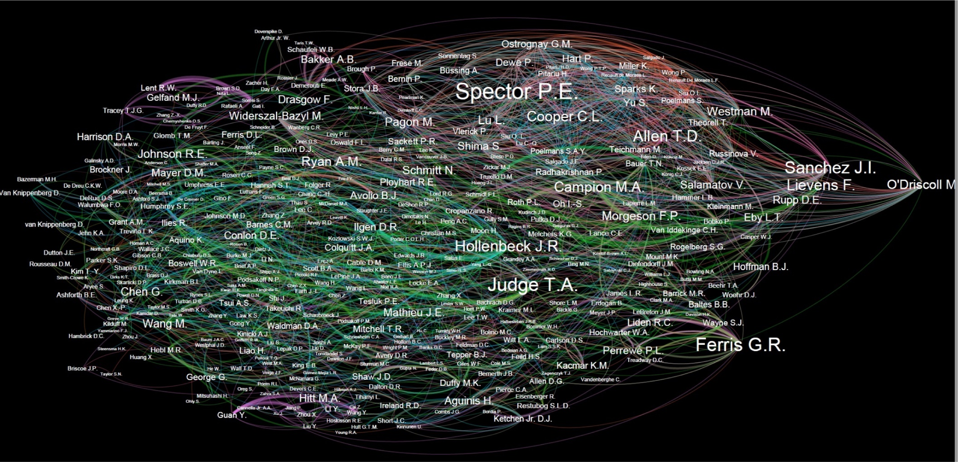
Restructured network of inner circle of authors (>25 coauthors) publishing in top organizational journals.
For researchers interested in the structure of collaborations, a visual examination of the colors that differentiate the journals in Figure 5B do not reveal any specific trends, and the collaborations appear to span different types of journals. Therefore, from the specific collaborations themselves, it is difficult to determine the structure of collaborations within journals. Further identification is required in order to obtain useful visualizations. Researchers may be interested in examining specific journals in order to further understand collaboration structure within journals. In this illustration, we focus on the journal Organizational Research Methods (ORM). We subset the data to only include collaborations within ORM and display only those with more than one ORM collaborative article. The network of collaboration is plotted in Figure 8 where labels of authors are scaled based on the number of collaborations. As can be seen there are several clusters of researchers who tend to publish together in ORM, with the more collaborative researchers being Adam W. Meade, Herman Aguinis, Larry Williams, and James M. LeBreton.

Collaboration network of authors who have published in Organizational Research Methods on more than one collaborative publication.
To conclude this section, using publication network data, we have illustrated social network big data visualization. While the size of the network data in the illustration is substantial, it is not massive. However, the same principles illustrated in this data set is applicable to a larger network data. In big data visualization, it is important to determine specific research question(s) for the network data. Identifying the appropriate data based on aggregation, subsetting, and visual highlighting follows from the research question(s). Furthermore, network visualizations are most effective when they can visually integrate different forms of data (numeric data and text data). Interactive visualizations further enable researchers to ask new and novel theoretical questions about the data.
Illustration 3: Social Media Text Data
As mentioned earlier, an important component of big data that differs from small data is that there are multiple modes, including structured (e.g., tabular data, census records, library catalogs) and unstructured (e.g., text documents, video, images, emails, webpages) data. In particular, within social science, the idea of big data is often unstructured and invokes ideas of social media text data, available through platforms such as Facebook, Twitter, and Yammer. Social media text data are often seen as distinct from small data because of the magnitude of the data and the uniqueness of language data making difficult to examine with qualitative coding methods and traditional statistical techniques, respectively. At the same time, methodological advances in natural language processing have enabled large-scale analyses of social media text data that render words and characters into meaningful patterns (Agarwal et al., 2011). These data enable researchers to overcome problems of survey methodology that can be time consuming, expensive, and restrictive (i.e., confined to constructs within a questionnaire rather than ecologically emergent). As such, social media text data have gained popularity in social science research; although, to our knowledge, work in this area within organizational science is only beginning to emerge (e.g., Wang, Hernandez, Newman, He, & Bian, 2016). Analyses of the language can reveal psychosocial aspects of the culture of an organization, as well as positive and negative sentiment felt within the organization and in the broader community. The example of visualizing social media data serves to illustrate how big data visualization is not merely a means to present information but is also a tool, or a means, to more inductive approaches as opposed to hypothetico-deductive approaches (Hambrick, 2007; Locke, 2007).
In this illustration, we utilize Twitter feed of organizations to demonstrate how social media language visualization can be conducted between organizations to identify trends and patterns. Specifically, we examine Twitter feeds from Fortune 500 companies over the period of the past year. The goal here is to demonstrate how the visualization of topics and sentiments can be performed on social media data. While a focus of only 500 companies may border on small data, the visualization process depicted here is extendible to a substantially larger set of companies and users.
Data
We manually obtained the Twitter usernames of the Fortune 500 companies. We then utilized the public Twitter API to obtain the 58,000 public tweets associated with these companies for the past year (2015-2016). The data were stored in a relational database and comprised the username, date/time stamp, message identifier, and the original message. A snapshot of the data obtained from this method has been shown in Figure 9. As can be observed, the analysis of such data in a typical qualitative approach with human coders to extract trends and patterns can be difficult given the large number of tweets from only 500 companies. To overcome this issue, we seek to use visualization to provide some insights to the common topics put on social media by Fortune 500 companies.
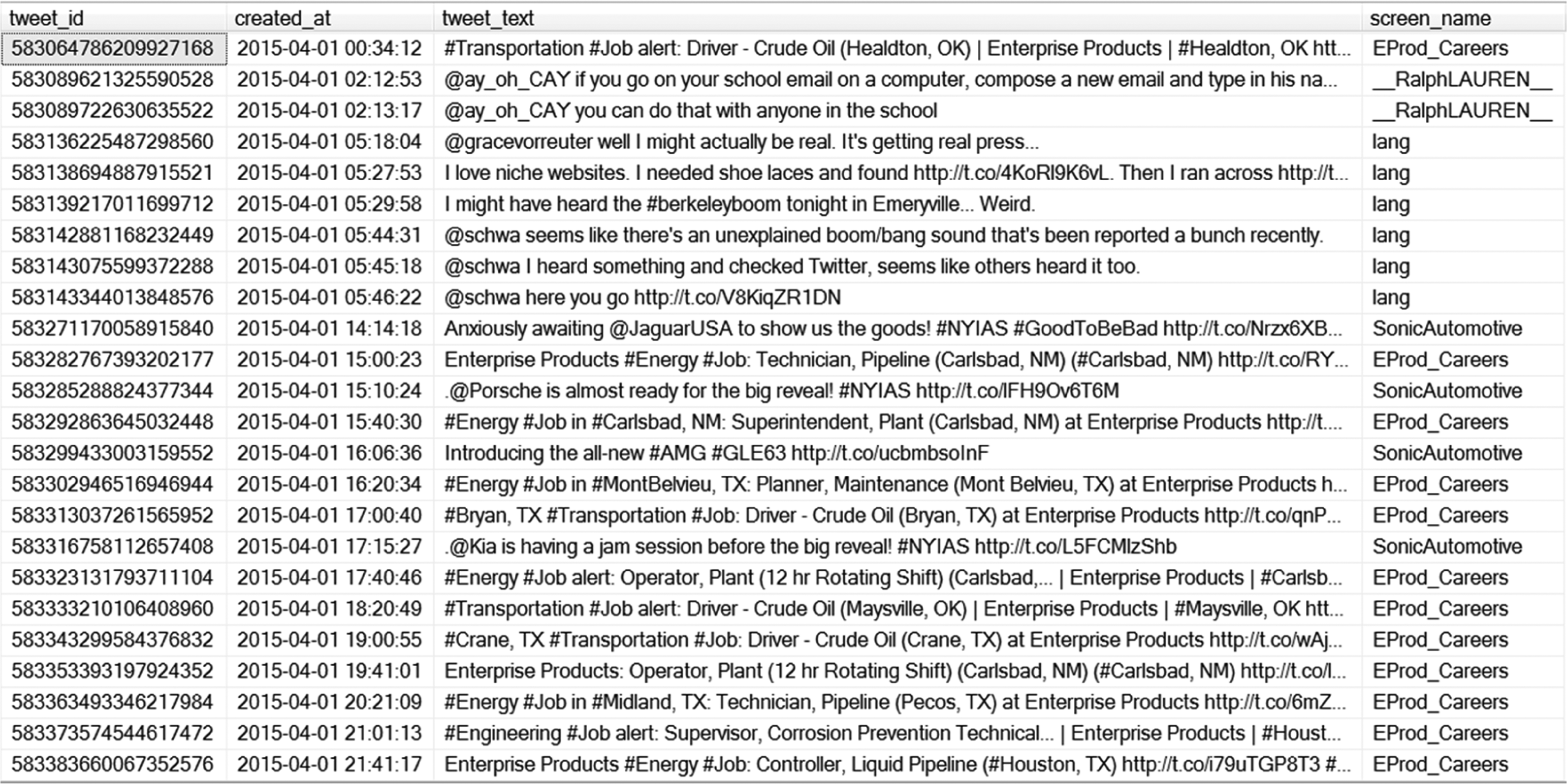
A snapshot of the raw tweets from Fortune 500 companies over the past year (2015-2016).
Visualization
With regard to the issue of identification (of relevant data to visualize), we need to develop a way to identify the key topics that are being mentioned in the tweets. In order to achieve this, we utilize the latent Dirichlet allocation (LDA; Blei, Ng, & Jordan, 2003) method to extract and rank the major topics from the tweets. The LDA technique is a popular probabilistic and unsupervised machine learning technique that identifies key topics from a large document corpus. This method assumes that a document of words is comprised of multiple latent topics with a Dirichlet prior. A Bayesian inference algorithm is used to retrieve the topic structure and the corresponding statistical proportion of the topic, along with a list of keywords that are prominent within the topic message. The LDA technique extracts the most sizable latent topics followed by smaller topics, similar to other latent class approaches for quantitative data (e.g., Tay, Diener, Drasgow, & Vermunt, 2011). Through the use of LDA, we can address the issue of identification by visualizing major topics, and the words that are most relevant to a specific topic uncovered.
After uncovering the topics from the tweets of the Fortune 500 companies via LDA, we can visually preview a large number of topics in a corpus of words. For this illustration, however, we focus on the top 5 topics, which comprise approximately 49.6% of the total tweets. To maximize interpretability of the topic visualization, we integrate different modes of data (LDA topics, raw tweets) in the visual layout. As shown in Figure 10, each topic has been organized into a word cloud where the size of each word encodes its frequency (i.e., number of messages that contain the selected keyword). The representative tweets of each topic are also displayed next to the topic. The topics are sorted in the descending order by the corresponding volume of tweets.
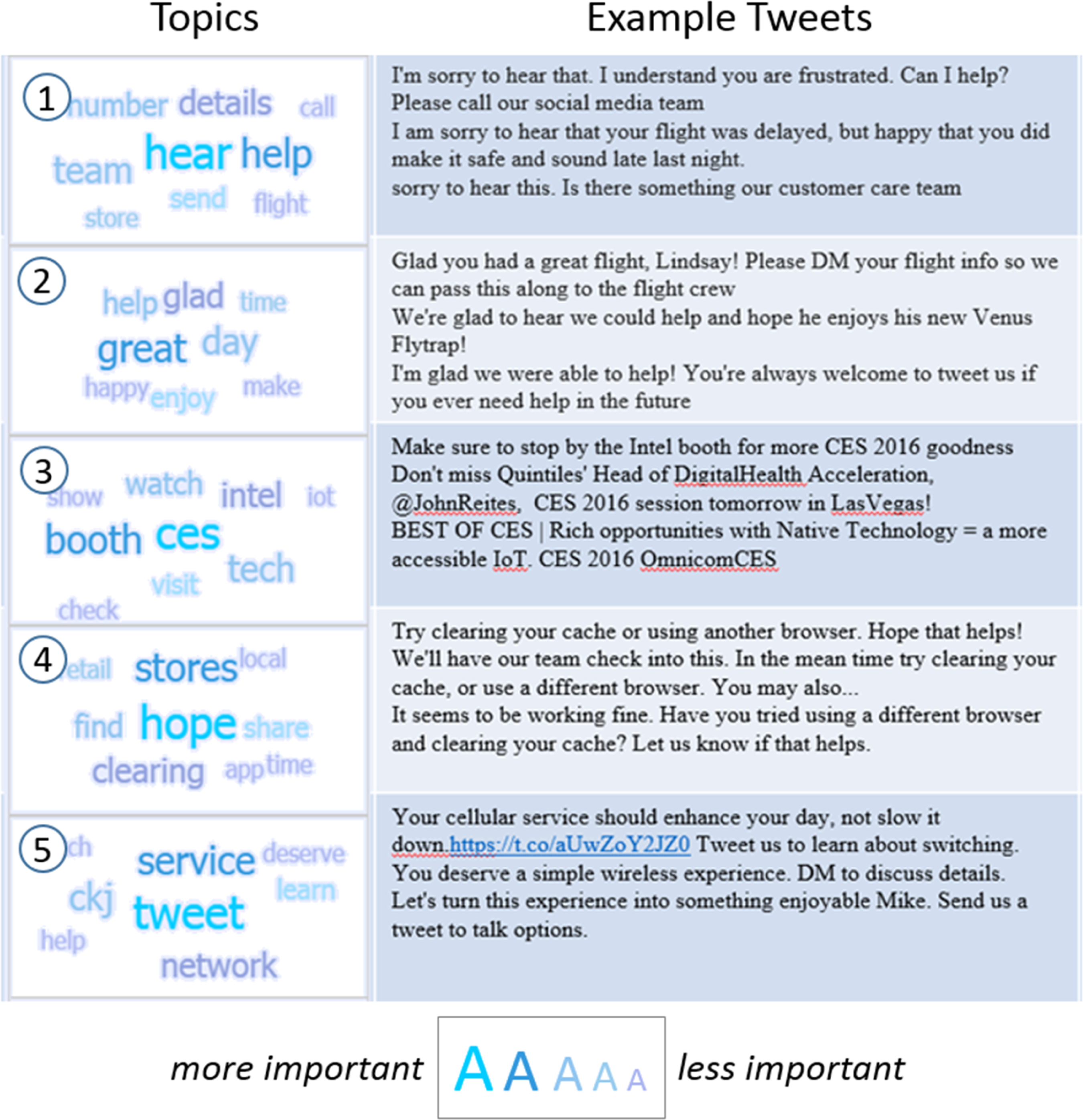
Top 5 topics based on tweets of Fortune 500 companies.
What are some of the specific trends that can be uncovered from the visualization? From the visualization in Figure 10, there appear to be two primary trends in tweet data for Fortune 500 companies: customer service and marketing. Customer-service-oriented topics can be seen in Topics 1, 2, and 4. The first two topics reveal that many tweets among the Fortune 500 companies are being used in the context of customer service and reflects a typical customer service interaction. In the first topic, we find that companies use tweets to acknowledge that a customer needs help and seeks to provide the help. In the second topic, companies also use tweets to express gratitude to customers. In the fourth topic, it appears that many of the customer service tweets concern technical support. Our finding that customer-oriented topics are more dominant in tweet data points to the importance of customer service placed by Fortune 500 companies in their social media. Companies actively monitor social media in order to communicate with their customers. It also shows that customers either leave comments or ask the customer service for help on social media.
The other trend in social media use by Fortune 500 companies is marketing. There are two topics uncovered in the visualization advertising an event and a cellular service plan. As shown in Figure 10, the third topic pertains to the global Consumer Technology Show (CES; https://www.ces.tech/), which is being advertised through tweets. The CES showcases more than 3,800 exhibiting companies, including manufacturers, developers, and technology companies where the companies typically host presentations of their latest consumer geared products. The fifth topic is a promotion of a service plan to followers on the social media stream. In the visualization, incorporating elements of interactivity would be useful as it enables researchers to further examine topics related to keywords in the visualization. In our example, assuming that researchers are interested in the CES event and the topics related to them, it is possible to filter these topics as shown in Figure 11. This reveals the companies that are creating buzz about their involvement in the CES event.
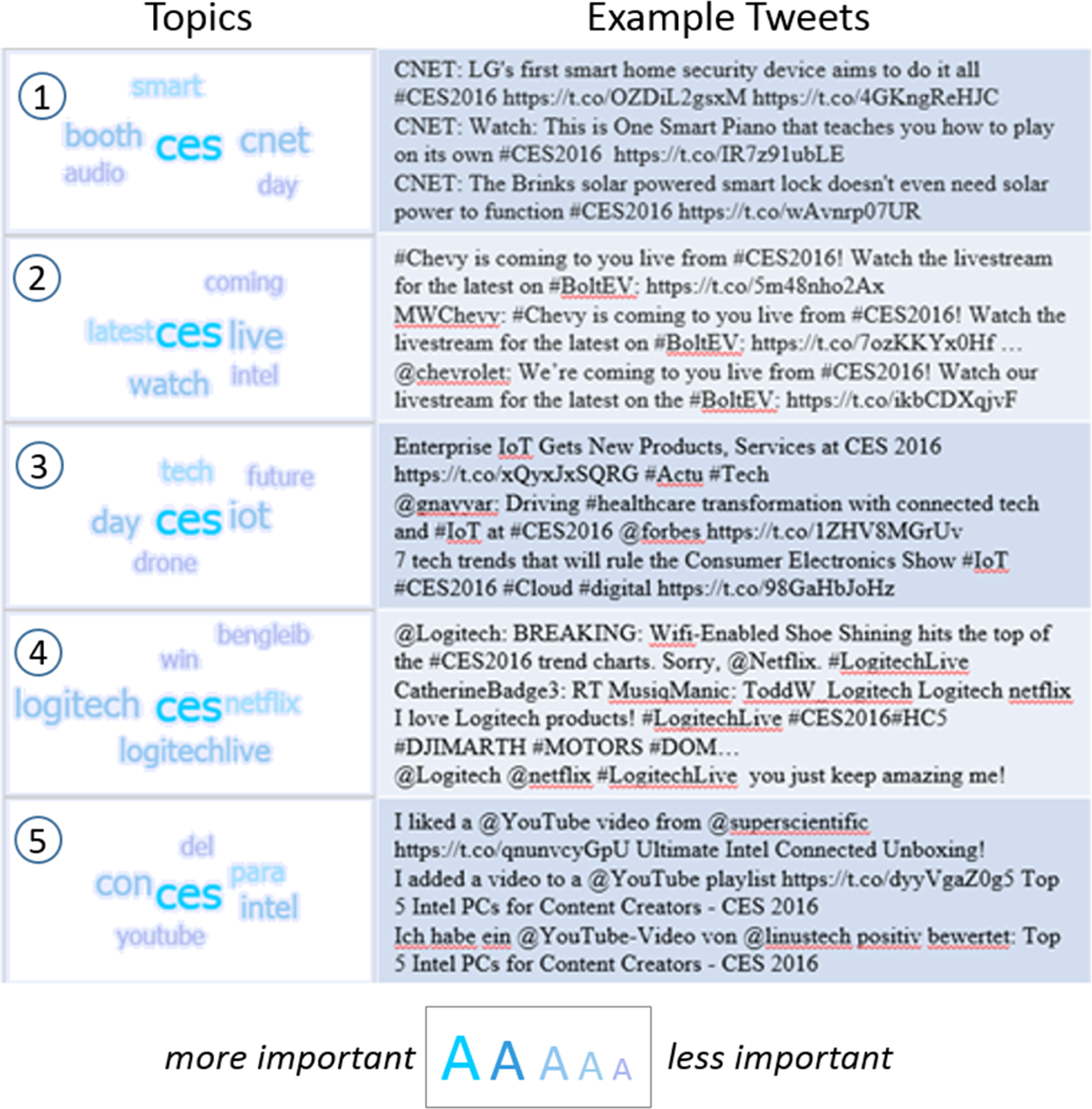
Top 5 CES-related topics based on tweets that contain CES keywords.
The visualization of social media language information can serve to generate new and interesting practical and theoretical questions that can be further examined. Apart from the dominant uses of customer service and marketing, what other communication uses can be found on social media among Fortune 500 companies? Are these differentiated by industry type? What are customer sentiments toward these companies on social media? How does customer sentiment vary with productivity metrics of companies (e.g., stock market prices, product launches)? What are the geographic hotspots associated with company mentions?
Researchers interested in further exploring topic modeling are referred to different tools available for topic modeling of social media text data. These include genism (https://radimrehurek.com/gensim/), software from the Stanford Natural Language Processing group (http://nlp.stanford.edu/software/tmt/tmt-0.4/), and the MAchine Learning for LanguagE Toolkit from University of Massachusetts at Amherst (MALLET; http://mallet.cs.umass.edu/topics.php).
Conclusion
In this article, we have highlighted the similarities and differences between small data and big data and the relevant issues to consider in big data visualization. We have suggested that the three “Vs” of big data alone and in combination have corresponding “Is” (i.e., identification, integration, immediacy, and interactivity) that need to be taken into consideration. We then reviewed general, basic ideas in big data: data processing, handling big data, visual representation and presentation, interactivity, and real-time visualizations. Finally, we broadly highlighted the relevance of the above through illustrative examples, from raw data to completed visualization.
Our examples are what Kirk (2012) would categorize as visualization types for mapping geospatial data (Figure 1), comparing categories (Figures 10 and 11), and plotting connections and relationships (Figures 5 –8), with the remaining categories of assessing hierarchies and part-whole relationships (e.g., stacked bar charts, treemaps), and showing changes over time (e.g., sparklines, stream graphs) not illustrated. All these types are relevant to organizational psychologists for both exploration and explanation, from uncovering potential insights to telling a thousand-word storie in a single visualization. For example, Illustration 2 allowed us to gain certain insights that would have been difficult to uncover by looking at the data alone: that there are clusters of collaborators that are more or less central to collaborative publishing efforts in organizational research (Figure 5) and, by successive iterations of data subsetting and visualization, the specific people who constitute the inner circle of most collaborative (Figure 6B) given certain criteria (Figure 7) and within a specific journal (Figure 8).
However, as can be seen in this article, much of the current implementation of big data visualization emphasizes the pragmatic and practical aspects where a researcher seeks to better understand the current data through visualization. While data-driven and inductive approaches have been more recently advocated for, they have not been prominent within the organizational sciences. We expect that the increasing use of big data and accompanying big data visualizations will enable researchers to better understand their data and provide new insights into important substantive phenomena.
Footnotes
Appendix
Declaration of Conflicting Interests
The author(s) declared no potential conflicts of interest with respect to the research, authorship, and/or publication of this article.
Funding
The author(s) received no financial support for the research, authorship, and/or publication of this article.