




Abstract
This article presents a methodology that organizational scholars can use to analyze, explain, and critically interpret the role of visual rhetoric in organizational communications. Corporations invest heavily in the visual design of organizational communications, including corporate reports, recognizing the distinctive role and benefits of visual imagery, as well as the rhetorical function of these documents. Current analytical approaches to visual rhetoric are either predominantly theoretical (with little structured guidance) or procedural (with little acknowledgment of important epistemic questions). This leaves a need for a methodology that combines a clear theoretical framework with explicit guidance on how to analyze visual rhetoric. This article bridges this analytic gap by offering a methodology that integrates a theoretical foundation of a priori analytical categories informed by selected writings of the French cultural theorist Roland Barthes with three abductively derived phases (categorical analysis, content analysis, rhetorical analysis) for analysis of visual design of corporate reports. We apply this methodology in an examination of a Qantas Annual Review and articulate our contributions to the field of organizational research methods.
Keywords
There is growing recognition of the “visual saturation” (Bell & Davison, 2013, p. 170), and “increasingly iconographical” nature (de Vaujany & Vaast, 2016, p. 763), of organizations. Scholars have revealed the important role of visual artifacts (such as drawings, timelines, photographs, and charts) in the organization of work (Ewenstein & Whyte, 2009) and in the communication of complex promotional messages to audiences within and beyond corporations (van den Bosch, De Jong, & Elving, 2005). However, this corpus of research remains nascent. According to Höllerer, Jancsary, Meyer, and Vettori (2013, p. 141), “the visual realm has, to date, remained largely unexplored,” especially so as a source and inspiration for building innovative methodologies in organizational research (Ray & Smith, 2012; Warren, 2008). Within the existing visual methodology literature, organizational scholars have placed greater emphasis on modes of visual data collection rather than on modes of visual data analysis, with even less attention paid to visual rhetoric (Meyer, Höllerer, Jancsary, & van Leeuwen, 2013). Accordingly, the goal of this article is to advance visual organizational research by proposing a methodology for the analysis of visual rhetorical features of organizational communications, using corporate reports as a generic example. 1
Development of this methodology is important for two reasons. First, to enhance the relevance and capacity of our field to address the current context where corporations are investing heavily in creating visually sophisticated organizational communications. Corporations have recognized the distinctive nature and benefits of visual imagery including sensory anchoring, instant accessibility, multicognitive processing, and multiconnectedness to other images and cultural contexts (Zillmann, Gibson, & Sargent, 1999). Visual images are often first to attract readers’ attention and appeal to intuitive rather than analytical reasoning (Davis, 1989). They can also enhance readers’ recall and perception of accompanying written text (Deegan, 2002), and emphasize or divert attention from particular aspects of text or data. Exploiting these known benefits, corporations use visual imagery for rhetorical purposes in their communications to produce desired messages about the nature and performance of the organization. Corporate reports represent a case in point; these are typically glossy and visually striking documents “almost universally used as a means of moulding corporate identity and reputation” (Davison & Warren, 2009, p. 846). Corporate reports are thus appropriate artifacts for the study of visual rhetoric, that is, how persuasive effects may be accomplished through the use of visual imagery.
Second, the broader field of visual communications is limited in its capacity to provide organizational researchers with a mode of visual analysis to respond to the opportunities above. According to Martin (2014), visual communications research is “turbulent and incoherent” (p. 188) with a multiplicity of competing approaches for analyzing visual artifacts. A notable feature in the broader field is a lacuna between theory-driven and procedure-driven techniques for visual analysis, which undermines the methodological rigor of the field according to van Leeuwen and Jewitt (2001). Theory-driven approaches rely on the individual application of complex concepts from cultural or linguistic theory. The drawback, according to Silverman (2010), is that they offer little structured or explicit guidance on how to conduct the analysis (e.g., Kress & van Leeuwen, 2006) thus limiting replicability. By contrast, procedure-driven approaches (e.g., quantitative content analyses) are typically data-driven and easily replicable, but offer little or no acknowledgment of the epistemic issues surrounding the interpretation of visual imagery. We propose a methodology that combines a theoretical foundation of a priori analytical categories derived from the semiotic thought of Roland Barthes (1972, 1977) with three abductively derived phases of visual rhetorical analysis. Semiotics is a set of concepts and theoretical principles to study how meaning is made through the workings of language (conceived as a set of linguistic signs) and other systems of cultural and visual representation (such as photography, clothing, or art). Our methodology thus meets a need in organizational scholarship for a replicable model of visual analysis that bridges the theory-procedure gap, and offers a distinctive methodological contribution to the study of visual imagery in organizational communications.
The article advances in four sections. Following this introduction, the second section further situates our article in existing approaches to visual organizational research and analysis, and the rhetorical study of corporate reports. It expands on the theory-procedure gap noted above, reviews existing approaches, and expounds our choice of works by Roland Barthes for the theoretical underpinnings of the methodology. The third section describes and explains the three key phases of our proposed methodology, and the visual design elements to which it is applied. The fourth section deploys the methodology in an exemplar analysis of a corporate document: the 2010 Annual Review of the Australian airline Qantas. The fifth section concludes by outlining the contributions of the article to organizational research methods, and recommendations for future use.
Review of Rhetorical and Visual Analytical Methods in Organizational Research
This section reviews and identifies important gaps in existing approaches to visual analysis in organizational research with particular regard to the study of rhetoric in corporate reports.
The Theory-Procedure Gap in Visual Communication Research
The visual dimension in organizational research lacks a “clear and broadly shared research agenda” (Meyer et al., 2013, p. 491). Existing work is distributed across several notable literature reviews (Bell & Davison, 2013; Meyer et al., 2013), special issues (see, e.g., Accounting, Auditing & Accountability Journal, 2009, vol. 22, no. 6), and specific historical or empirical studies, which are differentiated by level of analysis, theoretical approach, and type of visual artifact addressed. For example, organizational studies researchers have employed visual data as part of historical studies of leadership (Kuronen, 2015), group- and team-level coordination of work (Endrissat, Islam, & Noppeney, 2016; Ewenstein & Whyte, 2009), and field-level institutional analysis of CSR reports (Höllerer et al., 2013). The value of these studies lies not only in their distinctive unit of analysis of an underused data source in organizational studies, but also in the careful attention given by the authors to articulating how they collected or generated their visual data through, inter alia, archival, autoethnographic, or video methods, and the novelty thereof (Toraldo, Islam, & Mangia, 2018). Furthermore, some studies shine a light on the substantive role played by visual objects and artifacts in the legitimation processes and practices of organizations and managers respectively (for instance, de Vaujany & Vaast, 2016; Vergne, 2011). Typically less clear, however, is the question of how the analysis of the visual data was conducted, and theoretical and procedural aspects of the authors’ analytical processes.
The tendency to place emphasis on methods of visual data collection rather than visual data analysis in organizational studies (Bell & Davison, 2013) serves to deflect attention from the theory-procedure gap in visual research mentioned above. This lacuna was identified over a decade ago by van Leeuwen and Jewitt (2001) with particular regard to preexisting visual artifacts (such as advertisements, magazine covers or images, pictures, brochures, and so on). Theory-driven approaches draw upon a range of philosophical, linguistic, and aesthetic perspectives (e.g., Rose, 2012). Research studies or methodology texts in this vein tend to be conceptually dense, sometimes with a lot of jargon, and dependent upon the individual researcher’s internalized comprehension of the theoretical framework in use. They may present little clear explanation of how visual analysis has been or should be conducted, nor a structured and explicit set of analytical procedures for future researchers to replicate or adapt.
By contrast, procedure-driven approaches, notably content analyses and certain modes of coding/thematic analysis, are often more transparent about research design choices and analytical procedures (e.g., Grady, 2004) and are thus more easily replicable. However, there is typically little or no a priori discussion of the theoretical status of visual data, or findings generated, with such approaches. Such research often assumes an underlying realist position that can propagate the naïve illusion of the transparency of the visual image (Bell & Davison, 2013; see also our later comments on photography). Our review of leading visual research methodology texts and handbooks in and beyond organizational studies (Bell, Warren, & Schroeder, 2014; Horn, 1998; Knowles & Sweetman, 2004; Kress & van Leeuwen, 1990, 1996, 2006; Margolis & Pauwels, 2011; Pauwels, 2011; van Leeuwen & Jewitt, 2001) found that this theory-procedure gap persists.
Despite van Leeuwen and Jewitt’s (2001, p. 8) call for an “intermediary position” (following Collier, 2001) to bridge this theory-procedure gap in visual analysis, none has taken up this task. We undertake this methodological challenge by acknowledging the inseparability of theory and method, and providing transparent and replicable analytical procedures, which are also sensitive to the need for researcher reflexivity and the broader rhetorical setting (Consigny, 1974). Reflexivity is required on the part of the researcher herself, since her own intellectual and social position and interests, and her relationship to the object of inquiry itself, will necessarily shape the subjective dimensions of interpreting visual imagery (Toraldo et al., 2018). By being as explicit and transparent as possible in our description and justification of how we conducted a visual analysis of an exemplar corporate report, the proposed methodology can contribute to enhancing the perceived scientific rigor of visual management research and a “more reflexive orientation towards data collection and analysis” (Bell & Davison, 2013, p. 175).
Analyzing Rhetoric in Corporate Reports
Corporate reports were selected as the target for the advancement of this methodology not only because of their visually striking nature, but for two further reasons: (a) They provide substantial scope for developing an analytical approach as, typical of many corporate communications, they use a wide range of visual design elements spread over a number of pages (online and in hard copy) and thus are amenable to generalization; and (b) they provide an ideological setting for use of visual imagery (Quattrone, 2009) due to the manner in which the other information (i.e., narrative text and financial data) in reports is more often subject to institutional scrutiny and regulatory compliance. It is well recognized that corporate reports are rhetorical artifacts (Graves, Flesher, & Jordan, 1996; Preston, Wright, & Young, 1996; Preston & Young, 2000; Greenwood & Kamoche, 2013) that “communicate directions, instructions, organizational messages, or emphasis and tone” (Horn, 1998, p. 181). Researchers have predominantly studied the verbal rhetoric of corporate reports, focused on different elements of the written text through quantitative and positivist methodologies (Tregidga, Milne, & Lehman, 2012), for instance content analysis. Other approaches include linguistic or discursive perspectives such as critical discourse and genre analysis (Bhatia, 2012), corpus linguistics (Rutherford, 2005), or hermeneutics (Prasad & Mir, 2002). Only a small corpus of studies has explored the visual rhetoric of reports, and this is characterized by the theory-procedure gap noted above. Many studies are theory-heavy (e.g., Preston et al.’s, 1996, neo-Marxist/postmodern picture essay study of photographs in annual reports), with no explicit or replicable outline for research design and analysis. Others are procedure-driven with attention to research design choices but not theoretical underpinnings (e.g., Hrasky’s, 2012, content analysis of visual disclosures in sustainability reports). Rarely does a study combine the two, for example by grounding categories for content analysis in an a priori theoretical framework (e.g., Ditlevsen’s, 2012, use of semiotic concepts to count the frequency of icons and symbols in the visual identity portrayals of Danish firms).
Furthermore, although many visual studies of corporate reports acknowledge (more or less explicitly) that the visual domain contributes to the rhetorical effects of reports, rhetoric is rarely “closely defined, nor is there one specified theoretical framework” (Davison, 2007, p. 138). With the primary exception of Davison (2002, 2007, 2008, 2009, 2011; and, to a lesser extent, Graves et al., 1996, and McKinstry, 1996), few scholars have substantively or sustainably focused on theorizing or carefully articulating an analytical approach that addresses how visual displays in corporate reports work rhetorically. Scholars adopting a Barthesian perspective have demonstrated the use of repetition of the subject matter and style of an image (key to generating emphasis and memorability; Davison, 2008), rational and intuitive types of appeal in photographic images (Davison, 2007), but to a much lesser extent myth-making (David, 2001) in the visual rhetoric of reports. How other visual design elements beyond graphs and photographs (e.g., typography or layout) may contribute to visual rhetoric is yet to be addressed.
The work of Barthes is particularly effective in bridging everyday culture and the intellectual sphere and, as such, in developing an understanding of the production of corporate reports as both a science and an art (Davison, 2007). While many theories of communication might be “invaluable in elucidating techniques at work” (Davison, 2002, p. 608) in verbal or visual materials, it is semiotic and discourse approaches (primarily Barthes, van Leeuwen and Kress, and Foucault) that are most often and most fruitfully employed. Kress and van Leeuwen’s (1990, 1996, 2006) social semiotic and multimodal framework developed over three iterations makes analogous use of (structural functional) linguistic categories for analyzing “the way images and visual design create meaning” (Kress & van Leeuwen, 1990, p. 116). While they provide tools to describe and report on the detailed working of images, they offer little commentary on how rhetoric operates (van Leeuwen, 2017) and specific guidance on how to use them. Foucault’s (1972, 1977) earlier works on discourse (a system of thought comprising rules and statements encoded in both verbal and visual forms) and the “gaze” point to the roles of both visual artifacts (e.g., the encyclopedia) and visual social practices (e.g., surveillance) in mediating relations of power, and in the formation and regulation of identities and behaviors. However, rhetoric is not a key concept in Foucault’s work, nor is there a concern with figuration (allegorical representation), both of which are key to analyzing the nature and functioning of visual imagery (e.g., images as metaphors). In contrast, Barthes’s large corpus of evolving and semiotic writings includes a specific focus on rhetoric, an enduring interest in figuration, and a general set of concepts to enable interpretation of images (as texts).
Working With Barthes
Barthes’s writings are many and do not espouse one coherent theoretical position, but an evolving philosophy of communication. His earlier structuralist and semiological work developed a formal and ideological science of communications, while some of his later poststructural work assigned a more creative role to viewers/readers in the interpretation of texts/images. Our methodology draws upon both aspects of Barthes, acknowledging that the meaning and interpretation of visual imagery is a function of both the structural and ideological workings of the image as text itself (Barthes, 1972, 1977) and of the viewer’s subjective relation to that image.
Accordingly, our methodology is underpinned by three premises. The first is that linguistic theories developed for the study of written and spoken language can be applied, within limits, to the analysis of the visual. In this respect, Barthes’s writing in Mythologies (1972) deploys the structural linguistic theory of Ferdinand de Saussure to underpin his study of myths (mythology) as a visual system of communication. Barthes (1972, p. 112) couches mythology as both a “formal science” to be used to explain the mechanisms of visual rhetoric and an “historical science” to study the ideological aspects of visual signs. The second premise is that images are both reflective and constitutive of social realities, yet the historically and socially conditioned nature of images is vulnerable to being erased through the ways that cultural myth works in communication artifacts. For example, cultural metaphors and stereotypes purveyed in images may provide a quick and efficient message (e.g., “Italianicity” as portrayed in images of pasta, peppers and tomatoes; Barthes, 1977, p. 33) or evoke a complex set of feelings and desires, but at what cost to the social realities of those captured in such a snapshot? The captured image works metaphorically with our cultural understanding in several ways: image as a “close-up” detail we can expand to imagine the whole; image as a “cover-up” over which we can impose our own imagination; and image as a “frozen moment” from which we can infer preceding and subsequent events (Barnard, 2005, p. 53). Barnard (2005, p. 38) notes that visual design provides a rich source of such “ideological signifiers” that may be repeated across different visual elements and over multiple pages, and is a key example of rhetoric in action (Bell & Davison, 2013; Davison, 2008). This example illustrates what Barthes (1977, p. 49) means when he describes rhetoric as “the signifying aspect of ideology.” The final premise is that a text or a visual artifact is not the only site for meaning-making; sites of production and consumption are also vital (Rose, 2012). The intended meaning a producer holds may not be shared by its audiences, and different audiences may attribute different meanings to the same images.
A Three-Phase Methodology
We now move to our three-phase analytical approach. Figure 1 portrays this methodology (right-hand box) in the context of a broader research protocol (left-hand box), discussion of which is beyond the scope of this article. The first phase—the categorical analysis—involves a priori categories known by everyday social actors and/or induced from a genre of communication (e.g., corporate reports) and thus provides first order meaning. The second phase—the content analysis—involves abstract explanations of the social world and thus provides second order meanings. And the third phase—the rhetorical analysis—uses Phase 1 and Phase 2 to provide a critical view of first and second order meanings. 2 These three phases are presented in a linear fashion, but are unlikely to be undertaken in this manner and are not intended as a recipe to be followed fastidiously. Various aspects are expected to be useful at various points in the analysis and thus researchers may blend the three phases.
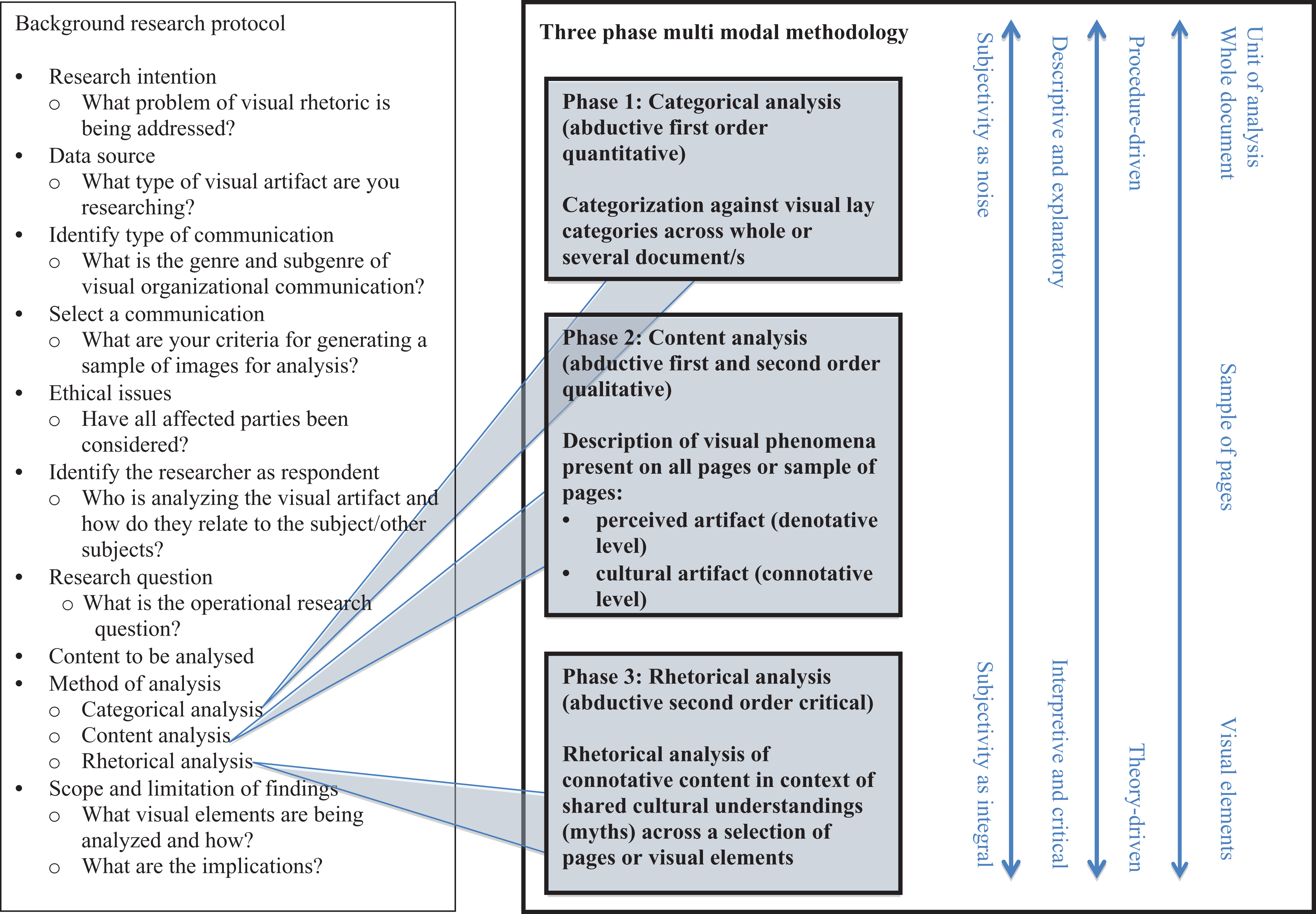
Methodology for Analysis of Visual Rhetoric.
Phase 1: Categorical Analysis
This first phase is the most procedure-driven and furthest removed from the preceding Barthesian vocabulary. It has a distinctive purpose: to describe and explain a picture of the whole document in order to augment subsequent finer grained interpretations of selected pages resultant from the content analysis (Phase 2) and the rhetorical analysis (Phase 3). This analytic method of categorizing visual elements present in corporate reports is not uncommon, with lay categories often derived from “common sense” or typical practice; that is, they may be recognizable by everyday social actors (Blaikie, 2007). On this basis, the categorical analysis involves first order abductive reasoning (Gephart, in press).
Categorical analysis is commonly undertaken by counting the number of occurrences of a visual element, however, is it not the only method available. Categorization can also be undertaken by size, compositional features (e.g., color, angle), or semiotic element (such as used by Ditlevsen, 2012). Combined with content-related categories (such as used by Anderson & Imperia, 1992; Hrasky, 2012), the choices of potential categories are many and varied, and not necessarily mutually exclusive. Inevitably, for purposes of expedience, inter alia, the researcher must choose which categorical schema is best suited based on the nature of the corporate document and the topic under investigation. It should be noted that use of computer-aided software might allow for a greater number of different analyses to be undertaken.
While category analysis is intended to be a largely descriptive task, some judgment is required in the interpretation of the categories and the reading of the data. That said, as noted in Figure 1, while subjectivity may be unavoidable, it is considered to be noise in the data (rather than the data themselves) and, therefore, at a minimum any interpretations should be widely agreed upon. Multiple analyses of the data by independent researchers, aimed at achieving consensus on the meaning and application of the categories, can add to the rigor of this aspect of the methodology. Once again, qualitative analysis software, which could be valuably employed to store files and overlay a number of categorical schema, could be used to capture and compare the categorical analyses of more than one researcher.
Categorical analysis affords a certain value in visual methodology by providing an overview of the document and an analytic basis for purposeful sampling. However, as a standalone method, categorical analysis is limited for interpretive purposes (Tregidga et al., 2012). This is not to suggest that categorical analysis is not ideologically laden. All phases of this methodology (any methodology) are imbued with our particular ways of seeing, and the categories and frequencies of visual design elements portrayed are themselves expressions of ideological activity in the social world. Rather, we are implying that analysis for rhetorical meaning through such categorization is significantly inhibited. For example, it would be a fallacy to assume that a large photograph necessarily has more rhetorical influence than a small photograph (as might be in the case in content analysis), while the possibility of avoiding subjectivity might be overstated.
Phase 2: Content Analysis
While the categorical analysis of Phase 1 is a descriptive abductively driven first order exercise, the content analysis of Phase 2 is both descriptive and interpretive and, as such, involves second order abduction. We identify two levels of content analysis based on Barthes’s (1977) distinction between a denotative and connotative reading of signs: a perceptual or denotative description of the perceived artifact, and a connotative description of the cultural artifact (noted in Figure 1). The denotative level of analysis describes the signifier and responds to the question “what is it?” (e.g., a picture of a rose). However, the connotative level brings out that which is signified, “what does it represent to you, make you think of or feel?” (e.g., I think of love), and thus is strongly associated with being a member of a particular cultural group, requiring interpretation at a high level of cultural knowledge in order to be understood (Barnard, 2005, pp. 35-36). Together the signifier and signified form the sign, which stands for the referent, the thing referred to (e.g., a rose; Saussure, 1974, pp. 65-67). Although these two levels of meaning are normally experienced at the same time, analyzing them separately can help explain the ideological function of connotation (Barthes, 1977). Furthermore, a set of connotators forms “a rhetoric” with, as previously noted, “rhetoric thus appearing as the signifying aspect of ideology” (Barthes, 1977, p. 49).
We can use Barthes’s distinctive concepts to move from a first order analysis based on observations of the social world and lay categories to a second order analysis that attributes meaning and, consequently, forms more general and abstract constructs. This is necessarily a more subjective task than a categorical analysis and the point at which “we treat ourselves as knowledgeable agents who can (and must) think at multiple levels simultaneously” (Gioia, Corley, & Hamilton, 2013, p. 20, italics in the original). This analytic process involves “‘making a hypothesis’ that appears to explain what has been observed” (Blaikie, 2007, p. 58) based not only on the phenomenon under investigation, but also on the social world in which it occurs and on the theory or perspective brought by the researcher. Notwithstanding this step away from the observed, the researcher needs to constrain the process of generating second order concepts in order to maintain a close connection with it. Thus the analysis is driven not solely by the data observed (inductive reasoning) or some a priori knowledge (deductive reasoning), but by an iterative interconnection between them (abductive reasoning).
Given that many possible competing hypotheses are available, and that acts of selection among various explanations are heavily contingent and subjective, how can we justify the validity of one explanation over another? While deeply descriptive, the connotative level of analysis is also manifestly interpretive and subjective. The way an image makes you think or feel cannot be correct or incorrect. However it is strongly bound by cultural experience (if you have never experienced Western arts, for example, why would a rose make you think of love?), hence it sits at the interface between an individual and their culture or social group (Barnard, 2005). Thus the validity of connotative analysis is better judged by the rigor of interpretation rather than the rigor of method. To be “interpretively rigorous” is to present “defensible reasoning, plausible [italics added] alongside some other reality that is known to the author and reader” (Guba & Lincoln, 2005, p. 205). In addition to plausibility, interpretive rigor requires authenticity in the form of researchers’ reflexivity regarding their subject position and experience of their research phenomena, and criticality, which comes from the questioning of taken-for-granted ideas and beliefs (Golden-Biddle & Locke, 1993).
Despite the possibility of being interpretively rigorous, a content analysis is limited in its capacity to explicitly link the visual content to the rhetorical use and ideological aspects of the visual elements and, thus limited in its capacity for criticality. Compelling second order analysis needs to not merely abstract the social world but “disrupt…readers’ common sense” and “actively probe readers to reconsider their taken-for-granted ideas and beliefs” (Golden-Biddle & Locke, 1993, p. 600). Phase 3 responds to this requirement.
Phase 3: Rhetorical Analysis
The third phase provides our methodology with its distinctiveness by bridging procedure- and theory-driven approaches while extending abductive forms of reasoning. Again, we acknowledge the subjective nature of the tasks involved, and identify ourselves as knowledgeable agents both in our roles as researchers developing the methodology and as users of the methodology in the study. As noted in Figure 1, the interpretive phases of the analysis (Phase 2 Content Analysis and Phase 3 Rhetorical Analysis) assume that researchers work reflexively and iteratively with their subjectivity (i.e., their own presence in and reading of the data) and their subject position (i.e., their membership of various communities underpinned by shared understandings) when making sense of what they see.
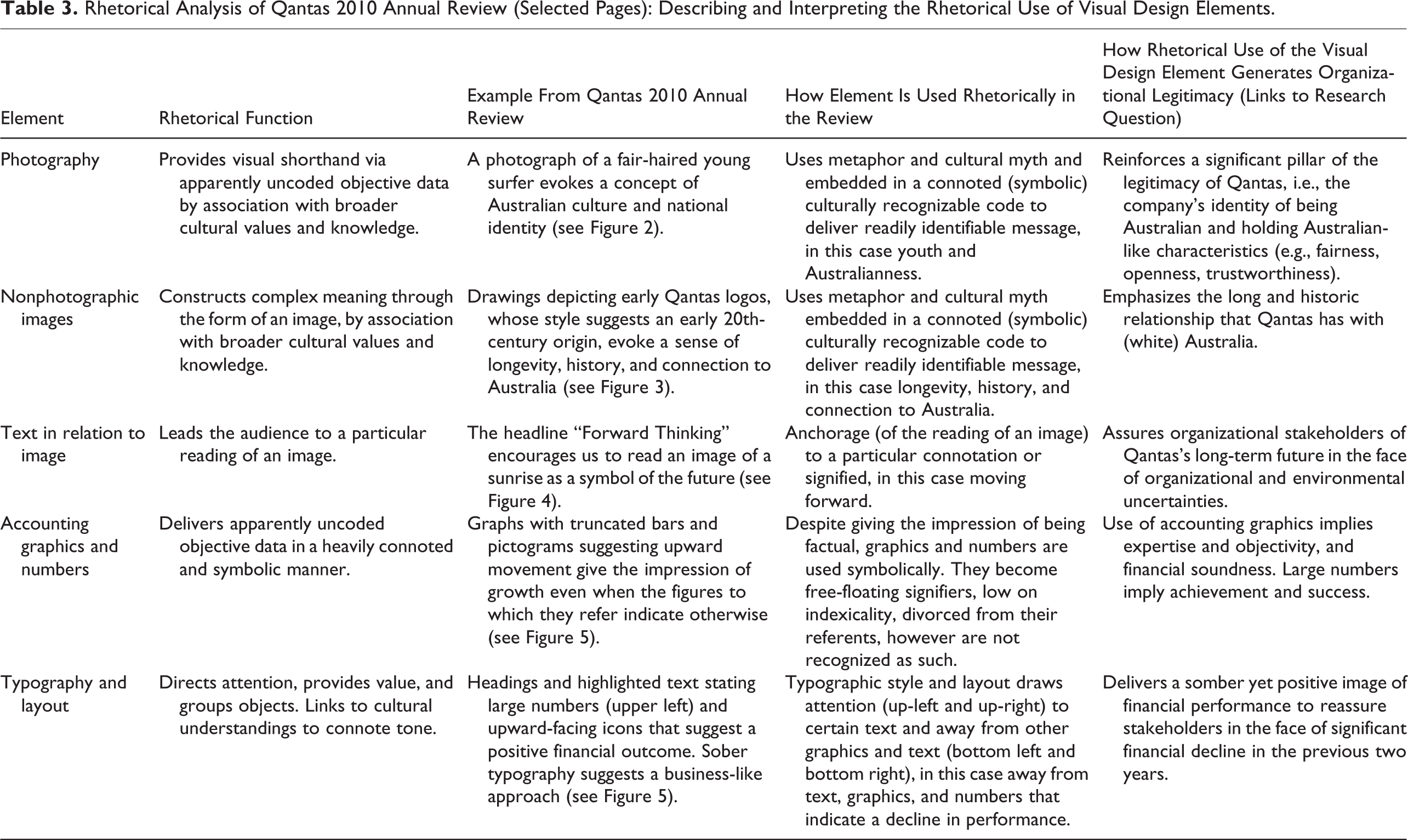
Hence in this phase, the rhetorical analysis, reflexivity is extended to include the researcher’s a priori knowledge, which is articulated explicitly in the context of the specific cultural milieu of the data. The visual design elements identified a priori in the document used in Phase 1 (e.g., financial graphics) are explored alongside the connotative findings abductively derived in Phase 2 (e.g., “growth”) in order to analyze the rhetorical function (Phase 3) of each of the elements (see Table 3). This analytic phase can be understood as a corollary of expansion analysis in discourse methods, which “seeks a more explicit link with external conditions that go beyond the surface information given by the text itself” (Cicourel, 1980, p. 114). This phase involves a segment-by-segment interpretation of the visual discourse drawing in background knowledge vital to understanding the discourse, and also showing where and how the discourse represents abstract concepts and processes (Gephart, 1993).
As part of this visual discourse, five key design elements of corporate reports play a role rhetorically in our methodology (individually and in their interrelationship) to direct readers’ attention, influence their judgment, and provide context and tone. We explain the rhetorical functionality of each element as follows.
Photography
Photography is characterized by an apparent truthfulness, rendering it potentially useful in financial communications like corporate reports whose purported purpose is to represent “things as they really are” (Brown, 2010, p. 485). Because of the indexicality of the photograph, that is the degree to which it indexes or indicates the object to which it refers (Peirce, Hartshorne, Weiss, & Burks, 1960), the viewer does not always distinguish between the picture of the thing and the thing itself (hence it has an apparent truthfulness). For analytic purposes, it is therefore important to differentiate between the literal image that carries the denoted or perceived message, and the symbolic image that carries the connoted or cultural message. Meaning can be carried in features deliberately presented to invoke a symbolic system (referred to as the studium) but also in inadvertent objects, “that accident which pricks me” (Barthes, 1981, p. 27; referred to as the punctum). In empirical terms, however, “the distinction between the two iconic messages is not made spontaneously in ordinary reading: the viewer of the image receives at one and the same time the perceptual message and the cultural message” (Barthes, 1977, p. 36).
The unique rhetorical power of the photographic image arises from the distinction between denotative and connotative elements being unclear and susceptible to manipulation. An assumption of the reality of the photograph applies not only to the denoted image; it flows through to the connoted image such that the reader may be blind to the presence of embedded metaphors. These metaphors are forms of specific cultural knowledge that act as cultural codes (Barthes, 1977, pp. 45-46) and thus may stand to be mistaken as natural or as “truth.”
Nonphotographic Images
Nonphotographic imagery (e.g., drawings, simple icons) also plays a vital role in corporate documentation. Barthes (1977) posits that the obviously coded nature of the drawing, in contrast with the seemingly noncoded nature of the photograph, is discernible in a number of ways. First, while the photograph may give an impression of being ahistorical or objective, the reproduction of an object or scene through the nonphotographic image manifests artistic techniques that are historically and culturally embedded, and learned as part of “an apprenticeship” (Barthes, 1977). Second, the act of image-making involves an unmistakable process of selection between the significant and the insignificant, drawing contrasts with the apparent accuracy of the photograph.
While visible evidence of the artist’s hand forecloses that semblance of objectivity that is characteristic of the photograph, the richness of the connotative palette that nonphotographic imagery may draw upon renders it full of rhetorical possibility. Simple nonphotographic images, which could be understood as icons, may appear to have less rhetorical potential than artistic drawing. However, similar to the photograph, the impression of an icon as neutral or denotative may in fact imbue it with greater connotative power. Table 1 provides a range of generic rhetorical functions that are provided by simple visual items such as icons (adapted from Horn, 1998). Examples of these functions are to be found in the findings in Section 4.
Rhetoric Functions of Visual Items.
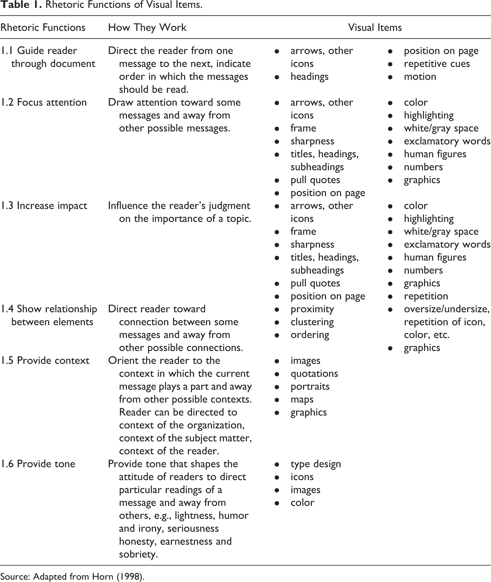
Source: Adapted from Horn (1998).
Text in Relation to Image
The perceived meaning of an image is shaped heavily by accompanying written text (the “linguistic message,” in Barthes’s terms), whether a headline, a caption, or an image credit. Image and text are both sources of social meaning; however, the manner in which they interact to cocreate and reinforce a message is of particular rhetorical significance. The typical function of the linguistic message is one of “anchorage” (Barthes, 1977), which refers to the capacity of written language to delimit the possible readings of an image. Barthes (1977, p. 40) explains it thus: “the text directs the reader through the signifieds of the image, causing him to avoid some and receive others; by means of an often subtle dispatching, it remote-controls him towards a meaning chosen in advance.”
Financial Graphics and Numbers
Corporate communications typically include financial graphics (Beattie & Jones, 2008) and numbers (viz., graphs, charts, figures, diagrams, tables, and diagrams) and, as with photography, they are often fallaciously assumed to be signs with high indexicality (Gephart, 1986). As such, financial information or other performance statistics are accorded high importance, yet these snippets are often divorced from the detailed data that would reveal their context. Similar to the lay use of statistics, many uses of financial graphics and numbers in corporate communications are guided by loose rules wherein there is a reliance “on ad hoc knowledge, rules of thumb,…to produce, compose, and understand the meaning” of numbers and graphics (Gephart, 2006, p. 418).
Financial graphics, although summaries of numerical data, are rarely found without verbal context (e.g., keys, labels or units), yet they present information that narrative alone may not provide, and work interactively with narrative. Financial graphics can be manipulated through selectivity, measurement distortion and presentational enhancement (Beattie & Jones, 1999). Tufte (2001, p. 107) describes as “chartjunk” those design features used “to make the graphic appear more scientific and precise, to enliven the display,…to exercise artistic skills.” The rhetorical functionality of financial graphs links not only to their eye-catching, memorable nature and capacity to show patterns and performance over time (Beattie & Jones, 1999). Graphics also rely on spatial rather than linguistic decoding, which is significant because “we think categories and concepts visually” as noted by Thompson (1998, p. 286), and may be considered egalitarian, in that they are independent of language and can be read by unsophisticated users (Thompson, 1998).
We pay particular attention to the rhetorical use of visually prominent numbers as “facts” or “statistics” because they can affect the reader’s impression of the financial standing of the company (Boje, Gardner, & Smith, 2006). In order to determine “how big is big” we need to differentiate a number’s value and its significance (Gephart, 1988, p. 49). For example, the number 1,000,000,000,000,000 may be more powerful for its suggested gravity than for any actual numerical information, thus conveying symbolism rather than numerical value, particularly when scanned by a financially illiterate reader.
Typography and Layout
The term typography refers to the composition of type on the page and includes the selection of typefaces, location, scale and color. It is important for two reasons. First, language is not merely linear, it is also in and of itself a spatial configuration, for example in its typographically created hierarchical structure (Noth, 2011). Second, typography also has culturally expressive and rhetorical functions linked to cultural codes, indeed may be the simplest visual form to do so (Barnard, 2005). Van Leeuwen (2005, p. 139), for instance, argues that “letter forms can become signifiers in their own right” and uses expressive examples to demonstrate how typography might be meaningful by way of connotation or metaphor. He also notes how strongly expressive type design can be employed rhetorically to connote such qualities as “technicality” or “industriality.” Even the most sedate and otherwise plain typography may connote clarity and organizational transparency, conveying a tone of honesty and sobriety.
Hierarchy of typography in a document is also expressive with various cues used to emphasize some elements and subordinate others (Lupton, 2004). These may include graphic cues (size, style, color), spatial cues (indent, line spacing, placement), or headings, subheadings, and pull quotes (i.e., snippets of information drawn out from the main text). Layout provides culturally specific spatial cues to meaning based on three features: information values, salience, and framing. For example, in Western cultures, the left-hand side of the page is used for “known” information, whereas the right-hand side is for “new” information; and while the “ideal” is found at the top of the page, the “real” is at the bottom (Barnard, 2005; Kress & van Leeuwen, 1996). Importance or salience of information can be signaled by position, foregrounding, and tonal contrast. Frames, lines, and arrows can be used to indicate which information does or does not belong together.
Integrating the Visual Design Elements
It is important not to judge these visual rhetorical elements in isolation, but to consider their interrelationships in a given document (Kress & van Leeuwen, 2006). They work interactively to provide reinforcement, emphasis, anchorage, and context for each other and for their respective messages. Furthermore, the five visual design elements present in corporate reports rely significantly on their interaction with shared cultural agreements for rhetorical power. Indeed, a strong indication of the collaboration of the visual elements is the confusion experienced by the reader when elements contradict one another. Barnard (2005, p. 37) explains this feeling of uneasiness as an outcome of conflicting cultural messages. For example, a “mismatch” between a typeface selected for connotations of technology, efficiency, and the future being combined with an image depicting rolling countryside and text describing cakes and tea.
Moreover, visual and narrative metaphors may be used in corporate reports to give simplified and positive impressions of a company. Studies of annual reports “reveal idealized images…of business locations and operations, eliminating reference to the less positive realities of the business world” (David, 2001, p. 198). Highlighting some features and hiding others constructs a partial version of the corporation, one that is devoid of its history, complexity, and disparate features. However, if repeated, especially alongside similar representations invoking similar meanings, this slim version may appear more stable and complete and, thus transformed into a myth, be mistaken for the full subject (Barthes, 1972).
Application
We now provide an example of the application of our proposed methodology to a particular corporate report. Visual features are particularly emphasized in an annual review, a condensed or summary form of the annual report, which contains less financial information and a “greater portion of narrative, pictures and other creative design materials” compared to annual reports (Davison, 2007, p. 137). Hence, we select the concise annual review from a large, publicly listed, blue chip company, namely Qantas Airlines. To guide our exemplar application, we used the following research question: “How can visual analysis of a corporate report explain and interpret rhetorical features of organizational communication aimed at generating legitimacy?” We provide a brief background to the company, including comments on the legitimacy challenges raised by the operating context, following by the analytic findings and case discussion.
Company Background
Qantas (an acronym for the Queensland and Northern Territory Aerial Service) was established in 1920 and wholly government-owned until publicly listed in 1995 (Qantas, 2011). This enduring company holds iconic status, both within Australia and internationally, as being characteristically “Australian” and as a high quality and safe airline. 3 The company experienced a complex of issues during 2007-2012, seemingly undermining its legitimacy and occasioning critical scrutiny by its stakeholders. First, there was Qantas’s attempt to move a range of jobs (e.g., maintenance, IT) offshore, manifesting as a wage dispute between the airline and their pilots resulting in Qantas locking out all its staff and grounding all Australian domestic and international Qantas flights around the world for 40 hours in October 2011 (Munro & Houston, 2011). Second, since 2008 there have been a number of in-flight safety incidents, which have also led to the fleet being grounded. Third, the Qantas share price has been volatile, falling over 60% from 2008 to 2013, while the index comprising the top 200 companies on the Australian Stock Exchange (ASX 200) increased over 50% (Hewett, 2013). One commentator suggested that “it could…take years for the company to recover its squeaky clean image” (Kamenev, 2010, n.p.). We next apply our methodology to the Annual Review.
Analytical Findings
Categorical Analytical Findings
A categorical analysis was undertaken to explore the use of visual design categories in the entirety of the Annual Review. As noted earlier, categorical analysis may be undertaken using any number of nonexclusive types of category related to visual elements (e.g., frequency, size, color, orientation) or report contents, which are commonly theoretically derived a priori, in order to provide an overview of the documents. Due to the size of the document and the range of visual categories under investigation we have selected to count the frequency of visual design elements (cf. Anderson & Imperia, 1992; a photo analysis of 25 airline reports) using three a priori theoretical categories—economic, social, and environmental (sometimes referred to as the “triple bottom line”)—that dominate reporting practice (cf. Epstein & Buhovac, 2014; Hrasky, 2012; Norman & MacDonald, 2004).
At the outset, our findings reflect a number of characteristics. First, the use of photography (n = 37) and text in relation to image (n = 42) far outnumbers that of financial graphics (n = 13) and nonphotographic images (n = 10). Second, financial graphics and numbers tended to be used to communicate economic messages (n = 5) rather than social (n = 2) or environmental (n = 1), and these were predominantly located in the second half of the report consistent with genre conventions. Third, photography tended to be used to communicate environmental (n = 7) and social (n = 7) messages rather than economic (n = 4), although most of the photography could not be categorized into any of these three established categories (n = 19). Fourth, images (photography plus nonphotographic images) tended to be highly represented in the nonspecific category (n = 26) rather than in the three a priori categories (n = 5, n = 7, n = 9). Many of these nonspecific photographic images related to products and services (e.g., silhouettes of planes, airport flight announcement screens, airport lounge customers checking in) appearing in the latter half of the report.
The findings reported here are based on the consensus agreement of two researchers, one an author of this article and one an independent researcher. Both researchers independently analyzed the four visual design elements (excluding typography and layout which are ubiquitous in reports) in the document against the three a priori categories and created two independent results tables, which were then compared, differences discussed and consensus findings of both researchers reached. Prior to the discussion, the agreement level was approximately 65%. However, once one of the assessors explained why they read a visual design element in a particular way, the other researcher could “see” the assignation to a particular category, and consensus agreement was subsequently reached. During this process the categories were discussed and further refined. Additional refinement and agreement might be attained with multiple independent analysts, a task that could be enabled through computer-aided software. The goal of multiple readings would be to achieve a more broadly shared and plausible interpretation rather than greater “objectivity.”
In sum, we find that this categorical analysis provides an overview of visual characteristics throughout the document. However, consistent with the findings of Hrasky (2012), the a priori theoretical categories (economic, social, and environmental) are suboptimal for data interpretation. Furthermore, despite researcher subjectivity in the coding process being present, it is not fully accounted for in the analytic method.
Content Analytical Findings
A content analysis was undertaken on a sample of four units (double-page spreads) of the Annual Review. These units were selected on the grounds that they contained the strongest examples of the visual design elements (they were among the 10 units that appeared 4 times). The analysis in Table 2 illustrates the detail and scope required of the two levels of analysis—description of the denotative perceived message and interpretation of the connotative cultural message—to bridge the categorical analysis previously reported and to facilitate the ensuing rhetorical analysis.
Content Analysis of Qantas 2010 Annual Review (Selected Pages): Describing Denotative and Connotative Visual Content.
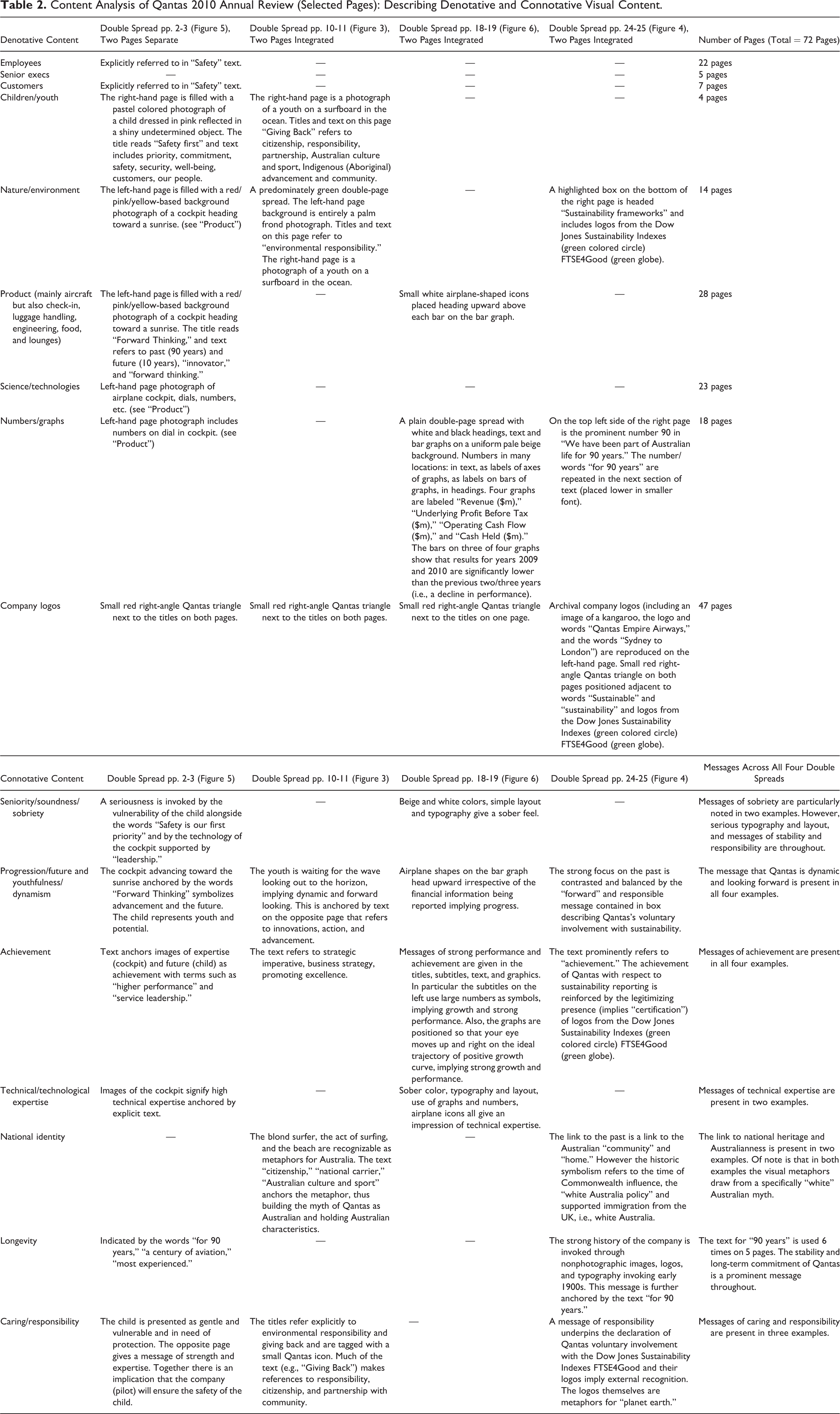
First, the four selected pages were coded and described based on the observable social world. At this first order level, (a) humans, animals, plants, and objects were described by size, color, placement, and so on; (b) any titles and text were transcribed in full or summary; (c) any graphics and numbers were described; and finally (d) logos or significant icons were described. This denotative content was expressed in conventional business terms often found in corporate reporting, as for instance “employees,” “senior executives,” “customers,” “nature/environment,” “product,” and “technologies” (as shown in Table 2). These groupings are more specific and contextual than the a priori categories of the categorical analysis and potentially better reflect the data. The terms and their descriptions were arrived at abductively by the researcher in a deliberate attempt to represent the visual content as concretely and descriptively as possible.
Second, the items that were previously described at the first-order level were then interpreted for abstract meaning using a second-order conceptual analysis. The first level denotative items foreshadow a higher level analysis of culturally laden themes and interpretive analysis, expressed in such terms as “caring,” “achievement,” and “expertise.” At this second order of analysis, (a) images were analyzed in combination with each other and with other proximal visual design elements, (b) they were then analyzed drawing on shared cultural understandings to establish connotation, and (c) finally these connoted messages were compared with similar messages throughout the selected pages. For example, the image of the cockpit (previously denoted as product) heading toward a sunrise (previously denoted as nature) in combination with the image of the child (previously denoted as children/youth) can be read as a message of potential, progression, and future orientation, a message that was identified in all four selected pages. These connotations, which are arrived at abductively by the researcher, are only one of many interpretations available. Thus, as discussed earlier, the researcher must establish interpretive rigor through authenticity, plausibility and criticality. In this application the researcher qua knowledgeable agent is not merely a scholar, but a white woman, citizen of Australia, a customer of the company, a member of the local community, and thus brings a particular set of cultural understandings and personal concerns to the reading of the document. She provides an interpretation that has strong credibility in the context in which it is given, even though it may not necessarily be the exact interpretation that readers would have arrived at themselves.
For purposes of explication, this content analysis has been undertaken manually and the findings are presented in full, resulting in a very large amount of researcher-generated text being displayed (as seen in Table 2). As an alternative, qualitative software might be used to capture multiple researcher-generated texts or to present visual displays of the findings (e.g., annotated images). Content analysis allows for greater specificity and proximity to the document, providing more explanatory, meaningful, and reflexively subjective analysis (see Figure 1). However, content analysis, even at a more interpretive connotative level, is limited in the degree to which it enables deep rhetorically based interpretations of various visual design elements and, importantly, how they relate to one another, or to contextual issues. Hence, we move to the application of theoretically grounded concepts as part of an interpretive, critical reading of reports in the next phase.
Rhetorical Analytical Findings
A rhetorical analysis was undertaken on selected elements from the sample of four pages from the Annual Review by one researcher. In this phase, the researcher undertakes a critical reading of the image, both the deliberate studium and the accidental punctum. She also maintains deep reflexivity regarding her relationship with the data in combination with her a priori knowledge, thus allowing for meaningful interpretation connected to cultural understandings. Taking a reflexive orientation means asking ourselves about the relationship among the inductive, deductive, and abductive; disallowing the separation of theory and method; and providing our own accounts of how we work together with theory and method. In short, we give more transparency to method yet embrace our subjectivity. The five visual design elements introduced earlier, their generic rhetorical function, and the analysis of how they are used rhetorically in the example document, are summarized in Table 3. In our analysis, we identify examples of the generic functions of visual design elements, using the numbering found in Table 1.
Rhetorical Analysis of Qantas 2010 Annual Review (Selected Pages): Describing and Interpreting the Rhetorical Use of Visual Design Elements.
Reading the “Objectivity” of Photography
Just as Barthes (1977, p. 33) exemplified our ability to connote “Italianicity,” we can connote Australian identity from the photograph of a young surfer in the water, from page 11 of the Review (Figure 2). In this image, the literal or denoted image is the surfer, made clear by the composition (e.g., Function 1.4, Table 1) and focus (e.g., Function 1.2, Table 1). Surfing may be seen by some as quintessentially Australian, thus this photograph connotes a symbolic image of “Australianness.” The connoted Australianness in this photograph in association with the text “Giving Back,” may direct stakeholders or potential stakeholders to understand they are not merely supporting Qantas, but investing in Australia itself.

Double-Page Spread From Qantas Annual Review (2010) pp. 10-11. Source: Qantas, 2010.
On the Review’s facing page 10 (Figure 2), an image of a palm frond (the denoted image) connoting nature generally, may be interpreted as a message about the beauty or value of the environment. Significantly, the juxtaposition of the images of the surfer and palm frond succinctly suggests that Qantas is interested in sustaining both Australian culture and the natural environment.
Reading the History of Nonphotographic Images
Archival nonphotographic advertising images, likely dating from the 1930s, are reproduced in the Annual Review (Figure 3). The historical origins of a nonphotographic image are typically revealed by the character of the line work (e.g., Function 1.5, Table 1) and the color palette (e.g., Function 1.6, Table 1).
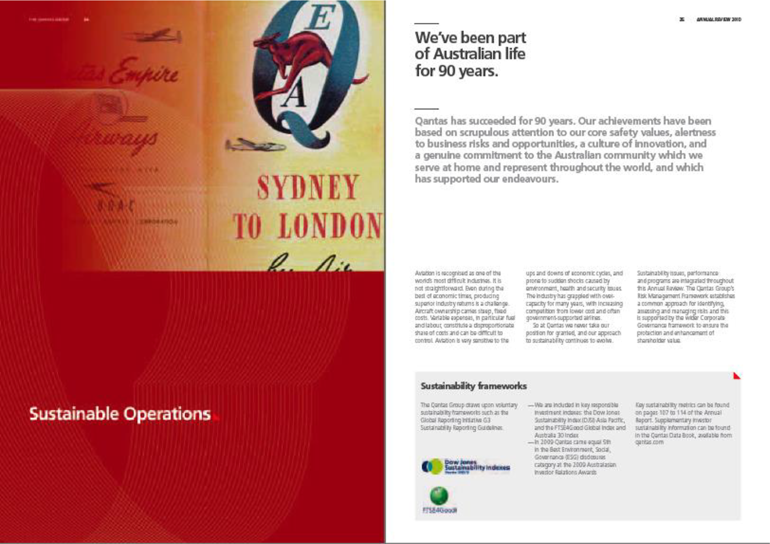
Double-Page Spread From Qantas Annual Review (2010) pp. 24-25. Source: Qantas, 2010.
This allusion to Qantas’s long history and traditions is reinforced by the text embedded in the image (e.g., Function 1.3, Table 1). Early logos in original font are faded but clearly readable. Embedded under an old-fashioned image of a bounding kangaroo, the words “Sydney to London” invoke an early major route travelled by white Australians, many of whom were British immigrants, and reflecting 20th-century Australia’s connection to the “mother country.” Australia’s colonial heritage and the “White Australia Policy” suggest that Qantas may be working with a particular white mythology (see Young, 1990) of Australianness.
Reading the Anchorage of Text
The rhetorical function of anchorage is apparent on page 2 of the Review (see Figure 4). The denoted image is the sun on the horizon, seen from the cockpit of an airplane. The headline on the page—“Forward Thinking”—implies that the image is a metaphor for the future. This message is reinforced by the compass on the head-up display: The aircraft is heading east, and the image is of a sunrise, not a sunset. The image’s message is doubly anchored by text within it (the head-up display) and external to it (the heading and copy; e.g., Function 1.3, Table 1). The company is portrayed as forward-looking; the linguistic message anchors our reading of the image, stabilizing those connotations that are seen as desirable, while expelling those that may be undesirable.

Double-Page Spread From Qantas Annual Review (2010) pp. 2-3. Source: Qantas, 2010.
The facing page 3 (Figure 4) also incorporates a rich text–image combination: an image of a child is overlaid with the text “Safety First.” The image of the child may be read as a visual metaphor for innocence, family, future and the like; the heading and copy on this page articulates the company’s avowed commitment to the “world’s best safety practices.” The potency of this text-image combination (e.g., Function 1.5, Table 1) and its place within the company’s Annual Review are significant in light of operational incidents that threatened Qantas’s reputation as one of the safest airlines in the world (Kamenev, 2010, p. 189).
Reading the “Expertness” of Financial Graphics and Numbers
On page 18 of the Review (Figure 5), a column graph of annual revenues is presented with a truncated axis (the y-axis starts at $10 billion). 4 This graph is also adorned with small pictograms of airplanes, a form of chartjunk, which suggest an upward trend (e.g., Function 1.2, Table 1), not reflected in the financial data. The text leads with the words: “In 2009/2010 the Qantas group delivered a strong result and demonstrated that it is well-positioned for future growth.” This indicates a positive trend that is contradicted by the actual results shown in the graph. This main graph clearly shows a fall in revenue of 12% over the most recent two-year period from 2008 to 2009.
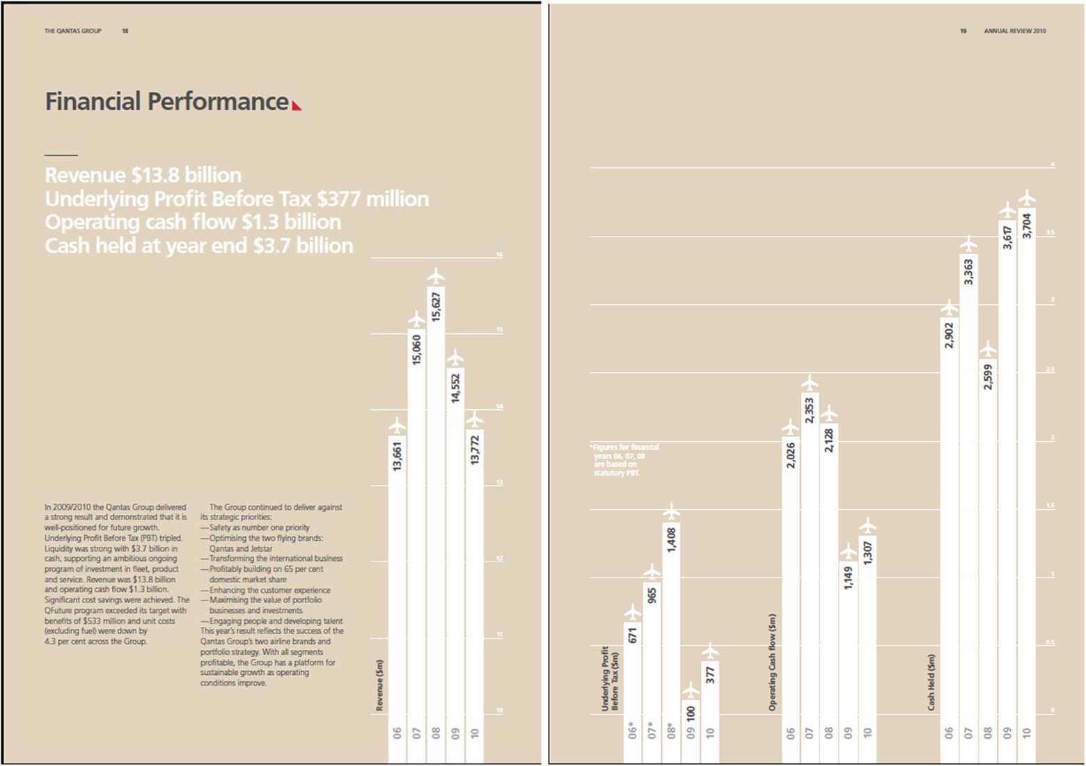
Double-Page Spread From Qantas Annual Review (2010) pp. 18-19. Source Qantas, 2010.
An example of a different rhetorical use of financial style graphics is the “table” on page 50 of the Review, describing domestic and international lounges (reporting “lounge type,” “number,” and “locations”). The graphic is located alongside photographs (of luxurious lounges) and text (“superior airport infrastructure”) that serves to reinforce the message of high quality service (e.g., Function 1.3, Table 1). This use of financial-style presentation imbues such nontechnical information with an undue importance and authority.
Reading the Tone and Prioritizing of Typography and Layout
The Swiss style of typography has become the archetype of corporate communication (Hollis, 2006) and the Qantas example adheres to this norm (e.g., Function 1.6, Table 1). The clean and clear typeface selection and layout present the image of the company as sober and honest. The Frutiger type family used throughout the Qantas example is a “humanist” sans serif typeface suggestive of calligraphic lettering and thus of the human hand, perhaps endowing a quality of friendliness and humanity to the Review.
On every spread, bold sideheads (e.g., Function 1.1, Table 1) provide a key to the page content. None of the body text in the report reveals any marked shortcomings of Qantas, however it presents a relatively nuanced picture of the company’s financial and reputational situation. In contrast, the sideheads are written in a strongly affirmative tone, and their pronounced size means that this attracts the reader’s attention (e.g., Function 1.2, Table 1). The sideheads serve a rhetorical function, permitting the rushed reader to skip the full content of some of the report’s pages, but communicating a positive impression of the company.
An Integrated Reading of Rhetorical Devices
We have analyzed the five rhetorical devices individually in order to develop this methodological heuristic, yet they are not to be solely employed in isolation. Indeed, our analysis includes many cross references that reinforce and enhance one another (e.g., Function 1.4, Table 1) to yield particular interpretations.
Not only do the rhetorical effects of these elements perform interactively on a single page or a double-page spread, they also work together throughout the document. An example is the swirling, grid-textured curve that appears throughout the Review (on 12 of 70 pages) as the background to a range of photographs, text, and financial graphics. This grid-like pattern may represent the graphic continuity between pages and a metaphor for the continuity of organizational elements, or the sinuous curves may be a metaphor for order and growth in the organizational setting (e.g., Function 1.5, Table 1). The internally generated symbolic message is made more powerful though its connectedness with externally shared symbolic understandings or cultural myths, the myth providing “material which has already been worked on” and thus embedded with presupposed meanings (Barthes, 1972, p. 110).
Discussion of Application
We have undertaken a three-phase approach to analyzing an exemplar document in response to the operational research question: How can visual analysis of a corporate report explain and interpret rhetorical features of organizational communication aimed at generating legitimacy? The categorical analysis provided an overview of the visual design elements throughout the document. The content analysis provided both a descriptive analysis of the denotative meaning and an interpretive cultural analysis of the connotative meaning of the visual design elements. The rhetorical analysis provides an interpretation of the connotations available in the visual design elements not only in relation to each other, but also in the contexts of the specific organizational setting, the research question and the researcher. In so doing, we have demonstrated how elements from formal theory (such as Barthes’s distinction of stadium/punctum, or denotation/connotation) as well as our (individual and collective) reflexive practices as interpreters of data can be used to undertake critical reflexivity in analyzing visual imagery.
This is not a static or cookie-cutter methodology. To begin, in studying different kinds of visual artifact from those addressed in this article, researchers may need to consider the limitations and necessary alterations to this methodology. For example, any movement or sound associated with a digital image could be analyzed either by expanding the methodology to include more work by Barthes (1977), or by referring to other texts from musicology or digital imaging. Contemporary developments in the social and digital media landscape, such as the emergence of new visual artifacts like memes are also a case in point. As a system of images (rather than a single image), memes communicate information quickly and efficiently, but with the distinctive propensity for infinite repetition, quotation and inflection that may add layers of comedy, politics, and subtext (Limor, 2014). Furthermore, while we have presented the findings from this analysis phase-by-phase for purposes of clarity and explication, they could be organized differently. For example, according to abductively derived themes or a priori areas of inquiry, thereby blending the analytic phases and potentially enhancing the meaningfulness of the findings.
Moving to an overarching assessment of the use of the methodology as applied in this article, it is apparent from the three-phase analysis that the visual design elements in corporate reports provide multiple ways to convey meaning. What is uniquely revealed through the higher-level rhetorical analysis is the manner in which these elements work interactively and invoke cultural myths to produce meanings that may symbolically generate organizational legitimacy. By linking the organization’s rhetorical messages with shared myths, external resources are available to the organization to be mobilized for purposes of legitimation (Suchman, 1995). The reader is implicated and enticed into this communication process through invoking cultural myth in a manner termed double order signification (after Barthes, 1972).
The understanding of myth-making as central to visual rhetoric in the exemplar case uncovered the unexpected presence of an embedded (racial) ideology and thus an underlying “dark side” to the corporate report. While the Australianness connoted in the report was evident in the second phase of the analysis, it was only with the third phase rhetorical analysis, that the significance of whiteness and the connection to mother country (“Sydney to London”) was revealed. The invocation of cultural myth through visual rhetoric speaks to “white” mythologies (Young, 1990) and the legacy of specific colonial histories for contemporary corporate activities (Jack, Westwood, Srinivas, & Sardar, 2011). Thus, cultural myth creates, conserves, yet masks dominant ideologies; verifying inclusion of some at the same time as determining exclusion of others.
The revelation of this racial ideology exemplifies a critical and interpretive “prising apart” of cultural myth, and how it operates in two ways to form a “second order signification system” (Barthes, 1972, p. 113). Cultural myth works in the first instance to naturalize a message so that it is mistaken as denotation or fact. Cultural myth is then, in a second instance, overlaid on this new “denotation” to produce a second, higher order message. Understanding this double movement of signification renders transparent the use of cultural myth for the purpose of visual rhetorical analysis as well as the “researcher’s interactive voice” in this analysis (Chase, 2007, p. 666), revealing the basis for our interpretation and critique.
Critical to this move from message (sign) to fact (signifier) are the assumptions and values embedded in the sign-now-signifier that are unseen and unacknowledged and thereby operate surreptitiously as ideologically constitutive. To return to Barthes’s words, “in the decorative display of what-goes-without-saying, the ideological abuse which, in my view, is hidden there” (Barthes, 1972, p. 11), myth “harmonizes with the world, not as it is, but as it wants to create itself” (p. 156). That the invocation of myth through visual design is ideologically constitutive is central to understanding the significance of cultural myth.
Contributions and Conclusion
This article was motivated by a need in organizational scholarship for a replicable and rigorous mode of visual analysis that bridges the theory-procedure gap in visual communication research, and recognizes the distinctive contribution of visual design to rhetoric in organizational communications. In this final section, we elaborate on the contributions of the three-phase methodology designed to meet this need, and make recommendations about how researchers could embrace it in future use.
First, we contribute to visual organizational research methods by developing and demonstrating a methodology that can be used to reveal the ideologically constitutive nature of visual design in a manner that existing approaches do not permit. Specifically, our method articulates the individual and interactive rhetorical functioning of a wide range of visual design elements typically used in organizational communications, notably (but not exclusively) in the final rhetorical analytical phase. The methodology does this because of its novel operationalization of selected concepts from Barthes (1972, 1977, 1981). We have demonstrated how semiological techniques like connotation, signification and mythologies, can be used to render analytically practicable Barthes’s formal scientific and historical, ideological methods. Our methodology enables description and explanation of the visual mechanisms through which ideology works, as well as critical analysis of the decoding of dominant social ideologies (Ganzin, Gephart, & Suddaby, 2014) and how their “dark sides” are naturalized through visual means. In so doing, this methodology contributes to the development of critical visual literacy for researchers.
Second, the application of our methodology shows how researchers can demonstrate the “reflexive intermediation” considered necessary by leading scholars in the field to raise the perceived scientific rigor of visual research methods in organizational studies (Bell & Davison, 2013). That is to say, we have shown how to link theory, method, reflexivity, and context in methodological practice at all stages of analysis. For example, we have demonstrated how seemingly “neutral” modes of content and categorical analysis require judgments and forms of subjective appreciation that put the researcher’s biases and theoretical interests into play, and how to account for those explicitly in analytical reasoning. Moreover, working methodically and iteratively through the initial category analysis, and then into the content and rhetorical analysis (back and forth), raised progressively more complex questions about the interpretation of images, and regularly took us back to the same fundamental questions of analysis. We have thus exemplified how theory matters when making practical analytical decisions, and how to operationalize complex theoretical ideas, while making transparent our own social positions.
Finally, we have shown how use of our methodology can generate findings and insights that have potential to make significant contributions to debates in organizational studies research. For example, the identification of a hidden racial ideology in the selected corporate report generates substantive findings about the tacit and potentially contentious role of myth-making in organizational communications. Such findings hold relevance to a number of organizational debates for instance in legitimacy theory, diversity and postcolonial organization studies, or corporate social responsibility. Furthermore, our article makes a contribution to the domain of ethnostatistics (Gephart, 1988) by providing a method for rhetorical analysis of visual displays in professional documents that use numbers, and to corporate reporting research. In the latter regard, the article advances methodological analysis of how myth-making operates as a key rhetorical device in corporate reports.
We recommend that future researchers use and adapt this methodology to suit their needs; remaining close to the specificities of their own reflexive and empirical context and cognizant of the limitations and possibilities of our analysis. Use of the method will vary with setting, research design and nature of the artifact, with adaptation likely necessary for images that are stand-alone, or different in nature to those covered in this article. For example, the multimodal coverage of visual design elements in our methodology is limited to two-dimensional organizational communications, and does not cover three-dimensional communications (e.g., online technologies, social media) comprising other modalities (e.g., music, moving images, video). Future research could embrace this greater multimodality in the analysis of visual artifacts. Beyond this, there are a number of ways in which it could enrich research projects. It could most productively be employed, for instance, alongside other research methods focused on researcher-instigated data (visual and other). Together, these methods could generate knowledge about other research subjects’ perspectives on corporate visual imagery (within and beyond corporate reports) and their broader experiences in organizational settings (perhaps combining methods that produce both visual and verbal data). It could also be part of a participatory or collaborative research design where researchers and participants work together with preexisting images and possibly create new images (Bell & Davison, 2013). In multimethod, multilevel empirical research, our methodology might also provide one element to investigate the production and construction, transmission and circulation, reception and consumption of organizational communications.
Footnotes
Author’s Note
Brad Haylock is now affiliated with School of Design at RMIT University, Melbourne, Victoria, Australia.
Acknowledgments
We wish to thank Monash University (Department of Management) for providing a small grant and Peter Uhlenbruch for providing research assistance in the early stages of this project.
Declaration of Conflicting Interests
The author(s) declared no potential conflicts of interest with respect to the research, authorship, and/or publication of this article.
Funding
The author(s) received no financial support for the research, authorship, and/or publication of this article.
