
Abstract
This study is a semiotic analysis of consumer-generated antibranding efforts and reveals tacit semiotic rules used by digital antibranders. A broad theoretical discussion about the semiotic characteristics of branding and antibranding is provided and “digital antibranding semiotics” is defined. The semiotics of consumer digital antibranding efforts are investigated in two studies examining a sample of antibranding images targeted at valuable corporate brands. The first study reveals that antibranders use drama and humor to demonize, criminalize, dehumanize, and “Hitlerize” the targeted brands, creating strong antibrand voices and positioning themselves against corporate greed and wrongdoing. The second study found that consumers successfully decode antibranding semiotic representations and classify them in terms of message clarity, fact finding, and “hostility versus entertainment values.” These findings reveal that both antibranding images with dark humor and clear messages and an aggressive and intriguing message have the potential to influence consumers.
Keywords
Introduction
The pictures and symbols drawn in the Pech Merle cave and many other caves around the world show a strong connection between the prehistoric cavemen and today’s digital civilization. This pictorial and symbolic evidence from long ago fills us with curiosity about what our ancestors were trying to communicate. Today’s human beings are doing the same thing our ancestors did in their time, creating symbols and signs to tell their story to the world. Whether drawn on rock walls or on a digital screen, both people are trying to convey meanings to the present and the future. Thus, our ancestors and modern “Homo digitus” are meaning makers or, using Chandler’s (2002) term, Homo significans.
Online consumers, or Homo digitus, are often visually literate consumers of our image-based digital economic systems (Schroeder, 2002). The building blocks of our image-based economies are the meanings imbued in various digital signs and symbols. The complex and paradoxical interactions between the production and consumption of semiotic artifacts (also conceptualized as ‘consuming representation’) determine the real creation of economic value in image-based economic systems (Nguyen and Belk, 2007; Oswald, 2012; Schroeder, 1988, 2002; Schroeder and Salzer-Morling, 2006). The valuation of semiotically enriched artifacts eventually aligns with consumer brand values. In many situations, brand values are worth more than the paper value of the company (Katyal, 2010; Klein, 2009; Oswald, 2012; Schroeder, 2002). This shows the importance of symbolic and semiotic value systems in modern image-based economies.
The role of semiotic value creation is paramount because of increasingly digitalized consumer markets. Self-publishing on the Internet enables millions of consumer-generated symbols and signs to flow through digital platforms (Wang, 2013). Consumers can now loudly and freely represent themselves (Kucuk, 2008b; Schau and Gilly, 2003; Zinkhan et al., 1999); they can easily design their own versions of symbols and brand logos to broadcast (Thompson and Arsel, 2004; Ward and Ostrom, 2006), subvert and recode corporate messages, and rebrand a brand meaning with digital media (Krishnamurthy and Kucuk, 2009; Kucuk, 2008b). Many consumers are communicating with each other through digital images, symbols, and signs, essentially creating new languages in their digital consumption and communication (Kucuk, 2008b; Lawes, 2002). These communication processes are so fruitful and revolutionary that cyberspace may be the most libratory environment for the expression of identities and ideas about social issues relevant to the consumption patterns of Homo digitus [as discussed in “Semiotic Democracy” (Katyal, 2006; Spinello, 2006) and “Semiotic Disobedience” (Katyal, 2010)].
However, more academic exploration of digital semiotics of consumer behaviors and brands is needed (Gaines, 2008; Mick et al., 2004). Specifically, what are the fundamental semiotic structures of consumer antibranding designs, advertisements (or “subvertisement”), and presentations? What are the basic semiotic codes of consumer-generated digital antibranding efforts? How do the semiotic characteristics of digital consumer artifacts affect markets and consumption? This study aims to address these questions.
Brand semiotics
Semiotics is the study of how meanings can be produced and communicated through different signs and symbols as part of our social life (Eco, 1976; Saussure, 1983). In short, “anything can be a sign as long as someone interprets it as ‘signifying’ something—referring to or standing for something other than itself” (Chandler, 2002: 13).
However, semiotics does not necessarily focus on the imminent meaning of the signs and symbols (Saussurean semiotics) but also on how the meaning of a symbol is regenerated by situation in the broader cultural and social contexts of consumer decisions (Peircean semiotics) (Mick et al., 2004). A Saussurean perspective indicates a more structural semiotics since it focuses more on pure text analysis to reveal the actualization process of meaning-making (Mick, 1986; Mick et al., 2004; Oswald, 2012); a Peircean perspective focuses on a broader and a more dynamic semiotics by investigating the ways signs are situated in cultural and social contexts (Mick, 1986). Clearly, Peircean semiotics benefits from Saussurean perspectives but goes beyond the general Saussurean meaning process. Saussurean semiotics focuses on the sign, a brand logo’s sheer meaning, while Peircian semiotics examines the placement of a brand logo in an advertisement—examining the relationships between brand identity, brand slogan, and other possible sign and code systems that will affect communications with consumers. It follows then that brands can become inseparable semiotic entities, icons in a consumption environment. In essence, this is a metamorphosis of brand symbols and signs into a conveyance of meaning for a living person or an identity (Gaines, 2008; Manning, 2010; Mick et al., 2004; Lury, 2004).
Thus, “branding semiotics” are the building blocks of a central meaning system where the brand symbols work as the letters or words of a consumption language. The more that brand symbols and branding language can be easily understood and shared among consumers the easier it is for brand meaning systems to become alternative social systems and generate economic value (Müniz and O’Guinn, 2001). Thus, “branding semiotics” is a sociocognitive semiotic process that ties consumers to a common consumption and meaning system (Thellefsen et al., 2007).
Brand denotation and connotation
Branding semiotics enables the development of iconic brands that can easily be recognized and identified by a simple logo, sign, or even color by everyone. In general, semiotic terms, every brand iconization effort by an advertiser has two components: denotation and connotation (Eco, 1976; Mick and Buhl, 1992; Mick et al., 2004). Denotation indicates the obvious meaning of a word, which is also defined as the first-order signification (Eco, 1976; Mick and Buhl, 1992). Connotation indicates the association and the subconscious meanings based on subcultural norms. These connotations are defined as higher order significations (Mick and Buhl, 1992; Mick et al., 2004).
Connotative meaning is often derived from the denotative meaning, thus existing within the denotative meaning. Brand names or linguistic representation of brand names might carry denotative meanings while brand symbols and symbolic signs might trigger connotative meanings for consumers. Both connotative and denotative meanings are widely used in the brand logo and slogan-creation processes by marketers. Powerful brand logos are the ones easily accepted and understood by the interpreter or consumer (Heilbrunn, 1997).
For example, Apple’s brand logo, a bitten apple, signifies a disobedience and the presence of knowledge, hope, and anarchy, using a well-known biblical image—a bitten apple (Floch, 2000; Oswald, 2012). Some brand logos are purely alphanumeric signs, such as IBM, 3M, and Coca-Cola; some others are iconic images or symbols, such as Apple’s bitten apple or Shell Oil’s yellow seashell, and many logos are combinations of signs and symbols (Heilbrunn, 1997, 1998). The colors and lines used in brand logos also support the recognition and understandability of the company philosophy embedded in the logos. Both IBM and Apple used parallel horizontal stripes in early versions of their logos, stripes that are believed to signify the “fundamental values of corporate America’s efficiency and commitment” (Floch 2000). Similarly, the colors of letters or images can very efficiently send a brand message (Chandler, 2002; Floch, 2000; Mella, 1988; Oswald, 2012). IBM, for example, is known as “Big Blue” because of the intensive use of blue, associated with the ocean depths, to signify deep knowledge and endless information storage. Thus, both IBM and Apple provided early examples of brand connotation in the modern branding world.
Although there is some significant progress in understating brand semiotics, more investigation, from various semiotic viewpoints, into the effectiveness of brand logos is still needed (Mick et al., 2004; Mick and Oswald, 2006; Schroeder, 2002; Schroeder and Salzer-Morling, 2006), especially with the advent of digitally empowered consumers enabling the argument that the control of brand semiotics is shifting from companies to consumers (Deighton and Kornfeld, 2009; Kucuk and Krishnamurthy, 2007).
Consumer antibranding semiotics
It is a constant struggle for companies to develop brand semiotics that unify them with their consumers. During this struggle, consumers can decode company-generated brand meanings in totally different ways—positively, negatively, and otherwise (Puntoni et al., 2010). This consumer decoding can reduce the semiotic power of company-generated brand meanings and lead to meaning deformation. Polysemic reinterpretations can also appear in subversive forms called “resisting readings” (Ceccarelli, 1998; Kates, 2002; Puntoni et al., 2010). If a decoding consumer dislikes the brand due to bad experiences, resisting reading can eventually open the door to direct semiotic attacks by the consumer. A semiotic destruction of company-generated brand meanings is intended to destroy corporate brand value and identity by dissecting and recoding corporate messages with informative and sometimes humorous subvertisements and/or counter advertisements (Katyal, 2010; Krishnamurthy and Kucuk, 2009). This is conceptualized here as “consumer-generated antibranding semiotics” or as “consumer antibranding semiotics.”
The idea behind antibranding efforts is to create noise—a lack of communication or a miscommunication—in the corporation-to-consumer sociocognitive semiotic communication processes. The general media communication literature is a good starting point for analyzing the effects of consumer antibranding meaning and communication processes. Hall (2001) classifies media messages in terms of the modes of interpretation and adaptation patterns used by the receiver or consumer. In this context, a consumer might fully comprehend and adopt the semiotic message, but most of the time they do not fully comprehend it and blindly enter company-created closed consumption circles. Alternatively, some consumers prefer to avoid consumption circles by passively rejecting company-created brand messages, or they negotiate and modify the meaning in public spaces on the Internet to express their opposition to the message (as also pictured in Figure 1).
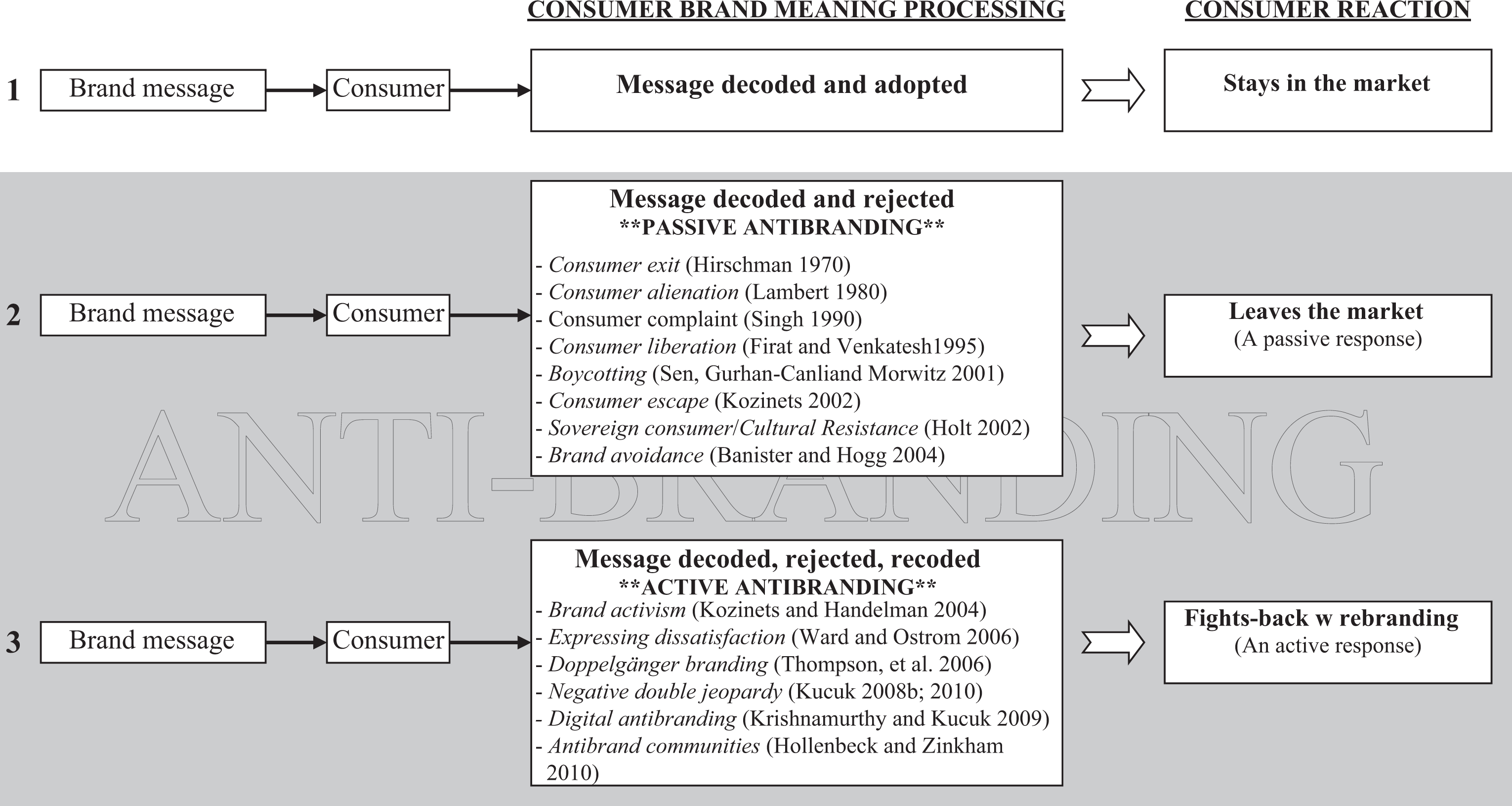
The evolution of consumer-generated antibranding communication.
The brand communication process in Figure 1 indicates a closer or one-sided corporate brand meaning system, unlike in modern digital markets. In a traditional marketing environment, brands are viewed as a firm-provided property (Kay, 2006; Manning, 2010; Merz et al., 2009). Consumers have no, or very limited, input to meaning creation processes and unconditionally accept the corporate-created semiotic value systems as if there were no other options. The purpose behind this process of brand iconization process is to develop a perceptually closed sociocommunicative system between company and consumer (Brier, 2001), a process largely mediated by corporate brand symbols and signs (Mick, 1986). This brand semiotic system is not a productive communication process from a consumer point of view.
However, some consumers show their disagreements with corporate meaning creation systems by leaving the markets (silently or loudly). The consumer brand meaning processing boxes shown in communication processes 2 and 3 in Figure 1 are discussed as “passive” (in process 2) and “active” (in process 3) forms of consumer resistance (Hollenbeck and Zinkham, 2010). The meanings created in passive antibranding processes are only shared with close in-groups and are thus “private responses,” while in the third process, or active antibranding, meanings are shared with the public, making them “public responses” (Singh, 1990). Consumers may feel alienated (Lambert, 1980) and exit (Hirschman, 1970) or escape (Kozinets, 2002) from markets, liberating themselves (Firat and Venkatesh, 1995) by breaking meaningless and semiotically impotent consumption cycles (Kozinets and Handelman, 2004). This might show itself in consumer boycotts—which are not very semiotically fruitful (Sen et al., 2001)—cultural resistance (Holt, 2002) and by avoiding corporate brands (Banister and Hogg, 2004). The impact of these consumer reactions is classified as passive because there is little media usage and therefore less brand semiotic development and market impact.
Digital antibranding semiotics
In the past, a company was seen as the only semiotic brand meaning generator, in digital markets brands are now dynamically cocreated within stakeholder-based semiotic ecosystems (Katyal, 2010; Kay, 2006; Lusch and Webster, 2011; Merz et al., 2009). Since the digital enlightenment initiated the rise of consumer power (Kucuk, 2008a; Kucuk and Krishnamurthy, 2007; Wolfinbarger and Gilly, 2001), consumers function as alternative market agents and address their corporate counterparts as equals (called “speech equalization”) (Wu, 1999). This speech equalization enables the Homo digitus consumer to negotiate brand meanings with companies, talk back, and bring negative publicity to the attention of the company and other consumers via online platforms, as indicated in the third communication process in Figure 1 (Katyal, 2006, 2010; Kozinets and Handelman, 2004; Krishnamurthy and Kucuk, 2009; Kucuk, 2008b, 2010; Thompson et al., 2006). Thus, in digital markets, brand meaning making started shifting from marketers to consumer semioticians and digital antibranding semiotics was born.
Semiotics shows us that the interaction between a meaning and an opposite meaning is a very practical function for enhancing the creation of meaning (Chandler, 2002). Saussure indicates that meanings can as easily be conceptualized by what they are not as by what they are (Saussure, 1916/1983). Alternatively, in a sign system meanings can often be better defined by negative meanings than with positive or associated meanings (Berger, 2005; Chandler, 2002). This negative differentiation becomes the main signifier in major sign systems and can create a better learning and communication experience (Chandler, 2002; Saussure, 1916/1983). In other words, digital antibranding semioticians are implementing fundamental semiotic rules while developing negative brand meanings in order to affect digital markets.
Method: semiotic analysis
Semiotic analysis is employed to understand what sign systems created by digital antibranding semioticians are intended to communicate. First, individual antibranding signs were collected through online searches and signifiers were analyzed in study 1. This systematic approach is used by marketing semioticians as a way of extracting basic semiotic codes from a brand meaning system (Oswald, 2012). A brand discourse analysis was conducted by integrating the findings of study 1 to reveal the messages antibranding semioticians are trying to narrate. Later, consumer interviews were conducted in order to understand consumer reactions to the semiotic signifiers and overall content of antibranding images in study 2.
Data collection process
The consumer antibranding semiotics targeted at 9 of the top 10 most valuable global brands, as listed in the 2011 annual issue of ‘Interbrand’, were studied. There has been little change in the top 10 brands for 10 years (except that the Internet and technology giants Google and Apple recently entered the top 10 most valuable global brand lists). The total value of the brands is described as around 400 billion dollars of intangible value. The average single brand value in the top 10 brand list is estimated as 46 billion dollars, thus the selected brands are a big portion of the image-based economy. Furthermore, these top 10 most valuable brands have been at the center of social attention and have deeply impacted consumption culture since before the last decade. These brands are often criticized and attacked by antibranders, perhaps, in part, because of the enormous image-based economic value they represent (defined as “Negative Double Jeopardy”) (Kucuk, 2008b; 2010).
In order to explore the role of brand semiotics on consumer-generated antibranding ‘Google Images’ was used to collect consumer-generated brand images and symbols targeted at the top 10 brands. Google Images can easily refine consumer-generated images into broad search categories and is currently the most powerful image search engine. To narrow the search results, three search key words and the brand name were searched as follows: “hate <brand name>,” “anti <brand name>,” and “<brand name> sucks.” This data collection method has provided very fruitful results for scholars in the past (Krishnamurthy and Kucuk, 2009; Kucuk, 2008b; 2010).
A total of 2600 images were accessed and examined through Google Images, and 332 consumer-generated antibranding images were detected. After an initial screening process, repeated images were dropped from the study, and a total of 295 unique consumer-generated brand images were determined to be a good fit for the study. During this search process, only one antibranding image was spotted for the brand General Electric—the fifth most valuable brand in the 2011 list; so this brand was dropped from the study.
Study 1: Brand discourse analysis
Brand discourse analysis reveals relationships between the literal meanings of brand signs, symbols, and logos and their cultural references that explain the overall meaning system. Thus, brand discourse analysis depicts dialectic implications of the structure of brand signs on both semiotic and semantic levels to create deductive representations of brand meanings (see Oswald, 2012 for more examples).
First, single semiotic signs are studied individually (microdiscourse) and are transferred into sentences (énonciation) to narrate what is communicated by the brand in the broader cultural discourse (macrodiscourse) (Benveniste, 1971; Oswald, 2012). The macrodiscourse covers “brand voice” (how signifiers and the signified are voiced) and “brand positioning” (where brand meanings are placed in broader cultural contexts). The goal is to link the brand signs and symbols to the broad myths and archetypes drawn from consumer culture (Oswald, 2012).
As a result, consumer antibranding semiotic subcodes, such as antibranding digital images, colors, language, and symbols, were analyzed individually and discussed as two major components: visual and verbal codes in study 1.
Visual codes
Eventually, every image requires verbal explanations (Schroeder, 2002). Images and visual codes are generally investigated through two of their major characteristics: color and symbolic codes.
Color codes
The color choices in a presentation or an artifact are very important subcodes. Colors can be used, along with other sign systems, as important brand identity features and as a brand logo identifier. Colors can have different meanings for different people for both psychological and cultural reasons. Color choices can reflect attitudes and feelings about an object or a situation; thus color choice is a strong communication and meaning creation tool. Deviations in colors can also mark a difference in consumer emotions and their understanding of other meanings (Thurlow and Aiello, 2007). Some colors might create pleasure; others might generate frustrations, depending on the perceptions of the receiver (Chandler, 2002; Oswald, 2012). People (and even animals) are sensitive to meanings or associations created by different colors (e.g. the common belief that the color red makes a bull crazy or increases blood pressure). Colors are an effective and expressive tool for affecting individual feelings, personality, and identity (Mella, 1988). Therefore, the dominant color combinations of all the consumer antibranding images and logos were analyzed and are reported in Table 1. Original corporate brand logos are also listed in Table 1 so that antibrander color choice can be easily compared with the original brand logo colors (indicated with boldface characters).
Color codes of consumer antibranding.
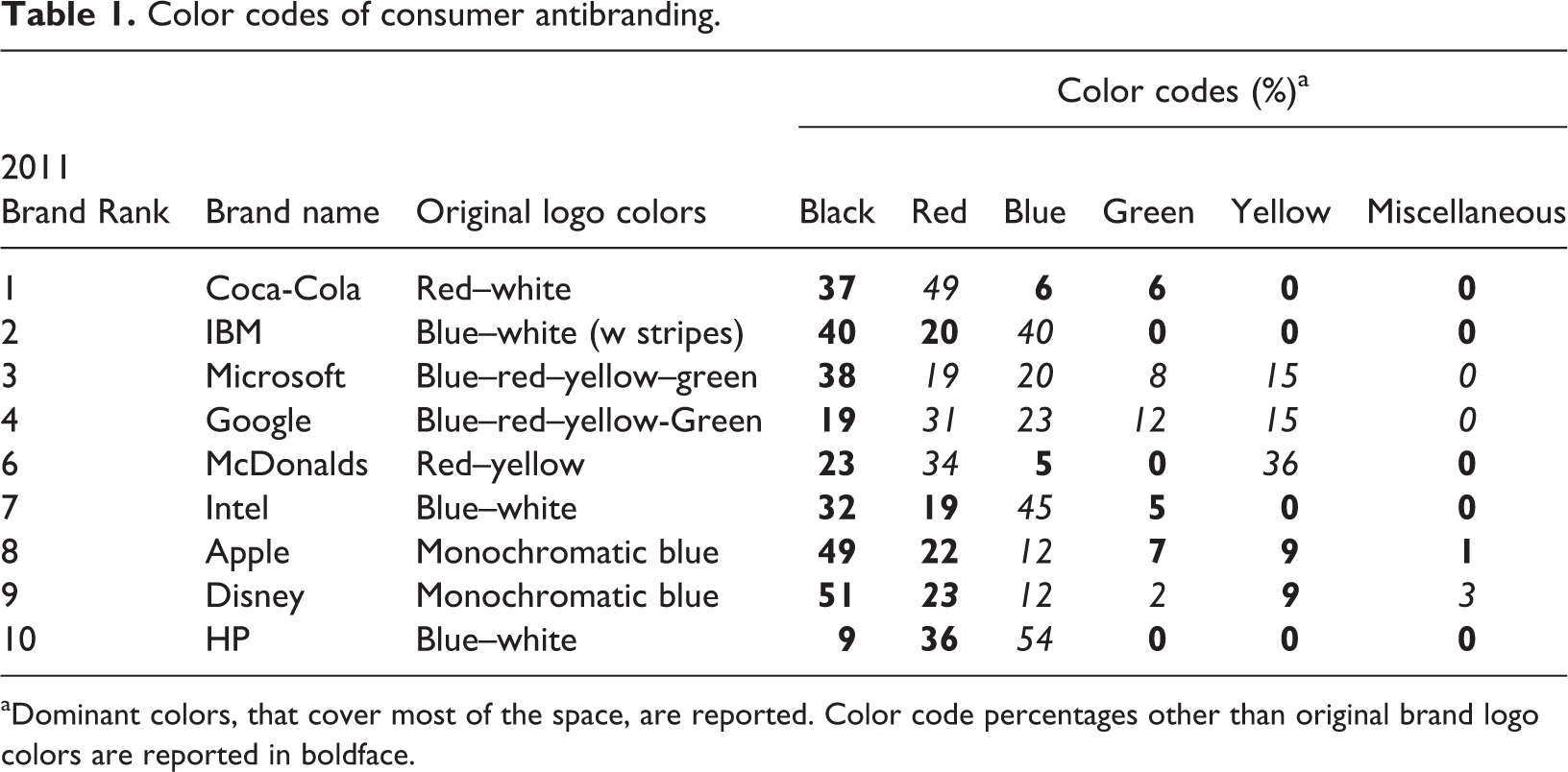
aDominant colors, that cover most of the space, are reported. Color code percentages other than original brand logo colors are reported in boldface.
After the original brand logo colors, the most used color is “black” (33% of the time) and the second most used is “red” (28% of the time). Black is often seen as symbolizing death, mourning, and opposition (rebellious feelings), while ‘red’ is generally seen in Western cultures as symbolizing passion, danger, anger, and hell (a religious reference). “Black and red” together are “fire and brimstone,” “the colors of Hell” (Genesis 19:24 and Revelation 19:20; Quran chapter 26). Interpreting antibranding colors from a religious point of view suggests that antibranders conceptualize corporate brands as sinners who deserve “the ultimate punishment of Hell.”
Alternatively, red and black used haphazardly around the object or painting indicates out-of-control emotions and pain (defined as “semiotics of pain” by Oswald, 2012), and people often describe their pain and dark mood using such colors. Other interpretations, from both religious and nonreligious perspectives, are possible, desirable, and informative, but, in general, the color codes used by antibranders demonize corporate meanings and indicate that these consumers are both passionate about their views and are feeling sad, depressed, and frustrated by the actions of the targeted corporations.
Symbolic codes
The symbols and signs used in antibranding presentations are another important semiotic subcode. All of the 295 consumer-generated antibranding advertisements and artifacts were examined, and all the signs and symbols used in these efforts are identified in Table 2. For each sign, the signifiers and signified are also identified. This process provides an approach to determining what antibranding semioticians are intending to say and reveal about the corporate brands they target.
Symbolic signifier/signified classification.

In order to understand which themes are used most frequently to unpack the meanings of these antibranding efforts, the frequency of the signifiers and signified are calculated in Table 3. The most memorable symbols and signs used online are the logos of targeted brands. Corporate brand logos appeared over 70% of the time in consumer antibranding advertisements. The percentages indicate that most of the time antibranding semioticians are associating the actions of their targets with “violence and murder,” viewing them as equivalent to murderers and express their rejection by putting an “X” or a “NO sign” on the brand logo to indicate that the brand has no place in their life.
Symbolic codes of consumer antibranding.a
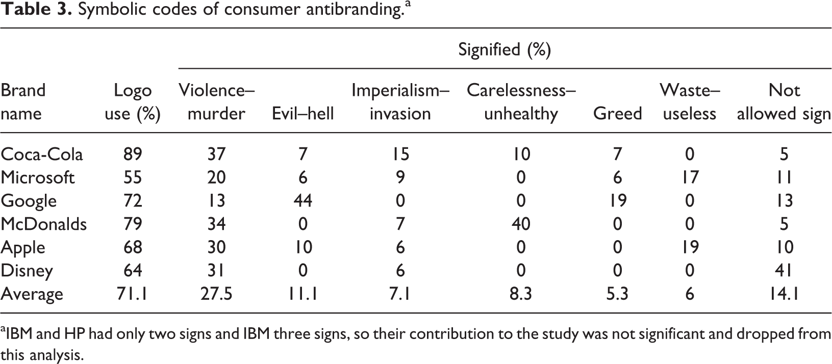
aIBM and HP had only two signs and IBM three signs, so their contribution to the study was not significant and dropped from this analysis.
Among the brands examined, Coca-Cola is seen as an evil and imperialist corporation poisoning consumers with unhealthy products that lead to diabetes and obesity. McDonald’s is also seen as an imperialist provider of unhealthy products that lead to obesity. Microsoft is criticized as a greedy provider of bad consumer products. Google is seen as yet another greedy corporation. Overall, consumers tend to express their anger and hate by creating violent scenes with the brand logos of targeted corporations.
Antibranding semioticians focus on three major issues: irresponsible corporate practices that hurt consumers, greed, and an imperialist mentality (invading the consumer’s world and destroying their good value systems). The last one—an imperialist business mentality—is commonly directly associated with Nazism. The World War II Nazi movement was very destructive of lives, cultural value systems, art, and the intellectual heritage of Europe. Antibranders use this context because they perceive corporate actions and practices as too Nazi-like and/or because they can generate attention by portraying the corporation as ‘Nazi-like’. The red–black color combination, discussed in the previous section on color codes, is also a major Nazi color scheme. Antibranders may feel like they are losing their freedom to corporate brands, resulting in a massacre of their value systems and beliefs. Many antibranders use swastika signs with brand logos to associate the corporate meanings with Hitler’s fascism.
The “Hitlerization” of corporate brand logos and meanings is an effort to focus the attention of ordinary consumers on the dark side of targeted brands. Hitler has a strong overt and subliminal level association with evil in consumer minds and that association clearly appears in consumer antibranding processes. Consequently, Hitler is a building block of modern mythology, a devil-like brand icon active in consumption markets. Interestingly, no other study has been identified in the literature that has found images of Hitler used for branding implications in this way.
Verbal codes
Verbal codes, the meanings of verbal language, are where semiotic science was born (Chandler, 2002; Oswald, 2012). Verbal codes are used in consumer-generated antibranding efforts as subversions of brand names and slogans directly associated with the brand. Examples of the verbal codes used by antibranding semioticians are reported in Table 4.
Verbal codes of consumer antibranding.
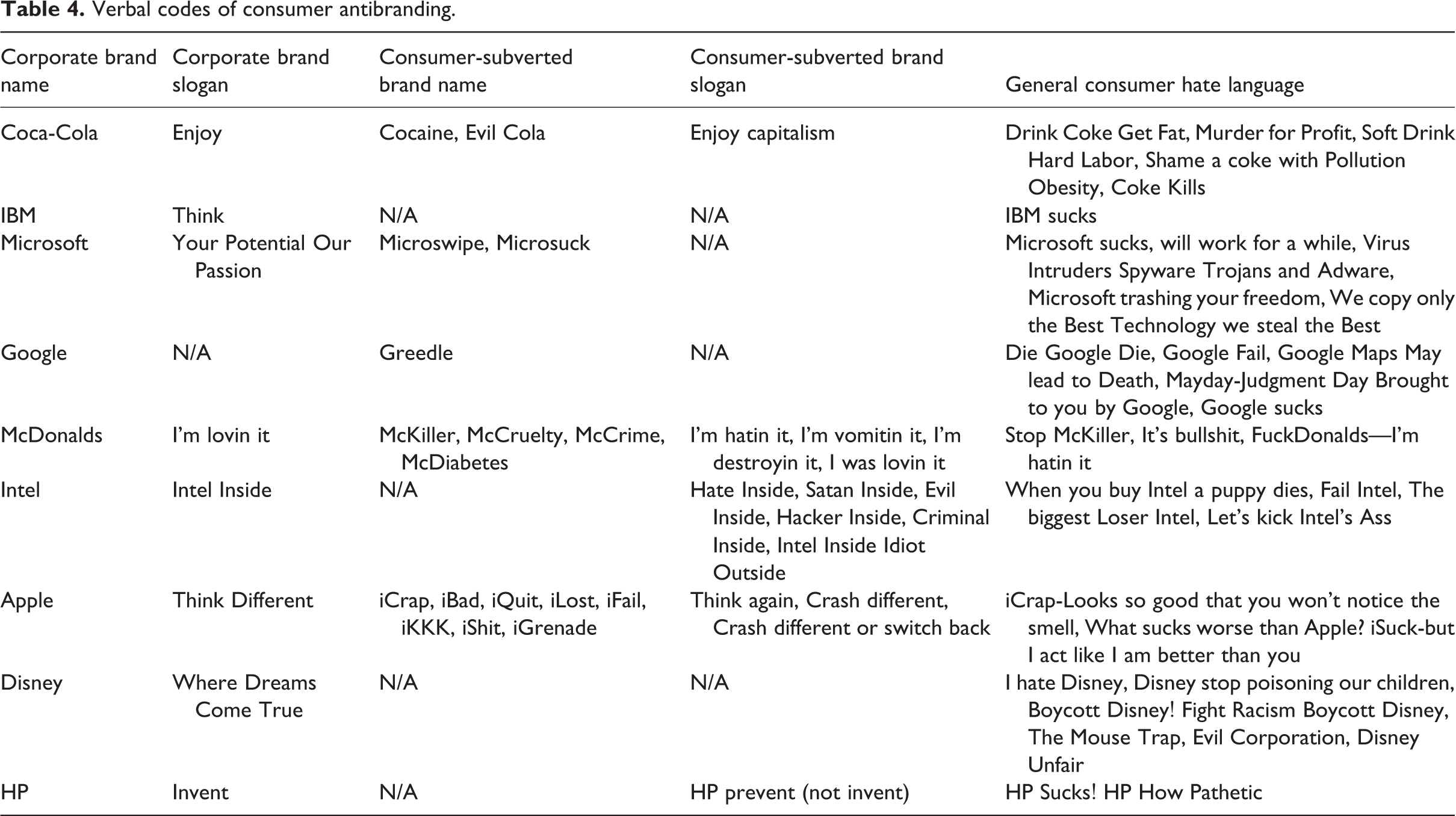
Verbal codes are analyzed here in three main groups, consumer-subverted brand names, consumer-subverted brand slogans, and general consumer hate language (in Table 4). Consumers embed many negative words into brand and product names, creating their own version of antibrand names. For example, McDonald’s is subverted into “McCruelty” and “McDiabetes,” and Apple’s iPod and iPhone are subverted into “iFail” and “iCrap.” In addition, antibranders have successfully subverted corporate messages and slogans as follows: McDonald’s famous “I’m lovin it” slogan is subverted into “I’m hatin it,” “I’m destroyin it,” and Intel’s “Intel Inside” slogan is subverted into “Evil Inside,” “Intel Inside, Idiot Outside,” and so on. Clearly consumer antibranding efforts can successfully subvert targeted corporate brand meanings and slogans while entertaining their followers.
Discussion
In study 1, subcodes are individually studied as the first step of brand discourse analysis. The findings of study 1 provide a path for understanding what digital antibranding semioticians are trying to say and accomplish—as pictured in Figure 2.
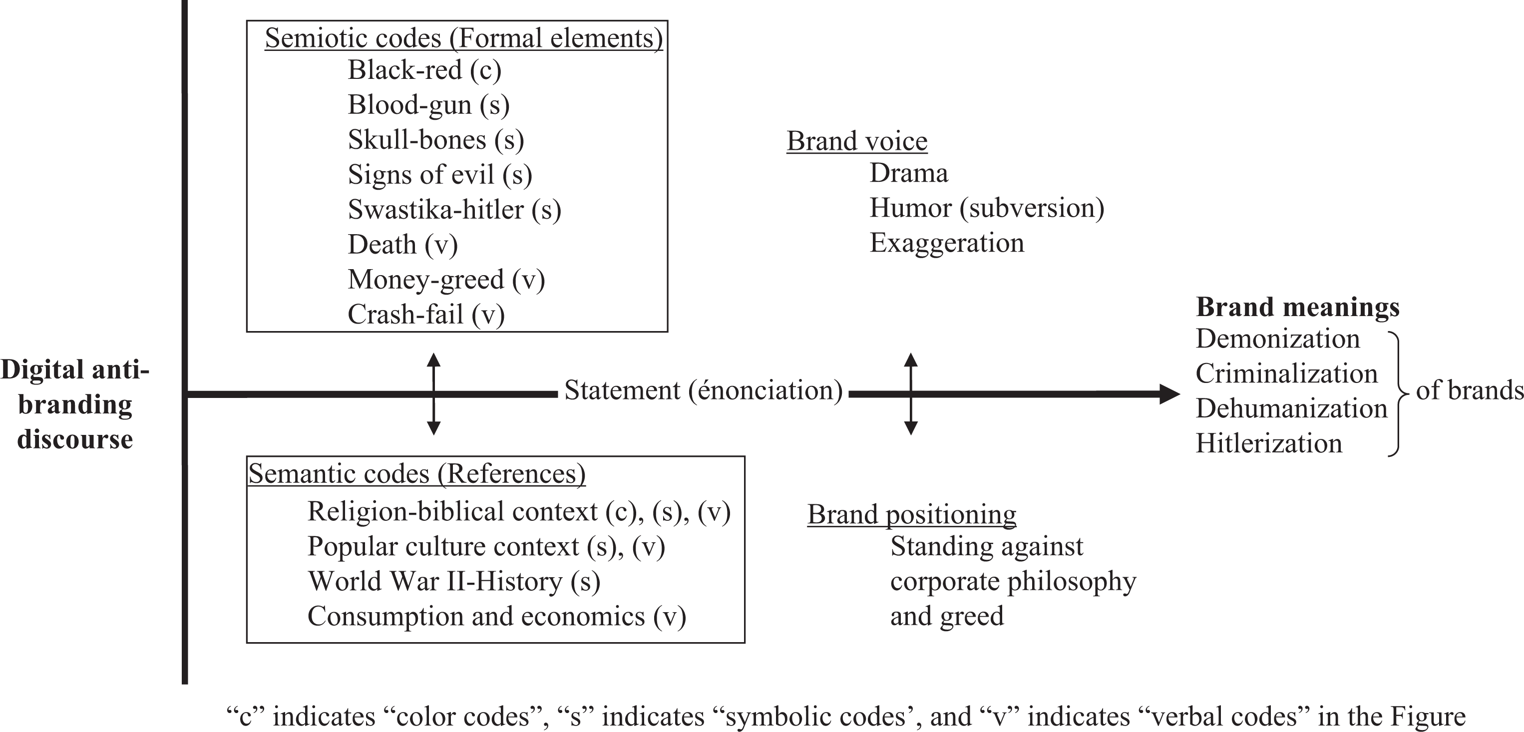
Digital antibranding discourse.
Both visual and verbal codes indicated that antibranding semioticians are trying to signify Hell and demonize the corporate brands. Antibranding semioticians seem to use this very powerful visual and verbal semiotic “hell coding” to redefine brand logos and influence other consumers by inspiring a reflexive revulsion. The discourse analysis also showed similar findings with the extraction of symbolic codes. Symbolic codes also revealed slightly different findings where guns, murder, and bloody scenes are used to accuse corporate brands of criminalizing and dehumanizing in the presentation of their consumption worlds. Corporate greed that undervalues human needs and welfare is also signified by associations with Hitler and Nazism.
Finally, the discourse analysis indicated that digital antibranders use drama, humor, and exaggeration to create a strong digital antibranding voice by presenting visual semiotic codes that demonize, criminalize, dehumanize, and “Hitlerize,” positioning themselves as against corporate greed and wrongdoings.
Study 2: Analysis of consumer semiotic decoding process
The purpose of study 2 was to discern how receivers locate a concept in semantic space by asking them their impressions of consumer artifacts. All of the 295 unique consumer-generated antibranding images and artifacts were first examined by five professional graphic designers from American Institute of Graphic Arts, Seattle, USA. The experts went through the images and identified those most able to highly impact viewers. The designers are experts equipped to analyze the semiotic power and deep meanings created by antibranding semioticians. The experts are agreed on (agreement levels varied between 80% and 100%) four antibranding symbols, as shown in Figure 3.
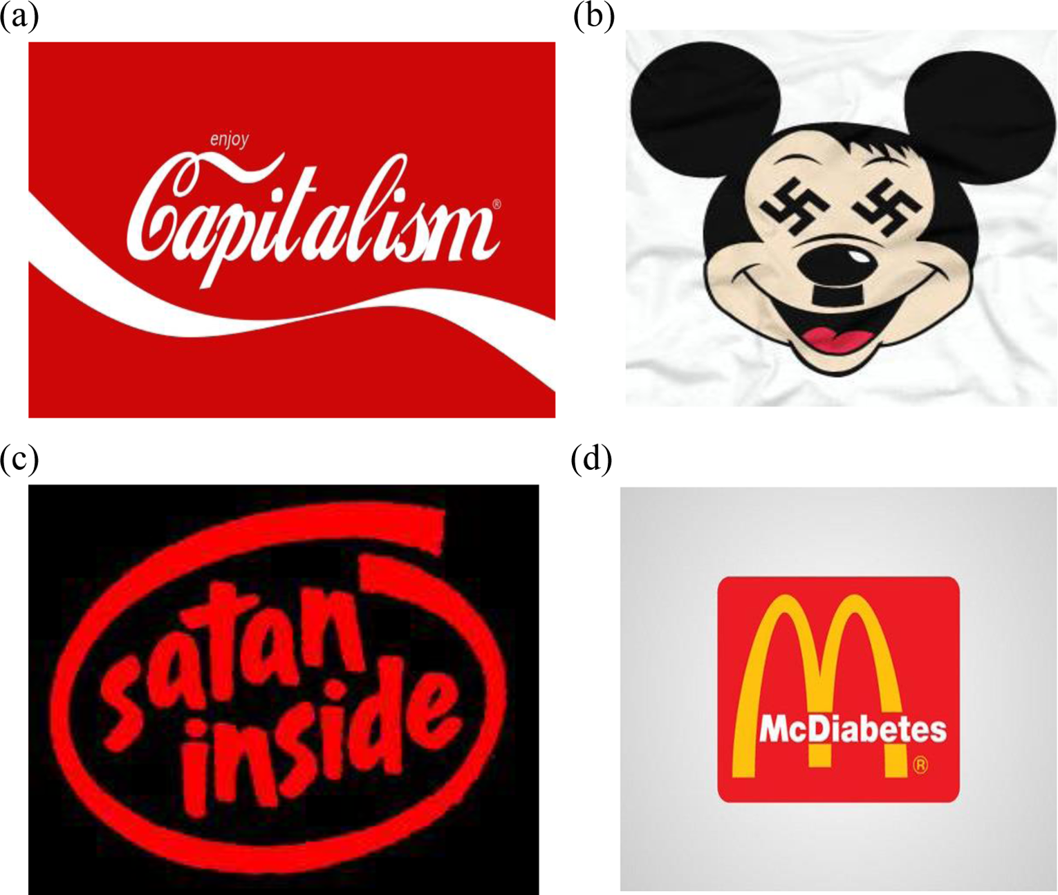
The most influential antibranding images (selected by expert judges).
The selected consumer subvertisements are fundamental examples of how antibranders view their relationships with the targeted brand and how they portray their negative feelings about corporate brand meanings. Face-to-face in-depth interviews conducted with consumers for the selected antibranding images are shown in Figure 3. The purpose was to develop a basic understanding and interpretative framework for decoding consumer approaches to negative semiotic meanings.
Most of the interviews were conducted in a small town with a middle-class population on the outskirts of a major city in the Pacific Northwest of the United States. Most of the consumers interviewed were not necessarily anticorporate or antibranding fans or supporters but were aware of these alternative interpretations. Because negative speech can be found offensive by some, the participants were carefully selected based on their ability and willingness to collaborate productively with the interviewer. During interviews selected antibranding objects were discussed, first individually and then together, in order to allow participants to make comparisons from various perspectives. The interviews took from 30 minutes to an hour or more. After 8–9 interviews, an interpretative framework started to emerge, and a total of 25 consumers were interviewed.
Consumer interviews
The interviews focused around three constructive dimensions: “message clarity,” “fact seeking,” and “hostility versus entertainment.” Message clarity is defined as the consumer ability to decode the semiotic representations perceived in the antibranding images. This measurement is the semiotic effectiveness of an antibranding image at successfully prompting the consumer perception of the antibranding message. If the message of the antibranding image is perceived as true and similar to the consumer’s experiences, knowledge, and belief systems, the consumer is less prone to find a way to make sense of the message in a different way. Alternatively, the interviewed consumers tended to review their memories trying to find something to justify/verify what the semiotic message seemed to say. This directly linked to the credibility and acceptance of the antibranding message and is conceptualized in this study as fact seeking. Interestingly, consumers made an effort to explain why a person would be producing these kinds of negative images. Finally, some consumers were really entertained by the humor in the signifiers and the signified, and others were offended by them and found them hostile, which is discussed as the hostility versus entertainment component. Although hostility was easily detected in study 1, consumers were also able to find some humor in the antibranding images.
The interviews conducted approximate the theoretical discussions developed earlier. As a result, the findings of the face-to-face in-depth consumer interviews, and a general semiotic analysis of the images reported in the context of the study 2 can be explained as follows:
Capitalist Coca-Cola
The creators of the selected anti-Coca-Cola image used the same colors (red and white) as Coca-Cola, its famous swift sign (the white wavy line in the middle), and the same basic slogan (“Enjoy”). The creators subverted and politicized this slogan (“Enjoy Coca-Cola”) into “Enjoy Capitalism.” The motive behind this rebranding, attacking Coca-Cola’s ‘wild capitalist approaches and worldwide colonist mentality’, was also accurately decoded by the majority of consumers interviewed (Figure 3(a)—slogan subverted).
Message clarity
The majority of consumers interviewed agreed that Coca-Cola is a symbol of capitalism, and that capitalism is easily seen as a greedy system, as described by these respondents: They are making fun of materialism and the negative sides of capitalism—how Coke can make millions of dollars while little guys struggle. (24, Female, social media company owner) There is a negative connotation—because (in capitalism), one group of people dominating others … it is power struggle … upper class is in control, and look down, say hey little guys (lower and middle class) who drink Coca-Cola, and control them through Coke. (32, Female, Teacher and Student—MA Psychology)
On the other hand, a few consumers found some ambiguity in the message as indicated by this interviewee: This seems like an anticapitalism message! Feels actually either way (depends on who’s car its on)… could be Dick Cheney’s car or Ralph Nader’s car. (30, Male, Videographer)
This ambiguity might cause some brand dilution problems since consumers were not able to consistently differentiate between positive interpretations of the comment on Coca-Cola’s image and the antibrander perspective as revealed by another study participant: When I saw this first I thought Coke and then I saw capitalism in there, that made me feel that this is manipulating. (43, Female, Supervisor)
Fact seeking
Although some respondents perceived the message as true and persuasive, some indicated that the message is politically driven and snide. Most of the fact-seeking efforts focused on the definition of capitalism and the long-standing ineffectiveness of Coke’s ability to create new traditions and knowledge while creating a big economic gap between incumbent soda manufacturers, as shown by these interview quotes: Coke is still around even though they have been challenged by many competitors in the past. They kept strong! However, people don’t have strong bonds they have used to these days. To be honest, it is like a government institution, so old, kind a part of an old system and establishment. It is not a monopoly, but close to it! (53, Male, IT consultant) Coke is big broad sweet drink, something that it is not really good for you, but it is out there … everywhere … I would probably give a little bit smirks! (55, Male, Architect
Hostility versus entertainment
The majority of the consumers found the image funny and entertaining, and some found it to be more neutral than hostile: Funny, creative… it is sending the message across. Makes me want to educate myself about Coca-Cola. (32, Female, Teacher and Student—MA Psychology) This is like “beating a dead horse” Coke has been a subject of criticism, so it doesn’t bother me anymore. A little bit amusing, not much! (60+, Male, Retired PhD)
Nazi Disney
The creators of this image used the famous Disney character Mickey Mouse. Two opposite meanings are integrated in this one image: Mickey and Hitler. Mickey’s eyes are replaced with swastikas and Mickey has Hitler’s iconic mustache and hairstyle. This rebranding of Mickey Mouse strongly associates the company with an incarnation of evil. Here the perceived monopoly power of Disney is seen as creating an antidemocratic market environment and brainwashing effort leading to the figurative massacre of consumer lives and value systems; a direct analogy to Nazi actions (also discussed in the Hitlerizing antibranding discourse in study 1; Figure 3(b)—mascot subverted).
Message clarity
This image is perceived as confusing or disgusting, hence unclear and a clash of two opposite images, Disney and Hitler. Interviewee comments included: It’s conflicting… for me it represents two extremes: extreme happiness (Disney) and extreme sadness (Hitler). It confuses me… feeling negative and conflicted. (43, Female, Supervisor) Mickey Mouse and Hitler. I can’t connect them to each other … the happiest place on the world; you don’t want to have any association with Hitler! (46, Male, Engineer)
Fact seeking
Many of the interviewed consumers disagreed with the message presented in this image. Consumers had a hard time finding experiences in their lives to support the signified message in this image; thus they perceived this image as biased. The image turned off the interviewees even though they were not fans of Disney. On the other hand, some of interviewed consumers became intrigued and wanted to know more about Disney, although they generally found the image really disgusting, as observed here: It is more intriguing, I want to know why they are bad. I really want to know why they do that! (26, Female, Preschool Teacher)
Hostility versus entertainment
Almost all of the consumers interviewed found this image hostile, disgusting, and offensive. This antibranding message was decoded as malicious and creepy by many of the consumers interviewed: They are taking my Mickey and turn into something ugly and bad, I don’t like it! (42, Female, Small Business Owner) Somebody got a sick sense of humor, gone too far! There is some cleverness in it, but over the top dark humor. (55, Male, Architect)
Satan Intel
Creators of this ad used totally different colors (red and black) from the original logo colors (white and blue). Some consumers were able to decode the darker and more demonic colors in this image, as was discussed in the demonization antibranding discourse in study 1. The company slogan Intel Inside is here subverted to “Satan Inside.” Thus, this ad has a religious overtone (Figure 3(c)—logo and slogan subverted).
The justification behind this attack focuses not on whether Intel’s computer processors provide high capacity and convenience to consumers, but instead focuses on whether the company is making it easy for companies and governments to benefit from stealing the personal information of consumers. Antibranders are suggesting that Intel’s technology has another agenda (a ‘satanic’ one, whether intended or not) that consumers are not aware of and perhaps would not approve of. This is also addressed in the criminalization antibranding discourse in study 1.
Message clarity
Although some interviewees found the message in this image to be clear, a majority was confused and unsure what the message was. Confusions were generally generated by the use of the word “Satan” or, since it is not a frequently noticed consumption product, by a lack of knowledge of the Intel brand. However, most respondents were able to decode the religion tone: When someone says “Satan inside” that that means Satan possesses you! They are trying to say that Intel possess you and makes them all massed-up. I am not a PC user, I should be agreeing with this! (32, Female, Teacher and Student—MA Psychology) Reminds me Westboro Baptist church in the South (they protest almost everything, and a lot of hate bags) Test from God! Satan is corrupting you. (23, Female, Student)
Fact seeking
There was less fact-seeking logic occurring during conversations about this image. This might be because of the fact that the image used a religious tone, which also implied a conspiracy to a few people: Conspiracy type of stuff. If you really knew what is going on inside, you wouldn’t buy the Intel. I don’t know enough about the Intel, their practices. (40, Female, Small Business Owner) Anticapitalist or antitechnology. Somebody who believes in conspiracy can find this true. (55, Male, Architect)
Hostility and entertainment
This antibranding image was seen as negative, dark, and malicious by many interviewees: Very dark, very black, negative side wide. I try not to go there. (60+, Female, Entrepreneur)
However, a few consumers were able to find some humor in this image: I found this one funny caustic humor! Burning acid humor! Huge corporation entity they are making fun of Intel. (60+, Male, Broker)
Unhealthy McDonald’s
The creators of this ad used McDonald’s golden arches and a red background, retaining the color combinations and symbols of the original brand image. Concerns about McDonald’s cheap and unhealthy fast food business model have gained the attention of consumers, markets, and governments. This ad brings the concerns to the forefront by embedding the word “diabetes” into the company name, subverting McDonalds’ name into “McDiabetes.” This image is a typical example of the dehumanization and criminalization in antibranding discourse discussed in study 1. The intent behind this subversion is to warn consumers about the health problems possibly created by McDonalds’ business model (Figure 3(d)—brand name and logo subversion).
Message clarity
Almost all the consumers found the message very clear and fair: Bingo! Somebody hit the nail on the head! Very funny, message is very clear and perfect—I agree with the creator of this ad. I don’t have to do too much thinking about this one … I thought it is right … I wish other people would step up, see it, and rebel against it … critical and not really hostile! (43, Female, Supervisor) The most straight forward one! Gets the message across! Kinda speaks to the future of America! I liked it! It is cool! (30, Male, Videographer)
Fact seeking
Most of the interviewees found the image and its message undoubtedly true. Most of the interviewed consumers already agreed with this antibranding image and expressed some association with their lifestyle: Everybody in my culture agrees with this… it’s like a cultural norm around here… (23, Female, Student) This one you can’t really argue! Other ones were debatable, but this one is undeniably true. (23, Male, Student-Barista)
Some consumers even showed some anger as they express their agreement with this image: McDonalds is a part of the institution and over the years developed such a strength, yet killing America, killing all of us! It is a cheap place, but contributing many health problems and they do nothing about it! They are creating a lot of pollution. I see their bags and trash everywhere! They are polluting our bodies and our environment. That makes me angry, so this logo is just right! (53, Male, IT consultant)
Hostility and entertainment
Most of the consumers found this message entertaining and funny. In fact, some of them could not resist laughing and smiling during the interview: It makes me laugh. Sad but it is true. I rolled my eyes and laughed when I saw this… so true! (23, Female, Student-Barista)
The McDonalds ad is also a unique example of how negativity and/or dark humor can impressively impact consumer perceptions: This is hilarious! I totally agree with it! Funny! Processed food we eat destroying our health, causes diabetes, obesity, and also addictive… I liked it this one, it speaks to me! (41, Male, MD—Medical Doctor)
Comparisons of antibranding images
At the end of each interview, all the antibranding images were presented to the consumers together. They were asked to compare the images and pick their favorite antibranding images. The interviewee reactions and facial expressions changed with each antibranding image they viewed. They generally looked a little bit puzzled when they saw the Coca-Cola antibranding image, shocked and disturbed when they saw the Disney antibranding image, confused when they saw the Intel antibranding images, and they laughed or smiled when they saw the McDonalds’ antibranding images.
Almost all of the consumers interviewed were more prone to accept the McDonalds and Coke antibranding images, finding the images funny and friendly rather than satanic or evil, as described by the interviewees below: Coke and McDonalds have elements of fun. Disney and Intel are not funny; they have some elements of a very dark side! Coke and McDonalds have more truth. If you run into a person who wear t-shirt with this McDonald’s logo you want talk with him and have fun with him, but if you see a guy wear this Disney t-shirt you probably want to avoid him, because he is the one likely carrying gun! (60+, Male, Broker)
During the interviews, many consumers were not able to take their eyes away from, and spent more time thinking about and analyzing the Disney and Intel images, trying to make sense of the extreme language. Some consumers also revealed being intrigued by the Disney and Intel images, even though the images were using aggressive language and religious and racist themes: Disney and Intel are over the top, but they make me think more. I don’t necessarily disregard them, I am curious about them. Disney and Intel are more thought provoking. It made me think and learn more about them! (25, Female, Barista) Disney and Intel, I liked it the least, but the most thought provoking! I started to think why they are doing that! There is more depth in these two (Disney and Intel), like a good book! (42, Female, Small Business Owner)
One of the possible reasons that consumers were intrigued by the Disney and Intel antibrand images is because these ads shocked the interviewees when they first saw them. Since visual environments are populated with ever more digital images, many images are starting to lose their power. Developing shocking images can be an effort to attract more consumer attention (Schroeder, 2002), as explained by some interviewees: Disney message has more Disney and Intel are
Discussion
In study 2, consumer responses to selected antibranding images were studied. Consumers found some humor (the McDonald’s subvertisment) in the studied antibranding images and tried to justify why antibranding semioticians use such derogatory and harsh language. This also supports the findings of the digital antibranding discourse analysis in study 1.
Specifically, consumers definitely indicated a semiotic distaste for the antibranding Disney image. Disney was perceived as unfairly victimized and might receive sympathy from those who see this ad. Disney should be more worried about intrigued consumers who want to know more about the issues that prompted the antibranding images. It seems companies who are attacked with opinionated and aggressive language should not worry about that speech because consumers often do not give credence to these kinds of approaches. The McDonald’s image received more interest and acceptance than the other images in this study, consumers could easily identify with the image. It is clear that humor disarms people and makes it easier for consumers to feel compelled by and involved in the message represented if there is some confirming truth that can be found. In summation, even though all the messages studied were negative, consumers tried to perceive positive, clear, and constructive messages.
Conclusion
Brand images and symbols are indispensable parts of modern consumption culture and digitally mediated economic systems. In these systems, the value of the images is determined by the brand’s ability to connect cultural and social meaning systems with appropriate semiotic codes. The Homo digitus consumer now has the power and ability to subvert and reject marketer-generated brand meanings that conflict with their values. Thus, companies who do not talk about and renegotiate their semiotic meaning systems with consumers face losing control of their meaning systems to those same technologically advanced consumers.
This study’s findings reveal that Homo digitus consumers are now able to fill the meaning gaps that result from corporate wrongdoings with negative brand meanings and semiotics in digital consumption spaces. In study 1, individual semiotic subcodes used by digital antibranders were investigated, and a digital antibranding discourse was developed. The findings of study 1 indicate that digital antibranding semioticians try to subvert corporate brand meanings by creating demonic, criminal, dehumanizing, and ‘Hitlerizing’ associations with corporate brands. Study 2 examined consumer decoding of antibranding images and their messages through consumer interviews. Study 2 shows that consumers easily decode, accept, and willingly identify with humorous meanings more than with aggressive or malicious attacks but that an aggressive and intriguing message has some potential to influence consumers. If consumers have prior knowledge or beliefs about what is subverted in the antibranding ads, the persuasion of the ad seems to increase significantly. Companies who are attacked by clear and funny agenda-driven messages may find that their brand images and identities will be hurt more than by aggressively designed negative consumer ads. However, companies should also focus on consumer messages with intriguing features, even when those features are negative.
In the light of these findings, some important managerial and policy issues are as follows.
First, the identification of the “good consumer” is changing in modern markets. Corporations often see antibranders as problem kids, but what these consumers are really trying to do is bring their disappointments to the attention of corporations and the marketplace. Thus, a good consumer in this digital age is willing to directly share feedback, positive or negative, with the company (Kucuk, 2008b; Lusch and Webster, 2011). It was easy to ignore negative feedback before the Internet because negative responses were stuck among in-groups and usually not communicated to the company or others. Consumer complaints are changing from a private experience to a public phenomenon as the number of digitally interconnected consumers increases (Ward and Ostrom, 2006). Traditional marketing philosophies underestimate the value and information richness of negative consumer feedback and neglect learning from negative feedback and comments. Some negative branding can be seen as disruptive and even anarchistic, but this same responsive rebranding can also stimulate market creativity, protect true expressive diversity, and eventually canalize public meanings for public benefit.
Second, although companies increase their brand surveillance and legal actions against antibranders in order to prevent the noncommercial use of their brands under Trademark Laws, consumers in the United States assert that antibranding actions should be protected by their “First Amendment Free Speech Rights” (Kopp and Suter, 2000). Complicating the issue, many fan sites are filled with unauthorized copies of brand images and videos. Allowing consumer fan sites to use trademarked symbols freely while policing antibranding creations is a significant dilemma for corporations. This quandary shows that there is an urgent need for overhauling traditional trademark laws as millions of new brand images and semiotic codes become available everyday for digital consumption.
Third, search engine companies are developing ways to search based on pictorial codification systems; understanding the meaning systems created by symbolic representations of brand images seems likely to foster the development of still better visual search engines for consumers to search the Internet with. Consumers are generating new semiotic codes everyday, thus there is a need to develop a search system that directs the user to the symbol or symbolic semiotic meaning he/she is looking for. Moreover, new businesses are emerging in digital image markets, such as Shutterstock and Instagram, which make it easier to stock and retail to the public billions of photographs, images, and illustrations, created by both amateurs and professionals.
The consumption and production of digital symbols and semiotic images is evolving toward a strong and democratic digital image economy. By using and developing new meanings for images, we are creating new communication systems and consumption philosophies everyday on the Internet. The use and consumption of digital images is increasing and more research on digital branding and antibranding semiotics will enhance the development of our modern and future image-based digital economy.
Footnotes
Acknowledgments
The author appreciates the comments of David G. Mick, Zeynep Arsel, Tacli Yazicioglu, and Christopher Gwyn on the earlier version of the article and Laura Zeck for her support during the data collection process.