




Abstract
With its mission to move science into practice, the Visual Analytics Science and Technology Challenge has become an integrated part of the annual Visual Analytics Science and Technology Conference since its inception in 2006. In this article, we discuss how we can transfer this objective into a classroom setting by using the Visual Analytics Science and Technology Challenge datasets and by encouraging student submissions to the challenge. By means of Bloom’s Taxonomy of Educational Objectives for Knowledge-Based Goals, we show how the Visual Analytics Science and Technology Challenge enables the integration of additional learning objectives into two types of courses: a dedicated course that focuses on the contest participation and an integrated course that uses the contest data to emphasize practical course elements. The core contribution of this article is that we assess the opportunities and pitfalls that we experienced at the University of Konstanz in Germany and Virginia Tech in the United States when augmenting the educational curriculum with the Visual Analytics Science and Technology Challenge.
Keywords
Introduction
The Visual Analytics Science and Technology (VAST) Challenge, since 2008, is a participation category of the IEEE Visual Analytics Science and Technology Symposium/Conference continuing the footsteps of the VAST 2006 and 2007 contests. The challenge provides realistic datasets and visual analytics scenarios with a ground truth that is published after the submission is closed and participation is open to the public. The purposes of the challenge are manifold: to identify the most useful visual analytics practices among all handed-in solutions, to allow data analysts to apply and test their newly developed methods, and to provide visual analytics lecturers with realistic data for their students to work on. In this article, we focus on the latter point and introduce different ways to augment the educational curriculum using the VAST Challenge. We give usage examples for different kinds of courses and challenges, describe our past experiences, point out opportunities and pitfalls, and share our lessons learned.
The rest of this article is structured as follows: in section “Teaching visual analytics using the VAST Challenge,” we associate concrete learning objectives to the different steps necessary for working on the challenge tasks and shape the course planning accordingly. In addition, we provide an overview of useful teaching resources. Next, we describe the use of the VAST Challenge either as a dedicated course (cf. section “Applied visual analytics: dedicating a course to the contest participation”) or integrated into undergraduate or graduate courses (cf. section “Integrating the VAST Challenge into courses”). In section “Lessons learned,” we provide our lessons learned from past experiences and discuss opportunities and pitfalls of using the VAST Challenge as part of the educational curriculum. Finally, section “Conclusion” concludes our key findings.
Teaching visual analytics using the VAST Challenge
There are many good reasons to use material from the VAST Challenge for teaching. It is otherwise difficult to get real-world datasets and if so, typically, no ground truth is available. The challenge scenarios are very motivating for students and help them to put the abstract concepts they learn in their university studies into an exciting real-world analysis context.
In this section, we briefly show how the use of the VAST Challenge reflects on the learning objectives of the course. Furthermore, we discuss relevant teaching resources and how software and technology can be used in a meaningful and motivating way.
Learning objectives
To systematically plan a course, Bloom’s Taxonomy of Educational Objectives 1 can give some guidance to the nature of the learning objectives and how to assess them in the course. For our concrete course planning, we used a revised version 2 of this taxonomy that takes into account more recent research in psychology for ordering the cognitive dimensions.
In principle, this revised taxonomy consists of two dimensions, the knowledge dimension and the cognitive process dimension. As described in more details in Table 1, the knowledge dimension consists of factual, conceptual procedural, and metacognitive knowledge at the highest level. Likewise, Table 2 contains an ordered list of verbs that describe simple to complex cognitive processes. At the highest level, these dimensional values are (1) Remember, (2) Understand, (3) Apply, (4) Analyze, (5) Evaluate, and (6) Create.
Structure of the knowledge dimension of the revised Bloom’s Taxonomy according to Krathwohl. 3

Structure of the cognitive process dimension of the revised Bloom’s Taxonomy according to Krathwohl. 3
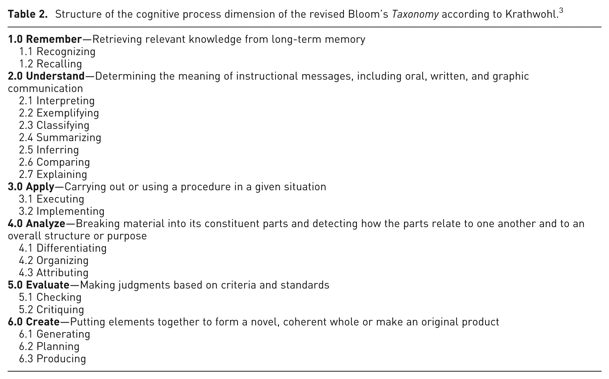
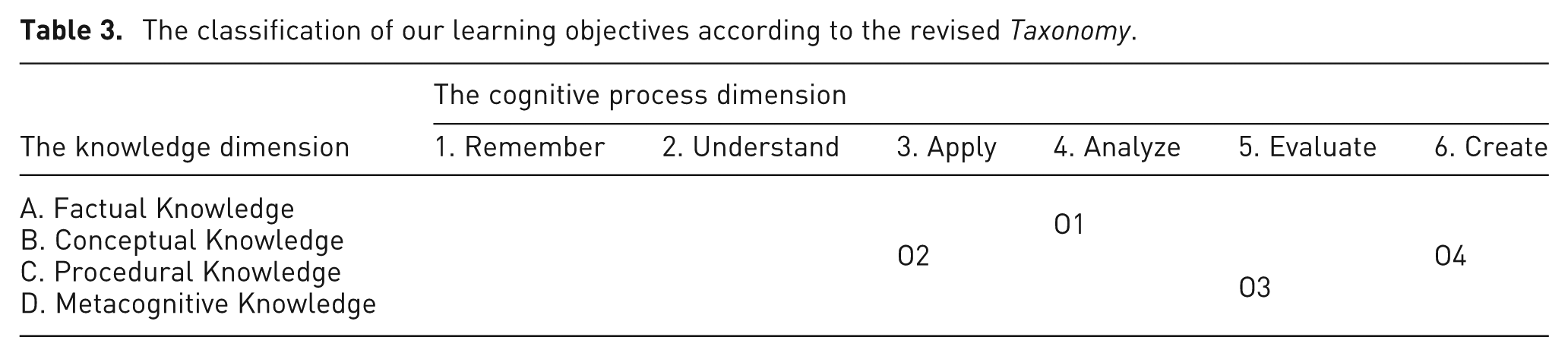
Applied to our course planning, we define our course objectives as follows:
Students are supposed to plan what they want to do with respect to the employed visualization and analytics methods and how the workload will be distributed among the team members. This objective involves Organizing (4.2) in the cognitive dimension as well as Factual (A) and Conceptual Knowledge (B) in the knowledge dimension.
Students are expected to apply the learned visual analytics methods to the contest dataset. This objective involves Executing (3.1) tools and methods (e.g. using standard software to display time-series data) and Implementing (i.e. adapting or innovating methods for application on the contest data). The focus of this objective is on Conceptual (B) and Procedural Knowledge (C).
To achieve O3, students should be able to perform the cognitive processes of Checking (5.1) and Critiquing (5.2) on their project outcome. This involves not only Procedural (C) but also Metacognitive Knowledge (D) such as knowledge about cognitive tasks and context (Db).
During the course students are expected to present their intermediate and final analysis results. For this, they need to describe how and why they used certain visual analytics methods to transform the contest data into an interactive visualization. This objective involves Generating (6.1) and Producing (6.3) from the cognitive dimension as well as Conceptual (B) and Procedural Knowledge (C).
Table 3 summarizes our four learning objectives by classifying them into the highest levels of the revised Taxonomy. In contrast to a classical course that primarily focuses on remembering, understanding, and applying factual and conceptual knowledge, the VAST Challenge not only allows students to reach higher cognitive processes such as analyze, evaluate, and create but also enables them to address all knowledge types as shown above.
The classification of our learning objectives according to the revised Taxonomy.
Teaching resources
Visual analytics can be described as the interplay between Information Visualization, Knowledge Discovery, and Interaction methods with the goal of enhancing the cognitive process of analytical reasoning. For the lecturer and students, we therefore recommend a selection of textbooks that should help to gain an overview of each respective domain and to look up specific methods when needed.
The Information Visualization field can be approached from different perspectives. Tufte’s books (e.g. Envisioning Information 4 ) mostly convey a critical perspective on the use of diagrams, often with nicely illustrated historical case studies. In 1999, Card, Mackinlay, and Shneiderman 5 published “Readings in Information Visualization: Using Vision to Think,” a useful collection of articles that make up the foundation of information visualization. Another perspective is to explicitly assess visualization methods with respect to human perception as done in Colin Ware’s 6 book Information Visualization—Perception for Design. Finally, Ward, Grinstein, and Keim 7 wrote Interactive Data Visualization: Foundations, Techniques, and Applications, 7 a textbook for use in classroom teaching. More information can be inferred from an international survey 8 among professors in the field.
Knowledge Discovery is also a complex topic that can be addressed in many different ways. For the sake of brevity, we limit our recommendation here to Berthold et al.’s 9 Guide to Intelligent Data Analysis and Fayyad, Grinstein, and Wierse’s 10 book Information Visualization in Data Mining and Knowledge Discovery that aims at bridging the gap between knowledge discovery and information visualization.
The Interaction field is also very broad, and there is thus a need for first focusing on the fundamentals. In his book Information Visualization: Design for Interaction, 11 Robert Spence describes, for example, how interaction can be designed in such a way that the interface supports exploratory tasks, which are typical for the VAST Challenge. To dig deeper into the topic, Research Methods in Human–Computer Interaction by Lazar and Feng 12 is a helpful starting point.
To learn about the cognitive process of analytical reasoning, a variety of references are helpful to understand the human dimension of visual analytics. Johnson-Laird’s 13 book How We Reason provides a broad overview of cognitive issues in reasoning. Heuer’s 14 Psychology of Intelligence Analysis examines cognitive biases and Structured Analytic Techniques for Intelligence Analysis 15 presents numerous techniques for overcoming bias that are broadly applicable in many domains. Pirolli and Card 16 offer a useful reference model of the analytical process that can guide tool designers. Esser 17 reviews benefits and pitfalls associated with collaborative analysis and groupthink.
While there is no teaching book specifically on the topic of Visual Analytics available yet, the book Illuminating the Path: The Research and Development Agenda for Visual Analytics by Thomas and Cook 18 nicely introduces the core methodology. Keim et al.’s 19 edited book Mastering the Information Age-Solving Problems with Visual Analytics furthermore investigates specific relevant visual analytics subfields, such as data management, data mining, space and time, infrastructure, perception, and cognition as well as evaluation. Note that both books are accessible on the web without any costs. Finally, Georgia Institute of Technology’s 20 “Visual Analytics Digital Library” bundles many valuable resources for teaching visual analytics.
Software and technology
Software
There are several software solutions available that integrate a large number of data analysis methods, which can readily be applied for dataset exploration and generating first hypotheses and findings.
The open-source solutions KNIME, 21 WEKA, 22 and RapidMiner 23 support the exploration of diverse data types and offer collections of established machine learning methods and basic visualization methods that can be customized through comprehensive user interfaces.
More flexible and scalable data processing can be achieved using scripting languages such as PERL 24 or Python. 25 UNIX commands like grep, cut, sed, and awk are an alternative.
More advanced visualizations can be generated with the open-source software R 26 and its numerous add-on packages or with the Tableau Software 27 that offers a wide range of visualization methods that can be created through an easy-to-use user interface. Moreover, an easily customizable web interface for the creation of diverse visualizations is provided by IBM’s Many Eyes. 28
Highly flexible visualizations can be created using open-source libraries like D3 Data-Driven Documents,29,30 a visualization framework written in javascript, or Prefuse31,32 written in java. For advanced user interactions, the java library Piccolo2D33,34 is recommendable.
Further specialized tools and libraries exist for certain data types like GraphViz 35 for graph visualization or Jigsaw36,37 for visual text analytics, to name just two prominent out of the numerous examples.
Technology
For the solution of some challenge tasks, the use of new technology can be very helpful and at the same time motivating for the students. This includes, for example, the use of large high-resolution screens (see Figure 1), interlinked displays, touch tables, and gesture recognition. That way, more data can be displayed at once or several coordinated views on the same data can be interactively explored using suitable easy-to-use interaction devices.
Tool designed for the solution of MC 1, 2011, showing geolocations and text content of messages for three different days.
Applied visual analytics: dedicating a course to the contest participation
Applied Visual Analytics is the title of a course that is organized at the University of Konstanz, Germany, and is based on the VAST Challenge. It gives advanced students the opportunity to put theoretical knowledge into practice. The students are required either to bring background knowledge in Data Mining and Information Visualization or visit the corresponding lectures in parallel. The participants are split into teams of two or three students working together on one Mini Challenge (MC) task. For each MC, we aim to have at least one student team, so that we can solve the Grand Challenge a joining all efforts.
Teaching the analytic process
First, the students are given brief introductions to standard data analysis and visualization tools as listed in section “Software and technology.” Next, the students are asked to explore how far they can get with any of those tools analyzing the given data. Usually, at some point, the standard tools do not provide further support and students have to develop their own tools for preprocessing, automated data analysis, or visualization. They are asked to assign anything they do to a certain step of the Knowledge Discovery in Databases(KDD) Process, 39 Visual Analytics Pipeline, 40 or a similar process flow. This helps them to structure, summarize, reason about, and explain their activities.
Iterative result refinement/feedback sessions
The students of a team have to subdivide the tasks among themselves, and they have to present their progress every week, as well as problems they face. Results and problems are then discussed with the whole class. This ensures that the other students not only focus on their tasks but also actively participate in the solution of the other tasks. From week to week, the results become more complete and elaborate. In the end, the whole class is aware of what all teams have done and can bring pieces together for solving the Grand Challenge.
Example for obtained analysis results
The Applied Visual Analytics course has been conducted throughout the last 4 years and several times has led to the winning of awards,38,41,42 among them Grand Challenge awards in 2009 and 2011. From the 2011 solution, we would like to present the MC 1 solution 38 as an example for results that students have obtained within the course.
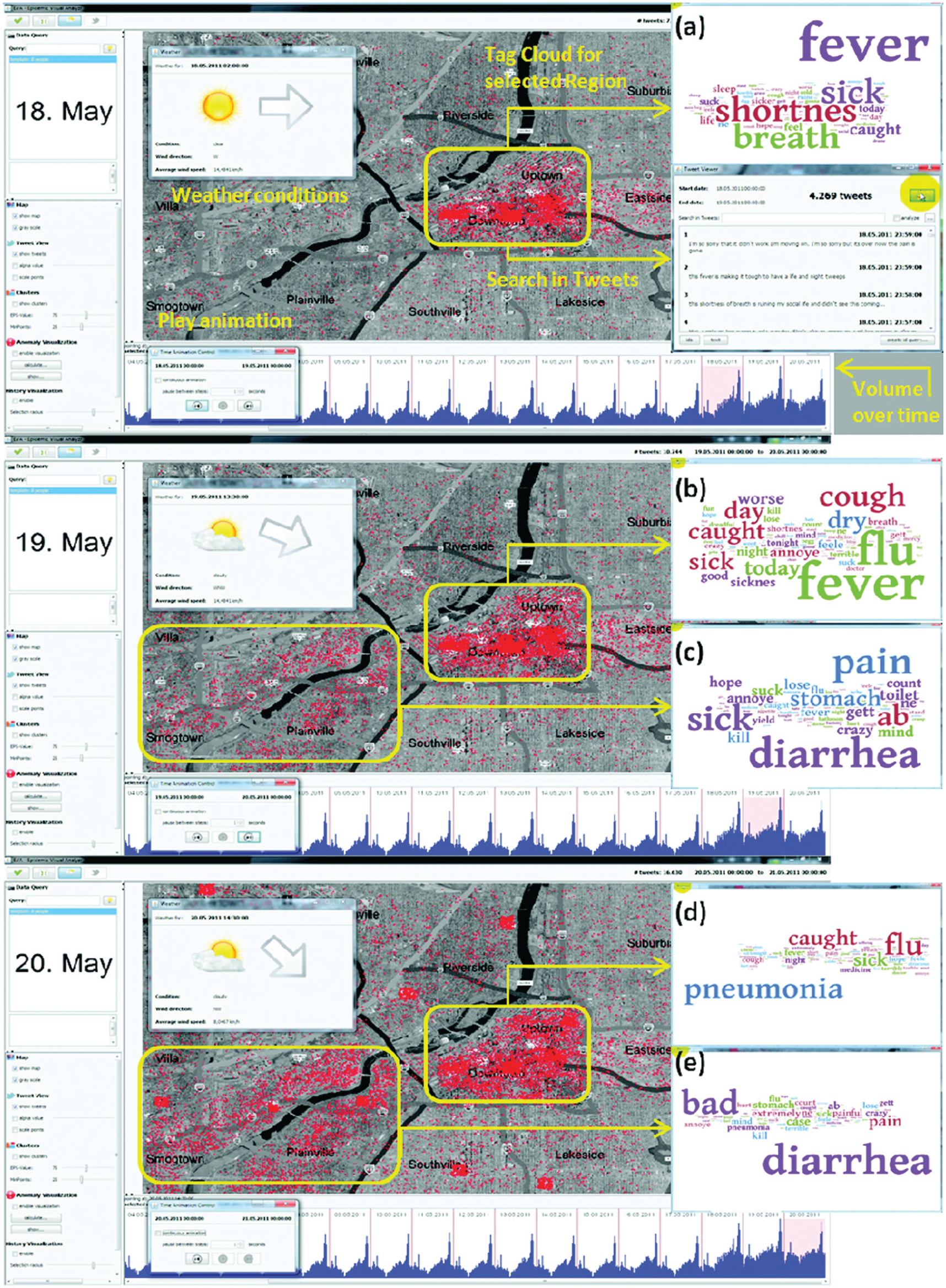
The data consist of microblogging messages from mobile devices (similar to Twitter messages) that come with a time stamp and the Global Positioning System (GPS) coordinates of the locations from where messages were sent. Analyzing about 1 million messages sent over the course of 3 weeks and some additional metadata (a geomap, information about weather conditions), participants shall characterize the outbreak of an epidemic spread. One of the challenges for the students is to integrate different special data types: time, geospace, text, and metadata. The students had to make a decision, to which visual variables to map the different data types and how to convey the interdependencies among them.
Figure 2 gives an impression of the tool developed to solve MC 1, showing screenshots of the user interface for three crucial days, May 18th to May 20th. In the middle of each screenshot, a map is displayed where messages are represented as red dots. At the left side, a panel for filtering and configuration is provided and weather conditions, like wind direction and strength, are shown at the top left. The bottom line shows the development of the data volume over time and allows the selection of arbitrary time intervals. Selecting both a time range and a map area, the user can narrow down the analysis and request only those messages that pass the filter. From these, tag clouds can be produced on demand as shown at the right side of the display. The data development over time can also be displayed through animation pressing a play button. When monitoring the dataset using animation, the 3 days shown in Figure 2 stick out clearly.

Comparative analysis of text clouds in Mini Challenge 3, 2011, at the Konstanz Powerwall display.
Only those messages are marked as red dots that report about sicknesses according to a keyword-based classification method. It can be seen that from May 18th onward people from the central city area report fever, flu, and pneumonia (see figure 2 (a), (b) and (d)) and from May 19th onward people in the southwestern city area report symptoms of diarrhea (see figure 2 (c) and (e)). Searching for possible causes, the students designed an algorithm to discover anomalies in the geospatial distribution of message content. They could identify a truck accident on a bridge located right in the middle of the two affected areas as the cause. The truck had spilled its apparently contaminated cargo into the river and the students came up with the hypothesis that the disease spread waterborne along the river and in wind direction toward downtown. More information about the approach is provided in the study by Bertini et al. 38
The exciting real-world scenario got the students very much involved generating and testing hypotheses about the causes and impacts of the epidemic spread. The Grand Challenge also required entrants to write a debrief, which explains the most relevant analysis results and findings to decision makers. Concrete recommendations for actions that authorities should take had to be deduced from the obtained results.
Integrating the VAST Challenge into courses
The curriculums of two existing computer science courses at Virginia Tech were augmented with the use of the VAST Challenge in the form of semester projects. Introduction to Human–Computer Interaction (HCI) is an undergraduate course in which students learn about HCI theory, the usability engineering process, user interface design principles, and user interface development methods. Information Visualization is a graduate course that covers visualization theory, design principles, methods for visual representation, and interaction techniques.
The VAST Challenge provides a specific domain problem scenario to which students apply and practice the HCI or visualization methods that they learn in these courses. Because the Challenge provides a novel scenario, it requires students to synthesize their learned knowledge to create novel approaches. Furthermore, reflecting upon their processes and outcomes enables students to evaluate the appropriateness and successfulness of the learned methods.
This use of visual analytics challenges fits into our educational agenda called “CS for CSI,” which seeks to motivate students that computer science is an important field skill in supporting popular domains such as investigative analysis or crime scene investigation.
Project structure
Students are assigned a semester-long team project with the objective of creating a software tool that can help analysts solve the VAST Challenge. In this case, the pedagogical goal is not the analytics to solve the challenge per se but rather the methods employed to create the tool. Thus, the students do not submit materials to the actual VAST Challenge. Instead, we use multiple similar previous Challenge datasets as test cases, and the official Challenge ground-truth solutions to support pedagogical assessment.
The project structure consists of five phases:
Requirements analysis: Understand the needs of the analytic user tasks and datasets involved in the Challenge scenario, by attempting to solve it using standard existing tools.
Design prototype: Design and implement a new user interface or visualization that will satisfy a need identified in step 1.
Evaluation and refinement: Use the new tool to attempt to solve a second similar Challenge scenario over a long period of time, refining the design of the tool throughout the process.
Live contest: Evaluate the final tool design by attempting to solve a third similar Challenge scenario during a single session in a competition between all student teams.
Presentation: Student teams present results to the entire class.
The students are evaluated on the following criteria in descending order of importance: (1) methods, including processes and techniques, applied; (2) the final design of their software tool; and (3) the correctness of their Challenge solutions generated using their tool. The use of previous Challenges with published ground-truth solutions enables immediate assessment feedback to the students. This helps to reinforce course content and provides a practical mechanism for grading. We score them using metrics similar to those used by the VAST Challenge organizers.43,44
The Live Contest phase is a recent successful addition to the project structure 45 and is modeled after the analogous live event that took place at the VAST Conference in 2006 and 2007.43,44 The goal of this phase is to stress test the students’ newly designed tools in a time-limited high-pressure environment. Our competition occurs at the end of the semester as a separate 2- to 3–h evening session that combines both classes (graduate and undergraduate). Student teams compete against each other in solving a new Challenge scenario that they have not seen before but that is similar in format to the scenarios they tested on earlier in the project. Each team uses its own software tool that they designed during the project. At the end of the session, teams submit their hypothesized solutions to the instructor. Then, all teams meet together to compare results, and winners are announced.
Examples
The student teams have produced a diverse variety of tools (see Figures 3 and 4). Some focus on the foraging and others focus on the synthesis portions of the sense-making process. Some focus on visualizations of derived attributes extracted from text data, while others focus on search queries and interactions directly with textual information. Some emphasize automatic data-driven visualizations, while others emphasize user-driven diagramming. Common approaches include variations of network visualization, tag clouds, timelines, geographic overlays, notes organizers, text highlighting, facet browsing, and complex query interfaces. The teams typically are able to discover 50%–100% of the ground-truth plot using their tools. An open question is whether we could arrange the project such that all the teams work together to produce an integrated tool. This could expose the students to a larger engineering project but would reduce each team’s autonomy in pursuing their own interests.
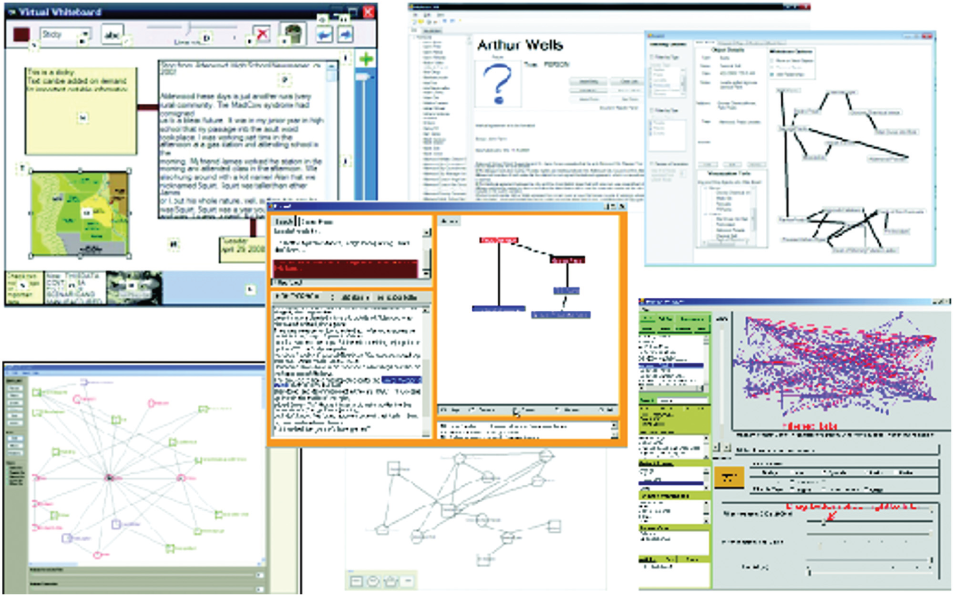
Examples of tools produced by undergraduates in the Human–Computer Interaction course.
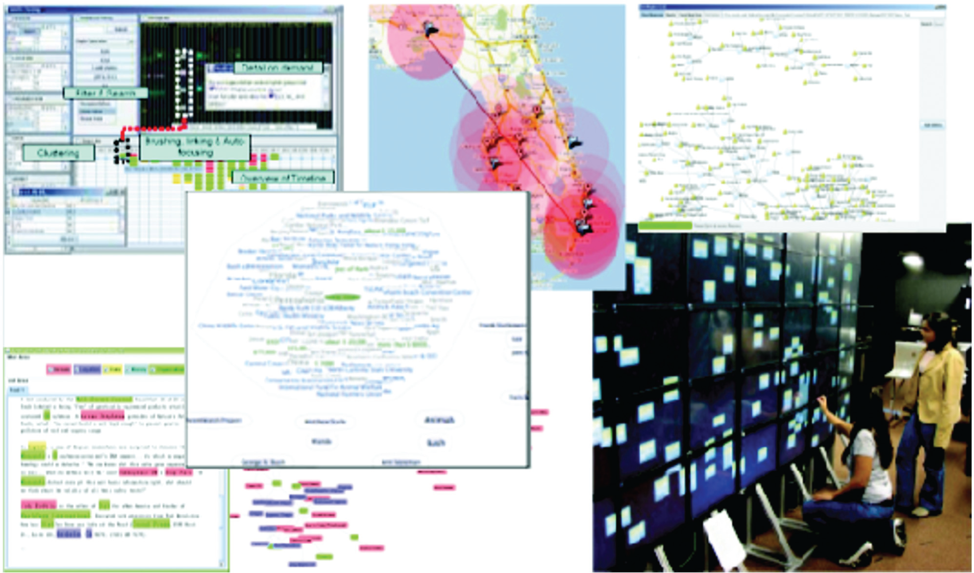
Examples of tools produced by graduates in the Information Visualization course.
Beyond learning the course material, the use of the VAST Challenge also serves to involve students in visual analytics research. A graduate student team that won the Live Contest in their class published an article about their novel system called VizCept, 46 which effectively supports small-team collaborative analytics. Other student projects have served to initiate student research theses and their subsequent related publications.47–51
Results
To help assess the pedagogical value of the project structure, we conduct surveys specifically about the project at the conclusion of the most recent offering of the courses. The questions asked for free-text answers, which were then categorized using open-coding, counted, and sorted.
What were the most important lessons you learned in doing the project? The undergraduates’ top answers were usability evaluation, teamwork, requirements analysis, new design ideas, iterative design, and user interface implementation techniques. The graduates’ top answers were analytic process, visual perception, collaborative visualization, designing for scalability, and specific visualization techniques. These responses are closely aligned with the pedagogical goals of the courses, indicating that the project is serving the desired intent.
Were the Challenge scenarios interesting? Overall, 16 of 18 undergraduate respondents answered affirmatively, and the top cited reasons were informative about analytics, entertaining, good topic, and realistic. In all, 9 of 10 graduate respondents answered affirmatively, with top cited reasons: informative about analytics, helped design, engaging, and realistic.
Did the scenarios help you learn more about how your software would be used? In all, 15 of the 18 undergraduates answered affirmatively, citing that the scenarios were important to enabling them to identify new requirements for their software and to evaluate their progress. All 10 graduate respondents answered affirmatively, citing that the scenarios helped them identify user tasks and roles, evaluate usability, and understand various real problems in analytics.
What did you learn specifically in the live contest? The undergraduates’ top answers were identified changes to their design, their tool actually helped, stress testing, teamwork, and variations in analytic processes. The graduates’ top answers were synchronous collaboration, tracking hypotheses, frustrations of time pressure, variations in analytic processes, and specific needs such as search and filter.
Overall, the live contest in phase 4 was the students’ favorite part of the project. The students found this form of evaluation extremely enlightening about the capability and usability of their tools. Being their own users enabled them to experience the usability problems and effects firsthand. Combined with the time pressure of the contest, being expert users enabled them to focus on the performance efficiency of their tools for gaining rapid insight into complex data. They felt the contest represented “real” usage and clearly exposed the successfulness of their tool design.
Lessons learned
In this section, we would like to discuss different opportunities and pitfalls of augmenting the educational curriculum with the VAST Challenge. While most of them apply to either of the previously described course types, certain points are particular for dedicated courses (see section “Applied visual analytics: dedicating a course to the contest participation”) or integrated courses (see section “Integrating the VAST Challenge into courses”).
Opportunities
As outlined in section “Learning objectives,” the use of the VAST Challenge offers the great opportunity to readily integrate high-level learning objectives and knowledge types, which are otherwise difficult to cover. In contrast to a classical course that primarily focuses on remembering, understanding, and applying factual and conceptual knowledge, the VAST Challenge not only allows students to reach higher cognitive processes such as analyze, evaluate, and create but also enables students to address all knowledge types contained in the revised Bloom’s Taxonomy. Yet, there is a lot more to the use of the VAST Challenge.
Motivational aspects
The practical work and challenge setting are very motivating for students, and they usually end up doing much more than the course would have required them to do. In addition, it may be a good opportunity to get students involved with the use of cutting-edge visualization and interaction technology, like gigapixel displays or touch tables, which is another motivating element.
Problem solving and creativity
The challenge tasks do neither have obvious solutions nor suggest obvious analysis strategies. Students have to continuously search for, test, evaluate, and revoke or refine analysis strategies. At the beginning, this involves becoming familiar with existing algorithms and tools, as described in section “Software and technology.” Students have to find out by themselves which algorithm and tool are suitable for their purposes and, more importantly, where the limitations are. Finally, their creativity for problem solving is required and trained. They have to reason about novel solutions based on their acquired knowledge and skills, a task that is both demanding and insightful.
Soft skills
Different kinds of soft skills are trained. Students learn that teamwork and a good organization and distribution of workload are important to get things done in a limited amount of time. Basic project management skills can be obtained in a practical context that come close to what is required in real-world research and industry projects.
In a dedicated course, writing a Grand Challenge debrief is good training to abstract from technical details and think beyond the mere analysis, turning findings into actionable knowledge. This important step is not always easy for students but provides them with a holistic view of their work.
An integrated course, in contrast, has the advantage that the ground truth is available right from the start. Thus, lecturers and supervisors can give more informed guidance during the course and have less workload assessing the quality of student solutions, as they know what the challenge requires students to find out. From the students’ perspective, it enables them to evaluate their solutions against the ground truth, which motivates students to improve their methods and recognize the value of the course content in doing so. With a growing history of VAST Challenges, students have the opportunity to test their methods against multiple similar challenge problems and multiple dataset sizes. Hence, the Challenge lends itself to integration into many different topical courses where such test cases are needed, including visualization, usability engineering, and data mining. Instructors must be careful, though, that some of the official solutions to past Challenges are publicly available online, and so some students might be tempted to cheat in a class competition. Ultimately, the Challenges push students to become highly qualified tool builders, which is an important goal of most integrated courses in engineering.
Pitfalls
Of course, there are also some pitfalls that lecturers and supervisors should always bear in mind.
Student’s preknowledge
Missing skills or different levels of preknowledge among the course attendees can hinder the progress of solving the challenge. Moreover, students are required to work and learn quite independently, and it is important to prevent them from taking a wrong direction. Especially in the dedicated course, students should be advanced and have a solid background knowledge in order to be able to fulfill the goal of the course, namely, handing in a coherent solution in time.
Increased supervision effort
Often basic domain knowledge is required for solving the challenge tasks that may refer to diverse fields such as the analysis of computer networks, genes, text documents, geospatial and movement data, time series, social networks, medical records, phone records, videos, and combinations of aforementioned data types. As it cannot be expected that students have this knowledge, it must be conveyed throughout the course. In the worst case, this implies that lecturers and supervisors must acquire by themselves the respective knowledge about the domain and domain-specific computer science methodology, which can heavily increase their workload. Another problem is the limited scalability of the course, which especially for the dedicated course is an issue. In that case, the supervision effort implies regular meetings and feedback sessions, so that either only a limited number of student teams can be properly supervised or additional faculty staff has to get involved. In the optimal case, several supervisors are available for the course who cover different backgrounds.
Scope creep
In the case of the integrated course, these pitfalls play out slightly differently. The Challenges often require multiple skills, but an integrated course typically focuses on one such skill, such as visualization or data mining, and it is unreasonable to expect all necessary prerequisites. Thus, the assigned project must be carefully scoped to reduce complexity, perhaps by providing preprocessed data or smaller datasets. Similarly, students may become overwhelmed by the feature creep if they attempt to build tools that aim for comprehensive solutions and should be cautioned to focus their attention on a well-defined portion of the larger problem. Some ambitious students attempt high-risk solutions using novel technologies such as gigapixel displays that may be outside the scope of the course content but often fail to complete their project due to the extra learning load and can require alternative evaluation metrics. Projects that carefully define their scope early, with approval feedback from the instructor, are the most successful.
Conclusion
As shown, augmenting the curriculum with a realistic data analysis scenario brings a number of educational benefits. While the classical model of lectures has some advantages, it is known that it has to be complemented by more practical educational elements. Traditionally, these come in the form of hands-on exercises and tutorials. In a sense, the VAST Challenge is an exercise that cannot be solved within a couple of hours but rather requires weeks of continuous incremental work. Apart from presupposing a proper organization and planning, it brings an additional dimension to teaching and learning: it leaves a much wider space for creativity, as it is not quite clear beforehand what a good solution could look like. Students thus get to explore the whole space of possibilities and are forced to reason about which of the numerous algorithms and techniques they have been taught might be suitable. In the end, creative combinations often lead to good results. Going through such a process of high-level problem solving trains students in a way of thinking that is important in both science and industry: beyond the mere reproduction of knowledge, they learn to translate it into novel applications.
Footnotes
Acknowledgements
We thank Franz Wanner for his pedagogical input to this article.
Funding
This research was partly funded by the DFG (German Research Foundation) within the priority research program SPP-1355 “Scalable Visual Analytics,” by the BMBF (German Federal Ministry of Education and Research) within the research project “Visual Analytics for Security Applications,” by NSF FODAVA grants CCF-0937133 and CCF-0937071, and the DHS VACCINE Center of Excellence.
a
Unlike in the year 2012, in previous years there was a Grand Challenge analysis task, that could only be solved when having solutions for all of the Mini Challenges