
Abstract
The enormous growth of data in the last decades led to a wide variety of different database technologies. Nowadays, we are capable of storing vast amounts of structured and unstructured data. To address the challenge of exploring and making sense out of big data using visual analytics, the tight integration of such backend services is needed. In this article, we introduce BANKSAFE, which was built for the VAST Challenge 2012 and won the outstanding comprehensive submission award. BANKSAFE is based on modern database technologies and is capable of visually analyzing vast amounts of monitoring data and security-related datasets of large-scale computer networks. To better describe and demonstrate the visualizations, we utilize the Visual Analytics Science and Technology (VAST) Challenge 2012 as case study. Additionally, we discuss lessons learned during the design and development of BANKSAFE, which are also applicable to other visual analytics applications for big data.
Introduction
In the past decade, the field of network and computer security has witnessed a steady increase in the amount of available data. In most cases, this enormous growth of data can be explained by automated processes and an increased number of server systems and active users. Such servers are continuously logging their system status and events to central logging services. While this growth of data in both volume and complexity is not a surprising new trend, the term “big data” was recently coined to describe massively growing datasets, the importance of which is also discussed in the McKinsey report. 1 Such data are of high volume, complexity, velocity and variety. Nowadays, we are capable of storing big data using a variety of new technologies. While some companies develop proprietary solutions, there is also a respectable body of open-source projects on big data. Experienced users can set up highly scalable backend storage systems on their own hardware or acquire dozens of virtual machines within seconds. Infrastructure as a Service (IaaS) providers offer direct access to highly scalable database services to their customers.
But why is the big data challenge not solved despite the availability of such great technologies? Storing tremendous amounts of big data in a reliable backend system alone does not help to gain actionable insights. Analyzing and presenting the right data remain very challenging. Visual analytics combines the strengths of big data storage and the integration of analytics and visualizations to make use of the human’s cognition and expert knowledge to distinguish between obvious and interesting findings. This eventually leads to a better understanding of the current situation and to actionable insights.
The main contribution of this article is to share our hands on experience with visual analytics for big data. In particular, we introduce BANKSAFE 2 as shown in Figure 1. We discuss lessons learned on building the BANKSAFE system and show its usefulness based on the VAST Challenge 2012 contest datasets. This discussion may also help other visual analytics applications at the scale of big data.

Providing situational awareness: the usage of BANKSAFE in a control room setting to analyze big data in large-scale computer networks.
The remainder of this article is structured as follows. Section “Related work” gives a brief overview of related work in the context of visualization for big data with a focus on network security. Section “BANKSAFE” gives an overview of our visual analytics application. With the help of a case study, we explain in section “Case study” how the different visualization modules helped to successfully solve the VAST Challenge 2012. From the experience in building BANKSAFE, we describe lessons learned in section “Lessons learned” and conclude in section “Conclusions.”
Related work
In 2005, Thomas and Cook 3 coined the term “visual analytics” in their research and development agenda and explicitly put it into the context of situational awareness, change assessment, and information fusion. When applying this to “big data”, the need for appropriate infrastructure 4 to serve the needs of visual analytics applications becomes more and more apparent.
Network security is one such application field that is characterized not only by big data but also by real-time analysis needs (cf. Mansmann et al. 5 ). However, apart from network security, other application fields with big data characteristics such as high-performance computing,6,7 movement analysis, 8 spatiotemporal text analytics on twitter messages, 9 or news analysis 10 have demonstrated the benefits of visual analytics methods for solving their problems. Concerning the availability of commercial tools, Zhang et al. 11 recently published a review of commercial tools with visual analytics capabilities. Besides comparing the features of these tools, the authors tested the scalability of the tools by measuring performance while loading data of various sizes.
Scalability, as the main aspect of big data issues, refers to fast processing capabilities for the analysis infrastructure as shown, for example, by Chan et al. 12 through high-performance database technology, predictive caching, and level of detail management. Nevertheless, it can also refer to visual scalability in the context of visual analytics. Mansmann et al., 13 for example, designed a visualization system for displaying traffic load to or from all Internet protocol (IP) prefixes in the Internet by hierarchically grouping these data according to autonomous systems, countries and continents in a space-filling treemap. An alternative approach for aggregating and visualizing network traffic data is demonstrated in the application PortVis. 14 In this application, the authors use port numbers for aggregating the traffic in the overview visualization and offer line charts that reveal the temporal characteristics on demand.
While temporal visualizations are broadly surveyed in the study by Aigner et al., 15 size, diversity, and complexity of network data justify the development of specialized temporal visualization methods for this field. For example, The Time-based Network Visualizer (TNV) 16 follows a matrix-based approach that plots traffic events for each host along a common time axis. On demand, the relations of one selected host to other hosts in the network can be shown.
ClockView, 17 as another example, addresses the problem of monitoring traffic loads or security-related events for thousands of hosts through small multiples of clock glyphs. This work is extended by representing the hierarchical structure of networks through circular treemaps, called ClockMap, 18 which we also use in BANKSAFE. The LiveRAC 19 system pursues an approach of reorderable matrix of charts with a semantic zoom to monitor a large number of network devices in real time. Interaction allows to switch between low-resolution representations for certain devices or time frames and line charts for high temporal resolution.
On a more abstract level, network traffic is often characterized through network security events that are derived from the raw traffic. Several systems have used such events and represented them in different ways: VisAlert 20 uses a circular layout to visualize the relationships between where (with respect to the network infrastructure), what (type of alert), and when network security events occurred. IDS RainStorm 21 uses a pixel representation along a time axis to show events per host. To show all hosts, the time axis is repeated several times for different subnets. The system of Mansmann et al. 22 uses a force-directed graph representation to show behavioral changes of network hosts according to their traffic loads or security events. Finally, SpiralView 23 represents timed network security events along a spiral to make reoccurring events visually salient.
Real-time aspects are an important characteristic for network security and are considered in systems such as the one by Best et al. 24 or Fischer et al. 25 The former system uses a high-throughput processing platform to model the behavior of actors in the network in real-time and a dynamic glyph representation. In addition, they use LiveRAC and a spiral pixel visualization to interactively investigate network traffic streams. In contrast to this, the system by Fischer et al. 25 presents a distributed log entry processing environment that classifies events according to a user-given severity assessment. For visualization, a timeline for each monitored system is created in which events are filled up continuously. Available geographic properties of the events can be animated in real time.
BANKSAFE
BANKSAFE is a situational awareness application for large-scale computer networks, consisting of different parts, as shown in Figure 2, and several visualization modules. To achieve scalability for large datasets, our system makes use of the cloud-based database service Google BigQuery. Monitoring and security data are imported into this backend. The remote data storage is accessed via an application programming interface (API). The main application is developed as Java web application hosted by Apache Tomcat. To further improve performance and to reduce costs, all queries are routed through a high-performance caching system. Additionally, BANKSAFE provides a web-based graphical user interface (GUI) using the Vaadin Java Web Framework. 26 Different visualization modules are implemented using Java Applets, HTML5, and D3.js. Besides standard bar charts to represent the number of active hosts or events, BANKSAFE includes several visualizations to support the analyst in getting an overview, finding trends, and identifying suspicious events. We developed different visualizations specifically for monitoring data, but also integrated ClockMap, 18 which was developed in the European research project VIS-SENSE, 27 focusing on visual representations to enhance network security.
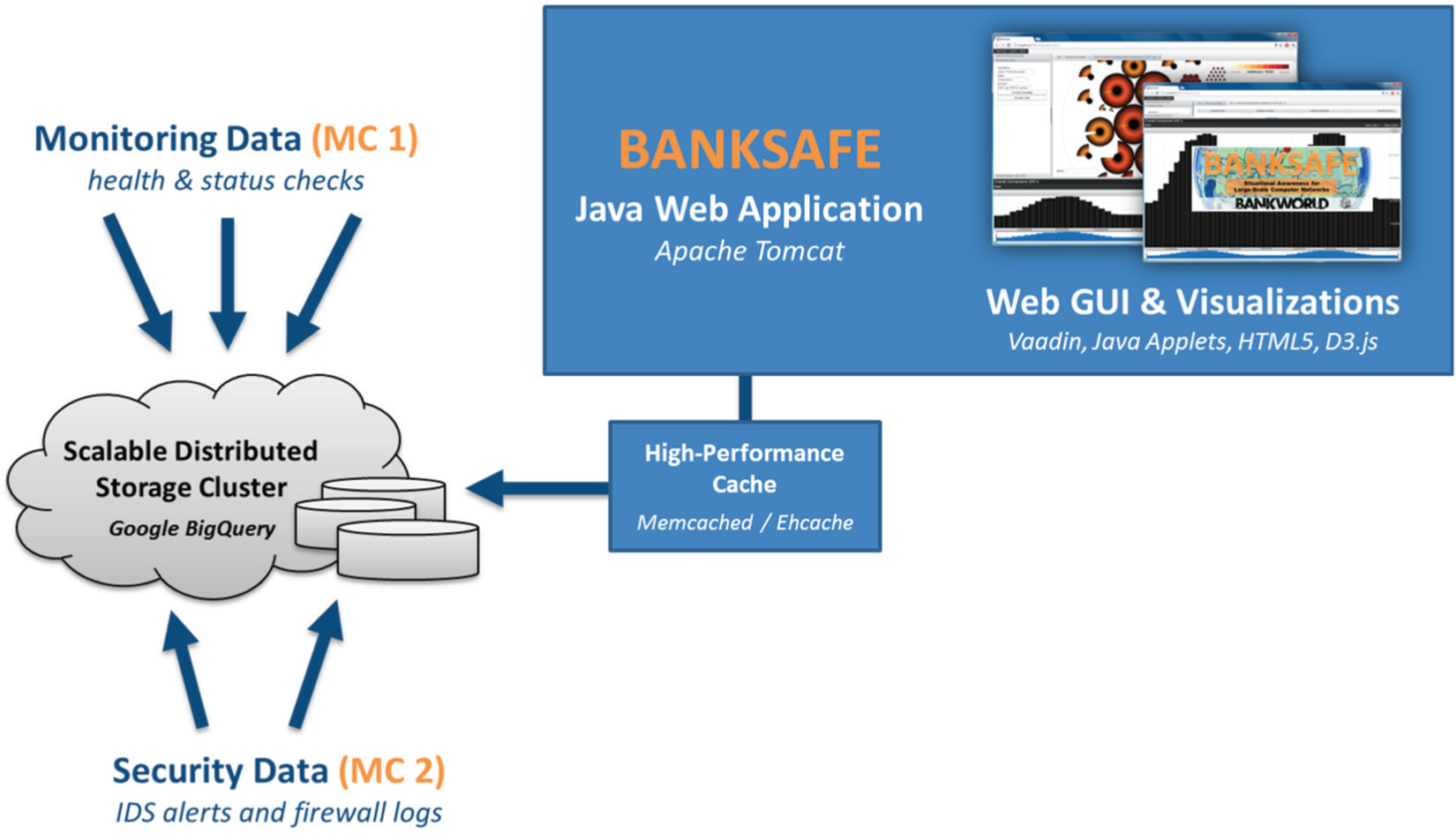
System architecture: monitoring data and security datasets are imported to Google BigQuery and accessed via a caching system by BANKSAFE, which provides GUI and visualizations based on a Java Web Framework.
When the user starts the web application, three views are loaded on the left sidebar (cf. Figure 4). Each view is related to the main tasks for a different type of data. The network health view focuses on monitoring data, the firewall perspective is linked to network traffic, and the intrusion detection view makes use of event-based alerts generated by intrusion detection systems (IDS). Depending on the selected view, there are different configuration settings available. The user can select the data source and time interval and can use these settings to load a suitable visualization module, which is added as tab to the main display. Additionally, a time chart is shown at the bottom of the web application, representing the number of hosts or the number of events over time depending on the selected view. With the help of our web application, it is possible to get a visual overview of heterogeneous datasets to enhance situational awareness.
Case study
The VAST Challenge 2012 did a great job in providing a “big data” reference dataset and a number of tasks for its exploration. In essence, the challenge focuses on the usage of “visual analytics applications for both large-scale situation analysis and cyber security.” In the given scenario, the so-called Bank of Money operates in “BankWorld” and has collected a dataset for two different mini-challenges.
The first mini-challenge provides system health and policy states as regular monitoring data of a million computers updated every 15 min. The second mini-challenge provides security-related IDS alerts and firewall logs of one particular regional office.
While the main task of the first mini-challenge is to create suitable visualizations to provide situational awareness to understand the network health and identify problems of this global large-scale computer network, the second mini-challenge requires the identification of unusual and suspicious events to propose countermeasures. Some details of the following case study have been previously published in a short paper 2 accompanying our challenge submission.
Network health overview
The network analyst needs to have a point-in-time network health overview to be aware of the current situation of the overall network. In the challenge’s dataset, each computer has a policy status ranging from 1 to 5, while 5 is the most critical one, indicating a possible virus infection. The network is structured in classes, regions, and facilities, leading to an organizational hierarchy. Consequently, conveying this hierarchy in the visual representation helps the analyst to detect abnormal behavior.
Figure 3, for example, presents the distribution of policy levels as treemap of about 50 servers in a single selected facility. About 85% of the hosts have a policy status of 1, represented as the most prominent green rectangle, while just a few have higher policy levels, visualized as smaller yellow and red rectangles. This simple but space-filling and scalable representation can give the analyst a point-in-time overview. When this is applied to all regions and facilities in the network, patterns and suspicious regions can be visually identified and interactively explored as seen in Figure 4.
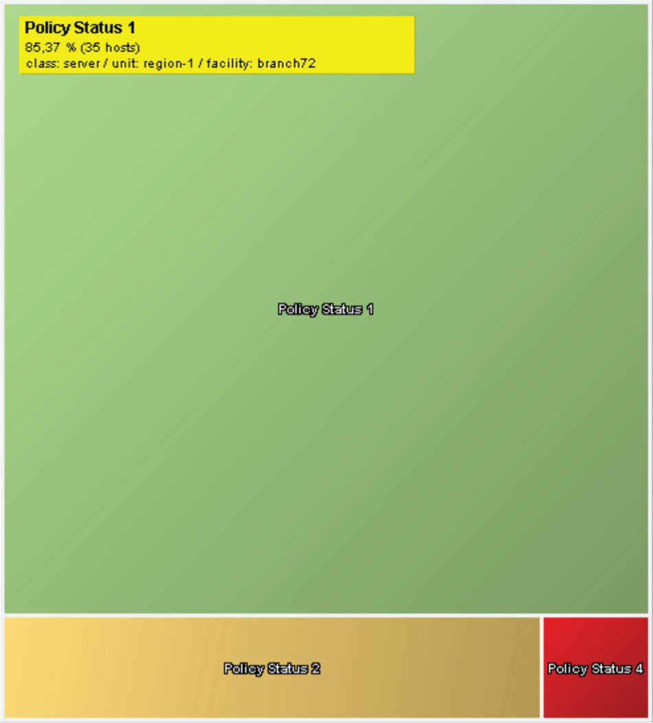
Policy distribution: a treemap visualization showing the percentage of computers with different policy levels in a single facility and region.
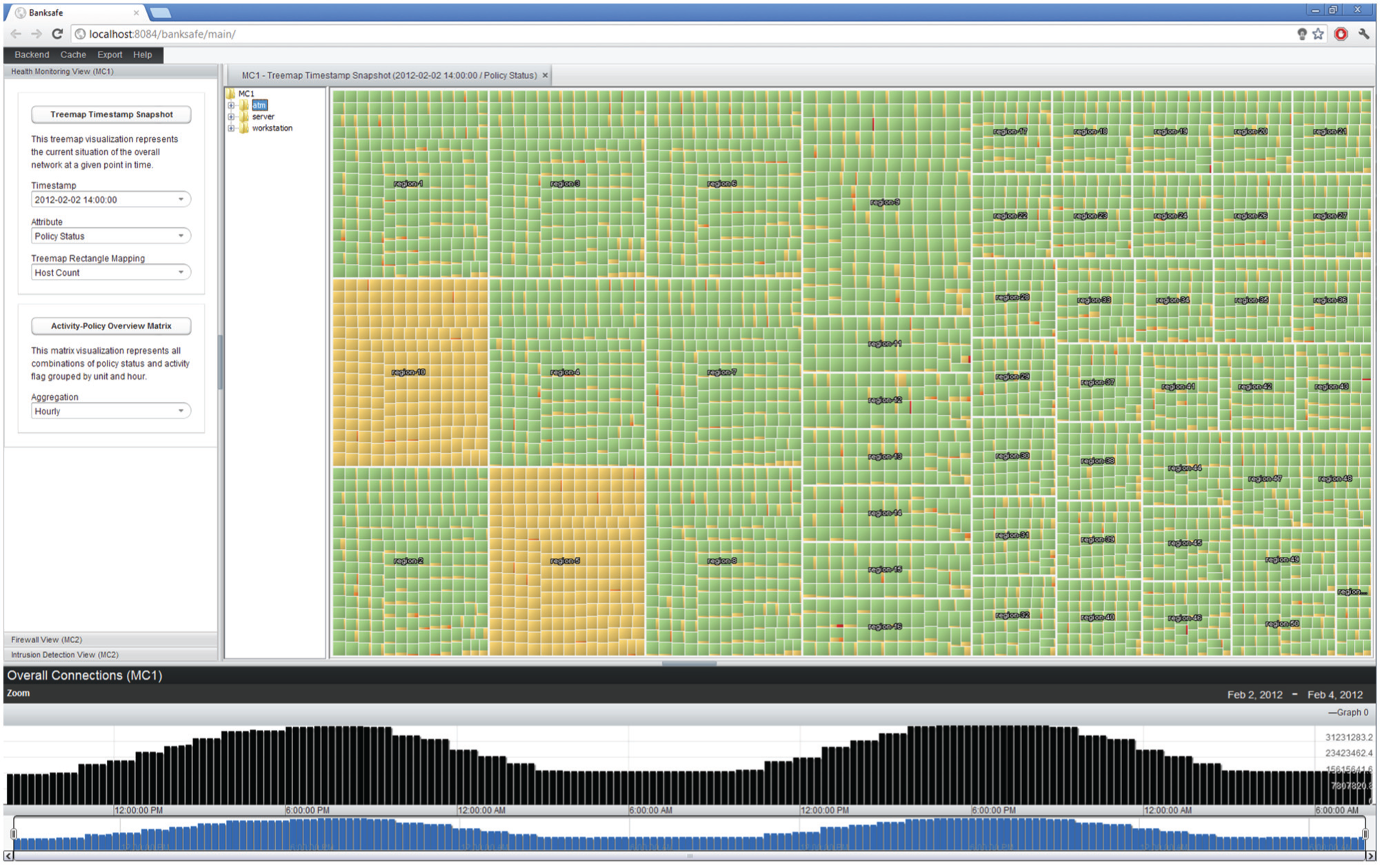
Point-in-time network health overview: the treemap visualization provides an overview for the current state of the whole computer network. The dominance of green rectangles reflects an acceptable overall policy situation.
Based on this visualization, the analyst can understand the current network situation on 2 February 2012 at 14:00. The overall impression is quite acceptable because the green color, representing a good system health status of most machines, is the dominating color in most areas. Further filtering could be used to hide low policy levels and just focus on the infected hosts. However, visualizing the context is important to come to the right conclusions. In this case, for example, region-5 and region-10 visually stick out because here the yellow color is dominating, which means that almost all machines suffer from moderate policy deviations (no green rectangles at all). Showing all regions is helpful for the analyst to judge such findings with respect to the patterns in all other regions, which further supports the conclusion that these regions have very suspicious computer health distributions. At a later point in time, the analyst wants to get another network overview, which is shown in Figure 5. The visual impression is completely different from the previous one. Now, we have many yellow- and even red-colored rectangles. The visualization shows indeed a widespread infection of thousands of computers on 4 February 2012 at 03:30.
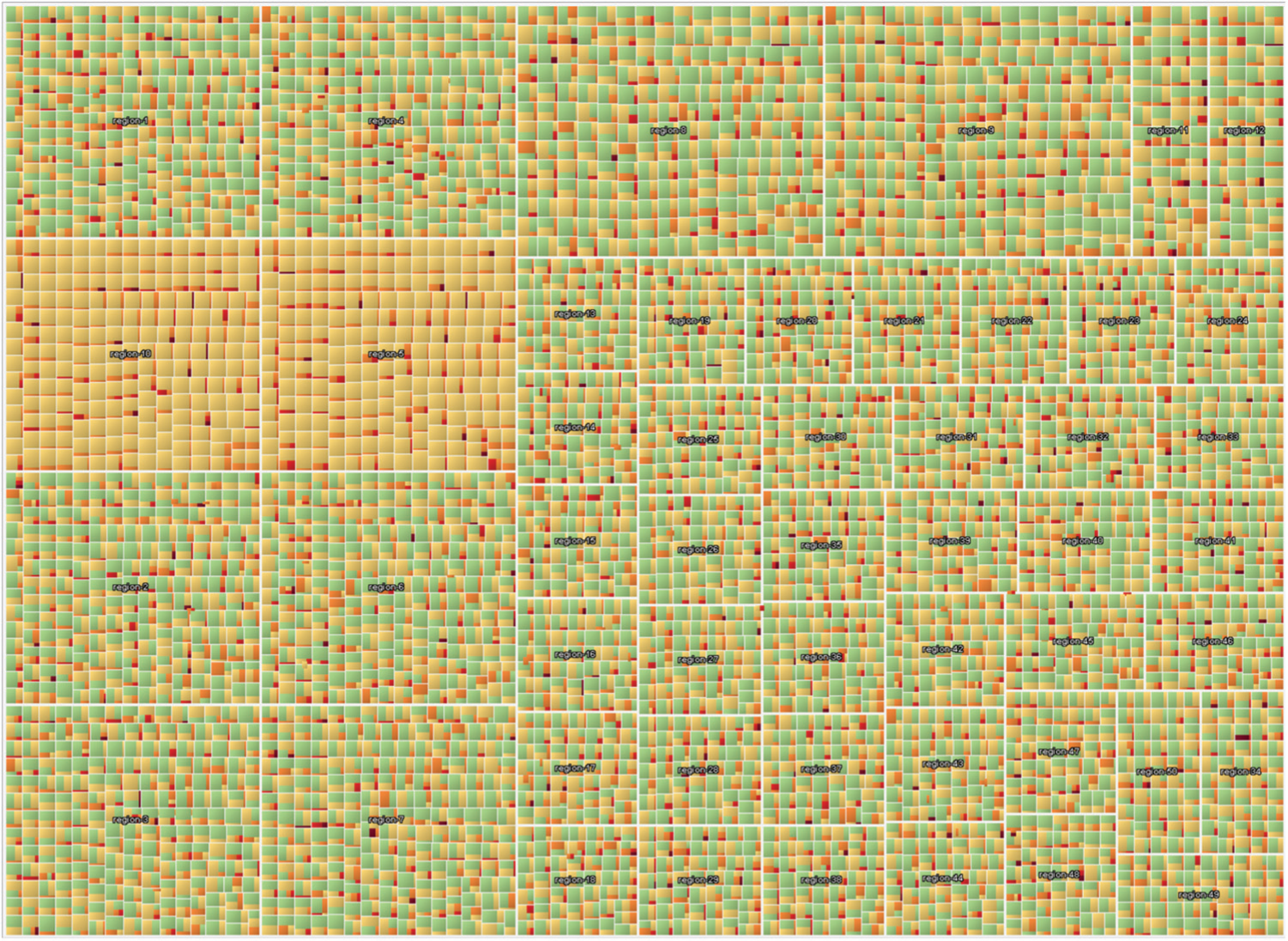
Network health overview: this case represents a widespread computer infection leading to a high percentage of critical policy levels.
Temporal network health
Another common task is the identification of possible trends in the monitoring data. To provide a compact but high-density information display, we implemented the following matrix idea. A single 5 × 5 colored pixel-matrix is depicted in Figure 6. Each pixel represents the number of underlying hosts. The matrix shows all possible combinations of policy level and activity scores of a single region for 1 h. This means that the yellow pixel at the position row 2, column 3 represents the number of hosts having activity flag 2 and policy status 3. To get a temporal overview, these matrices are arranged in a small multiple display where each row represents a single region and the different columns the different hours. Additionally, the ordering of the rows is done according to a multidimensional scaling (MDS) projection of the geographic coordinates of the respective headquarters. Geographically near regions are plotted near to each other. As a result, clear temporal patterns can be seen. With the help of this representation, the general trend of a continuous shift to higher policy levels and more activity became visible. Furthermore, many machines in the East suddenly went off-line, which was another unexpected and very suspicious finding.
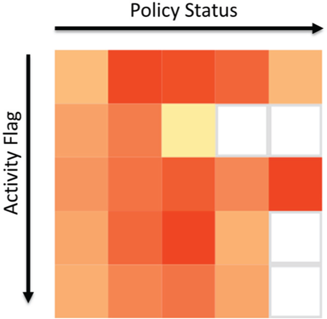
Activity–policy matrix: the colored rectangles represent the number of hosts having a particular activity flag and policy combination. The whole matrix represents 1 h of data for one particular region.
ClockMap for firewall data
To visualize time-series data of many hosts within their respective subnet or organizational hierarchy, we use the ClockMap 18 visualization. This technique employs a circular treemap and embeds circular temporal glyphs using a clock metaphor to represent 24-h time-series data as shown in Figure 7. The whole visualization is mapped to a zoomable user interface and uses semantic zooming combined with aggregation to support the user to smoothly navigate in the nested hierarchy. Zooming out loads the aggregated time-series of whole subnetworks containing many hosts. Zooming in eventually reveals the time-series for single host. In the second mini-challenge, the analyst needs to solve the task to identify suspicious events and connections. Figure 8, for example, shows the traffic of all computers within the network, connecting to an Internet Relay Chat (IRC) service on port 6667/TCP. This technique was also used to identify forbidden Secure Shell (SSH) connections, which were initiated by intruders. Interactively exploring this compact glyph representation is, therefore, capable of answering questions such as the following: Which host has suspicious connections to a specific port? Which subnets are affected? What is the connection pattern? and How much traffic do they produce?
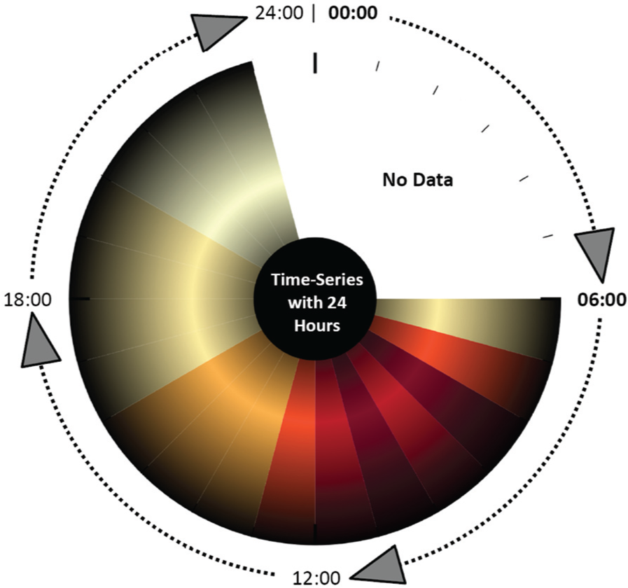
Circular clock glyph: this clock glyph by Fischer et al. 18 represents a 24-h time-series for one host using colored segments to map the time-series value for each hour.

ClockMap visualization: the different colored circles represent local computers establishing connections to IRC servers. The colored segments of each circle represent the number of connections over time.
Relaxed timeline for IDS alerts
To analyze IDS events, the analyst can use the Relaxed IDS Timeline, similar to the one used in the study by Fischer et al. 25 Events are plotted on different timelines. Each timeline contains the events of a particular source IP address. The color is mapped to the event classification attribute, which helps to visually distinguish the event types. Selecting an event presents more information and highlights all other events of this particular type using connecting lines. With the help of this visualization for event data, several hosts producing IRC authorization messages could be identified. It seemed that those machines became suddenly infected and attempted to talk with their bot master over IRC. With the help of BANKSAFE, the administrators can query for the destination IP addresses of the remote IRC servers to block them to prevent further communications. The visual analysis of alerts is superior to the textual analysis of the raw file because a better compact overview is possible to immediately focus on particular patterns and directly investigate reoccurring events using the interactive highlighting support of similar events.
Lessons learned
In the following, we discuss lessons learned during the conceptual design, technology review, and development of BANKSAFE. While some parts discuss specific design decisions, most of them are also helpful and applicable to other visual analytics applications handling large datasets.
Common architectures
A common conceptual architecture for visual analytics would speed up the implementation and integration process for novel applications. However, so far, there is no common development framework for visual analytics applications available taking into account all the required modules for backend systems, analytics, interactions, and visualizations. Research is conducted in this area, however, because of the complexity of the different modules, and the fact that visual analytics is data driven and user driven, it is very hard to design such conceptual architectures. 28 There is some effort, for example, in the VIS-SENSE project, to design a visual analytics framework for security-related datasets.
Commercial platforms
Available open-source or commercial platforms and visual analytics tools did not provide the customizability, flexibility, and scalability 11 needed to properly solve many cyber security tasks. In particular, the vast amount of data, the heterogeneous data sources, and the need to provide a situational awareness overview did not fit available solutions.
Backend service
The lack of suitable common architectures, frameworks, or commercial platforms led us to one of the most critical data-driven questions for any visual analytics application: What backend is most appropriate to solve the particular task? While no database or storage technology is best suited for all use cases, a careful technology review is required. Due to the broad variety of well-established and less mature but still highly efficient and scalable database systems, the selection of an appropriate technology is more complex today than it would have been a few years ago.
While systems making use of MapReduce programming model are great for batch processing of large datasets, such systems alone do not provide low-latency responses. HBase or Storm can be used in combination with Apache Hadoop to provide low-latency queries or real-time analytics. Other products from the field of the so-called NoSQL databases also provide specialized products, which are good and highly scalable alternatives to traditional relational database management systems (RDBMS).
In 2010, Google published the Dremel 29 system, which is a scalable, interactive query system for massive large read-only data. Based on this technology, they offer a service called Google BigQuery, which is quite suitable to do interactive ad hoc queries that are needed as a basis for interactive visual exploration. After careful considerations, we decided to use this external service as default backend for BANKSAFE. Major disadvantages such as the dependency on and the reliability of an external service provider, privacy concerns, and unpredictable running costs were negligible in our case. For other more sensitive projects, the usage of such an external service would be quite questionable. However, there are also open-source projects (e.g. Drill 30 or Impala 31 ) related or similar to the Dremel technology.
Overall, the integration of Google BigQuery as backend provider was quite satisfying, which led us to the conclusion that thinking broad in terms of possible suitable backend technologies really helps to find adequate solutions. Making the right choice in an early stage saves time and effort in the long run. What privacy policies do you need to follow? What are the data characteristics you have? What are the most important tasks and queries? These questions really affect the concrete decision.
Web application frameworks
In our past research work, most of our visual analytics tools have been mostly built as local Java applications. Better support for novel interaction techniques, scalability, performance, better rendering possibilities, and reliability are just a few advantages of local software. However, browsers, web technologies, and web applications have become more and more powerful in recent years. To benefit from available and well-known libraries, we decided to use the Java-based Web Framework Vaadin 26 because of the good documentation, the large community, and the number of available open-source add-on modules.
Query handling
In BANKSAFE, we have different types of queries, some which are cheap database lookups with low latency, others with simple aggregate functions or joins, and long-running aggregation queries to produce different time-series charts for long time periods. To maintain interactivity and reasonable response times, we integrated batch processing background jobs to precalculate complex queries. Often, it is possible and helpful to calculate such statistics or aggregates during data import. However, we made use of an external database service, so we wanted to keep the import as simple as possible. To have most complexity in the visual analytics application itself, we decided to create such aggregates in batch mode or, if needed, on-the-fly, and not in the data import mechanisms.
While querying the database was pretty satisfying in the beginning, we had to deal with several pitfalls. The main use of Google BigQuery is interactive ad hoc queries. It is fast and reliable if you directly type in your query. Then, the analyst is able to directly react to syntax or database errors. However, in our case, we automatically created the appropriate queries based on the different user interactions and provided parameters. This revealed previously unknown situations, and we ran in several design and quota limitations of BigQuery, resulting in failing queries. To still make use of BigQuery, we had to integrate several workarounds.
During testing, for example, we sometimes received “response too large to return” errors. Such behavior was at that point quite unexpected to us. In the meanwhile, Google published an explanation about such situations in their documentation: BigQuery runs analysis on your data using a single-pass through a tree-like structure, with only a single read from disk from each leaf node processing your data. This structure is what makes BigQuery fast, but it also creates challenges when very large amounts of data need to be passed up the tree.
32
This problem is especially challenging because it does also affect intermediate results of subparts of more complex queries. As a workaround, we automatically create more restrictive queries and combine the results afterward.
This experience will affect our development of future visual analytics applications, to more carefully construct automatically created queries and put more emphasis on a better query and job management. Long-running queries should be reflected as currently running jobs in the user interface to give the user more feedback on problematic queries and provide means to cancel, restart, or modify such unpredictable long-running queries.
Caching
When using external pay-per-query databases, you definitely want to reduce the number of redundant queries to the service. Most queries in BANKSAFE are very specific and result in medium-sized responses because of the usage of aggregation for overview visualization and filtering parameters for drill-down operations. Therefore, it is possible to reduce costs using server-side caching mechanisms to prevent redundant remote queries of the users. In the beginning, we just made use of Memcached, 33 which is a popular generic, open-source, high-performance, and distributed memory object caching system. All query results were cached in memory to have the most frequent query results always available. This solution can be easily integrated into any application.
However, it turned out that in practice, we need more control about the cache, especially with respect to persistence after server reloads. BANKSAFE uses Java technology on the server side anyway, so we decided to integrate Ehcache, 34 which is a Java-based caching system providing even data persistence and good reliability. This really boosted the interactive performance of our application, without much effort, just by reducing the database querying latency for many redundant queries.
Scalable visualizations
To successfully analyze the datasets, we pursued different directions in parallel. On the one hand, we not only discussed and implemented specific data- and task-dependent visualizations (e.g. activity–policy matrix, treemap visualization for regional distributions) but we also tried to migrate and implement other published visualizations (e.g. ClockMap, 18 Relaxed IDS Timeline 25 ). While the ClockMap representation, originally designed for network traffic in the VIS-SENSE project, could directly be applied to the firewall data, we invested time in order to reimplement this Java-based application as native web visualization using D3.js. However, this was not successful because of performance issues with Scalable Vector Graphics (SVG) rendering for the number of objects we wanted to visualize. Eventually, we had to integrate this visualization as old-fashioned Java Applet, to achieve the needed rendering performance. In contrast to this, the activity–policy matrix was successfully implemented using the D3.js framework. Consequently, knowing the limitations of a given web technology is crucial to technically implement smooth and interactive visualizations. Making use of HTML5 canvas or WebGL directly would have been better choices to implement such complex visualizations for the web.
Combining technologies
In BANKSAFE, we combined different technologies and programming languages in the different visualization views. We used Java Applets but also D3.js with JavaScript. However, it is obvious that linking the different visualizations using different technologies is much harder because workarounds are needed. So, this is really a trade-off between just reusing existing visualizations and reimplementing some of them to have the benefits of better integration and interconnectivity of all views.
Conclusion
In this article, we presented BANKSAFE, a visual analytics application for big data. While our system relies on big data technology for the backend, the frontend is composed of multiple visualizations: a treemap to show the policy or activity status of all available hosts at a particular time snapshot, a hierarchical circular treemap to show host activity over time, small multiple matrices for a combined analysis of changes in policy and activity status, and a visual timeline to explore IDS alerts. These visualizations help to identify trends, patterns, and suspicious events in both datasets of the VAST Challenge 2012. Part of our contribution is that we share our hands on experiences of how to apply big data technology in a visual analytics application. We hope that this is to some degree transferable not only to similar network security applications but also to other domains with big data challenges.
In the future, we plan to continue research in the integration of novel backend systems, continue to work on more general visual analytics frameworks, and further investigate the better usage of web technologies to implement scalable and novel visual analytics application.
Footnotes
Funding
The research leading to these results has received funding from the European Commission’s Seventh Framework Programme (FP7/2007-2013) under grant agreement no. 257495—“Visual Analytic Representation of Large Datasets for Enhancing Network Security” (VIS-SENSE)—and was partially supported by the DFG Priority Program 1335 “Scalable Visual Analytics.”