
Abstract
This article proposes a semi-interactive system for visual data exploration using an iterative clustering that combines an automatic approach with an interactive one. We propose a framework to improve the interactivity between the user and the data analysis process, allowing him or her to participate actively in the iterative clustering tasks using a two-dimensional projection. Defining a cluster by its seed (center) and its limit, the proposed approach allows the user to modify the automated values or to define new seeds and the associated cluster limit himself or herself. The user can perform the clustering according to his or her visual perception manually and can also choose to let the automated approach find optimal seeds and then interact with the process to iterate the clustering process according to his or her visual perception and domain knowledge. Most of the evaluation criteria for clustering evaluate the complete clustering and not each cluster separately. In this article, we propose to adapt evaluation criteria to single clusters, allowing the users to evaluate their own clusters and perform the clustering iteratively until satisfaction. To evaluate our proposed approach, we conduct a user evaluation, where the users are asked to perform clustering interactively according to their visual perception and with the semi-interactive one. We also compare the obtained results with those of automated clustering. The quantitative results have shown that the cooperative approach can improve the clustering results in terms of accuracy.
Keywords
Introduction
The human ability to model the visual space is limited to just three dimensions. Data dimensionality is a major limiting factor; finding relations, patterns, and trends over numerous dimensions is, in fact, difficult, because the projection of n-dimensional (nD) objects over two-dimensional (2D) spaces necessarily carries some form of information loss. Techniques like principal component analysis (PCA), 1 multidimensional scaling (MDS), 2 and stochastic neighbor embedding (t-SNE) 3 offer traditional solutions by creating data embedding that try as much as possible to preserve distances in the original multidimensional space in the two-dimensional space projection.
Having a 2D data projection, the user expects to have structured datasets from which he or she can conclude some clustering results. The clustering term refers to the process of grouping similar objects, where similarity is measured by a metric function. Clustering methods have been studied in different research fields such as statistics, pattern recognition, machine learning, information visualization, and data mining. Given a good 2D projection with a clustering data structure, the clustering process is not complete until it is evaluated, validated, and accepted by the user. The most intuitive method for validating clusters can be visualization. Visualization can improve the understanding of the clustering structure. Visual representations can be very powerful in revealing trends, highlighting outliers, and showing clusters.4,5
Furthermore, there exists a variety of criteria to evaluate the clustering results. Halkidi et al. 6 presented a survey of the most known validity criteria available in literature, classified in three categories (external, internal, and relative). Moreover, they discussed some of these criteria’s representative validity indices, along with sample experimental evaluation. Most of the evaluation criteria for clustering evaluate the complete clustering and not each cluster separately. 7 Only a few criteria exist; the Wemmert–Gançarski compactness criterion 8 gives an evaluation for each cluster, but this evaluation is based on the position of other cluster centers. The intraclass inertia also provides an evaluation for each cluster but is biased by the cluster size and the variance on the dimensions. Two new criteria are proposed in Boudjeloud-Assala and Blansché. 9 These criteria are applied to evaluate single extracted clusters through an iterative approach for a subspace clustering. For our work, we define a cluster by its seed (center) and its limit, and we propose to use these criteria 9 to evaluate the clusters that are interactively and semi-interactively fixed by the user. We also compare the obtained results with those of the automated clustering method.
The use of clustering methods is generally static in nature since the user loads a dataset, selects a few parameters, runs a clustering algorithm, and then visualizes or views the results. The process generally ends here; clustering is used simply to analyze the data, not to explore it. One possible solution is to integrate visualization tools and combine the two processes together, which means using the same model for clustering and visualization. This leads us to the necessity of interactive visual clustering (IVC). IVC has demonstrated great advantage in data mining since it allows the user to participate in the clustering process by providing the domain knowledge and by making better decisions based on his or her visual perception. 10
Moreover, with the use of today’s technology for data generation, collection, and storage, typical datasets have a large size. Due to the users’ need for tools that have instantaneous reactivity, we are forced to use an efficient visual clustering exploration strategy. As recommended in Keim et al., 10 we believe that if we adapt the visualization environment and combine it with the clustering approach, the global approach can be used to provide a very natural way for users to explore large datasets. For example, the user can compare clusters through different criteria, create new clusters using a few dimensions, completely re-cluster the set based on a sampling dataset, interact with the tool to cluster data iteratively without a prior fixed number of clusters, and so on.
In this article, we propose a semi-IVC method to improve the interactivity between the user and the data mining process, allowing him or her to actively participate in the iterative clustering process. The method combines an automatic approach with interactive tools to find optimal clusters and visualize them in a 2D projection. Using these cooperative approaches, we can quickly explore moderately large datasets and improve the clustering results in term of accuracy.
The rest of this article is organized as follows. The related work is explored in section “Related work.” The proposed semi-visual exploration tool with the optimal search approach is discussed in section “Semi-interactive visual exploration system.” We explain and comment our usage scenarios in sections “Usage scenarios” and “Discussion.” Finally, we conclude in section “Conclusion.”
Related work
We propose, in this article, a framework allowing the user to participate in the clustering process by providing the domain knowledge and making better decisions based on his or her visual perception. Even if it is not exactly the case, this process can be considered as semi-supervised clustering because we use the visual interactivity. To set our work in context, we try to present as exhaustively as possible a description of visual data mining methods and semi-supervised clustering algorithms.
Visual data mining
When it comes to the knowledge discovery process, there are at least two ways to combine automatic methods with interactive visual methods. It is possible to use the visualization methods in the preprocessing of automatic algorithms or in the post-processing of the same algorithms.
In preprocessing data, the hidden concepts can be acquired visually from very large amounts of the data information (patterns, trends, etc.). One can find trends or correlations in the data, for example, by viewing the initial data. This step can also guide the user in selecting the most appropriate mining algorithms or their parameters.
Post-processing visualization methods are mostly used to interpret and evaluate results through graphical representations that are more accessible than columns of numbers or a set of rules.
Another possibility to combine or collaborate automatic methods with interactive visual methods is to replace the automatic algorithm data mining process with a visual interactive algorithm. This is called visual data mining, which differs from information visualization. These various interactions illustrate the benefits of combining automatic methods with interactive visual methods. The understanding of the results will be increased and the accuracy of the automatic algorithms can be easily improved.
Such systems, in which the visual methods totally replace the automatic ones, are somewhat more rare. For example, users can actively participate in the construction of the decision trees, such as in perception-based classification (PBC), 11 decision tree visualization (DTViz), 12 or Interactive Construction of Decision Tree (CIAD). 13 In the last one, the authors presented two graphical interactive decision tree construction algorithms able to deal with (usual) either continuous data or interval and taxonomical data.
Da Costa and Venturini 14 presented an interactive method for numeric or symbolic data visualization that allows a domain expert to extract useful knowledge and information. They proposed an approach based on points of interest (POIs). The POIs are located on a circle, and the data are displayed within this circle according to their similarities with these POIs. Some interactive actions are possible, such as selecting, zooming, and dynamical changing of the POIs.
Another approach developed by Desjardins et al. 15 was IVC, in which the user can interactively explore relational datasets, in order to produce a clustering that is appropriate for their tasks and interests. This approach combines spring-embedded graph layout techniques with user interaction and constrained clustering. The user can then move groups of instances around on the screen in order to form initial clusters. A constrained clustering algorithm is applied to generate clusters that combine the attribute information with the constraints implied by the instances that have been displaced.
Some other techniques are proposed using parallel coordinate visualization tools. Guo et al. 16 proposed an interactive clustering for high-dimensional data in parallel coordinates. Their interactive scheme allows users to directly apply attractive and repulsive operators to regions of interests, taking advantage of an electricity interaction metaphor, for clutter reduction and cluster detection. The authors proposed to the user to interact directly with the parallel coordinate plots and to provide great flexibility in exploring and revealing underlying patterns. They also supply the user with a graph indicating the logical relationship between clusters.
All of these methods try to get the user more involved in the data mining process using interactivity. Visual data mining can also be defined using the same automatic approach as in data mining or machine learning process, together with visualization and interactivity to let the user participate actively in the knowledge extraction or the data mining process.
Some of these systems allow the user to interact with the clustering process as it occurs through adding some constraints. For example, Looney’s 17 approach enables the user to eliminate or merge clusters at various steps of the algorithm. The users can also provide their preference to the system, as in Bruneau and Otjacques’ 18 proposed approach, by indicating pairs of elements they would like to see close or far apart. The approach combines a 2D projection with a clustering algorithm that operates on these projected data. The users can interact directly through the 2D representation, by providing examples according to their expert ground truth and adding some constraints.
Rinzivillo et al. 19 proposed an interactive clustering method for large spatio-temporal data. Initially, a density-based clustering algorithm is applied to a subset of the data objects with an appropriate distance function. After that, for each cluster prototypes that are selected using classifiers, the user can refine classifiers by adapting the initial clusters. For example, sub-clusters can be excluded or included into new clusters. The authors proposed a visual representation of the clusters and sub-clusters, which allows the user to interact with the tool.
Martin et al. 20 proposed an approach where a user can interactively add some constraints to get the data objects’ position in the projected space. These constraints will be taken into account in the next iteration of the dimensionality reduction. They assumed that the user can modify the similarity of objects.
Another concrete cooperation between automatic algorithms, interactive algorithms, and visualization methods is the proposed tools of Poulet 21 to optimize the interactive split performed in the current tree node or to compute the best split in an automatic mode. It allows the user to be helped by an optimization method based on a support vector machine. Also, Zhou et al. 22 presented a framework to reduce edge clutter to improve visual clustering for parallel coordinates. They used an optimization method applied to the configuration of the curved edges by minimizing the energy of the system through linear programming.
To explore high-dimensional datasets, interactivity is widely used. For example, Boudjeloud-Assala 23 proposed a cooperation between automatic algorithms, interactive algorithms, and visualization tools through an evolutionary algorithm. This evolutionary algorithm is used to obtain optimal dimension subsets which represent the original dataset without losing information for unsupervised mode (clustering or outlier detection). The user can actively participate in evolutionary algorithm searching through setting his or her own preferences. This cooperation improves the evolutionary algorithm convergence.
Johansson and Johansson 24 introduced a system for dimensionality reduction by combining user-defined quality metrics using weight functions to preserve as many important structures as possible. The system aims at the effective visualization and exploration of structures within large multivariate datasets and provides enhancement for various structures by supplying a range of automatic variable orderings.
Among the most promising work in this area is the work of Tatu et al. 25 in 2009, in which they proposed automatic analysis methods to extract potentially relevant visual structures from a set of visualization candidates. They proposed to rank visualizations based on features, according a specified user task. This approach provides the user with a manageable number of potentially useful visualization candidates, which can be used as a starting point for interactive data analysis.
In 2012, Tatu et al. 26 proposed another method for the visual analysis of high-dimensional data in which they employed an interest-guided subspace search algorithm to detect a candidate set of subspaces. They introduced subspace similarity functions and provide navigation to interactively explore large subspace sets. This approach allows us to compare and relay subspaces with respect to involved dimensions and clusters of objects. The main application of the methods presented above is to handle high-dimensional data, using classical visualization methods such as parallel coordinates and scatter plot matrices.
This article presents a cooperative approach that combines iterative clustering with interactivity to deal with moderately large datasets. We use visual perception to interact with clustering algorithm and automatic evaluation unlike the existing semi-interactive visual algorithms, presented before, which use the ground truth by adding some constraints or enabling to provide the user preference to the system. Our objective is to use the visual perception to identify potential cluster seeds and limits. The user can actively participate and construct iteratively the clustering driven by the automatic evaluation through interactivity. The automatic approach can help the user trying to find the optimal cluster seeds and the optimal cluster limits according to the evaluation criteria. To deal with high-dimensional datasets, we propose to visualize and interact with datasets using a 2D projection such as PCA, t-SNE, or MDS (Figure 2(a)).
Semi-supervised clustering
In the previous section, we have seen the various ways of interacting and adding some constraints to clustering algorithms visually; this field is similar to semi-supervised clustering. A number of algorithms have been proposed for enhancing clustering quality by employing such supervision. Some methods use constraints to either modify the objective function or learn the distance measure.
In the following, we explain the process of semi-supervised clustering through the k-means algorithm. 27 A common form of clustering is to partition the dataset into homogeneous clusters such as members of the same cluster are similar and members of distinct clusters are dissimilar.
The k-means algorithm is a very popular partitioning approach in clustering problems. The k-means algorithm strongly depends on the number of clusters k and on initialization seeds. First, k initial cluster centers are defined. An object oi is assigned to the cluster Cj having a center
To improve the quality of the results by integrating knowledge to the k-means algorithms, semi-supervised clustering methods have been introduced. These algorithms use a small set of labeled data (called seeds) to guide the clustering process. Generally, there exists two types of semi-supervised scenarios, in which (limited) supervision is provided either as a partially labeled dataset or in the form of equivalence constraints.
The seed-based k-means algorithm has been proposed by Basu et al. 28 They proposed two variants of semi-supervised k-means clustering, seed k-means and constraint k-means. 28 In seed k-means, the labeled data are used to compute an initial center for each cluster. Then, a traditional k-means is applied on the dataset without any further use of the labeled data, while in constraint k-means, the information is used as constraints, so that the labeled data cannot be removed from the cluster.
The main problem in this context is to determine how to choose the most appropriate seeds for the algorithm. The second difficult task associated with k-means algorithm is determining the optimal cluster number (k). The number of ways in which a set of n objects can be partitioned into k nonempty clusters is given by kn/k!.
Some research has shown that the performance of unsupervised clustering algorithms is improved with limited supervision through labeled data or constraints. Constraint-based methods rely on user-provided labels or constraints to guide the algorithm toward a more appropriate data clustering. This is done by modifying the objective function for evaluating clusterings, 29 enforcing constraints during the clustering process, 30 or initializing and constraining the clustering process based on labeled examples. 28
Basu et al. 31 proposed a probabilistic model for semi-supervised clustering based on hidden Markov random fields (HMRFs). The model generalizes a previous approach that combines constraints and Euclidean distance learning and allows the use of a broad range of clustering distortion measures. The authors presented an algorithm that performs partitional semi-supervised clustering of data by minimizing an objective function derived from the posterior energy of the HMRF model.
Some other methods are proposed for semi-supervised clustering, based on adaptive distance metrics, including string-edit distance trained using expectation maximization (EM), 32 Euclidean distance modified by the shortest path algorithm, 33 or Mahalanobis distances trained using convex optimization. 34
Defining a cluster by its seed (center) and its limit, the proposed approach in this article allows the user to modify the automated values of the limit or to define new seeds and the associated cluster limit himself or herself. The user can perform the clustering process manually and can also choose to let the automated approach find optimal seeds and then interact with the iterative process to run a new iteration or stop the clustering process. Our objective is to improve the visual interactivity between the user and the iterative clustering process, allowing him or her to participate actively and visually in the clustering tasks using a 2D projection (as in Figure 1(a)).

Framework of the semi-interactive visual exploration system: (a) the workflow of the visual exploration system, blocks with gray background represent parts controlled by the user. The user decides whether he or she wants to process himself or herself or let the automated approach cluster the data. The approach also provides a possibility to decide which dimensions (attributes) to keep and to only process on a part of the dataset, which dimensionality reduction methods to use, and which cluster construction methods to apply on the selected cluster. (b) The user can interact actively with the exploration process. (c) The exploration system interface (iterative cluster selection, dimension selection, 2D projection, evaluation criterion histogram, extracted cluster descriptions, cursor to fix the cluster limit value, etc.).
Semi-interactive visual exploration system
We propose an original semi-interactive exploration and clustering system, which allows the user to participate actively in the clustering tasks using a 2D projection. The proposed approach allows the user to modify the automated values or to define new seeds and the associated cluster limit himself or herself. The user can perform the clustering manually and can also choose to let the automated approach find optimal seeds and then interact with the iterative process to improve the clustering results according to his or her visual perception and domain knowledge. The proposed system is summarized by the framework in Figure 1(a).
For example, when a user is given a dataset to explore, he or she will first choose the 2D projection from MDS, t-SNE, or PCA (Figure 2(a)) or he or she will simply choose the 2D scatter plot (2D-SP). The user can then select the attributes (dimensions) for the data projection (Figure 2(b)) and/or select parts of the data by zooming and choose to process only a subset of the data objects (Figure 2(c)). The user can interact with the tool to cluster data iteratively without a prior set number of clusters. Defining a cluster by its seed (center) and its limit, the proposed approach allows the user to modify the automated values or to define new seeds and the associated cluster limit himself or herself (Figure 2(d)). The user can then perform the clustering manually and can also choose to let the automated approach find optimal seeds (Auto compute button in Figure 2) and/or interact with the iterative process (Extract another cluster button in Figure 2) in order to improve his or her visual clustering perception.
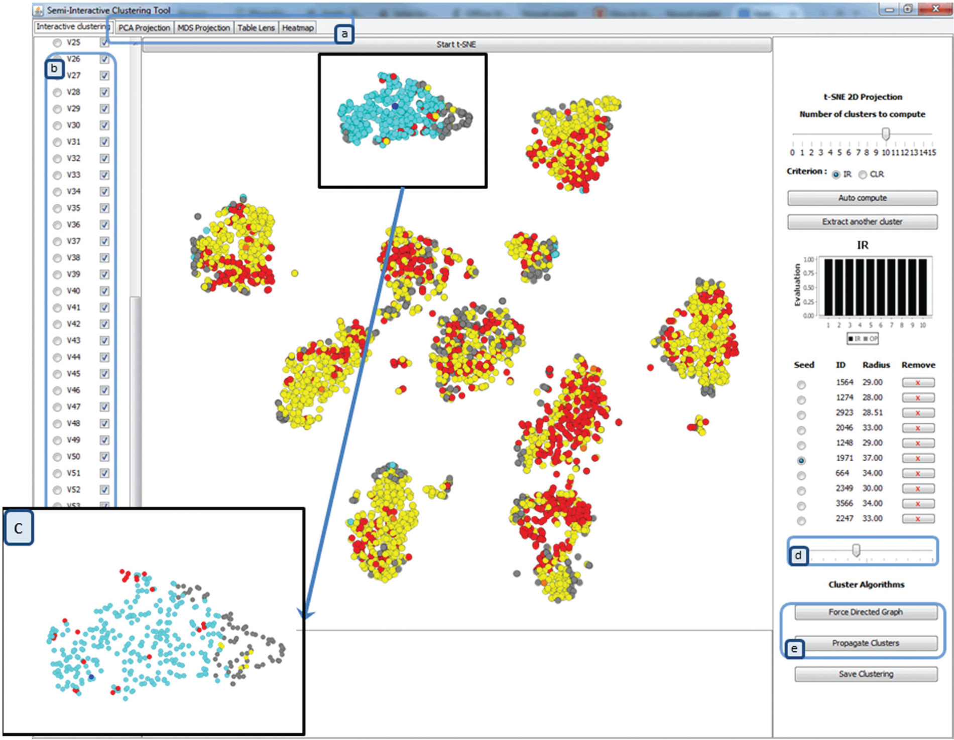
The tool interface: projected dataset with t-SNE: in yellow the previous extracted clusters, with their seeds indicated in orange; in blue the actual activated cluster, with its seed indicated in dark blue; in red the data points that are in two or more clusters; and in gray the data points that are not clustered. (a) Possibility to choose different visualization tools, (b) dimension selection, (c) zooming on a part on data, (d) moving on the cluster limit, and (e) applying appropriate algorithm.
According to his or her visual perception and domain knowledge, the user can apply a force-directed graph or propagation algorithm to the selected seed to visually cluster the data (Figure 2(e)). As we can see in Figure 3, where a dataset consisted of two spirals is projected, we first apply our automated approach (Figure 3(a)) and then we use a propagation algorithm to cluster the whole dataset (Figure 3(b)). For such datasets, we cannot use a force-directed graph, so the method lets the user choose an appropriate algorithm according to his or her visual perception.
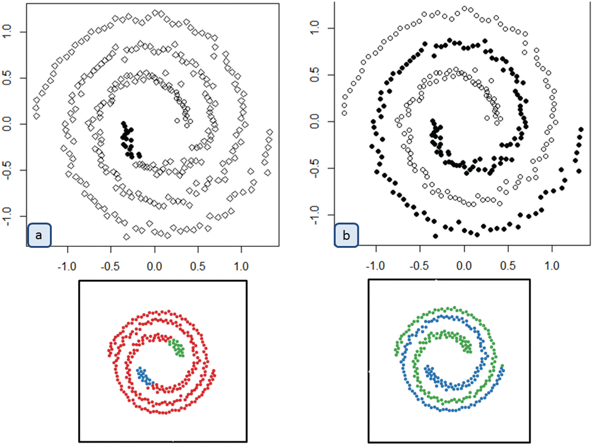
Example with propagation method: (a) automated approach and (b) propagation algorithm.
Optimal approach
The proposed approach combines the interactive search and an optimal search, to perform clustering. The interactive manner is done with mouse button click and cursor moving (the selected seed is indicated in darker blue in Figure 2(c)). The optimal search is done using evaluation criteria for single clusters, allowing the user to evaluate his or her own clusters. However, as each cluster is extracted independently, we need to know whether the extracted clusters are different (different subset of objects). To ensure this, we proposed another penalty criteria for overlapping cluster which is simply added to the previous criteria (the data items that are in the overlapped area are indicated in red in Figure 2).
Cluster evaluation
Most of the evaluation criteria for clustering evaluate the complete clustering and not each cluster separately. Only a few criteria exist, like Wemmert–Gançarski’s compactness criterion 8 which gives an evaluation for each cluster, but this evaluation is based on the position of other cluster centers. As we only define a cluster by its seed and its limit, we cannot use such a criterion. The intraclass inertia also provides an evaluation for each cluster but is biased by the cluster size and the variance on the dimensions.
We present in this article two new criteria, developed to evaluate single extracted clusters through an iterative approach for a subspace clustering. 9 The first criterion is the cluster limit ratio (CLR), which represents the ratio between the distance (d(,)) of the last object (o) of the extracted cluster and the first object outside the cluster (cj is the center of the cluster Cj)
The second proposed evaluation criterion is the inertia ratio (IR), which represents the ratio between intraclass inertia and the total inertia of the data, normalized by the number of objects in the extracted cluster and the whole dataset

The proposed criteria provide an evaluation of the compactness of one cluster. However, as each cluster is extracted independently, we need to make sure that the extracted clusters are different (different subset of objects). To ensure they are, we proposed to add a penalty for overlapping cluster OP, defined as follows
where λ ≥ 0 is a weight chosen for the penalty depending on the significance one gives to overlapping clusters. This penalty is simply added to the previous criteria CLR and IR.
Find cluster limit
Given an object that can represent potential cluster seed, the proposed algorithm first detects the limit of the cluster resulting from this seed. We look for the set of data points (objects) that are located in the neighborhood of the seed. To do this, we compute the distance between all the data points and the cluster seed and order them from the closest object to the farthest. Then, we try to find an abrupt distance increase that will indicate the cluster limit. We choose to use the peak detection method presented by Palshikar 35 applied to differential distances (see Palshikar 35 for more details concerning the algorithm). Other cluster limit detection methods might be used, but this one is fast and gives the algorithm a complexity of O(n × d), where n is the number of data points and d is the number of dimensions.
Implementation details
Our semi-interactive visual exploration approach can be implemented in many different ways. Our current method uses classical PCA, 1 MDS, 2 and t-SNE 3 to calculate the dimension projection (Figure 2(a)). The approach also provides a possibility for the user to decide which dimensions to keep (Figure 2(b)) and what dimensionality reduction methods to use. In our case, we evaluate the interactive clustering with the t-SNE projection using all dimensions (all boxes are checked in Figure 2(b), for the corresponding dimensions).
The search for an optimal solution can be done through exhaustive search, random search, or through using an evolutionary search. For the method proposed in this article, we apply the exhaustive search to find optimal seeds. To compute the different criteria, we need to have the objects in the cluster. To find them, we use the cluster limit approach (section “Find cluster limit”).
For data objects, we set the distance function as Euclidean distance. Our approach is not limited to this metric; an Euclidean distance is adapted to detect compact and hyperspherical clusters. To detect other cluster forms, for example, hyperellipsoidal clusters, we can choose the Mahalanobis distance. All these measures and evaluation criteria are computed in the original space (or in selected dimensions (Figure 2(b))) and then projected in the 2D space (with t-SNE in our example).
We use the force-directed graph to perform the automatic clustering of data objects applied to the cluster seed. In practice, the analyst can also choose another appropriate algorithm for the datasets under analysis (e.g. algorithm propagation (Figure 3)).
Qualitative evaluation
We conducted a laboratory study to assess how well people can use our tool to explore, make sense, and discover clusters in datasets, as well as to detect any usability issues to improve the system. The datasets used in this evaluation are from the University of California at Irvine (UCI) machine learning benchmark repository 36 (described in Table 1). These datasets are moderately large (1000–10,000 instances) multidimensional (10–100 dimensions) datasets.
Datasets.
For this qualitative evaluation, we recruited four participants, from our laboratory team. The experiment was conducted on a desktop which was running on Windows 7. The participants used a mouse to interact with our proposed tool.
Whatever the dataset size, the tool reactivity is instantaneous. In fact, one of the first user’s expectations is for the tool to respond quickly; thus, the user does not get tired.
In the first version of our tool, all the activated data points are indicated in red, and the data objects that do not belong to clusters are indicated in gray (Figures 5 and 6).
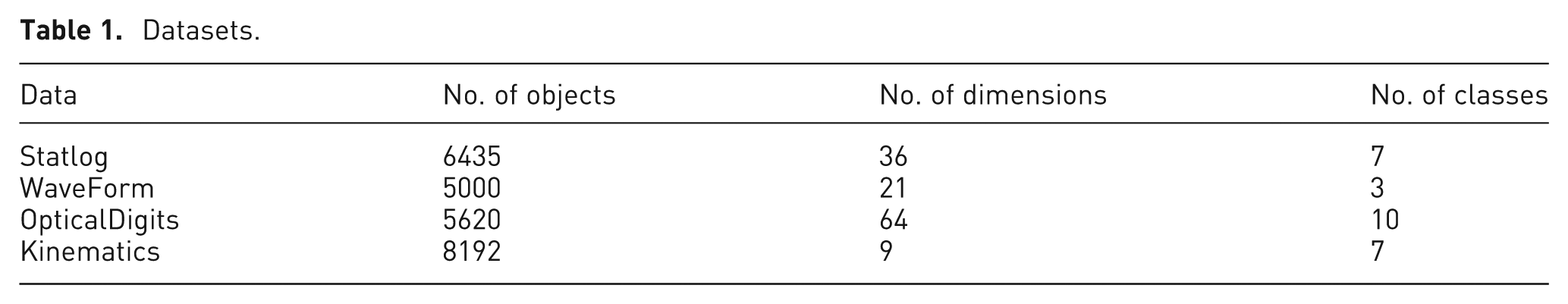
As we can see in Figure 2 for OpticalDigits dataset and in Figure 4(a)–(c) for the WaveForm, Statlog, and Kinematic datasets, respectively, this experiment allowed to improve our tool indicating the following:
Yellow: previously extracted clusters
Orange: seeds of previous extracted clusters
Blue: currently activated cluster
Dark blue: seed of currently activated cluster
Red: the data points that belong to two or more clusters
Gray: the data points that are not clustered.
The datasets exploration: (a) WaveForm, (b) Statlog, and (c) Kinematic datasets.
Based on the experiments conducted in this study with datasets (described in Table 1) and our own experience and goal, we develop a list of user scenarios to perform the quantitative evaluation for our proposed tool.
Usage scenarios
In the following, we describe a brief example of a possible use of our system through three scenarios with a WaveForm dataset (5000 objects, 21 dimensions). The WaveForm dataset is composed of 3 wave classes, with 21 dimensions (attributes), all of which include noise. Each class is generated from a combination of two of the three “base” waves; each instance is generated with added noise (mean 0, variance 1) in each dimension. We apply our tool to the unsupervised exploration process, so the real classes are not visualized. The objective is to find as good as possible the real known classes, according to the different scenarios. We compare different results with the real known labeled objects using four clustering evaluation criteria.
Scenario 1: purely visual interactive
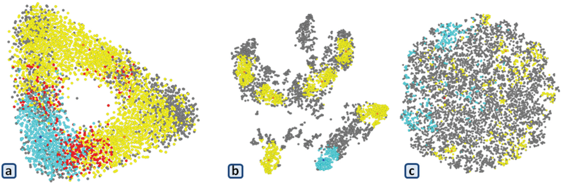
The first scenario consists in testing the different interaction possibilities with the projected dataset according to the clustering tasks. Ultimately, we want to obtain clusters or clustering results only through the interactive process. We first describe the interaction with the cluster seed selection and limit detection. Using t-SNE, the preprocessed WaveForm dataset projection has a triangular form. In the main data item plot, for example (Figure 5(a)), the user can see three or six clusters. He or she fixes three potential seeds to the axis of the triangular form of the data projection. The three seeds interactively selected are in different colors to track them during the exploration process (indicated in blue in Figure 5(b)). For each cluster, we can interactively fix the same limit value or different values. The user fixes one value and applies the force-directed graph directly to the selected clusters (Figure 5(c)). The results are not satisfying, so the user changes the seed selection and fixes three potential seeds to the angles of the triangular form of the data projection (Figure 5(d)). As we can see in Figure 5(e), the user fixes the cluster limit and applies the force-directed graph. In Figure 5(f), the user moves on the cluster limits: large value (Figure 5(f1)) and small value (Figure 5(f2)). Some iterations of the force-directed graph algorithm are then applied only on the data closest to the seed according to the seated limit, the clutter is, then minimizing. We see in gray the data objects that are not selected from the various clusters by the method. The user can also fix six potential centers at the angles and axes of the triangular form of the data projection (Figure 5(g)). The user applies the force-directed graph to the selected clusters (Figure 5(h)), where the results cannot satisfy the user. The user can play around with the data to obtain satisfaction and can finally save the clustering results.
Scenario 1: purely visual interactive method: (a) projected WaveForm dataset with t-SNE 2D projection, (b) potential centers in axes, (c) force-directed graph on the selected clusters, (d) potential centers in angles, (e) force-directed graph on the selected clusters, (f) modifying the clusters limit, (g) potential centers in the projected dataset, and (h) force-directed graph on the selected clusters.
Scenario 2: semi-visual interactive
The second scenario consists in testing the different possibilities of visual interactivity with the automated approach. The goal is to obtain clusters or clustering results with this process to evaluate and compare different scenarios. Given the main data item plot obtained with t-SNE, the user can begin by applying the automated search iteratively (Figure 6). When the user investigates the two evaluations criteria through IR + OP and CLR+OP values histogram (Figure 6(e)), he or she decides to iterate the CLR criteria (Figure 6(h)–(j)). For example, the user can decide to change the cluster seed or to interactively add another seed. For each cluster, the user can interactively fix the same limit value or different values. The user can apply directly the force-directed graph to the selected clusters (Figure 6(d) or (i)) or the propagation algorithm.

Scenario 2: semi-visual interactive method: (a) three potential centers with IR criterion, (b) four potential centers with IR criterion, (c) five potential centers with IR criterion, (d) force-directed graph on the selected clusters, (e) IR + OP and CLR + OP values histogram, (f) four potential centers with CLR criterion, (g) force-directed graph on the selected clusters, (h) five potential centers with CLR criterion, and (i) force-directed graph on the selected clusters.
Scenario 3: purely automatic
The last scenario consists in applying the automated approach to different datasets. This scenario does not involve the user; we just execute the cluster extraction with the IR+OP and CLR + OP evaluation criterion and save the results to compare them with the results from the previous scenarios.
Protocol
We explain first the dataset and the objective of our tools. We do some interaction to explain how the tool works and then explain the first scenario. This step takes 5 min; after that, we let the user go through the first one (5 min). Then, we introduce rapidly the second scenario with the automated approach and then we let the user work. This step takes less than 5 min in total with the explanations. The participants used a mouse to interact with our proposed tool. When the user finishes his or her clustering process, he or she saves the results and executes the second scenario. We ask the user to find the clusters to minimize the number of clusters, the number of gray data objects, and the number of red data objects. When the user finishes the two exercises, we show him or her the real classes of the dataset.
Dataset
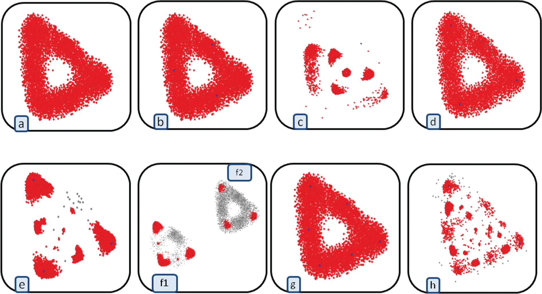
For the quantitative evaluation, we choose one dataset: OpticalDigits (5620 objects, 64 attributes, and 10 real classes) from UCI machine learning benchmark repository. 36 Optical Recognition of Handwritten Digits (OpticalDigits) dataset is a collection of normalized bitmaps of handwritten digits from a preprinted form, from a total of 43 people. Handwritten character recognition has attracted enormous scientific interest due to its obvious practical utility. Online handwriting is important when keyboards are difficult to use, for example, when the writer is mobile and the device needs to be portable. The dataset contains static representation, that is, the image is generated as a result of the movement of the pen tip. Two different hand movements for the same character may lead to similar images. Or, different images of the same character may be generated by similar hand movements. Our objective is to evaluate the clustering results (interactive, semi-interactive, and automatic clustering) according to the real classes of these data (the numeric characters). Figure 7 shows the real classes according to the associated numeric characters, from the t-SNE 2D projection. This projection is obtained form the 64 attributes (variables and dimensions) of the dataset, and the distance is also calculated from the original space (64 attributes).
Real classes of Optical Recognition of Handwritten Digits dataset, with associated numeric characters.
Participants
We recruited 11 participants (1 female), aged 30–40 years, from our laboratory team. All the participants were researchers who had computer science or related backgrounds. In order to balance the users’ expertise levels in our experimental dataset, we selected two participants whose research interests were information visualization and interaction in general, three participants whose research interests were data mining, and others working in completely different research areas. The experiment was conducted on one desktop; therefore, the participants went through the first two exercises one after the other.
Quantitative evaluation
We present quantitative comparisons between the three scenarios: (1) purely visual interactive, (2) semi-visual interactive, and (3) automatic method. Our objective is to evaluate and compare the clustering results according to the real classes of datasets.
Evaluation
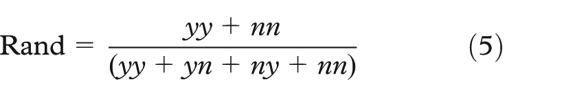
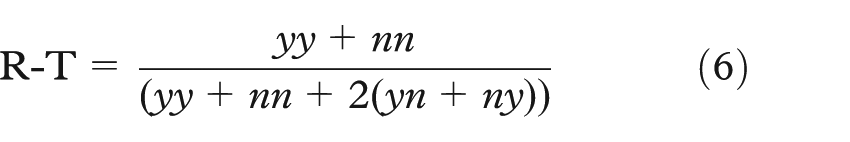
To evaluate our proposed approach, we compare the obtained clustering results (interactive, semi-interactive, and automatic) with some external evaluation clustering: 7 Jaccard, Rand, Rogers–Tanimoto (R-T), and similarity indices. These indices return values from [0, 1], value 1 means that we have the same partitions.
We consider P1 as the real data labels (classes) and P2 the obtained cluster labels using our tools. All the evaluation indices rely on a confusion matrix representing the count of pairs of points depending on whether they are considered as belonging to the same cluster or not, according to partition P1 or partition P2. There are thus four possibilities:
yy: the two points belong to the same cluster, according to both P1 and P2
yn: the two points belong to the same cluster according to P1 but not to P2
ny: the two points belong to the same cluster according to P2 but not to P1
nn: the two points do not belong to the same cluster, according to both P1 and P2.
Having these notations, we define the Jaccard index as

The Rand index as
The R-T as
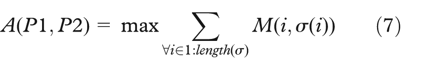
The similarity index measures how different those two partitions coming from one dataset, are from each other, and is defined as: let M be n × m(n ≤ m) confusion matrix for partitioning P1 and P2. Any one-to-one function σ: {1, 2, …, n}→{{1, 2, . . ., m}, with σ an assignment.
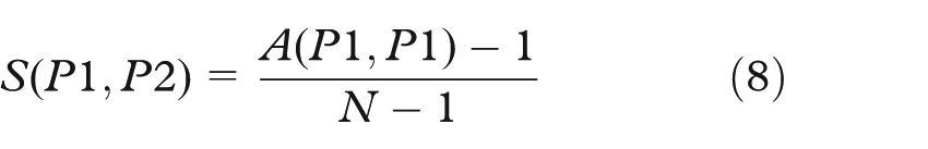
The A(P1,P2) index is defined as
Using this value, we can compute similarity index, where N is quantity of partitioned objects (here it is equal to
Discussion
In the following, we present the obtained results and discuss some problems appearing during exploration and visualization process.
Numerical results
To evaluate our proposed approach, we compare the clustering results obtained through the interactive (scenario 1), semi-interactive (scenario 2), and automatic (scenario 3 with only the IR + OP) scenarios. We compare the clustering results with the real class partitions through the Jaccard, Rand, R-T, and similarity indices. These indices return value from [0, 1], value 1 means that we have the same partitions. Table 2 summarizes the obtained results of all users (U1–U11). As we can see in Table 2, the obtained results with scenario 2 (the semi-interactive approach) are closest to reality than the other scenarios (the highest value is indicated in bold, the smallest is indicated in italics).
Numerical results for 11 users using scenario 1 (purely visual), scenario 2 (semi-visual), and scenario 3 (automatic).
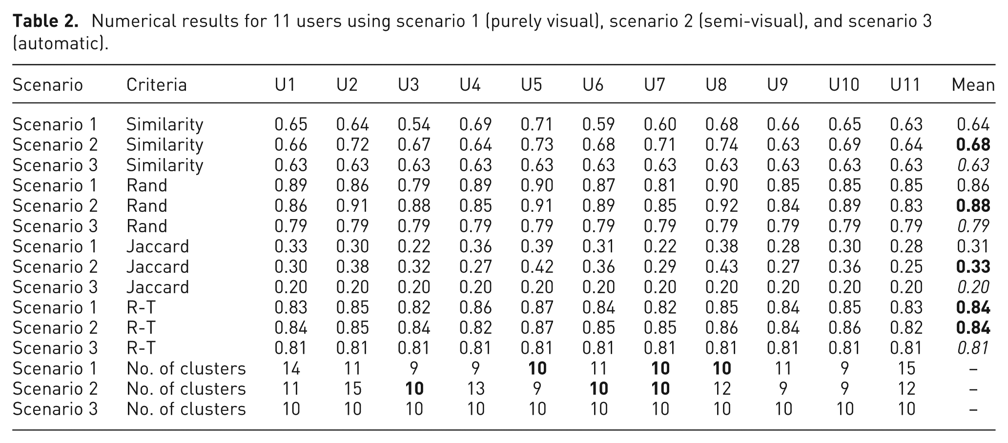
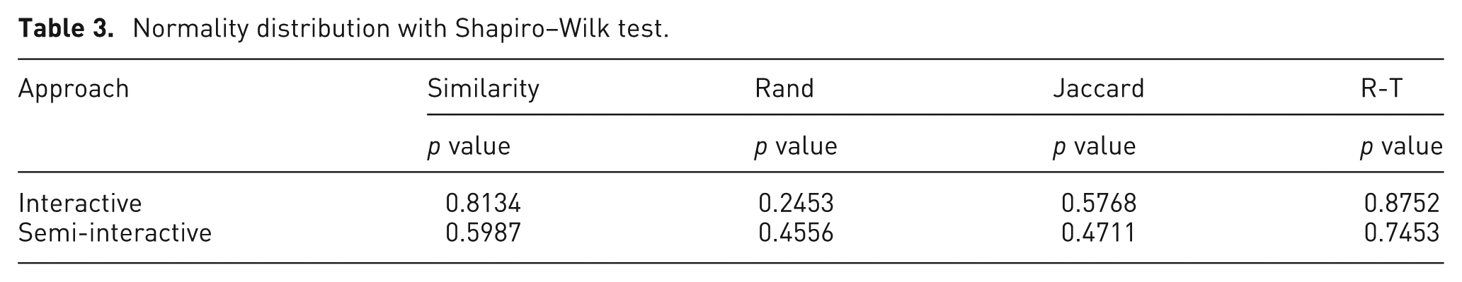
Before testing the significance of the difference between the means, we first apply the Shapiro–Wilk test, to check whether the samples U1–U11 (for Jaccard, Rand, R-T, and similarity values) came from a normally distributed population. As we can see in Table 3, if different p values are greater than the chosen alpha level (0.05), then the null hypothesis that the data came from a normally distributed population cannot be rejected. We can conclude that the different samples U1–U11 (Jaccard, Rand, R-T, and similarity values) are from a normally distributed population.
Normality distribution with Shapiro–Wilk test.
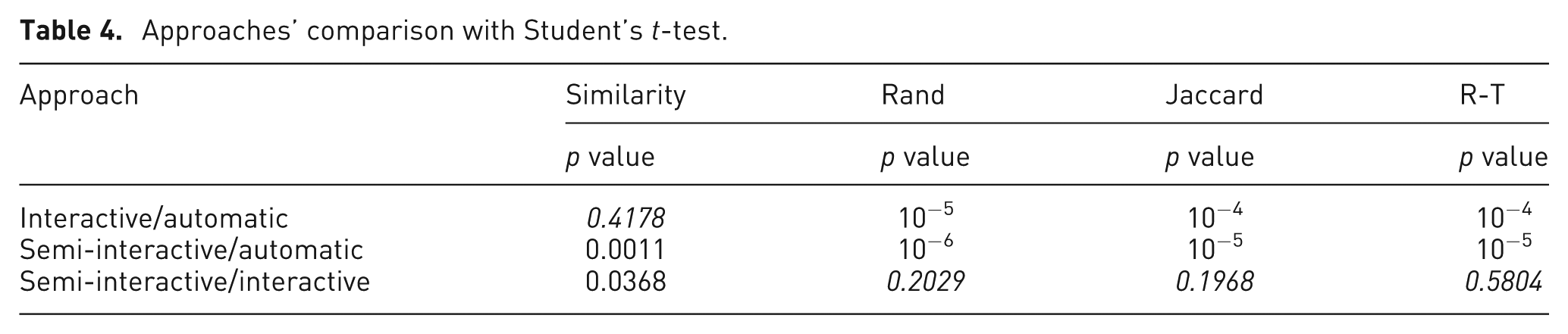
Furthermore, we apply Student’s t-test to determine whether the data samples are significantly different from each other. We then compare the following:
Interactive approach with automatic one;
Semi-interactive approach with automatic one;
Semi-interactive approach with interactive one.
We can see in Table 4 the different values obtained, and we indicate in italics the values that do not have enough significance to conclude some thing. However, we carry out enough tests to be able to say that according to all the evaluation criteria, we can conclude that the semi-interactive results are better than automatic ones. With respect to the Rand, Jaccard, and R-T indices, the semi-interactive and interactive approaches are better than the automatic one. According to the similarity index, we can conclude that the semi-interactive results are better than the interactive and the automatic ones.
Approaches’ comparison with Student’s t-test.
Without assuming the data to have normal distribution, we can use the Mann–Whitney–Wilcoxon test to decide at 0.05 significance level whether the scenario result series of the similarity, Rand, Jaccard, and R-T indices have an identical data distribution and then we can compare the mean values.
Table 5 presents the different values from the Mann–Whitney–Wilcoxon test. We indicate in italics the values that are not significant enough to allow for any conclusion. However, according to all the evaluation criteria, we can conclude that the semi-interactive results are better than the automatic ones. Looking at the similarity index, we can conclude that the semi-interactive results are better than the interactive and the automatic ones and that the interactive result is better than the automatic one.
Approaches’ comparison with Mann–Whitney–Wilcoxon test.

The lack of efficiency of the automatic approach (as we can see in Table 2) might be explained through the cluster limit detection method. This method tends to produce smaller clusters than expected. The clusters are thus too small, and there are a lot of unclassified objects, which requires the lower evaluation of this clustering result. Another detection method might find bigger (and better) clusters and thus improve the efficiency of the automatic (and semi-interactive) approach. Then, we can also propose to the user to choose between different limit detection methods (density based, non-Euclidean distance based, etc.).
Also, the choice of the number of clusters can influence the results. As you can see in the numerical results (in Table 2), even though we explained the dataset, only a few users fixed their number to 10 clusters as in the real dataset (mostly those who had a background in the data mining field).
Users’ feedback
In the following, we describe some comments that are done by the users during the users’ quantitative evaluations. Some remarks are done about the clusters, for example, affecting different colors for seeds to find them more easily from the dashboard on the right of the tool’s interface (Figure 2), adjusting the cursor values to the radius of the current cluster, or using a graduated color to identify the points that are distant from the seed.
One of the most important remarks concerns the red colors for the data points that belong to two or more clusters. The red color for all the overlapping points disrupted some users, and they preferred to show how the current cluster overlaps with the foregoing, without involving the others. The idea is to use a different color to indicate the actual points that overlap with the previous extracted clusters and the overlapping part.
Visual interpretation
Our system provides contributions in two main areas: data exploration techniques and cluster evaluation. More specifically, our system provides an intuitive mechanism for visually exploring moderately large multidimensional datasets, and it offers a fluid, iterative clustering, refinement, and re-clustering process to enable this exploration.
Given the whole dataset projection, we can choose interactively a number of centers to alleviate the volume of the data. Once cluster limit is fixed (automatically or interactively), a few numbers of iterations of the force-directed graph (or the propagation algorithm) are then applied to each cluster. In the 2D projection, when we apply the force-directed graph, the data objects lose their structure. We can handle this problem in two ways. The first one is to use the propagation algorithm to add some of the closest objects to the cluster and then the data topology does not change in the visualization. The second solution is to consider the selected seeds as the representatives of the data. The information is then summarized in the seeds and in the associated clusters and limits.
Instead of considering all the data to compute the distance and build the projection, we only use the seeds to compute the distance and to project them. Once the seeds are projected, we project the points around them according to the radius.
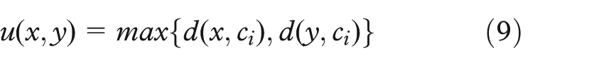
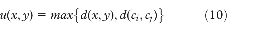
We can formulate the distance u on the X set, where X represents the whole dataset, as follows:
For all x, y, ci∈Ci⊂X, with ci representant of Ci, we have
For all x∈Ci, y∈Cj, with ci representant of Ci, we have
We can use the u meta-distance to perform the computation of the new projection. Considering only the seeds, we preserve the topology of the 2D projection used. The stress of the 2D projection methods can be applied to this new distance.
Conclusion
This article has presented a new semi-interactive system for visual data exploration using an iterative clustering process that combines an automatic approach with an interactive one. We propose a framework to improve the interactivity between the user and the data analysis process, allowing him or her to participate actively in the clustering tasks using a 2D projection, both as support for data projection, and to evaluate the clustering process. Defining a cluster by its seed (center) and its limit, the proposed approach allows the user to modify the automated values or to define new seeds and the associated cluster limit himself or herself. Most of the evaluation criteria for clustering evaluate the complete clustering and not each cluster separately. We propose in this article to adapt new evaluation criteria (IR and CLR) for single clusters, also allowing the users to evaluate their own clusters. Since each cluster is extracted independently, clusters can overlap (same objects in different clusters). To reduce this impact, we propose another penalty criterion for overlapping clusters (OP). The user can perform the iterative clustering manually and can also choose to let the automated approach find optimal seeds and then interact with the process to improve the clustering results according to his or her visual perception and domain knowledge. After having carried out statistical comparisons, we can conclude that we have significantly improved the clustering results using this cooperative approach.
In the future, we plan to test our approach on different subspaces. We believe that the optimal clustering can be different according the subspace data projection. Another possibility would be to explore our method on multi-view clustering or on subspace clustering. We can also investigate the possibility of applying our method to data streams, assuming it is possible to treat the data on sub-time windows. In terms of application, it is interesting to improve our method to deal with other domain knowledge as specified by the user in the overall clustering process (e.g. biomedical datasets), allowing the user to not only analyze data but also, more importantly, explore it. We plan to evaluate our tool by users outside of the computer science or information technology space, such as clinicians or medical doctors. For example, using this approach to group patients into clusters based on some high-dimensional blood-based proteomic data, which could differentiate their risk for a certain cancer. This is a useful thing to know, and we can evaluate the usefulness of our approach from an information science perspective. From a visual and interactive point of view, there are certainly more things to do, such as improving interaction according to the user’s feedback.
Footnotes
Funding
The author(s) received no financial support for the research, authorship, and/or publication of this article.