
Abstract
A common strategy for encoding multidimensional data for visual analysis is to use dimensionality reduction techniques that project data from higher dimensions onto a lower-dimensional space. This article examines the use of motion to retain an accurate representation of the point density of clusters that might otherwise be lost when a multidimensional dataset is projected into a two-dimensional space. Specifically, we consider different types of density-based motion, where the magnitude of the motion is directly related to the density of the clusters. We investigate how users interpret motion in two-dimensional scatterplots and whether or not they are able to effectively interpret the point density of the clusters through motion. We conducted a series of user studies with both synthetic and real-world datasets to explore how motion can help users in completing various multidimensional data analysis tasks. Our findings indicate that for some tasks, motion outperforms the static scatterplots; circular path motions in particular give significantly better results compared to the other motions. We also found that users were easily able to distinguish clusters with different densities as long the magnitudes of motion were above a particular threshold. Our results indicate that incorporating density-based motion into visualization analytics systems effectively enables the exploration and analysis of multidimensional datasets.
Keywords
Introduction
To facilitate data analysis tasks, multidimensional reduction techniques map high-dimensional data onto a lower-dimensional visual space in the form of two-dimensional or three-dimensional scatterplots. Typically, two-dimensional scatterplots use similarity-based or distance preservation layouts, utilizing a distance metric defined for the given multidimensional attribute space. Multidimensional data may be split into multiple classes, or it can be segmented into different clusters using different clustering algorithms. To make sense of these multidimensional data, it can be helpful for certain tasks if it is known how the clusters or classes are defined and structured in the multidimensional attribute space. However, multidimensional projection mappings are prone to distortion because projection methods may not necessarily preserve the spatial relations of the data. Thus, it is important to know how effective the scatterplots are at preserving segregation of the data. Several quantitative measurements have been introduced to assess projection methods with respect to such properties.1,2 In this article, we explore instead the user perception of visual analysis tasks related to projections of data clusters.
Finding patterns and relations is difficult because projecting higher dimensions onto two-dimensional spaces introduces some loss of information. 3 In light of this issue, Healey 4 discusses the importance of retaining the most important features when possible, arguing that the “strongest” feature should be used to encode the relationships that are most relevant to a user’s task. As documented by Etemadpour et al. 5 and Sedlmair et al., 6 density strongly affects the perception of clusters. Since density is an important feature of the multidimensional data, it makes sense, as far as possible, to preserve this information during the dimensionality reduction. According to Gestalt principles, 7 humans tend to perceive objects as if they were related when they move together in a similar direction or motion pattern. This principle, known as common fate, indicates that using motion may be an effective way of grouping information. In this article, we explore various methods to encode density using density-based motion. While motion is often avoided because it is an “aggressive trigger” that can distract from visualization tasks when used injudiciously, 8 motion is nonetheless known to be an pre-attentive visual feature 9 that could effectively represent the density of clusters in multidimensional data. Additionally, we believe that the frequency of the motion may be an effective means to represent the density of clusters. Finally, as noted by Bartram et al., 10 since motion does not seem to interfere with existing color and form coding, using motion to represent density leaves the other modalities available for visualization designers to communicate extra information or to represent other aspects of the data. We also believe that motion could be effective for uncovering data points that overlap or become visually cluttered when projected into a lower-dimensional space. For these reasons, we hypothesize that motion could be a useful modality for assisting in visualization tasks related to projected multidimensional clusters. However, detailed perceptual guidelines on the use of motion in high-dimensional data projections have not, to our knowledge, yet been documented.
A previous study 11 identifies data analysis tasks for the evaluation of multidimensional data projections. We believe that this user-centric task categorization can be used to guide the organization of multidimensional data projection layouts. We divide tasks into four categories according to the typical visualizations required to support them: pattern identification tasks, relation-seeking tasks, behavior comparison tasks, and membership disambiguation tasks. These tasks are gathered from an extensive study of visual analytics projects across real-world application domains, all of which involve multidimensional projection. This article investigates the ability of users to perceive aspects of the multidimensional data when encoding density in this way to understand how tasks involving clusters, such as pattern identification, similarity seeking, and ranking, can be enhanced by motion.
In the following sections, we evaluate user performance on a series of visual analysis tasks using density-based motion. We discuss two experiments that make use of four different types of motion in order to study the effects of moving clusters on human perception over multidimensional data projections. In the first set of experiments, we analyze a user’s perception when he or she is given typical analysis tasks for two-dimensional scatterplots that have been generated synthetically. In this user study, we evaluate the ability of users to perceive clusters and their relationships via density-based motions. In a second experiment using synthetic data, we evaluate the ability of users to discriminate between different magnitudes of motion. Our results show that users were able to perform more effectively on visualization tasks, and, more specifically, that circular motions are especially effective for most tasks. Finally, using real-world multidimensional datasets from two different domains (an image collection and a collection of documents) projected into two-dimensional visual spaces, we also explore the effectiveness of density-based motions. Users are asked to perform three main analysis tasks on the two-dimensional scatterplots created using either Isomap, 12 as a representative of the multidimensional data scaling (MDS) approach, or principal component analysis (PCA), 13 a classical dimension reduction strategy (although PCA projection methods are usually more prone to distort relations within and between clusters). We show that users perform well if clusters are mapped to density-based motions even when examining projected data that distorts their spatial relations. As Ware 14 has stated, understanding the perceptual processing of users can provide design guidelines for visualization systems. Based on the results of these user studies, we draw conclusions on how the different density-based motions influence visual interpretation and how this supports or hinders effective task completion. The main contributions of the article are as follows:
We provide a systematic user-centered examination of visual tasks related to projected multidimensional data;
We show that density-based motion can be used to augment projection methods that obscure particular patterns when they group points so close together that they are hard to perceive;
We find a lower bound of motion magnitudes related to density that enables users to differentiate clusters;
We improve certain visualization tasks related to the analysis of multidimensional data, including relation-seeking and pattern identification tasks between or within clusters;
We explore how adding motion can enhance pattern detection and cluster ranking tasks;
We show that, in certain cases, motion may be as effective as color for cluster identification tasks.
Related work
Ware et al. 15 show that animation is a strong attention draw that consequently may distract people from their primary task. However, other studies have found that characteristics of animation may facilitate information-centric tasks and can be used as an effective way to show large amounts of information in a small space.16,17 Lum et al. 18 apply motion as an enhancement technique to show structural detail when looking at objects under suboptimal lighting conditions. Motion has also been studied to determine whether or not it is a useful modality for encoding data or augmenting information visualization tasks, and many researchers examine the effectiveness of motion in visual search tasks.18–21 Motion can be used to indicate a global movement of a single entity through, for example, animation of particles or glyphs that represent magnitude and orientation. Bartram et al. 10 describe an empirical investigation of use of variations in color, shape, and motion in information-dense displays to see how dynamic information is communicated from the system to the user. Their results show that when motion is applied to a static glyph, even small linear oscillations are significantly easier to recognize than a change to the glyph’s color or shape. Furthermore, they show that motion is perceptually efficient for visualizations incorporating multiple groups of data objects, and that circular motion in particular is more easily perceivable (but demands more attention) than other types of motion. 22 Ware and Bobrow 23 suggest that the rapid visual querying of nodes is possible when using highlighting methods with interactive diagrams. In their investigation, they carry out evaluations of moderately large networks containing up to a few thousand nodes. These previous studies show that motion is a powerful perceptual cue that is effective for a variety of perceptual tasks. Nonetheless, it remains a relatively underexplored visual modality for practical applications, including the visual analysis of high-dimensional data.
Many projection methods exist to generate two-dimensional similarity-based layouts from a higher-dimensional space, such as PCA and MDS. PCAs generate similarity layouts by reducing data to lower-dimensional visual spaces. 13 MDS refers to a broad range of techniques that transform points defined in a higher-dimensional input space into points represented in a lower-dimensional visual space while maintaining pairwise distances between points. 24 Some projection methods, such as isometric feature mapping (Isomap), favor maintaining distances between clusters instead. Isomap replaces the original distances by geodesic distances computed on a graph to obtain a globally optimal solution to the distance preservation problem. 12 Many studies explore numerical methods to evaluate the quality of layouts.1,25–27 However, Etemadpour et al. 28 show that user performance is dependent on specific data characteristics and that no projection technique can enable users to perform equally well on every type of task. Moreover, they show that the technique that elicits the best user performance for a particular task may still have some issues. For instance, the best overall subject performance is obtained on Isomap layouts, which distorts distances. Other tasks favored PCA, which has problems with cluster segregation that can lead to misinterpretations of the data. That is, the correlations of data points or clusters may not be accurately identified after they have been mapped from a higher-dimensional data space to two-dimensional display space. Visual class separability— how well groups of points can be distinguished by users—is investigated in different studies.29–31 Sedlmair et al. 32 consider the accuracy of class density measures in multidimensional projection two-dimensional layouts. Etemadpour et al. 33 examine the role of visual attention and guidance of attention for two-dimensional projection layouts from the user’s perspective. Rensink and Baldridge 34 investigate the perception of correlation in scatterplots from a psychological perspective. They explore the use of simple properties, such as brightness, to generate a set of scatterplots, finding that perception of correlations in a scatterplot is rapid, and that in order to limit visual attention to specific information, it is more effective to group features together. On examining animated graphs, Robertson et al. 35 find that using motion as way to display trends over time does not lead to effective visual analysis among users. However, the exact opposite finding is reported by other researchers, including Kehoe et al. 36 Our work also indicates that motion, judiciously used, can be helpful for analysis tasks.
Using density-based motion for multidimensional data analysis tasks
We introduce a series of user studies to look at different motions, readily perceivable by humans, that are similar to motions investigated by other researchers. The magnitude of each of these movements is in proportion to the density of the cluster to which a point belongs. Specifically, we look at point cloud scatterplots without connectivity containing up to 1000 nodes generated from high-dimensional datasets. We investigate the use of different types of motion and compare them to static scatterplots. The static scatterplots already use proximity for clustering; thus, the motion condition is used to augment this proximity feature. Bartram et al. 10 state that unlike hue or shape discrimination, motion is well suited to extracting information from “noisy” environments across the entire visual field. Thus, motion may be especially important in visualizations that are cluttered and difficult to extract information from, such as PCA projections of high-dimensional data. In the following sections, we introduce terms and tasks relevant to all of our experiments; thereafter, we discuss specific user studies in more detail.
Definition of cluster density
The density of a cluster is defined via a minimum spanning tree algorithm that is applied to that cluster. The local outlier factor (LOF) method 37 can identify outliers in different densities and requires only a single parameter, the number of nearest neighbors. The LOF algorithm first computes a reachability distance measure between objects, then creates a local reachability density for each object by considering its nearest neighbors, and finally compares the object’s local density with that of its neighbors. The minimum spanning tree is created for each cluster and its density is defined as the inverse of the average edge length in the minimum spanning tree, as it has short edges in dense regions and long edges in sparse regions. This gives us an optimal set of edges each with the shortest possible length. The density is defined as the number of points in the cluster divided by the sum of lengths of the edges in the spanning tree
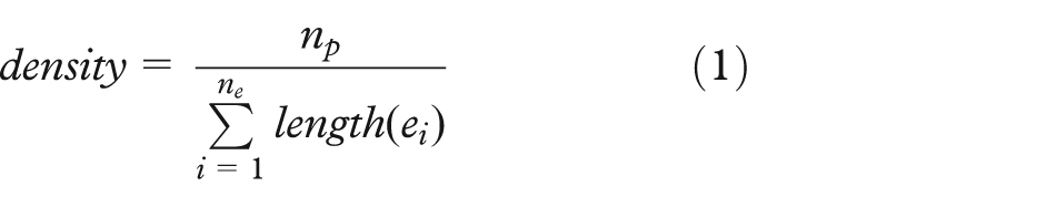
where np is the number of points in the cluster; ne is the edges created by the minimum spanning tree algorithm; and ei indicates the ith edge in the spanning tree. For example, if the spanning tree for a cluster with five data points creates four edges of length 3, 4, 5, and 7, then the density for that cluster is calculated by 5/(3 + 4 + 5 + 7). Equivalently, it is calculated using the inverse of the average length of edges in the spanning tree. A minimum spanning tree is an especially appropriate solution for multidimensional datasets because it considers distances in high-dimensional space, it scales well even when data contain many dimensions, and it is not sensitive to differences in the shape of clusters. In our studies, this technique was also used to calculate densities of synthetic datasets which have only two dimensions.
Analysis tasks
Previous work by Etemadpour et al.5,11 identifies user-centric subtasks grouped into four main categories of data analysis tasks. They indicate that this user-centric task categorization can be used to guide the organization of multidimensional data projection layouts. They identify typical questions raised when visually analyzing multidimensional data in order to define representative user tasks. In this article, we also make use of subtasks drawn from this categorization:
Pattern identification tasks
We examine trends which are more obvious in lower-dimensional data than in projected higher-dimensional data. Relevant issues include cluster/class preservation and separation.
Relation-seeking tasks
We consider relationships and similarities between different reference sets.
Behavior comparison tasks
To compare characteristics of subsets (or clusters), we consider capturing different data behaviors, such as asking the subjects to compare the point densities within clusters, where density is defined as the number of points per area.
Membership disambiguation tasks
We consider positional and distributional relationships within clusters/classes where objects occlude each other. Peng et al. 38 state that clutter reduction is a visualization-dependent task. Clutter and noise obscure the structure present in the data and make it hard for users to find patterns and relationships.
One objective of high-dimensional data exploration is to find correlations within the data, thus uncovering hidden relationships in its distribution that provide new insight. 39 In this article, we investigate user performance on class segregation tasks. Thus, we asked the subjects to estimate the number of clusters in the given distribution in a scatterplot, hereafter referred to as the Count Cluster task. A list of potential tasks within the relation-seeking task category can be considered for multidimensional data visualization. We believe that finding similarities in projected high-dimensional data can be considered as comparison tasks with respect to a given reference set, including, for example, identifying the neighbors of a given cluster within a single dataset. Thus, we asked the subjects to identify which cluster a given point is most similar to, hereafter referred to as the Association task. Etemadpour et al. 11 explore how high-dimensional data projections can provide insight into important data dimensions and details, and describe a range of tasks related to behavior comparison, such as identifying the smallest or largest clusters, or finding the clusters with the minimum or maximum number of elements. Since density is an important metric that indicates stronger relationships between points within a cluster, we asked the subjects to rank the clusters by density, hereafter referred to as the Rank Density task.
For the Count Cluster task, all data points were shown in a single color because we did not want colors to distract a user’s attention from the main task of counting clusters. For the Rank Density task, the colors were assigned randomly to the given clusters in order to decrease the chance of inadvertent associations with colors. For the Association task, each of the two clusters were color-coded either green or blue, while the reference point is given a red color. Demiralp et al. 40 introduce perceptual kernels that represent the perceptual differences between and within visual variables as distance matrices formed from aggregate similarity judgments. Indeed, to identify the closest cluster to a given reference, we compute pairwise distances between all objects of the target cluster and those of the remaining clusters in the multidimensional space and identify the smallest distance. Figure 1 shows an example stimulus for each task.

Instances of task stimuli: (a) estimate number of clusters, (b) rank clusters by their density, and (c) determine whether red object is similar to green or blue cluster.
Types of motion
Both sets of user studies (those using synthetic datasets as well as the one using real-world data) examine different types of movement. Specifically, we look at four different motions, chosen because, as discussed above, they represent simple motions readily perceivable by humans and moreover, because they are similar to motions that have been investigated by other researchers. We call these four motions: wiggle, spin, pulse, and rotation. As shown in Figure 2, wiggle indicates a back-and-forth translation along the horizontal axis, rotation indicates the circular movement of a point while retaining its orientation, spin indicates an in-place rotation, and pulse indicates a repeating expansion and contraction in scale. The magnitude of each of these movements is in proportion to the density of the cluster to which a point belongs. We consider velocity as one of the factors that change the magnitude; specifically, the velocity is correlated to the inverse of the cluster density. Thus, all points belonging to the same cluster have the same rate and magnitude, and the denser the cluster the less movement there is.
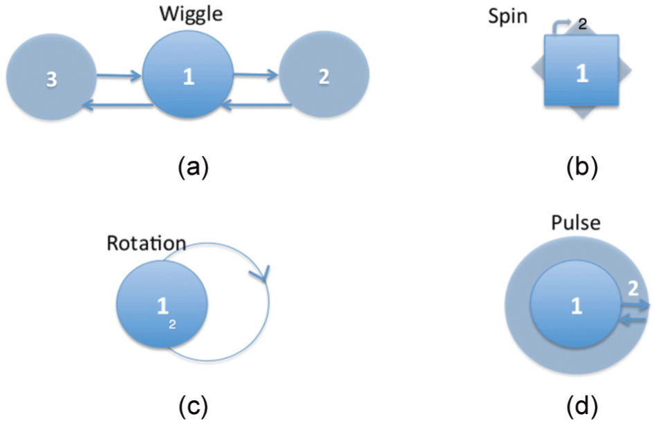
Instances of motion stimuli: (a) wiggle, a combination of linear transitions; (b) rotation, or circular motion; (c) pulse, an in-place expansion/contraction motion; and (d) spin, in-place rotation.
Hypotheses
As discussed in section “Related work,” there is disagreement as to whether or not using motion to encode trends over time is effective for visual analysis tasks. Therefore, we want to explore this ourselves to determine whether in fact motion is an effective way to represent aspects of our datasets. Our first analysis goal is to compare the static pattern to the animated clusters on two-dimensional scatterplots. We believe that density-based motion would improve the performance by helping users maintain an awareness of the interesting (or hidden) information. Most intuitively, we believe that the animated viewing would enable users to perceive patterns more easily. These general assumptions are formalized through three hypotheses that address the different aspects of the user tasks.
H1a: The incorporation of density-based motion into two-dimensional scatterplots will improve performance on pattern identification tasks when compared to a static two-dimensional scatterplots without any motion.
Considering Count Cluster, a more detailed inspection reveals that a good spatial segregation of clusters is required. Using density-based motion would postulate that the points within a cluster are perceptually grouped because of their identical movement. This allows the user to perceive differences in the layout of the scatterplots.
H1b: Reference points appear more similar to clusters that are moving in the same way, regardless of distance.
Elements tend to be perceived as aggregated into groups if they are near each other. 7 Association asks users to determine which clusters are most similar to a particular point. Due to the change of distance between some of the components, for instance, points within a cluster may be perceived as belonging to a group with nearby points, rather than the group that is most similar. We postulate that a reference point will be perceptually grouped with a cluster of points that uses the same motion, defined by cluster density, regardless of distance.
In our two-dimensional scatterplots, we expect that visual attention is drawn toward the sparser clusters because of their associated motion’s greater magnitude. In other words, the points that are closer in distance create a denser cluster with little movement. Accordingly, we formulate the following hypothesis:
H1c: Motion makes it easier for users to compare and rank clusters with different densities.
Bartram and Ware 22 found that motion shape is a more effective discrimination attribute than motion direction. We hypothesize that the use of some motion shapes will lead to better performance on tasks involving density.
H2a: Some motion shapes will command more attention leading to higher performance.
Finally, we also gather a subject’s confidence about his or her effectiveness when performing the tasks and thus hypothesize the following:
H2b: User confidence is higher for scatterplots that use motion to encode density.
Furthermore, for our second study, using the real-world datasets, we formulate the following hypotheses:
H3a: Density-based motion will improve user performance of Count Cluster on real-world projections;
H3b: Density-based motion will improve user performance of Association on real-world projections;
H3c: Density-based motion will improve user performance of Rank Density on real-world projections.
Since both motion and color are handled by a dedicated visual processing mechanism, 22 we anticipate that motion, as a pre-attentive visual feature, would perform as well as color:
H4a: Pairwise comparisons between detection accuracy using color-coded clustering and density-based motion will not deliver any significant difference for Count Cluster;
H4b: Pairwise comparisons between response times using color-coded clustering and density-based motion will not deliver any significant difference for Count Cluster.
Computation of errors
Given the ground truth, we compute the errors in the answers given by the subjects for each task. For Count Cluster, which required the subjects to estimate a number, the error percentage is computed by

where ntrue is the estimated ground truth and nanswer is the reported answer. For Association, which required a cluster to be identified, the error is either 0 or 1. For Rank Density, which required the user to rank clusters, we first calculated the number of changes required to get from the user’s reported answer to the ground truth. Each cost of transformation was then calculated as the absolute value of the difference between the densities of the clusters involved in the transformation. This was then divided by the sum of the densities of all three clusters, in order to normalize the value relative to the “worst case” answer, in which all three rankings must be swapped. At the end of this calculation, we further multiply by 100 in order to make it easier to read, respectively, and the user’s error would be calculated as

Evaluating density-based motion on synthetic datasets
In our first study, we use synthetic datasets for which the properties of the clusters and the correct cluster assignments are known a priori. The synthetic data are used to evaluate the role of cluster density and applied density-based motion on task completion success. 41 Our goal is to examine whether we can amplify human perception when individuals visually analyze scatterplots. Specifically, we investigate cluster density (i.e. point density within a cluster as defined above) when clusters are mapped on a two-dimensional space.
In order to obtain test data of sufficient complexity, cluster generators were developed based on a standard cluster model using multivariate normal distribution. In two-dimensional, these clusters are frequently elongated and of arbitrary orientation, as in Figure 7(a), which was generated with the Gaussian cluster generator. Since points that form clusters are connected based on their distances, densities are computed based upon distance-based measures, as mentioned in section “Definition of cluster density.” This dataset is two-dimensional and contains nine clusters; both the generators and the specific test datasets used in this article are available online (https://github.com/deric/handl-data-generators). In the first study, section “Discovering patterns,” we investigate the influence that different motion patterns have on the performance of particular tasks. In the second study, section “Discriminating movement,” we investigate the necessary amount of motion that enables a user to effectively distinguish between two clusters of similar density. A video demonstrating the different phases of our user study can be found on the authors’ website (http://evl.uic.edu/creativecoding/sage/synthetic.m4v).
Investigations and statistical methods
We conduct a controlled user study involving a total of 77 subjects (27 females and 50 males) with normal vision (though one participant indicated color blindness). All of the subjects were undergraduate or graduate students: the subjects for the first experiment (“Discovering patterns”) study consisted of 42 students; 35 students participated in the second experiment (“Discriminating movement”). For the statistical analysis of the results of the user study, we investigate scatterplots using four types of motion, as well as static scatterplots with no motion, for each task individually. By looking into the mean errors (as computed using the methods described in section “Computation of errors”) over all subjects and all synthetic datasets, we test the distribution of the error values against normality using the Kolmogorov–Smirnov and the Shapiro–Wilk tests. In the case of non-normal distribution, we use the Friedman test on K-related samples when comparing more than two groups. We also perform pairwise comparisons of the groups using a Wilcoxon test on the results at the 0.05 level in order to be able to report which pairs of groups differ from each other significantly. The Kruskal–Wallis is used as a non-parametric method for comparing more than two samples that are independent. In case of normal distribution, we use a t-test when comparing two groups and an analysis of variance (ANOVA) test when comparing more than two groups. For pairwise comparisons, in cases where there are more than two groups we run a series of Tukey’s post-hoc tests. In addition to the mean error, we also evaluate each participant’s confidence ratings (on a five-step Likert scale) as well as the time it took for each participant to fulfill the tasks.
An Apple iMac with a 21.5″ screen is used to present the scatterplots via interactive web pages (served through a locally running server) that also collects the user responses. The system immediately displays the image associated with the first task, following a brief set of demographic questions. The users are presented with a sequence of either still or moving images displaying the respective scatterplots. For each image, they are asked to answer the question as soon as they know the answer and to act as quickly as possible although we do not limit the time.
Discovering patterns
The first experiment uses four different synthetic datasets; for each scatterplot, we generated one stimulus for each of the three tasks, producing a total of 36 scatterplots (similar to the ones shown in Figure 7). For all four datasets, different clusters are presented in all stimuli. Ware and Bobrow 23 have shown that interactively highlighting subgraphs could efficiently support visual queries on graphs containing nodes. In their study, motion highlighting proves to be as effective as static highlighting, and a combination of motion and static highlighting is even more effective. Contrary to this study, we have not considered visual queries on node-link diagrams. Instead, we consider point cloud scatterplots without connectivity containing up to 1000 nodes, adding each of the four different types of motions to the static scatterplots. That is, we are able to show how the motion condition augments the static condition, which already uses proximity for clustering. Subjects were assigned in groups of seven to a specific trial. We used a mixed design containing a between-subject factor and 12 trials distributed over time. Each trial contains all three tasks and four different synthetic datasets. All subjects fulfilled their tasks in only one session. Each session took around 20 min and each subject saw three different types of motion. The motions were presented in a random order to subjects that saw the same motions.
Results
Figure 3 summarizes the comparative analysis of the animated scatterplots for each of the three tasks, Count Cluster, Association, and Rank Density, described in section “Analysis tasks.” In terms of correctness, the statistical tests among all four motion and static scatterplots showed that there is statistical significance in the mean errors for all tasks. The outcome of the pairwise significance test is indicated by the red horizontal lines that are color-coded on a scale from red to white. More precisely, groups of projections with no pairwise significant difference among their mean error have lines of the same color. For Count Cluster, the Friedman test showed very strong significant difference (χ2(4, 24) = 44.232, p < 0.01) among all scatterplots. The Pairwise Wilcoxon W comparisons showed significant differences between all comparisons, and that the static scatterplots had the lowest accuracy compared to animated scatterplots. Additionally, rotation was significantly better than all other motions; thus, it is indicated with the stronger red line as the winner (while the other motions are indicated with the lighter red lines).
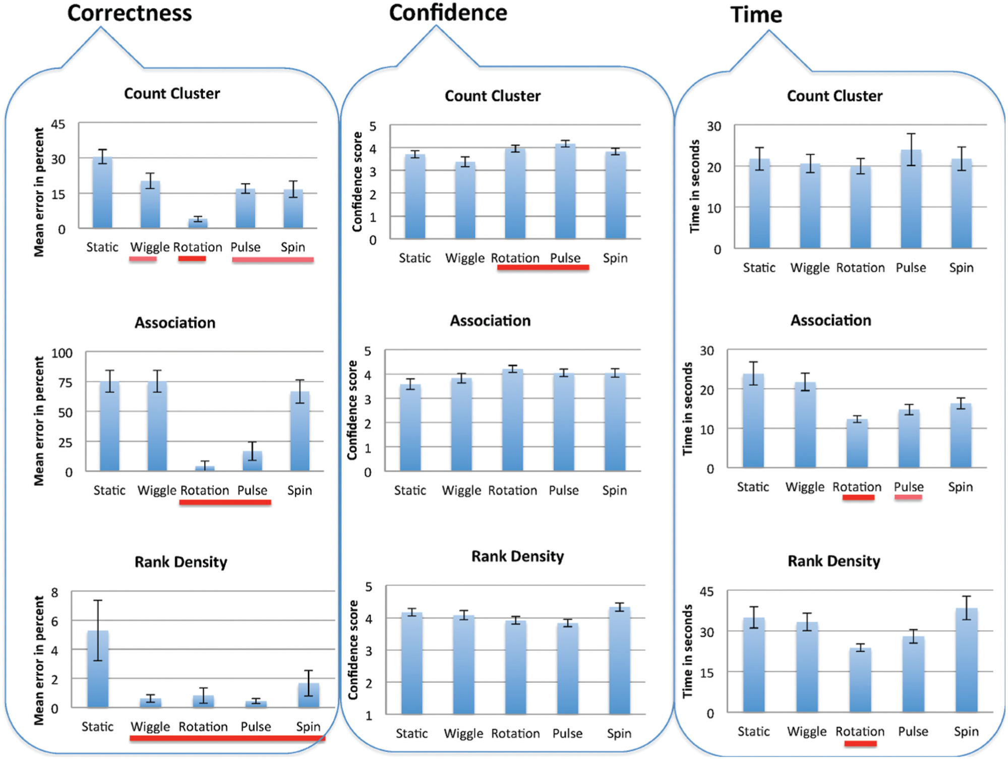
Results of comparing animated scatterplots on the tasks considered in terms of correctness (bar charts show mean error and standard error from the mean); confidence (comparing mean confidence values for completing tasks with different motions); and time (comparing mean times for completing tasks with different two-dimensional scatterplots). The horizontal lines encode pairwise statistical significance using a red-to-white color transition.
We analyzed all the other tasks similarly. For Association, the Friedman test delivers statistical significance (χ2(4, 24) = 44.936, p < 0.01)). Pairwise comparisons showed significantly better results for rotation and pulse compared to the other alternatives. Pairwise comparison between pulse and rotation did not deliver significant difference (p = 0.469). For Rank Density, there is sufficient evidence to conclude that motion had better performances compared to static scatterplots. The Omnibus test for statistical significance showed strong significant difference among all scatterplots (p = 0.007). Pairwise Mann–Whitney tests proved, with significance, that static scatterplots had the lowest accuracy compared to all motions. However, pairwise comparisons between motions did not indicate any significant differences. Hence, we can conclude that hypotheses H1a, H1b, and H1c are confirmed.
To determine which motions did better than others, we counted how often one motion belongs to the winner group and how often it belongs to the loser group. The winner motion exhibits higher performance with a significant difference to the other alternatives. Analogously, we determine the loser group for each task in similar way. It can be observed that animated scatterplots do well in comparison to the static scatterplots on all of the main tasks. In particular, it can be observed that rotation performs well on all three tasks and is ranked first. In general, pulse also performed well and ranked first on two tasks (Association and Rank Density) and ranked second on Count Cluster. Moreover, wiggle and spin performed well on Count Cluster and Rank Density, but not on Association. Hence, we can conclude that the type of motion influences the results and that hypothesis H2a is confirmed, and moreover, these results complement a study by Bartram and Ware 22 that ranked circular motions as visually more useful than “linear” or “zooming” motions.
We investigated the subjects’ confidence in their answers for all tasks over each of the synthetic datasets and observed no significant difference, except on Count Cluster, where a significant difference was found using the Friedman test (χ2(4, 24) = 12.635, p = 0.013). Pairwise comparisons showed a significant effect of rotation and pulse when users’ reported a higher confidence. Pairwise comparisons, however, indicate no significant difference between rotation and pulse. For Count Cluster, the results indicate that the confidence increased for both rotation and pulse which is consistent with the accuracy of their results using these motions. Thus, our hypothesis H2b is partially confirmed for Count Cluster with the motions rotation and pulse.
Finally, we measured how long it took the subjects to fulfill the tasks. Figure 3 shows the mean completion times for tasks Association and Rank Density. Tasks were always answered quickly when using rotation. For Association, all comparisons show statistical significance (χ2(4, 24) = 13.083, p = 0.001) and pairwise comparisons showed that rotation enables users to complete the tasks significantly faster than pulse, and that both of these motions significantly outperformed the other motions, spin and wiggle, as well as the static scatterplots. There is a strong correlation between correctness and time (Figure 3) for Association; tasks were completed quickly and with more accuracy when rotation or pulse was used. Similarly, a strong correlation was also found for Rank Density (χ2(4, 24) = 12.033, p = 0.017) when rotation was used.
Discriminating movement
In the second study, we investigate the ability of users to detect and discriminate motion information that is based on structural characteristics related to the density of clusters. As the magnitude of motion for each element in a cluster is proportional to that of cluster’s density, two clusters with quite similar densities reveal similar motion information. Huber and Healey 42 present an experimental study designed to understand how different perceptual properties of motion represent data in a visualization environment. They show that minimal visual differences are needed for flicker, direction, and velocity, but that target flicker must be coherent with the background. They also study the cycle length, defined as the duration of the target element’s cycle in milliseconds, and investigate the viewer’s ability to distinguish the presence or absence of a small group of target elements that flicker at a different rate from background elements. In other contexts, Villegas et al. 43 explore how users interpret motion patterns in animation, and Forbes et al. 44 introduce metrics that help establish the minimum discriminability of two motion textures. This section summarizes our main findings about an individual’s ability to discriminate stimuli that involve similar movements with different magnitudes. Again, velocity is considered one of the primary factors of magnitude. In our algorithms below, the target elements and background elements complete an entire cycle within the same amount of time. That is, viewers can perceive a difference between the target and the background motion rates if the target elements complete a cycle with higher velocity. Changes in velocity are used to tease apart a δ value that reflects a change to the density of clusters. Direction and path curvature are similar for the target elements and background elements in order to keep them coherent, and linear oscillation paths are used.
We investigate the minimum difference in magnitude (velocity) that enables users to distinguish between similar clusters. Specifically, this experiment studies a viewer’s ability to distinguish a small group of similar points within a cluster (target elements) that move at a rate different from the other points. Nine clusters are shown overlaid onto a 3 × 3 grid; each cluster is roughly centered over one cell in the grid. When participants move the mouse over one of the clusters, that cluster is highlighted, as shown in Figure 4, where the bottom left cell is selected, highlighting one of the clusters. The magnitude of motion is the same for all but one of the clusters. The participants are asked to click on the cluster of points that appear to have a magnitude of motion that is different from the background clusters as soon as they can identify it. They are asked to choose the cluster that moves at a different rate once they detect it visually, without using the highlighting method, minimizing any effects from highlighting that could confound results.
Examples from our user study in which a user is asked to detect a cluster with a different magnitude of motion.
The mapping functions for four different types of motion are used in the different synthetic scatterplots. The absolute difference in the magnitude of motion (i.e. the velocity) between the points in the target cluster and the points in the background clusters is defined for the different motions like so
where d is the density of the cluster and dn is the density normalized within the interval (0, 1]. Overall, 10 different δ values have been examined for each motion leading to a total of 112 stimuli, similar to the one shown in Figure 4.
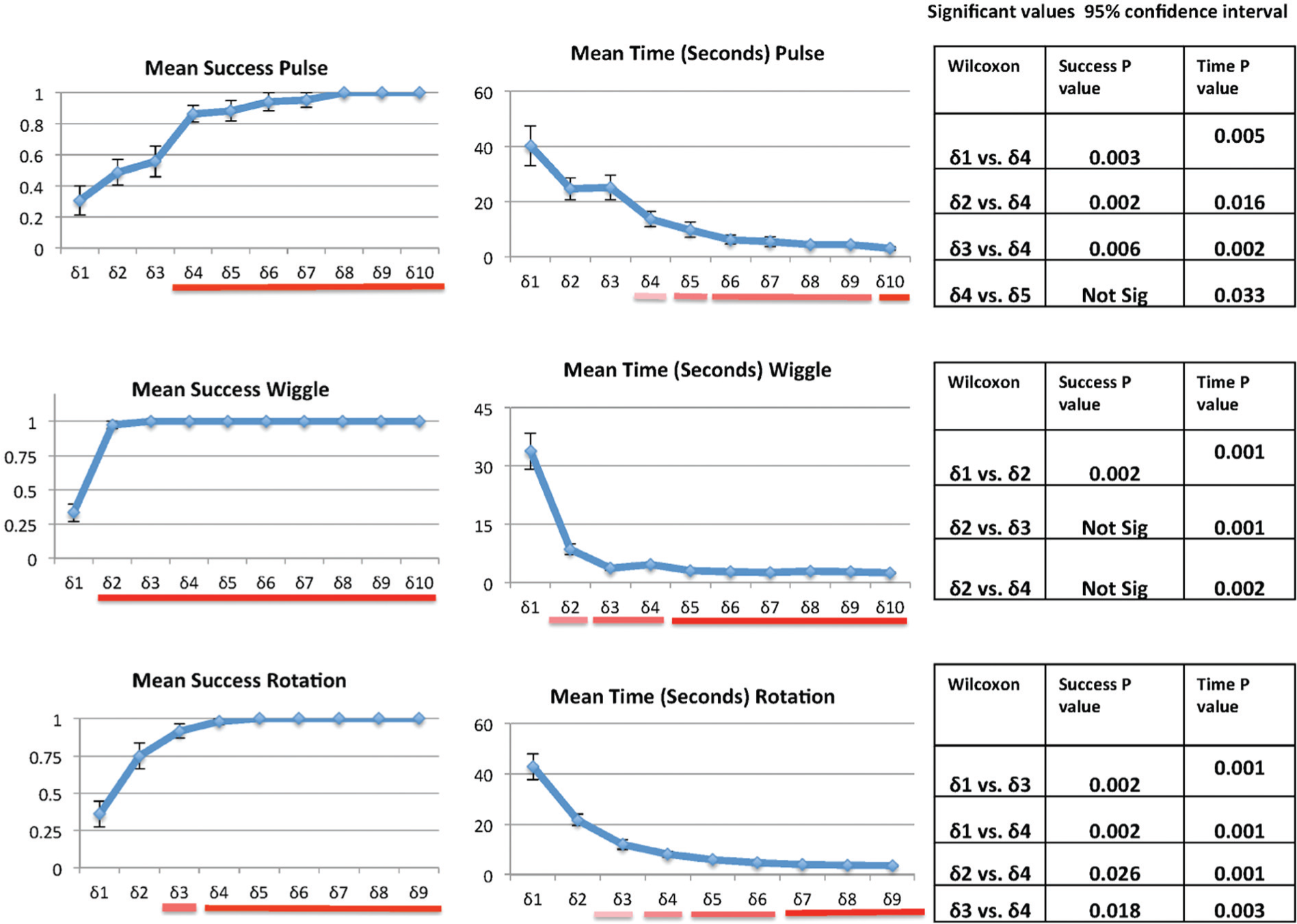
Results
In all, 35 students participated in this study, and a between-comparison strategy was followed. We anticipated that identification would be faster and more accurate when the target cluster was moving faster (i.e. when we used a larger δ value). We were interested in finding the smallest δ value while maintaining high accuracy. We then checked whether detections made while using this value occurred significantly more quickly than with smaller δ values. Prior to administering the user study, we checked our set of δ values to make sure that they made sense intuitively and later investigated these values more carefully using psychometric functions. As Figure 6 illustrates, two performance metrics were recorded during the experiment: the mean viewer success rate and the mean viewer response time. Indeed, detection success rates and response times were better when using higher δ values. For pulse, δ = 5 significantly outperformed the smaller δ values in both success rate and time (as listed in the table of significant values on the right side of Figure 6). A Friedman test showed significant difference for all comparisons (χ2(9, 13) = 62.099, p < 0.01). However, the Friedman test treats δ values as a nominal axis. Since the δ values were, by necessity, chosen intuitively, fitting to a psychometric function is the ideal analysis for the mean success results. The Weibull function 45 using a “maximum likelihood” procedure has been used. The coherence level that predicts 80% correct performance as an acceptable success rate is picked to determine the values for each motion’s success rate. For pulse, pairwise comparisons using a Wilcoxon signed-ranks test did not deliver significant difference between δ = 5 and higher values in terms of success rate. However, δ = 6 and higher values had a significantly quicker response than δ = 5, but still δ = 5 can be considered the first point that created a significant interaction. Moreover, as shown in Figure 5, using the fitting function δ = 5.4978 predicts with an 80% correctness rate that the parameters maximize the log likelihood. Similarly, δ = ⌊d⌋ × 3.54 for wiggle can be considered the lower bound for an effective distinction between magnitudes. Referring again to the statistical table in Figure 6, one may consider δ = ⌊d⌋ × ⌊d⌋ as the first significant value for rotation. However, we chose δ = ⌊d⌋ × 0.608⌊d⌋ as the psychometric fitting function shown in Figure 5 because of its higher performance in terms of success rate and time compared to smaller values.
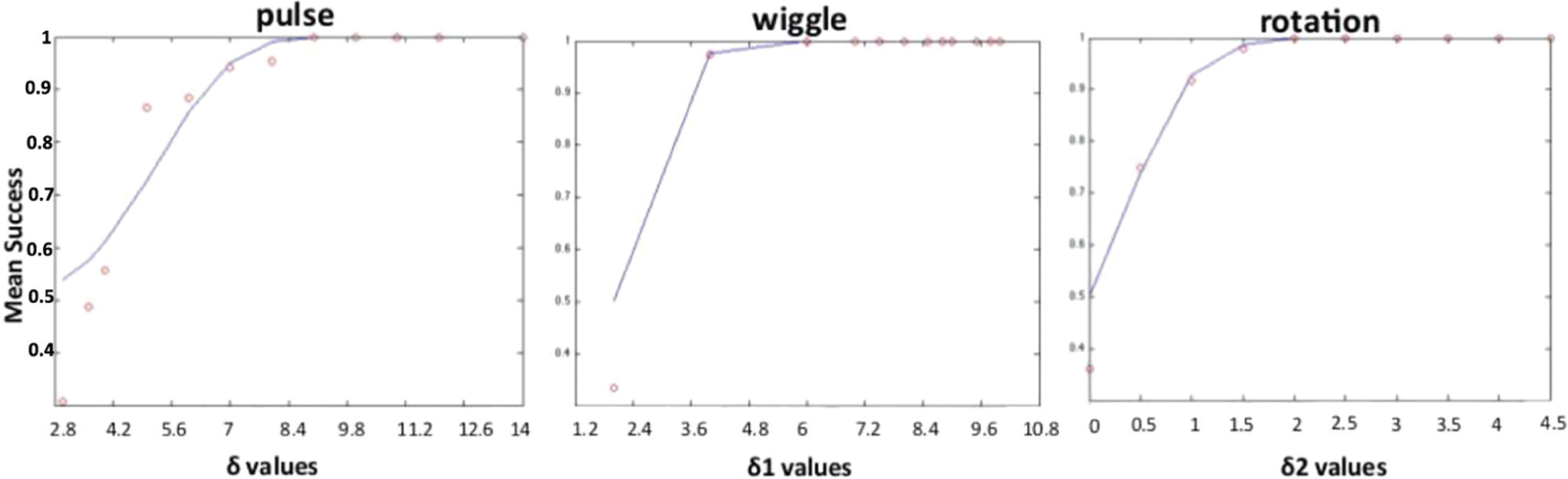
Fitting with a parametric function (the Weibull function): for pulse, δ = 5.4978 predicts 80% correctness; for wiggle, δ1 = 3.54 predicts the 80% correctness and δ = ⌊d⌋ × 3.54 is desired; for rotation, δ2 = 0.608 predicts the 80% correctness and δ = ⌊d⌋ × 0.608⌊d⌋ is our desired significant value.
These charts show the results for the motion discrimination study. On the left, we show correctness (where the bar charts show success mean and standard error from the mean); in the middle, we show time (comparing mean times for completing tasks); and on the right, we show the table of significant values. The horizontal lines encode pairwise statistical significance using a red-to-white color transition.
These results provide information regarding which densities can be easily perceived within a scatterplot that encodes density using motion. A viewer’s ability to distinguish the presence of a small group of target elements that move at a velocity different from background elements increased with higher values. Selection time dramatically decreased with higher δ values and was close to pre-attentive (approximately 250 ms once we accounted for the interaction time). At or above our threshold δ values, pulse selection mean time was 4.3 s, wiggle selection mean time was 3.5 s, and finally rotation selection mean time was 6.02 s. This shows that using motion can be useful for identifying different clusters with different densities as long the velocity of motion is above a particular threshold. This information could also be useful to help differentiate clusters with similar densities that overlap in a scatterplot. These results give a perceptual relevance to our metrics since they are similar for each of these three motions.
However, we found that spin was not easily distinguishable as the first δ value that showed significant correct answers was δ = d2 × 25, which decreased the mean response time from 24.7 to 11.25 s. This δ value corresponded to seconds per rotation. Users were only able to distinguish the cluster with different velocities when the δ was very high, and thus, we concluded that spin would not be an effective motion for any of our tasks as the differences in densities in real-world data are unlikely to be so far apart (and thus we decided not to include it in our additional user studies in section “Evaluating density-based motion on real-world datasets). The amount of visual change per unit time appeared to have been very different for the different motions (spin especially was much smaller), so it is not surprising that this was less effective. As stated above, the velocity of the movement was made proportional to the density of the clusters.
Evaluating density-based motion on real-world datasets
In addition to investigating motion on scatterplots created from synthetic data, we also examine the use of motion in real-world datasets. 46
Datasets and projections
We use a document collection and an image collection. Textual datasets generally have a high dimensionality even when the data are relatively sparse. The KDViz dataset is chosen as representative of document datasets with high dimensionality (http://vicg.icmc.usp.br/infovis2/DataSets). It contains documents collected from an Internet repository related to four different topics with 1624 unique documents, 520 different dimensions, and 4 highly unbalanced labels. Image datasets generally have a lower dimensionality and are sensitive to the choice of the feature space. We use the Corel dataset as representative of image datasets (UCI KDD Archive, http://kdd.ics.uci.edu). The Corel dataset includes 1000 photographs related to 10 different themes, and each photograph is described by 150 dimensions (i.e. their SIFT descriptors).
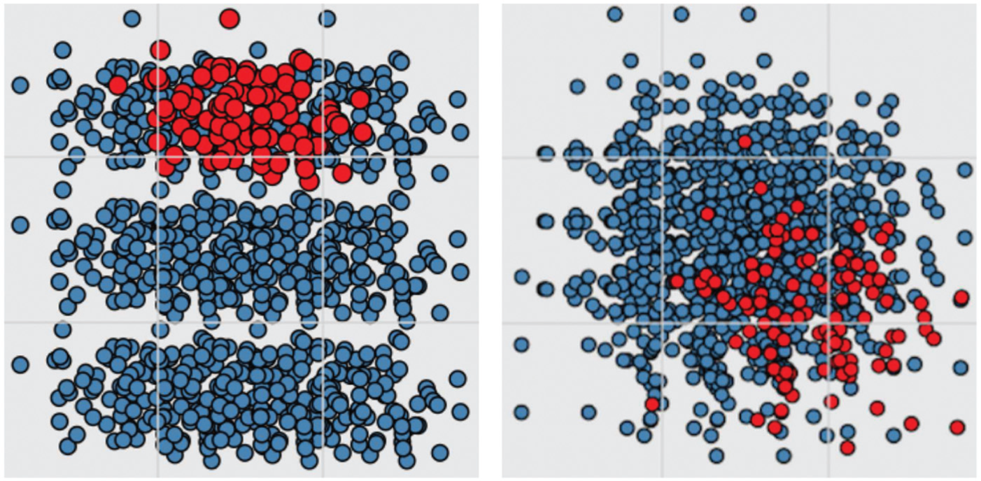
We select two techniques as representatives of distinct strategies for embedding data in two dimensions, namely statistical dimension reduction (PCA 13 ), and MDS (Isomap 12 ). As discussed above, PCA is a classical dimension reduction strategy often employed to generate visual embeddings of data. Two-dimensional layouts are obtained by considering the two first principal components (at the risk of disregarding other potentially relevant components). Isomap is a variant of MDS that builds a weighted nearest-neighbor graph from the data, with pairwise point distances as edge weights. The distance between two points in this graph creates the shortest path. Cosine distance is the usual choice for text data and we use this in our study for both projection techniques when examining KDViz. For the Corel dataset, the choice of the distance function was made based on the best point segregation on two-dimensional projections; consequently, cosine distances were chosen for PCAs and Euclidean distances were chosen for the Isomap projections. For the experiments with these real-world datasets, we consider multidimensional data analysis tasks similar to the ones described for the synthetic data user study. Figure 7 shows an example stimulus for each task.

Instances of task stimuli: (a) estimate number of clusters; (b) rank red, green, and blue clusters by density; (c) determine whether the red object is most similar to the green or blue cluster.
Set-up for user study with real-world datasets
We developed an interactive multidimensional data projection tool for our experimental studies. Our tool allows us to create a series of views, each of which features one of the three motions we are evaluating to represent clusters in either the KDViz or Corel dataset, which are projected into two-dimensional using either the PCA or Isomap projection. For instance, Figure 8 (top) shows a view using an Isomap projection applied to the Corel dataset using rotation. By changing a slider at the bottom of the tool, the user is able to interactively increase or decrease the magnitude of the motion. This slider updates a magnitude factor F which alters the motions described in section “Discovering patterns.” For wiggle and rotation, F alters the range of the x and y coordinates of the points. For pulse, F alters the maximum radius of the point size.

Example of Isomap projection applied to the Corel dataset (top image) and of PCA projection applied to the KDViz dataset (bottom image). The user can drag the slider to change the magnitude value dynamically.
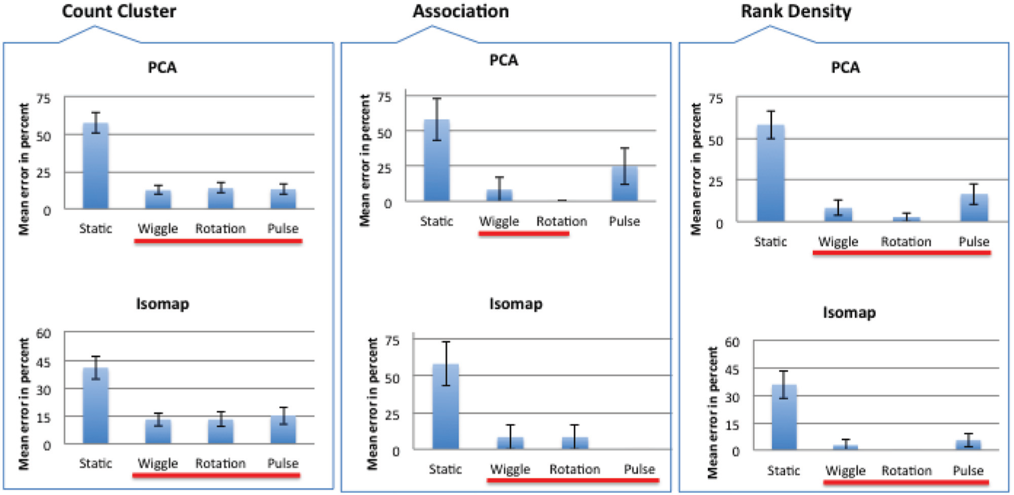
We conduct a controlled user study that involves 12 subjects who were students or researchers in computer science or medicine. The primary task area was approximately 6″ × 6″, with a margin approximately 3″ from the left side of the stimulus window and 1″ from the top. The stimulus subtended a field of view of approximately 24°–27°of visual angle from the center of the stimulus window. Each subject was presented with a series of 28 different scatterplots of projected multidimensional data. For each of the scatterplots, we asked the participant to complete one of these three tasks. The presented images include both animated and static projections. For counterbalancing, a random function is used to shuffle the order of the presented images. Again, as defined before, higher density clusters move less; more movement indicates a sparser cluster. For Count Cluster, three motions (pulse, rotation, and wiggle) in addition to static layouts are considered. The static layouts are either color-coded based on cluster labels or shown with a single color. For Association, the given object is shown in red and the two other clusters are colored green and blue. For Rank Density, three clusters are shown in three different main colors (red, green, and blue). For both Association and Rank Density, to avoid bias, we randomly assign colors to each cluster.
We test four different clustering techniques to determine cluster assignments for Count Cluster. We use the adjusted Rand 47 index to compare the similarity of different cluster assignments to the class labels given in the data. As other authors have stated, taking class labels can be used to generate pairwise constraints, but it is arguable whether or not this is the best solution for understanding relations within multidimensional data.6,48 The Rand index measures the similarity of two different partitions of data (e.g. clusters or classes). Given that each partition assigns each element into one of many subsets, the Rand index calculates the amount of agreement between the two partitions. Four clustering techniques are considered: K-means, X-means, 49 hierarchical agglomerative, 50 and hierarchical divisive. 51 X-means is an extension of K-means that attempts to find an ideal number of clusters for a given dataset, rather than using a value of K supplied by the researcher. 49 Hierarchical clustering techniques organize data into hierarchical trees, which can be created in two ways: agglomerative clustering 50 hierarchically groups each element based on similarity, beginning with the two most similar elements; divisive clustering 51 works instead by splitting the data into smaller and smaller clusters based on the dissimilarity of elements. Once the hierarchical tree has been created, it can be “cut” at some level to partition the data into a number of clusters. Each clustering technique is tested across a range of values of K (with the exception of X-means, which determines the optimal number of clusters on its own). For the Corel dataset, which contains 10 classes, K values from 4 to 20 are used; for the KDViz dataset, which contains four classes, K values ranging from 2 to 10 are used. For each clustering technique, and for each value of K, the adjusted Rand index is calculated, and the cluster assignment with the highest adjusted Rand index is used to assign elements to clusters in our study. For instance, a hierarchical agglomerative clustering with K = 12 yields the best Rand index (0.69) for the Corel dataset.
Results of real-world study
Correctness
Figure 9 summarizes the results for real-world data and each projection separately. The Omnibus tests for statistical significance showed that there is statistical significance in the mean error for all tasks. The outcome of the pairwise significance test is indicated by the red horizontal lines. More precisely, groups of motions with no pairwise significant difference among their mean error have lines of the same color. Hence, we can conclude that density-based motion outperforms static projections. Thus, hypothesis H3 is confirmed. We considered one numerical measure that measures the cohesion and separation between groups of instances on the layout. The Silhouette 27 of a projection is obtained by averaging the Silhouette coefficients of its n instances. Resulting values vary in the range [−1, 1], with a values of 1 indicating that the groups are perfectly separated. Figure 10 shows Silhouette measurements for each dataset. The highest Silhouette values (red bars) were obtained by Isomap on Corel and KDViz. Corresponding Silhouette values show that PCA did not perform well on the KDViz dataset. However, for the Corel dataset, PCA improved the separability coded by the original space features. For KDViz, Isomap enhanced separability. Two principal directions were used to compute the PCA layouts, but were not capable of effectively separating either the K = 12 clusters in the Corel dataset, or, as illustrated in Figure 8, the unbalanced classes in the KDViz dataset. Our statistical investigation showed that density-based motion has the additional advantage of adding extra information to the display that is especially helpful when the projections create cluttered clumps of points.
Results in terms of correctness (the bar charts show mean error and standard error from the mean). Here, the results of comparing the projection methods for the different tasks are considered; and there is statistical significance for all three tasks. The horizontal lines encode pairwise statistical significance using a red-to-white color transition.
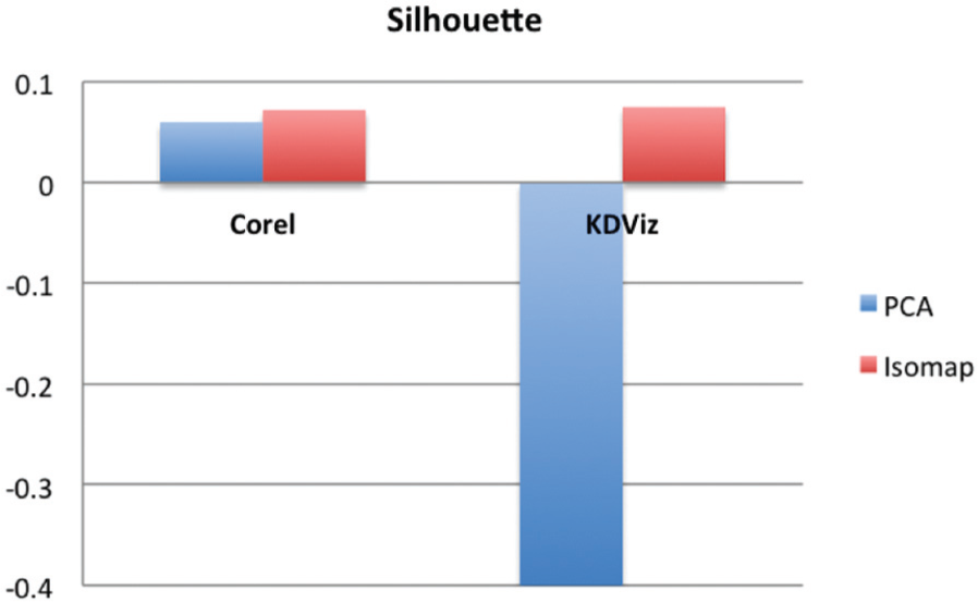
Silhouette coefficient computed for the original data.
We asked users to estimate the number of clusters in color-coded projections without any motion (where the color of the projected data points was based on what cluster they belonged to). Wilcoxon signed-ranks test did not reveal any statistical significant difference between motion and color (Z = 20.089, p = 0.929); however, mean error for motion (mean error = 13.5402) was higher than mean error for color (mean error = 10.9375). Therefore, we can confirm H4a. We also investigated how long it took for the subjects to complete the tasks in color-coded projections and animated scatterplots. The statistical test did not show any significant different between color and motion when time is compared (Z = −0.471, p = 0.638). Finally, for confidence levels, comparison between color and motion did not reveal any significant differences (Z = −0.192, p = 0.848). Thus, H4b is also confirmed.
Confidence levels
With regard to confidence levels, a one-way ANOVA test showed significant differences among all comparisons for Count Cluster (F(3, 92) = 11.57, p < 0.05). A Post-hoc Tukey showed significantly that the static projections had the lowest level of confidence (mean = 2.83). For Association, again significant differences were seen (F(3, 92) = 33.39, p < 0.05) and Post-hoc Tukey confirmed that static projections had the lowest scores. For Rank Density, static projections also had significantly lesser confidence scores (F(3, 92) = 11.601, p < 0.05). These results are very consistent with the results we found in examining user accuracy of the tasks, that is, the users’ confidence was warranted.
Time
Finally, we investigated how long it took for the subjects to complete the tasks. Findings for Count Cluster did not reveal any significant differences between motions and static projection (χ2(3, 24) = 7.25, p = 0.064). Similarly, for Association and Rank Density, a Friedman test also did not show any significant differences (χ2(3, 24) = 1.05, p = 0.789) and (χ2(3, 24) = 2.6, p = 0.457). We can conclude that perception plays an important role in interpreting the scatterplots. For example, PCA had problems with cluster segregation and led to misinterpretations in a static projected data. In particular, mapping of density-based motion can enhance the perception and user’s performance significantly, where the cluttered layout was displayed.
We also performed a comparative analysis of motions and color-coded projection methods on two types of data, which had similar levels of accuracy. As Bartram et al. 10 discuss, color is particularly well suited for categorization but less effective at showing other relations. Our results showed that density-based motion can be an effective way to show the density and similarity relations in multidimensional data visualization. However, the cognitive costs associated with using color and motion simultaneously should be investigated because, as Healey et al. 52 stated, the various graphical codes may perceptually interfere with each other. Nonetheless, our results indicate that motion can be used as an additional approach in order to enable users to effectively explore different aspects of data. A video demonstrating the different phases of our user study can be found on the authors’ website, along with the full data collected from all 12 of the participants (http://evl.uic.edu/creativecoding/sage/realworld.zip).
Conclusion and future work
In this article, we described a series of controlled user studies that evaluated how users perceive density-based motion in scatterplots. In the first experiment of our first study using synthetic datasets, we investigated the effectiveness of different motions for a range of tasks in scatterplots. These scatterplots were created with synthetic datasets that had distinct characteristics in terms of sparseness and distance distribution. In particular, we considered group segregation (identifying clusters), distance preservation (finding similarities), and behavior comparisons (ordering densities). Four types of motion were chosen and the results confirm the intuition that motion techniques perform well on different types of tasks. In the second experiment of the first study, we found a lower bound of motion related to density that created the best overall subject performance in enabling users to differentiate clusters.
In our second study, we considered cluster segregation, similarity identification, and behavior comparison tasks using real-world datasets. After excluding one motion that performed poorly in the first study, three types of motion were examined and the results confirm our general hypothesis that motion techniques perform well on different types of tasks. In the first experiment, motion as a low-level perceptual cue with a lower bound related to density was investigated to improve performance on similarity detection of data points and their associated clusters. In the second experiment using real-world data, we formulated hypotheses for visual analyses of projected multidimensional data. We investigated the role of motion related to cluster characteristics in real-world data and statistical tests confirmed those hypotheses.
Results from our experiments show that three types of motion can encode different values of density, but that minimum visual differences are needed to ensure rapid and accurate detection. Rotation velocity must differ by at least a delta value of 0.608 and, interestingly, requires a smaller delta value compared to the other types of motion in order to attract more attention. Our results showed that applying motion to a static scatterplot makes it significantly easier to recognize clusters. Our experiments did not explicitly measure how distracting each motion appears to a viewer. However, there were obvious interferences between the number of clusters and the velocity of the motions according to their density. That is, it was harder for participants to order the clusters based on their density when higher number of clusters were moving in a scatterplot; and, because it was easier to perceive the differences between the velocities, it was thus easier to rank the clusters based on their density when less number of clusters were moving in a scatterplot.
Multidimensional data representations are often visually very complicated; our results showed that using a density-based motion not only is useful for representing clusters of data, but also that it can be potentially used as a means to more effortlessly inspect other interesting aspects of multidimensional data. Thus, for a future application, we would like to test the effectiveness of motions when allowing users to have control over the velocity and magnitude of movement. We also plan to design further user studies to explore other perceptual properties of motion, including frequency, amplitude, direction, and phase. Although our results showed that motion can be used for effective visualization, we also will explore the visual interference between individual motion properties, as well as between motion cues and static cues. Finally, our evaluations thus far have focused on high-dimensional datasets with only a medium-sized amount of data points; future work will explore the use of density-based motion on projections of datasets that are made up of a very large number of data points.
Footnotes
Acknowledgements
We thank David Kao for encouraging us to expand our earlier conference paper (presented at Visualization and Data Analysis in February 2015), culminating in this article. Kelland Thomas helped us to recruit research participants for our user studies. Paul Murray provided assistance in developing the interactive visualizations for the user studies.
Funding
The author(s) disclosed receipt of the following financial support for the research, authorship, and/or publication of this article: This publication is based on work supported in part by the USDA Agriculture and Food Research Initiative (AFRI) (grant number 2013-67015-21231) and by the DARPA Big Mechanism program (grant number WF911NF-14-1-0395).