
Abstract
TexTonic is a visual analytic system for interactive exploration of very large unstructured text collections. TexTonic visualizes hierarchical clusters of representative terms, snippets, and documents in a single, multi-scale spatial layout. Exploration is supported by interacting with the visualization and directly manipulating the terms in the visualization using semantic interactions. These semantic interactions steer the underlying analytic model by translating user interactions within the visualization to contextual updates to the supporting data model. The combination of semantic interactions and information visualization at multiple levels of the data hierarchy helps users manage information overload so that they can more effectively explore very large text collections. In this article, we describe TexTonic’s data processing and analytic pipeline, user interface and interaction design principles, and results of a user study conducted mid-development with experienced data analysts. We also discuss the implications TexTonic could have on visual exploration and discovery tasks.
Keywords
Introduction
Over the past few decades, the amount of stored data has increased tremendously, yet the ability to glean meaningful information from this data continues to pose a challenge. Visualization is often used to leverage the human ability to visually identify patterns and make sense of abstract concepts. This approach is especially helpful for exploration and discovery-oriented tasks for large text collections, where the data set is often large and unfamiliar and in which it is difficult to articulate what exactly to look for a priori such as through query-based searching. Visual analytics is a type of visualization application that utilizes user interaction with the visualized data to support sensemaking and analysis. 1 This approach is particularly useful for problems involving large amounts of data that cannot be easily or quickly understood using conventional analysis methods and tools.
In this article, we present TexTonic (Figure 1), a visual analytic system that supports the exploration of very large unstructured text collections through user-driven analytics. TexTonic extracts, clusters, and visualizes terms from documents to reveal topics within the overall collection. Users can interact with the data via semantic interaction, 2 a method to support user-driven analytics through interaction with the visualization. This direct interaction with the data helps users to automatically tune the visualization in support of their current analytic mental model. This system is meant to help the user manage information overload by providing progressive visualization (clusters of terms, snippets of documents, full documents) guided by user-driven analytics that adjusts the form of the data based on the user’s analytic needs. The result of semantic interactions combined with the other user interactions such as zoom and pan is a dynamic system that helps reduce the burden that big data pose on users and now makes exploring large collections more intuitive and manageable. TexTonic supports analysis by helping the user begin their initial exploration of data that are too large to explore using existing text analysis tools.

TexTonic visualization of Voice of America (5043 documents).
The users we aim to support often work with very large text collections that they know little about in terms of content and structure. There are many ways that “very large” can be defined, and in the context of this article, we are concerned with the number of unique documents in the collection, rather than the number of unique terms in the collection, or the at-rest footprint of the collection. As a point of reference, we demonstrate our visual analytic on Wikipedia which contains over 4 million documents. The combination of overview visualization techniques combined with controllable levels of detail is often used to address scale. TexTonic further manages scale through user-driven analytics. The domain expertise of users does not usually include the skills needed to tailor the analytics used to process the data for their specific analytic need. TexTonic’s unique contribution is the ability to interact with an intuitive visual representation to steer a generic analytic model toward something more aligned to the user’s intent without the need to be an expert in text processing.
Related work
Spatial text visualization
Visualization is a powerful mechanism to present textual data set to users. One popular approach for visualizing text is through the use of a geospatial metaphor, where relative distance between points (e.g. documents) is used to represent relative similarity. 3 For example, IN-SPIRE’s Galaxy View leverages such a geospatial metaphor. 4 Their work demonstrates how unstructured documents can be translated into a weighted vector of keywords, and by using dimension reduction methods, relationships are visualized in a spatial layout of documents. Similarly, STREAMIT 5 and ForceSPIRE 2 display documents in a spatial visualization using a force-directed layout, where edges (or springs) between the nodes (or documents) are a summation of the shared weighted keywords. Felix et al. 6 presented TextTile, a visualization technique that combines structured and unstructured text corpora into a single data model for interactive exploration. It uses a combination of multiple natural language processing (NLP) methods to do so. In addition, Kim et al. 7 presented TopicLens which lets users explore the main keywords in a spatially represented visualization of topics (generated from topic modeling) to get a better understanding of the relationship between documents, the topics they belong to, and the keywords that define the topics.
A more literal geospatial example is used by GMap 8 that visualizes a graph of keywords as a geographical map, where clusters of the graph are colored as land masses. Additional work has used a computed spatial layout based on the data characteristics to show documents in spatial visualizations (e.g. Skupin, 3 Davidson et al. 9 and Olsen et al. 10 ). Perhaps most similar to our approach is GMap, 8 which presents users with land masses of keywords. While effective, we go beyond this visualization technique to include interactive methods that enable (1) changing the level of detail shown for specific topics of the data and (2) changing the relative relationships between keywords and adjusting their importance.
Visually presenting overviews of large amounts of text has been approached by showing visualizations of terms or keywords in a data set, as opposed to the document-centric visualizations as described previously. This approach for scaling the visual representations has resulted in visualizations that are commonly referred to as “tag clouds,”“word clouds,” or “wordles.” These approaches focus on showing terms used in a data set based on their frequency and optimizing the reduction of whitespace within a bounded area.11–13 Font sizes and weight, and color are popular visual encodings for showing these quick, quantitative overviews of data. The term-centric metaphor has been extended by adding meaning to the relative spatial positioning of the terms. For example, techniques exist for generating a context-preserving word cloud based on similarity metrics between the terms including frequency of use 14 and parts-of-speech relationships. 15 These approaches apply mathematically generated locations to terms, such as force-directed layout algorithms 14 or multidimensional scaling (MDS). 16
Additional work applies these spatial techniques to visualize the data contained in Wikipedia. For example, Holloway et al. 17 have created a spatial visualization of English Wikipedia through the use of the semantic content in the markup metadata generated by the users of Wikipedia (e.g. the topics, categories, and additional metadata used in the wiki). Pang and Biuk-Aghai 18 present a Wikipedia “world map” that adheres to the geographic metaphor even more closely. Their work represents Wikipedia content as a geographic terrain, where peaks and valleys are created based on the amount of information about a topic (similar to the SPIRE ThemeView visual metaphor, 19 VxInsight, 9 etc.). Another geographic approach is a multi-scale word cloud approach enabling users to zoom into areas of the visualization to retrieve additional details. 20 This approach computes static locations of terms, phrases, and documents, allowing users to zoom into areas to reveal more information.
Semantic interaction
Semantic interaction is a technique that tightly couples the visual encoding and metaphor of a visualization with user interaction. 2 The approach enables users to influence the system’s underlying data model by directly manipulating the information within the visual metaphor, such as enlarging or shrinking the terms or changing the position of elements in the visualization. Interactions with the visualization are inferred analytical reasoning that are translated to steer the underlying analytic data models. 21 The interactivity supported by the visual analytic tool can help reconcile the disparity between the mental model and system model. 1 Users implicitly tune the visualization based on their underlying mental model as opposed to making manual adjustments out of context of the original interaction and analysis. The model proposed by Endert et al. 2 emphasizes the differences between implicit model steering versus explicit, direct control of model parameters.
Much of the work on semantic interaction has focused on steering data models 22 by manipulating and interacting with data objects (e.g. documents). For example, by directly interacting with the spatial layouts produced by analytic models, people can directly reposition data points to organize documents based on their preferences and expertise. Methods have been produced that take this input to steer dimension reduction techniques.2,23,24 The common strategy among these approaches is to solve for a weighting schema across the feature space that corresponds with the user-determined placement of the data points in the spatial visualization. Similarly, Głowacka et al. 25 leverage reinforcement learning techniques to update their data model given user feedback on keywords. Arnold and Gajos 26 utilize multidimensional scaling to explore semi-automatic placement interactions to help guide spatial layout decisions in a visualization. StarSPIRE 27 extends the semantic interaction workflow by also performing document retrieval from the inferred models produced.
The primary contribution of this work when compared to existing semantic interaction research is twofold. First, the visualization displays and allows interaction with multiple levels of hierarchical content, displaying terms, phrases, snippets, and documents, while previous work has been limited to only documents or terms. This supports TexTonic’s ability to represent and visualize document collections at very large data scales. Second, TexTonic incorporates information aggregation techniques for model steering to determine at what level of detail (e.g. terms, snippets, full documents) to show the information in the visualization.
TexTonic’s user interface is a spatial visualization that displays information at multiple levels of detail. User interactions with the data through the visualization interface are interpreted and translated into real-time personalized analytics. These user-driven analytics close the gap between the users’ mental model of the data and TexTonic’s initial data model generated from the supporting analytics, making it easier for the user to understand and explore the data. The system steers the underlying analytic models in real-time based on the exploratory user interactions.
The TexTonic visual analytic (Figure 1) is composed of three primary components: the underlying analytics and data processing, the visualization interface, and the user-driven semantic interactions. First, data are processed and analyzed using text processing and key term extraction to produce a data model of the text collection. The important key terms are displayed in the visualization by dimension reduction and force-directed layout algorithms. Finally, the interactive visual interface updates the data model in real-time based on the user interactions in the visualization. Combined, these components support exploration of very large unstructured text collections. Compared to existing work, TexTonic offers a number of unique contributions including a dynamic spatial text visualization, consideration of term relationships rather than document relationships, and the application of semantic interactions in support of user-driven analytics.
TexTonic
TexTonic is a visual analytic system that supports the exploration of very large unstructured text collections through user-driven analytics (see Figure 1: Voice of America, Figure 2: Enron, and Figure 3: Wikipedia). It is meant to help the user manage information overload by providing progressive visualization guided by user-driven analytics that adjusts the form of the data based on the user’s analytic needs. This approach helps users deal with larger data sets by tailoring the data model and subsequent visual to what they are interested in by interpreting their interactions. TexTonic supports analysis by helping the user begin their initial exploration of data that are too large to explore using existing text analysis tools.
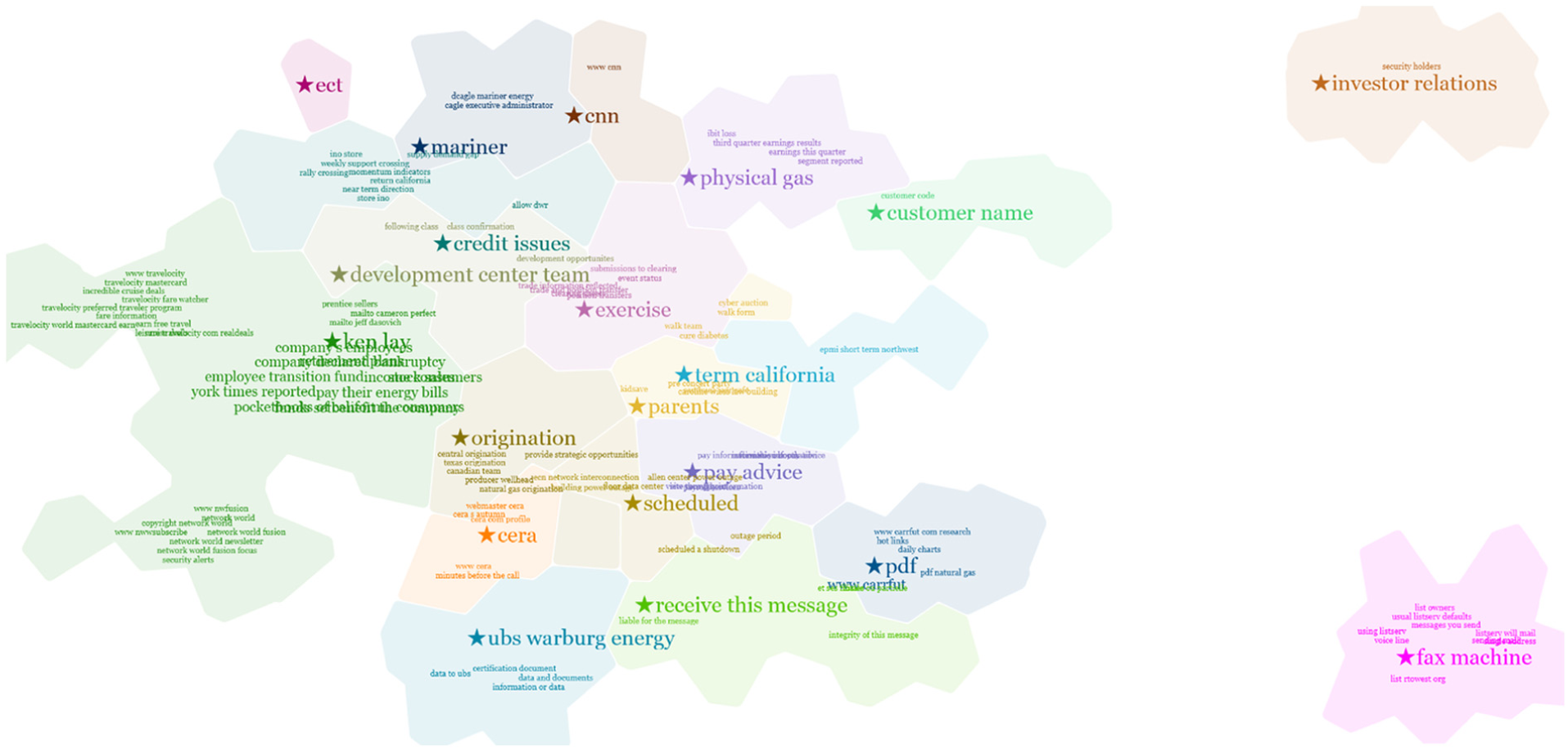
TexTonic visualization of Enron (510,596 documents).

TexTonic visualization of Wikipedia (4,825,201 documents).
Data processing and analytics
TexTonic’s data processing and analytics pipeline is a multi-stage process that includes the processing of raw files into analytic artifacts used for visualization in the user interface. This first step processes the raw text data and generates an index of the top terms mapped to the source document data, individual term weights, and term association scores. We used Rapid Automatic Keyword Extraction (RAKE) 28 with a common stop-word list to extract the top 10,000 terms (individual words and phrases) from the source data. A term is a string of one or more consecutive words, present in a document, and identified as a candidate keyword. A keyword is the distinction made by RAKE that identifies a term as being important for a document. 28
The optimal number of terms to extract depends on the diversity of terms used in the document collection. Homogeneous collections, such as Enron emails, may have smaller dictionaries than heterogeneous collections, such as Wikipedia. In the case of Wikipedia, the top 10,000 terms (excluding stopwords) provide 98% coverage of all Wikipedia articles. RAKE operates on a per-document basis and is more affected by the size of the document vocabulary rather than the number of documents in a collections. RAKE’s contribution to TexTonic is important because of its ability to identify and extract phrases. The extraction of short phrases is critical to the usability and comprehension of the visualization because of the additional context that is lost in individual keywords.
A similarity matrix is generated that contains document frequency, term weight, and a term association score. Document frequency is the number of documents containing a term and is calculated as

where
Term weight is a measure of how often that term is important for a document, where
where 2 is used as an added scale factor. The possible range of term weights is [0.0, 2.0].
Term association is the a measure of how well two terms predict each other. We use an F-measure to evaluate

A Lucene 29 index is used to map the extracted terms to the source data, but any indexer may be used. For a given term, Lucene selects sample text snippets for each term from related documents based on term density. A separate index of associated terms is maintained that often includes common synonyms and alternate spellings of the indexed terms. This index supports term search and document retrieval in the user interface.
K-means clustering is applied to the similarity matrix to produce a set of clusters and cluster centroids that represent topics contained in the document collection. K-means is a convergence on a set of mean points and does not assume uniformity of the distribution. As a result, clusters may contain different numbers of terms based on how the terms converge on the mean points. The data processor interface also calculates g-means which can be used to inform k. The user may disagree with the g-means recommendation and choose a different
Finally, principal component analysis (PCA)
30
on the centroids reduces the dimensionality of their vectors from 10,000 to 2. These two dimensions (2D) are used to calculate the
Visualization and user interface
TexTonic uses a spatial visual metaphor to represent information, as shown in Figure 1. The visualization represents a hierarchy of terms, snippets, and documents positioned spatially using color, size, and location to imply relationship. TexTonic utilizes a visualization method similar to GMap, 8 with several key differences. Both TexTonic and GMap use a force-directed layout to organize and position terms in 2D space; however, our approach differs from GMAP in that we cluster our terms in high dimensional space and use dimension reduction on cluster centroids to anchor clusters to a certain position in 2D space and then use a force-directed layout to show the remaining terms in each cluster. The resulting layout is a more precise measure of the relationship between groups (although the placement of the nodes is still only as precise as FDL) without the noise from position optimization. It is possible that two very similar groups have star terms positioned on or near each other, resulting in a visual mash-up between the two group terms (see Switzerland and Village clusters in Figure 3).
Terms are animated when they first appear on the space and continue to move into their positions to reflect changes to the underlying analytic model via semantic interactions. These changes to the spatial layout may be subtle (such as only moving a few pixels in space) or significant (such as moving to associate with another term). This movement is critical to reduce change blindness and help users track these changes as many terms may move in response to a user’s interaction. Term movement is also an indicator of the effects of user interaction on the model (via semantic interactions), and large changes (such as many terms moving in space) indicate a major change to model.
The term animation is a physics-based model that takes into account the weighting of terms in the graph and the distances the terms must move in space based on the new model weights. Positioning is not deterministic because the dynamic layout is always responding to user interactions as they work with the data. Therefore, optimal term placement algorithms (such as Been et al. 31 ) are computationally expensive for TexTonic because of constantly moving terms. To balance utility and usability, we compromised computational cost of optimal label placement with occasional term overlapping by allowing users to adjust term padding and spacing to their preference. Anecdotally, we have found that our users prefer closer spaced terms at the expense of some term overlapping versus perfectly visible labels. Terms can be clicked and temporarily dragged to reduce occlusion without affecting the underlying model.
Clusters are identifiable by the shared background generated from a Voronoi diagram, font color of associated terms, and of term position. Each cluster contains a star term that is the term closest to the centroid. The star term is positioned using the

Hierarchical highlighting of “defense secretary robert gates” as a child of “president barack obama” as a child of the centroid cluster term “government” (Voice of America).
Term size is determined by term weight and position in the hierarchical cluster. Top-level terms are larger, mid-level terms are smaller, and the lowest level terms are the smallest and hidden from view until the area of interest is in view.
Terms can also be “pinned” to a specific location and are no longer affected by dynamic layout effects. Pinned terms serve as landmarks in the visualization and can mark terms of interest. They can have semantic interactions applied to them, such as move and resize. These interactions are described in more detail in the next section.
TexTonic uses progressive disclosure through three levels of zoom to control the amount of information a user has to manage at any one time. For example, the initial overview (zoom level 1) generated by TexTonic only shows the highest weighted terms in all of the clusters and provides a high-level view of the entire data set. The user can use zoom to dive deeper into the data, revealing mid-level (zoom level 2) terms, and pan to move the view across the spatialization. These interactions combined help the user focus on a specific area of interest. At the lowest levels of the data (zoom level 3), additional terms and snippets of source text are shown to provide the most detailed context of the data. These snippets are also available by request for any term the user selects.
The general visualization principle is similar to a word cloud, however with several differences. Word clouds are a useful visualization technique that many users are familiar with. Our application of semantic interactions, which connects the underlying analytic to the visualization, sets TexTonic apart from word clouds. The additional visual structure and visual encodings (term position, cluster position, term size, cluster color) also work to enhance the visualization technique, going beyond an information graphic approach to supporting interactive visual analysis. Because of the variable size in font size and phrase length, optimizing the position of terms while managing computational cost remains a challenge. Too little spacing causes term overlap and reduces readability, while too much spacing reduces the saliency of the clusters and is an inefficient use of space. TexTonic provides several configurable scaling factors to allow users to adjust term spacing to their preference.
User-driven analytics through semantic interaction
TexTonic automatically interprets certain user interactions and updates the data model using semantic interaction. 2 When a user interacts with the visualization, their actions are implicitly interpreted by the system. This is used to update the term weights in the similarity matrix, resulting in a real-time, user-driven analytic. This in turn changes the data model which is then reflected in the visualization.
The user interactions are based on recommended semantic interaction heuristics described in Endert et al.
2
and leverage the bi-directionality of the visual encodings and metaphor. That is, the techniques used to encode specific attributes of the data also serve as the methods for interacting with the underlying models. Below, we describe how each interaction updates the visualization and the underlying models. Users can resize star terms or pinned terms directly in the visualization which updates the term weight and term pair relationships in the similarity matrix. Let

where
As one particular effect, the change in the similarity matrix drives information retrieval methods to find additional information in the data set that may not have been immediately visible. Then, the graph used to drive the visualization is updated and adjacent vertices in the graph that contain affected features are updated. For example, Figure 5 shows how changing the term size of “investor relations” increases the weights of related terms. In addition, if the weights of lower weighted terms are also increased, they are raised in the hierarchy and may become visible in the visualization.

Pinning and resizing the centroid term “investor relations” increase the weight of related terms in the cluster, elevating them to the visible hierarchical layer (Enron).
Term movement in the visualization is a way for users to express their assertions and hypotheses about the clustering and relative association between terms. Let

or in the case of increasing distance between

where
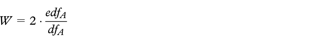
For example, Figure 6 shows how moving two terms (“ireland” and “played”) closer together updates the association scores of all related terms and results in more contextually relevant information displayed in the visualization. Individual term weights are also updated in this process, and the sizes of the terms are adjusted in the visualization according to the new weights. Searching for a term will temporarily increase the weight of matched and related terms. Let

as well as affects related term A’s term weight

where
Moving the pinned term “ireland” closer to “played” updates the nearby association scores, causing sports-related terms in the “Ireland cluster” to move closer to the “played” cluster (Wikipedia).
In addition to upweighting, TexTonic temporarily reveals relevant clusters in the visualization for terms that may not be currently visible. While the search box is open, terms can be pinned and upweighted to identify discoveries worth saving and influencing the data model, as shown in Figure 7. This helps the user feel free to look for terms or clusters that may be of analytic interest that was not previously visible in the visualization. Terms can also be deleted in the visualization, resulting in the term weight and associated term relationships set to zero in the similarity matrix. This has the effect of removing the term’s influence in the analytic data model.

Searching for the term “canadian” increases related term weights and makes them visible in the “played” cluster (Wikipedia).
While any one particular user action may change term weights somewhat, individual actions taken in isolation from other actions have limited influence on the overall model. An experimental term movement may leave a small residual effect if corrected but will have minimal impact on the model as a whole. Recognizable influence on the model comes from the accumulation of adjustments from the user performing many interactions over the course of the analysis.
By interacting with terms, users can express their assertions and hypotheses about the clustering and relative term association. These semantic interactions offer two benefits to TexTonic. First, they allow users to explore the data through a set of interactions that occur directly on the visualization. Second, semantic interactions reduce the gap between users’ mental models of the specific analytic contexts they are working in and the system’s data model. These interactions are the foundation for how TexTonic supports exploration and discovery of large textual data sets.
Use case: football (United States) vs football (world)
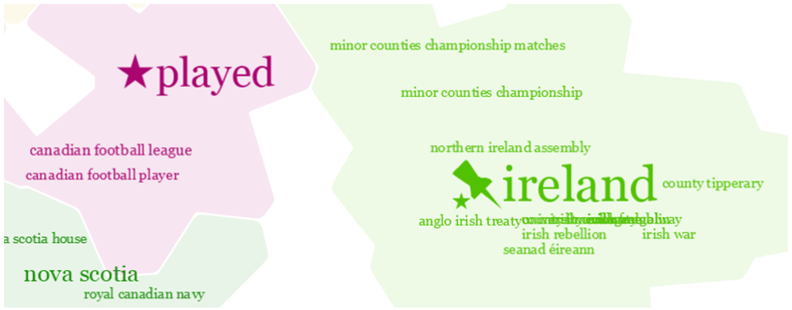
As a way to better describe how TexTonic can be used in interactive text analysis, we present a use case exploring the differences between American football and football in the rest of the world using Wikipedia as our corpus. To begin, we start with TexTonic’s overview of the Wikipedia data set (Figure 3). By reviewing the major groups, you can see that there might be some groups near the bottom of the visualization that are relevant to our investigation: Club, Games, and Match.
If we were more familiar with the world-view of football, we might pick up on star terms near the bottom of the visualization that are common terminology: “club” and “match.” Zooming into this area reveals additional terms to confirm this might be a good area for additional investigation (Figure 8).

Zooming into the area around Club, Games, and Match (left) reveals the next level of terms (right).
However, if we were more familiar with American football, we might not key in on the terms “club” or “match” as something relevant to football and instead choose to search for the term “football.” Doing so not only reveals terms that contain the term “football” across the groups but also temporarily increases the term weight of lower weighted terms so that they are now visible in our current zoom level (Figure 9). Notice that terms that were not previously visible are now temporarily visible in search mode. Our assumption about these three groups being relevant to our search is confirmed and we can dive a little deeper.

Searching for the term “football” reveals hidden terms in the groups Club, Games, and Match.
Next, since we know these three groups seem to be the most relevant, we can drag and isolate them from the other groups to conduct a targeted exploration relevant to our task. The terms and their positions in these three groups have changed slightly from what was shown in their original positions. Isolating the groups has changed the associated relationships between these groups and the other groups in the visualization (Figure 10).

Isolating Club, Games, and Match for further investigation.
At this point, we know that all three groups contain the term “football,” but it is unclear how these three groups may differ. Knowing a little bit about American football, we search for the term “National Football League” and see it appears in the Games group. We decide to dig a little deeper and pin the “national football league” term and increase its weight. Immediately new terms appear that we had not seen before, including “college football hall” and “assistant football coach.” These terms now appear because their term association score increased when the term weight for “national football league” increased, making them more important in the model and now visible at this level of zoom (Figure 11).
Searching for the term “National Football League” (not visible at the highest level) shows that it has been clustered into the Games group (left). Pinning and increasing the weight also increase the weight of related terms and make them visible (right).
In another search-pin-upweight example, we explore FIFA. In a search for “FIFA,” the term “FIFA World Cup” was temporarily upweighted and visible during the search and so we pinned this term. Wanting to explore FIFA more, we upweighted “FIFA World Cup,” and more FIFA-related terms are now visible in the group (Figure 12).

Searching for the term “fifa” (not visible at the highest level) shows multiple terms that contain the string “fifa” and they have all been clustered into the Club group (left). Pinning and increasing the weight of “fifa world cup” also increase the weight of related terms and make them visible (right).
In a final example, we take a different approach to exploring the Match group. We pin and upweight the star term “match” which also increases the weight of its associated terms. A term we are unfamiliar with, “challenge cup” appears and we double click on it to see snippets of documents for additional context. The snippets include terms such as “Scottish,”“goal,” and “club,” and we conclude that the Challenge Cup is a Scottish football (American soccer) championship. A particular snippet catches our interest, and we can pull up the source document to read further (Figure 13).
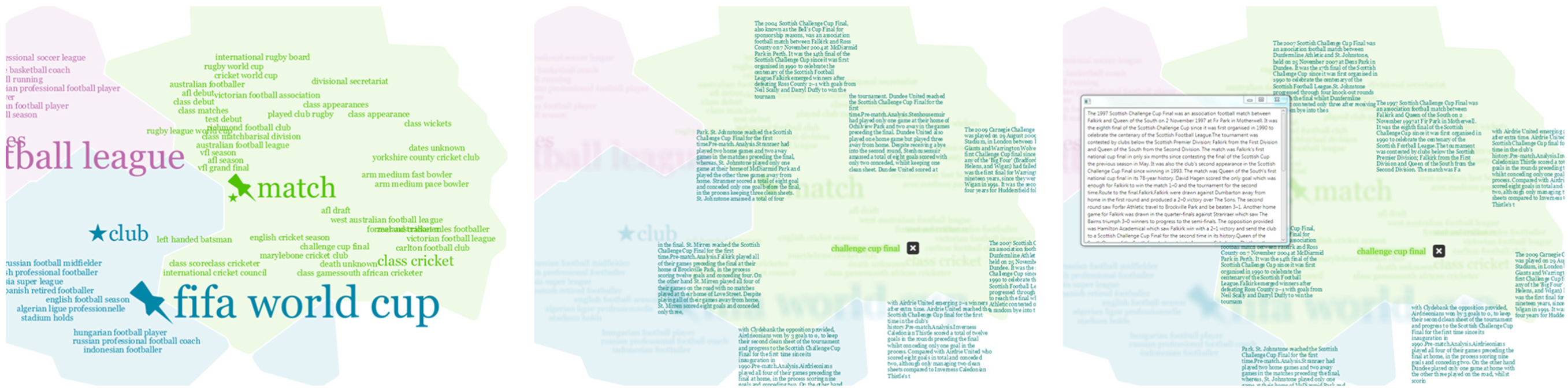
Upweight of “match” increases the weight of relative terms that are now visible (left). Double clicking on “challenge cup” reveals a snippet of sample text the term is extracted from (middle). Double clicking on a snippet gives us the full source document.
User study
We conducted a user study of TexTonic part-way through development. The aim of the study was to evaluate TexTonic visualization and interaction approaches for usability and system improvements. We recruited 10 experienced data analysts (female = 5; mean age = 42 years) who participated in the study. All of the participants had at least 2 years of experience working with structured and unstructured text data as a professional analyst. Study sessions were audio and video recorded and notes were recorded by an in-room observer.
TexTonic was set up at a workstation with a large, high-resolution display. English Wikipedia was used as the test data set with around 4 million articles processed using the data processing and analytic pipeline described in the earlier section. We chose Wikipedia as the evaluation data set because of its diversity in content and size and generalizability. We believe that how TexTonic is used will be highly dependent on the data set and experience of the analyst. Our analysts had expertise in different topic areas and so it was important to choose a data set all participants would be familiar with and to design study tasks that relied on universal analytic techniques. Although Wikipedia and other encyclopedic data sets have ontologies to help organize information, our use of Wikipedia was motivated by size and availability of the data set.
Procedure
Participants were asked to complete three tasks representative of TexTonic use. While completing the tasks, participants were encouraged to “think aloud” to provide insight to their thought processes. Training before the tasks was a self-exploration that also served as an introduction to TexTonic. Participants were first asked to spend 10 min using TexTonic in undirected exploration of Wikipedia and report anything interesting that they found. If a participant did not discover a feature on their own, the moderator would demonstrate it to them and then ask them to describe the effects on the visualization. This was done to evaluate whether participants understood how features such as semantic interactions work and affect what the user sees in TexTonic.
The study tasks were designed so that participants completed exploration and discovery activities through the use of TexTonic using standard analytic techniques. The following tasks were given to participants:
Explore the term “French navy”;
Explain the significance of “oak leaves” in history;
Compare the American National Football League (NFL) and the Canadian Football League (CFL).
These tasks were each prompted as explicit questions that could be queried for directly; however, the importance of providing provenance of the answers was stressed. Moderation style was based on the Think Aloud Protocol (TAP) 32 and participants were encouraged to talk out loud about their thought processes. Ad hoc discussion with the moderator driven by a participant could and did occur during task completion. For this reason, time on task was not a formalized metric. The order that the study tasks were provided to participants was randomized.
After each participant completed the study tasks, they were asked to complete the Summative Usability Scale (SUS) 33 to assess usability and the NASA Task Load Index (TLX) 34 to assess mental demand. We modified the TLX to measure the overall mental demand of the entire TexTonic experience rather than evaluate individual tasks, and participants completed the TLX after they completed all of their tasks, rather than after each task. After participants completed the SUS and TLX, a post-study interview was conducted. Participants were asked to identify five things that they liked and disliked about their TexTonic experiences. Participants were also provided an opportunity to share any other feedback about TexTonic with the researchers.
Results
Overall, TexTonic performed well in the usability study. Participants were able to learn how to use the visualization features, were able to complete the tasks, and provided positive comments about the experience. The study also identified some usability problems that we fixed, improving the overall TexTonic user experience.
Exploration and feature discoverability
Most of the participants (n = 8) discovered the semantic interactions on their own and understood how these interactions affected the underlying data model. For the two participants who did not understand the semantic interactions, the moderator demonstrated and explained them before moving on to the study tasks.
Task completion strategy
Task completion was examined for the French Navy, German Oak Leaves, and American and Canadian Football tasks. Because of the open-endedness of discovery tasks, task completion was evaluated on a scale rather than pass/fail:
Attempted the task, but did not find any relevant topics or terms;
Found relevant topics and terms, but did not find any interesting details;
Found relevant topics, terms, and interesting details.
All participants were able to find topics and terms relevant to all three tasks. Participants were able to easily find details to complete the French Navy (n = 9) and German Oak Leaves (n = 10) tasks. Participants had more difficulty finding details about the difference between American and Canadian Football (n = 6); however, four of six of these participants were able to find the relevant topic and terms.
Task completion strategy was also examined. Observed strategies included the following:
Starting with keyword search;
Starting with the visualization;
Starting with the visualization and then switching to keyword search before much progress was made.
Half of the participants used the keyword search strategy to complete all three tasks (note that they were not the same participants across all tasks): French Navy (n = 6), German Oak Leaves (n = 5), American and Canadian Football (n = 5). Several participants started with the visualization and then switched to a search strategy: French Navy (n = 3), German Oak Leaves (n = 4), and American and Canadian Football (n = 3). One participant completed the French Navy and American and Canadian Football tasks only using the visualization strategy. Two participants used only the keyword search strategy to complete all three tasks. No participants used the visualization exclusively to complete all three tasks.
Participants exhibited an ability to maintain a balance between the visualization-driven exploration and search-directed query to perform their tasks. Several of the participants who began tasks using the visualization before switching to a search strategy did so in order to focus on an area of interest (visualization) and to dig deeper into the details (search). Several of these participants expected search to be limited to the area of the visualization proximal to their cursor (rather than a global search).
Usability
SUS scores closer to 1 indicate low usability and closer to 5 indicate high usability (see Figure 14). In general, participants found that TexTonic was Not Complex, Easy to Use, and Easy to Learn. The lowest scores were related to Consistency and lack of Integration. We believe this sentiment was due to two factors. First, some participants had difficulty interpreting the topic of some of the term clusters. While the clusters were statistically accurate for the analytic, they did not match the participants’ mental models of what they expected to be clustered. This is a key usability finding that we will revisit in the “Discussion” section. Second, there were several small usability problems and bugs found by participants throughout the study that may have contributed to their low impression of integration. This was to be expected because this study was conducted early in the engineering process.

System Usability Scale (SUS) results from the user study.
Mental demand
TLX scores closer to 0 indicate less mental demand and closer to 20 indicate more mental demand (see Figure 15). In general, the TLX scores for TexTonic were low and represented overall low mental demand of study tasks. Overall, participants felt that TexTonic use required low Mental Demand and that completing tasks also took little Effort to use and low Frustration. These scores echo the SUS scores that indicated TexTonic was Easy to Use, Easy to Learn, and Not Complex. However, participants’ self-assessment of Performance was moderate, possibly because of the open-endedness of discovery tasks and not knowing when it has been completed.

NASA TLX results from the user study.
General impressions
After participants completed the study tasks and the summative evaluations, they were asked to describe the top five things they liked and disliked about their TexTonic experience. Most of the participants offered positive comments about the visualization (n = 7). Participants liked the way TexTonic clustered terms together to create topics. As one participant stated, “What I like about TexTonic is that the visualization allows you to get a better sense of what the clusters are because there is more content than just a few keywords” (P2).
Participants valued the ability to zoom into areas of visualization to focus their exploration on a given region of the data. Participants also liked the ability to move terms to organize the space and adjust the weight in the text model: “I liked being able to tell my tools what to do, and TexTonic did that well” (P7).
Many participants had trouble understanding the cluster labels (n = 6). As one participant described, “I don’t understand why those terms were picked” (P8), while another participant felt, “The relationship between terms was not obvious” (P4). It seemed that the text analytic was not matching the users’ mental models for what they expected to see. This raises a number of interesting questions about the context of an analytic, which we will discuss more in the “Discussion” section.
Many participants expressed interest in an advanced search (n = 5). Specifically, participants wanted to search within a specific topic cluster. As one participant explained, “I want to do an advanced iterative search to be able to dig a little deeper” (P6). This feature would support the strategy of many participants who first used the visualization to identify a topic of interest and then used search to identify the location of details. This requirement may come from a mismanagement of expectations. TexTonic is meant to provide a high-level overview of a large text corpus, not support in-depth analysis. However, TexTonic was very easy for participants to learn and use, and perhaps they expected to be able to do more with it. An advanced search capability is a feature that more involved analysis would require.
Finally, many participants explicitly said how TexTonic was easy to use, user-friendly, and intuitive (n = 4). As one participant put it, I’ve played with a lot of tools … one thing I have to say is that in an hour’s time, I felt more confident about this tool than I’ve felt about any other I’ve touched in the same time span. (P7)
Discussion
TexTonic is not meant to replace in-depth reading of documents, but to support high-level exploration of large data sets as a way of discovering documents to analyze in more depth. For example, the Google Scholar query “physics in culture” returns 3.15 million hits—too many to read in depth, even if just reviewing the titles. TexTonic’s interactive overview of query results would help the user find a more targeted subset of papers to read.
The user study showed that the tight coupling between the user interaction and the visual metaphor was an effective method for users to visually explore the data set. In addition, users relied heavily on prior experience and knowledge of the data set to aid them in exploring the data, raising the questions of how important it is to use real analysts in system development and how prior knowledge affects sensemaking strategies. We reflect on these observations in the following sections.
Benefits and pitfalls of ecological validity
There are sometimes drawbacks to engaging with real users, especially data analysts. Analysts are notoriously difficult to recruit for user studies. They are very busy, overworked people who must prioritize every task to maximize their efficiency. 35 Analysts are trained to conduct analysis in a specific way and may not be able to be temporarily flexible to new or alternate processes during a user study. If an analyst does not understand how a tool works, she may be less likely to trust the tool. This is often overcome through training and use over time, which is not always possible before a user study. Despite these drawbacks, the benefits of involving real users with real problems and real experiences outweigh the pitfalls of involving them in research.
At the same time, there are a number of benefits to involving professional data analysts in the design and evaluation of visual analytic tools. Analysts have real-world experience analyzing data, and supporting them is the end goal. Analysts represent that experience and provide realistic, expert opinions during a user study. Analysts also have the context of real-world problems. Despite the drawbacks, the wealth of experience and expert opinion that real users provided in the user study was invaluable feedback in the design and development of TexTonic.
Exploration and discovery
The challenges derived from real users helped increase our understanding for how analysts complete exploration and discovery tasks. For example, participants in the user study were unsure if and when they had completed a task. Based on what we observed and discussed with participants in the post-study interview, this could be for two reasons. First, the exploratory nature of the tasks means that there was no clear end goal or answer. Participants commented that they were unsure when all of the information about a term was being shown or if additional information could be retrieved, extracted, or shown. Second, all of the participants were practicing data analysts. They may have had professional pride (or training) to be sure that they found every detail that told the complete story of the task. 21
Supporting intuitive vs accurate mental models
As mentioned in the preceding section, the SUS scores in conjunction with the observations made during the study suggest a discrepancy between the users’ mental models of Wikipedia and statistically based text extraction model (such as the one used in TexTonic). One of the major findings from the usability study was how the clusters and star terms matched (or rather did not match) some participants’ mental models of the data. While participants could eventually understand what a cluster was about, the star term was not necessarily what they were expecting.
Star terms were chosen from the k-means centroid which was the highest weighted and presumably most representative term of the cluster. Statistically this was the most accurate term to use to represent a cluster; however, participants were expecting a more generalized topical term to help describe the cluster at a higher level. For example, the star term “played” was the most statistically representative term for the cluster that could topically be described as “sports.” Which term is really the best term to represent the cluster? This begs the question, “How much should we support the user and their existing models?”
Another example of user and system model conflict rose from participant confusion from the term “French navy” being part of the “species” cluster. Someone knowledgeable of French naval history in the 19th century might not find the relationship between “French navy” and “species” counter-intuitive, especially if she is familiar with the contributions of the French naval officer and botanist D’Urville. We did not expect most participants to have this knowledge or consider it important enough to affect their mental model of the data. Where does this leave us as analytic system designers?
Encyclopedic knowledge bases such as Wikipedia have well-defined ontologies that are used regardless of whether the data actually fit into that model. Through their experiences, people learn this model and use it to influence their own mental model of same or similar information. It makes sense to take advantage of what users already know, such as this pre-existing ontology, to increase the usability of an analytic system. At the same time, the purpose of exploratory analytics is to help people discover new things that they did not already know or think of explicitly searching for. At the same time, if you utilize an already well-known data model, then the likelihood of finding something new or unexpected in the data is much lower.
This raises several interesting research and design questions. What is the best way to design a statistically sound model that supports rather than alienates the user? To address such questions is challenging for a number of reasons. First, mental models vary from user to user, and whether an observed relationship supports one’s mental model depends on context that the user already has, as well as the user’s ability to make inferences about what she sees. Also, what does it mean for a visualization tool to support the user? Specifically, where the text model and mental model conflict, who determines which model is correct? In cases where it is the mental model that is wrong, how can a tool convince the user rather than alienate her? In general, the value of any tool is only as strong as the trust a user has in it. We believe hat the latter degrades as the user observes relationships that conflict with her mental model, making it increasingly difficult to place confidence in the information visualized. These challenges are important not only to the evaluation of visual analytic tools but also to better understand how to couple mental and computational models.
Future work
The conflict between supporting and challenging the users’ mental model is not easily resolved. However, it has led us to think about future work in several areas. The purpose of the star terms is to provide not only an anchor for visualization positioning but also a reference from which users can begin to interpret a topic. However, we saw that literal, statistically accurate terms were not able to help users with this. Utilizing a general ontology such as Zymurgy 36 may support intuitive labeling of clusters while limiting model bias of more specific ontologies, such as the Encyclopedic example.
Another area of interest is in improving the performance of the analytic pipeline. The term similarity matrix is at the heart of TexTonic’s analytic, providing the basis for term weights, term associations, and term clustering. It is also the most computationally expensive component of TexTonic’s analytic pipeline at
Different text analytics could also provide different insights. Currently, TexTonic supports a common analytic model that leverages document co-occurrence to generate term relationships. RAKE works well for calculating relationships between documents. However other text analytics, such as Latent Semantic Indexing (LSI) 37 or Latent Dirichlet allocation (LDA) 38 may also be appropriate. When combined with hierarchical clustering (similar to the work by Hoque and Carenini 39 ), topic modeling becomes a powerful analytic for visualization tools.
This leads us to wonder how to best recommend analytics for particular contexts. For example, different analytics may work better on different data sets or help users answer different analytic questions. Understanding how to map analytics to use cases and then make recommendations to the users is a much larger analytic research area. Support for multiple analytics in the data pipeline would also make TexTonic flexible for a variety of analytic use cases. We intend to use TexTonic to evaluate multiple analytics to explore how to appropriately map data, analytics, visualization, and use cases for more effective visual analytic systems.
Conclusion
TexTonic provides a scalable approach to visualizing, and interacting with, large text collections. Our work offers the following contributions to the visualization and analytic research communities:
A dynamic spatial text visualization that is intelligently driven by user interactions;
Visualization of term relationships rather than only looking at document relationships;
The application of semantic interaction to term relationships rather than only document relationships.
TexTonic offers a visual analytic far text beyond a visual map. The uses of multiple layers of analytics that are driven by user interactions with the data provide a novel and useful way of exploring very large text collections.
Footnotes
Acknowledgements
The authors would like to thank colleagues at the US Department of Defense and the Pacific Northwest National Laboratory for their early feedback on our work.
Funding
The author(s) received no financial support for the research, authorship, and/or publication of this article.