
Abstract
There is a growing need for accessible tools providing information on environmental hazards in community spaces. While tools like the U.S. Environmental Protection Agency’s EJScreen and EnviroAtlas provide publicly accessible information, they do not always provide clear metrics for understanding the impacts of hazards they display, and their long-term availability is uncertain. We have developed a novel tool for community members, advocates, and policymakers to understand the unique risks that federally recognized Superfund sites and the increasing likelihood of extreme heat events over time pose to people living and working in carceral facilities. HEAT MAP (Hazard, Environmental, and Toxicity Mapping of American Prisons) features interactive maps, relevant context, and representative case studies. Maps displaying carceral facilities, with radii of concern around Superfund sites and a visualization of heat predictions at the county level, enable users to visualize threats facing incarcerated people in these facilities. We focus attention on carceral facilities due to the inability of incarcerated people and their family members to alter their living environment. When carceral facilities are housed on or near Superfund sites or are subject to extreme heat, lack of agency in one’s housing and mobility can be understood as an issue of environmental injustice.
Keywords
INTRODUCTION
Examining prisons within the context of environmental justice reveals how incarcerated people, along with the marginalized communities they are often co-located with, are disproportionately affected by environmental hazards. 1 The United States incarcerates 1.8 million people, or 531 per 100,000 residents, the world’s largest prison population and among the highest per capita rates. 2 This system of mass incarceration, comprising state and federal prisons, jails, and immigrant detention centers, is complex and unequal. Two-thirds of the nearly 600,000 people in local jails have yet to be convicted of a crime and instead are held in pretrial detention, usually because they cannot afford bail. 3 The vast majority of individuals in pretrial detention are Black or Latino, highlighting the inequalities between race, income, and incarceration. Additionally, only 3% of criminal cases end in a trial, with 97% of all criminal cases ending in a guilty plea as accused people are pressured into taking plea bargains under the threat of a longer sentence, the ruinous cost of mounting a defense, and the severely under-resourced public defender system. 4 Regardless of the cause of their imprisonment, we challenge that all incarcerated people have the right to safe and healthy living conditions.
Incarcerated individuals are among the most vulnerable to environmental injustices, as they have little control over their living conditions. While many have called attention to issues such as water contamination, unsafe and toxic working conditions, inadequate medical care, lack of sanitation services, and even chemical attacks by authorities, 5 their ability to push for change is limited. Reports also document the connection between carceral spaces and impacts on human health from exposure to toxic chemicals 6 and to extreme heat events. 7 For example, State Correctional Institute Fayette (SCI Fayette), a state prison in Pennsylvania, is sited on a former coal preparation and processing facility and directly adjacent to the Labelle Refuse Site, a 500-acre coal ash dump where it is believed that millions of tons of waste were improperly disposed of from the coal processing facility. 8 Coal ash is particularly toxic to humans, as it contains arsenic, chromium, lead, mercury, and other dangerous substances. The Human Rights Coalition, the Center for Coalfield Justice, and the Abolitionist Law Center conducted a 12-month investigation at SCI Fayette in 2013 over health concerns. They interviewed 75 individuals and found that many reported respiratory, throat, and sinus conditions, gastrointestinal problems, skin conditions, and thyroid disorders. 9 Most respondents’ symptoms did not emerge or worsen until after arriving at SCI Fayette.
Two pressing issues of environmental justice within carceral facilities are their proximity to pollution-based hazards and the increasing prevalence of extreme heat events. One important type of pollution-based hazard is the Superfund site, an area that the U.S. Environmental Protection Agency (EPA) has identified as hazardous to human and environmental health and designated for cleanup. While tools like the EPA’s EJScreen and EnviroAtlas are publicly available and visualize some risks people housed in carceral facilities experience, these tools have several limitations when considering these specific variables. Additional tools are needed to address the information gap in understanding carceral facilities’ exposure to environmental hazards.
DATA AND METHODS
HEAT MAP (Hazard, Environmental, and Toxicity Mapping of American Prisons) highlights two critical environmental risks faced by U.S. carceral facilities: (1) the proximity to hazardous Superfund sites and (2) projected days of extreme heat exposure today, as well as predicted heat exposure by midcentury (2036–2070). The interactive website builds upon EJScreen and EnviroAtlas by paying specific attention to the environmental exposures of incarcerated people, enabling higher resolution analysis and providing users with context and information. Specifically, we hope this tool can be used to bolster concerns about the living conditions of incarcerated people and advocate for better living conditions, government cleanup practices, and protections against extreme heat events.
HEAT MAP is a web-based application built using the R Shiny package, developed by the authors at the University of California, Santa Barbara, from 2022 to 2024. The tool is publicly and freely accessible at https://matthuy.shinyapps.io/toxic_prisons/ and is currently maintained by the authors to ensure its continued availability for researchers, advocates, and the public. The tool integrates several publicly available datasets to map carceral facilities and environmental hazards. Data on U.S. carceral facilities were sourced from the Homeland Infrastructure Foundation-Level Data, a program under the United States Department of Homeland Security. These data contained information for 6738 carceral sites originally uploaded in June 2020 and last updated in May 2022. We gathered these data in July 2022 and verified no data have been updated prior to completing our analysis in 2023. Information and geographic coordinates for Superfund sites were obtained from the National Priorities List of the U.S. EPA Superfund Enterprise Management System. These data were last collected by our team in September 2023, when the Superfund National Priorities List contains 1336 Active Sites, 445 Deleted Sites, and 41 Proposed Sites. Extreme heat data are drawn from two sources: historical data (1971–2000) and future projections (2036–2065) for days with a heat index above 100°F are based on climate modeling from the Union of Concerned Scientists’ 2019 report, ‘Killer Heat in the United States’ and projections of average temperature increase due to climate change by midcentury (2041–2070) from the EPA’s LASSO tool for climate change data.10,11
Existing tools and their limitations
Tools like EJScreen and EnviroAtlas are essential resources for public environmental education. EJScreen, for instance, allows users to easily visualize the proximity of hazards, such as Superfund sites and particulate pollution, to community infrastructure like schools and prisons. EJScreen has made complex data on environmental health accessible to the public and has inspired our efforts to expand understanding of the vulnerability of incarcerated people. The proximity of Superfund sites to vulnerable communities is a primary area of concern. While EJScreen provides a valuable overview by presenting Superfund proximity as a percentile at the census tract level, analyzing specific threats to carceral facilities requires a more granular approach. Investigating the specific risks of a Superfund site requires knowing its precise name and location, making a more localized tool necessary. EnviroAtlas features hundreds of variables, and while it is possible to select Superfund sites amid these options, there is no way to highlight prisons as a variable on the map. These tools also fail to visualize future changes in extreme heat risk, and the February 2025 removal of EJScreen highlights the precarity of relying solely on government-managed data sources. A new tool is therefore necessary to fill the gap in understanding and visualizing carceral facilities’ exposure to environmental hazards.
How HEAT MAP fills knowledge gaps and facilitates action
The goal of HEAT MAP is for users to be able to identify a cause for concern, or to validate concerns, about a prison that is exposed to risks either from a Superfund site or extreme heat. HEAT MAP fills a gap by focusing on two specific issues, Superfund sites and extreme heat, and how those variables interact with carceral facilities.
Using HEAT MAP to understand the proximity of Superfund sites to facilities
The tool provides users with high-resolution geographic information by including the exact location of Superfund sites, the names and information associated with these sites, and the carceral facilities adjacent to these sites. Included in the additional information is a site’s Hazard Ranking System score 12 from the EPA indicating relative danger to human health. Carceral facilities appear as gray dots, and Superfund sites appear as a set of two circles; the innermost circle represents a distance of 1.8 miles from the center of a site, and the outermost circle represents a distance of 3 miles from the center. These distances were selected because studies within the human health literature have identified them as areas likely correlated with human health impacts, with a greater risk associated with the 1.8-mile radius and decreased but statistically significant risk associated with the 3-mile radius. 13 The circles initially appear blue but turn red if a carceral facility is located within the radius, as shown in Figure 1. Users can get information about the Superfund site and the facility by hovering with their mouse and clicking on it. By highlighting Superfund sites in red that have a facility within a 3-mile radius, the tool quickly helps users to find sites and facilities of high concern. Each map featured in the tool shows only one variable, thus allowing for intuitive visualizations and eliminating the chance that users choose the wrong variable or get overwhelmed with information. Below is a screenshot of HEAT MAP over Tacoma, Washington, next to a map of the Superfund site from the EPA.
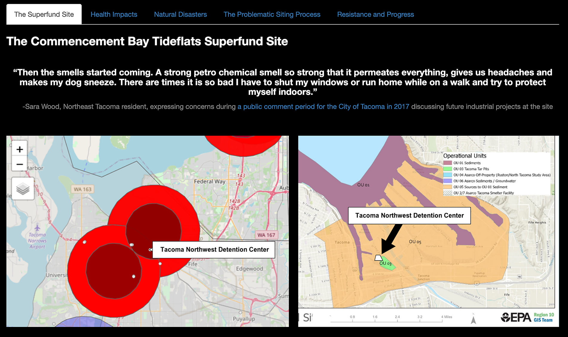
(Left) The Commencement Bay Tideflats Superfund site and Northwest Detention Center (NWDC) as shown in HEAT MAP. (Right) The Commencement Bay Tideflats Superfund site as mapped by the EPA in 2022. We’ve added a white polygon showing the location of the NWDC to the EPA map. With information from the tool, users can easily see there is cause for concern and conduct additional research to find detailed maps of the site, such as the one shown here, along with more information about the threats facing a facility.
Users can then decide to do further research on the Superfund site, including its toxicological makeup, and move toward action. This process is demonstrated in full on the tool’s Case Study tab. The first case study features the Northwest Detention Center (NWDC), the second largest immigrant detention facility in the U.S. It is built on the Commencement Bay Tideflats Superfund site, and reports have raised concerns about potential impacts to human health. In 2017, Tacoma residents living near the site expressed concerns during a public comment period for the city of Tacoma discussing future industrial projects at the site. “Then the smells started coming. A strong petrochemical smell, so strong that it permeates everything, gives us headaches and makes my dog sneeze. There are times it is so bad I have to shut my windows or run home while on a walk and try to protect myself indoors,” stated Sara Wood, a Northeast Tacoma resident. 14 Figure 1 shows NWDC is built directly adjacent to one of the most toxic areas on the site, the Tacoma Tar Pits, and users can learn about what contaminants exist in the soil and water around the facility. In conducting research on the NWDC, one comes across several local and state-level organizations advocating and fighting for the people detained there, providing legal help and resources, lobbying for policies that protect detainees, and fighting to close the facility and reform the immigrant detention system. Anyone could use HEAT MAP to replicate this research process with any facility in the United States.
Using HEAT MAP, it is easy to see that the NWDC is located on top of the Commencement Bay Tideflats Superfund site. While other tools like EJScreen do show that the area around NWDC has a high score for “Superfund Proximity,” this level of geographic specificity differs from the broader, census-tract-level risk indicators found in tools like EJScreen. Having specific information, including the name and location of the site, enables the user to jump directly to researching the Superfund site and finding information on what pollutants are present there, at what levels, and what the risks are to detainees.
Using HEAT MAP to understand the risk of extreme heat in facilities
Heat stress is the leading cause of death from weather-related events globally, and extreme heat events are predicted to increase in frequency and strength as climate change intensifies. 15 Research has shown that the impacts of extreme heat are not evenly dispersed. For example, neighborhoods that experienced redlining, the practice by which the federal government labeled communities with high concentrations of immigrants and minority populations as undesirable for real estate development and investment from the 1930s to 60s, see a greater risk from extreme heat events. Homes in these communities are less likely to have air conditioning, are more likely to be built around heat-absorbing roads, and are less likely to have green spaces that can cool down the surrounding area. 16 A study of 108 cities found that 94% of communities labeled as “high risk” for investment during redlining experienced elevated surface temperatures today. 17 Extreme heat is an issue of environmental justice, magnified for marginalized communities. 18 This is particularly true for incarcerated people who cannot move around freely, open windows, or install or turn on A/C. Research has shown that a temperature increase of 10°F above the average was associated with a significant increase in prison mortality, with deaths increasing 5.2%–6.7% among people diagnosed with heart disease. Heat also compounds risk for people who take psychotropic medications; 43% of the state prison population has a previous mental health diagnosis, placing many incarcerated people at increased risk for heat-related illness. Furthermore, suicide rates in carceral facilities increased by 22.8% in the 3 days following an extreme heat event. 19 Many states do not mandate air conditioning in state prisons, including Texas, Louisiana, and Florida. 20 A 2024 study evaluating the risk of extreme heat to incarcerated people in the United States found that 52% of dangerous heat and humidity exposures in the country occurred in Texas and Florida, at 28% and 24%, respectively. 21 Over 915,000 people, 45% of the incarcerated population, are in facilities experiencing an increase in dangerous heat events. As David Fathi, director of the ACLU National Prisons Project, states, “This is not an issue of comfort or luxury; it is an issue of life and death.” 22
The threat to incarcerated people is even greater when different environmental hazards interact. The health risks from simultaneous exposure to extreme heat and air pollution, a common concern near toxic Superfund sites, are not merely additive but synergistic. For instance, recent research found that while exposure to extreme heat alone increased the risk of death from cardiovascular disease by 5% and high air pollution alone increased it by 6%, the risk surged to 21% on days when both hazards were present. 23 This compounded threat is especially dire for incarcerated individuals, who often have pre-existing health conditions that are exacerbated by heat and poor air quality, and who lack the agency to mitigate their exposure.
In the summer of 2023, Louisiana experienced record-breaking heat, with heat indexes climbing as high as 120°, leading the state to declare its first-ever extreme heat emergency. Louisiana has one of the highest incarceration rates in the world, and Louisiana State Penitentiary, notoriously known as Angola after the former slave plantation that occupied the same land, is the nation’s largest adult maximum security prison. In response to a lawsuit about dangerous heat in Louisiana prisons, the Department of Corrections stated they were compliant with state policy to provide all inmates in Louisiana’s correctional facilities with “cold water, ice, additional cool showers, and increased ventilation by opening windows and the use of fans,” when temperatures rise above 88°. 24 However, these actions do not cool down the facility and do not prevent inside temperatures from reaching dangerous levels. We used HEAT MAP to take a deeper look at Angola.
The tool shows users their selected state and county with three different projections of extreme heat: (1) number of days above 100°F using historical data, (2) projected number of days above 100° by mid-century, or (3) the magnitude of the projected increase in average daily temperatures by mid-century (2041–2070).25,26 Figure 2 displays the first and second projections for Louisiana. Carceral facilities are shown on the map as gray points. Users can click to learn more information about each facility. The Extreme Heat tab provides users with a striking visualization of the number of days of extreme heat expected to change in their selected county.
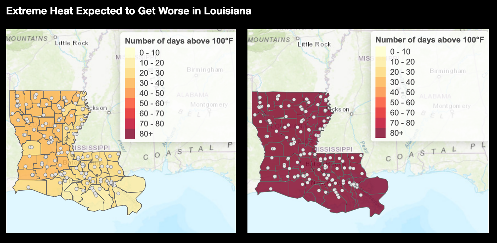
(Left) This map displays the average number of days per year from 1971 to 2000 with a heat index above 100°F. (Right) This map displays the projected average number of days per year with a heat index above 100°F in midcentury (2036–2065), with little to no action to curb current heat-trapping emissions growth. Heat index is defined as the “feels like” temperature resulting from the combination of temperature and humidity.
While issues of extreme temperatures in carceral facilities have historically been a concern in Southern states, it is important to recognize that these issues exist in northern states such as Washington, Michigan, and New York as well and are becoming more common due to climate change. A recent study found that facilities in the Pacific Northwest, Northeast, and upper Midwest recorded the greatest increased risk of heat-related mortality due to greater temperature anomalies during heat events. Increased mortality due to extreme heat events is higher in prisons across the Northeast, at 21%, where prisons are less equipped to endure heat waves. The data reveal that no state is immune, making climate resilience in carceral facilities imperative to protect incarcerated people from deadly heat stress.
By visualizing current and future heat risks, HEAT MAP transforms abstract climate data into a concrete tool for action. It equips incarcerated people, their families, and advocates with the specific evidence needed to demand protective measures, such as mandated cooling, and to challenge the siting of facilities in increasingly hazardous locations. This capacity to pinpoint vulnerability, especially in regions not traditionally associated with extreme heat, is crucial for building proactive climate resilience and advancing the fight for humane conditions within the carceral system.
LIMITATIONS
While HEAT MAP addresses critical gaps in publicly accessible environmental justice data, it is not all-encompassing. State Correctional Institute Fayette (SCI Fayette), mentioned in the introduction, is a prime example. Although it is known to be dangerous to humans, the EPA lists coal ash as solid waste, the same classification as household garbage, rather than hazardous waste, which more closely aligns with toxicologists’ classifications. 27 This results in the area surrounding SCI Fayette being dangerous to humans but not officially considered hazardous by the government. While this tool sheds light on the connection between carceral spaces, toxic sites, and those most at risk, SCI Fayette is not included in the data or findings of this tool, because the coal ash dump, though toxic, is not currently listed as a Superfund site.
Additionally, due to computational constraints of loading large-scale high-resolution data, Superfund sites take the form of dots located at the central point of each site, with circles representing a 1.8-mile and 3-mile radius from the site center. In reality, Superfund sites are each uniquely shaped, and this circular representation is an oversimplification that does not accurately represent the full extent and reach of the harmful pollutants present in these areas. It is also impossible to represent the full extent of contamination without complex pollution models, as each site has a different makeup of toxicants and environmental conditions that influence its pollution potential.
Call to action and conclusion
HEAT MAP is a valuable tool for promoting environmental justice within the carceral system and can play a significant role in improving the lives of incarcerated people. The tool enables users to delve deeper into specific threats posed to incarcerated individuals by identifying facilities of concern and providing details about nearby Superfund sites and heat risk. Users can then research contaminant types, potential health risks and the historical context of the site. Moreover, HEAT MAP facilitates connections with advocacy groups working to improve conditions for incarcerated people. By identifying local or national organizations involved in legal aid, policy advocacy, or facility closure campaigns, the tool empowers users to participate in broader movements for change.
Although HEAT MAP is a valuable resource, it is not intended to stand alone. We hope to encourage resources to be put toward increasing the potential for similar data-driven mapping tools to empower EJ decision-making. The recent deactivation of EJScreen demonstrated the need for a diversified set of tools and resources driven by the public. The data limitations revealed in making this tool highlight a broader issue: data measurements and regulations are inherently political, and many facilities likely face similar risks, but are not captured in studies due to technical classifications and the specific requirements for Superfund designation. Future investigations should consider the proximity of prisons to various hazardous sites, including brownfields, power plants, and oil and gas development. We contend that tools such as HEAT MAP serve an important role in telling a story and connecting people to resources, but they are just the first step in facilitating multifaceted, intentional collaboration across government agencies and communities to enact change at both the local and national levels.
AUTHORS’ CONTRIBUTIONS
M.P.H. provided conceptualization, methodology, software, visualization, writing—original draft preparation. E.J.B.: Provided data curation, investigation, writing—review and editing.