
Abstract
This study investigates two potentially complementary reporting scenarios in annual reports: reactive impression management and retrospective sense-making. It examines stock market performance graphs in European listed banks’ annual reports before and during the global financial crisis. Our results indicate that banks reacted to the global financial crisis by omitting stock market performance graphs from the annual report and from its most prominent sections. On the other hand, banks reduced favorable distortions and favorable performance comparisons. No significant evidence of retrospective sense-making is found. Overall, the findings are consistent with impression management incorporating human cognitive biases, with companies preferring misrepresentation by omission over misrepresentation by commission. Under high public scrutiny, banks appear to seek to provide a more favorable view by concealing negative information rather than by favorable distortions or comparisons. The study contributes to the development of impression management theories. It uses a psychological interpretation that incorporates human cognitive biases, rather than adopting a purely economically based perspective.
Introduction
Financial reporting is an important type of business communication which is highly regulated. However, one area where plenty of scope exists for discretion and interpretation is graphs. Graphs play an important role in determining users’ perception of the company (Penrose, 2008). They are an eye-catching presentational format, frequently used in annual reports, as “an integral part of a company’s overall disclosure strategy” (Beattie & Jones, 2008, p. 71). They attract the reader’s attention, facilitate comparisons, synthesize key performance indicators in a readily accessible form, contextualize performance (Beattie & Jones, 2001; Frownfelter-Lohrke & Fulkerson, 2001; Hill & Milner, 2003), and improve decision making (Hirsch, Seubert, & Sohn, 2015; Penrose, 2008). In addition, graphs can influence investors’ judgments of earnings’ current performance and earnings potential (Dilla, Janvrin, & Jeffrey, 2013).
However, Penrose (2008) has pointed out that more research is needed in graphical reporting as graphs can also be used opportunistically to manipulate users’ perceptions of companies’ performance (Beattie & Jones, 2008; Courtis, 1997). Our study aims to investigate graphical impression management and retrospective sense-making of major European listed banks in a time of intense public scrutiny, the global financial crisis. The systematic financial downturn provides an opportunity to analyze psychological factors that can influence how annual report preparers react when exposed to public visibility. Reactive impression management and retrospective sense-making can both be part of a reactive perspective (Merkl-Davies & Brennan, 2011). Reactive impression management is how preparers respond in a self-serving way to concerns, increased scrutiny and/or public pressure (Merkl-Davies & Brennan, 2011). Retrospective sense-making is aimed at giving voluntary, non–self-serving, ex-post explanations of organizational outcomes and events that have already occurred to sustain or restore a company’s image (Aerts, 2005; Merkl-Davies, Brennan, & McLeay, 2011; Stanton & Stanton, 2002). Sense-making, more broadly, can be defined as the process through which people work to understand unclear issues or events (Maitlis & Christianson, 2014).
In this article, we focus on stock market performance graphs as they portray key financial information and are frequently graphed within annual reports (Falschlunger, Eisl, Losbichler, & Greil, 2015). Stock market performance graphs have been encouraged by regulators such as the SEC. However, they have been generally neglected by the previous literature (see Beattie & Jones, 2008, for a review). They can assist users to assess management performance and compare it with reported benchmarks (Bannister & Newman, 2006; Lewellen, Park, & Ro, 1996). Stock market performance graphs are also likely to be of key interest to annual report users and to be under intense public scrutiny during the global financial crisis. As share prices fell dramatically, the potential need to conceal negative organizational outcomes became imperative. Thus, focusing on banks’ stock market performance graphs before and during the global financial crisis, represents a unique setting in which to investigate graphical reporting behavior in times of an extremely high public scrutiny.
This study makes the following contributions. First, it contributes to impression management theories by analyzing two partially complementary and competing approaches: an economically based approach and a psychologically based approach. The former is based on economic rationality and assumes that actors are rational and act opportunistically to maximize their utility, calculating the expected consequences of each choice (Merkl-Davies & Brennan, 2011). The psychological approach assumes that individuals’ judgments and decisions are influenced by different representations of the same problem (Tversky & Kahneman, 1981, 1986) due to bounded rationality (Simon, 2000) and cognitive biases. In particular, this study focuses on omission bias, that is the tendency of human beings to evaluate wrongful omissions less harshly than wrongful commissions, even when the negative consequences are equivalent (e.g., Baron & Ritov, 1994; Spranca, Minsk, & Baron, 1991).
Second, this study responds to Sandell and Svensson’s (2016) call for research on the use of accounts during the global financial crisis, by investigating these two theories before and during the global financial crisis. The global financial crisis led to more intense public scrutiny and pressure on companies (Barth & Landsman, 2010). Such a change in the external environment from economic instability to public visibility can threaten companies’ organizational legitimacy (Patelli & Pedrini, 2014) and lead managers to make different disclosure choices (Aerts, 2005; Carter & Dukerich, 1998; Sandell & Svensson, 2016). We test whether and how impression management omission techniques (e.g., selective use of graphs) and commission techniques (e.g., graphs’ favorable distortion) were employed.
Banks are particularly interesting because they were central to the global financial crisis (Barth & Landsman, 2010) and thus under the media spotlight. As their performance was severely hit (Beltratti & Stulz, 2012) and their managers considered responsible for the crisis (Hargie, Stapleton, & Tourish, 2010), banks needed to restore their reputation and maintain their legitimacy (Linsley & Kajüter, 2008; Oliveira, Rodrigues, & Craig, 2013). Therefore, this focus on banks provides us the opportunity to analyze the psychological factors that could influence annual report preparers’ communication strategies when exposed to intense visibility and scrutiny.
The remainder of this article is structured as follows. In the next section, we develop the theoretical framework and hypotheses. We then present our research methodology, including sample selection, data gathering, and classification of graphs. We present our findings in the fourth section, followed by our discussion and conclusion section.
Impression Management and Retrospective Sense-Making: Literature Review and Hypotheses’ Development
Impression Management
Impression management in corporate reporting assumes that managers are self-interested and misrepresent information in the annual report in order to pursue their personal interests rather than those of users (e.g., Beattie & Jones, 1992, 2000a, 2008; Hooghiemstra, 2000; Merkl-Davies & Brennan, 2007). In line with this perspective, previous studies have concluded that graphs in corporate reports are mostly used to manipulate readers’ perceptions of corporate performance and to provide them with a more favorable view than is warranted (Beattie & Jones, 2008). Information can be misrepresented opportunistically in two ways: by omission or by commission. Previous studies based on economic theories do not distinguish between the two (e.g., Leung, Parker, & Courtis, 2015).
Omission is when managers selectively omit certain graphs with unfavorable information but include those with favorable information. In this way, companies can present their performance in the best possible light (e.g., Beattie, Dhanani, & Jones, 2008; Beattie & Jones, 1992, 2000a; Dilla & Janvrin, 2010; Falschlunger et al., 2015; Steinbart, 1989) and divert annual report users’ attention away from the companies’ negative news (Leung et al., 2015). Omission also involves nondisclosure in prominent parts of the annual report. As users tend to read annual reports briefly (Bartlett & Chandler, 1997; Penrose, 2008; Squiers, 1989), the location of a graph becomes extremely important (Beattie & Jones, 2001). 1
Misrepresentation by commission occurs when companies use techniques aimed at manipulating performance trends via fabrication or exaggeration, such as measurement distortion and the strategic choice of cross-sectional performance comparisons (Beattie et al., 2008; Beattie & Jones, 1992, 2000b; Cassar, 2001; Falschlunger et al., 2015). 2 Measurement distortion exists when there is a discrepancy between the actual data depicted in the graph and their graphical representation (Tufte, 1983) caused by enhancing positive trends or attenuating negative trends (Beattie & Jones, 1992, 2000b; Falschlunger et al., 2015). The use of performance comparisons related to competitors or years can be another way of misrepresenting information (e.g., Brühl & Kury, 2016).
In line with prior literature (Brennan, 2015; Cassar, 2001; Lewellen et al., 1996; Merkl-Davies & Brennan, 2007), the strategic choice of cross-sectional comparisons is defined as the judiciously selective inclusion of these other benchmarks to make the original bank’s performance look better.
Previous studies on impression management have generally followed a purely economically based approach (Merkl-Davies & Brennan, 2007). No distinction is made between omissions or commissions if they lead to the same consequences. These studies argue that managers, driven by economic rationality, will always try to exploit information asymmetries and provide biased information to maximize their utility (Merkl-Davies & Brennan, 2011). In line with this assumption, graphs have been found to be favorably misrepresented by both omissions (e.g., selectivity) and commissions (e.g., measurement distortion; e.g., Beattie & Jones, 1992, 1999; Falschlunger et al., 2015; Mather, Ramsay, & Serry, 1996).
Psychology provides a different method of interpreting impression management. Psychological studies suggest that individuals have an omission bias (Spranca et al., 1991). This occurs because there is less evidence of causality, responsibility (Kordes-de Vaal, 1996; Spranca et al., 1991), and intentionality (DeScioli, Bruening, & Kurzban, 2011). In an impression management context, a psychologically based approach thus suggests that managers are more likely to misrepresent information by omission rather than by commission.
Psychologically and economically based perspectives partially compete and overlap. An increase in omission practices can be justified by using both an economically based and psychologically based approach as it both opportunistically provides a more favorable view of the firm’s performance and takes into account users’ omission bias. On the other hand, a decrease in commission practices can only be justified by a psychological approach, as an economically based approach would predict an increase, rather than a decrease, in wrongful commission to achieve favorable representation.
The global financial crisis represents an ideal setting to investigate impression management from a psychological perspective as during the global financial crisis banks’ performance was severely hit (Beltratti & Stulz, 2012). Banks came under increasing and intense public scrutiny from politicians, regulators, shareholders, and the media, with bank managers considered as responsible for the crisis (Hargie et al., 2010). Information misrepresentation was thus more likely to be detected.
Consequently, following a psychologically based approach, we argue that, as annual report users might evaluate misrepresentation by omission less harshly than misrepresentation by commission, banks will change their impression management techniques and focus less on commission. We set out four hypotheses below. The first two (Hypotheses 1a and 1b) are consistent with both the economically and psychologically based perspectives, whereas the other two (Hypotheses 2a and 2b) are consistent with only the psychological perspective. Thus, we expect that during the financial crisis:
Our theoretical framework and hypotheses are summarized in Figure 1.

Theoretical framework.
Retrospective Sense-Making
Retrospective sense-making refers to the current interpretation of past events (Weick, 1995). Managers may give an ex-post explanation of past events and convey to the reader a complex, contextualized picture of reality. By contextualizing these events they justify them, but without an opportunistic self-serving intent (Merkl-Davies et al., 2011). In a global financial crisis context, given the increase in public scrutiny, retrospective sense-making might be attractive to bank managers. Major banks, given their pivotal role in the economy, might prefer less opportunistic voluntary disclosure (Abrahamson & Park, 1994). In order to continue graphs’ usage during the global financial crisis, managers could engage in retrospective sense-making, and increase the level of contextualization in three ways. First, graphs could compare a company’s stock market performance with that of competitors. Second, companies could use longer time series to contextualize current stock market performance. Finally, companies can portray other performance indicators (e.g., earnings per share, volume of trades, etc.) within the stock market performance graph to provide a reader with a more comprehensive, yet more complex, picture of the overall company’s performance.
In contrast with impression management, the increase in contextualization is neutral or unfavorable rather than self-seeking (Merkl-Davies et al., 2011). 3 Hence, during the global financial crisis, banks are more likely to contextualize their stock market performance and we expect that:
Research Methodology
Sample and Data Gathering
We selected the European commercial banks from the largest five European economies by GDP (Eurostat, 2016): France, Germany, Italy, Spain, and the United Kingdom, and listed from 2005 to 2010. We focused on European banks as they operate in a very different economic and financial context, compared with U.S. banks, and as the role of banks in providing credit to the private and public sectors is important in Europe, interestingly more than in the United States (Weigand, 2015). Also, European banks were affected by the financial crisis after U.S. ones (Allen & Faff, 2012). Graphical reporting in bank’s annual reports, being mainly a voluntary choice, is unlikely to be affected by national laws and by the recommendations of national central banks. This period (2005-2010) was chosen as it provides an excellent setting to investigate the effect of the global financial crisis.
Using the database Bankscope, we identified 157 listed banks. We excluded the following: listed subsidiaries of a holding bank that was already in the sample (20), financial companies that close examination revealed were not commercial banks (75), and banks that were not listed (or whose annual reports were not available) in all the years covered (16). The final sample comprises the whole population of 46 listed commercial holding banks: 10 French banks, 9 German, 17 Italian, 5 Spanish, and 5 from the United Kingdom. Bank size was on average equal to €368 billion total assets and varied from a minimum of €185 million total assets to a maximum of around €2.6 trillion (see Table 1).
European Banks’ Characteristics.
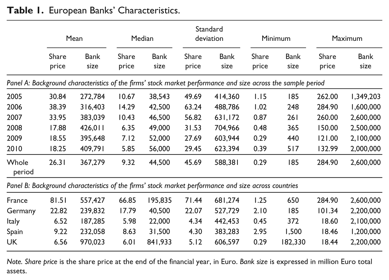
Note. Share price is the share price at the end of the financial year, in Euro. Bank size is expressed in million Euro total assets.
We gathered the electronic version of consolidated annual reports from the banks’ websites. We then collected data about the graphs’ title, category topic and type (e.g., column, line, etc.), time series and cross-sectional comparisons, and data on other indicators portrayed within the graph. Data on banks’ stock market performance were collected from Bankscope database by Bureau Van Dijk.
Method
Stock market performance variables graphed include share price, market capitalization, and total shareholders’ return. We considered 2005, 2006, and 2007 as precrisis years and 2008, 2009, and 2010 as years of global financial crisis. During 2008, Lehman Brothers Holdings collapsed and the economic crisis erupted globally, with GDP collapsing in most developed countries (Keusch, Bollen, & Hassink, 2012). Moreover, 2008-2010 represents a period of negativity and uncertainty (Patelli & Pedrini, 2014). For all the banks, we calculated the stock market trend. As shown in Figure 2, the stock market performance crashed from 2007 to 2008.
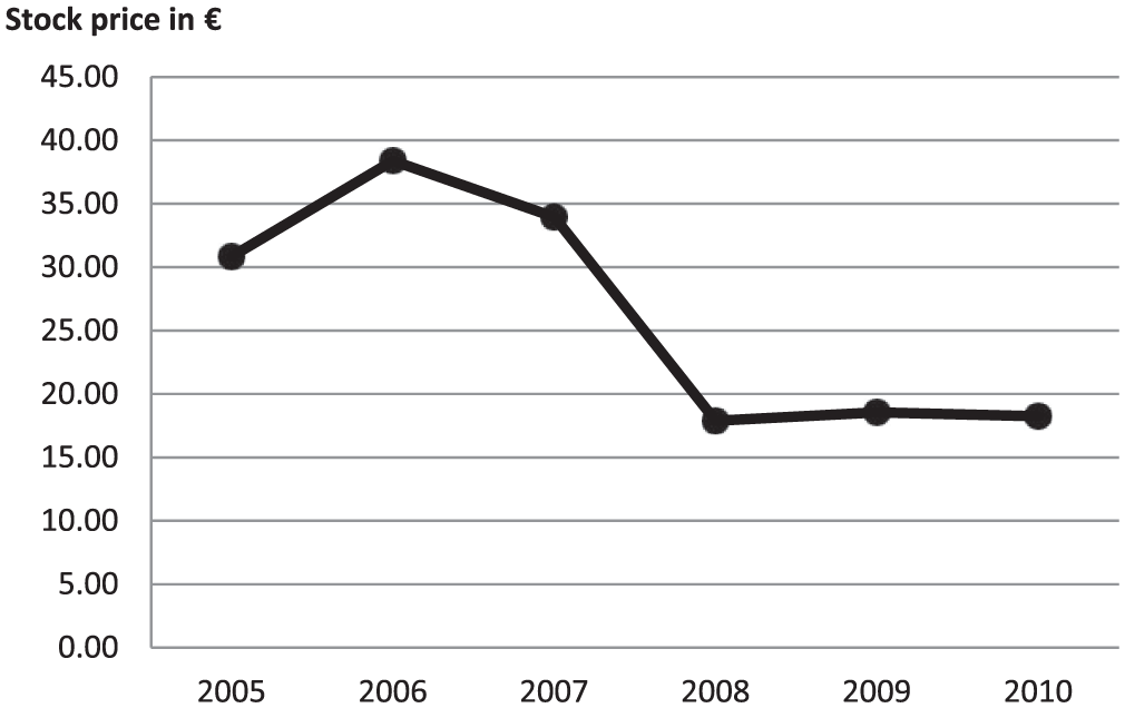
Banks’ stock market performance trend 2005 to 2010.
The average share price was €30.84 in 2005, €38.39 in 2006, and €33.95 in 2007. Then, it dramatically dropped to €17.88 in 2008 (see Table 1). In 2009 and 2010, the share prices remained low at €18.55 and €18.25, respectively.
Selectivity and De-Emphasis as Measures of Wrongful Omission in Graphical Reporting
Following previous literature (e.g., Beattie & Jones, 1992, 1999, 2001; Falschlunger et al., 2015; Mather, Ramsay, & Steen, 2000), we tested selectivity in graphs’ usage (Hypothesis 1a) by using univariate analysis. We used a t test to investigate whether the average number of stock market performance graphs included in a bank’s annual report was significantly lower in 2008-2010 than in 2005-2007. To test de-emphasis in a graphs’ location (Hypothesis 1b), we considered prominent graphs as those included either at the beginning of the annual report (first 5 pages) or within the highlights (Beattie & Jones, 2001). We used a t test to investigate whether the proportion of prominent graphs was significantly lower in 2008-2010 than in 2005-2007.
Favorable Measurement Distortion and Cross-Sectional Performance Comparisons as Measures of Wrongful Commission in Graphical Reporting
For graphs’ cross-sectional comparisons (Hypothesis 2a), we first estimated the proportion of favorable cross-sectional comparisons within an individual graph. A comparison was considered as “favorable” when the competitor’s benchmark provided a lower performance than the bank. We then measured the proportion of favorable comparisons across graphs included by a bank in the annual report (FAVCOMP). We used a t test to investigate whether FAVCOMP was higher or lower in 2008-2010 than in 2005-2007.
Following previous studies (e.g., Beattie & Jones, 2000b; Cho, Michelon, & Patten, 2012; Frownfelter-Lohrke & Fulkerson, 2001), we estimated the degree of inaccuracy in graphical presentation by identifying the degree of graphical distortion. Following previous literature (Falschlunger et al., 2015; Mather, Mather, & Ramsay, 2005; Muiño & Trombetta, 2009), we measured the degree of graph’s distortion using the Relative Graph Discrepancy (hereafter RGD) index. 4 The RGD index is the difference between the actual height of the last column and the height at which it should have been plotted. It is calculated as follows:
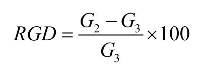
Where G2 is the actual height of the last column and G3 is the correct height of the last column (if plotted accurately) equals:

Where D1 is the value of first data point (corresponding to first column), D2 is the value of last data point (corresponding to last column), and G1 is the height of the first column. In a line graph, the height of a column is replaced by the distance from the point of the line to the horizontal axis.
To test Hypothesis 2b, we first classified graphs as materially or nonmaterially distorted. Material distortions are those detected by the reader (Beattie & Jones, 2002). We considered a cutoff level of ±2.5% to distinguish between material and nonmaterial distortions (Falschlunger et al., 2015; Mather et al., 2005; Muiño & Trombetta, 2009). Positive and negative values of RGD represent favorable and unfavorable distortions, respectively (Mather et al., 2005). Favorable (unfavorable) distortions overstate (understate) increasing trends or understate (overstate) declining trends. We measured the proportion of favorably distorted graphs and unfavorably or not distorted graphs included in an annual report. We used a t test to examine whether the proportion of favorably distorted graphs was higher or lower than unfavorably or not distorted graphs in 2008-2010 than in 2005-2007, during the global financial crisis than before.
Contextualizations as Measures of Retrospective Sense-Making in Graphical Reporting
We tested using t tests retrospective sense-making in graphical reporting. First, we examined whether contextualization increased comparing the prefinancial annual reports with those published during the financial crisis, in terms of the proportion of stock market performance graphs with a cross-sectional comparison, the length of a time series (i.e., average of the years portrayed within the stock market performance graphs); the proportion of stock market performance graphs portrayed within the graph, also other bank’s performance indicators (e.g., volume of trades). Second, we investigated via t tests whether during the global financial crisis: unfavorable cross-sectional comparisons were equal or higher than favorable (Hypothesis 3a); time series portraying a declining trend were equal or higher than those with a rising trend (Hypothesis 3b); and stock market performance graphs which included other bank’s indicators portraying a negative performance were equal or higher than those portraying a positive performance (Hypothesis 3c).
Findings
Descriptive Statistics
Overall, we found 300 stock market performance graphs: 222 share price, 53 total shareholders’ return, and 25 market capitalization graphs. Out of the 300 graphs, 256 were voluntary and 44 were mandatory graphs of total shareholders’ return (included in the annual reports to comply with the U.K. Directors’ Remuneration Report Regulation, 2002). We considered only the 256 voluntary graphs to test impression management by omission (Hypotheses 1a and 1b); impression management by commission in the choice of favorable performance comparisons (Hypothesis 2a) and retrospective sense-making (Hypotheses 3a, 3b, and 3c). We excluded the mandatory U.K. graphs (Directors’ Remuneration Report Regulations, 2002) because they have to be located in a specific part of the report and mandated to include cross-sectional performance comparisons.
To test impression management by commission via measurement distortion (Hypothesis 2b), we considered both mandatory and voluntary graphs, but excluded 12 graphs because RGD values were undefined and 5 because the RGD could not be calculated (Mather et al., 2005). This results in 283 graphs.
As shown in Table 2, the number of stock market performance graphs included in banks’ annual reports decreased from 49 in 2006 to 36 in 2010. In most cases (79%), banks used line graphs to represent their stock market performance. Column graphs were also used, but less frequently (18%). Other types of graphs were rarely adopted. Table 2 shows a sharp decline in the number of column graphs from 24% in 2005 to 8% in 2010, while line graphs increased from 76% to 89%, despite a general decline in graphs’ usage.
Descriptive Statistics on Voluntary Graphs (Number of Observations: 256 Graphs).
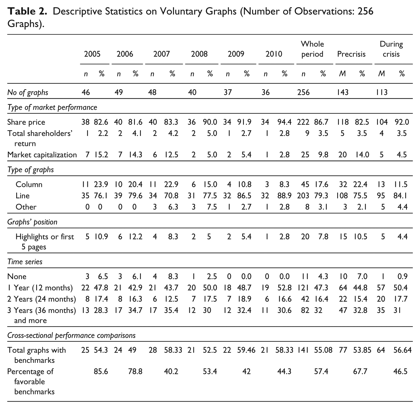
On location, we found that almost 8% of graphs appeared in the highlights or in the first 5 pages (see Table 2). Out of the 256 voluntary graphs analyzed, 141 (55%) included cross-sectional performance comparisons with 57% of these graphs showing favorable comparisons. Favorable comparisons were more common before than during the global financial crisis (68% vs. 47%). Most of the graphs analyzed (96%) included a time series (at least 1 month portrayed). One year was the most common length of time horizon graphed, representing 47% of the graphs.
Table 3 reports mean and median RGD index values. During the overall period analyzed, the RGD index mean value was 163.1%. Mean RGD levels were considerably higher with favorable rather than unfavorable distortions (RGD = 305.2% vs. RGD = 34.1%). This shows that impression management was very prevalent.
Descriptive Statistics (%) on Measurement Distortion Relative Graph Discrepancy Index (Number of Observations: 283 Graphs).
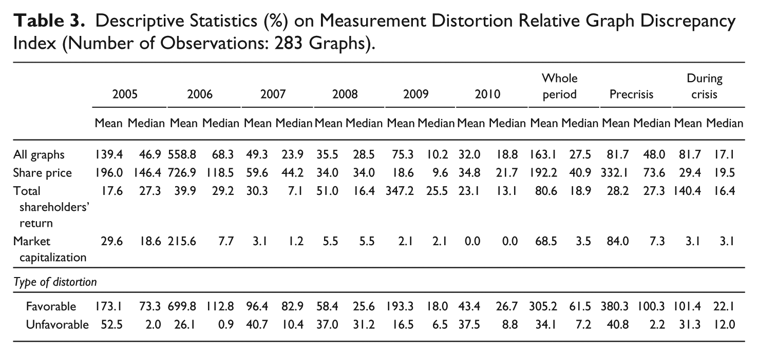
Table 4 shows the proportion of favorably and nonfavorably distorted graphs. The table shows that the percentage of distorted graphs in the overall period 2005-2010 was about 85%. This provides ample evidence of inaccuracy in the graph’s construction. Overall, 52% of stock market performance graphs were favorably distorted. Before the global financial crisis, the proportion of favorably distorted graphs was much higher than the nonfavorably distorted (68% vs. 32%). By contrast, during the global financial crisis, the proportion of nonfavorably distorted graphs per bank’s annual report was higher than the favorably distorted (66% vs. 34%).
Measurement Distortion: Proportion of Favorably/Nonfavorably Distorted Graphs (177 Annual Reports).

Note. We considered distortions as material with a ±2.5% relative graph discrepancy index threshold.
During the overall period, favorable distortions were mainly caused by an overstatement of a rising trend rather than an understated declining trend (42% vs. 10%). This difference was mainly driven by the precrisis period. Unfavorable distortions were mainly the consequence of an exaggeration of a declining trend rather an understated upward trend (23% vs. 10%). Overall, graphs were thus more likely to lead to the overstatement rather than the understatement of trends.
Impression Management in Graphical Reporting: Evidence From a Psychological Perspective
Both the number of stock market performance graphs included in banks’ annual reports (t = 2.11, p < .05) and the proportion of those located in its most prominent parts (t = 2.30, p < .05) were significantly higher before than during the global financial crisis (see Table 5, Panel A). These results support Hypotheses 1a and 1b. Banks systematically omitted stock market performance graphs from the annual report and from its most prominent parts, thus de-emphasizing stock market performance trends, which mostly declined, during the global financial crisis. This was consistent with both an economic and psychological approach to impression management. Banks adopted a variety of quite legal techniques in their graphical presentations. For instance, a bank might insert a particular graph in the highlights section before the global financial crisis, but then omit it or replace with a different graph during the global financial crisis.
Tests for the Hypotheses on Omission (Hypotheses 1a and 1b) and Commission (Hypotheses 2a and 2b).

To test Hypothesis 1b, we dropped 94 annual reports as they did not include any stock market performance graphs.
To test Hypothesis 2a, we dropped 124 annual reports as they did not include any stock market performance graphs or any stock market performance graphs with a cross-sectional performance comparison.
To test Hypothesis 2b, we dropped 99 annual reports as they did not include any stock market performance graphs or it was not possible to calculate the Relative Graph Discrepancy (RGD) index. We considered distortion as material with a ±2.5% RGD index threshold. Results do not qualitatively change by considering the ±5% RGD index threshold.
p < .1. **p < .05. ***p < .01.
Our results show that favorable cross-sectional performance comparisons were significantly less frequent during the global financial crisis than before (46% vs. 68%; t = 3.03, p < .01). Before the global financial crisis, the proportion of favorably distorted graphs was significantly higher than the proportion of nonfavorably distorted graphs (p < .01). By contrast, as shown in Table 5, during the global financial crisis, the opposite was true (p < .05). 5 Thus, in line with psychologically based impression management (Hypotheses 2a and 2b, see Panel B of Table 5), but not with an economic perspective, we found that banks were less likely, during the global financial crisis, to use favorable performance comparisons and favorable distortions.
In Figures 3 and 4, we used typical data which we adapted to give an example of changing graph use before and during the global financial crisis. Before the global financial crisis, the graph overestimated a rising trend and this led to a favorable distortion. During the global financial crisis, the same graph overestimated a declining trend which led to an unfavorable distortion. Both before and during the global financial crisis, the graph was distorted via the use of a nonzero axis.
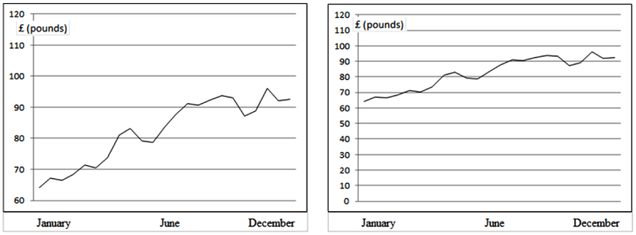
A typical example of a favorably distorted graph (based on annual reports’ adapted data) with a rising trend before the crisis and of the same graph plotted following the correct graph-design standards.
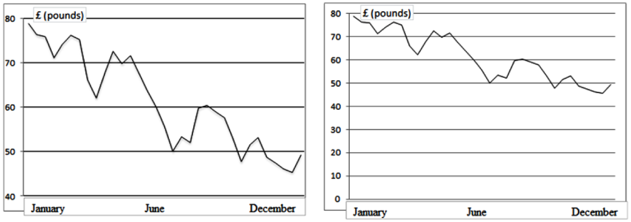
A typical example of an unfavorably distorted graph (based on annual reports’ adapted data) with a declining trend during the crisis and of the same graph plotted following the correct graph-design standards.
Retrospective Sense-Making in Graphical Reporting: Evidence of Contextualization
We found that the degree of graphical contextualization increased, although not significantly, during the global financial crisis (see Table 6). Stock market performance graphs were characterized by a slightly greater presence of cross-sectional performance comparisons (70% vs. 63%), a higher average number of years portrayed (4.07 vs. 3.13), and a greater presence of other performance indicators (16% vs. 13%). The contextualization provided a more unfavorable than favorable view of the bank’s stock market performance. Indeed, during the global financial crisis, unfavorable rather than favorable cross-sectional comparisons were more frequent (54% vs. 46%), time series portraying a declining, rather than an increasing, trend were higher (59% vs. 41%) and stock market performance graphs portraying other bank’s indicators (e.g., volume of trades) within the graph, displaying a negative rather than a positive performance were higher (57% vs. 43%). However, this increase was not statistically significant (see Table 6) and thus we found no substantive evidence to support Hypotheses 3a, 3b, and 3c.
Tests for the Retrospective Sense-Making Hypotheses (3a, 3b, 3c) in Stock Market Performance Graphs of European Banks.
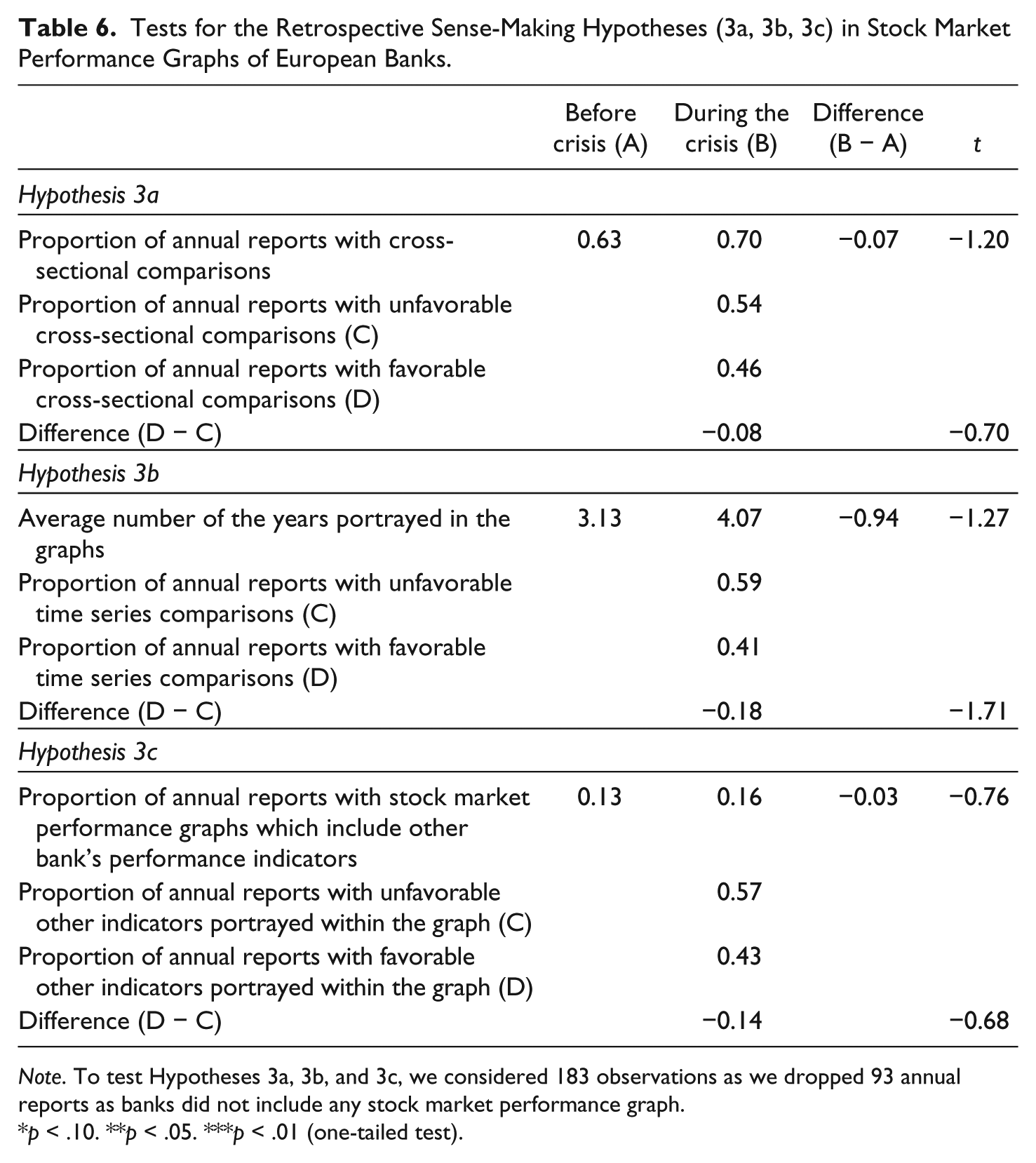
Note. To test Hypotheses 3a, 3b, and 3c, we considered 183 observations as we dropped 93 annual reports as banks did not include any stock market performance graph.
p < .10. **p < .05. ***p < .01 (one-tailed test).
Discussion and Conclusion
Our article provides evidence of how preparers of European banks’ graphical reporting responded to the global financial crisis by engaging in reactive impression management (i.e., they responded in a self-serving way by misrepresenting information to provide a more favorable view of banks’ performance) than was warranted. By contrast, we found no significant evidence of retrospective sense-making.
Managers of European banks reacted to the global financial crisis, an unexpected external negative shock that increased the uncertainty of annual report’s users (Patelli & Pedrini, 2014), by misrepresenting information by omission, but avoiding misrepresentation by commission. They reduced the use of stock market performance graphs in their annual reports, thus de-emphasizing their negative organizational outcomes. In addition, managers de-emphasized the prominence of these graphs, by not inserting them in the most prominent, readily accessible, sections (e.g., highlights) of the annual report.
These findings can be explained by both an economically and a psychologically based perspective. However, we did not find any evidence of an increase in misrepresentation by commission in banks’ graphical reporting during the financial crisis. Banks reduced favorable distortions and favorable performance comparisons. In times of crisis, therefore, banks preferred omitting information (by using selectivity and de-emphasis in location) rather than fabricating (or exaggerating) trends. This contrasts with the situation before the global financial crisis. This reporting choice seems, prima facie, to be in contrast with prior impression management literature, based on an economic view of individual behavior (e.g., Beattie & Jones, 1997, 2000b; Cassar, 2001; Cho et al., 2012). This could be due to the limited psychological validity of economically based impression management in times of external crisis. These findings are better explained using a psychological perspective on impression management, an approach that takes into account omission bias. We thus show that economically based and psychologically based perspectives can have a partially competing nature. The latter can provide useful insights by taking into account the fact that users may suffer from cognitive biases.
During the global financial crisis, which caused an unprecedented and systemic economic downturn, banks were subject to greater public scrutiny. Thus, bank managers seem to prefer, under the fear of detection, misrepresentation by omission (i.e., reduction of the number of graphs and the proportion of graphs located in prominent positions) over misrepresentation by commission (i.e., increase in favorable performance comparisons and favorable distortions). This reporting choice limited public negative reaction and condemnation and is still consistent with impression management. Indeed, the intentional omission of negative pertinent information is a strategy to introduce reporting bias, by hiding negative information from the annual reports’ users (Leung et al., 2015).
This study contributes to the studies of natural language in corporate annual reports (e.g., Beattie & Jones, 2008; Brühl & Kury, 2016; Frownfelter-Lohrke & Fulkerson, 2001; Merkl-Davies & Brennan, 2007; Penrose, 2008; Poole, 2016; Sandell & Svensson, 2016) by investigating two potentially complementary scenarios of managerial corporate graphical reporting: reactive impression management and retrospective sense-making. In answer to the call by Merkl-Davies and Brennan (2007), we provide evidence of reactive impression management on financial performance, specifically stock market performance graphs.
Our study also contributes to the development of impression management theories, by using an innovative approach taking into account human cognitive biases rather than adopting a purely economically based, agency theory approach. Psychological explanations of impression management were provided by an emerging literature on narratives (e.g., Merkl-Davies et al., 2011). We contribute to this literature by explaining preparers’ visual reporting techniques as influenced by users’ cognitive biases, such as the omission bias. The presence of omission bias (Spranca et al., 1991) helps explain why, in contrast with prior economically based impression management literature (e.g., Beattie & Jones, 1992, 1999; Falschlunger et al., 2015; Mather et al., 1996), selectivity in the graphs’ usage, emphasis, and favorable measurement distortions are not necessarily complementary, but can be alternative impression management strategies. In line with prior psychological literature (e.g., Baron & Ritov, 1994; Kordes-de Vaal, 1996; Spranca et al., 1991), managers preferred misrepresentation by omission over misrepresentation by commission because the former tend to be judged less harshly than the latter, even when the negative consequences are equivalent.
This study also improves our understanding of graphical reporting practices adopted by banks in their annual reports. We provide evidence that banks changed their visual voluntary disclosure in times of great public scrutiny and concern, by taking into account the potential users’ reactions. Given the focus of our study, we cannot rule out that annual reports’ preparers in other industries might be similarly biased, depending on the external pressure faced and on their ability to interpret users’ reactions. Future research is welcomed to investigate whether in times of unexpected important exogenous events (e.g., environmental disasters or economic crises) wrongful omission practices in disclosure are preferred over wrongful commission, in different industries.
Our study has some limitations that provide opportunities for future research. Our sample of banks is relatively small, does not include U.S. banks, but still covers most of the major and important European banks (Financial Stability Board, 2011). However, it would be useful to extend our study globally and to make a comparison between graphical reporting by European and U.S. banks.
Further testing of the role and influence of cognitive biases and, specifically, omission bias, in the broader field of financial reporting and business communication would also be very useful. Future research could also investigate to what extent narratives, pictures, and other presentational formats are a substitute or a complement to making graphical choices in impression management and retrospective sense-making.
The conclusions derived from this study also have important practical implications. Omission of negative information leads to a lower comparability of annual reports over time. Readers should take this into account when they use corporate annual reports as the quality of their decision making could be lowered by the omission of graphs within firms’ reports (Hirsch et al., 2015). Auditors should assume a greater role in ensuring the neutrality of information voluntarily communicated in the annual report, by carefully reviewing visual information within the annual reports and, in particular, in the narrative sections. They should perhaps compare consecutive years’ annual reports to identify any relevant omissions of key financial performance indicators. The study also suggests professional bodies and regulators to devise guidelines that can help both preparers and users draw and interpret graphical information in a neutral, nonmisleading way. Companies could be mandated to indicate any changes in graphical policy or to present certain graphs of specified key financial indicators in a fair and accurate way. These graphs would benefit from being audited. In the European context, a first attempt has been made by regulators in the United Kingdom, who require U.K. quoted companies to produce a directors’ remuneration report that must also include a graph showing total shareholders’ return over the past 5 years (Directors’ Remuneration Report Regulations, 2002). In future, similar attempts would be welcomed.
Footnotes
Declaration of Conflicting Interests
The author(s) declared no potential conflicts of interest with respect to the research, authorship, and/or publication of this article.
Funding
The author(s) disclosed receipt of the following financial support for the research, authorship, and/or publication of this article: Andrea Melis acknowledges the financial support of Fondazione di Sardegna. Michael John Jones acknowledges the financial support of the University of Cagliari (UNICA), as this research is part of the Visiting Professor programme, sponsored by Regione Autonoma della Sardegna (RAS).