
Abstract
This study investigates the impact of varying moisture levels on the perceived color appearance of polyester fabrics through a controlled psychophysical experiment involving human observers and instrumental colorimetric assessments. A total of 27 fabric samples across 9 color families and 3 depths of shade were evaluated under 3 moisture conditions: dry, 20% wet, and 120% wet. Observers performed paired comparisons using the AATCC Gray Scale for Color Change and categorical judgments of lightness, brightness (chroma), and hue shift. A total of 9720 assessments were thus obtained. Intra- and inter-observer consistency was assessed using STRESS indices and Cohen’s or Fleiss’ Kappa coefficients. Results showed that lightness was the most reliably judged perceptual attribute, with high consistency across and within observers, while brightness and hue judgments were more variable. Exploratory analysis revealed that higher moisture contrasts led to stronger perceived color differences, with directional hue shifts typically occurring along the red–blue directions. One-way ANOVA and Tukey HSD tests confirmed statistically significant differences between all moisture level comparisons. Instrumental color differences (ΔE00, ΔL, ΔC, ΔH) exhibited moderate correlation with observer ratings (r = 0.5812), with the highest agreement observed for lightness (70.21%), followed by brightness (38.72%) and hue shift (27.98%). These findings highlight the limitations of relying solely on instrumental data when evaluating color under variable moisture conditions.
Keywords
Introduction
The visual appearance of textiles plays a pivotal role in shaping consumer perception, influencing product design, and guiding quality control in the textile industry. Among the many factors that affect appearance, moisture is particularly significant. Wetting can alter a fabric’s optical properties, leading to perceptible changes in color, including lightness, brightness, and hue. Understanding how different moisture levels impact color perception is essential, especially for synthetic fabrics such as polyester, which are widely used in apparel, upholstery, sportswear, and technical applications.
Historically, textile manufacturers and testing organizations recognized that variations in ambient humidity and residual moisture could produce perceptible differences in color appearance during quality evaluation. As a result, standard conditioning procedures, such as those defined by AATCC and ISO, were introduced to equilibrate fabric moisture content before visual or instrumental assessments. These conditioning steps aim to ensure consistent evaluation environments, mitigating apparent color shifts attributable to transient moisture effects.
Prior research in color science has examined numerous variables influencing material appearance. For instance, Isherwood et al. 1 modeled the effects of hue, surface orientation, and micro- and meso-scale texture on the perceived lightness and saturation of objects. Their experiments showed that factors such as specular roughness, relief height, and lighting geometry significantly influence the perceptual outcomes of color attributes. Chae 2 also reported that variations in surface roughness systematically affect perceived color attributes.
Senthilkumar and Selvakumar 3 found that increasing moisture content reduces surface reflectance in dyed fabrics, leading to perceptible darkening. Similarly, Dalton et al. 4 investigated dyed wool fabrics and observed that higher moisture levels produced consistent decreases in lightness and shifts in chroma and hue.
Collectively, these studies highlight the role of light scattering in color appearance. When fabrics become wet, water forms surface films that interact with fabric geometry, altering light propagation and reflection and thereby modifying both measured and perceived color attributes.
Researchers have also explored how humans visually interpret surface wetness. Sawayama et al., 5 for example, combined image analysis with psychophysical testing to examine wetness perception across diverse materials, including textiles, clays, and wood, under controlled dry and wet lighting conditions. Their findings indicate that the visual perception of wetness is guided by ecological optics, particularly by the statistical changes in color and gloss induced by wetting.
Despite these advances, studies that systematically evaluate color shifts of textiles under controlled moisture levels remain scarce, particularly those involving polyester samples. Much of the existing literature relies on image-based experiments, which may not fully replicate the complex optical interactions present in actual wet fabrics.
Liquid transport and optical behavior in textiles are closely related, both governed by fiber morphology and moisture distribution. Hsieh 6 demonstrated that pore geometry and fiber wettability control liquid movement within yarns, while Miller and Tyomkin 7 showed that fabrics draw water through capillary action, filling inter-fiber voids, and forming internal moisture patterns that influence appearance. From an optical standpoint, Nassau 8 explained that changes in refractive index and scattering modify lightness and chroma. When water (n ≈ 1.33) replaces air (n ≈ 1.00) within the fiber structure, the reduced refractive-index contrast diminishes backscattering and increases the optical path length, raising the probability of dye absorption and lowering total reflectivity.
The mechanism of moisture-induced color change is illustrated in Figure 1. Water (n = 1.33) fills the voids, reducing scattering and increasing absorption, thereby making the fabric appear darker in the wet state.

Schematic comparison of light scattering patterns in a dyed fabric in dry and wet states.
Senthilkumar and Selvakumar 9 confirmed that bulk water content modifies both absorption and scattering, producing darker and duller colors. Irawan and Marschner 10 further demonstrated that fabric micro-geometry and fiber refractive properties jointly determine overall visual appearance.
Despite these advances, relatively few studies have systematically examined human visual perception of fabric appearance under varying moisture conditions. Such investigations are essential for establishing perceptual thresholds of color change during wet-to-dry transitions and for developing predictive models that relate wet appearance to dry evaluation.
To address this gap, the present study investigates how varying levels of moisture influence the perceived color appearance of polyester textiles. A controlled psychophysical experiment was conducted using real fabric samples at defined wetness levels. Observers evaluated color differences through gray scale ratings and categorical assessments, while corresponding instrumental colorimetric data were collected for comparison. Emphasis is placed on perceptual attributes such as lightness, brightness, and hue, as well as inter- and intra-observer variability in judgments.
Furthermore, this study assesses the degree of alignment between subjective visual evaluations and instrumental metrics (ΔE00, ΔL*, ΔC*, ΔH*), identifying where human perception diverges from or conforms to objective measurements. By integrating perceptual and instrumental data, the findings provide a deeper understanding of color appearance under moisture and yield practical insights for product evaluation, performance testing, and consumer experience in moist or wet-use conditions.
The implications of this work extend beyond controlled laboratory studies. In the sportswear industry, where polyester knit fabrics dominate, perspiration and environmental moisture frequently alter the visual appearance of garments during use. Such wet-state color shifts can compromise uniformity and aesthetic appeal, especially in professional contexts where color consistency among team uniforms is critical.
From a manufacturing and quality-control perspective, these findings provide quantitative and perceptual guidance for defining moisture-tolerant color acceptance thresholds and refining inspection protocols, with direct relevance to industrial tolerance setting and QC assessment under non-equilibrium moisture conditions. For designers and product developers, understanding how wetness affects perceived brightness and hue enables more reliable shade planning and material selection during product development. Finally, for researchers and color scientists, the study contributes to improving predictive color models that better reconcile instrumental data with human perception in moisture-sensitive materials.
Collectively, these insights bridge the gap between controlled color evaluation and real-world performance, supporting both technical accuracy and consumer satisfaction in color-critical textile products.
Methodology
Sample preparation
A total of 54 samples of 100% polyester double-knit fabric (≈310 g/m2) were prepared. The compact interlock structure offers low capillary volume and moisture retention. Comprising nine distinct hues: green, gray, black, orange, yellow, red, blue, navy, and white. For each color, three levels of color strength, designated as Color1 (light), Color2 (medium), and Color3 (heavy), were created. Two identical specimens were produced for each color-strength level to facilitate controlled paired comparisons under varying moisture conditions.
Each fabric sample was subjected to three defined moisture conditions:
Dry (0% added moisture, baseline dry weight)
20% Wet (fabric weight increased by 20% with water)
120% Wet (fabric weight increased by 120% with water)
The selected moisture levels were designed to simulate realistic wetness scenarios. The 20% condition represented light dampness, comparable to post-exercise perspiration, while the 120% condition corresponded to full saturation below the dripping point. These thresholds were established through preliminary trials to ensure visible changes in color appearance while maintaining sample integrity and handling consistency.
Moisture levels were controlled gravimetrically. The dry weight of each fabric swatch was first measured using a calibrated analytical balance, and target wet weights were calculated accordingly. Samples were fully saturated with deionized (DI) water and then passed through a standardized laboratory roller wringer to remove excess moisture until the desired wet weight was achieved. Each sample was maintained within ±5% of its target value at room temperature.
To ensure visual consistency, all samples were trimmed into uniform square swatches of identical dimensions, and the fabric grain direction was aligned consistently across all specimens. The study was conducted under laboratory conditions of approximately 40% relative humidity, stable temperature, and minimal air movement to minimize evaporation.
During visual evaluations, two experimenters alternated in preparing and presenting wet samples. Immediately after one set was assessed, the next set was introduced into the viewing booth in random order. This workflow ensured that each comparison occurred within a controlled and unified observation window, minimizing moisture drift among specimens and maintaining stable apparent wetness throughout the assessment period.
Experiment setup
Experiment design
The study employed a paired-comparison psychophysical design. Each of the nine colors included three samples representing light, medium, and heavy depths of shade. Each sample was assessed in three pairwise comparisons representing differences in moisture levels:
Dry (0%) versus 20% Wet
Dry (0%) versus 120% Wet
20% Wet versus 120% Wet
In each trial, a matched pair of samples was manually positioned side by side within a calibrated light booth. This setup enabled direct visual comparison under consistent illumination, allowing observers to assess perceptual differences in color appearance attributable to moisture level.
Viewing conditions
All visual assessments were conducted under controlled lighting using Macbeth SpectraLight III light booths (X-Rite, USA), configured to approximate CIE standard D65 illumination. Prior to testing, the spectral output of each booth was measured using a Photo Research SpectraScan PR-670 spectroradiometer to ensure compliance with D65 standard in terms of spectral power distribution, correlated color temperature (CCT), and luminance uniformity.
Samples were placed on a neutral gray, matte-finished background, illuminated at a 45° incident angle. Observers viewed the samples perpendicularly (0° viewing angle) to minimize glare and ensure consistent visual geometry. The booths were installed in a quiet, enclosed space to eliminate auditory distractions and reduce ambient light interference.
To support perceptual consistency:
○ Each participant remained in the same booth throughout the study.
○ A one-minute adaptation period under D65 lighting preceded every session.
○ Observers wore neutral gray laboratory coats and gloves to minimize chromatic interference from clothing or skin tone.
○ Observers requiring corrective lenses used them consistently throughout testing.
Observers
Ten undergraduate students from NC State University served as participants. The cohort consisted of seven females and three males, with an average age of approximately 21 years, and included individuals identifying as African American, White, Asian, and South Asian (Indian).
All participants:
○ Had previously passed standardized assessments for visual acuity and color vision, including the Ishihara Test and Farnsworth Munsell 100 Hue Test.
○ Had prior experience using the AATCC Gray Scale for Color Change as part of their color science coursework.
○ Were familiar with controlled viewing conditions and psychophysical color evaluation procedures.
Each observer independently evaluated the sample pairs. They were instructed to:
○ Use the AATCC Gray Scale to assign perceptual difference ratings for each pair.
○ Record their assessments using a structured spreadsheet on their personal laptops which contained pre-filled sample identifiers and data entry fields for Gray Scale Rating (assessing perceived color change), and three categorical descriptors of color change.
Observers held the gray scale next to the fabric samples during each assessment to ensure consistency. All evaluation data were collected and validated immediately after each session. A total of 9720 assessments (10 observers × 3 sessions × 27 colors × 3 moisture levels × 4 ratings per pair) were thus obtained. Figure 2 illustrates the visual evaluation setup used in the psychophysical experiments.

Illumination and viewing setup used by observers for evaluating color differences between fabric samples.
The psychophysical experimental protocol was approved by the North Carolina State University Institutional Review Board (IRB Protocol No. 28533), and all participants provided informed consent prior to participation.
Data processing
Instrumental color measurement
Colorimetric measurements were performed for all samples under each moisture condition using a Datacolor 850 spectrophotometer. The instrument was configured using % Reflectance Mode and employing a special Large Area View (LAV) aperture containing a glass window to prevent moisture transfer to the integrating sphere during measurements. In addition, specular and UV components were included. CIE Standard Illuminant D65; and 10° Standard Observer colorimetric functions were used for the calculation of colorimetric attributes. Glass correction was used in the Tools® software to adjust the recorded values. For each fabric swatch colorimetric attributes CIE L*a*b*C*h as well as CIE XYZ tristimulus values were recorded.
These measurements were conducted in triplicate to ensure consistency and repeatability, and the mean values were used for further analysis. By capturing both absolute and derivative color metrics, the study ensured a comprehensive characterization of each fabric’s optical appearance under dry and wet conditions.
Subjective visual evaluation
In the psychophysical component of the study, observers provided two types of visual assessments for each sample pair:
Color Change Rating: Participants used the AATCC Gray Scale for Color Change, assigning ratings on a 1–5 ordinal scale, where: 5 = No noticeable change, and 1 = Severe change. Intermediate ratings (e.g. 3 or 4) indicated moderate levels of perceived difference.
Lightness/Brightness/Hue Judgments (Categori-cal): Observers made a comparative assessment by categorizing each pairwise difference as “Brighter”—if one sample appeared perceptually more chromatic, “Duller”—if one sample appeared perceptually less chromatic and “Same”—if no perceptible difference in brightness was observed. Similarly, assessments included lighter, darker, or same for lightness difference description as well as redder, greener, yellower, bluer, or same for hue shift judgments.
Each participant entered their ratings into a pre-structured digital form, which was subsequently collated for statistical analysis. Both types of subjective data were analyzed alongside instrumental color metrics to examine perceptual-instrumental correspondence and the influence of moisture on visual judgments of color.
Results
Radiometric assessments
Radiometric validation of the D65 illumination in all light booths was carried out using a SpectraScan 670 spectroradiometer (Photo Research, USA). All measurements were conducted in a darkroom environment to eliminate ambient light interference and ensure accurate readings. Key parameters assessed included the spectral power distribution, luminance, and correlated color temperature (CCT). The spectral power distributions (SPDs) of the three light booths are shown in Figure 3 and Table 1.

Normalized spectral power distributions (SPDs) of three light booths used for visual assessments.
Summary of radiometric parameters for D65 light sources.

Results illustrate similar overall SPD shapes, although there are minor differences in intensity across the spectrum. Light Booth 3 (yellow line) exhibits slightly lower power in the longer wavelengths (above 620 nm). However, this difference is unlikely to significantly impact observer judgments, as the human visual system exhibits lower sensitivity in that region of the spectrum. Therefore, the minor variation in SPD among the booths should have minimal perceptual effect under typical viewing conditions.
In a previous study, Kulappurath and Shamey 11 demonstrated that perceived color differences for identical stimuli presented under varying practical luminance levels, comparable to those used in the present study, do not exhibit statistically significant differences. Thus, the luminance variations among the three booths used in this study are unlikely to have introduced significant differences in the results obtained. The measured values confirmed that all light booths conformed closely to the CIE D65 standard, demonstrating consistency in spectral output and photometric properties across booths.
Inter- and intra-observer agreements
To evaluate the consistency of individual observers across repeated trials (T1–T3), intra-observer agreement was assessed using two statistical metrics: the STRESS index 12 and Cohen’s Kappa. 13 As described in Experiment Setup, each observer completed three trials involving evaluations of the same fabric sample pairs. Pairwise comparisons were performed for all combinations: Trial 1 versus Trial 2, Trial 1 versus Trial 3, and Trial 2 versus Trial 3.
Grayscale ratings from the AATCC Gray Scale for Color Change 14 were converted to visual color difference values (DV) using a third-degree polynomial regression, as defined by Lee 15 :

Where Gi represents the original gray scale rating for color change.
These DV values were then used to compute the Standardized Residual Sum of Squares (STRESS) index, 12 which quantifies agreement on a 0–100 scale, with lower values indicating stronger agreement:

Where Ei and Vi are the DV values from two different trials, and F1 is a scaling factor that minimizes residuals.
To assess inter-observer agreement, we used the same STRESS methodology across observers and added Fleiss’ Kappa for evaluating categorical judgments in hue, brightness (chroma), and lightness. A pseudo-STRESS metric was also calculated with F1 = 1 to reflect absolute visual differences. This dual approach provides insight into both absolute and relative agreement among observers.
Table 2 presents both intra- and inter-observer STRESS metrics, showing intra-observer consistency across trials and inter-observer variability in grayscale assessments.
Intra- and inter-observer variability based on STRESS and F1 metrics.

The results in Table 2 show that most observers demonstrated moderate intra-observer consistency, with mean STRESS values generally between 40 and 60. The elevated STRESS values (compared to patch-based color difference experiments) likely reflect:
○ Amplification of small perceptual discrepancies due to nonlinear polynomial transformation;
○ Greater perceptual complexity introduced by moisture (e.g. gloss, scattering, surface texture).
Observer F7 showed notably higher intra-observer STRESS, suggesting perceptual inconsistency or cognitive fatigue. Conversely, F4 exhibited excellent inter-observer agreement, though their pseudo-STRESS was higher due to greater absolute differences that aligned well with group ratings.
To visualize consistency across trials, Figure 4 presents a heatmap of Cohen’s Kappa values for hue shift (left), brightness/chroma (center), and lightness (right). Each cell represents trial-pair agreement for an individual observer.

Intra-observer agreement in hue shift, brightness (chroma) and lightness judgments between trials, evaluated using Cohen’s Kappa.
The following observations are shown in Figure 4:
○ Hue shift: Kappa values mostly fall between 0.45 and 0.65, indicating moderate to substantial agreement;
○ Brightness: Most observers fall in the fair agreement range (Kappa = 0.21–0.40), reflecting perceptual ambiguity or greater difficulty;
○ Lightness: Results show the highest intra-observer consistency (many values above 0.50), likely due to higher perceptual salience of luminance.
Some participants (e.g. M3) showed lower consistency across all dimensions, possibly reflecting differences in attention or perceptual strategy.
To evaluate categorical agreement across observers, we employed Fleiss’ Kappa, 16 a multi-rater extension of Cohen’s Kappa. This metric is well-suited for analyzing agreement in three-category classification tasks such as “Brighter,”“Duller,” or “Same” (brightness), “Lighter,”“Darker,” or “Same” (lightness), and “Hue Shift Toward X,”“Away from X,” or “No Shift” (hue).
Table 3 presents Fleiss’ Kappa values for each perceptual attribute:
Inter-observer agreement for categorical judgments (Fleiss’ Kappa).
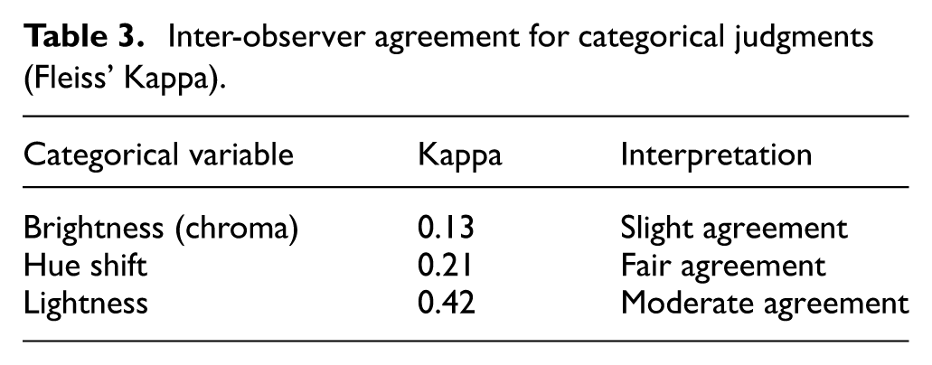
These values align with the intra-observer trends: lightness judgments were most consistent, while brightness exhibited the greatest variability, likely due to subtler and more subjective perceptual cues.
Additionally, a slight increase in consistency from Trial 1 to Trial 3 suggests a training or familiarization effect, where repeated exposure improved task performance and judgment stability.
Exploratory analysis
An exploratory analysis was conducted to further examine the distributional characteristics and trends in both gray scale ratings and categorical judgments. The aim was to identify perceptual patterns related to moisture-induced color appearance changes.
Gray scale rating
Figure 5 presents a boxplot illustrating the distribution of gray scale ratings for each moisture-level comparison pair: Dry versus 20%, Dry versus 120%, and 20% versus 120%. Among these, the Dry–20% pair exhibits the highest median rating, close to 5, with a narrow interquartile range. This indicates that participants consistently perceived minimal color differences between dry and lightly damp fabrics.

Boxplot of gray scale ratings per moisture-level pair.
By contrast, the Dry–120% and 20%–120% pairs show greater spread in responses and lower median ratings (approximately 3.5 and 4, respectively). These broader distributions reflect increased perceptual variability and suggest that larger moisture contrasts elicit more noticeable and inconsistent visual changes in fabric color appearance.
Figure 6 provides a histogram view of gray scale rating distributions across all participants, again categorized by moisture-level pair. Clear perceptual trends are evident:

Histogram of gray scale ratings across moisture-level pairs: Dry–20% (purple), Dry–120% (green), 20%–120% (yellow).
Ratings for the Dry–20% pair (purple) cluster tightly between 4 and 5, reinforcing the perception of minor visual change.
Ratings for the Dry–120% (green) and 20%–120% (yellow) pairs shift leftward and spread more broadly across the 1–4 range, confirming that higher moisture differentials produce stronger and more variable perceived differences.
To explore color- and shade-specific patterns, Figure 7 presents gray scale ratings for all fabric samples, grouped by hue and color strength (Color 1 = light, Color 3 = heavy). Several perceptual trends emerge.

Boxplot of gray scale ratings per fabric sample.
Samples such as White 2, Black 1–2, and Yellow 2 display high median ratings and narrow interquartile ranges, indicating strong inter-observer agreement and minimal perceived color change with moisture.
By contrast, Gray, Navy, Blue, and Orange samples show broader distributions and longer whiskers, reflecting greater variability in judgments and higher perceptual uncertainty across observers.
Some medium-to-heavy red shades exhibit lower median ratings, suggesting stronger apparent wet–dry color differences—likely related to their reflectance spectra and the increased optical path length in darker, more absorbent fabrics.
Interestingly, certain lighter or mid-depth chromatic hues (e.g. some Green and Blue samples) also show increased variability, possibly due to heightened chromatic sensitivity or reduced diffuse reflectance when moisture alters surface scattering.
Overall, the findings indicate that both hue composition and shade depth influence the perceptual stability of color appearance under moisture variation, with neutrals and high-value hues exhibiting the greatest observer consistency. Perceived color differences are governed not only by the magnitude of moisture contrast but also by the color’s chromatic strength, spectral characteristics, and interaction with surface wetness. The observed patterns of agreement and variability across samples underscore the importance of material- and color-specific evaluation in color appearance research.
Categorical judgments
To analyze participants’ subjective categorical assessments of color appearance, we evaluated observer responses in terms of hue shift, brightness (chroma), and lightness. A frequency heatmap, illustrated in Figure 8, was constructed to visualize how these judgments varied across the three moisture-level comparisons: Dry versus 20%, Dry versus 120%, and 20% versus 120%.
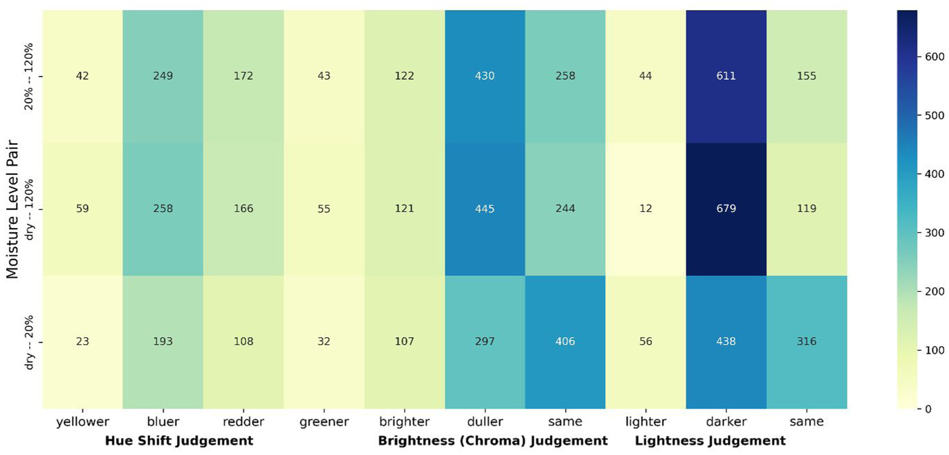
Heatmap of frequency counts for categorical judgments of hue shift, brightness (chroma), and lightness across moisture-level pairs.
Hue shift judgments
As shown in the left panel of Figure 8, hue shift judgments were dominated by responses along the blue–red axis. Specifically:
○ The most frequent responses were “bluer” and “redder” as moisture increased, especially for the Dry–120% and 20%–120% transitions.
○ Judgments of “greener” or “yellower” were comparatively infrequent across all pairs.
This pattern suggests that moisture-induced optical changes, such as altered absorption or scattering properties, most often shift perceived hue toward bluer or redder tones, rather than along the green–yellow dimension of the color plane.
Brightness (chroma) judgments
In the center panel, categorical judgments of brightness (interpreted as chroma) show a consistent perceptual trend:
○ In both the Dry–120% and 20%–120% comparisons, the majority of responses indicate that wet samples appeared “duller.”
○ For the Dry–20% comparison, most responses cluster around “same,” reflecting little perceived difference in brightness at lower moisture contrasts.
These results are consistent with known effects of moisture on textile surfaces, where wetting typically reduces surface reflectivity, suppressing chroma, and dulling the visual appearance.
Lightness judgments
The right panel of Figure 8 highlights observer assessments of lightness. Here, the data are particularly striking:
○ “Darker” was overwhelmingly selected for the Dry–120% and 20%–120% conditions.
○ “Lighter” responses were rare across all comparisons.
○ The Dry–20% pair again yielded more neutral responses, with many observers choosing “same.”
This indicates a strong perceptual association between increased moisture and diminished perceived lightness, likely due to changes in specular reflection and surface translucency that accompany water absorption.
Taken together, the heatmap reveals coherent and interpretable perceptual patterns:
○ Hue shift judgments reflect movement predominantly along the red–blue direction of the color space;
○ Brightness/chroma is perceived to decrease with moisture, particularly at higher color strength levels;
○ Lightness is consistently judged to decrease with water content, reinforcing the darkening effect of wetting.
These categorical results align with the continuous grayscale ratings presented earlier and reinforce the view that moisture alters fabric appearance in multiple, perceptually salient dimensions. The strong directional patterns in the judgments also suggest that observers relied on intuitive, consistent visual cues across trials and moisture conditions.
Mixed ANOVA/repeated measures analysis
Following the exploratory data analysis, a one-way Analysis of Variance (ANOVA) was conducted to assess the impact of moisture level differences on perceived color change, as evaluated by observers using the AATCC Gray Scale for Color Change.
Table 4 summarizes the ANOVA results. The analysis revealed a highly statistically significant effect of moisture pair comparison on gray scale ratings (F(2, 2427) = 324.48, p = 1.31 × 10−125), indicating that the degree of perceived color difference varied substantially depending on which two moisture levels were being compared (e.g. dry vs 120% vs dry vs 20%).
One-way ANOVA results for perceived color change across moisture level pairs.

Although the ANOVA confirms a significant overall effect, it does not specify which pairs of moisture levels differ significantly from each other. To identify these differences, we performed a Tukey’s Honest Significant Difference (HSD) post hoc test, which adjusts for multiple comparisons and controls the family-wise error rate.
As shown in Table 5, all pairwise comparisons between moisture level conditions were found to be statistically significant at the p < 0.001 level. The largest observed effect occurred between the dry–120% and dry–20% conditions, which aligns with earlier descriptive findings showing that larger moisture contrasts led to greater perceived color changes.
Tukey HSD post hoc test results for pairwise comparisons between moisture level conditions.

These inferential results provide strong statistical support for the earlier perceptual observations: as moisture contrast increases, so does the perceptual magnitude of color change. Furthermore, the narrow confidence intervals and extremely low p-values confirm the robustness and reliability of these findings across the full observer pool.
Comparison of instrumental versus visual differences
To examine the relationship between instrumental color measurements and visual perception, all 27 fabric samples were evaluated using a Datacolor Spectrophotometer 850. Each sample was measured separately at each of the three moisture conditions: dry, 20%, and 120%, yielding a total of 81 measurements. These instrumental values were then compared against the perceptual evaluations obtained from observers.
Comparison of gray scale ratings versus DE 2000
Instrumental color differences were calculated using the CIEDE2000 (ΔE00) formula. To enable direct comparison with visual assessments, participants’ gray scale ratings (G values) were converted into visual difference values (ΔV) using the polynomial function defined in equation (1). A Pearson correlation analysis was conducted to examine the relationship between these converted ΔV values and the corresponding ΔE00 measurements.
The resulting correlation coefficient (r = 0.5812) indicates a moderate positive relationship between perceived and instrumentally measured color differences. Figure 9 presents a scatter plot illustrating the association between the mean ΔV values from observer responses and corresponding ΔE00 values across the 27 samples at each moisture level. Color coding was used to denote sample hue. The black dotted line shows the ideal agreement between instrumental and visual color differences.

Scatter plot of mean observer-perceived color differences (ΔV) versus instrumentally measured ΔE00 values for all samples.
A clear positive trend is evident, particularly among warm hues such as orange, red, and yellow, suggesting strong alignment between instrumental and perceptual assessments for those samples. However, notable deviations from this trend are observed for some samples, especially those exhibiting ΔE00 values above 15, which fall well above the red dashed arbitrary threshold line. In these cases, samples showing instrumentally large color differences were not perceived as having equally large visual differences by observers, possibly due to the non-uniform performance of the color difference models across the color space, limitations of the gray scale evaluation method, nonlinear perception of color differences or perceptual masking under wet surface conditions.
Categorical judgments versus ΔL, ΔC, and ΔH
To further evaluate alignment between instrumental color components and categorical visual judgments, we compared observer-reported changes in lightness, brightness (chroma), and hue with calculated differences: ΔL, ΔC, and ΔH, respectively.
Lightness (ΔL)
To compare the perceived lightness judgment against ΔL, each sample pair was categorized based on the sign of its ΔL. If ΔL > 0 then the sample was categorized as “Lighter,” if ΔL < 0, then it was assigned as “Darker,” and if ΔL = 0, then the pair was classified as “Same.”
These ΔL-derived labels were then compared with observers’ lightness judgments, and percent agreement was computed. This approach provided a quantitative measure of the agreement between participants recorded responses versus instrumentally measured lightness changes.
Brightness/chroma (ΔC)
A similar method was used to compare brightness (chroma) values. Sample pairs with ΔC > 0 were considered “Brighter,” those with ΔC < 0 were classified as “Duller,” and those with ΔC = 0 were rated as “Same.” The assigned categories were then compared with the brightness judgments provided by observers. Finally, the percentage agreement between the ΔC-derived categories and participants’ subjective evaluations was then calculated.
Hue shift (ΔH)
For hue comparisons, ΔH was interpreted within the context of hue angle quadrants. For instance, in the yellow-red quadrant, a positive ΔH denotes a counterclockwise shift (toward yellow), while a negative ΔH signifies a clockwise shift (toward red). Cases with |ΔH| < 0.00001 were considered perceptually “Same.” Categorized ΔH values were then compared to the participants’ reported hue shift judgments.
Table 6 presents the percentage agreement between observer judgments and instrumentally derived categorical values across all perceptual attributes.
Agreement between observer judgments and instrumentally assigned categorical values.

These results show the highest agreement in lightness judgments, aligning with prior findings that lightness is the most intuitively recognizable attribute for human observers. In contrast, brightness (chroma) and especially hue shift judgments exhibited lower levels of agreement, indicating greater perceptual variability and increased difficulty in detecting these subtler visual dimensions under moisture-induced appearance changes.
Discussion
This study investigated how varying moisture levels affect the perceived color appearance of polyester fabrics, using a controlled psychophysical experiment and corresponding instrumental colorimetric measurements.
Intra-observer consistency was assessed using the STRESS index and Cohen’s Kappa. Most participants provided reasonably consistent gray scale ratings across three trials, as reflected in moderate STRESS values. However, a few individuals, notably Observer F7, showed substantial variability, likely due to differences in visual sensitivity or interpretative strategies. Cohen’s Kappa results supported this trend: lightness judgments exhibited the highest consistency, while brightness (chroma) showed the lowest, indicating that lightness is a more intuitive and perceptually salient dimension for most observers.
Inter-observer agreement followed similar patterns. STRESS values reflected moderate alignment across participants, with Fleiss’ Kappa revealing slight agreement for brightness (κ = 0.13), fair agreement for hue shift (κ = 0.21), and moderate agreement for lightness (κ = 0.42). These results reinforce the notion that lightness is the most reliably judged perceptual attribute, both within and across observers.
Exploratory analyses highlighted the role of moisture magnitude in shaping perceptual outcomes. Larger moisture transitions (e.g. dry–120%) led to stronger and more variable color change judgments, while smaller transitions (e.g. dry–20%) yielded minimal and more consistent perceptual responses. Most hue shift reports occurred along the red–blue directions, with few observers noting shifts toward green or yellow, suggesting a directional bias in hue perception under moisture variation. Observers also consistently perceived wetter fabrics as darker and duller, particularly at higher moisture levels, reflecting reduced lightness and brightness perception.
The ANOVA confirmed that moisture level significantly influenced perceived color change, with a highly significant p-value (p = 1.31 × 10−125). Tukey’s HSD tests showed that all pairwise comparisons were statistically significant, with dry–120% transitions yielding the largest perceptual differences. These findings underscore the importance of controlling moisture in both quality control and consumer applications where visual consistency is critical.
Instrumental versus perceptual comparisons showed a moderate correlation (r = 0.5812) between ΔE00 values and converted gray scale difference scores. While alignment was strong for many samples, notable discrepancies were observed, particularly when ΔE00 exceeded 15 units. These outliers suggest that large instrumental differences do not always translate into large perceptual differences, possibly due to contextual or surface gloss effects that modulate human interpretation under wet conditions as well as the non-uniform performance of the model across the color space.
Finally, categorical judgments compared to ΔL, ΔC, and ΔH showed varying levels of agreement. Lightness alignment was highest (70.21%), followed by brightness/chroma (38.72%) and hue shift (27.98%).
This pattern aligns with the known non-uniformity of human color perception and the attribute weighting embedded in the CIEDE2000 formula.17–20 As shown by Isherwood et al. 1 and Chae, 2 surface roughness can strongly influence the scattering pattern of light across fibrous substrates, and in our study, similar moisture-dependent surface alterations likely contributed to the observed darkening effect. Irawan and Marschner 10 further demonstrated that the specular and microfacet distributions of woven fabrics determine their visual appearance; in contrast, instrumental measurements at fixed geometries average these effects and therefore fail to capture the same gloss and texture cues integrated by human vision. Similarly, Dalton et al. 4 observed that when moisture modifies surface conditions, perceptual evaluations can diverge from instrumental predictions. The present results show that moisture, by reducing refractive-index contrast and filling the inter-fiber voids with water, reconstructs the internal light-scattering path within the fabric.6–9 This internal-path restructuring alters both the proportion and the effective length of scattering, introducing additional bias between human and instrumental assessments and amplifying their discrepancy. Therefore, this observed divergence is attributed to changes in the internal optical-path structure rather than solely to differences in surface texture or illumination geometry.
In summary, human vision operates in a non-uniform color space where sensitivity varies with hue, chroma, and lightness, while also integrating surface texture and spatial context, factors that instruments inherently ignore. Consequently, numerical color differences cannot fully represent perceptual judgments, particularly under complex surface or environmental conditions. The present findings reinforce this view by demonstrating that moisture-induced changes in the material’s physical state amplify these perceptual–instrumental discrepancies. Together, the results provide empirical evidence that such moisture-related appearance changes are both perceptually significant and dimension-specific, with lightness emerging as the most reliable visual attribute. While instrumental measurements offer objective reference points, psychophysical assessments reveal critical perceptual nuances, especially under wet conditions that modify gloss, scattering, and overall visual complexity.
Limitations and conclusions
Several limitations pertaining to the current study should be acknowledged. The observer pool included only ten participants with limited demographic diversity. This small and relatively homogeneous sample may not fully represent the range of perceptual variability found in broader populations, particularly across different age groups, cultural backgrounds, or levels of visual expertise.
This study focused exclusively on polyester fabrics and a fixed set of 27 colors. Consequently, the findings may not be generalizable to other fiber types (e.g. cotton, wool) or to a wider spectrum of hues, chromas, and surface textures. In addition, this work did not investigate why some materials exhibit little to no visible change upon wetting, leaving the underlying mechanisms behind such (perceived or real) stability unexplored.
The moderate correlation observed between ΔE00 values and perceived differences indicates that instrumental color metrics alone may not fully capture the complexity of human visual perception, particularly under wet conditions. The discrepancies between objective measurements and psychophysical responses highlight the need for further investigation into models that better reflect perceptual realities.
The following key conclusions can, nonetheless, be drawn from this study. First, moisture levels significantly influence the perceived color appearance of polyester fabrics, with larger moisture contrasts resulting in more noticeable perceptual changes. Among the evaluated visual attributes, lightness emerged as the most consistently judged dimension, exhibiting the highest intra- and inter-observer agreement. In contrast, brightness (chroma) and hue shift judgments showed greater subjectivity and variability, reflecting the nuanced and often ambiguous nature of these perceptual dimensions. Notably, hue shifts were most commonly reported along the red–blue directions, suggesting a directional bias in color perception under wet conditions.
Observers consistently perceived wetter fabrics as appearing both darker and duller, particularly at higher moisture levels. Statistical analyses, including one-way ANOVA and Tukey HSD tests, confirmed that perceived color differences between moisture conditions were not only detectable but also highly significant. While instrumental color differences measured using ΔE00 showed a moderate correlation with observer ratings (r = 0.5812), several instances revealed discrepancies, especially for samples with larger ΔE00 values, highlighting the limitations of relying solely on instrumental metrics. The alignment between instrumental and perceptual judgments was highest for lightness (70.21%), followed by brightness (38.72%) and hue shift (27.98%). Beyond its perceptual significance, the findings have direct implications for industrial color quality control. Moisture alters tolerance boundaries in a directionally selective way, meaning that samples evaluated under non-equilibrium moisture conditions can be visually acceptable to the human observer while simultaneously failing an instrumental tolerance threshold. This finding is particularly important for predicting the dry appearance of fabrics during wet processing in the production workshop and for evaluating the visual performance of textiles designed for wet environments, as traditional dry balance assumptions often no longer apply in functional textiles or wet use environments, thus providing an empirical foundation for defining moisture-aware visual tolerances. These findings support moisture-aware calibration procedures that align visual assessments with instrumental criteria across production and end-use conditions. The results highlight the importance of integrating psychophysical evaluations into assessments of textile appearance, especially under wet conditions where gloss, scattering, and surface effects can influence visual perception beyond the predictions of standard colorimetric models.
Footnotes
Acknowledgements
Special thanks are extended to the members of the Color + Print Innovation team Marielle Newman, Brendan Roddy, and Bailey Bush for their valuable technical guidance, insightful discussions, and ongoing support throughout the project.
Funding
The authors disclosed receipt of the following financial support for the research, authorship, and/or publication of this article: The authors gratefully acknowledge the financial support provided by Under Armour, which made this research possible.
Declaration of conflicting interests
The authors declared no potential conflicts of interest with respect to the research, authorship, and/or publication of this article.