
Abstract
The scientific journal Nature, published weekly since 1869, serves as an excellent case study in visual communication. While journals are becoming increasingly specialist, Nature remains firmly multidisciplinary; and unlike many scientific journals, it contains original journalism, opinion pieces, and expert analysis in addition to peer-reviewed research papers. This variety of content types–covering an extensive range of scientific disciplines–translates into a wide and varied audience, and the need to employ an equally wide variety of communication styles.
For example, a research paper may employ technical language to communicate to a highly specialized audience in that field, whereas a news story on the same subject will explain the science to an educated lay audience, often adding a wider context and stripping out acronyms. Each type of piece will use a communication approach tailored for its intended audience.
This is true for visual content as well: the intended audience of a scientific figure, illustration or data visualization will determine the design approach to that visual. At Nature, given the high volume of content plus high quality standards, this process is applied in a fairly systematic way, using a framework to guide creative decision-making. That framework is described here, along with a discussion of best practices for the design of research figures and graphics by context.
1. Introduction
Visual communication of science has a long history. Copernicus was visualizing our solar system in the 16th century—his revolutionary heliocentric map in De revolutionibus orbium coelestium (On the revolutions of the celestial spheres, 1543) looks similar to graphics one might see published today. For centuries, visuals have been used to explain phenomenon, combining mathematics (data) with aesthetics (shape or color) to create graphics or illustrations that enable learning and comprehension.
While charts and maps and other basic forms of information display have not changed drastically since the 12th century (Collins, 1993), methods of disseminating scientific information have transformed over time. Books and personal letters gave way to publications, with the first scientific journals appearing in the 17th century (as collected correspondence and meeting notes), to be consumed by the elite, and eventually evolved into the mass-produced, printed, peer-reviewed journals of the 19th and 20th centuries. Now, most journals publish their content electronically, disseminating science instantly around the globe.
Scholarly publishing not only presents a clear channel for information dissemination but also gives form and context to scientific content. A basic framework is shared by many journals, with content assigned to specific article types, such as “Article” (original research) or “Review” (a survey of the current literature). These classifications and designations determine the form of visual content as well. For example, just as the tone of the text changes from an Article to a Review, so do the visual elements. As such, to properly communicate science within a publication, a framework for visualization is required.
2. The journal Nature as case study for framing visual communication
The scientific journal Nature, published weekly since 1869, serves as an excellent case study in visual communication. While journals are becoming increasingly specialist, Nature remains firmly multidisciplinary, and unlike many scientific journals, it contains original journalism, opinion pieces, and expert analysis in addition to peer-reviewed research papers. This variety of content types—covering an extensive range of scientific disciplines—translates into a wide and varied audience, and the need to employ an equally wide variety of communication styles.
For example, a research paper may employ technical language to communicate to a highly specialized audience in that field, whereas a news story on the same subject will explain the science to an educated lay audience, often adding a wider context and stripping out acronyms. Both pieces—news and research—can be found in the same issue of Nature, along with other content that illuminates the topic, such as an expert summary of the research paper, or perhaps an editorial. Each type of piece will use a communication approach tailored for its intended audience.
This is true for visual content as well: the intended audience of a scientific figure, illustration, or data visualization will determine the design approach to that visual. At Nature, given the high volume of content plus high-quality standards, this process is applied in a fairly systematic way, using a framework to guide creative decision-making.
3. Nature’s visual communication framework
Our framework for visual communication can be usefully summarized into three categories that vary by the level of design intervention employed by Nature art editors. The first category, level 1, is for peer-reviewed research; the second category, level 2, is for summaries of research or science policy pieces created by external experts in conjunction with Nature editors (such as News and Views or Comment); and the final category, level 3, is for original science journalism created internally by Nature staff (such as News in Focus or News Features).
“Design intervention” in this context generally correlates with “creative ownership”—the less an art editor is involved in the initial creation of a visual, the lower the level of “design intervention” by Nature in the visual communication process. For example, in the case of a peer-reviewed research paper, Nature is publishing the work of external researchers, who are the authors of their paper. As such, the authors of a paper play a much greater role in the creation of research figures than the art editor, who will intervene only minimally. However, in the case of an internally generated news story, Nature itself is the sole author—giving the art editor complete creative ownership.
Decisions about the level of design intervention for a visual are already made for us, clearly determined by content type. Therefore, there is not much discussion or debate about which level to apply to a particular piece of visual content. Each content type has its own process that is predetermined and applied consistently. The following section explores the three levels and gives examples.
Level 1: Peer-reviewed visuals created by external authors
Scientific figures published in a peer-reviewed research paper chiefly exist to provide evidence of a specific finding. A figure may contain images (such as microscopy), scientific visualizations (such as computer simulations), or data visualizations (such as graphs and charts). Visuals are created by the authors of the paper and submitted for peer review along with the original manuscript. Authors are occasionally asked to modify figures by referees and editors during peer review and other processes leading to acceptance for publication.
The Nature art team does not play a role in the creation of peer-reviewed research figures or in the peer review process. Queries surrounding the validity, accuracy, or usefulness of visual representations are addressed by peer reviewers and editors. This serves an important function to analyze and question methods and techniques, thus increasing trust in the visuals themselves. Transparency is a key aim in the process of publishing figures, as authors will typically go on to describe their rationale for data collection, analysis, and visualization in the paper itself, often in the “Methods” section.
The art team works with research figures only after the paper has been officially accepted. Once accepted, an artworker reviews all figures and intervenes only lightly as it is important that the evidence remains unadulterated in the process and that the author’s voice and intent are preserved.
Design intervention at this level is typically to improve legibility and clarity, to ensure optimal composition and sizing, and to apply Nature’s style consistently for all figures (including elements such as font selection, type size and weight, label formatting, and line width). As can be seen in Figure 1, while there are modifications to the presentation, we are careful not to modify the content.
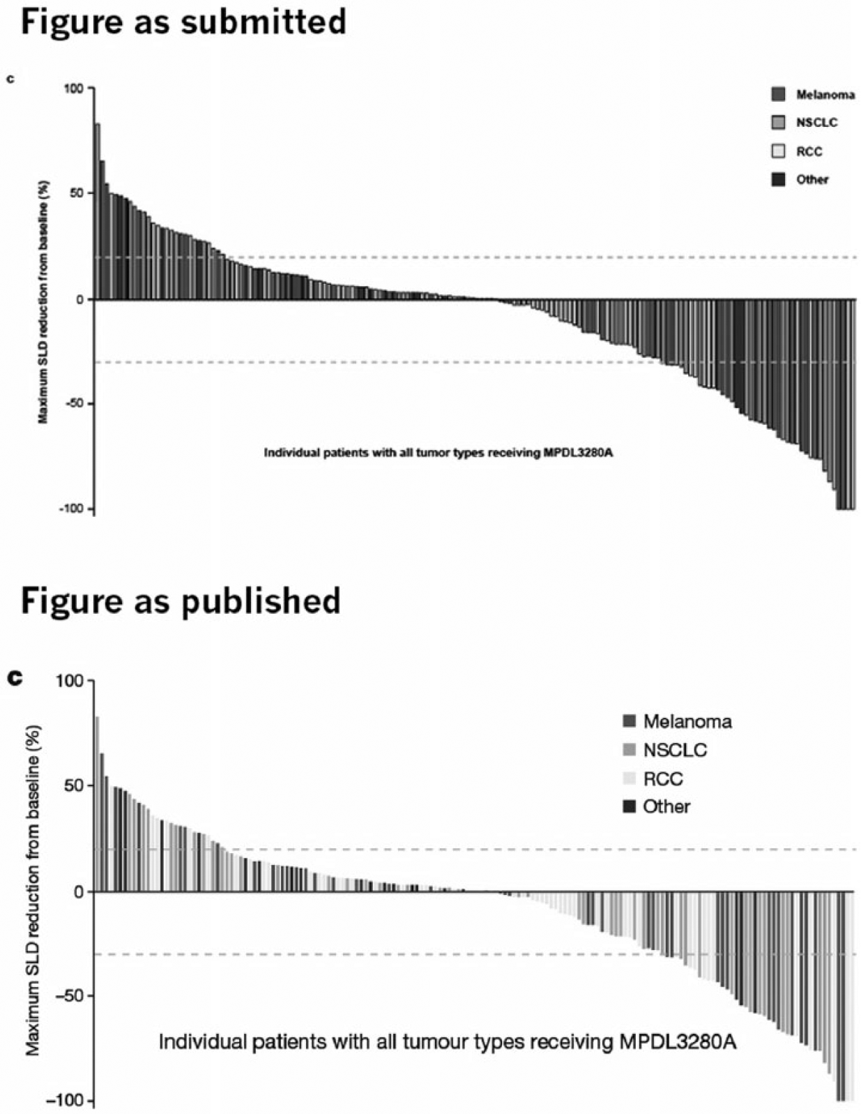
Nature art editors intervene only minimally in the design of research figures. In this instance, we improved the typography for legibility and removed black outlines around the bars to give a better view of the data.
Level 2: Non-peer-reviewed visuals co-created by Nature and external authors
While research papers are written for a highly specialist audience and news stories aim quite broadly, there is content in the middle of that spectrum, created for the non-specialist scientist. A News and Views article is a good example of this content—it summarizes a peer-reviewed research paper in around 1000 words or less, with one summary figure. The goal is for, say, a life scientist to be able to understand a News and Views article on particle physics.
Importantly, experts in the field are the authors of these pieces. These experts are invited by Nature’s News and Views editors to share their view of the research. They are independent views from the field— always explanatory, and usually favorable, but not always.
The author is encouraged to submit an idea or sketch for a visual that summarizes their piece. The News and Views editor assigned to the piece will then work to co-create a visual with the author and a Nature art editor. If the author submitted a high-quality idea and sketch, the editor will usually pass that along to the art editor, with possibly a few changes (see Figure 2). Or in the absence of ideas from the author, the editor and art editor will co-create together, usually with hand-drawn sketches.
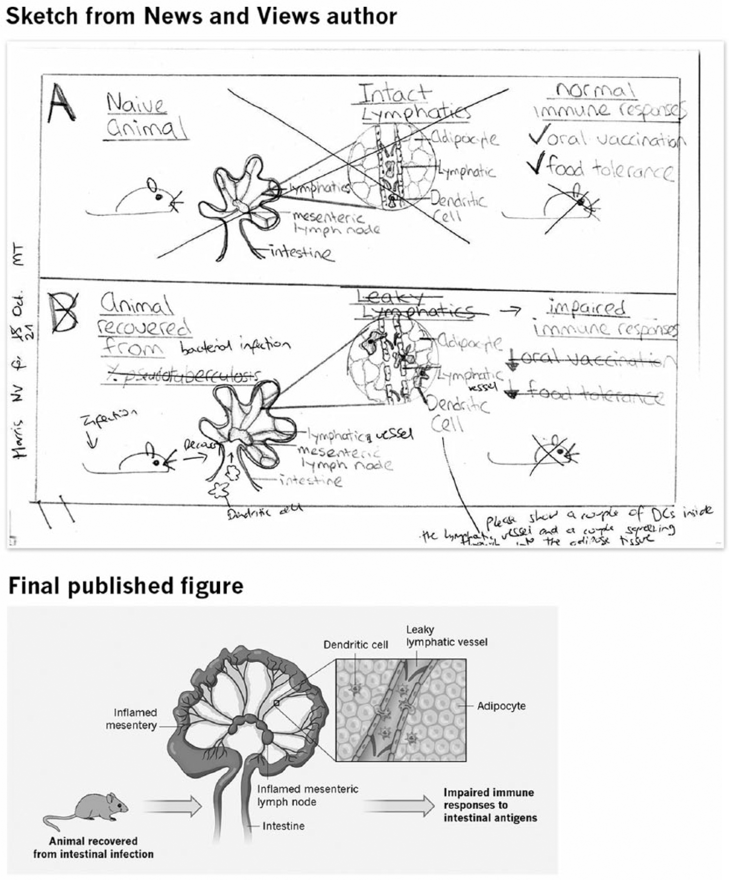
The first panel shows the original sketch submitted by the external author of a News and Views article. The editor’s blue and red pen marks show the process of simplifying the message so that it is comprehensible to a non-specialist audience of scientist. This sketch was passed on to an art editor, who then used images from our symbol library (the mouse and cells) and also drew some original art, arranging the elements with an eye to legibility and clarity (Nature
The art editor will then translate that sketch into a visual for publication—usually a scientific illustration—using best practices for graphic representation. This creative process varies widely, depending on the complexity of the topic as well as to the extent that the external author and internal editors agree on the visual representation of the science. Research published in Nature tends to be a breakthrough or presents something broadly new, which increases uncertainty in how something might be visualized. It is sometimes the job of our art editors to visualize processes and phenomena for the first time—this is naturally an iterative and cooperative endeavor.
As Nature is a weekly journal, we produce around 200–250 illustrations each year for News and Views alone. To create high-quality visuals at this speed, we rely on our own image library of symbols that represent objects and processes (see Figure 3). Using a consistent visual language, the art editor can concentrate on how best to visualize the idea at hand rather than working out how best to draw DNA or cosmic rays over and over again.
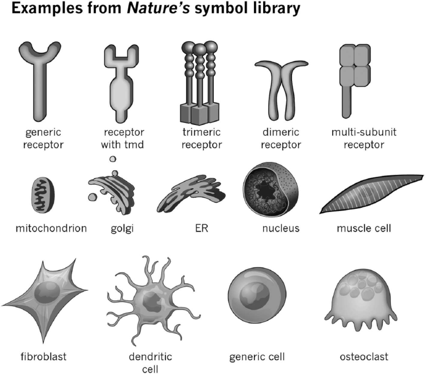
An example of our symbol library for News and Views.
A simplified visual language is useful not just for the efficiency of creation but also for comprehension by the reader. Visual language is a sign system (Bertin, 1967 [1983]), and if used optimally it can enable quick comprehension of ideas, much like you are reading this sentence without contemplating each letter. In this explanatory style of scientific illustration, complex processes and phenomena are plainly displayed using standard representations of objects (like neurons or planets) and phenomena (like gravity or cell signaling), most of which cannot be detected directly by the human eye.
Level 3: Journalistic, non-peer-reviewed visuals created internally by Nature
Nature’s team of science journalists produce news stories daily online and weekly in print. This content includes breaking news stories of interest to scientists, exclusive investigative reports, or long-form features that offer a deep analysis of relevant events, topics, and personalities in the scientific landscape.
Once Nature news editors have decided to run a story, they brief Nature art editors on the piece, and together they brainstorm for ideas for visuals. Before getting started, the art editor must identify what type of visual would best support the story as well as enlighten and entertain the reader. For example, a story pegged to geography, such as migration patterns, will often work well with a contextual aid like a map, whereas a story on complex physics will frequently need an explainer graphic that shows processes using symbols. A story that hangs on the numbers will do well to show a simple data visualization like a line or bar graph.
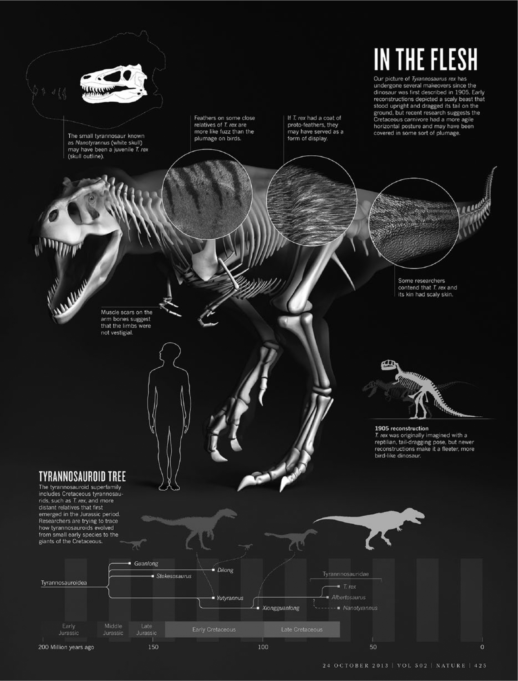
Once the goal of the visual has been determined, the art editor works alone to develop a draft visual to present back to the editor and creative director and/or art director, in an iterative process that may take many cycles to achieve high standards. The end result may come in a variety of forms: a simple one panel diagram, a graphic narrative using data and illustrations (often called infographics, see Figure 4), an animated explainer video, or a data-rich interactive graphic for digital platforms.
Visuals for news articles are designed to enlighten and entertain a broad audience of scientists as well as the science-interested public. They are created internally by Nature’s teams of editors, art editors, and subeditors, with thorough research and fact-checking to ensure high standards of accuracy (Nature
For internally created graphics, the responsibility for research and data mining lies solely with Nature reporters and editors (unlike a research figure). Given this, plus the broad creative freedom given to the art editor, news content goes through a thorough fact-checking and subediting process by internal subeditors assigned to non-peer-reviewed content. The ultimate goal of news graphics is engagement with a wide audience while keeping with Nature’s core values of accuracy and clarity.
4. Internal structure: Resourcing visualization
The average weekly issue of Nature contains more than 100 images that are sourced, drawn, graphed, or otherwise handled by the art team. For this volume of work to be achieved consistently, to very high-quality standards, the team must be adequately resourced and efficiently organized. The current team has just over a dozen members—with one creative director, one art director, and a mix of illustrators, art editors, artworkers, and media editors (for photography and moving image). Due to the nature of the work, with much of it high profile and under embargo, we do not rely heavily on outside freelancers. Our in-house team produces most of our visual content.
There was, however, a time when one could count the members of the art team on one hand. As recent as 2003, there were only three art editors and one art director. Most of the work was resizing and formatting research figures and creating News and Views images. News and opinion content was then very minimal. The team grew steadily with the rise of digital publishing in the first decade of the 21st century, which drove an increase in content variety (particularly for various type of news), a demand for faster publishing, and an increase in visuals in peer-reviewed content (such as supplementary information). The increase in visual content is likely due to a few converging factors, chiefly driven by exponential increases in computing power—giving researchers more data to analyze—as well as providing the community with increasingly sophisticated visualization technology at lower prices, thus democratizing the practice.
In the pre-digital age, the art team was even more minimal. According to one long-time employee who started at Nature in 1976, the department at that time consisted of one person, three “assistants” (one as young as 16 years), a desktop mechanical Monotype machine producing lettering on “bromide” photographic paper, lots of cowgum, tins of Ronson lighter fuel, lots of Rotring pens of various sizes, spraymount, razor blades, a magnifying glass, and a minifying glass. At that time, presumably, most of the work was physically constructing the issue, pasting together the work of authors and external artists.
5. Art and design for science communication—Further reading
It should be mentioned that there are established best practices for information design and visual communication that guide our practice at Nature. Each type of content requires a unique approach and standards. For peer-reviewed research figures, publishers do not create these visuals, but we do encourage authors to follow best practices, pointing them to literature such as the Points of View column that has appeared in Nature Methods since 2010. This column is specifically for scientists and highlights key themes, such as design of data, salience, color coding, typography, gestalt principles, networks, heatmaps, symbols, layout, grids, and how to create an overview figure, to name a few. There are more than 40 columns to date, recently collected in one volume (Nature Collections, 2010–2015).
Nature has long subscribed to the less-is-more philosophy for research figures, also called the “data-to-ink ratio” by Edward Tufte (1983), which advises the stripping out of unnecessary elements, clarifying by simplifying. Tufte is an excellent source for further reading on the basics of information design of charts, graphs, and other statistical visual tools, with an emphasis on achieving the most truthful yet intuitive representation of data.
For non-peer-reviewed content, where the art team is either co-creating with authors or has sole creative ownership of the visual, we are guided by additional principles. Context and intended audience determine the design approach. For example, a one-page journalistic infographic might blend graphs with beautifully rendered scientific illustration, resulting in an informative and also entertaining piece, as in Figure 4. The accessible, high-ink-density style of this type visual is appropriate for news, but contrasts with the style and aims of a research figure, where low-ink-density graphics deliver specialist information.
Alberto Cairo (2012) gives an excellent overview of graphics and information design for journalism, balancing the importance of the integrity of statistical data visualization with the art of conveying information with illustration and other eye-catching visual techniques required to gain audience attention.
The majority of our visuals at Nature are for exposition, to explain phenomena to a mostly scientific audience. For ease of distribution and archiving, they are mostly static. We do, however, create a small amount of exploratory visuals in the form of web-based interactive graphics. Most of these graphics are created to go with our news content, usually with data journalism pieces relevant to our audience. An example is when we published a story on the top 100 research papers of all time, by citation (Van Noorden et al., 2014). We created both an explanatory graphic for print and an exploratory graphic for online to allow the reader to search and freely explore the data on which the story was based.
We have experimented with interactive figures for peer-reviewed research, but these files are difficult to archive, so publishers are more likely to link to exploratory visual tools that are hosted by consortia or institutions rather than hosting and presenting large data sets themselves, generally speaking.
For further reading on design for exploration and interactivity, Tamara Munzner’s (2014) Visualization Analysis and Design is an excellent grounding in theory that spans practically all core topics in the field of visualization. For a practical guide, Nathan Yau (2011) gives specific examples of design tools used to create interactive graphics for web.
Underlying all of this is the study of visual perception and semiotics, pioneered by Jacques Bertin (1967 [1983]). His seminal text explores visual communication through the lens of signs, metaphor, symbolism, and analogy. Building on Bertin, Colin Ware (2013) approaches communication based on the science of perception and vision to find answers to why we see objects the way we do and gives advice on how to create visuals that communicate more clearly.
6. Conclusion
At Nature, two key questions shape our thinking and process for visual communication: (1) who is the intended audience (technical vs non-specialist) and (2) who has creative ownership (external authors, shared internal/external, or internal only). The “audience” question guides content creation, such as how much detail to provide in a visual or its editorial style. The “ownership” question guides the publishing process, helping us place the design of each visual in a clear framework, with predetermined levels of design intervention for each.
This framework gives a firm foundation for consistent visuals of high quality, with proven results over the years. However, that is not to say that we do not have our challenges. Daily struggles include the following: research figures supplied in file formats that are not easily editable, which causes delays; having to reshuffle work around the team when a project takes more time than was scheduled; and the constant time pressure of working under strict deadlines.
In the long term, some challenges that face us are as follows: increasing pressure to publish research faster, but to the same standard; constant vigilance to detect fraud in research figures, which is time-consuming for the larger team (manuscript editors as well as art); and the general increase in visual data that are published with peer-reviewed research, particularly in the form of supplemental information and extended data (Powell, 2016).
Looming over all of this, as both a challenge and opportunity, is the fast pace of digital transformation of the publishing industry. Designing visual content for small screens such as smart phones is a particular challenge for information design, as is the need to create multiple versions of a graphic to accommodate various platforms such as mobile and desktop. The increasing ease of creating and consuming motion graphics such as video and animation will drive demand for these formats; however, it will require more resources to produce this type of content. There is also the challenge of archiving interactive graphics that are created in software that is no longer widely supported.
However, while forms may change with time—from static representations to moving image, for instance—the communication function remains the same. For visual content creators, the basic principles of information design and visualization will remain the touchstone of their practice, whatever comes.
Footnotes
Funding
The author received no financial support for the research, authorship, and/or publication of this article.