




Abstract
The extent to which newspapers display graphic images of death has rarely been studied in relation to the degree of the visibility of bodies, nor do many comparative analyses exist. This has led to a narrow understanding of how and why audiences are exposed to human suffering around the world. In examining newspaper images of the dead from the 2010 Haiti earthquake across 15 countries, this study develops a graphic image content scale to measure such visualizations. It finds significant differences in graphic images across the studied sample, both in terms of the amount of images and the degree of visibility of death. The study argues that major sociocultural influences, such as different religious traditions and societal levels of violence are part of the reason for the differences.
Introduction
Of increasingly popular concern in the study of news media coverage of human suffering and death is the way in which death is displayed visually. Two approaches have dominated this area: one is concerned with the extent to which graphic images are present (see Aday, 2005; Fahmy and Kim, 2008; Keith et al., 2006; Tsang, 1984), while the other is interested in the cultural meanings and effects of images of human suffering and death (see Chouliaraki, 2006; Moeller, 1999; Sontag, 1977; Taylor, 1998; Zelizer, 2010).
Yet, most studies deal with the topic on a somewhat superficial level, examining only whether death is present, rather than the ways in which it is displayed. There is further a lack of comparative studies that could shed more light on the cross-cultural validity of existing studies’ findings. The overwhelming majority of the literature has focused on the Anglo-American sphere, often implicitly assuming similar situations around the rest of the world. Yet, anecdotal evidence shows cross-cultural variation in the visibility of death, necessitating more comparative research, as ‘there is no one representation of death in the news, and cultural contexts may play a large part in variances’ (Hanusch, 2010: 168).
This article takes up that challenge and reports the results from a comparative study of newspaper images of death following the 2010 Haiti earthquake. The 7.0 magnitude tremor, which struck near the capital of Port-au-Prince on the afternoon of 12 January 2010, proved to be one of the most destructive in recent memory, killing around 230,000 people in one of the poorest nations on earth (McElroy, 2011). With the death toll on a similar scale as the 2004 Indian Ocean earthquake and tsunami, global saturation coverage was immediate, resulting in sufficient newspaper content for a comparative study. In examining news images from 30 newspapers in 15 countries in the Americas, Oceania and across Europe, the paper develops a typology of graphic image content, which is tested against a number of potential sociocultural influences.
Imag(in)ing death in the news
The visual plays an important role in news coverage as images are traditionally seen to provide documentary evidence of an event. We trust photographs and films simply because ‘seeing is believing’. As Sontag (1977: 5) has argued, ‘a photograph passes for incontrovertible proof that a given thing happened. The picture may distort; but there is always a presumption that something exists, or did exist, which is like what’s in the picture.’ In fact, photojournalists during the 1930s and 1940s attempted to offer ‘a “visual expansion” of journalistic practice, one that appears to increase the truthfulness of news and extends the adage that “the camera does not lie” to journalism’s primary authority, the reporters’ (Zelizer, 1995: 136). Images of death are particularly relevant, because they can show us the end of human life and confront us with a reality that words often cannot. While written or spoken accounts can be explicit in detail, to actually see bodies of the deceased leaves little to the imagination. A close link also exists between the journalistic reporting on death and the production and shaping of collective memory (see, for example, Zelizer, 1992, 1998). Journalists often employ the past to make sense of the present, and this is particularly so when dealing with trauma or death, as Zelizer (2010) has pointed out in her analysis of news images of people about to die. There is a close cultural connection between a society’s norms and values and how death is mediated in the public sphere.
The study of news imagery is often conducted against the background of semiology, which sees images as operating on two levels, the denotative (its literal meaning), and the connotative (the broader meanings that members of a certain society or culture associate with the sign). French linguist Roland Barthes (1972) introduced myths as a second order of signs, which is concerned with the way in which signs become new signifiers that are not arbitrarily related to a signified, but rather set against deep cultural contexts. In the context of images of death, Seaton (2005) has pointed to the meanings surrounding the recurrent use of pietá images in news coverage, which demonstrates that certain types of photographs can be traced back to religious iconography. Seaton argues the repetitive use of pictures of mothers and fathers holding their dead children in almost every natural disaster or war evoke certain emotions in us that are grounded in a Christian upbringing. More recently, Zelizer (2010) has examined the visual in her discussion of the ways in which about-to-die images move the public. She is concerned with the cultural forces that shape such imagery and is able to uncover repetitive patterns through which US media are able to avoid content of too graphic a nature and stir the public’s emotions and imagination.
How the public might be affected by such imagery has been a topic of debate for some time. On one hand, scholars have been concerned about a perceived rise in the visibility of death in the news (Carruthers, 2000; Moeller, 1999; Sontag, 1977). This increased presence of graphic images, some argue, is leading to compassion fatigue among audiences (Moeller, 1999). Others have pointed to the empirical evidence that news media, at least in Western countries, are careful to not show actual death. Campbell (2004: 55) even argues that ‘we have witnessed a disappearance of the dead in contemporary coverage’. Audience studies in Western countries have shown that many do not want to see graphic images, and the media’s reluctance to show them may thus be grounded in the same social attitudes as their audiences’. In fact, the overwhelming majority of studies has shown that images of death are extremely rare in Western newspapers. Fishman (2001) found only a few examples in her study of US newspapers, as did Singletary and Lamb’s (1984) analysis of award-winning photographs. A study of German and Australian newspapers showed images more commonly displayed the dead when still alive, or depicted general scenes of destruction. Only 4.5% of images showed death, with blood visible in 1.7% (Hanusch, 2008).
Of particular concern has been the distinction between ‘our’ and ‘their’ dead (see, for example, Adams, 1986; Campbell, 2004; Herman and Chomsky, 1988; Moeller, 1999; Tsang, 1984). A study of US news magazines’ coverage of the Gulf War found only 2% of images included wounded or killed American soldiers, but almost all of those were ‘either flag-draped coffins in US home-town funeral ceremonies or portraits taken of soldiers prior to deployment in the Middle East’ (Griffin and Lee, 1995: 819). Only 0.5% showed dead Iraqis, despite the large number of those killed. Recent studies of the Iraq and Afghanistan wars have similarly noted only small amounts of dead bodies in news images (Aday, 2005; Fahmy and Kim, 2008; King and Lester, 2005; Silcock et al., 2008).
Most studies have dealt with graphic imagery of death on a descriptive level, mainly concerned only with whether death was visible or not, rather than the ways in which death may have appeared. This study is particularly interested in the degree to which death is visible in news images around the world, and the potential reasons for any differences.
Sociocultural influences on graphic images
A more global understanding of graphic news imagery is important, because comparative studies allow us to generalize theories and test interpretations against cross-cultural differences (Hanitzsch, 2009). In relation to images of death, comparative approaches ‘may tell us more about our own attitudes to dealing with death by looking at the way in which others handle the end of life’ (Hanusch, 2010: 168). They may also enable a more integrated approach to the visualization of death in the news by testing for a variety of influences. The following paragraphs explore some of the potential sociocultural determinants of difference in the visualization of death, based on the notion that a society’s cultural background influences the ways in which journalism is practiced (Hanusch, 2009; Kim and Kelly, 2008; Ravi, 2005). Thus, ‘images used strategically in the public sphere reflect not only beliefs, attitudes, and values of their creators, but those of society at large’ (Edwards and Winkler, 1997: 289). The development of these determinants is based on a broader analysis of aspects of death in the public sphere discussed in the communication, journalism, sociology, psychology and cultural studies fields. They relate in particular to four areas: religious tradition, cultural values, proximity and conditions of violence.
The first area to be explored here is the impact a society’s religious tradition may have on the visual news coverage of death. Religion has long been identified as related to individuals’ death attitudes, both in terms of the type of religion as well as the level of religiosity (see, for example, Kellehear, 2007). Seaton (2005) believes the news media still display a number of religious elements, despite the fact they evolved out of secular ideas, an aspect that, according to her, is particularly evident in newspaper imagery. Comparing Catholic and Protestant traditions of news imagery of death, Castanos and Muñoz (2005) argue that Catholic countries have a different relationship with death based on differences in visual culture. For example, they believe that Protestant traditions have favored an ‘antivisualist coverage of pain’, while Catholic iconography, as evidenced by images of a bleeding Jesus on the cross, has a tradition that is more open to showing graphic death (Castanos and Muñoz, 2005: 6). Religious traditions run deep, because even in relatively secular societies, journalists ‘can still be seen as personifying the old religious virtues as they are reflected in their ethical and moral stances’ (Underwood, 2001: 46). In Mexico, for example, the mix of Catholicism and Aztec traditions is said to have contributed to a unique relationship with death, culminating around the famous Day of the Dead (Lomnitz, 2005), and one could expect that news imagery of death in such a society may be relatively liberal.
Additionally, research into religious attitudes and death anxiety has shown a link between the level of religiosity individuals have and the extent to which they may fear death, although this is not an entirely uncontested view (see Neimeyer et al., 2004). Evidence from studies of the social history of dying (Ariès, 1974; Kellehear, 2007) suggests that when religion was a stronger force in social life, death was made sense of through it, rather than modern-day practices in the secularized West where medicine is the dominant force in dealing with death. Mellor and Shilling (1993) argue that the processes of secularization and privatization in Western societies led to a fear of death. In the context of news coverage, Staudt (2009) notes that death was increasingly repressed in the US public sphere from the 1920s to 1960s, at the same time as Americans were becoming more secular. She argues that the resurgence of religiosity since the 1960s has accompanied death’s return to the public sphere.
We could therefore assume that a country’s dominant religious orientation may have an impact on the way in which news images display death, as well as the extent to which its citizens hold religious beliefs, leading us to the following hypotheses:
H1: Death is more visible in news images from predominantly Catholic countries as opposed to those from predominantly Protestant countries.
H2: Death is more visible in news images from countries with higher religiosity.
A second area discussed in the literature concerns a society’s cultural values. A number of studies have in recent years highlighted the importance that cultural values play in accounting for differences in journalistic practices across countries (Hanusch, 2009; Kim and Kelly, 2008; Ravi, 2005). Many scholars argue that the visual coverage of events says much about the cultural circumstances in which it is portrayed (see, for example, Brothers, 1997; Moeller, 1989). A useful measure here is the individualism/collectivism dimension developed by Hofstede (2001), and which has been applied and replicated in a number of subsequent studies across various disciplines (Inglehart and Oyserman, 2004), despite some methodological shortcomings (McSweeney, 2002). The dimension measures the strength of social ties between members of a society. In individualist societies there are only loose ties between individuals, while in collectivist societies, these ties are much stronger and group interests prevail over individual interests.
Individualism/collectivism has also been applied to comparing news images. For example, Kim and Kelly’s (2008) analysis of news and feature photographs in US and Korean newspapers outlined significant differences between the style of photojournalism in both countries, which could be put down to the dimension. American photojournalists employed an interpretative approach grounded in individualism, while their Korean counterparts relied on mere description, in line with their society’s collectivist attitudes. The degree to which particularly collectivist values may impact differences in news coverage of death has been outlined by Hanusch (2008).
In modern, individualized societies, death has been removed from the everyday experience, away from family units to nursing homes and hospitals, while in traditional, collectivist societies, where many family members lived in the same house, death occurred in the home and was experienced more regularly (Kellehear, 2007). Thus, applying the knowledge from the literature, it could be expected that collectivist cultures may display death more liberally because they are more used to experiencing death up close:
H3: Death is more visible in news images of countries that are more collectivist than individualist.
An important consideration in news coverage of foreign events relates to geographic and cultural proximity. Numerous studies of news and death have argued that geographic distance plays a role in determining the extent to which death is made visible. The dominant argument has been that the further away death occurs, the more likely it is that graphic images are shown because of the lack of audience connection with those affected (Adams, 1986; Moeller, 1999; Tsang, 1984). Yet, as the wider literature on foreign news has shown (see, for example, Wu, 1998), cultural proximity plays perhaps an even more important role. This has also been demonstrated in research on death, with Walter et al. (1995: 587) identifying an ‘it could have happened to me’ factor, which often leads to a depersonalization of distant victims, and a greater likelihood that graphic images may be shown. Similarly, journalists’ tongue-in-cheek formulae like ‘one dead fireman in Brooklyn is worth five English bobbies, who are worth 50 Arabs, who are worth 500 Africans’ (cited in Moeller, 1999: 22) give a glimpse of the importance cultural affinity with a location plays. Assumedly, then, those dead who are culturally and/or geographically distant may be displayed in more graphic ways, leading to the two following hypotheses:
H4: Death is more visible in news images from countries which are geographically distant.
H5: Death is more visible in news images from countries which are culturally distant.
A further measure of the degree to which members of a society may be relatively used to death relates to the extent to which they experience it on a regular basis. As noted previously, in traditional societies people were used to seeing death around them due to communal lifestyles. In fact, as Elias (1994) has pointed out, the level of violence in pre-industrial societies meant life was uncertain and brief. In modern times, however, this experience of death became rarer, with life more and more bureaucratized and death mostly removed to hospitals. Differing levels of violence may expose some cultures more regularly to death than others. While there has been very little research conducted in this area from a journalism or communication perspective, it would seem logical to suggest that newspapers in societies with high levels of violence may also show more explicit images of death, due to a perceived hardening of attitudes.
A common measure of societal violence is the Global Peace Index (GPI), which records the presence and absence of peace in 149 countries around the world via 23 separate quantitative and qualitative indicators, including the societal level of conflict, deaths from violent internal conflict, level of violent crime and the number of homicides (Institute for Economics and Peace, 2010). While the GPI has not been used in journalism and communications research, it has found application in cross-cultural psychology, peace and conflict studies and economics (Burgess et al., 2009; Fischer and Hanke, 2009; Suffla et al., 2010). Taking the GPI as an indicator for societal violence, one could expect higher degrees of graphic imagery in countries with a higher GPI.
H6: Death is more visible in news images from countries that score higher on GPI.
The 2010 Haiti earthquake presents an ideal case study for testing the hypotheses developed here, as it satisfies a number of requirements for a comparative approach. First, the events in Haiti instantly reached a global audience, with newspapers everywhere replete with coverage, providing ample content for analysis. Further, the fact this was a natural disaster excluded to some degree the political dimension that complicates comparative studies of war deaths. This was a humanitarian emergency, and therefore coverage was arguably less influenced by politics – Haiti was not at war with any country and the events thus could not be seen through a lens of Haitians as the enemy. Finally, a large number of images of death of varying degrees of graphicness were available through wire services, giving news outlets around the world access to them.
Methodology
To examine the visibility of death in news images, a visual content analysis of 30 quality newspapers in 15 countries was conducted. The following countries and newspapers were chosen: Argentina (La Nacion, Clarín), Australia (The Australian, Sydney Morning Herald), Belgium (De Morgen, De Standaard), Brazil (O Globo, Folha de S. Paulo), Canada (The Globe and Mail, Toronto Star), France (Le Figaro, Libération), Germany (Frankfurter Allgemeine Zeitung, Süddeutsche Zeitung), Italy (La Stampa, Corriere della Sera), Mexico (La Jornada, El Universal), Norway (Aftenposten, Bergens Tidende), Portugal (Diário de Notícias, Público), Spain (El Mundo, El País), Switzerland (Neue Zürcher Zeitung, Tagesanzeiger), United Kingdom (The Daily Telegraph, The Guardian) and the United States (The New York Times, The Washington Post).
Country selections were made to represent the three media systems developed by Hallin and Mancini (2004), with Australia, Canada, the United Kingdom and the United States representing the Liberal model, Belgium, Germany, Norway and Switzerland the Democratic Corporatist model, and Argentina, Brazil, France, Italy, Mexico, Portugal and Spain the Polarized Pluralist model. While Australia and the Latin American countries were not originally included as part of Hallin and Mancini’s (2004) model, the Polarized Pluralist model can be considered the best fit for Latin American countries (Hallin and Papathanassopoulos, 2002), while Australia may be closest to the Liberal model, despite some similarities with the Polarized Pluralist model (Jones and Pusey, 2010). A further criterion for selection was that countries were either predominantly Catholic or Protestant in order to test Hypothesis 1. Nine of the chosen countries (Argentina, Belgium, Brazil, Canada, France, Italy, Mexico, Portugal and Spain) had a predominantly Catholic tradition, while the other six (Australia, Germany, Norway, Switzerland, the UK and the US) were classified as Protestant (Norris and Inglehart, 2011: 46). While the majority of the chosen countries are Western, the sample still provides for a diverse array of media systems to warrant cross-cultural examination. Further, the differences between journalistic practices and news coverage among individual Western countries are already considerable (Hanusch, 2009).
Newspapers were chosen based on their importance as agenda-setting media in their respective countries and to provide a balance between left- and right-leaning newspapers where possible. The chosen newspapers can be considered representative of the quality press in their respective countries. Tabloid newspapers were excluded from the study, as they do not exist in many of the countries sampled here. Further, initial analysis of tabloid newspapers in Australia, Britain and the US showed a number of newspapers displayed no or extremely few images of death.
Newspapers were analyzed for each day from 13 to 21 January 2010. This timeframe was chosen to include the violent looting which resulted in deaths some days after the actual earthquake. Because of the time difference, some newspapers did not publish news about the earthquake until 14 January. Newspapers were accessed either through hard copies or exact digital reproductions (in Adobe Portable Document Format) available in online databases or on newspaper websites. Because of this, but also because of the different formats of newspapers – ranging from tabloid size to Berliner to broadsheet format – the size of images was measured as relative to the page size. This resulted in image size being expressed as a percentage of page size.
The unit of analysis was a news photograph that related to the Haiti earthquake. All such images were examined and counted, with those depicting or signifying death in any way selected for further study. In order to best differentiate between varying degrees of graphic imagery, a typology was developed. This was important, because an image of closed body bags, with no actual people visible, may have a very different impact on the viewer than an image that shows a corpse with their face visible in the rubble. In the first step, a qualitative description of each image was recorded by two coders and later analyzed to determine suitable categories. Some of the categories were guided by previous research (Griffin and Lee, 1995; Hanusch, 2008). Once categories were determined, the two coders recoded each individual image using the typology developed. This process resulted in five types of images. The inter-coder reliability test for the five categories resulted in a Krippendorff’s alpha score of .926. The categories depict increasing levels of visibility of death in news images:
Implied death: This includes images in which death is indicated, but no actual bodies are visible. Examples are images that show only covered bodies, coffins or body bags.
Fractional death: Images display only body parts of the dead, such as a hand hanging out of rubble, or a foot sticking out from underneath a sheet. Images showing bodies from a distance, or only a blurred mass of bodies, were also included here.
Masked death: This category contains images showing dead bodies clearly, but which do not show faces. For example, some images show bodies of victims lying face down or with their faces otherwise obscured. Some images of looters killed in mob violence show them lying in the street with their faces down.
Unveiled death: The fourth group of images shows the bodies of the dead with their face visible. The distinction to the previous category is important, as such images are generally considered more graphic in Western society.
Contorted death: The fifth category is arguably the most graphic. It includes images that show contorted masses of bodies, often at make-shift morgues. They display bodies lying on top of each other in the street or in mass graves. Included here are images which show bodies being man-handled, such as bodies loaded onto bulldozers for removal, or medical personnel throwing bodies onto piles of other bodies.
Results
Basic parameters
The 30 newspapers examined for this study published a total of 2109 images relating to the Haiti earthquake between 13 and 21 January 2010. Of these, 175 images (8.3%) were classified as signifying death in Haiti, with the remainder showing scenes of physical destruction, survivors, aid efforts as well as politicians (Table 1).
Amount and prominence of images.
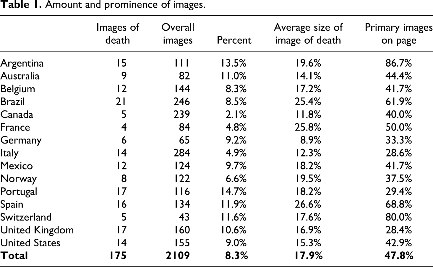
Closer inspection shows considerable differences within the sample, with individual country percentages ranging from a low of 2.1% in Canada to a high of 14.7% in Portugal. In addition to Canada, countries with the lowest percentages included Brazil, France, Italy and Norway. Those with a figure higher than 10% were Portugal, Argentina, Spain, Switzerland, Australia and the United Kingdom, with Belgium, Germany, Mexico and the United States somewhat in the middle. Absolute numbers of images range from 5 to 21, with the largest number published in Brazil, the UK and Spain, while the least amount appeared in Canada, Switzerland and Germany.
Average sizes of images also differed quite markedly, as did decisions about whether to place them as the most prominent ones on a page. Taking size and placement into account is crucial to get a better idea of the prominence newspapers give to images of death. Across the 15 countries studied, almost half of all photos represented the primary image on a page, with an average of almost 18% of page size. On the conservative end of the spectrum, German, Italian and UK newspapers tended to cover death relatively sparingly, while newspapers in Spain, France and Brazil displayed images more prominently.
Graphic image content
A comparison based purely on the presence of images of death cannot tell us much about the ways in which newspapers have dealt with varying degrees of graphic imagery, however. For this purpose, the Graphic Image Content Scale (GICS) was developed in order to better describe how photographs were dealt with in various national environments. The comparison of countries across the GICS reveals some remarkable aspects in addition to the basic parameters discussed earlier (Table 2).
Newspapers’ images on the GICS.
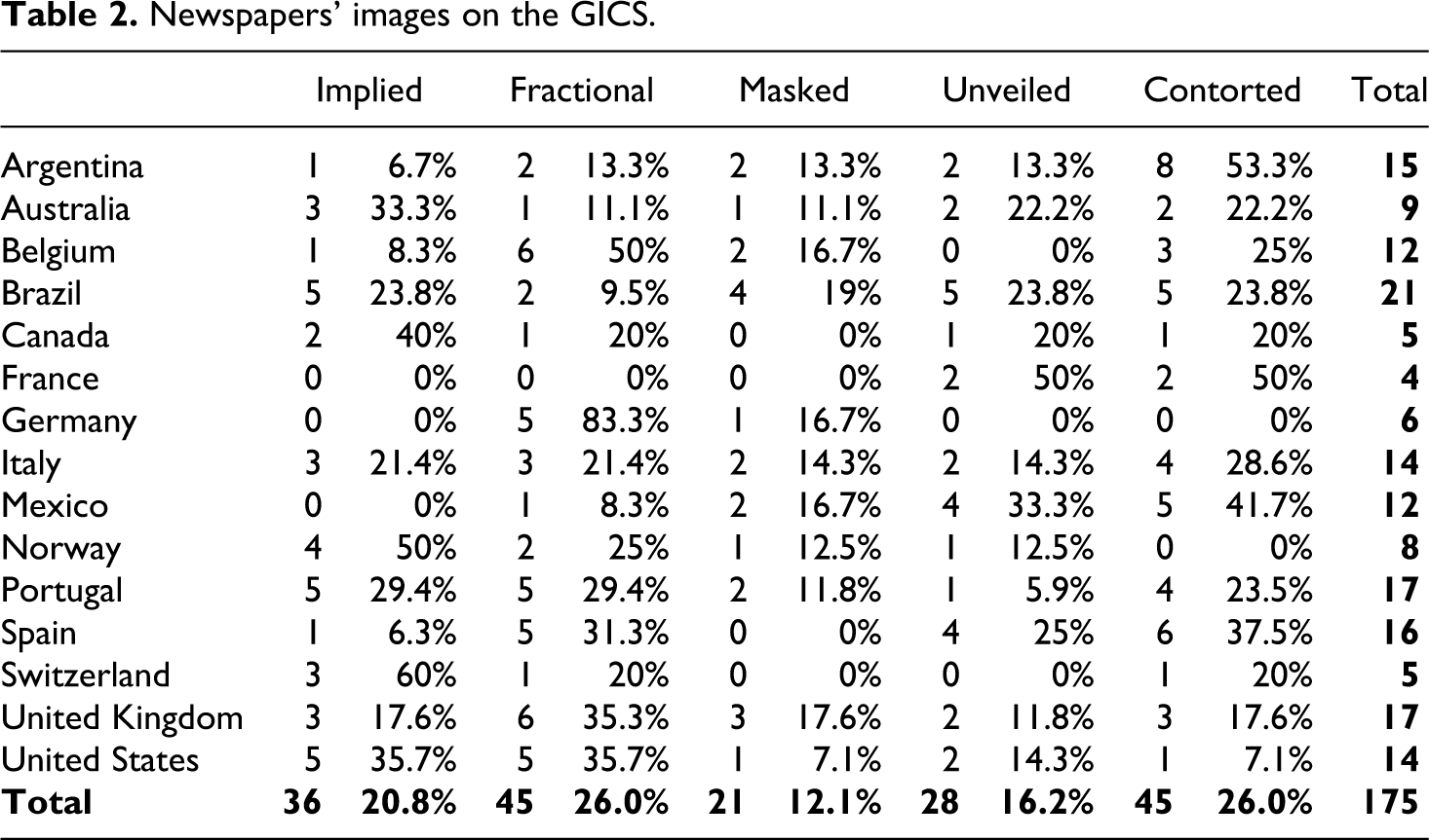
Overall, barely more than one-quarter of images were in the ‘fractional death’ category, showing only body parts. The same percentage, however, also showed ‘contorted death’. ‘Implied death’ made up just over one-fifth of images overall, while ‘unveiled death’ was present in 16.2%. The least common category at 12.1% overall was ‘masked death’. An inspection of individual country scores shows quite pronounced differences in the ways in which death is visualized. Some countries that displayed relatively little death overall also exercised restraint in the types of images chosen. For example, German newspapers showed almost exclusively fractional death, with only one image falling in the masked death category. Similarly, half of Norwegian newspapers’ images depicted only implied death. The case of Switzerland is illuminated considerably when considering the kinds of images that were shown. While Table 1 shows that four of the five Swiss photographs were published as primary images on a page, the level of death was restricted primarily to ‘implied death’ and ‘fractional death’, with only one photograph showing ‘contorted death’. On the other hand, the four images in French newspapers showed exclusively unveiled or contorted death. Newspapers in the United States showed predominantly ‘implied death’ or ‘fractional death’ (71.4% combined), while in the UK there was a more even spread, as was the case in Australia.
Some countries displayed considerably higher levels of graphic death in their newspaper coverage, with more than 50% of Argentine, Brazilian, Mexican and Spanish images displaying ‘unveiled death’ or ‘contorted death’. Arguably most graphic was the coverage in Mexican newspapers, where 41.7% of images showed ‘contorted death’, with a further 33.3% displaying ‘unveiled death’. In Argentina, ‘contorted death’ made up 53.3% of images, with a further 13.3% displaying ‘unveiled death’. In Spain, those percentages were 37.5% and 25%, respectively, and in Brazil, just over half of images overall (52.6%) showed ‘unveiled death’ or ‘contorted death’.
These differences are reinforced when examining the countries according to their membership in Hallin and Mancini’s (2004) media systems (Table 3). Polarized Pluralist countries were significantly more likely to show graphic images than the other two systems, χ2(9, N = 175) = 21.223, p = .007, with Cramer’s V = .246 indicating a medium-sized effect.
Media systems and GICS.
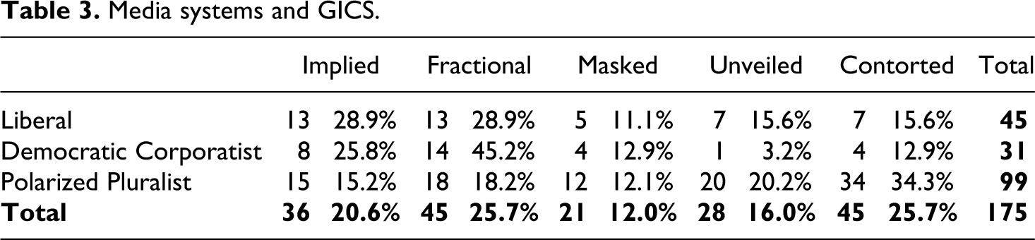
In fact, the category of ‘contorted death’ was by far the most common category of images of death in newspapers from Polarized Pluralist countries, with just over one-third of their images showing contorted masses of bodies or bodies being manhandled. In total, more than 50% of images fit within either the ‘unveiled’ or ‘contorted’ categories, while this was the case in 31.2% of Liberal countries and in only 16.1% of Democratic Corporatist newspapers. At the same time, newspapers in Democratic Corporatist countries overwhelmingly displayed either ‘implied’ or ‘partial death’ (71% combined, compared to 33.4% in Polarized Pluralist countries).
Determinants of graphic imagery
Because the GICS was developed on the basis of the increasing degree of graphic content and operates at the ordinal level of measurement, only chi-square analysis or H-tests could be carried out when examining the influence of sociocultural factors. In order to test Hypothesis 1, a chi-square analysis was implemented to identify whether the religious background of countries was related to any differences in the GICS. As Table 4 shows, newspapers from predominantly Catholic countries were significantly more likely to show increasingly graphic images than those from Protestant countries, χ2(4, N = 175) = 14.183, p = .007. Cramer’s V = .285 indicates a medium-sized effect.
Religion and GICS.

Around one-third (32.8%) of images in Catholic countries showed ‘contorted death’, while this was the case in only 11.9% of images in Protestant countries. Conversely, 64.4% of images in Protestant countries showed either no bodies at all or only body parts, while that was the case in only 37.1% of Catholic countries’ images. Thus, Hypothesis 1 was supported, indicating that a country’s religious tradition appears to be related to the visibility of death in news images.
In order to measure religiosity, data from the latest results of the World Values Surveys was used (Inglehart and Welzel, 2010). These comprehensive and representative surveys from 97 countries around the world provide state-of-the art knowledge about societal attitudes on a wide range of issues and have found wide application in a variety of disciplines, in particular political sciences. Inglehart and Welzel (2010) differentiate between countries along two major dimensions. First, the traditional vs. secular-rational values dimension ranks countries in terms of the extent to which they regard religion as important in their lives. This dimension tracks both religious beliefs and practices. Second, the survival vs. self-expression values dimension relates to the way in which societies feel secure. Self-expression cultures increasingly focus on subjective well-being and quality-of-life rather than sheer economic and physical security.
To operationalize levels of religiosity, countries were separated into groups of high (a score of < –.5 on traditional/secular-rational scale), medium (> –.5 and < .5) and low (> .5) religiosity, based on data from the WVS (Inglehart and Welzel, 2010). However, a chi-square analysis could not find any significant differences between the sampled countries, χ2(8, N = 175) = 7.655, p = .468. Thus, Hypothesis 2 was not supported.
Hypothesis 3 had suggested that in cultures which hold collectivist values, i.e. who emphasize the group over the individual, death would be more visible. To test collectivism as a determinant, Hofstede’s (2001) scale was applied, and the sampled countries were divided as to whether they were predominantly collectivist (< 50 on Hofstede’s scale) or individualist (> 50). A chi-square analysis showed that despite a trend for collectivist countries to be more graphic, this was not significant, χ2(4, N = 175) = 8.998, p = .061. Thus, Hypothesis 3 must be rejected.
Clearly not supported was Hypothesis 4, which had suggested that the more geographically distant a country was, the more likely its newspapers would show graphic images. Geographic proximity was measured as the distance between Port-au-Prince and each country’s capital in kilometers, and countries grouped accordingly (< 5000 km, < 7500 km, < 10,000 km, > 10,000 km). An H-test showed no significant relationship, H(3) = 6.118, N = 175, p = .106, and, in fact, many countries relatively close to Haiti, such as Mexico, Brazil and Argentina, showed a large number of very graphic visuals. In order to test for cultural proximity, Inglehart and Welzel’s (2010: 554) diagram was applied, which delineates culturally similar groups according to their scores on the two dimensions identified earlier. This is because the data on their cultural value map of the world ‘reflect each society’s economic and socio-cultural history’ (Inglehart and Welzel, 2010: 553). Thus, the sampled countries can be found in groupings for Latin America, Catholic Europe, English-speaking countries and Protestant Europe. While Haiti was not one of the countries in the WVS, we can reasonably place it with other Latin American countries, just as Haiti’s neighbor, the Dominican Republic, was when it was surveyed (Inglehart and Welzel, 2005). Closest to Latin America on the map are Catholic Europe as well as the English-speaking countries, with Protestant Europe the furthest away culturally. Chi-square analysis shows there is a significant relationship between cultural proximity and graphic news imagery, but not like it was hypothesized (Table 5).
Cultural proximity and GICS.

In fact, the Latin American countries culturally closest to Haiti showed the most graphic imagery, followed by Catholic European, English-speaking and then Protestant European countries, H(3) = 19.774, N = 175, p < .001, with η2 = .113 indicating a medium-to-large effect. We therefore must reject both Hypothesis 4 and 5.
In contrast, there was clear evidence to support Hypothesis 6, which stated that in countries with a higher level of violence, depictions of death would be more prominent in newspapers. To measure the level of violence, the 2010 Global Peace Index was applied. In order to conduct the comparison, countries were divided into five categories, ranging from very high to very low states of peace (Institute for Economics and Peace, 2010). An H-test demonstrated that countries ranking lower in terms of their state of peace tended to be more graphic in their depiction of death, H(3) = 8.772, N = 175, p = .032, with η2 = .05 indicating a medium-size effect. 1
Discussion
Far from omnipresent, images of death are relatively rare in news coverage around the world. This is not a surprising finding, which is in line with other studies (see, for example, Fahmy and Kim, 2008; Hanusch, 2008; Silcock et al., 2008). However, the extent to which death is visible in individual images is significantly different between various countries. In particular, Latin American and southern European newspapers tend to be much more graphic than northern European and North American newspapers. How the public experiences human suffering in such images is far from uniform, and claims of apparently ever more graphic imagery in Anglo-American newspapers pale in comparison to the kinds of material Latin American audiences are exposed to. It was argued earlier that the visibility of death in news images depends to a large degree on the cultural context in which such images are viewed. The importance of culture as an influence on journalistic practice, in addition to political and economic determinants, has been highlighted by a number of scholars (Hanusch, 2009; Kim and Kelly, 2008; Ravi, 2005). This study has shown that a number of sociocultural factors may be related to the way in which different cultures experience death in their newspapers. Of the factors examined here, it was found that a society’s religious tradition and the level of societal violence were significantly related to the presence of graphic imagery in quality newspapers.
In terms of religion, Protestant countries are more likely to hide death in their images, while Catholic countries display it more liberally. Together with previous research (Castanos and Muñoz, 2005; Zelizer, 2010) this supports the need to probe more in-depth the contributions iconographic traditions are making to visual choices in journalism. The emphasis here is on a society’s religious traditions, rather than necessarily the extent to which journalists or society at large regard religion as important. As Norris and Inglehart (2011: 17) have argued, ‘the distinctive worldviews that were originally linked with religious traditions have shaped the cultures of each nation in an enduring fashion’, and they have arguably shaped photojournalism as part of this process.
In this regard, the link between intrinsic religiosity and more accepting attitudes to death did not equate to a stronger presence of graphic images in countries with higher religiosity. While there is a slight trend for Protestant countries to be more secularized (the Catholic countries of Latin America tend to also be the most religious), the English-speaking countries, most notably the United States, tend to display higher religiosity than Catholic European countries (Norris and Inglehart, 2011).
A further surprise was that a society’s level of collectivism alone was not significantly related with the degree of graphic imagery. Based on evidence from past studies (Hanusch, 2008; Kellehear, 2007), it was expected that the more collectivist a society, the more acceptable it would be that images of death be published in newspapers.
On the other hand, conditions relating to societal violence are also related to the visibility of death in news images. Put succinctly, the more a society is used to seeing violence and death in real life, the more likely it is that journalists will take a more graphic approach. The Global Peace Index was a useful measure in this regard, and it was positively correlated with the visibility of death in news images.
Neither geographic nor cultural distance were found to be significantly related to the degree of graphic imagery, shedding new light on the long-held view that the more distant a country is the more graphic images of death tend to be (Adams, 1986; Campbell, 2004; Tsang, 1984). Rather than showing more graphic imagery, newspapers in countries such as Australia or Norway displayed few graphic images. In contrast, the Mexican and Brazilian press showed significantly more. It must be pointed out, however, that this study examined the relationship between graphic imagery and proximity in reverse to many other studies, which focused on coverage in a single country and included news images from across the globe. Based on the data available here, it is impossible to know whether newspapers would have covered a similar event differently if it happened closer or further away from them.
The analysis of cultural proximity using Inglehart and Welzel’s (2010) dimensions of cultural values nevertheless resulted in an interesting finding. The cultural groupings they developed – Latin America, Catholic Europe, English-speaking and Protestant Europe – resulted in significant differences in graphic imagery, with a medium-to-large effect. A reason may lie in the fact that the dimensions tap into a variety of the factors identified here. One dimension covers aspects of religiosity, while the other taps into similar constructs to Hofstede’s (2001) collectivism dimension (see Inglehart and Oyserman, 2004). As demonstrated by Norris and Inglehart (2011), the dimensions combined track developments toward modernization, a process which has been seen as responsible for the gradual removal of death from the public sphere (Ariès, 1974; Elias, 1994; Kellehear, 2007). The more modernized countries are on the Inglehart and Welzel (2010) map, the less they may therefore be willing to display death publicly in their newspapers. This is based on a relative grouping of countries, and somewhat broad, as the analyses here relied only on chi-square analysis. It is worthy, however, of further examination in future research.
Conclusion
This study examined the coverage of death in news images from a natural disaster across 15 countries, with the objective of identifying the main sociocultural influences on any differences. The findings demonstrate there is considerable variance in the way in which the same event, with a similar availability of images globally, is reported across different cultures. This study developed a typology of death which is based on increasing levels of visibility of bodies, ranging across ‘implied’, ‘fractional’, ‘masked’, ‘unveiled’ and ‘contorted’ death. The differences in the types of images the examined newspapers chose were striking, with, for example, more than 50% of Argentine newspapers’ images displaying contorted death, while German and Norwegian newspapers did not show any such photographs. As a result, audiences across those countries experienced a different reality of what happened in the Haiti earthquake. Some were shielded from the horror of masses of bodies, while others were confronted with the reality in quite explicit ways. One could therefore argue that newspapers in North America and northern Europe, rather than showing too much death, are actually censoring much of what has happened. The reality these newspapers construct for their readers, and therefore the collective memory they create, is a significantly different one. As Zelizer (2010) has noted, by choosing to not show death in its completeness, newspapers move the public’s emotions and imagination. It would be too simplistic to argue that one approach to publishing images of death is necessarily better than another. What this study demonstrates is that decisions are grounded in sociocultural contexts, and they need to be seen against those individual backgrounds.
Cultural aspects including religion, as well as levels of societal violence, were the main determinants on the ways in which a culture displays death in its newspapers, as well as overall modernization processes. This study underlines an argument that journalists are products of their culture, drawing on cultural values and myths. In terms of visual journalism, it particularly emphasizes the importance of cross-disciplinary approaches, with a need to employ fields such as iconography in the analysis of news images.
There are, of course, limitations to this study. Based on only one event, the results here need to be reproduced by other studies. This also relates to the lack of a political dimension. The Haiti earthquake was chosen for that purpose, with the objective to eliminate politically motivated decisions, because the study was concerned with a cultural view of how newspapers in the various countries make decisions about images of death. Existing studies have repeatedly shown that there are differences in the way ‘our’ dead and ‘their’ dead are treated visually in wars (see, for example, Griffin and Lee, 1995; Taylor, 1998), and future studies would need to examine a representative amount of news coverage across one year and across different cultures. Similarly, they would need to broaden the approach to include a wider range of variables. The results here show significant differences along Hallin and Mancini’s (2004) three media systems, and factors such as journalistic traditions, professionalization and levels of print media competition are deserving of further attention. The constraints of an article of this size restricted the focus to sociocultural variables.
Further, the studied newspapers came only from Catholic and Protestant countries, a conscious decision to investigate the effects of the known differences in iconography. Yet, future studies should examine more religious traditions, for a more comprehensive assessment. A broader sample could also include tabloid newspapers. This study only chose the quality press in order to examine the coverage of death across each country’s leading journalistic outlets, providing for functional equivalence in the sample, and because of the lack of tabloid newspapers in some of the studied countries.
Despite some of these limitations, it is hoped that this study can point the way for future work on the sociocultural influences on news work around the world, and for conceptualizing news images, especially those that display human suffering and death.
Footnotes
Acknowledgment
The author would like to thank Peter English for his invaluable research assistance in the preparation of this article.
Funding
This research received no specific grant from any funding agency in the public, commercial or not-for-profit sectors.