




Abstract
This paper reports on the development trajectory of an empirical tool for transit-oriented development planning in Flanders, Belgium. The tool, StationsRadar, draws on a branch of empirical railway station assessment tools that aim to support transit-oriented development planning processes by visualizing the performance of station locations for a range of transport (‘node’) and land use (‘place’) accessibility indicators. At the root of this paper lies the observation that, while the vast majority of reviewed studies highlight the relevance of the developed tools for planning practice, little work is undertaken to systematically verify that claim. Against this backdrop, we invoke an experiential research strategy as recently proposed in the field of planning research; we organize a series of experiential workshops in which we probe the tool’s added value for regional planning in Flanders. In the process, we specifically work towards a qualitative appraisal of tool ‘usability’ and discuss how our findings bear relevance to the well-rehearsed practice of developing empirical transit-oriented development support tools. Additionally, we elaborate on and illustrate the ramifications of our findings in terms of the subsequent/iterative technical revision of the tool. We conclude this paper by putting forward three major usability recommendations pertaining to: interactive and diversified data visualizations, actor-mobilizing momentum in light of data transparency, and the integration of ‘hard’ and ‘soft’ data in light of crowdsourcing aspirations. We reflect on the broader technical and methodological challenges that come with implementing these in practice.
Keywords
Introduction
Cities and regions around the world are pursuing a variety of policy and planning strategies in order to curb the adverse impacts of car-centric urban systems. One of these strategies is ‘transit-oriented development’ (TOD). This planning paradigm pursues a purposeful concentration of urban development around transit stations in order to support transit use and other more environmentally sustainable travel modes such as walking and cycling (Ibraeva et al., 2020). In Flanders (the northern and Dutch-speaking part of Belgium), the spatial development principles of the TOD paradigm are firmly embedded in current policy and planning debates (Boussauw et al., 2018). This is informed by environmental and socio-economic sustainability goals, such as transitioning to a less carbon-intensive mobility system and safeguarding the accessibility of the region’s major urban–economic centres.
Against this backdrop, the research presented in this paper reports on the development of a novel, open and interactive planning support tool named ‘StationsRadar’. The tool classifies as an ‘accessibility instrument’ (Papa et al., 2016; Silva et al., 2019; te Brömmelstroet et al., 2014) as it is intended to support integrated land use and transport strategy making at railway station locations. We developed the tool in close dialogue with Flemish policy and planning stakeholders by drawing on the experiential case study research strategy that was recently proposed for planning research by Straatemeier et al. (2010) in this journal (see also Straatemeier, 2019 and many of the contributions discussed in Silva et al., 2019). By invoking this methodological approach, we subscribe to the widely shared contention within current debates on planning support systems (PSSs), and on accessibility instruments in particular, that instead of developing ever more technically advanced tools, more research is needed that probes actual user experiences and expectations and explicitly involves the local planning and political–institutional context in the tool development process (Balducci and Bertolini 2007; Silva and Larsson, 2018; Silva et al., 2017).
Besides the practical pursuit of providing the Flemish regional planning practice with an empirical tool to better inform current TOD planning debates, the work presented in this paper has a clear-cut methodological objective: we aim to contribute to a better understanding of how to develop and design accessibility instruments for TOD planning purposes. We particularly focus on a branch of TOD planning support tools that has derived from the literature on ‘node-place modelling’ (originally Bertolini, 1999) (some examples include Balz and Schrijnen, 2009; Caset et al., 2018, 2019; Groenendijk et al., 2018; Nigro et al., 2019; Papa et al., 2018; Singh et al., 2017; Vale et al., 2018). These empirical station assessment tools are intended to support TOD planning processes by visualizing the performance of station locations on a range of transport (‘node’) and land use (‘place’) accessibility indicators. However, while the vast majority of these studies highlight, or at least hint towards, the relevance of their developed tools for planning practice, to date surprisingly little work has been undertaken to verify these claims.
With this in mind, this paper aims to contribute to a better understanding of the added value of this type of TOD planning support tools for planning practice, and this by deriving insights and recommendations from our experiential approach as was applied to the case of StationsRadar. We particularly focus on aspects of tool ‘usability’, i.e. the perceived ease of use and performance of the tool functionalities such as user friendliness, data quality and visualization, data transparency and communicative value (Pelzer, 2017). In the context of this research, we also examined tool ‘utility’, i.e. the ‘fit’ of the tool with the phase of the planning process and the scale of the planning issue (Pelzer, 2017). However, in order to keep this paper self-standing, this paper predominantly discusses the outcomes of our usability appraisal.
The remainder of this paper is structured as follows. In the Background section, we provide more background on the type of TOD tools that StationsRadar builds on. We also elaborate on the rationale and motivation behind invoking an experiential case study research strategy in light of this research. In the Methods section we introduce the reader to the StationsRadar beta version and clarify the experiential approach and workshop protocol and set-up. In the Findings section, we elaborate on our main findings and clarify the technological development trajectory of the tool. We wrap up this paper by discussing and formulating specific recommendations and challenges for future research efforts along these lines.
Background
Visualizing the potential for TOD: An overview of empirical station assessment tools
StationsRadar builds on the ‘node-place modelling’ literature. Bertolini (1999: 199) introduced the model as ‘an analytical tool to help identify the potential for public transport-oriented urban-regional development’ and applied it to the Amsterdam and Utrecht agglomerations. In its most basic guise, it takes the shape of a simple x (‘place’) and y (‘node’) diagram, in which different indicators are translated into a node and place index by means of multi-criteria analysis. The node index is operationalized as the transport accessibility of a railway station, while the place index is conceived as a cumulative accessibility measure capturing the intensity and diversity of activities in the ‘station area’ (usually defined as a station’s walkable precinct). The place index is typically interpreted in terms of the ‘D’ ingredients of TOD planning – ‘density’, ‘diversity’ and ‘design’ – as first proposed by Cervero and Kockelman (1997) and later extended by Ewing and Cervero (2010).
Over the past two decades, this literature has produced a proliferation of academic and non-academic studies in which empirical station assessment models have been developed. Typically, these studies develop visual renderings of ‘node’ and ‘place’ performance levels, taking the shape of polar graphs in which relative performance levels are plotted on scaled axes with a common origin. Figure 1 provides a non-exhaustive overview of this type of visual renderings. Some recent examples, all developed in The Netherlands, are the ‘node-place diagram’, the ‘kite model’ and the ‘butterfly model’. The former divides the standard cartesian diagram into four axes, whereas the kite model comprises five dimensions. Alongside some typical node- and place- like features (such as ‘position of the station in the public transport network’, ‘multimodality’ and ‘urbanization of station area’), the kite model includes additional dimensions such as the presence of services at the station. Finally, the ‘butterfly model’ represents a visual rendering with six axes, reminiscent of the wings of a butterfly. The left ‘wing’ includes all node-related dimensions and the right-wing place-related dimensions.

Non-exhaustive overview of polar graph visualizations in the TOD literature.
In addition to these applications, the ‘node-place-experience’ model (Groenendijk et al., 2018) adds indicators reflecting the traveller’s experience at the station (in terms of comfort, ambient elements and personnel presence). Meanwhile, Vale et al. (2018) extended the model with a TOD ‘design’ dimension, reflecting the ‘walkability’ of the station areas. The web diagram introduced by Singh et al. (2017) also quantifies the walkability and ‘bikeability’ of the station area, alongside dimensions such as ‘user-friendliness’ and ‘passenger load’ of the transit system. Two other recent examples include the work of Papa et al. (2018) and the triangular polar graph introduced by Nigro et al. (2019). Similar to the framework developed by Caset et al. (2018), the latter also visualizes the impact on the ‘place’ dimensions for different station area sizes.
The key assumption underpinning these TOD support tools is that the development potential of public transport hubs (most often railway station locations) can be derived from the empirical evidence that is provided by these transport and land use (and sometimes additional) indicators. The underlying assumption, then, is that these visual renderings will help communicate these findings to policy and planning professionals in order to support strategic TOD planning and policy processes. Surprisingly, however, this key assumption is rarely validated in close dialogue with the intended users of the developed applications. Two notable exceptions are the studies by Duffhues et al. (2014) and Kickert et al. (2014). Both papers report on a serious game named ‘SPRINTCITY’ that is built around an intervention model drawing on node-place modelling principles and indicators. The game was developed through a continuous feedback loop between its players and the game developers. The nature of this application is nonetheless different compared to the applications discussed in this paper, as SPRINTCITY is a predictive (instead of descriptive) model.
What works, and why? Accessibility instruments and experiential workshops
The observation that few planning support instruments commonly discussed in the literature (node-place models included) are explicitly validated in close dialogue with their intended users (Balducci and Bertolini, 2007; Pelzer, 2017; Straatemeier, 2019), reveals a lack of cross-fertilization between the output of applied academic research and actual planning instruments and hampers the integration of scientific and practical knowledge (Balducci and Bertolini, 2007).
For the particular case of ‘accessibility instruments’, this contention has been voiced frequently over the past years (Silva et al., 2017, 2019; Silva and Larsson, 2018). As Papa et al. (2016: 57) explain, accessibility instruments are ‘a type of planning support systems (PSS) designed to support integrated land-use transport analysis and planning through providing explicit knowledge on the accessibility of land uses by different modes of transport at various geographical scales’. While there is an extensive body of work on the development and classification of accessibility measures, usefulness assessments of these methodological advances as perceived by their intended users (planning and policy professionals) remain thin on the ground (Silva et al., 2017). As a result, a plethora of accessibility instruments are produced, often based on abstract ideas that are far removed from actual practice and that lack a clear, shared understanding of the needs and demands of the specific planning context at hand (Silva et al., 2017).
In line with these studies, we argue that in order to address this type of research questions (‘What works?’ and ‘Why does it work?’), academics need to engage with practice and submit their findings to explicit testing in close cooperation with relevant stakeholders. Recent efforts in this direction were put forward by Straatemeier et al. (2010), and have since been applied in different research settings and geographical contexts (see Silva et al., 2019; te Brömmelstroet et al. 2014). The methodology put forward by Straatemeier et al. (2010) is coined ‘experiential case-study analysis’ and draws on theories and methods of ‘experiential learning’ as articulated in the field of education by Kolb and Fry (1975). As explained by Straatemeier (2019: 55), central to this approach is the notion that experiential learning unfolds through ‘an iterative sequence of interlinked activities, with a continuous shift between reflection and action, the one nurturing the other’. By the same token, an experiential research design should allow for connections between the following interlinked sets of activities in a direct and systematic way: ‘observation and reflection’ (O&R), ‘forming of abstract concepts’ (FAC), ‘testing in new situations’ (TNS) and ‘concrete experience’ (CE). In more specific terms, such a research design spiral requires a series of ‘close-to-real-life’ cases that allow lessons from the first case to be included in the second case and so on. In the process, researchers build on CE provided by the planning professionals and aim to gradually enhance the relevance of their theoretical improvements for planning practice, and this in order to deduce meaningful insights about the underlying mechanisms that determine why particular planning innovations do or do not work.
Methods
StationsRadar: The beta version
StationsRadar is rooted in earlier work (Caset et al. 2019) in which a ‘node-place-people’ model was developed and applied to all 287 railway station locations in the Flemish and Brussels railway network. Similar to the examples discussed in Figure 1, the indicators are visualized by means of a polar graph and include railway network centrality indicators and feeder mode (bus, tram, metro, car and bike) accessibility indicators, as well as contour measures quantifying land use characteristics of the station area 1 (densities of jobs, inhabitants and amenities, the morphological and functional mix of land use and the walkability of the built environment). Besides these ‘node’ and ‘place’ characteristics, a ‘people’ dimension reflects rail user-based data that was provided by Belgian National Railway Company NMBS. These data provide insight into the size of a station’s catchment area, ridership numbers for different weekdays and the profile of station users.
Figure S1 in the Supplementary material shows the landing page of the beta tool version. Box A illustrates a polar graph example for the station of Hasselt. In line with the tools discussed in Figure 1, these graphs were static, in that they displayed fixed and normalized indicator scores (reflecting the relative performance of a particular station compared to all others on a scale between 0 and 10). Box B allowed to plot different thematic maps, while boxes C, D and E provided information about indicator calculations, the raw data and the metadata. The tool was developed in R, through the RStudio 2 Integrated development environment (IDE), using the following R packages: tidyverse 3 (data collection, curation and analysis), ggplot2 4 (polar graphs), leaflet 5 (maps) and Shiny 6 (R translation to a JavaScript based interactive web app).
Three experiential workshops
In order to probe the perceived usability of our tool, we devised three close-to-real-life ‘experiential workshops’ (Silva et al., 2019) with Flemish planning and policy professionals. According to Billger et al.’s (2016) typology of usability studies, our study classifies as a ‘prototype study in a simulated setting’. The guiding question throughout the experiential process was the following: How usable is the StationsRadar tool and (how) can its usability be improved?
Three half-day workshops were organized in the planning context of three different ‘transport regions’: Ghent, Aalst and Leuven (see Figure S2 in the Supplementary material). These recently established (January 2019) regional partnerships in Flanders (15 in total) have been devised to stimulate cooperation between different stakeholders on the organization and coordination of public transport networks, and this in dialogue with the Flemish Department of Environment (competent for spatial planning). The key stakeholders of each transport region council (which consists of a political and an administrative leg) include: the local authorities (municipalities), the public transport operators, the Flemish Department of Mobility and Public Works, the Agency of Roads and Traffic and the Flemish Waterways. The coordinating role of the Department of Mobility and Public Works is of key importance, and additional stakeholders (such as the Provincial Government, the Flemish Department of Environment or intercommunal organizations) can be invited to join the council.
For each workshop, multiple station cases were selected together with the local co-organizers. This selection was made on the basis of several arguments. First, station-specific elements played a role. We aimed for cases (i) that were the subject of current and relevant transport and/or urban planning questions and (ii) that together formed a balanced mix in terms of regional importance. Second, certain stations were selected based on stakeholder-specific arguments; some municipal stakeholders were deemed more experienced and ‘passionate’ about the topic, which could have ramifications in terms of the success of the workshop and the overall group dynamics.
In terms of workshop participants, our sampling strategy pursued a stakeholder composition that closely mimicked that of the administrative leg of the transport region council. As a corollary, the test users are representatives from: the municipalities in which the station cases are located, the Flemish Government, the Provincial Government, intercommunal organizations and public transport companies NMBS and De Lijn (the Flemish bus and tram company). Given the tool’s integration of transport and land use indicators, we aimed for a balanced workshop presence of participants with a background in transport and spatial planning. In total, 45 participants attended the workshops. Table S1 in the Supplementary material summarizes additional information on the workshop participants and lists the names of the station cases for each workshop.
Our workshop protocol draws on the work of te Brömmelstroet et al. (2014) and was modified in line with ideas raised by the local co-organizers. Each workshop consisted of five distinct parts: (A) Introduction (15’); (B) Intuitive exercise (30’): A round-the-table exercise in which the municipal representatives were invited to introduce their station and describe its accessibility in an intuitive way; (C) A hint of theory (’45): A clarification of TOD concepts, the method of node-place modelling and the StationsRadar tool functionalities; (D) Tool testing (135’): Participants were assigned to worktables (see Figure 2) which were set up as focus groups and which hosted a balanced composition of participants in terms of their organization, background and expertise. Each focus group discussion centred on topical planning questions that pertained to the TOD potential of each station (area) case. In order to address these questions, participants had to consult the tool and exchange viewpoints with the others around the table. Each focus group was moderated by a facilitator of our team who actively steered the discussion to zoom in on relevant usability statements and hypotheses; (E) Survey (’15): A post-workshop survey.

A worktable setting during the Aalst workshop.
Data were collected in the B, D and E parts of each workshop. For practical reasons, we will mainly focus on the insights that we derived during the tool testing in part D, especially since the survey findings are largely in line with the focus group findings.
The focus groups were audio recorded and transcribed verbatim. The survey (see Figure S3 in the Supplementary material) contained Likert-type scale statements rated 1–5 (from ‘strongly disagree’ to ‘strongly agree’). In total, 43 surveys were completed. The survey design drew on the work of Champlin et al. (2018) in that it focused on the following dimensions: the participants and their background, the perceived quality of the workshop process at the individual and group level (evaluating general satisfaction, insight, communication, shared language, consensus-building and efficiency gains), tool usability (evaluating transparency, credibility, output clarity, focus, level of detail, etc.), and tool utility (evaluating the added value of StationsRadar in the Flemish planning context of the transport region). On a total of 40 statements, the survey included 22 usability statements, 14 of which specifically focused on the polar graph data visualizations, and 6 on the overall tool functionality.
In line with an experiential research design, usability hypotheses were continuously revisited as an input for each successive workshop. In other words, hypotheses that were raised during the first (or second) workshop were (re)introduced by the facilitators during the second (or third) workshop. Importantly, in contrast to the work of Straatemeier (2019), the tool was not modified in between workshops, as we lacked the resources to do so within the given timespan. This has an important methodological drawback in that the received feedback is not grounded in actual before and after experimentation. However, as the protocol was uniform across the workshops, our approach allowed us to aggregate our findings and formulate robust usability expectations. Moreover, as will be illustrated, given that the feedback across workshops was consensual, our findings can be interpreted straightforwardly.
Findings
In this section, we summarize the most important usability outcomes that we derived from the workshops, followed by a clarification of how we transformed the beta version of the tool accordingly.
Usability insights
We provide a chronological account of the insights collected throughout the experiential process, from our perspective as academics. We draw on the focus groups to illustrate particular findings by means of citations, and we integrate the most relevant survey findings. We refer to Table 1 for a schematic summary of the most important (i.e. most recurring) feedback in terms of tool usability and the workshop process.
Summary of usability and workshop process feedback.
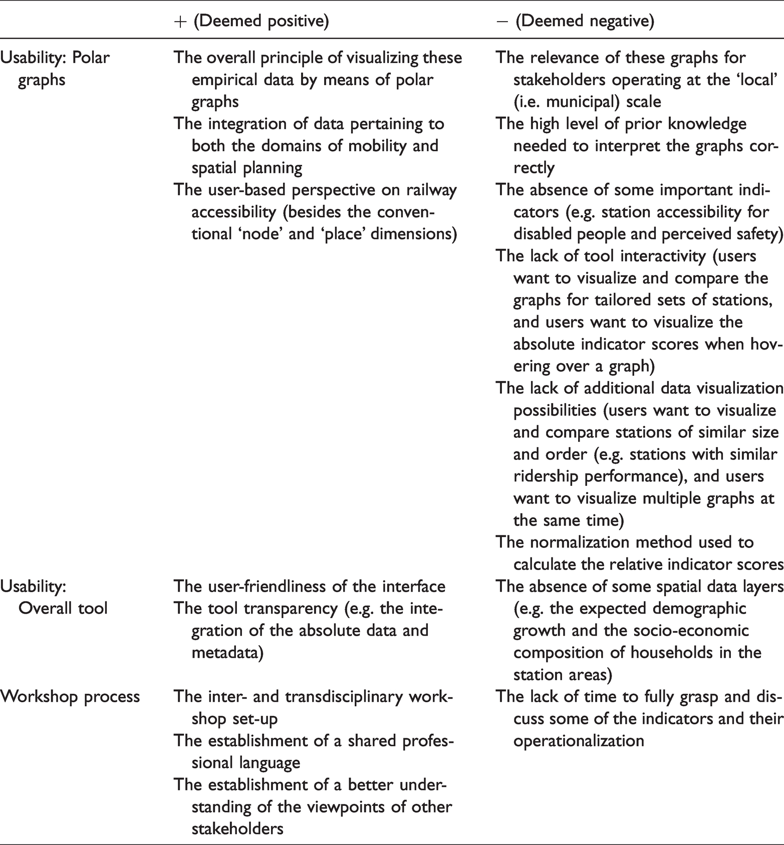
The experiential learning process started with a number of observations and reflections (O&R) that took shape during the preparatory meetings leading to the first workshop. Our local co-organizers expressed a strong interest in the tool for a number of reasons. First, an academic and alleged ‘politically neutral’ setting in which a sample of crucial regional stakeholders would be joined under the banner of TOD, was deemed interesting as it would allow our co-organizers to probe the stance of the participants with respect to this relatively new policy principle. Also, whereas our co-organizers hypothesized that the tool might introduce a ‘common ground’ to support supralocal discussions about station development potential, some concerns were raised with regards to the ‘very mathematical’ indicators. After two tool stress tests with our university colleagues and a further refinement of the tool and the polar graphs (FAC), StationsRadar was ready to be tested during the first workshop in Ghent (TNS).
At the time of the workshop, the transport region of Ghent had just been established. The CE on the basis of which the tool was validated was therefore largely stakeholder-specific, instead of it being a cohesive planning practice with well-defined roles. Nonetheless, some clear O&R in terms of tool usability could be made. First, the tool was deemed most relevant for the ‘supralocal stakeholders’ (the mobility providers, the intercommunal organizations and the Flemish and Provincial Governments). A variety of uses on the scale of the transport region were envisioned: to ‘better inform regional allocation decisions’, ‘help developing a hierarchy of nodes’, ‘help integrating the different layers and modes of public transport in the region’ and ‘function as a communication tool between stakeholders’. However, the added value of the tool at the local, municipal, level seemed less evident; while many participants stressed the need for empirical evidence as an input for local strategy-making, the polar graphs were deemed insufficient at this stage, mainly in terms of the level of detail. Most municipal stakeholders stated that the absolute figures provided in the data table were (far) more relevant than the relative scores displayed in the graphs. A second reflection concerned the lack of interactivity of the tool and, more specifically, the observation that users could not plot polar graphs as a function of their own desired station selections: ‘It would make more sense if we could compare stations of a similar size and order’. Additionally, the tool should allow plotting multiple graphs next to each other, fostering the ease of visual comparison. Third, we observed and experienced how the NMBS rail user-based data revealed novel and meaningful insights. This was especially the case for representatives of smaller municipalities who generally lack the resources to frequently update mobility plans and organize passenger counts or conduct user-based surveys.
With the above reflections in mind (FAC), we embarked on the second workshop in Aalst (TNS). In contrast to the previous case, the transport region of Aalst was established in 2016 as a pilot project. The CE of the workshop participants was therefore more developed in terms of there being a collective practice. In general, most participants found the idea behind the tool very strong, referring to the integrated approach of mobility and spatial planning and to the ‘stimulus’ it could give to ‘thinking more regionally’. Similar to the previous workshop, the difference in perceived usability between the local and the regional governance scales was quickly raised. However, during one of the focus groups a discussion arose about how the tool’s usability could be improved for local stakeholders, and how this in turn could benefit the transport region’s functioning. As a mobility expert explained: ‘If the tool would allow for flexible polar graph comparisons between municipalities, then it might foster inter-municipal dialogues in which certain measures taken and their actual impact are compared and discussed. For example, if a municipality introduced toll parking at the station, it would be interesting to see, also for neighbouring municipalities, how this affects particular parts of the graph. In this way, the tool could foster a bottom-up and peer-review dynamic that could reinforce the transport region’. Additionally, a series of interesting improvements in terms of polar graph visualization were proposed, such as displaying the absolute data when hovering over a slice of the graph. Or, as one spatial planner proposed: ‘It would be great if we could make selections of stations based on one particular theme, such as ‘ridership’. In that way, you could easily select stations with similar ridership characteristics, plot their graphs and examine how and why they are performing differently. These usability statements reveal a similar need for interactivity as was expressed during the first workshop. Another point that was also raised earlier concerns the difference in expertise and resources between smaller and larger municipalities. As stated by an Alderwoman responsible for Mobility and Public Works: ‘The problem is that, and I mainly speak on behalf of the rural municipalities, whenever you have all that information, you need to be able to work with it. You need to have the manpower to get started with it and draw conclusions from it’. This statement resonates with the perceived complexity of the beta tool version by many participants. As one mobility expert put it: ‘After today’s workshop it became clear to me how the tool comes close to the complexity level of our transport models or ArcGIS. In other words, you will always need an operator’. This perceived complexity translated into the survey findings pertaining to the indicators and their mode of operationalization. These survey statements were met with a high number of blank responses and with most participants stating that the workshops did not provide enough time to respond in a well-informed way. As one participant noted: ‘We should be able to work with the tool for a longer period, let’s say a week, in order to give more grounded feedback’.
We concluded that the second workshop led to some innovative usability suggestions, and that our O&R were largely in line with those of the first workshop. We also experienced how some stakeholders (such as De Lijn and some municipalities) offered to contribute to the tool by providing additional data, which inspired us to reflect on a tool design that could cater for increased user involvement in this direction.
With the above usability hypotheses in mind (FAC), we embarked on the final workshop in Leuven (TNS). Although this transport region had just been established, a large share of participants was experienced in working together on this regional scale (CE) due to their involvement in another regional project. Similar to the previous workshops, an important observation was that participants requested more flexible station comparisons, and that they stressed the importance of the absolute numbers over the relative graph scores. For example, a municipal mobility expert asked: ‘But why did you opt to compare stations with each other? This diagram totally contrasts with how we are used to look at things. You look completely different at those numbers. We always start by looking at the absolute numbers, the inflow: how much and how do people get there etc. But these diagrams… It’s all so relative’. Along with the above, suggestions were made to alter the way in which the relative scores were normalized, and ideas for additional indicators were proposed such as a ‘design for all’ indicator (reflecting the accessibility of the station and bus stops for disabled persons), an indicator reflecting perceived safety of the station area and one reflecting the level of road congestion in the vicinity of the station. Throughout the survey, some additional suggestions to include cartographic material, i.e. a layer visualizing the expected demographic change in the region and a layer reflecting socio-economic characteristics of station area residens (age, income, …). However, other participants questioned the need to further expand the amount of data included and would rather distil the most relevant indicators only. A final observation in line with the previous workshops was the strong interest for the NMBS user-based data. For example, a Provincial policy officer responsible for spatial planning reflected ‘how great it would be if the data about the catchment area sizes could also be visualized spatially, let’s say by using raster images so there is no privacy problem’.
An updated StationsRadar tool
Drawing on these usability insights, we thoroughly modified the tool. Figure 3 illustrates the updated tool’s different components, which we now briefly discuss.

The components of the updated StationsRadar tool.
The majority of participants expressed a desire to plot multiple polar graphs simultaneously, and to plot the scores for tailored and flexible sets of stations. In order to live up to these expectations, we had to rethink the way in which the polar graphs were created. While ggplot2 offers much interesting features, it does not allow for this kind of flexibility. We therefore opted for an open-source Javascript 7 framework by using ‘Vue.js’, 8 ‘Vuetify’ 9 and the JavaScript libraries ‘D3.js’ 10 and ‘Highcharts’. 11 The polar graphs were designed using D3.js and Highcharts. The relative scores are now calculated reactively, so that the performance values are scaled relative to the particular group of stations selected. Also, when hovering over the diagram the absolute performance values are shown along with an indicator description. Figure 3(d) provides an illustration for the 27 stations that are located in the transport region of Aalst.
Besides this intervention, we also tackled the user feedback pertaining to the ability to plot selections of stations for one particular theme (i.e. one particular slice of the polar graph). To this end, we invoked line chart visualizations that display the absolute indicator scores in a more informative way (see Figure 3(c)). These charts give a quick overview of indicator performance and distribution across the stations selected. Figure 3(c) illustrates the performance of a group of 12 stations that are located along a rail corridor, and this for the theme of ‘rail-based accessibility’ which consists of six indicators. When hovering over the plot, the absolute values are shown. These charts were developed by drawing on the ‘spline with inverted axes’ template in Highcharts and D3.js.
Besides these charts, the absolute data can also be consulted in the data tables as illustrated in Figure 3(e). These tables are reactive in that the user can easily search and group records. In line with user recommendations, we also incorporated additional indicators where feasible. For example, recent data of station car and bike parking utilization rates were provided by one of the organizations and were added to the table.
The ‘maps’ tab serves to visualize geographic datasets in order to enhance the interpretation of the different data graphs. Figure 3(a) and 3(b) provide some illustrations. The former map displays a vector layer classifying all Belgian stations according to their ‘transfer centrality’ (Caset et al. 2019) in the railway network, whereas the latter displays a raster map showing the density of ‘regional amenities’. All maps are zoomable and additional data attributes can be visualized when hoovering over the map.
Discussion and conclusions
This paper reported on an experiential approach to the development of a TOD planning support tool in Flanders. At the root of this project was the observation that few of the accessibility instruments commonly discussed in the literature (node-place modelling applications included) are explicitly validated in close dialogue with their intended users. This is surprising, as the majority of node-place based studies touch upon the interface between planning research and practice and highlight, or at least hint towards, the usefulness of their empirical outcomes to (a variety of) stakeholders involved in TOD planning.
In order to help bridge this gap, we extended the work of Straatemeier (2019) and Silva et al. (2019) by organizing a number of experiential workshops in which the recently developed StationsRadar accessibility instrument was tested and subsequently revised on the basis of the concrete experience of policy and planning stakeholders actively involved in the Flemish transport regions. The development process from the beta to the updated version that is now published online (see https://stationsradar.ugent.be), can be considered part of another loop in this experiential learning process, as we revisited and altered the abstract concepts (the graph and map visualizations) and produced a version that is now ready to be submitted to new rounds of testing, albeit in a real-life context.
While we acknowledge that our usability appraisal would have higher analytical purchase had we also incorporated an ex post evaluation of the updated tool, we believe that the observations and reflections discussed in this paper bear relevance for the well-rehearsed practice of developing empirical station area assessment tools for TOD planning. While each planning context is unique, it may well be the case that our usability recommendations are, to a certain extent, transferable across planning contexts. Below, and by way of concluding this paper, we therefore summarize the most important general usability recommendations emanating from our study. In the process, we reflect on the broader technical and methodological challenges that come with implementing these in practice. Interactive and diversified data visualizations: There was a clear consensus that the data and the derived indicators needed to be visualized as interactively as possible, allowing users to draw and compare graphs on the fly for tailored sets of railway station locations. Additionally, participants expressed a need to consult the data by means of multiple, diverse, visualization modes. For example, the line charts serve a different purpose compared to the polar graphs in that they quickly provide absolute numbers and data distributions for tailored sets of indicators, whereas the polar graphs provide a more generic station profile reflecting aggregated, relative, performance levels. These observations are revealing in that none of the TOD support applications discussed earlier have incorporated interactive elements, nor have they (or do they seem to have) experimented with multiple data visualization techniques beyond the traditional polar graph standard. As a corollary, we believe that future work along these lines (i.e. work that develops TOD support tools that depend on strong visual cues) may benefit from a closer engagement with the field of visual analytics (dealing with visual and interaction metaphors and semantics) (see Andrienko et al., 2010 for a fuller discussion). Transparent disclosure of data and actor-mobilizing momentum: We experienced that it is crucial to transparently communicate the absolute numbers behind the polar graph visualizations. While this finding may not surprise, it does provide food for thought since most of the TOD applications discussed earlier stop short of this level of transparency necessary to meaningfully support TOD planning. We also experienced that the open disclosure of data from different organizations instigated other stakeholders to also contribute to the platform by disclosing their own unique data. While this actor-mobilizing momentum arguably signifies one of the most valuable achievements of this research project, it also brings about substantial challenges in terms of data curation. Although we devised a standardized contact sheet allowing users to get in touch if they wish to contribute, in an ideal scenario users would be able to modify and save data records directly in the tool, thus pushing the level of tool interactivity – and ownership – to the highest possible extent. Arguably, the easiest way to accommodate this level of interaction (i.e. add, remove and edit records) implies creating a user-based portal that is supported by a full R Shiny/Vue.js integration. Such an approach would be similar to the current set-up, with the difference that R Shiny would not only be used to visualize data, but also to collect and curate the data. This approach, in turn, generates significant challenges in terms of data quality control, data integrity and in terms of resources (a dedicated server and backend development would be needed) (see also Haklay, 2010 for a fuller discussion in light of volunteered geographical information). Integrating ‘hard’ and ‘soft’ data and crowdsourcing aspirations: The previous point resonates with the desire that was voiced by many participants to visualize additional ‘soft’ or qualitative data (Billger et al. 2016) that would pertain to aspects such as station area safety, comfort and inclusivity. For the case of StationsRadar, these data may be gathered by means of crowdsourcing techniques. Such an intervention would expand the planning support tool with a dynamic ‘sounding board’ functionality, displaying crowdsourced ‘soft’ station accessibility data as provided by citizens. The potential of such an approach was raised recently by Bertolini (2017) who hints at the importance of including non-expert planning stakeholders in experiential learning processes, possibly by means of web-based interaction. By the same token, Silva and Larsson (2018) recently made a plea to connect the different contexts and uses of the accessibility concept (i.e. academic, policy and planning and every-day life) in a more systematic way. Such a future research avenue in which ‘traditional’ datasets are integrated with crowdsourced data will arguably require a more intensive engagement of the empirical TOD planning support literature with participatory approaches to mapping and GIS and with critical discourses on ‘smart cities’ (Batty, 2012).
Supplemental Material
sj-pdf-1-epb-10.1177_23998083211010793 - Supplemental material for Visualizing the potential for transit-oriented development: Insights from an open and interactive planning support tool in Flanders, Belgium
Supplemental material, sj-pdf-1-epb-10.1177_23998083211010793 for Visualizing the potential for transit-oriented development: Insights from an open and interactive planning support tool in Flanders, Belgium by Freke Caset and Filipe M Teixeira in EPB: Urban Analytics and City Science
Footnotes
Acknowledgements
We want to thank Belgian National Railway Company NMBS and the Flemish Institute for Technological Research VITO for the provision of data in light of this research project, as well as everyone who participated in and helped organizing the workshops.
Declaration of conflicting interests
The author(s) declared no potential conflicts of interest with respect to the research, authorship, and/or publication of this article.
Funding
The author(s) disclosed receipt of the following financial support for the research, authorship, and/or publication of this article: This work was supported by FWO (Fonds Wetenschappelijk Onderzoek, grant number 1S09616N).

Supplemental material
Supplemental material for this article is available online.
Notes
References
Supplementary Material
Please find the following supplemental material available below.
For Open Access articles published under a Creative Commons License, all supplemental material carries the same license as the article it is associated with.
For non-Open Access articles published, all supplemental material carries a non-exclusive license, and permission requests for re-use of supplemental material or any part of supplemental material shall be sent directly to the copyright owner as specified in the copyright notice associated with the article.
